WooCommerce is a popular platform for building websites, offering numerous features, customization options, and a user-friendly interface.
We’ve handpicked these top 40 WooCommerce websites to help small businesses and non-profits maximize their online presence.
We ranked sites based on design, functionality, uniqueness, and user experience. These top WooCommerce websites offer inspiration for building or revamping any WordPress e-commerce site.
Whether you’re starting out or seeking a refresh, this list is your guide to building out a WooCommerce design. For other platforms, see our Best Websites of 2023 article!
Top WooCommerce Website Designs
1. Protest
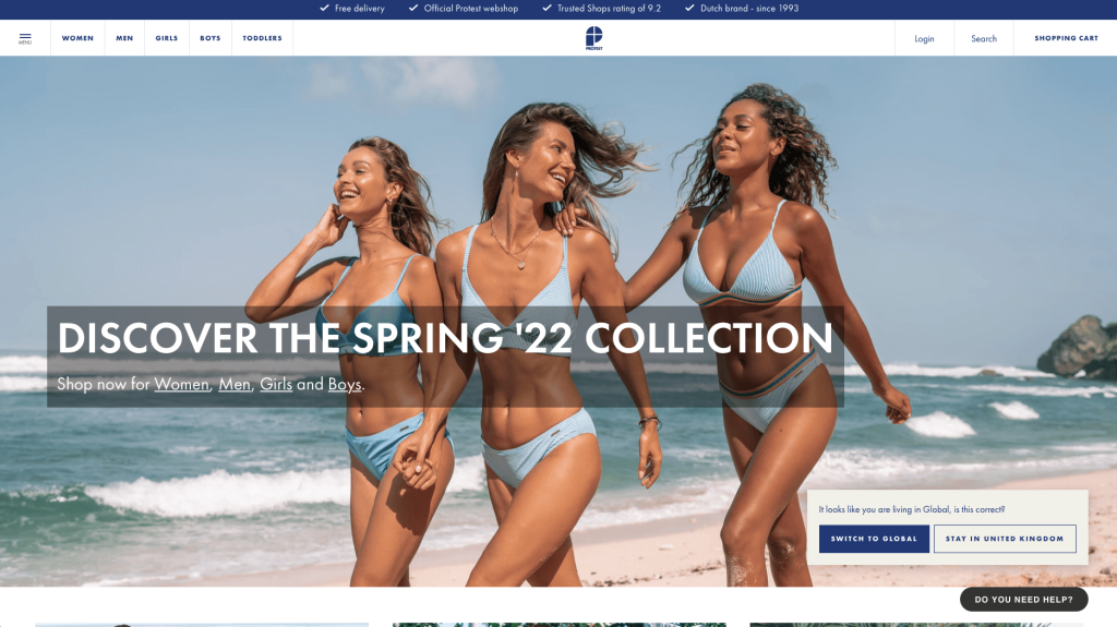
This company utilizes an interesting logo design with 4 wedges making a “P”. Protest shows off great product width, meaning they have lots of types of products within their clothing line. They include clothes for women, men, girls, boys, and toddlers so they can truly keep life-long companies. Including a banner for current and upcoming sales was another good marketing move.
Related: Looking for a developer to help build your next WooCommerce website? Check out our ecommerce agency.
2. NC Fit
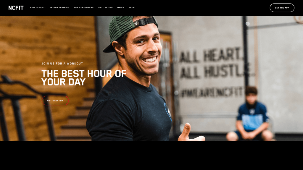
Dark colors dominate this site, making it feel very modern and classy. Everything is well organized and carefully places items to create a design with great white space. Another great choice was their bold fonts. Including videos and high quality images was another good marketing decision. Having bright red buttons to help customers get to other areas of this site was also nice.
3. Only Mine
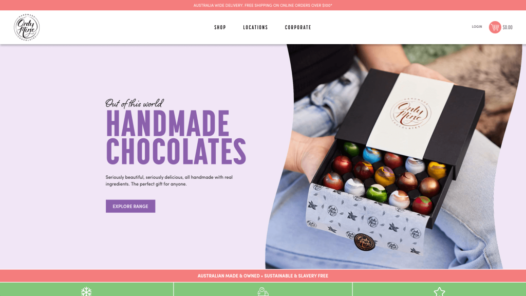
This company gives off a luxurious feel based on their package designs. Their logo design adds to that feeling because there is no cheesy image, just text. Curly fonts are used to seem less modern and a little more of a creative company. Navigation is simple and all products are displayed neatly. We liked their little drop down allowing customers to pick an occasion, type of chocolate and monetary range to find perfect items for you. Another feature we found useful was their recipe section that uses their products to help you make tasty treats.
Related: Already have an ecommerce site running WooCommerce? Our SEO experts can help with search engine optimization.
4. Sawmill Designs
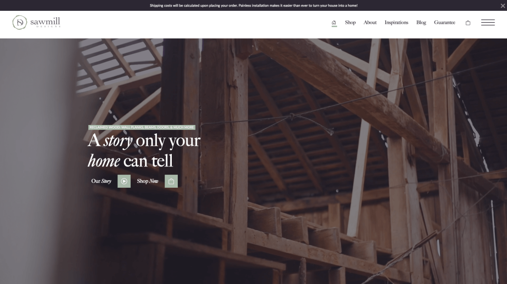
Sawmill Designs is unique because it offers a wide variety of services, including custom furniture design, carpentry, and home decorating. Likely this business’s best feature was their logo design, including a “D”, “S”, and some leaves. Sawmill Designs used graphics to showcase what each type of product will look like in your home, which was useful. Automatically playing videos are used throughout to tell a story. Including a blog was a feature we will never disrespect.
5. Disruptive Youth
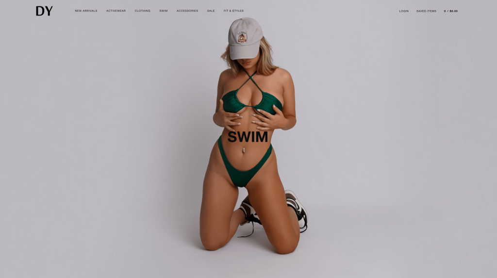
Disruptive youth has a huge collection of different bikinis for women. They went with a template with little writing so images were left to do the talking. Featuring a wishlist feature was another thing that stood out to us. They also offer lots of different styles in nearly every color. We also thought it was interesting to sell accessories (scrunchies) that match their swimsuits, we would love to see beads for bikini strings or other types of accessories.
6. Joco
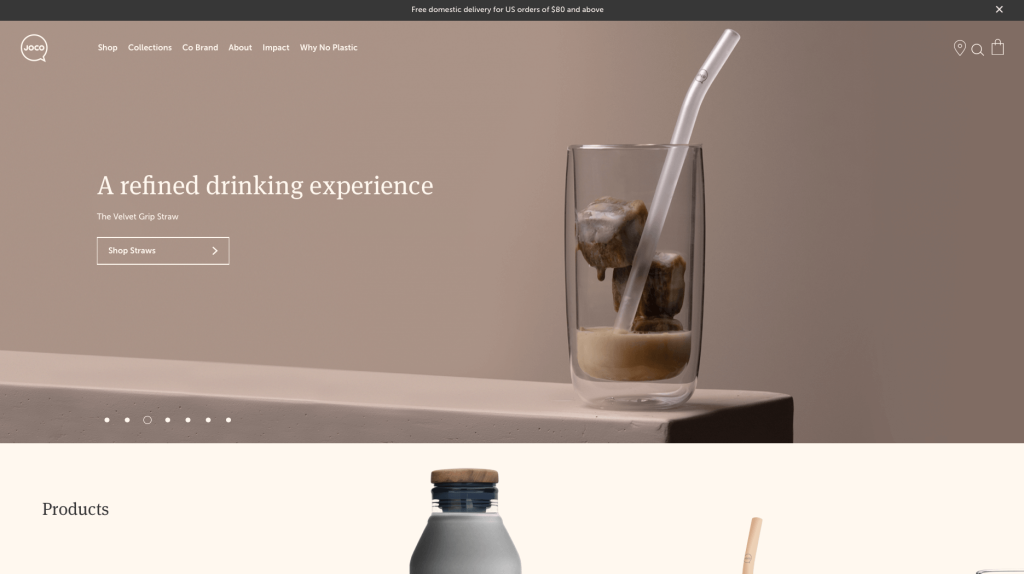
JOJO cups is very modern both in their site and their product. Tones of gray and off-white are used to evoke a sense of simplicity. It was smart to inform customers on their mission to reduce plastic. It was nice to include wooden lids for some products. Additionally, it was decent to include short paragraphs of information about each item.
7. Zoya’s Pantry
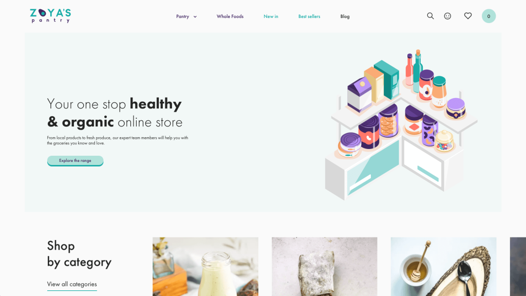
Graphics and imagery was something that really improved this template as a whole. Thin and basic fonts are used to create that simplistic feel. It was creative to include hearts to add products to a favorites list. Lots of additional information was included about each product, so customers know exactly what they are ordering. White space is used very carefully so it balances out all of Zoya’s Pantry’s content.
Related: Need help maintaining or managing your WooCommerce website? Let us know and we can help!
8. Magna-Tiles
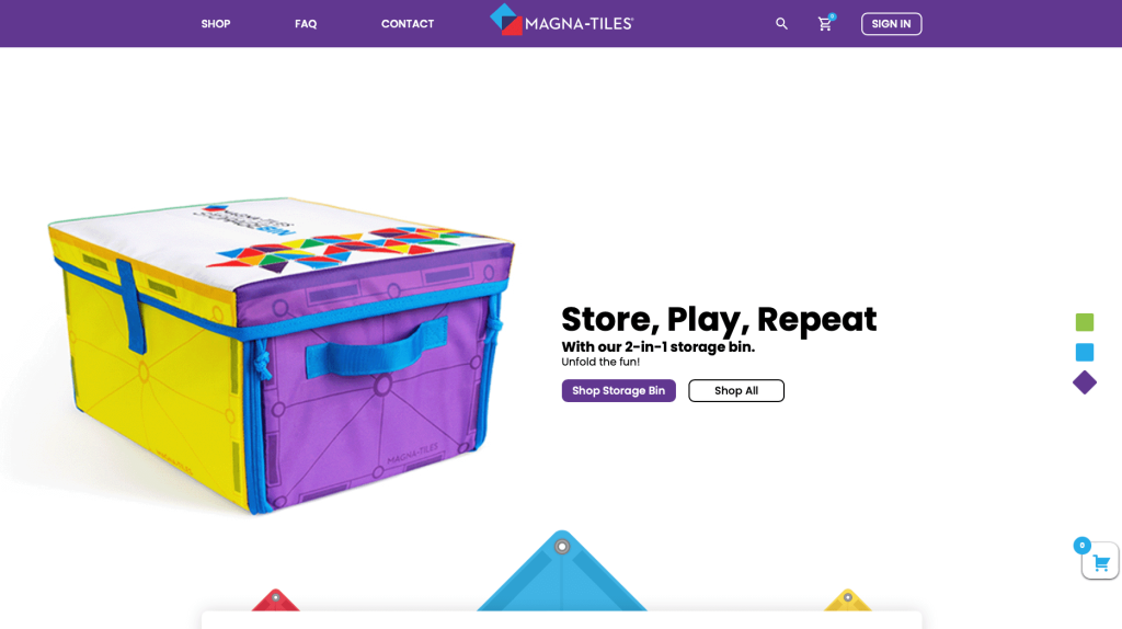
Here we have an extremely innovative product that is well represented in their WooCommerce sire. Bright and inviting colors are used along with a clean and organized template. Magnatiles’ logo design showcases their interlocking feature. It was nice how all their products were organized into four different categories. A FAQ page was something else that truly stood out to us.
9. Printing New York
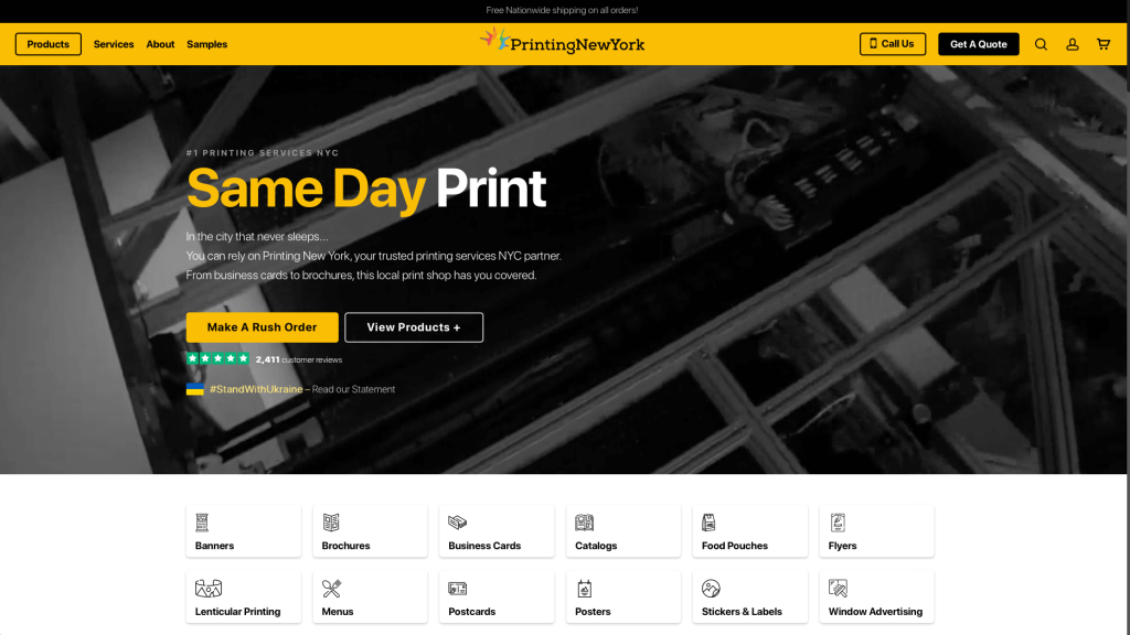
Modernism leaks through every page of this black and yellow covered example, giving it a classy and professional look. We loved their automatically playing video that showcases not only NYC but also what they do at their company. This company did a great job with their logo design that looks like a modernized version of lady liberty’s crown. Printing New York has been around since 1988, so customers know that they can trust them.
10. BetterBody Foods
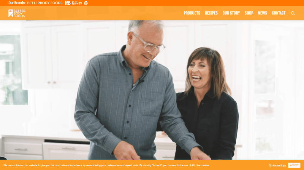
BetterBody Foods uses a bright orange to evoke positivity towards this business. High quality videos show their healthy ingredients that are used. Lots of different diets help to separate their items so customers with specific diets are able to find what they want faster. Including their Instagram right into their template was genius.
11. Kawaii Box
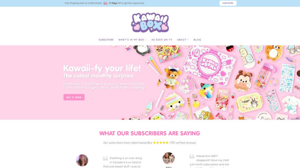
Kawaii Box is a monthly subscription box filled with super cute kawaii items from Japan! Using a pastel color scheme and bubbly letters makes for a kiddish feeling. It was absolutely amazing to include customer reviews and an Instagram section. Another feature we enjoyed was their as seen on TV section, and their blog.
12. Porter & York
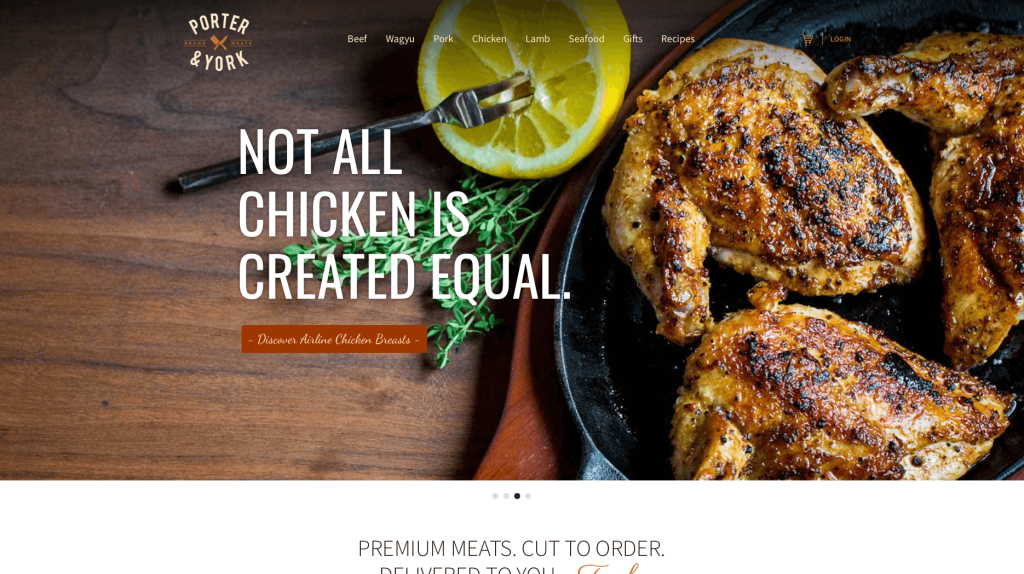
Port & Yorker shows that they sell high-quality meats with their stunning imagery. We loved how their images included raw meat cuts and what meals their meat could become. This is a great example if you want to play around with typography. They use various different fonts that all work together to create a professional feel. Lots of simple graphics were added in to make cuts of meat more obvious what you are buying.
13. Nic Harry
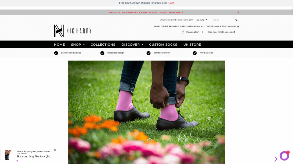
We loved how this logo design seems modern but still creative. Lots of negative space can be noticed, but in a way that it isn’t boring. We liked how most of their imagery clearly focused on their products versus seeing entire model images. This sock company stands out because of their crazy patterns. You can also see all reviews from other customers when viewing a specific product.
14. Ashville Bee Charmer
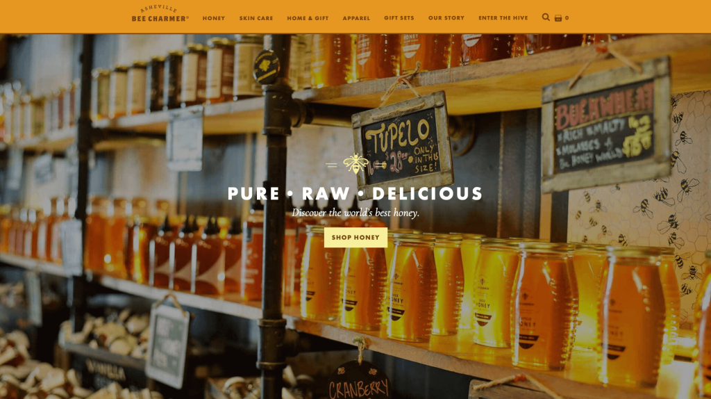
Asheville Beecharmer takes advantage of oranges, yellows browns and off-whites to create that natural feel. This design is also responsive, so it looks great on many different devices. Using a variety of small flowery graphics to make sure that natural feel is noted. It was amazing to include information related to their community that surrounds their business locations.
15. SmokeHaus
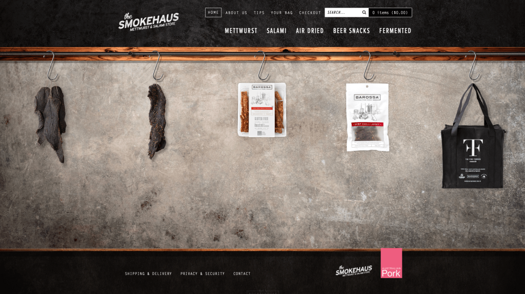
Smoke Haus is an Australian-based online store that specializes in selling smoking accessories. The website has a minimalist design with a black and white color scheme. The layout is easy to navigate, and the products are well-organized. We like that there is a section on the website dedicated to helping customers find the right product for their needs. The blog also posts valuable articles related to smoking, which may help visitors learn more about this niche hobby. One of our favorite features is that each item description includes ratings from previous buyers who have purchased the product. The homepage is brief and to the point.
16. Hidden Grounds Coffee
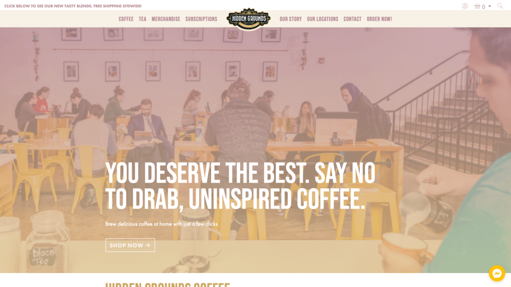
Everything about this site seems simple and modern. We loved how Hidden Grounds Coffee uses lots of bold fonts along with a simple color scheme. Overall it was pretty easy to navigate through because products are very well-organized. Additionally, we enjoy how bright yellow accents that are used as buttons and small accents. Extremely short paragraphs could be noticed to help make this site less overwhelming. Lastly, including an entire section for parts of their Instagram page.
17. Nalgene
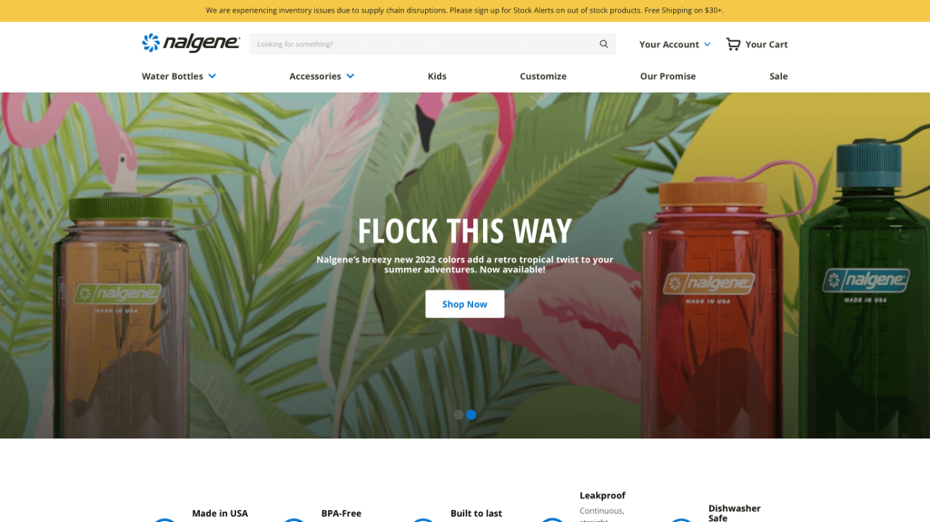
Playful emotions are evoked with their creative fonts along with interesting patterns and graphics. We really thought that having. We thought it was really creative to add a feature to create your own designs, where you can find anything from bright pink to classic black. Nalgene is also a very reputable company with and it shows through their design. Additionally, having a search bar was smart because it allows for customers to find specific information faster.
18. Striiiipes
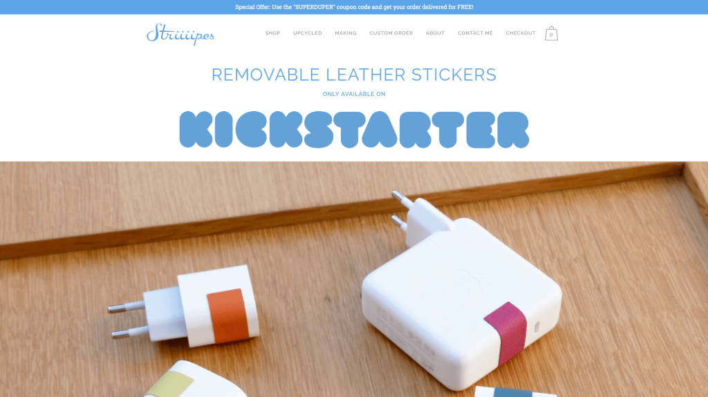
Modernism is a feature that comes through in both their product and their web design. Everything has a great balance and allows for simple navigation. Showcasing a good variety of their unique products was extremely helpful to customers. We thought adding in drop down boxes for their navigation bar was thoughtful. Adding in a contact button next to each item description so you can message them directly with any questions or concerns about their product was a perfect choice.
19. Stems Brooklyn
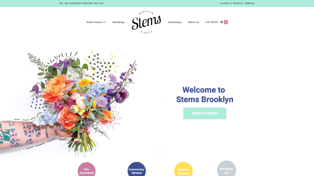
This is an amazing example for anyone looking to develop a site. Having a creative pastel color scheme was a creative choice that we enjoyed. This layout is easy to follow, and a clear hierarchy of information is shown. It was a cool idea to show a picture of their building. We thought it was interesting to paint their part of their building with bright colors to stand out from red brick. Including lots of stunning images of beautiful flowers. Lots of buttons were also included to help customers get to certain information faster.
20. 3 Speed Holster
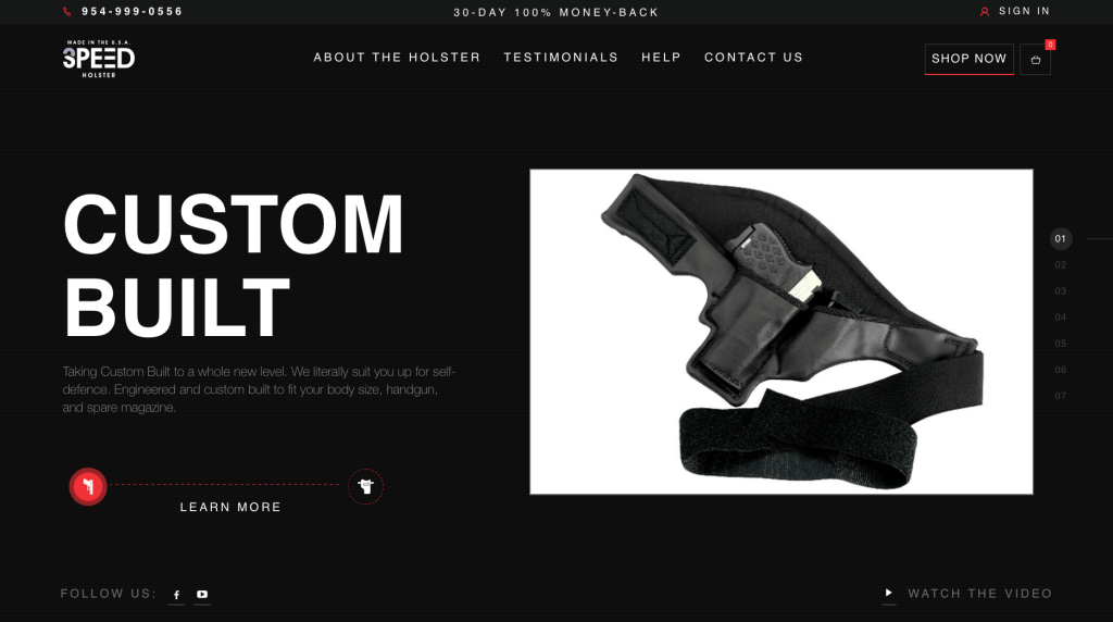
While this example could use a bit more work, it wasn’t terrible. We liked that there was lots of pictures of their innovative product. A dark background helps to create a different feel for this company. Likely this business’s best feature was their logo design that utilized a 3 and speed in one icon. We also liked that there was just the perfect amount of information so it doesn’t seem overwhelming.
21. Sake One
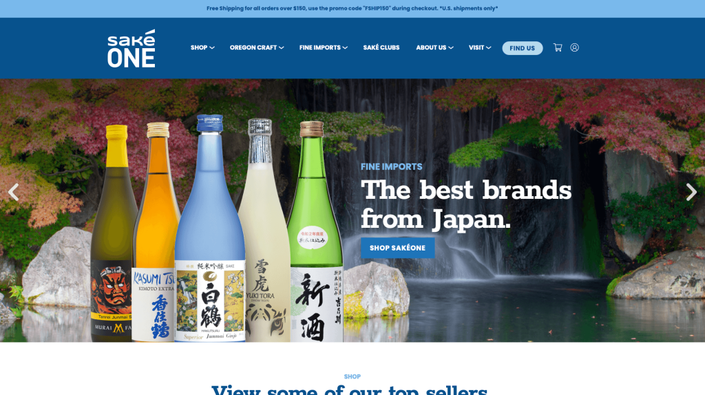
Here we have a minimalist design with a clean, white color scheme. It was great that Sake One used remarkable packaging designs, clearly displayed throughout these pages. We loved how they added in a section for their social media page. We also enjoy their white and blue color scheme that is simple and calming. Finally, this company did a great job with their variety of fonts.
22. Huru
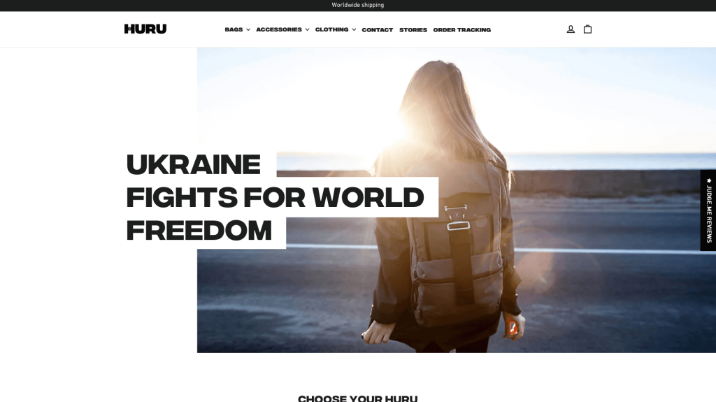
Bold fonts clearly are a plus for this design because it really shows off a modern feel. Along with that, using mainly black and white helped with that simplistic look they were going for. Huru’s overall aesthetic is very pleasing to all customers eyes. There are not a lot of bells and whistles, which is nice when you’re just trying to find information quickly.
23. Rusty Surfboards
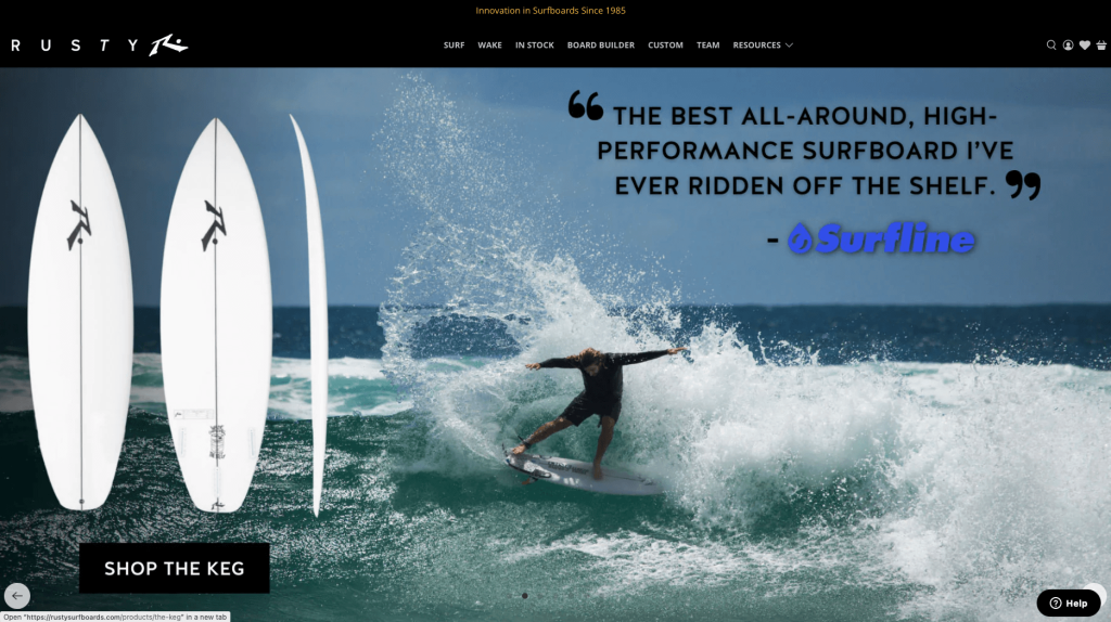
Rusty Surfboards does a great job with their loads of images carefully placed in areas that enhance the overall look. Overall, this design is very clean and minimalistic. Adding in lots of connective blog posts was a smart idea. We also like how it has a lot of negative space and making it look less cluttered. We also thought it was helpful to have drop-down boxes for their navigation bars.
24. Chuckling Goat
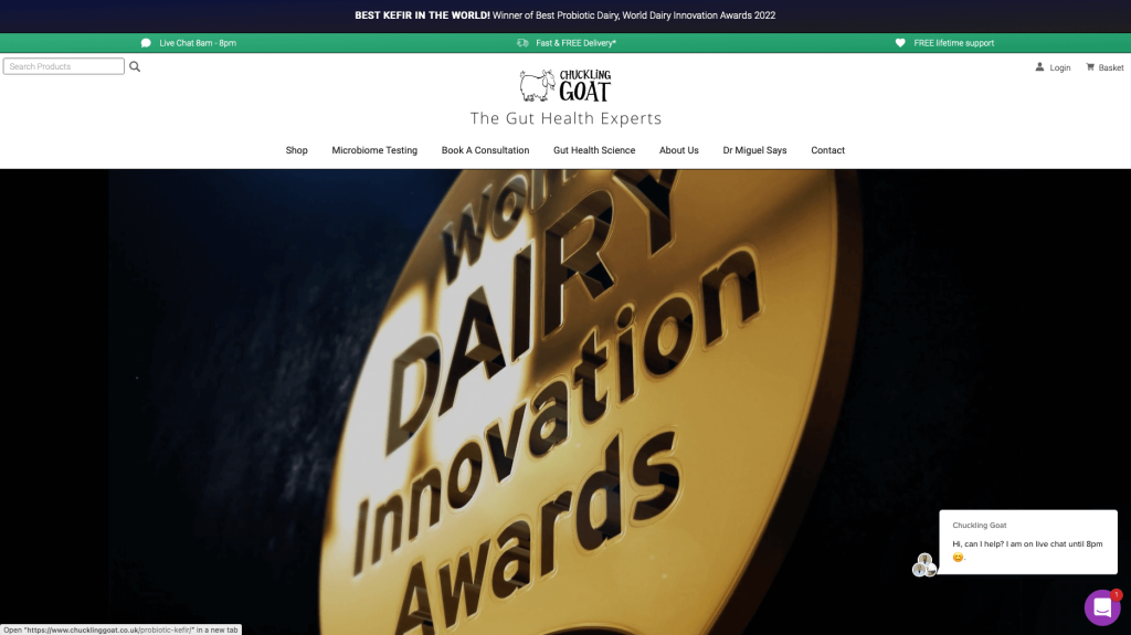
Another one of our examples sells organic goat’s milk soap and skincare products, and you can tell by their business name. Some images are included which really helps with their visual appeal. It was smart to have short and straightforward paragraphs. Another feature we enjoy is having buttons to help customers to get to other pages. We also really enjoyed their use of a green accent.
25. Rotimatic
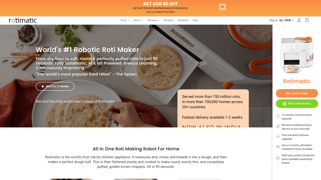
We really like that this company shows off their product as many people might not know what it is. An orange accent covers a mainly white color scheme that helps important parts. All of their photos are very high quality, and they do a great job of highlighting interesting features about this machine. We also liked how they used lots of small graphics to help make this site look more interesting.
26. Avrox
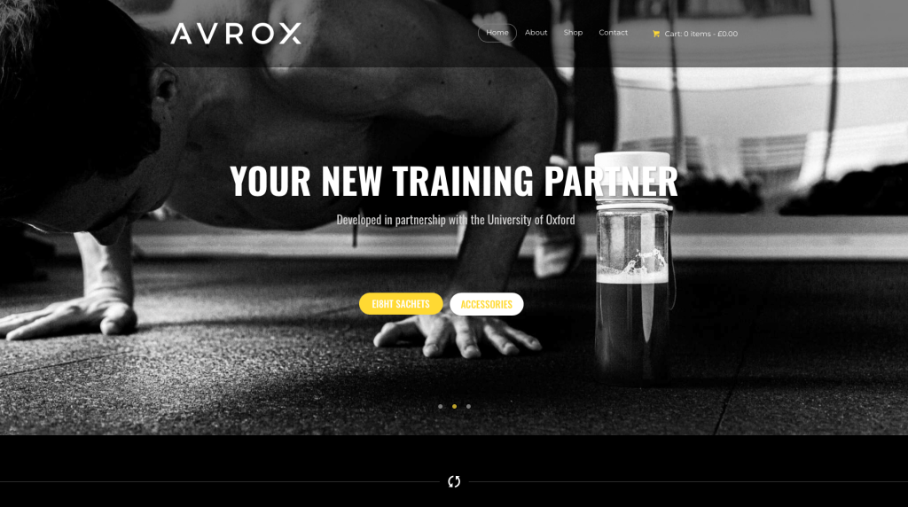
This company did a great job with their black and white palette with an accent of red. Everything is very clean and organized, making it easy to navigate. It was smart to include videos to help customers understand this company a little more. Including a search bar was something else we liked. Customer service is available if you have any questions about an item or how something works.
27. Custom Barres
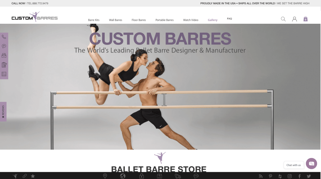
We love their white, black and light purple combinations. We enjoy their high-quality images that really match their color palette. Overall, this theme gives off a sporty and classy fitness look. We also love how everything was very well organized. We also really enjoyed their search bar. There was also a lot of whitespace which makes everything more readable and user-friendly. The chosen font seems clean and looks good with design elements that they used.
28. DogTV
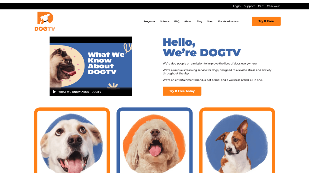
DogTV is very colorful and features lots of images of happy little doggos. We really like their use of additional graphics to enhance their overall look. This company is a great option for those looking for a new place to shop for their dog’s needs. We thought it was helpful that they have clearly labeled pricing. Including a special blog was another smart choice. One more unique feature was their science and FAQ portion.
29. Good Dye Young
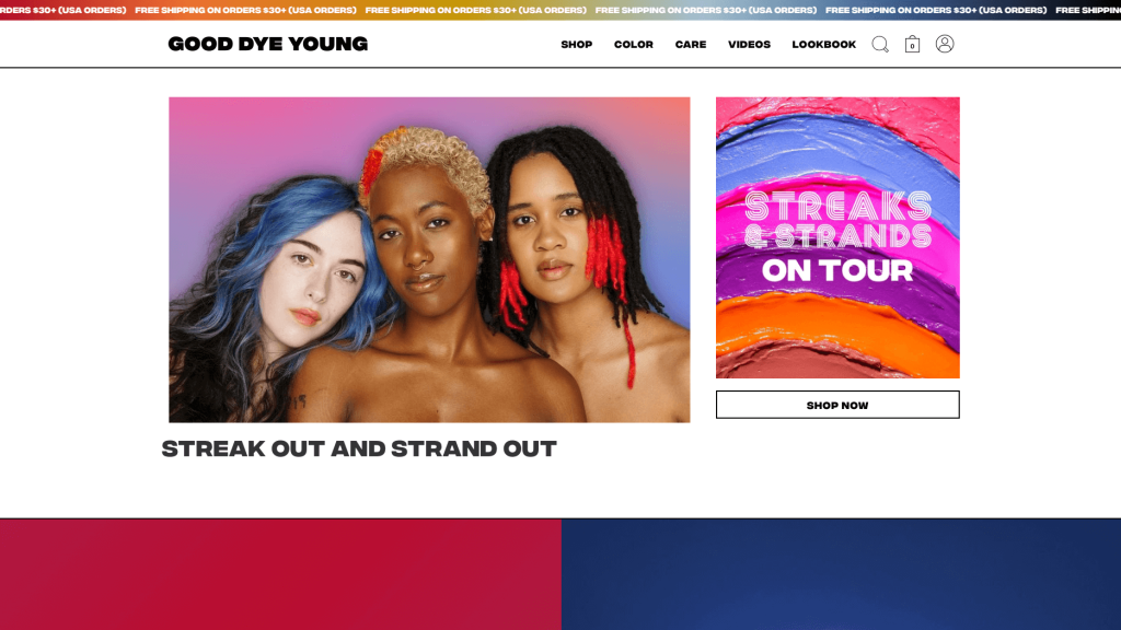
This hair dye company has a near perfect online presence. It was smart to organize their products by color, making it easier to shop around. Additionally, we loved all of their play-on-word titles, one even being their business name. Having a blog helps customers to learn more about them, hair care and more without even leaving this site. We also loved their logo design that features GDY and it’s arranged to look like a winking face with its tongue sticking out.
30. Pete & Pedro
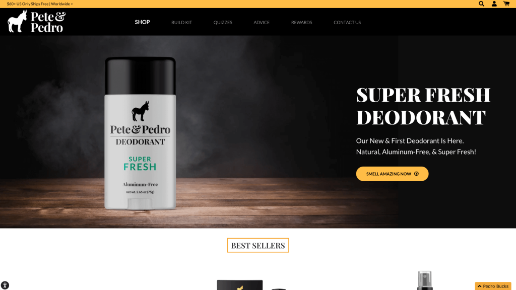
Pete & Pedro has many cool opportunities throughout their site. We liked how you are greeted almost immediately by a spinning wheel of savings. It was creative to include a quiz that customers to take to recommend products for them. It’s an overall modern design using mainly black and white with small yellow accents. Every product has high-quality images that help customers to decide what is right for them. We thought it was helpful to rate each product based on customer reviews. Finally, adding in a video section to see this company’s products in action was brilliant.
31. Duke Cannon
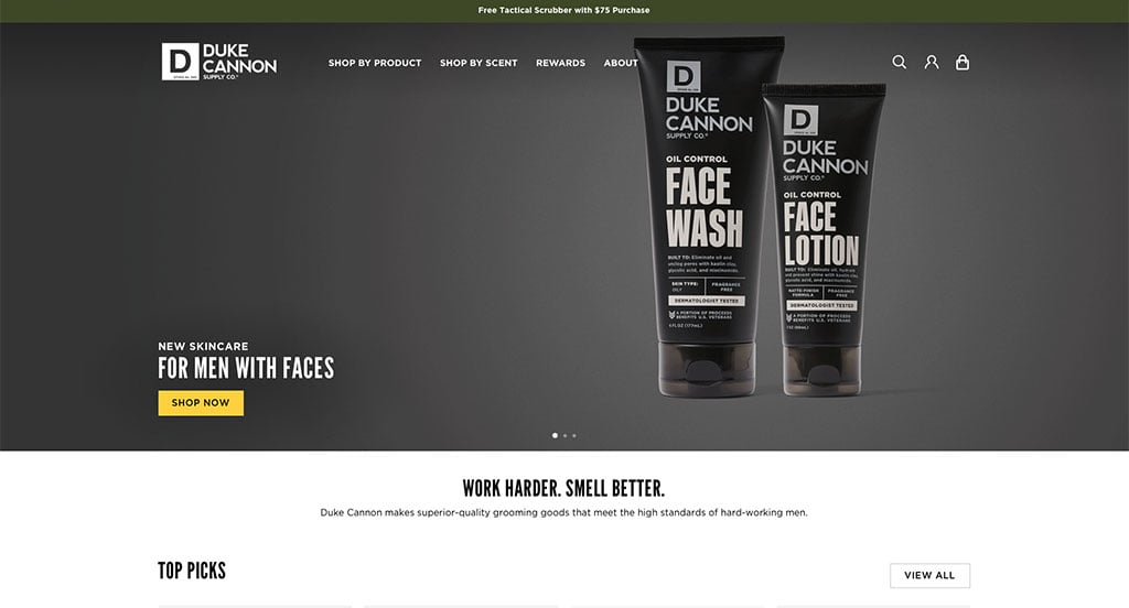
Duke Cannon did a nice job displaying a variety of their products along with their creative packaging. Another aspect we enjoyed was their use of short videos endorsing their products. We loved this company’s layout design that they chose because it displays their products well, but also balances images, written content, videos and whitespace. Additionally there was lots of buttons to help customers get to additional information. Be sure to consider this unique design when developing your next custom website.
32. AeroPress
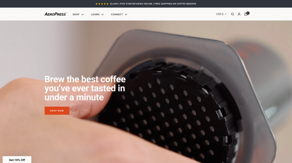
AeroPress is a great example of a simple, well-designed WooCommerce site. It was thoughtful to showcase their product all throughout this design. Once again we have a clean and modern feel where products are clearly displayed. Large red buttons are used to help guide customers to additional information. We also liked their thoughtful feature comparing their product to similar ones.
33. Bog Berry Dryer Balls
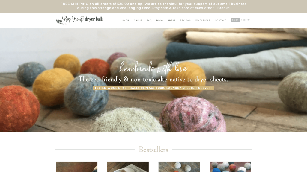
Bog Berry Dryer Balls does a great job creating a look that seems natural and woodsy. It was also great to include lots of images of this product used in different ways. It was also helpful to have a stunning logo design. Their use of different fonts were also amazing. Finally, choosing a domain that matched their company name was smart.
34. Earthbound
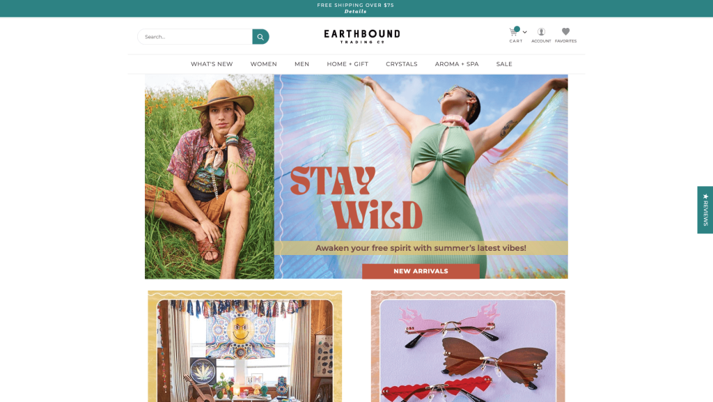
Color scheme really stays true in this example. Using blue, purple, and other colors that match up was a whole other type of beautiful. We also really loved their layout to stagger images in a unique pattern. It was stunning to have small graphic accents on their images to help certain products stand out. We thought it was smart to include a small banner sharing that free shipping is available if you spend $75.
35. Startup
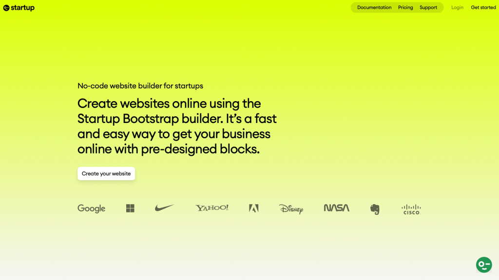
Here we have a very tech-oriented interface and a simple theme with bright colors. Startup uses lots of simple fonts to help customers feel that they will be paying for a very straightforward service. It was helpful to add images with rounded corners to look a little more interesting. Adding in lots of logos of famous companies that trust this company.
36. Tom Chalky
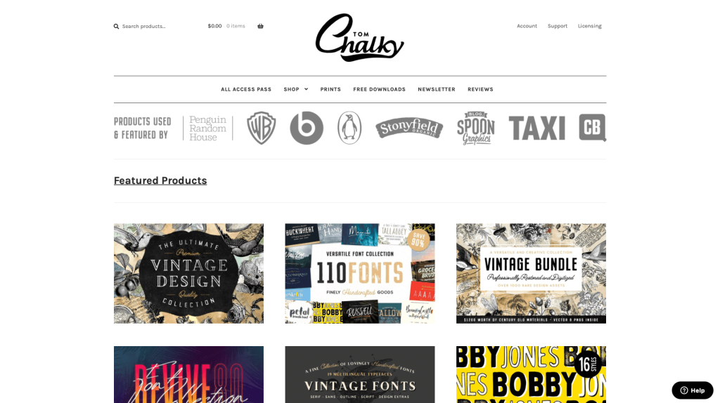
Tim Chalky showcases their portfolios very well, which was very smart on their part. Having a straightforward design was a great choice because it helps customers focus on their products. Lots of whitespace allowed for everything to fall into a beautiful grid design. Overall, this website looks very polished and would be great for any business to be inspired from.
37. Veer
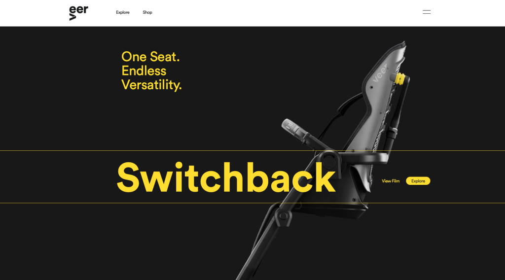
This company uses a great color scheme that alternates between black and white with an accent of yellow. It was super helpful to include buttons so customers can navigate easier. We also thought it was great because of their blog articles. Everything about this website is sleek and modern. Their products are displayed nicely with plenty of images. Additionally, their logo design was simple but playful.
38. Poppy Barley
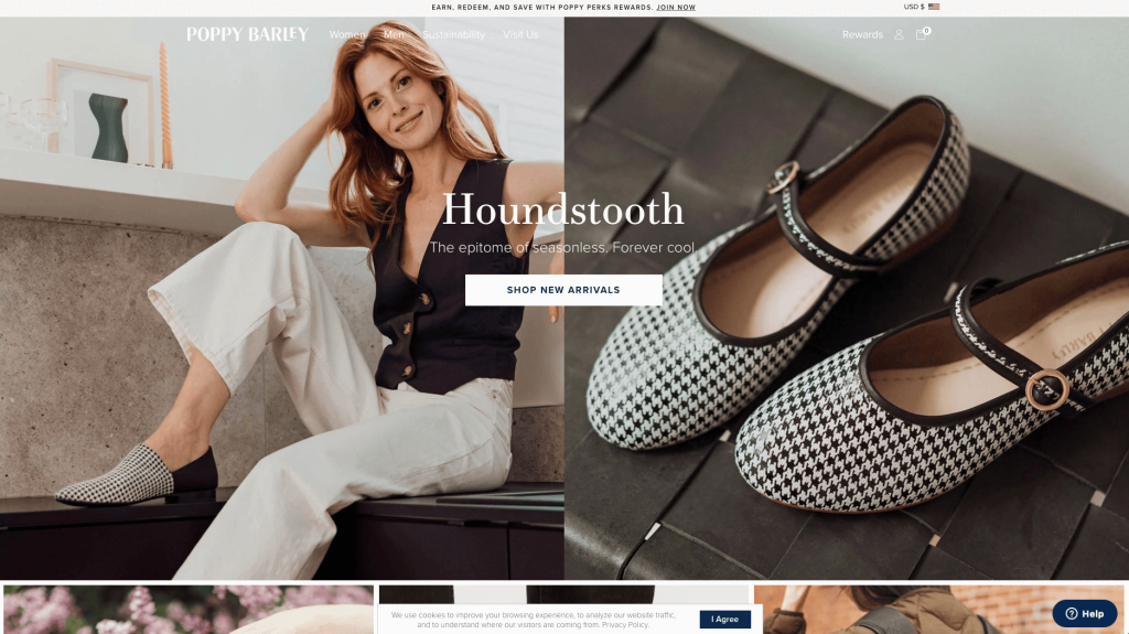
Poppy Barley is a store for trendy footwear and backpacks for both men and women. We do think that this company shows their perception of “trendy” with their logo design, font choice, and their simple color schemes. Each item has a modern yet vintage touch to them. We like how products are displayed right away in a way that is not overwhelming. Navigation is also super simple in Poppy Barley’s template. While this design is aesthetically pleasing, it still keeps things simple enough for people of all ages.
39. Daelmans Stroopwafels
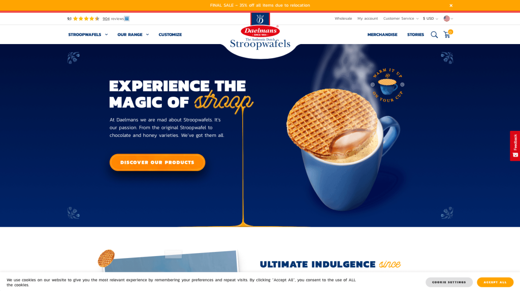
Likely this company’s leading feature was their dark blue and orange color scheme. We loved how this company definitely showcases their products in a perfect way. We loved their short and straightforward paragraphs to make everything easy to understand. Including a well-written and informative blog, was something other sites envy. We also love their use of creative fonts.
40. AB AETERNO
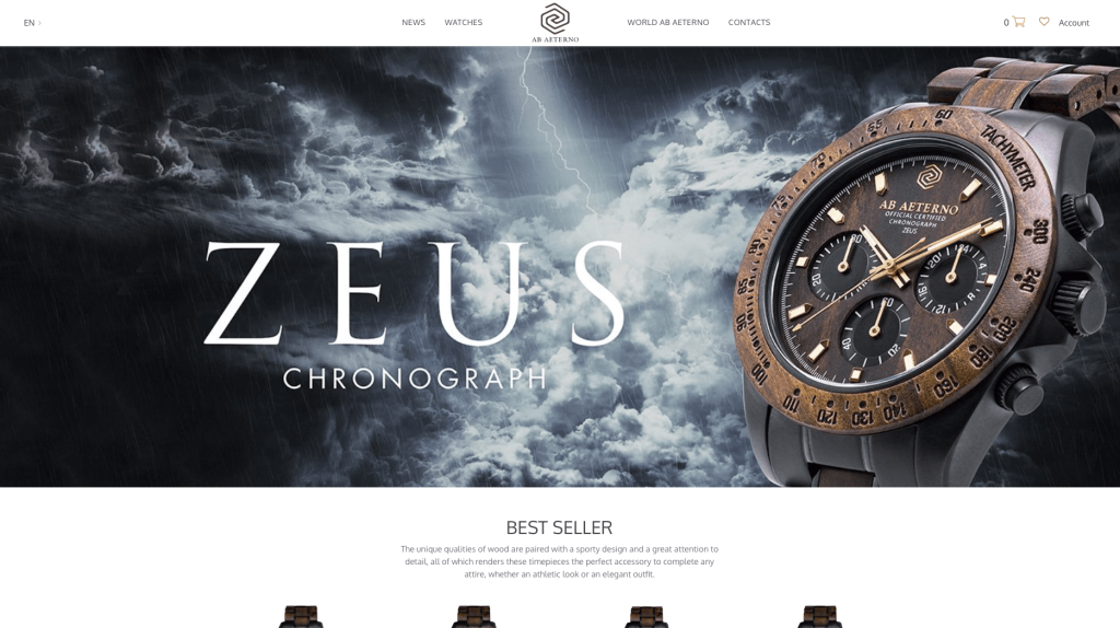
This company screams luxury in every portion of their layout. Their products use lots of high quality materials, making it feel like a better product. Their imagery sets them apart from many competitors. We loved how this company uses and reuses their logo design throughout their pages. Their colors, backgrounds and overall product shows off a masculine product, making males feel better about their purchase.
Recommended WooCommerce Themes
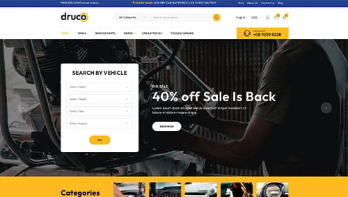
Druco – Themeforest
$59
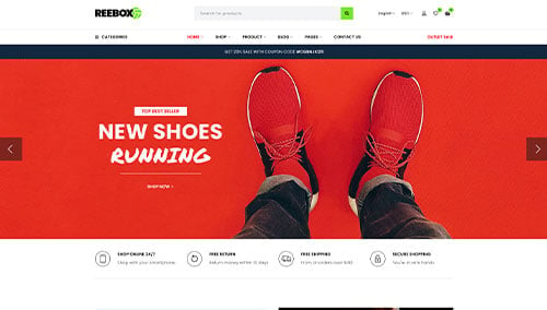
Reebox – Themeforest
$48
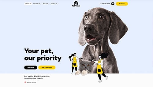
PetMania – Themeforest
$89
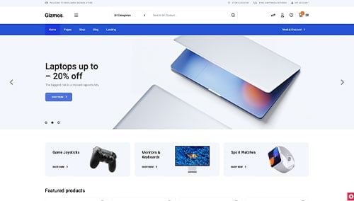
Gizmos – Themeforest
$89
FAQs about Web Development for WooCommerce Websites
Ecommerce websites in WooCommerce typically start at $6,000, while custom mockups with a custom theme begin around $20,000. Costs rise with premium design, custom functionality, and data migration needs.
Yes, WooCommerce supports payment gateways like PayPal, Stripe, and credit card processors for secure transactions.
Yes, WooCommerce enables customer reviews, boosting trust and influencing purchases.
WooCommerce Subscriptions lets you sell recurring products and services with regular billing, ideal for memberships and subscriptions.
We handle content updates during redesigns by reviewing existing material, collaborating on new content, and strategizing placement to ensure accuracy and brand alignment.