In this article, we’ll discuss 15 commercial web design tips for your website. As a business owner, you know the importance of having an online presence. A website is often your first point of contact with customers and prospects, so it needs to be designed well. Today we will discuss 15 commercial web design tips that can help your company reach its full potential online!
Recommended Strategies for Building a Great Commercial Website
1.) Create a plan to show your company’s culture
Everyone is different, and your company should be no exception. When designing a website, think about the culture of your company and try to represent that in a way that will resonate with your audience.
For example, if you are an organization whose mission is to help people understand their finances better through education, then consider using graphics, charts, and graphs on pages related to financial topics.
This keeps all parts of the site visually cohesive while also reinforcing who you are and what you do!
The color of your website should be consistent and reflect what you offer or what you sell. For example, blue for travel websites, green for eco-friendly sites, purple for creative projects, etc.

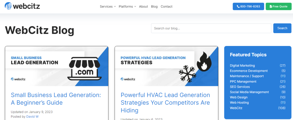
2.) Build a blog for supporting SEO content
If you have the time, consider starting your own company blog. Just like any other type of website, it is more likely to be successful if you are constantly adding fresh content and updates, which will keep people coming back again and again for new information. And by publishing on your company site first, you can also gain subscribers from every person who visits!
You can blog about anything from new products, tutorials, tips & tricks and many other things too! Just make sure you also post regular updates on your company’s Facebook page!

3.) Design for mobile to ensure its readable
Keep in mind that people using different devices when browsing your website. Your existing website might not load well on your mobile phone. As such, make sure your redesigned website is responsive and works just as well on mobile as it does on desktop.
4.) Stay informed of changes in web design trends
It’s important that you keep up with current developments in commercial web design, as doing so will increase the likelihood of success for your company. Be sure to check out blogs, like The Web Designer Depot or this site, for information about what is changing in the field.
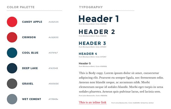
5.) Create a style guide to ensure branding is followed
Creating a style guide is an essential first step if you want other web designers, web developers, and digital marketers on your team to produce consistent work without needing constant direction about how things should look. This saves everyone’s valuable time! And by having this file available as a reference when needed, any updates will be easier than ever.

6.) Use videos to break up content and improve visit duration
Videos have quickly become one of the most powerful ways to engage with your customers and promote your products. So don’t hesitate to use them on your site, even if they are just short clips that show how a product works or explain the benefits of using it.

7.) Think about SEO to ensure organic traffic isn’t lost
Maintaining good SEO is important because it helps your website rank higher in search engines, which helps potential customers find you. SEO tips include optimizing your pages with the keywords you want to rank for, using keyword-rich titles and headlines on each page of your site, building up a strong backlink profile, as well as improving the speed of your site.
8.) Use calls to action to direct visitors to important areas of the website
If you provide a blog on your site, don’t just publish and expect traffic the calls to come in. Implement calls-to-action throughout the page by asking visitors to subscribe or purchase products/services. Calls to actions are very important it you want to convert visitors into customers.
9.) Make your site easy to navigate for improved user experience
Visitors should be able to find what they need without much trouble or confusion. This means that all relevant information should be found on one specific page, instead of scattered in separate categories throughout your website. Not doing this will confuse visitors and could possibly deter them from working with you.
10.) Make membership worth it for current and potential customers
Offer exclusive downloads, members-only discounts, premier access to new items, and early previews of sales events. These are ways to make people feel special and committed to staying subscribed. Remember our tips about using calls-to-actions? You can also offer something free when someone signs up for.
11.) Make it easy for website visitors to contact you
If you want clients to contact you, it’s important that they can do so with minimal effort. This means making sure the form is easy to find on each page and has a phone number for them.
12.) Create targeted landing pages for paid ads or search phrases
Many people will visit your site looking for something specific, so create targeted landing pages so that visitors don’t have to click around. This improves the likelihood that visitors will find useful information, without wasting time browsing through other content that isn’t relevant or useful to their situation.
13.) Place your contact information above the fold
For many people, the first thing they do when visiting a new website is looking for contact information. Make sure that this important text appears on your site above the fold so it can be seen without scrolling down.
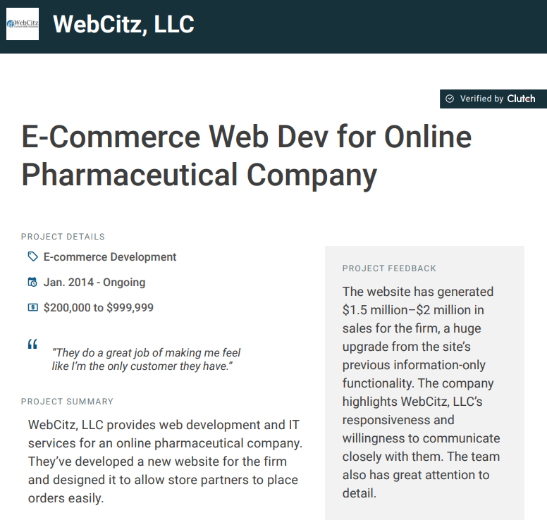
14.) Include case studies to show your expertise
You can show your worth by including case studies that talk about successful jobs and collaborations. These will show that you can walk the walk, not just talk the talk.
For example, “We built a website for Blue Diamond Farms. They are an organic farm that produces soy milk, cheese, and other dairy products to support sustainable agriculture in the Caribbean. With our help, they increased revenue by 280%”…

15.) Make the website fast to reduce your bounce rate
Optimizing your site for speed is a must, so make sure that it loads in about two seconds or less. The last thing you want is for your visitors to get annoyed and visit your competition instead.
Final Thoughts on Developing a Commercial Website
In conclusion, commercial websites should be aesthetically pleasing and provide the visitor with all the information they need to know about your company. I hope the tips in this article have been helpful to you and that your website will be a success.
If this sounds like a lot of work, well, it sure can be! Sometimes hiring a professional is the best way to go about doing something.