Do you want to build a stronger online presence in order to attract more clients? Our guide containing 50 architecture websites that showcase these things.
We’ve analyzed lots of sites, and chose ones that are focused on design, functionality, uniqueness, and user experience. Get inspired and discover tips to make you stand out.
Explore top examples in architecture, interior design, landscape, sustainable design, and building engineering. Looking for something different? Check out our web design examples for other industries!
Top Architectural Company Website Designs
- 1. 10 Design
- 2. Workstead
- 3. LSM
- 4. Handel Architects
- 5. 1100 Architect
- 6. Raad Studio
- 7. Olson Kundig
- 8. Sighte Studio
- 9. Steven Holl Architects
- 10. VMDO Architects
- 11. Ross Barney Architects
- 12. Clarke Design Group
- 13. SOM
- 14. Ramsa
- 15. Makhno Studio
- 16. Wardle
- 17. Patterson Associates
- 18. Fender Katsalidis
- 19. VLK Architects
- 20. RDAI
- 21. Nick Leith-Smith
- 22. CDH Partners
- 23. VIGUIER
- 24. OFFICE Kersten Geers David Van Severen
- 25. Marvel Designs
- 26. Leong Leong
- 27. ROSSETTI
- 28. KPF
- 29. Hacin
- 30. RSHP
- 31. ZGF
- 32. Darra Joinery
- 33. JJ Design Studio
- 34. Wade Design Architects
- 35. Lemay
- 36. EFFEKT
- 37. Oh
- 38. Measured Architecture
- 39. Cooper Carry
- 40. HOK
- 41. Office Sain
- 42. Villa Rondinelli
- 43. Merrell Soule Architects
- 44. Arena
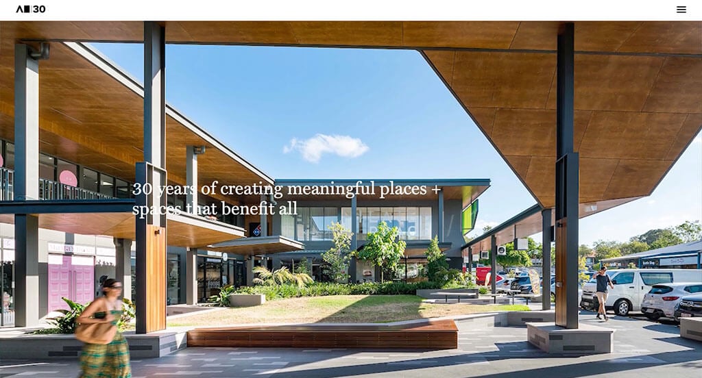
- 45. Arkhefield
- 46. FALK Built
- 47. Feilden Clegg Bradley Studios
- 48. Williams Lester Architects
- 49. Aspen Homes
- 50. Sasaki
1. 10 Design
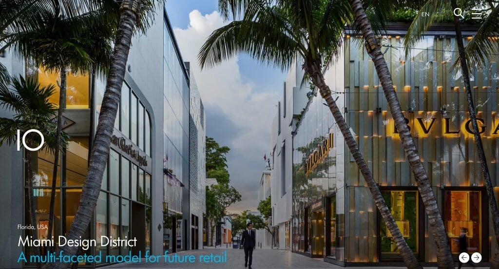
Right away, we can notice a stunning photo choice presented in a slideshow format for an introduction to their business. We also thought it was cool to include only images on their landing page because it gets people to explore content related to images that interest them. 10 Design did a great job with their simple logo design that fits their business. A smart choice was their use of short paragraphs to keep customers engaged.
2. Workstead
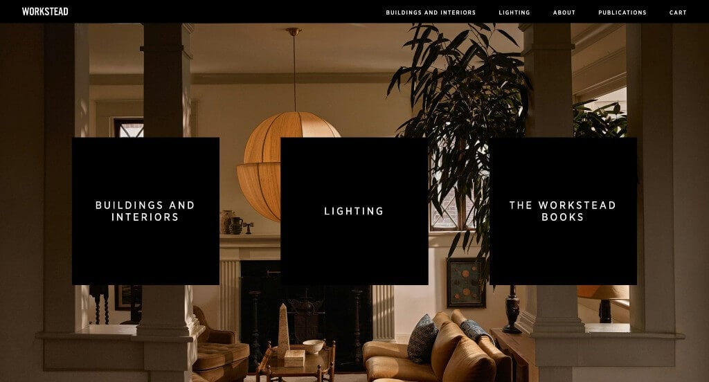
Workstead did a great job with their opening page using an image as a background with three squares of linking content. Additionally, using a well organized navigation bar is extremely helpful for customers to find additional information. We loved how sharp squares are used to add in written information and images. A black and white color scheme is used and it helped to create a modern look. Workstead had website marketing in mind when creating an easy check-out process in their website.
3. LSM
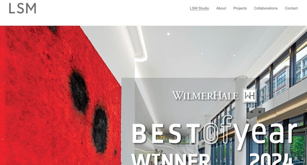
Here, we have another great option to find inspiration in. One of the first things we saw about this one was their balance of white space that helped keep everything looking sharp. LSM made sure to include subtle hints on how they have won a best of year award for 2024. It was a nice touch to show off a menu with plus buttons to expand the additional information. The creative way they show customers mock-ups and reality on previous projects was definitely refreshing.
4. Handel Architects
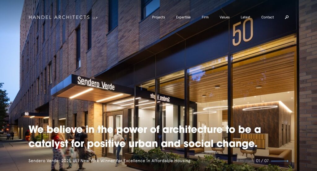
Although there was numerous architectural designs to choose from, Handel Architects was a perfect well-designed site with a dark blue, sea-foam green and white color scheme. As you scroll through, you might notice their interesting layout. We really enjoyed how they made use of creative photo frames to help stand out visually. Including a blog was another feature we didn’t dare to ignore. They clearly had a focus on usability when deciding to use a search bar.
5. 1100 Architect
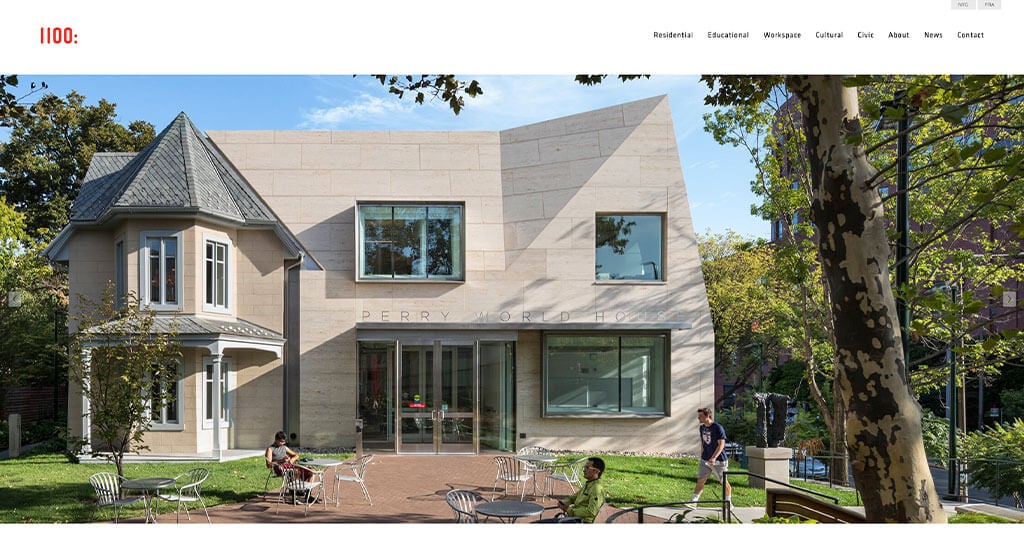
This site made great use of a slideshow right away with lots of high-quality images, which draws customers in. Adding in small icons in the footer to guide people to their Instagram and LinkedIn pages. We loved how their buildings were sorted into different topics so that new customers can look at buildings that could be similar to theirs. A full contact page is also included which is extremely helpful for anyone looking to reach out.
6. Raad Studio
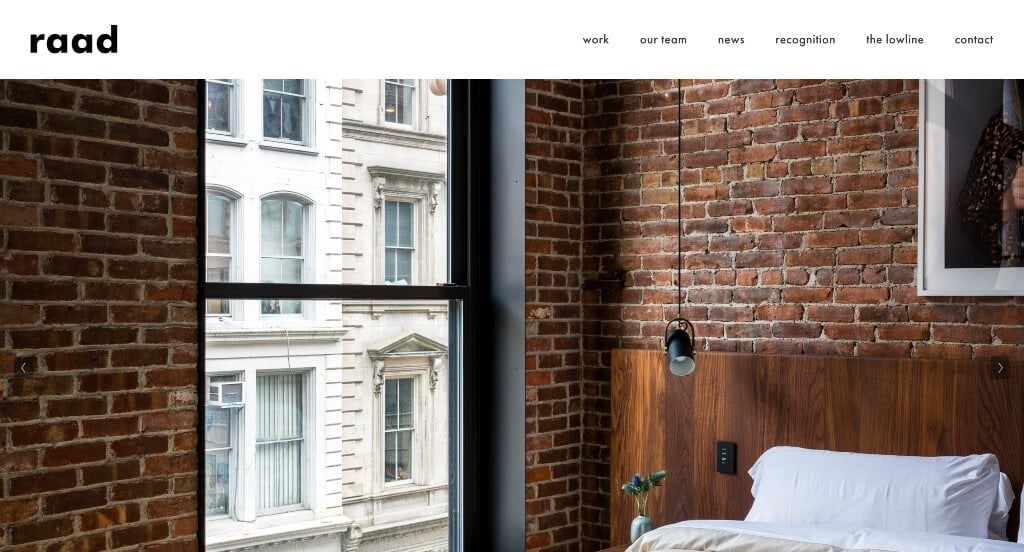
Raad Studio makes use of a stunning black background that feels much more luxurious. All of their written content is formatted into nice, clean paragraphs. Having a page designated to their team was a smart move because it allowed for new customers to learn about the people who they’ll be hiring. The stunning imagery to showcase their products was definitely an impactful feature we saw. Including a blog was also extremely helpful for anyone looking to gain more information.
7. Olson Kundig
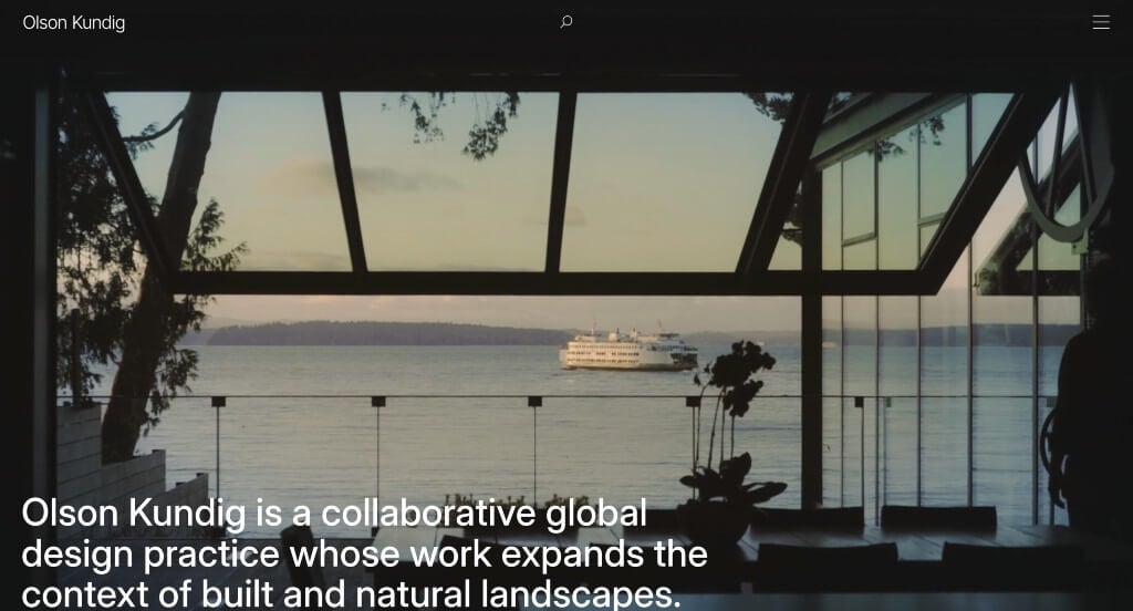
Our favorite part about Olson Kundig was their interesting transitions that blurred out text when it becomes unimportant. Using images as nice backgrounds was another choice that we couldn’t ignore. Having a well organized menu is another thing that we took time to appreciate. We also loved their simple but professional font that covered their design. A search bar can also be found near in the header which is always helpful.
8. Sighte Studio
Related: Having trouble getting ranked in Google? Check out these SEO services for architecture companies.

We loved how Sighte Studio made use of large images to display some of their past projects. They made great use of stunning fonts with all capital letters to help it stand out. Informative paragraphs written about their team was a nice touch. We thought the s on their logo design was cool and also served as their logo design. This business did a great job with their well organized navigation bar, making it super easy to find whatever they are looking for in this site.
9. Steven Holl Architects
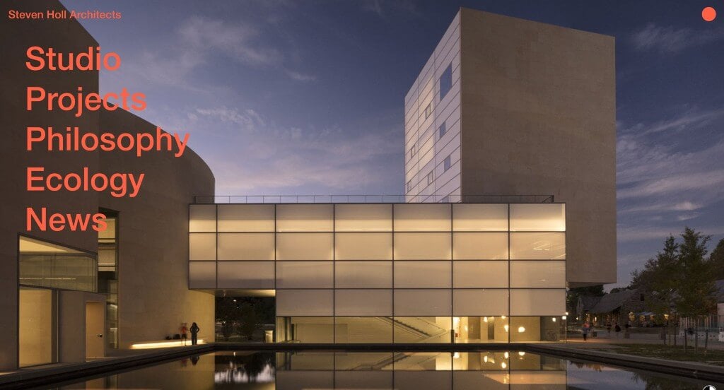
Immediately, we loved how they displayed their menu in a more creative way. Large images was another feature that we really enjoyed to allow for an appealing layout. It was amazing to include interesting images with texture as backgrounds for each of these pages. All of this content was well organized helped and labeled well which was extremely helpful. Finally, we loved how Steven Holl Architects has a simple color scheme that adapts based on their images.
10. VMDO Architects
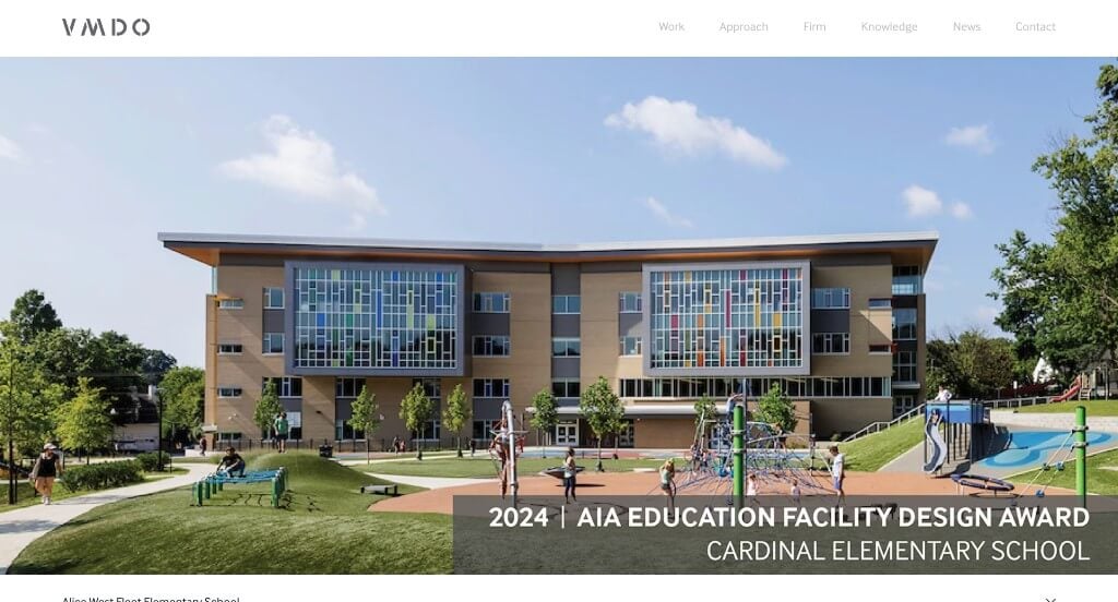
This layout made great use of rectangles to place written content into their site. This allowed for VMDO to easily separate their content making it much much easier for customers to find relevant information. We also appreciated how colors of white and gray were used for a custom look. Having small little phrases to connect to viewers was a cool idea. We loved the use of bolded fonts for titles to make sure people know what they are about to read. Simple navigation was another perfect addition to this template.
11. Ross Barney Architects
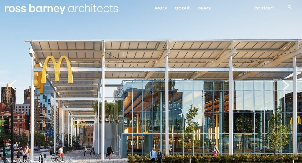
Showing off some of the most unique architectural pieces in a large image format was a great choice. Including quotations of reviews from highly-popular businesses or institutes was a great choice. We loved their bubbly letters that can be noticed in their navigation bar to make everything easier to read. Ross Barney Architects had design elements in their mind when picking out their striking color combination with a nice green accent. We also really enjoyed how they made use of overlapping images and videos to create a more interesting template.
12. Clarke Design Group
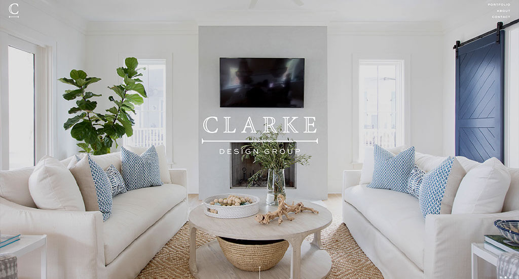
The first thing that we noticed about Clarke Design Group was their unique loading icon that uses their logo. It was a nice choice to include a simple transition between each large image relating to each of their featured projects. Their use of stunning fonts and simplistic lines was another choice we couldn’t ignore. Adding in a portfolio page to include all of their past designs was perfect. Their stunning imagery was definitely the best part about this design.
13. SOM
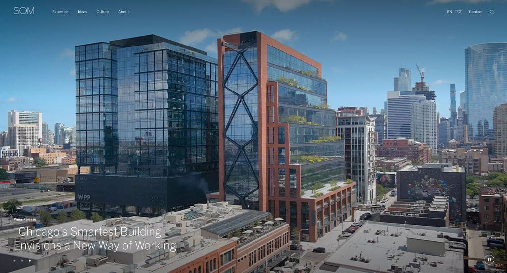
Something cool about this example was their use of an automatically playing video to introduce their business. The striking black background was amazing because it stands out against their competitors. We enjoyed how many texts are underlined to allow for links into other areas of this site. Incorporating stories and research helped customers gain more information about SOM. With so many good reasons to consider this webpage, it’s obvious why we included it!
14. Ramsa
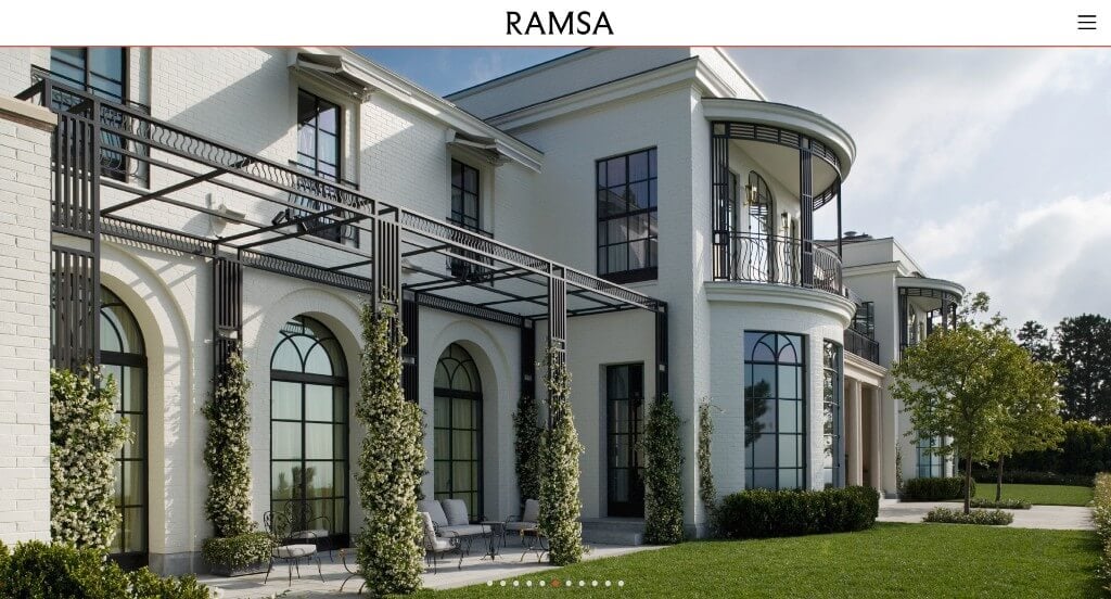
Full-page photos are used with an image carousel to attract customers to their business. It was cool to have a drop down menu to sort through project types and locations within their project page. Having something similar to a blog named under the tab Storyboard. This clean template also does a great job balancing out their white space. Finally, it was helpful to have a well labeled navigation bar that includes all the important parts of their business.
15. Makhno Studio
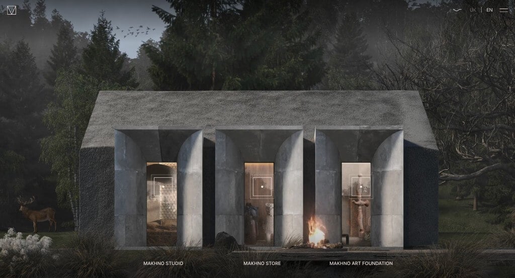
Upon first entering this example, a creative animation is used to give the illusion of water color. Another aspect that we really enjoyed was their use of a house design to direct viewers towards other areas of their design. A layout free of distractions was also refreshing. Once you click on one of the links from the landing page, it takes you to beautifully organized pages. A modern black and white color scheme stays true throughout their entire design.
16. Wardle

This is a good example of a website design for design firms looking for a professional look and feel for their next website. After scrolling past the header of this building design website, you’ll notice their bold lettering. Another design quality of this creative architectural design website is the simplistic color scheme. The interesting logo helped make this one of the best architecture firm websites we considered. With so many good reasons to consider this architectural design website, its obvious why we included it in this list of the best websites!
17. Patterson Associates
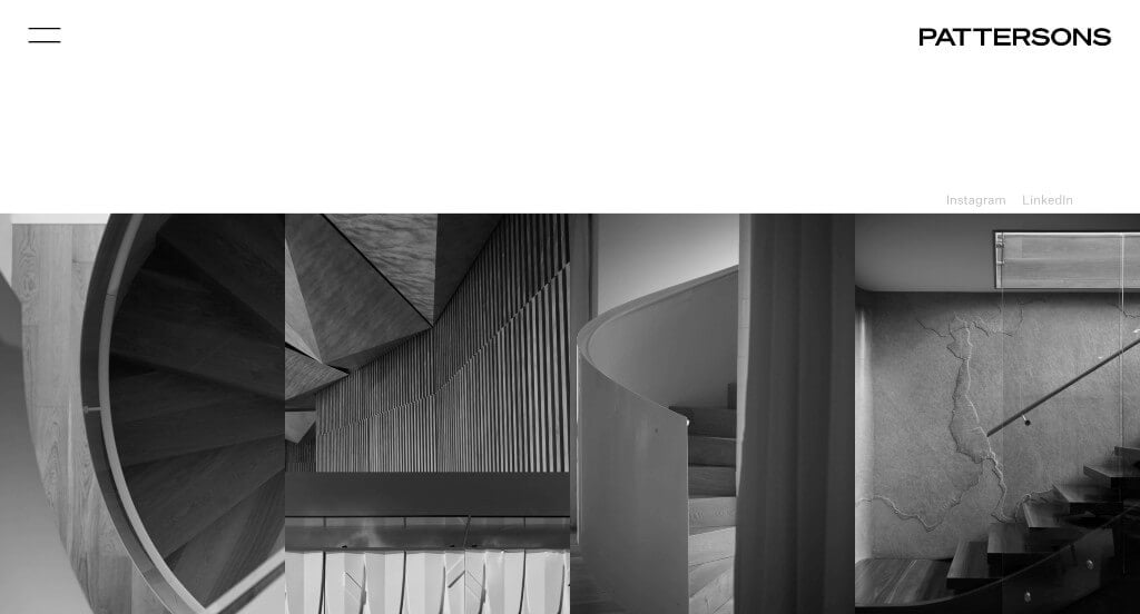
This was a design we could never forget. All the images are turned into black and white images to create a different feel for this design. As you scroll through, you might notice how as you hover over the images, it releases bright colors of reality, linking you to that product. Including in Instagram and LinkedIn links was something that we thought was helpful. We loved their organized menu that included two languages to create a shadow effect. A simple design is used which allows for people to navigate through all their information.
18. Fender Katsalidis
First off, we noticed this company’s stunning logo design. They made sure to showcase it right on their landing page which was smart. Large videos displaying right away was also nice to grab attention. We liked how once hovering over linked text, customers can notice a bright yellow underline appear. From a marketing perspective, it was helpful to include a search bar. We also thought it was helpful to use a layout that allows for some whitespace that isn’t necessarily symmetrical, but still looked balanced.
19. VLK Architects
This was one of our favorite designs due to their perfected color scheme. A dark blue is used harmoniously next to bright white to create a design full of a feeling of innovation. Adding in lots of pictures was obviously a must for anyone trying to sell a service. Their incorporation of case studies was extremely helpful for incoming customers. VLK Architects also did amazing with their creative logo design that is memorable. Don’t forget about their interesting transitions that happen naturally as viewers scroll through.
20. RDAI

This company likes to play with lights and we loved that about them. Almost all of their images include the element of backlit ceilings or walls which helps them identify themselves in such a large market. A simple font is used throughout this entire design which allows for customers to read quickly while enjoying a clean design. They clearly had a focus on marketing when building white space into their template. For designers looking for ideas for their next site, this example will definitely be one to consider.
21. Nick Leith-Smith

After clicking out of this business’ landing page, you’ll notice that their overall layout allows for images to speak for them. After looking through their pages, you’ll immediately notice a customized and playful font. The ability to view projects by desired room type was also thoughtful to include. An overall simplistic look was adapted here and we loved that. We also thought it was smart to use a domain that matches their company name. Make sure to check out this design while looking to get inspired.
22. CDH Partners
We chose CDH Partners because it’s nicely organized and uses a blue accented color scheme. The seemingly bullet pointed information was probably the most impactful quality in their design. Allowing for images to pop up once people hover over certain content was another idea we liked. Having a customer review section was also a smart idea. Large buttons were utilized to make sure everything is easy to locate, which was really helpful for anyone who visits the site. A news section was also a thoughtful addition for any design in this industry.
23. VIGUIER
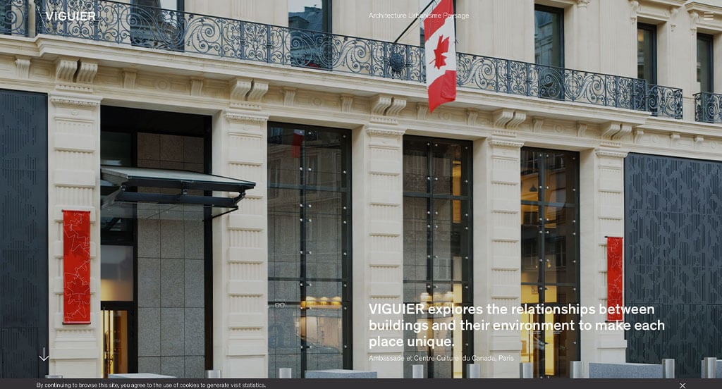
Our team liked how this site had an extremely simple landing page with large images to get people engaged. A black and white color scheme is used so that the colorful images can brighten it up. What we liked most on Viguier’s homepage was their balance of projects, news and focus articles. Another thoughtful quality in these creative pages was their simple but modern logo. Viguier clearly had marketing in mind when building an attractive layout. Their menu was also very well labeled, making it easy to find what you are looking for.
24. OFFICE Kersten Geers David Van Severen

If you’re searching for professional ideas, here’s an example you can’t turn away. We loved how they showed off blueprints and final images for some of their projects right away within their homepage. We also liked how in this area, they used small fonts so the images could explain themselves. OFFICE Kersten Geers David Van Severen does an awesome job with their news section included at the bottom of their homepage. It was nice how they allowed images or text to appear upon hover within the entire news section.
25. Marvel Designs
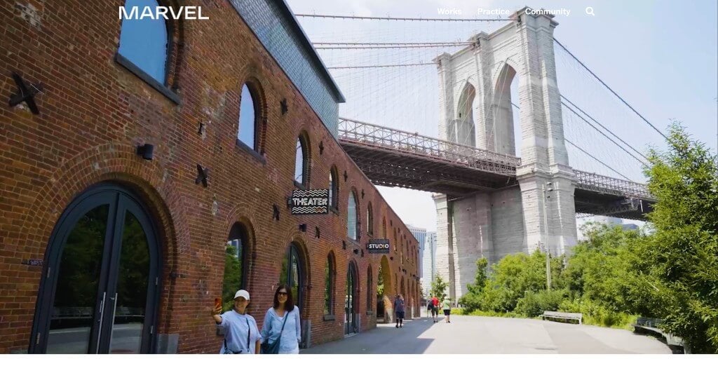
Although this example seems similar to its competitors, their focus on community is what helps separate them. By this, we mean their long list of articles and stories that relate to them as a business for all community members to use. We also liked how they created a staggered layout for imagery. Another thoughtful quality was their use of a bold font choice. A search bar is also included to that viewers can easily find information that they are looking for. We also thought it was smart to add little horizontal lines to separate any part of their pages that served as a menu.
26. Leong Leong
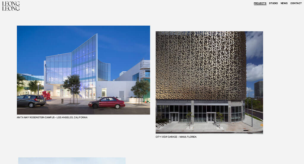
Leong Leong is lacking in color, but that just gives it a more luxurious look. We loved the images that are from a variety of different locations. Creative spacing in between their images was another feature that we noticed. They also did a great job optimizing their content in order to include the information customers need. They had digital marketing in mind when creating a clean and elegant design. Adding in their entire team, clients and selected press was a nice touch.
27. ROSSETTI
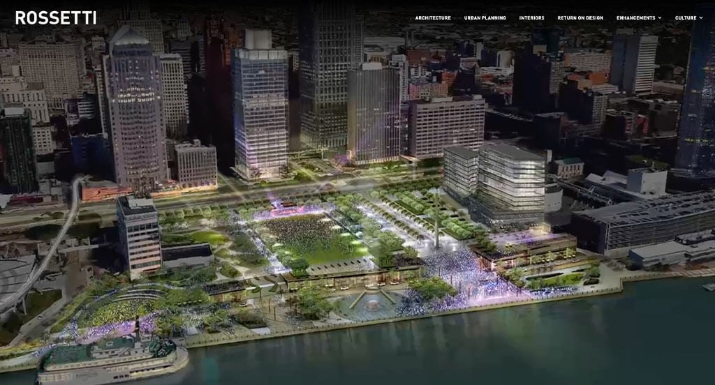
ROSSETTI makes great use of a black, white and red color scheme. The alternating background colors really stood out to us and made us more interested in this business. It was amazing to add in lots of examples of their past projects (including the Lambeau Field Reimagination). We loved how maps and blueprints of past projects are included in some areas. Sometimes, it was nice to include a high quality image of their project to match with their blueprints.
28. KPF
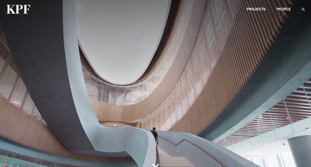
Here’s another example that we loved to find inspiration from. High-quality images no matter what size they are was a great idea that we noticed right away. It was cool for additional information about a certain project to pop up upon hover. We liked their use of measured spacing for all of their content. Simple buttons can also be noticed to scroll through content. Finally, it was a nice touch to include their social media links in the footer.
29. Hacin
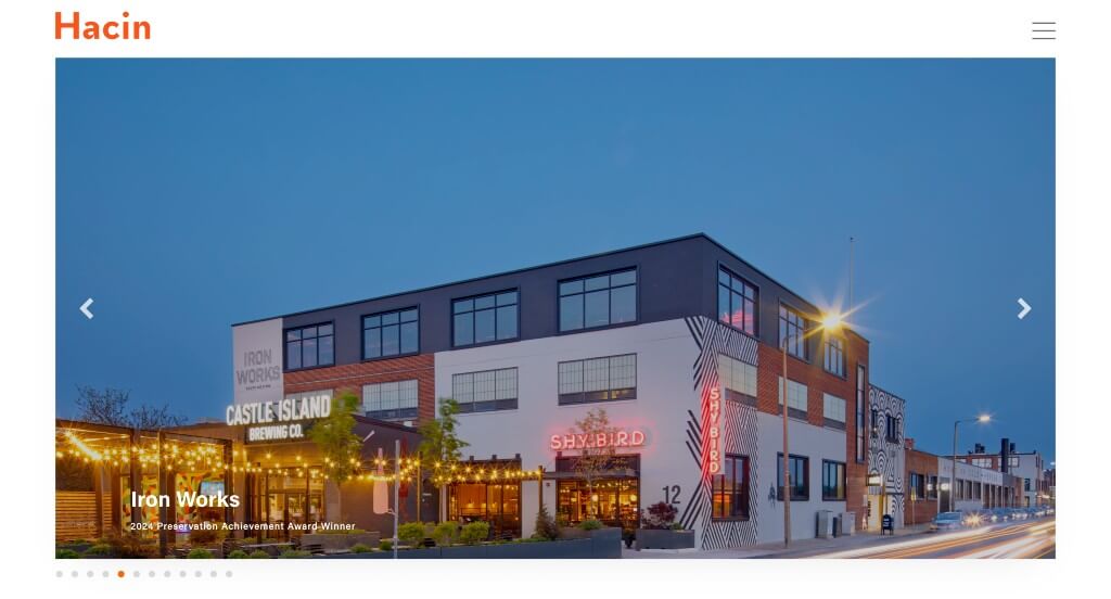
We liked how this business used black and white with an accent of orange for a creative feel. We loved how different sized images were used harmoniously in order to create a stunning design. Adding in a “read more” dropdown that is linked to another page was a great idea. Having a good balance of white space was refreshing in this layout. We liked how a feature is included to include posts from their Instagram page. Hacin clearly put thought into their design when creating a clearly labeled menu for it.
30. RSHP
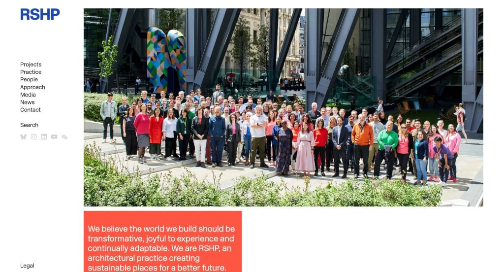
Lots of great elements were hidden into this example. Right away, we noticed their unique squares of color containing short paragraphs of content. As we continued through this design, we saw that they paired a white background with color schemes that change depending on the page. Their innovative organization of images and content boxes really stood out to us because there was more thought in it. Adding in videos was also helpful for anyone looking into this company.
31. ZGF
Related: For an immersive architect’s digital marketing campaign, consider services that focus on helping architectural firms get more leads.

This is a great example from a design firm for others looking for inspiration. It was nice to include how long this business has been serving their customers in order to gain trust. ZGF did a great job with interesting transitions and animations to show their information creatively. Using a professional and simple font is a smart choice for any business building out their webpages. Adding in slight accents of bright red was another aspect that we couldn’t forget.
32. Darra Joinery
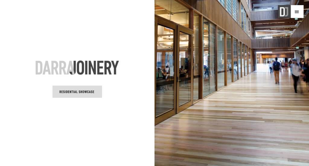
This example uses grayscale to help their images pop more. Along with that, they also used black and white graphics to show their attention to detail as a company. This logo design was another thing that we found useful because it created a graphic with their initials. Their fonts are fairly simplistic, making for a very professional feel.
33. JJ Design Studio

This sliding image display used right away introduces this company well and grabs attention for sure. Placing their mission right within their homepage was a great way to show off what they as a business care about. High quality images are used throughout their pages in order to create a more appealing template. Drop downs are used within their navigation bar which is helpful because it makes it easier to find information.
34. Wade Design Architects
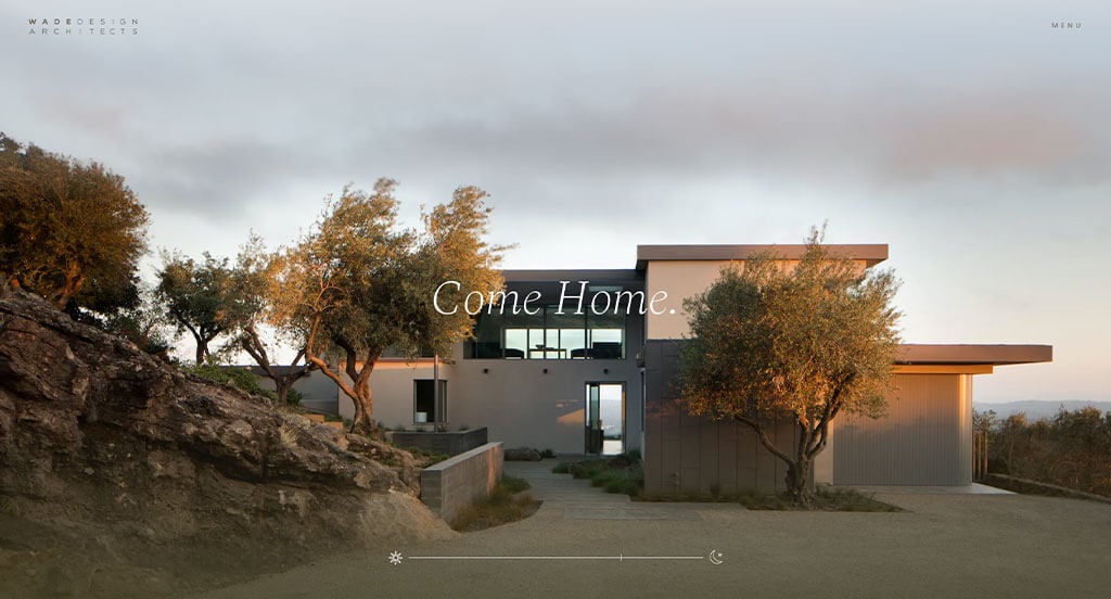
We liked how they combined elegant natural colors to form an attractive layout. Even though we have reviewed lots of sites, something that stood out to us was their feature that scrolls from sunrise to sunset with different designs of theirs. Using a calming text was another reason why we included this architectural design company into our list. Having an interesting way to navigate their layout with a few transitional animations was something else that we enjoyed. There were numerous qualities to consider when putting together this list, and Wade Design Architects made it easy for us to decide.
35. Lemay
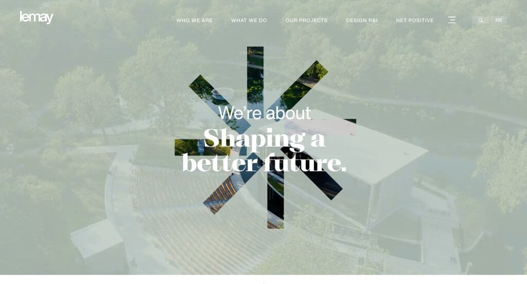
This is a good example that can provide inspiration for other businesses in this industry. After scrolling past the header, you’ll notice their stunning fonts. Their grid pattern that allows for different areas of their site to shine through was a great choice. Including a video with their manifesto was another choice that we thought was unique. Finally, we thought it was nice to include a well labeled navigation bar and menu.
36. EFFEKT
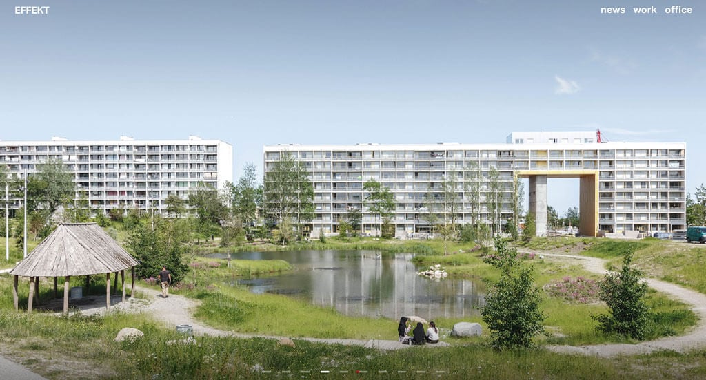
Once again, we have a design that is driven by their large, high-quality images. Dividing their design into work, office and news was a great choice. We thought it was cool to have the ability to organize their news stories by year. Including quality content was also refreshing. Overall, their organization was what helped them stand out. Even though their information is sorted into three categories, those groups include more navigation bars. Finally, having a bold font helps customers to read everything easily.
37. Oh
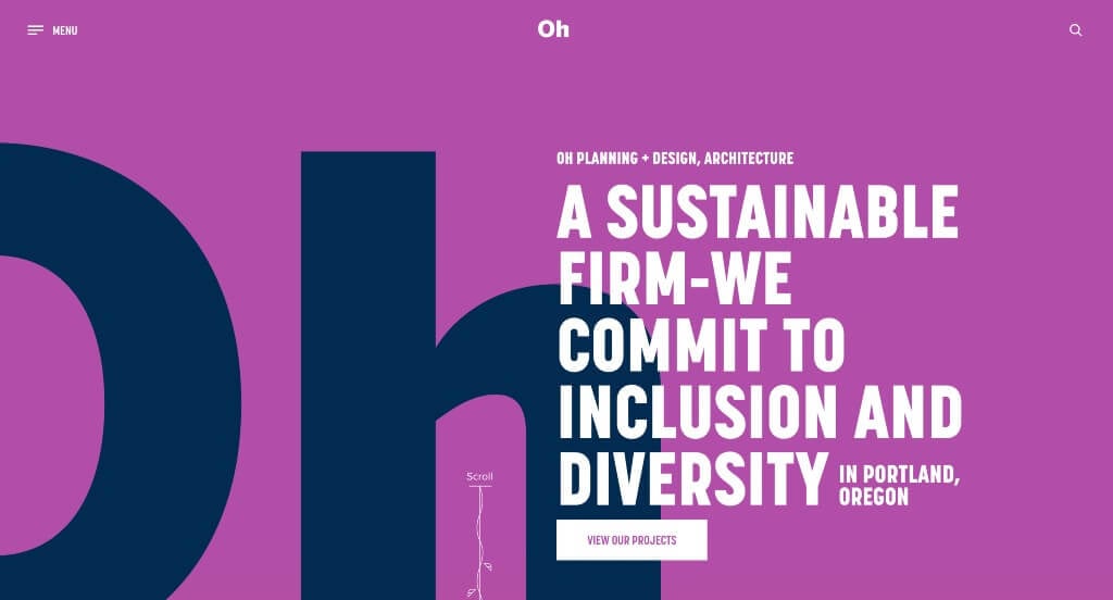
We knew right away this example deserved to be on our list due to their bright ombre backgrounds. A bold text to emphasize a statement was another unique quality we enjoyed. It was smart to have small little graphics that bloom vines as you scroll through their template. Titles were placed neatly and subtly in the backgrounds to direct attention to certain areas. Images were also displayed in a zig zagged pattern with content in order to balance out their visual design.
38. Measured Architecture
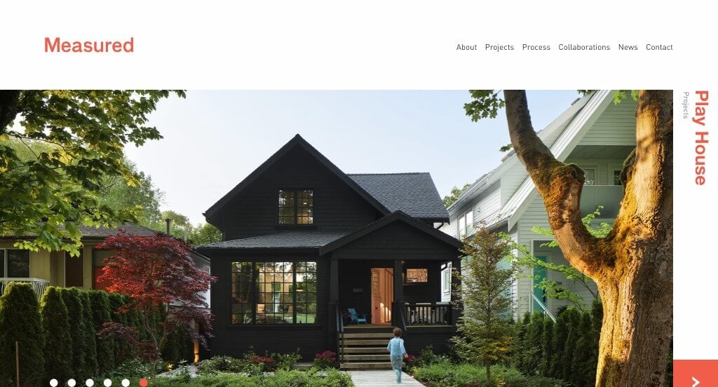
A stunning layout is definitely used for this company, which makes their content easier to digest. While most examples share this quality, we thought Measured Architecture did a nice job of incorporating an accent color. Logically organizing their content helped make them into our list. We loved how many different sizes of images are included to create interesting visuals.
39. Cooper Carry
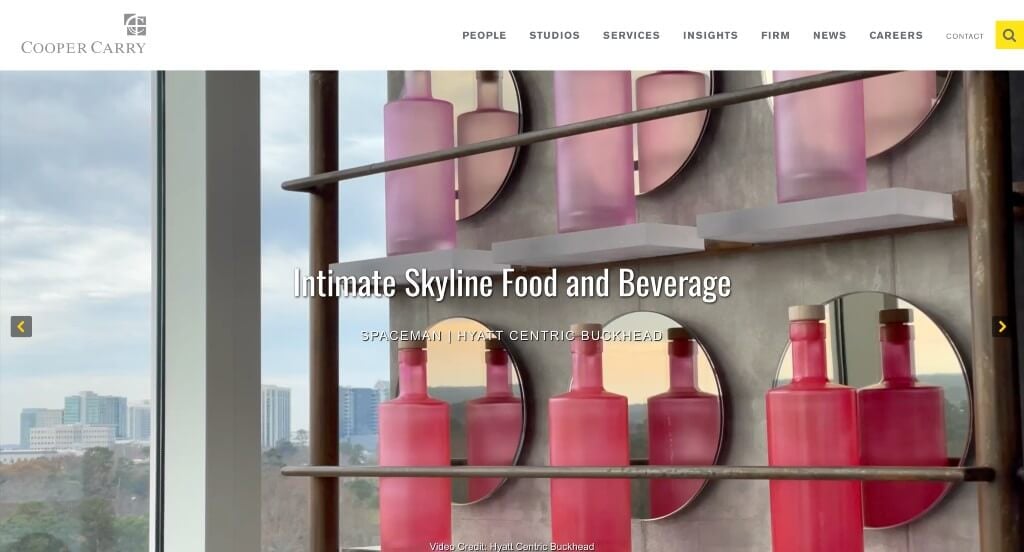
Cooper Carry’s template has a very classy feel to it, thanks to its blended use of black, white and yellow. Using a creative and professional logo was one of the most impactful qualities here. We really loved how they used drop-downs within their navigation bars to keep everything organized. They clearly had a focus on website marketing when creating a noticeable search bar. Their professional and simple font was another piece of their site that we couldn’t ignore.
40. HOK
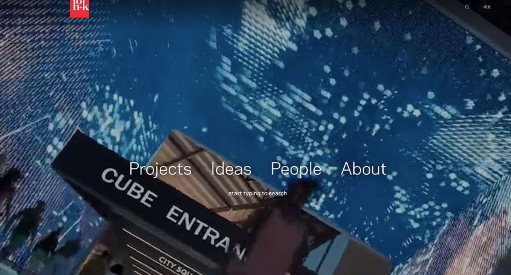
Here’s an example that clearly knows how to use automatically playing videos. HOK does a great job organizing and maintaining a nice flow for their content by using lots of images. Clients ability to see how each agent conceives a new idea was a nice touch for a business like this. They clearly had a focus on digital marketing when allowing for a simplistic layout. Adding in buttons helps with navigation features to keep all their information easy to find.
41. Office Sain
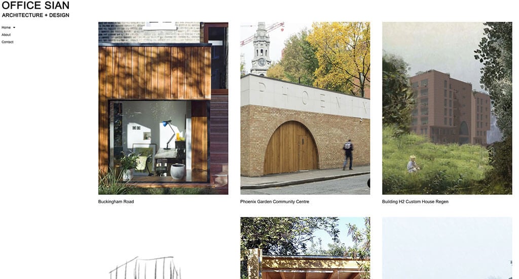
A design feature we like a lot about Office Sian was their perfect spacing between images because that isn’t something you find often. We loved how they made use of a black and white color scheme to look more simplistic and modern. Showcasing testimonials was not only smart, but also helped people gain trust with them. Lots of images featuring a variety of types of projects was another choice we enjoyed. Be sure to consider this company’s site when building out yours.
42. Villa Rondinelli
Here’s another site that dominates due to its high quality images. Along with its images, they do a great job with their attractive font that shows up throughout this entire website. We liked how they alternated the arrangement of their images and content to create a more balanced look. Buttons are included to keep the pages less cluttered and provide people with more information.
43. Merrell Soule Architects

The white, gray and black color scheme of this design studio site stood out to us because it creates a clean and professional design. The look and feel of the homepage of this architecture firm website caught our attention because of their vivid and beautiful images. The simple loading animation was definitely refreshing for a unique website. They had internet marketing in mind when building the easy to use template of their website. Any website designer making websites for architectural designers will want to consider checking this website out.
44. Arena

A large image is sure to grab attention right away especially if you are looking to build this type of building. Arena was an outstanding site because of their subtle animations as viewers scroll through this design. Their logo was interesting because it almost matched the look of a sports stadium. Their contrast of bright red with dark blue made this layout even better. Displaying some of their clients helped those who are unsure show that they are a reputable brand.
45. Arkhefield
Placing in lots of images in black in white was a noticeable feature of Arkhefield. We thought it was even better to allow bright colors to flood into the images upon hover, bringing customers to reality. Displaying videos in many different areas was helpful to break up content. You might also see that Arkhefield paid attention to forming their written content into short paragraphs. They had ease of use in mind when creating a clearly labeled navigation bar.
46. FALK Built
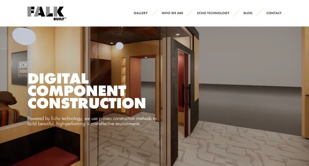
Lots of great elements came into play for this example while we were reviewing it. First off, we loved how they used bold bubble letters for titles and sleek, small fonts for subtitles. Making sure that their color scheme was neutral with black, gray and white was great because it helped images guide the entire design. After scrolling through, you’ll notice their well-planned information blocks. Adding in some videos showing a step-by-step process was another feature we enjoyed.
47. Feilden Clegg Bradley Studios
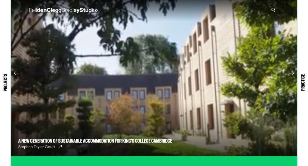
Almost instantly, we noticed a variation of green hues which stood out to us because it creates unity throughout the page. Having a playful feel with their use of a grid-like layout was what helped them become more memorable all together. Adding in lots of links was helpful to organize content was nice. A interesting little animation was cool to have once hovering over some of their images. They clearly had internet marketing in mind when creating the optimized content.
48. Williams Lester Architects
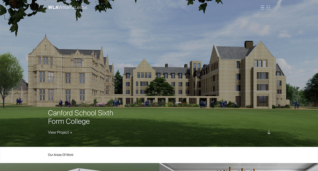
We chose Williams Lester Architects because of how its nicely organized with a black and white color scheme. The ability to view projects based on structure type was an impactful part of this example. Adding in a news and events area was extremely helpful for clients to learn more. Having essentially two forms of menus – one with images and one with text – was another idea we thought was helpful. Anyone making sites for architectural designers will want to consider checking out this one.
49. Aspen Homes
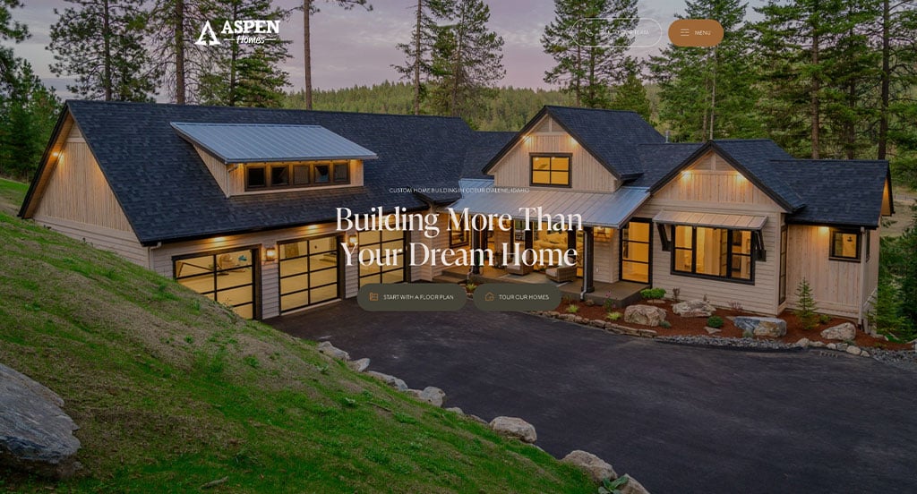
Right away, we noticed how Aspen Homes made use of a logo design that is interesting and logical. After scrolling through, you’ll notice smooth transitions to display images and text professionally. Using a domain that matches with their company name was a small choice that sets them apart. Aspen Homes clearly had a focus on marketing when creating large call to action buttons.
50. Sasaki
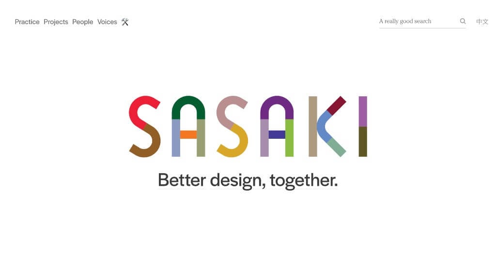
We liked the simple animation that introduces customers to this business. Bright colors are used in chunks in their logo, which looks great. Splitting apart their motto to share more information on each part was a great idea. There was lots of information that was included in this example provided through links on the homepage. Including a search bar was another feature that we found to be helpful.
WordPress Architectural Themes
You can find free themes at wordpress.org or explore architectural-inspired templates on ThemeForest.
Dessau – Themeforest
$85
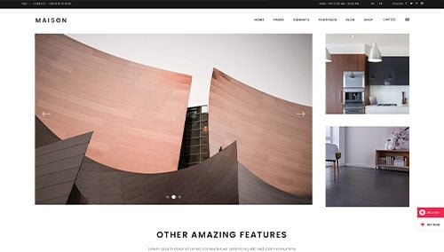
Maison – Themeforest
$85
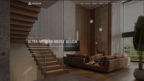
ArchSan – Themeforest
$129
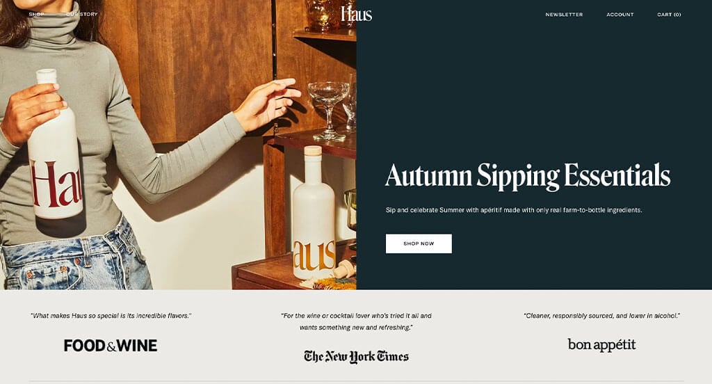
Haus – Themeforest
$49