Attention B2B professionals! Boost your online presence with our guide to the top 48 B2B web page examples. Our experts evaluated each site based on design, functionality, uniqueness, and user experience, finding examples that showcase true excellence. Find inspiration and tips to help you stand out in a crowded market.
Drive your B2B success with this guide! Discover website examples from tech, office supplies, HR, finance, marketing, and logistics providers. For more design inspiration in other industries, check out our expert web design blog.
Top B2B Website Designs
1. RxOneShop
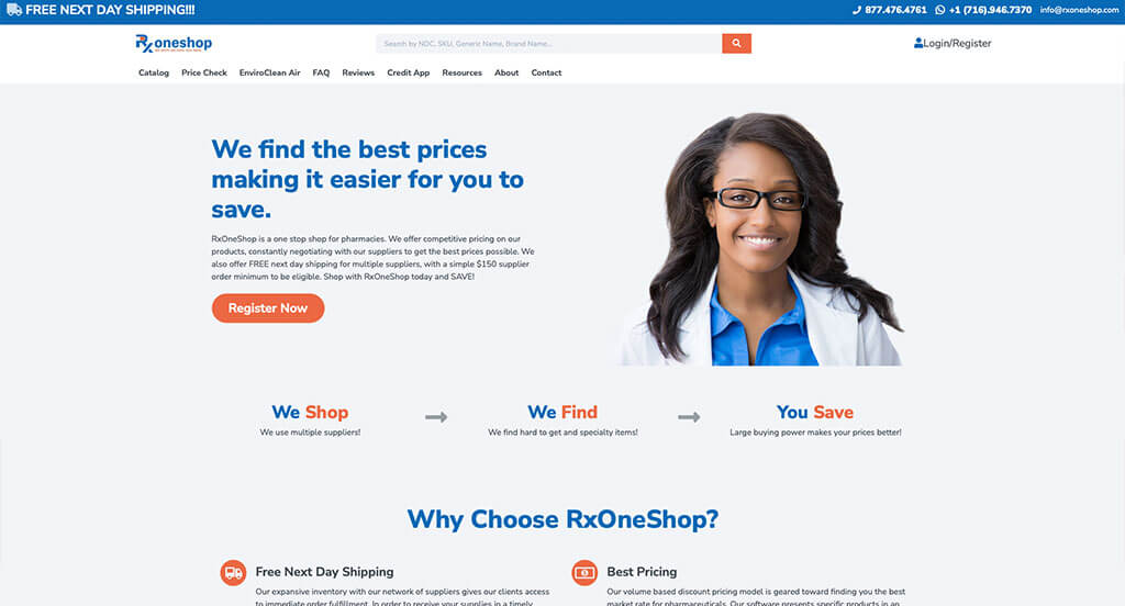
Right away we can notice how RxOneShop makes use of a blue and orange accent color to highlight important information. Short paragraphs which were used, which was nice because it made it easier for customers to read. Bold fonts can be found to help organize content. We also loved how a search bar was used to sign customers up for an email list. It was really smart to include a step by step chart with buttons so customers can understand what to do.
2. Adobe
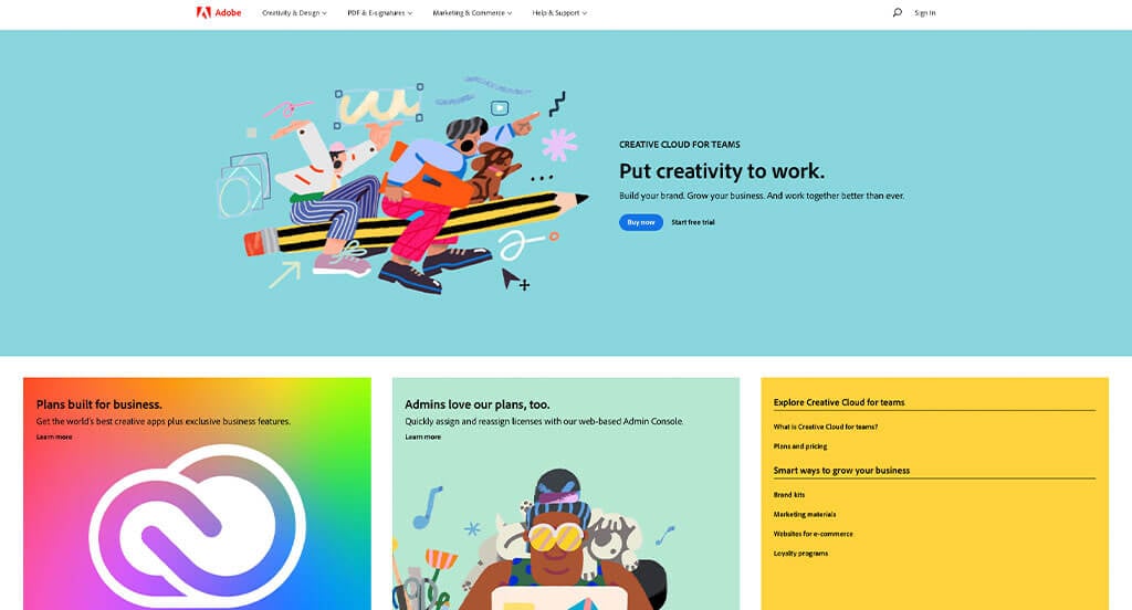
We liked how little squares of information was used to organize everything. Additionally, using graphics that resemble pieces of their service was brilliant. Showing off their logo and additional app logos was really cool. Adobe had internet marketing in mind when including a noticeable free trial button. We also felt their navigation was very helpful with their drop downs for each category.
3. Plexus
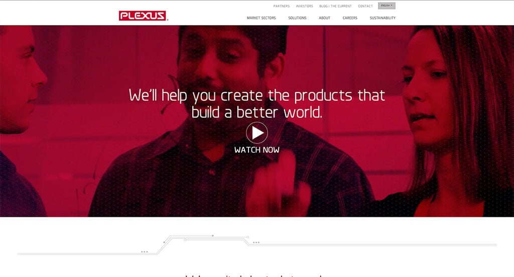
Plexus takes an approach that we absolutely loved with their red filters over images or behind certain texts. These fonts were carefully picked to find the best possible feel for this business. We also enjoyed their use of little line graphics to help break up all the information. Plexus also does a good making sure to implement case studies related to their business. There was lots of simple graphics that help to organize buttons that provide more information.
4. Cisco
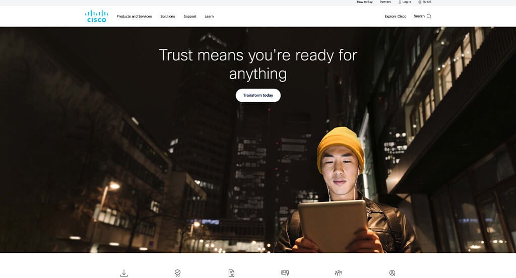
This company makes sure to show off that they have been in business for 40 years to build trust with their customers. We thought that it was a good idea to use blue to showcase every button and link in this site. Their domain was simple and matches the company name which is always a great option. Another thoughtful feature in this professional layout was the innovative and memorable logo. Cisco clearly had a focus on accessibility when maintaining simple navigation within this site.
5. Jeta Corp.
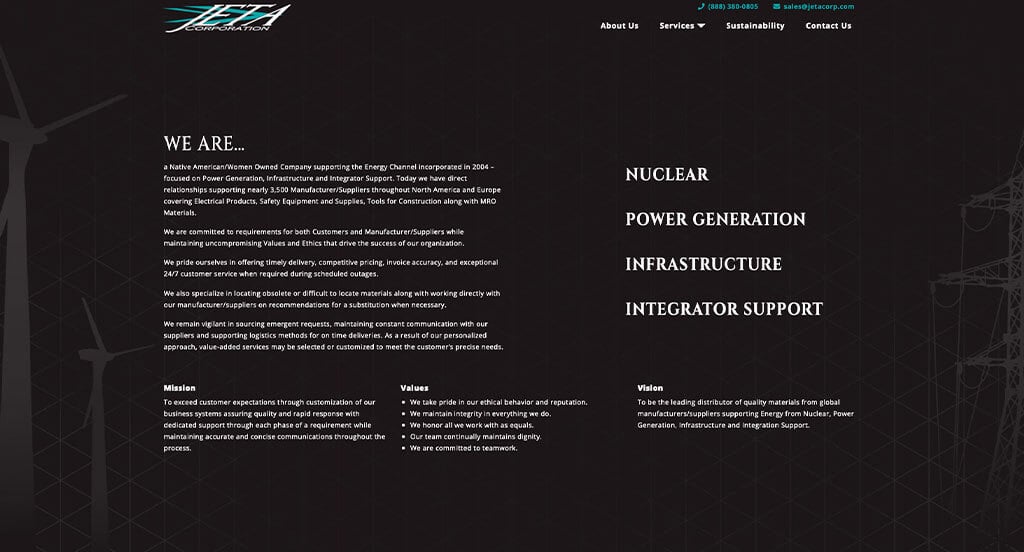
Jeta Corp. did well with a dark background and bright white fonts. We thought their logo design looked cool event though it was simple. In this design, each of the paragraphs are written straightforward, sometimes even using bullet points to organize the text was smart. It was a great choice to include large images as the backgrounds because it adds some visual interest to their simple design.
6. Cummins
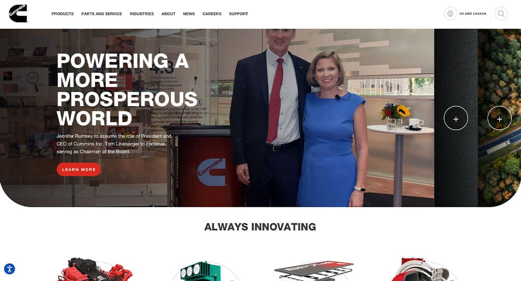
The first thing that we can notice is how Cummins used creative photo frames to allow for a unique feel. The use of bright red buttons and horizontal lines to organize and break up content was a feature we couldn’t ignore. Full screen images can also be noticed which are once again helpful to break up lengthy texts. Cummins clearly had a focus on conversions when designing the smooth transitions throughout their entire website.
7. SaturnCloud
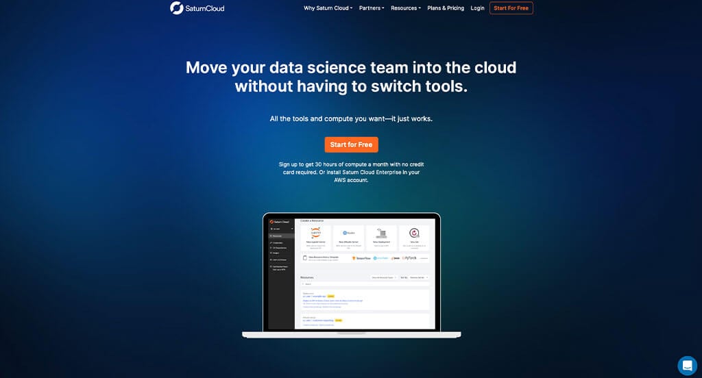
SaturnCloud made a good use of bright colors against dark backgrounds. It was a very great idea to include awards from the past year so customers can build trust with this business. There was a perfect balance of white space that helped with organization and visual appeal. Small graphics can also be noticed throughout the pages to help pair content with a bit of visuals. Another design quality of that you might notice is their creative backgrounds.
8. Loader Parts Source
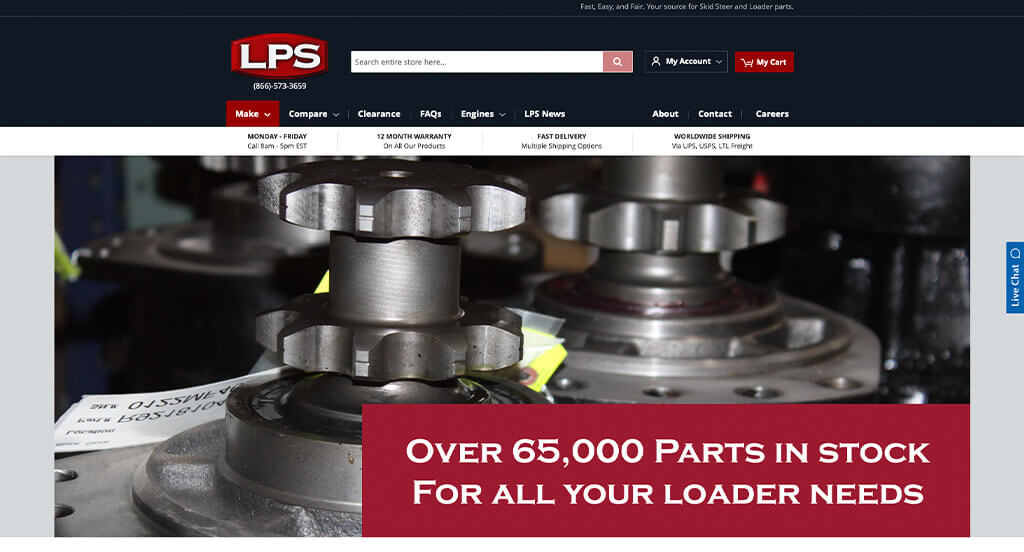
We loved this company’s variety of creative graphics and fonts because it looks amazing. After scrolling past the header, you’ll notice shades of red that tie together their template. It was also a smart choice to include a customer review section so new customers can look at past service. Warranties are also included on many of their parts, which makes customers more willing to buy a product. For part suppliers looking for examples for an upcoming site, make sure to check out Loader Parts Source.
9. Farrell Equipment & Supply
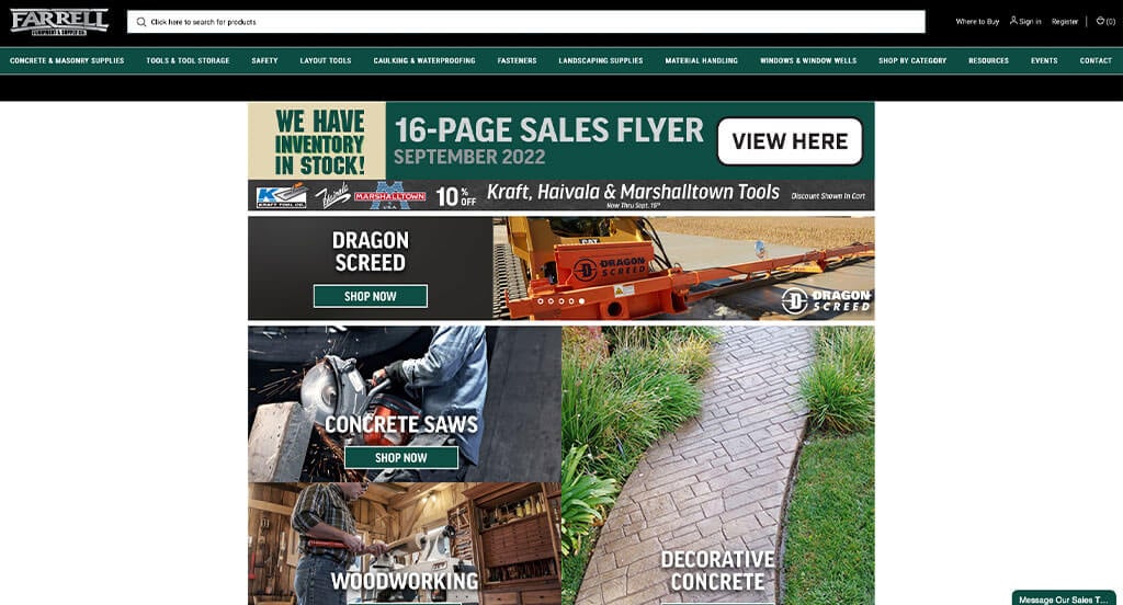
One of Farrell Equipment & Supply’s features we were sure to notice was was their email sign-up list. It was also interesting to include squares with bright backgrounds to help separate products by their respective companies. Little tags can also be noticed to show off items that are on sale. Farrell Equipment & Supply clearly had website usability in mind when designing a clearly labeled menu. There were lot of qualities in here to consider while putting together this list of top websites for B2B companies.
10. Sysdoc
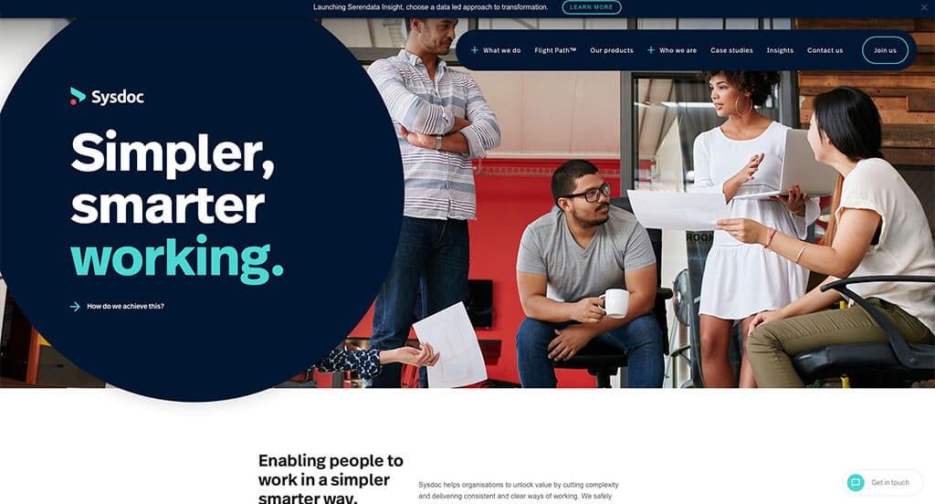
This business did a great job with picking a bold and professional color choice. It was interesting to add some slightly animated graphics. Everything was well distributed and balanced allowing for a pleasing template. Including a variety of case studies is something that we can’t ignore. Including a section for news was also a great addition. We also loved their use of rounded buttons to make the site in whole look cleaner.
11. AT&T Business
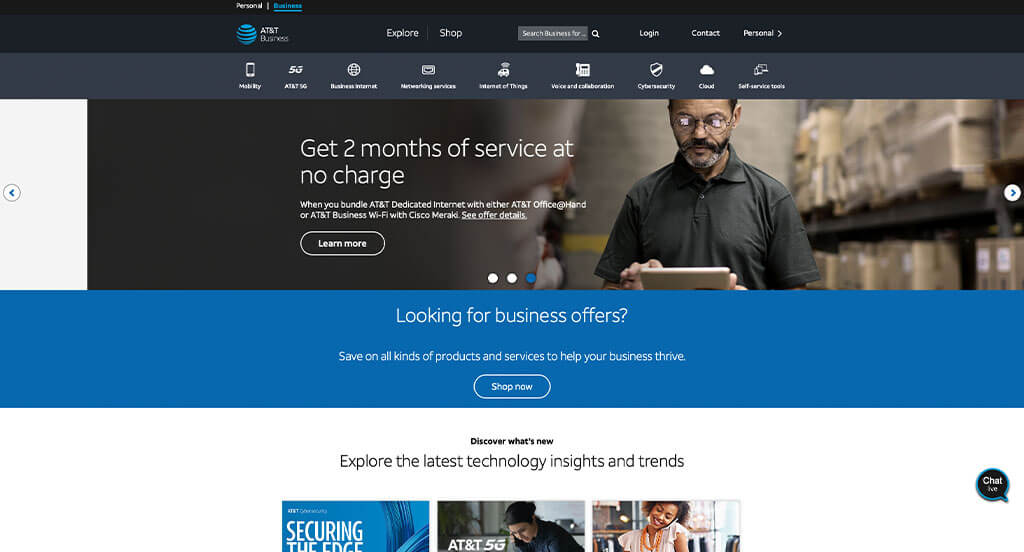
AT&T Business has a very classy feel to it, thanks to its unique use of black, white and blue. High-quality images were used in this example and it really helped pull this site together. A simple layout is another design quality that stands out in a grouping like this. From a marketing perspective, we liked the way they utilized live agents in the form of a chat to connect to customers faster.
12. Omnicom Group
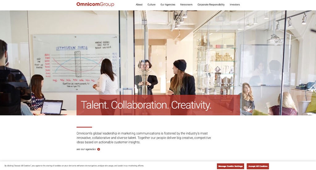
The overall template was certainly a plus for Omnicom Group. Making sure all of their information flows well was another impactful feature of the homepage of Omnicom Group. Changing colors depending on content filling each page was refreshing for a custom marketing site. We also might notice a well organized “newsroom” with lots of content within it. Finally, we loved how their domain matches their company’s name to make it easier for customers to find.
13. Western Digital
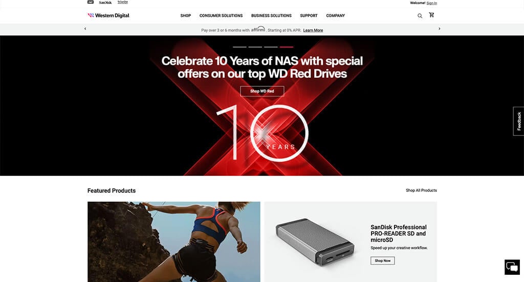
Western Digital does a great job displaying their products. Using high-quality images is always a good choice when trying to sell anything. We also thought their contrast of colors really brought attention to this example. Western Digital clearly had ease of use in mind when building a clearly labeled navigation bar. We also loved how their was a cart and a search bar to make navigation and shopping on this site easier.
14. Spectrum Business
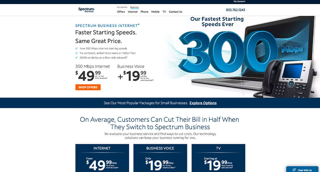
Spectrum Business makes good use of a variety of blues. As you scroll through the homepage, you’ll notice right away small graphics that help create a perfect design. It was smart to utilize bullet points, making it easier for readers to skim through their information. We also liked their simple and bold fonts that helps to decipher their titles from other content. Make sure to take a look this example if you’re looking for inspiration.
15. Proof Drinks
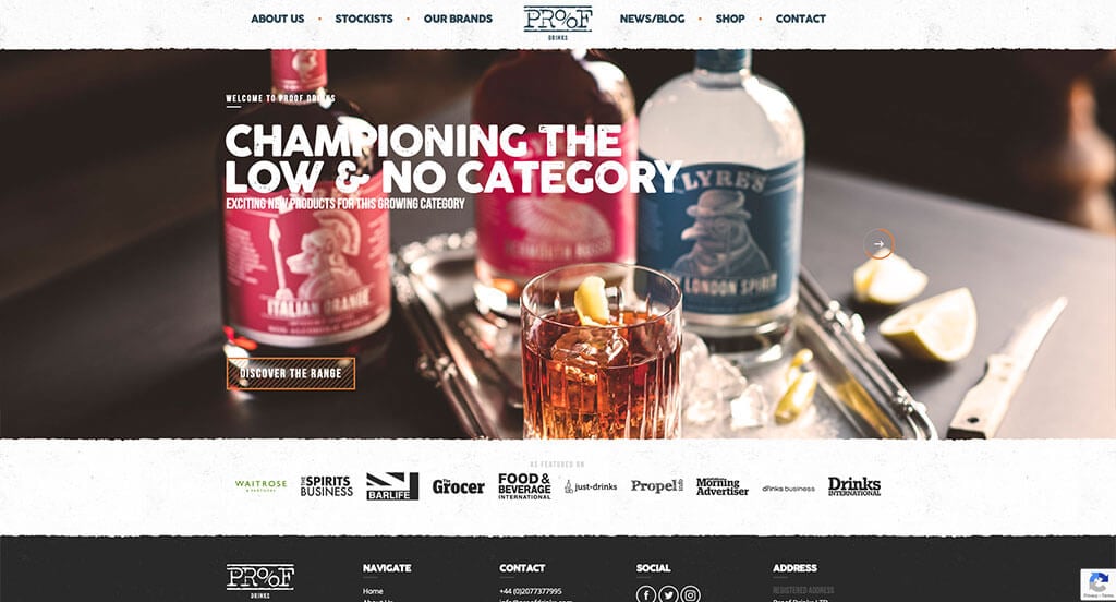
Here we have another amazing example. Not only do the pictures guide along this brilliant site, but so does the amazing fonts. We thought their logo design was creative and simple, allowing for a professional feel. Adding in businesses that feature them was a feature we certainly didn’t miss. There was no shortage of reasons to include Proof Drinks in our list of B2B’s to consider when developing their next website.
16. Bobcat
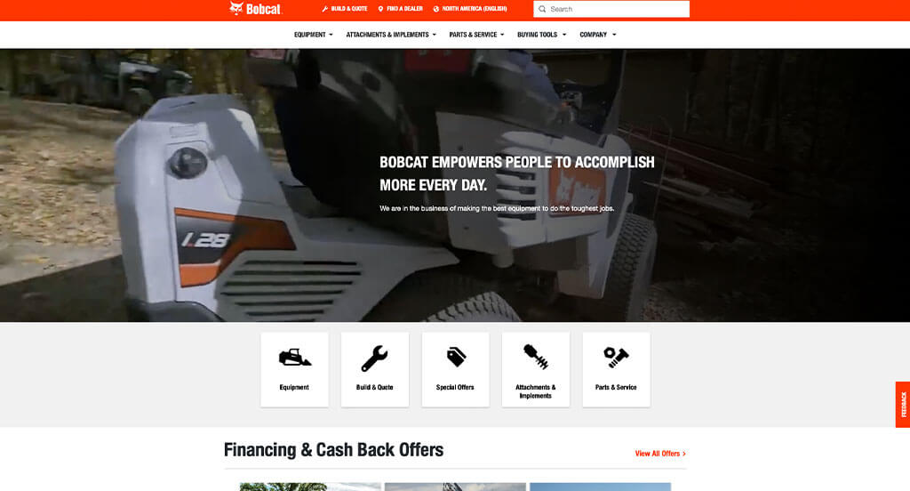
The orange, black and white colors used in this custom equipment site stood out to us because it conveys a feeling of hard working machines and reliability. Having an area designated to offers and deals is something people always get excited about. Adding in features like a search bar, location finder and more all are helpful for customers. Having a build & quote option was another quality that we enjoyed.
17. WeWork
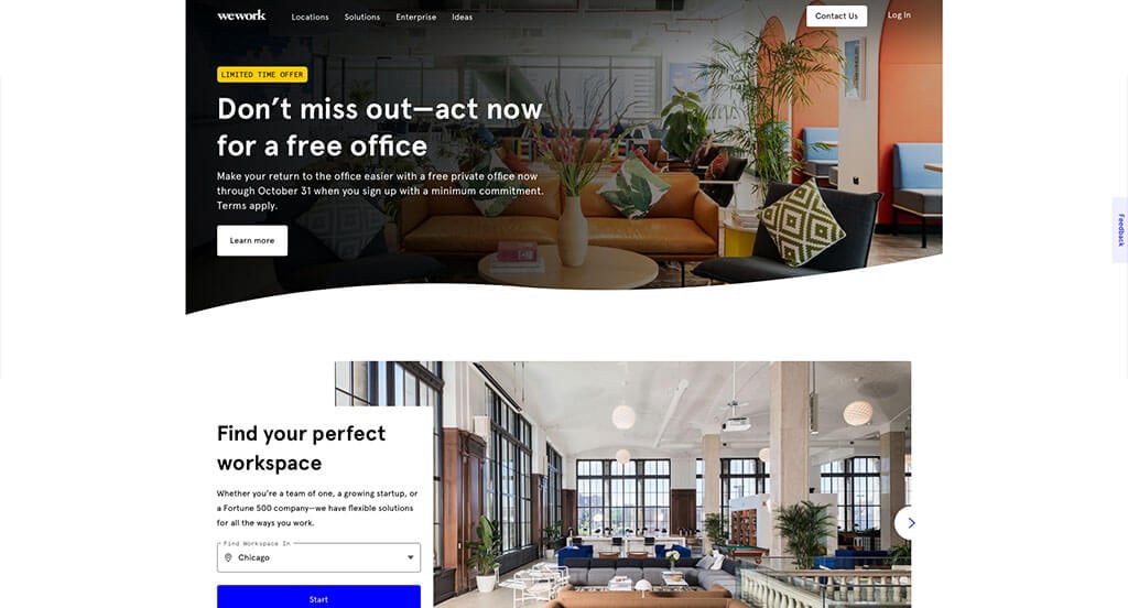
WeWork takes advantage of a mixture of text, photos and videos to create a stunning template. Using high-quality images helps to show off the well decorated rental space is another unique quality that we enjoyed. WeWork clearly had a focus on conversions when creating a short fillable form to help customers determine the ideal workspace for them or their company. Another feature we enjoyed was their buttons that are bright blue or outlined in blue to emphasize them. What a great website to review when designing your next business to business website!
18. Asana
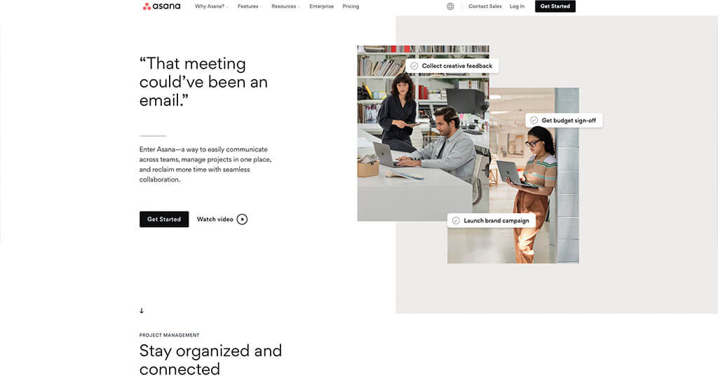
This site knows how to take advantage of a black, white and pastel color scheme. Making use of smooth transitions was definitely a very impactful quality within their homepage. You might notice a live chat that allows customers to quickly contact this company. Asana also does a good job with simple, colorful graphics. Their layout using staggered squares of color and such was an idea that we loved.
19. Atlassian
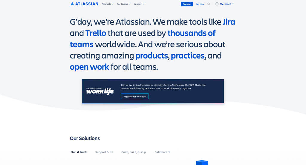
Atlassian used a blue and white color scheme with many other accent colors, that created a design we are sure to remember. Their logo design was simple but extremely professional which was something we enjoyed. Another thoughtful quality within this web page is their professional text. We certainly couldn’t ignore how this business utilized interesting photo frames that naturally livens up their entire site.
20. Rockwell Automation
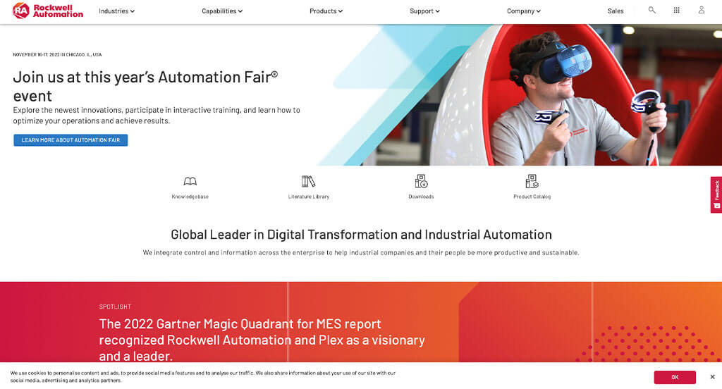
Bright colors are definitely what takes this site to the next level. Along with that, inventive photo frames and “x” graphics that match with those frames. The repetitive use of reds and oranges was a unique choice that we loved. Rockwell Automation clearly had a focus on digital marketing when allowing for simple navigation within this website. Finally, we thought that their menu was well-labeled and very organized which was super nice.
21. Southwire
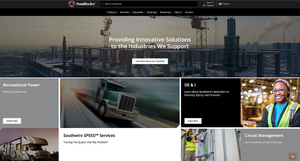
The first thing we noticed was how Southwire used a neutral color palette to cover their website. We liked the high quality image slider that can be noticed right away in their homepage. We really enjoyed how everything was well organized so people can always find the information that they are looking for. It was also a smart idea to include their logo design repetitively in a variety of places. You might also notice that they display how many years they have been in business to gain trust with their new and existing customers.
22. Envoy
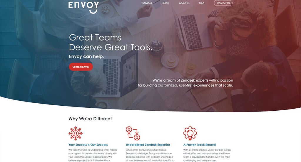
Envoy is an example that totally deserves to be on this list. There was lots of small animations that improve the full layout of this design. Using bright colors for their animations also helped to accent the information on their site. Implementing case studies was something else that they do a great job with. Additionally, they had a focus on customer usability when creating the informative blog.
23. Pacon
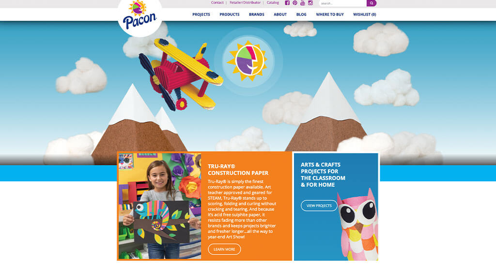
Lots of bright colors are used to create a childish feel for this company. Their navigation bar is extremely well organized allowing for information to be found quickly. We loved their use of a colorful and artistic logo, which makes sense for their business. Adding in a blog allowed for lots of information to be included. A wishlist was a unique feature that we noticed that made them stand out from their competitors.
24. Restaurant Cooler Gaskets
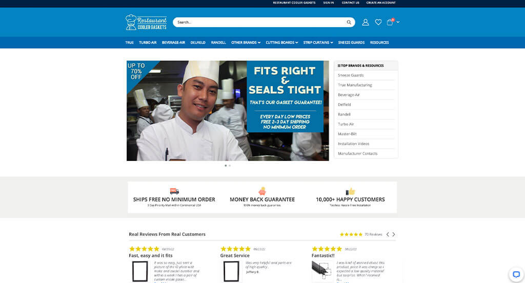
Here’s another example we didn’t ignore. Their relaxing blue and white color scheme was a great choice. After scrolling past the header, you’ll immediately notice Restaurant Cooler Gaskets focus on producing quality products. Allowing for money back options and free shipping showcases their focus on customer happiness. It was also a great idea to include a customer review section.
25. Cooper Lighting Solutions
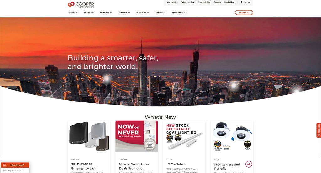
Accents of bright red and oranges was a great choice, especially for a lighting business. We loved their automatically playing video with a reddish-orange moving line raising awareness to specific parts of their design. Using alternating color blocks was smart because it helped naturally break up content. Cooper Lighting Solutions clearly had internet marketing in mind when implementing case studies into their design. Their use of professional fonts was another aspect that we absolutely loved.
26. Vidyard
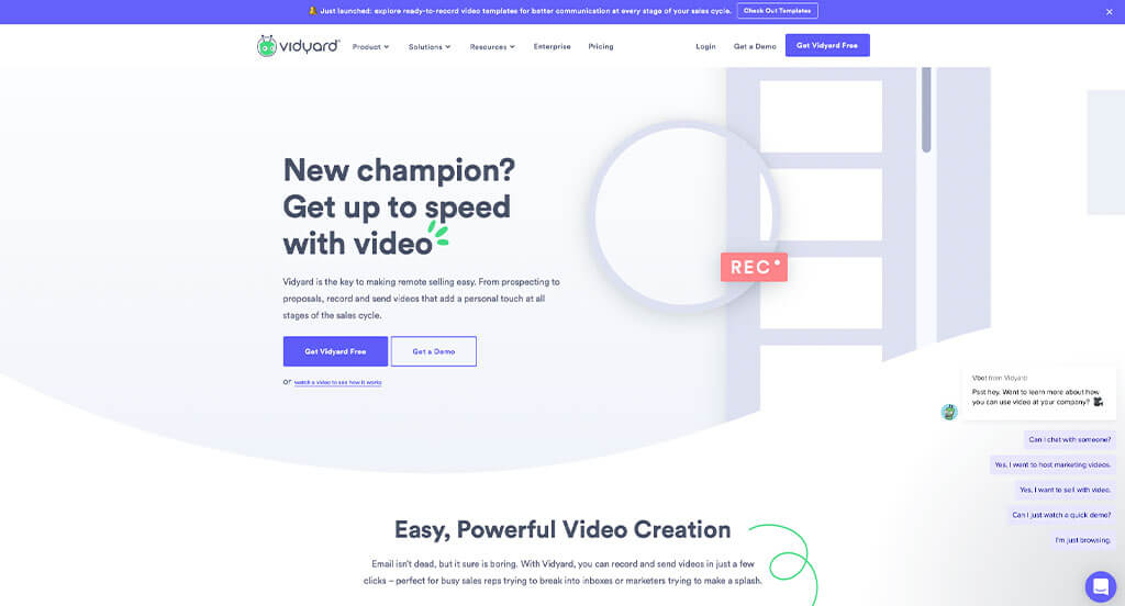
We chose Vidyard because of their stunning color palette. Having nice backgrounds for their content was another thing that helped them stand out. Using bullet points to organize information was very helpful for readers. Vidyard clearly had website accessibility in mind when designing a striking layout for their website. Finally, using screenshots to show customers what they might see was a smart idea.
27. Oshkosh Corporation
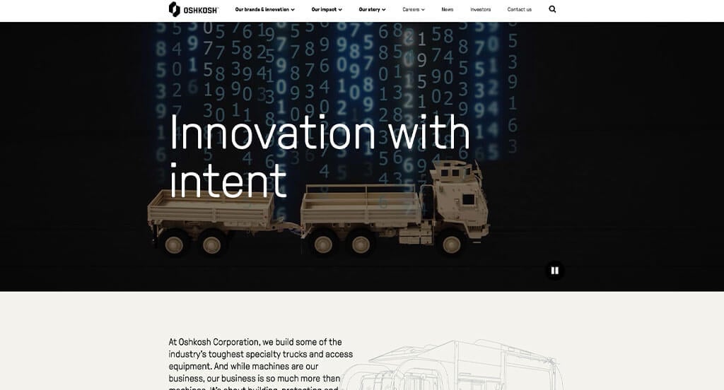
Oshkosh Corporation did great using a image slider to add interest to the overall design. We thought it was cool how their images for product types are simple and provide unity. Adding in videos is something else smart that we surely didn’t ignore. Their logo design is simple but extremely professional, which we loved. A simple color scheme says it all for a site like this one. Adding in lots of links and buttons was helpful to organize all of the information. Oshkosh Corporation had website usability in mind when building a simple navigation bar.
28. Procore
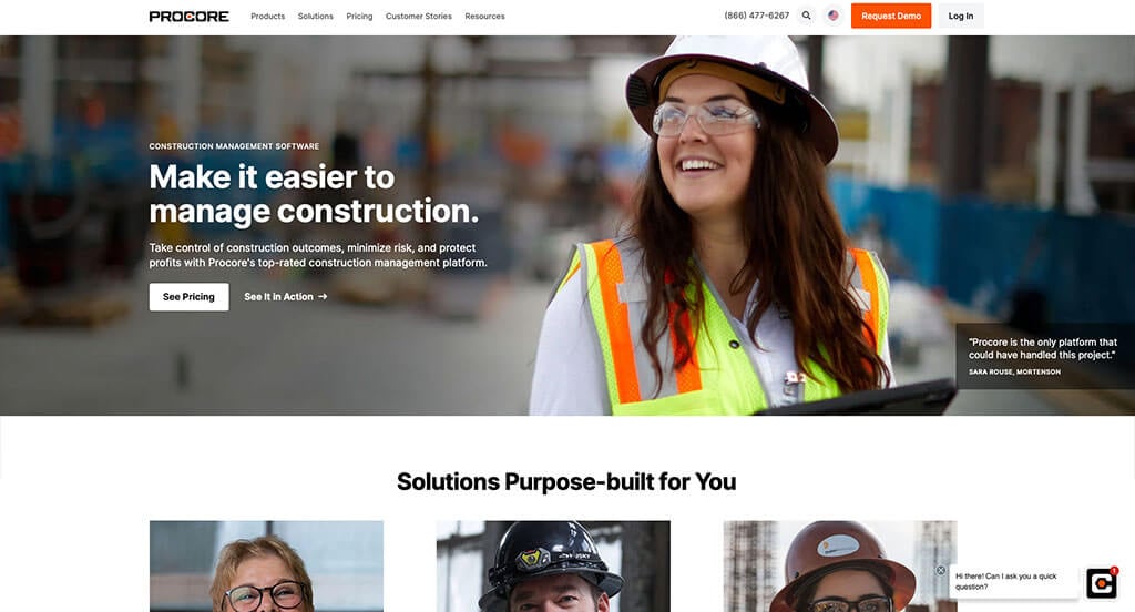
One of the design features that stood out to us was their use of innovative fonts for titles and content. We also really liked how everything was placed into a logical structure, making it easier for customers to digest. Another design quality in this creative software that was done well is their balance of white space. Adding in customer stories are a great choice because it helps new customers gain trust with them. Easy navigation was a marketing feature we noticed right away.
29. Datatron
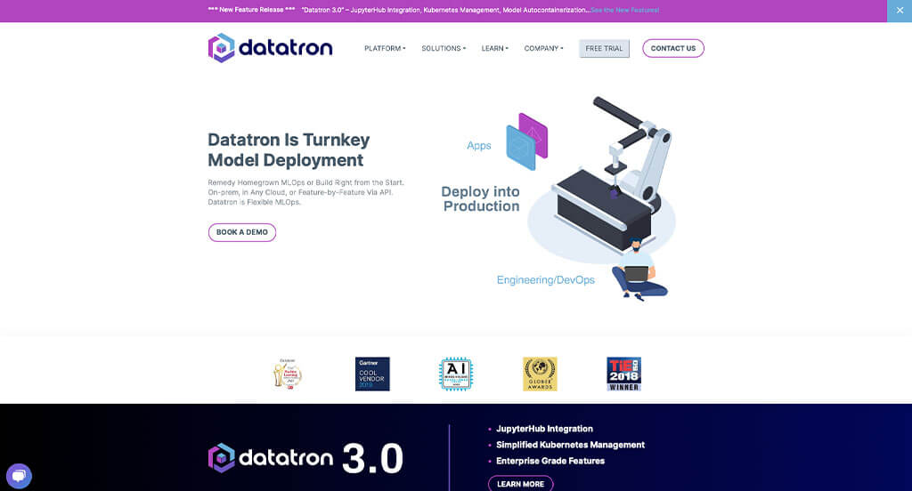
Having cool hues all over in this site feels extremely comforting and professional. We enjoyed the use of subtle animations and graphics that help take this example to another level. Datatron has a unique logo design that uses their color scheme and repetition. It was also a smart idea to include awards their company has won over time. Bullet points can also be noticed to make information easier to read through.
30. Leviton
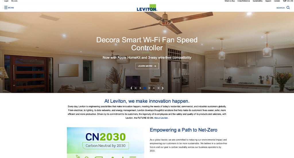
High-quality images and videos used all throughout this design definitely a great choice. This logo design was simple, but perfect because they used the same colors that cover their design. It was very helpful to have linking titles that help bring customers to other pages. We also liked how a search bar can be seen to help customers find products they might be searching for.
31. Olumo
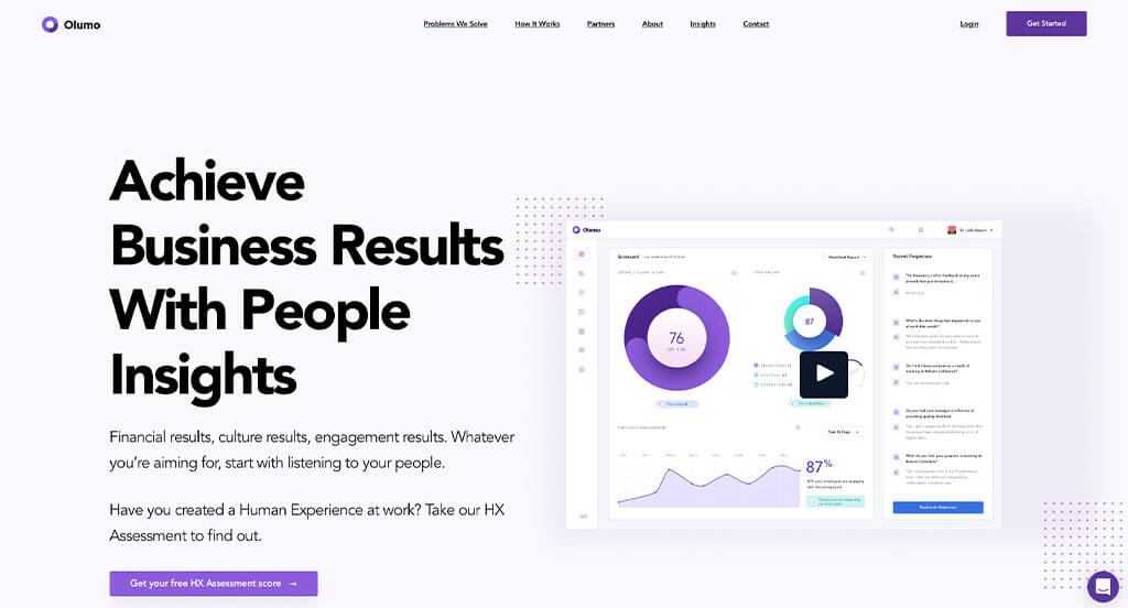
Lots of pale purples and whites are used in this design and we love it because it adds a sense of visual interest. Adding in creative graphics and patterns helped it stand out from boring layouts. We loved how Olumo used their logo design multiple times, sometimes even to display processes. Having well-laid out contact information was definitely helpful for everyone. We also thought it was great to have a domain that matches their company’s name.
32. ResMed
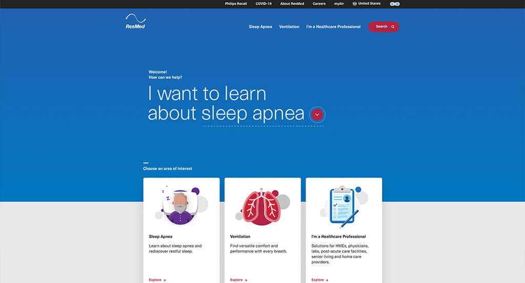
Graphics are definitely the best part about this design because it allows for customers to pair visuals with written content. Subtle animations are used in these graphics, making them breathe life into this example. Using a few colors to accent certain texts and links was a good idea. We also took some time to notice that all of their paragraphs are written in a straightforward manner, which makes the paragraphs easier to skim.
33. Gulfstream Aerospace
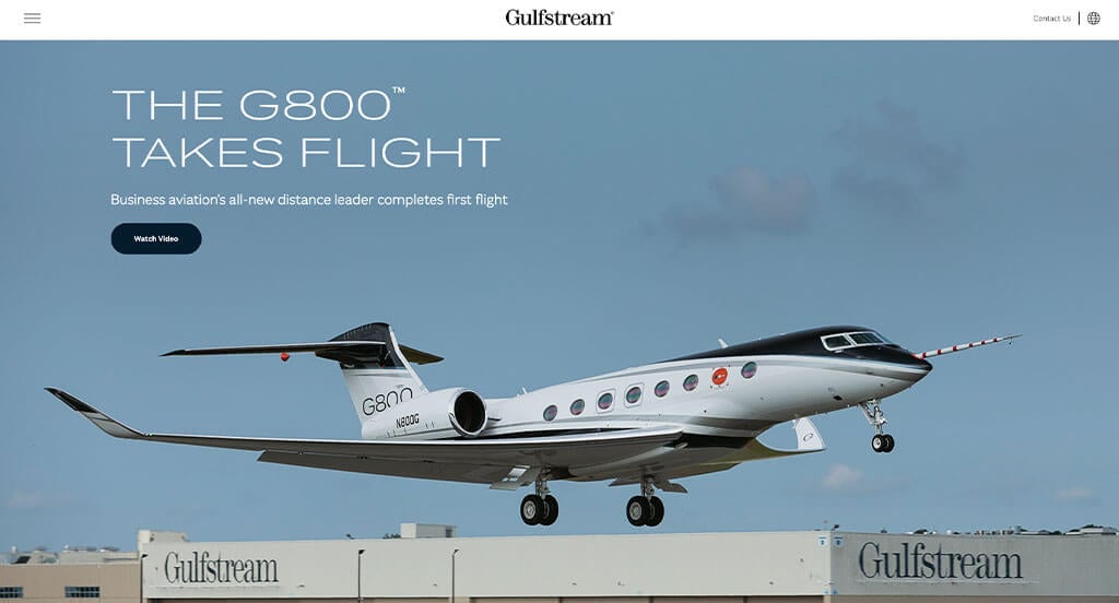
Here we have an extremely futuristic design with a modern feel. Their fonts are extremely readable and sleek which elevates their visual appeal. Along with that, their color scheme helps to bring a modern feel to their design. Having a simple, clean logo design is another element that surely plays into their overall feel. We liked how they used a variety of photo frames or staggered images to create a more interesting design.
34. Yapstone
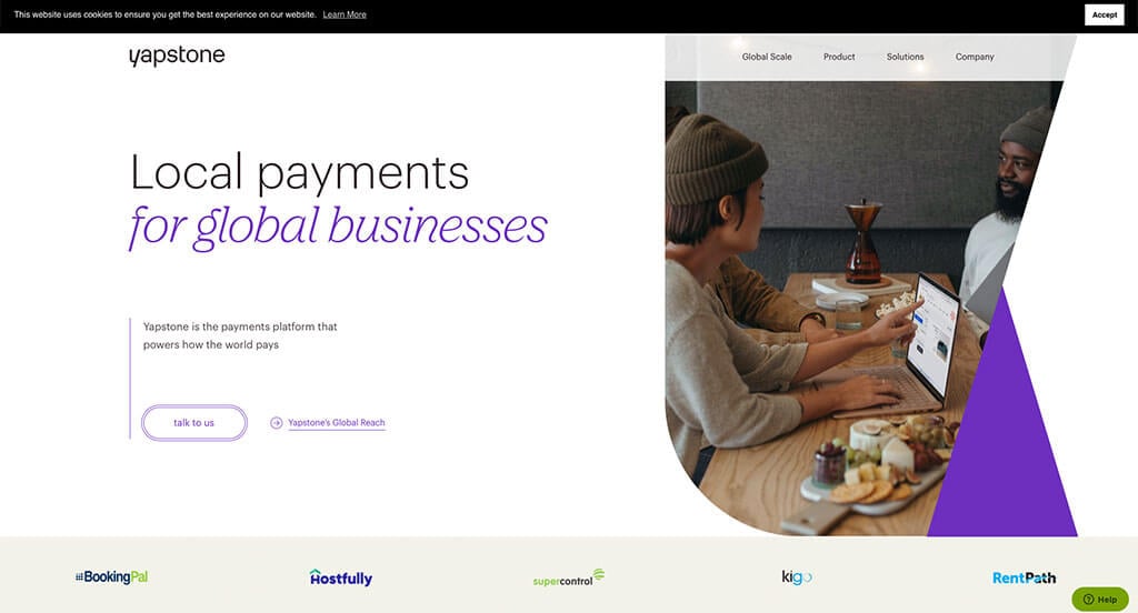
This company does an extremely good job with their stunning color scheme. There’s hints of purple all throughout the design that look great and aren’t overpowering. Small graphics can also be noticed to help readers connect visuals to the written content. Yapstone also does a great job with writing in short paragraphs to allow customers to skim through much easier.
35. Berlin Packaging
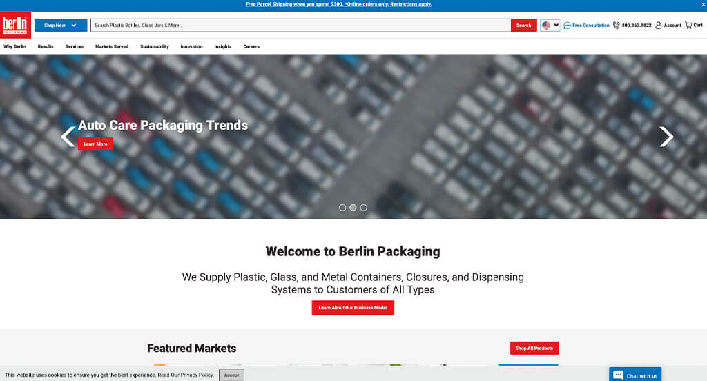
Here’s another example to take inspiration from when building out your next site. While the blue and red colors were nice, it wasn’t the best part about this design. The organized content along with balanced white space was definitely what made this one stand out. Berlin Packaging also did a good job using the negative space of their name to add in a bottle design in their logo. It was also helpful for navigational purposes to have a well labeled navigation bar along with a search bar.
36. Good Start Packaging
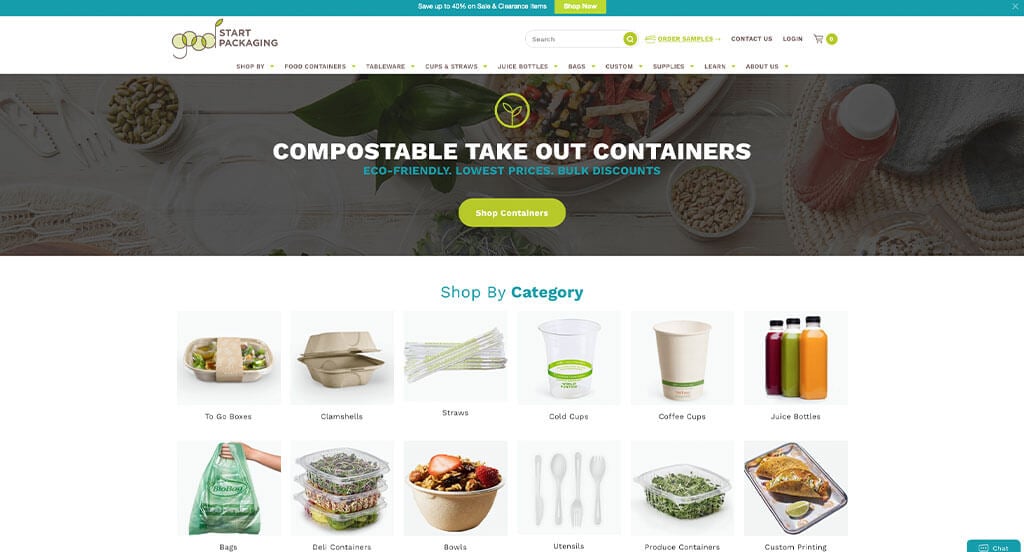
This is a great web design for packaging websites to take a look at when looking for ideas. A green, brown and blue color scheme was very impactful because it allows for a natural feeling. We really loved their logo design how it used their color scheme along with making use of a little leaf icon. This easy to use template helped make this one of the best container supplier websites we reviewed. It was extremely helpful that Good Start Packaging used images to help sort out their products, making them easier to find.
37. MailChimp
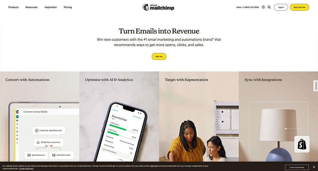
We really enjoyed this site due to their bright yellow underlining, accenting and highlighting important information so that it stands out to customers. Showcasing all of their integrations with other well-known business was another good choice. MailChimp did well balancing their content and whitespace so that nothing feels squished. We also thought it was nice that they included buttons to start free trials, to help get customers involved with their product before purchasing.
38. VanZeeland Manufacturing
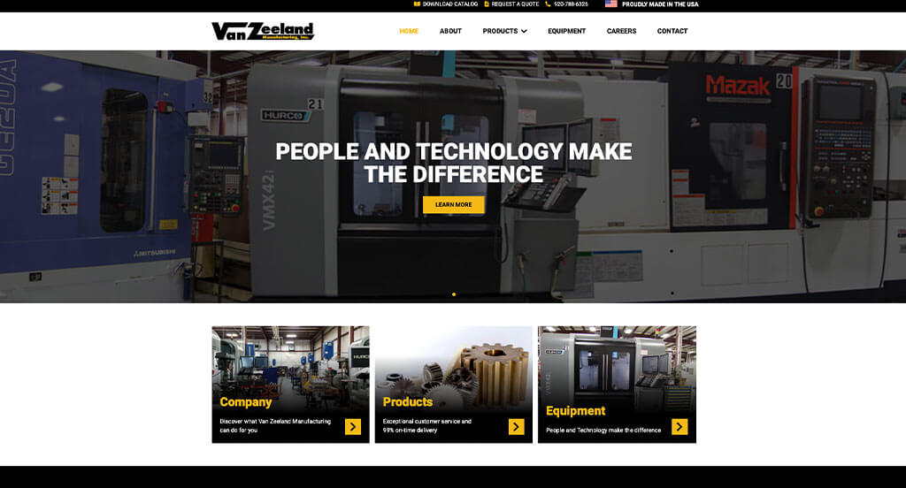
VanZeeland Manufacturing makes use of a basic font that is bold and extremely readable. We loved how they used images with faded into their backgrounds to match with their short paragraphs. This company also used a yellow accent that didn’t disappoint. Whether it was on paired with a black background or a white background, it was striking either way. Having a clearly labeled menu helped make this one of the best ones we considered.
39. Monday
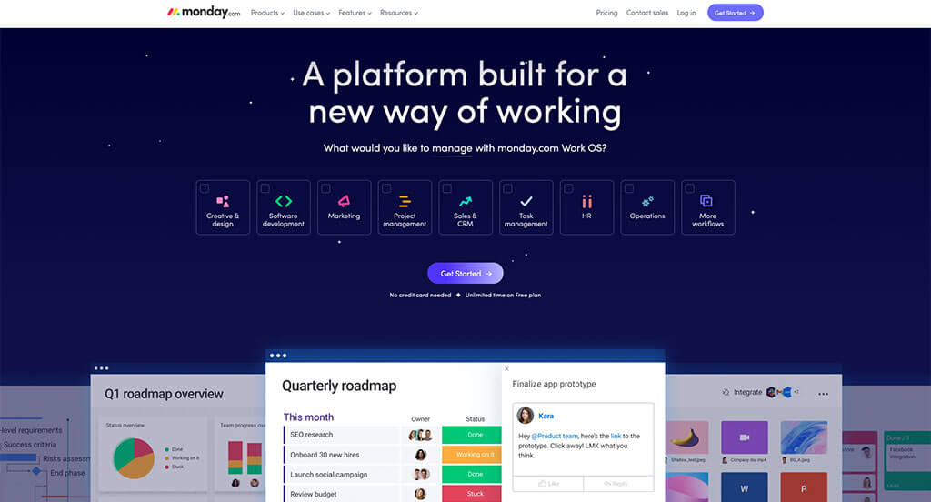
Monday has a very professional feel to it, thanks to its blended use of colors. We really enjoyed how all of their images are large and don’t seem forced into place anywhere. Their font was relaxing, which helped make their overall design feel more relaxing. It was a great idea to use bright colors for their buttons and product option blocks. We also loved how their product rectangles include bullet points of information upon hover.
40. Artik
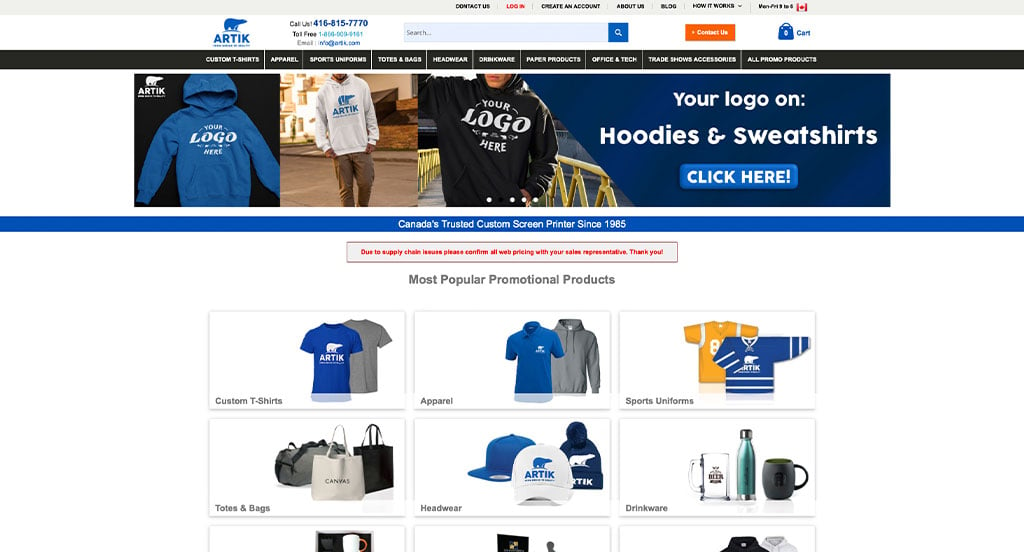
If you are looking for ideas, this is another site to find concepts to adapt to your business. We thought it was really smart to clearly label the variety of products they allow to be customized. Lots of images were included which was helpful because people were able to see what is possible with this business. Artik utilized a blue and white color scheme which we really loved because it matches their name and logo design.
41. Toast
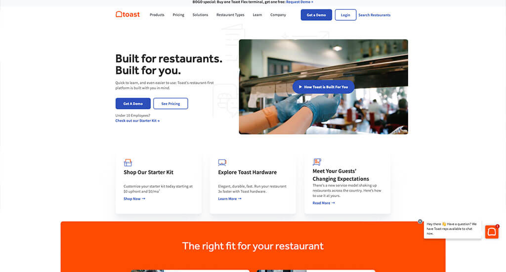
There was lots of good features to note in Toast’s design, guaranteeing it a spot on our list. As you scroll through their page, you’ll notice that they offer a live chat to help customers contact them quickly. We loved the bright orange colors that are used as an accent to break up content. It was smart to include the businesses that use their product with short clips showing their product off. Finally, we loved how they displayed awards to gain trust with new customers.
42. Businessmap

This is a good example of a web design for management platform sellers looking for a custom look and feel. Our web designers thought this was a good homepage design example for marketing software because of the well-thought out animations. Another thoughtful feature of this creative software supplier site is their blue color blocks to break up content. They had ease of use in mind when creating the simply labeled menu of their website. For business to business retailers looking for ideas on their next website, this example will definitely be one to consider.
43. Andex
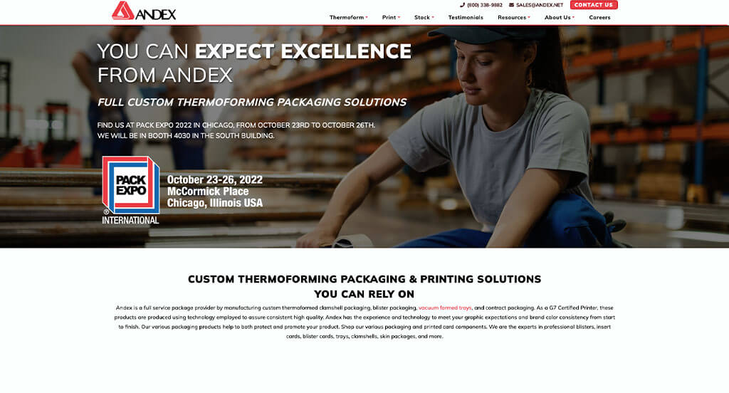
A repetitive red color scheme is used for this packaging site which we loved because it has a bold feel while still feeling professional. Additionally, we thought it was smart to showcase their different options such as blister, blister cards, clamshells, insert cards, trays, and skin boards. Lots of graphics are used to help guide customers through their information. The simplicity of this website helped it be one of the best packaging supplier sites we reviewed.
44. Trello
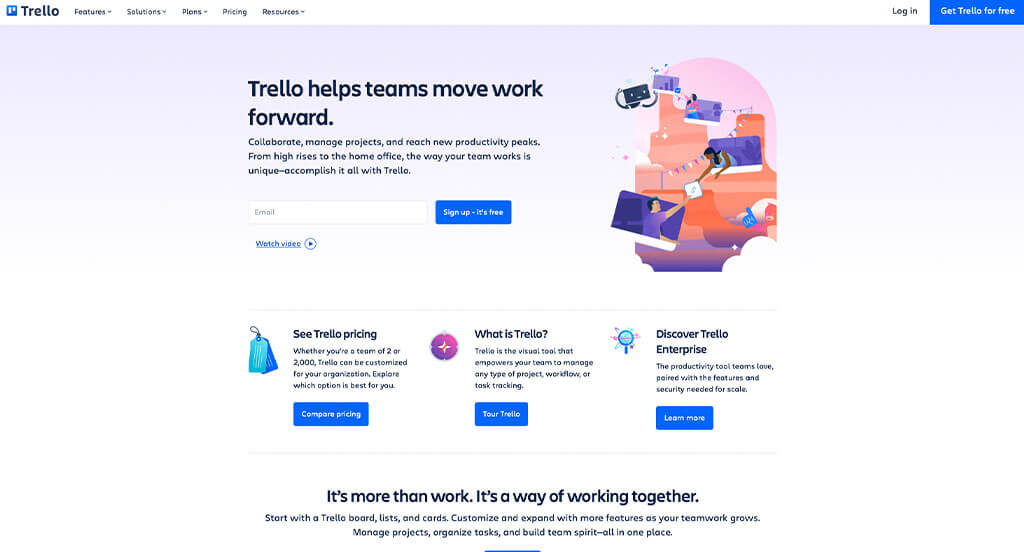
Trello made great use of a simple background with relaxing accent colors throughout the entire design. We also loved how they used a simple yet professional font for this design. It was cool how graphics looking like screenshots were added in to help customers guess what they’ll be seeing. Picking out a simple domain name that matches with their business was another choice that we couldn’t ignore.
45. Garrett’s Maintenance Service Inc.
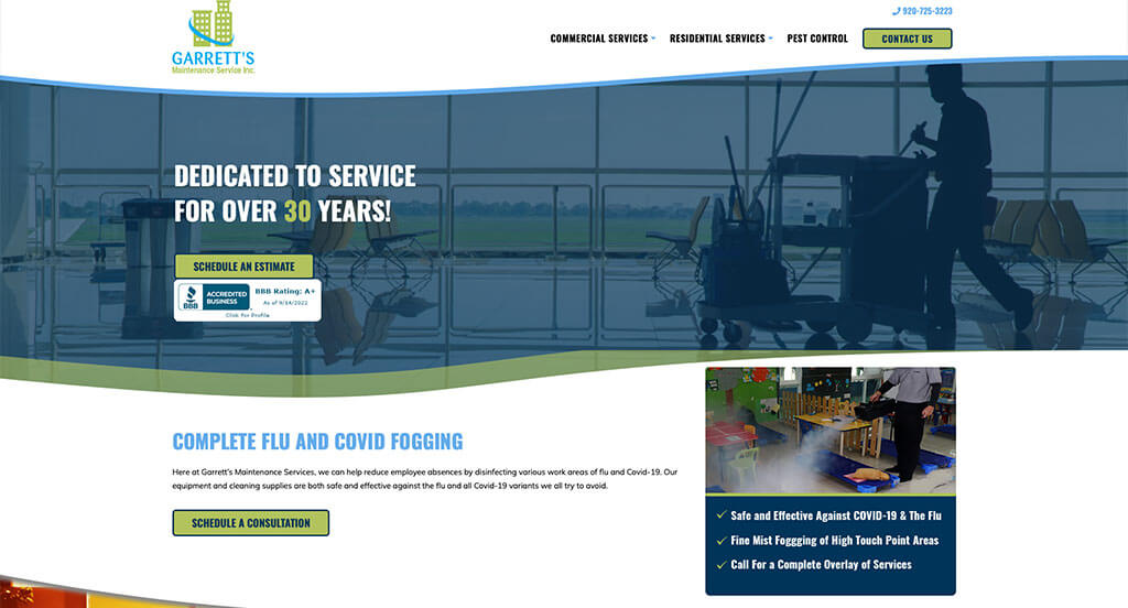
Upon entering this site, we knew right away that this would be another example in our list. A blue, white and green accent allows for a clean design. We liked how images were used as a background in a variety of areas. Including a customer review section was absolutely a consideration to make them stand out. Small graphics that make use of their color scheme was another feature that we really enjoyed.
46. Schneider National
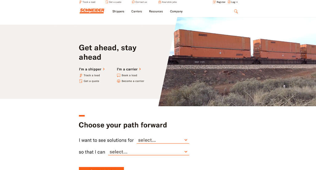
Videos and large images are for sure a great idea for any site looking to attract customers. We loved how bullet points are used to help organize information, making it easier to read. Adding in quotes from higher-up people in their company was another cool idea. Using bright orange accents for graphics, buttons and other important information was a great idea. We thought it was cool to have a link depending on if the customer is a shipper or a carrier.
47. Exstratus
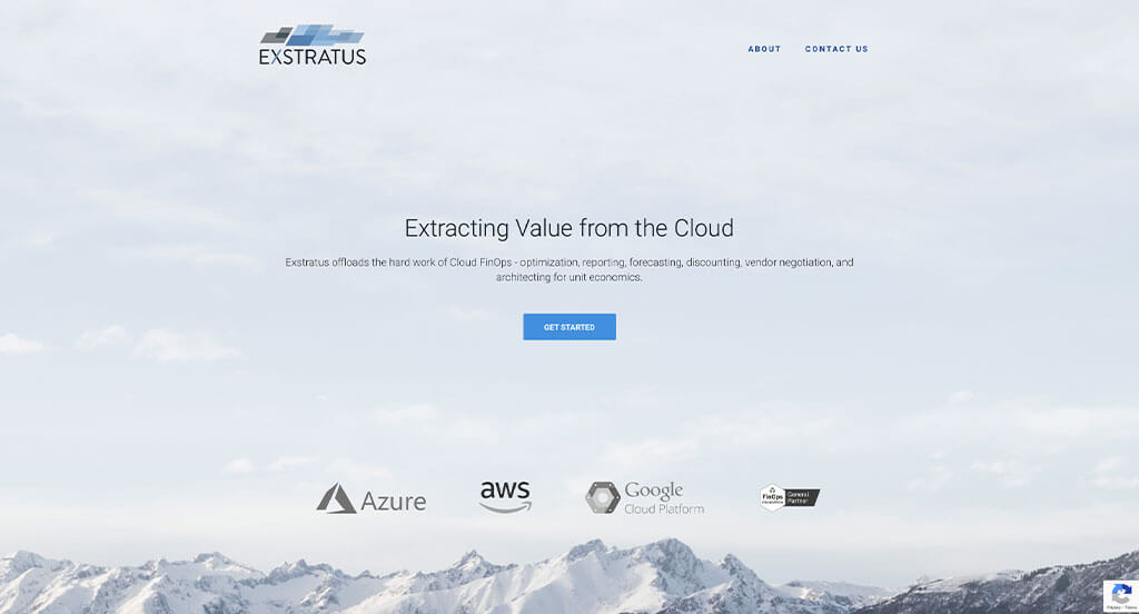
This example was extremely organized and we absolutely loved that. There was bullet points that were used along with a good balance of white space. Exstratus has a very professional feel to it, thanks to its unique use of blue and gray hues. It was a nice touch to include other companies that are their customers. Be sure to consider the one-of-a-kind design of this business to business website when developing your next website.
48. Evernote
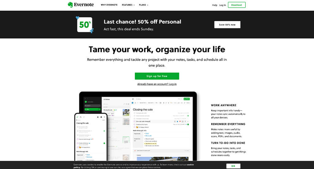
We chose Evernote because of its nicely organized layout that uses an accented green color scheme, which we like because it gives off a feel of preparation. Their small animations that appear upon hover was exciting. Small graphics can be seen all throughout this design which looked amazing. Large colorful buttons are another feature in this custom software website we enjoyed.
How to Build an Impressive B2B Website
Are you building or redesigning your B2B website? Yay! Let’s explore a step-by-step guide. If you’ve already picked a domain, hosting, and platform, feel free to skip ahead.
1.) Acquiring a Domain Name
Choosing a domain name is key—it’s your B2B website’s online address and a vital part of your branding.
Follow this process to help you select the perfect domain name:
- Brainstorm: Begin by generating potential domain names that reflect your company name, the services or products you offer, and your target audience.
- Simplicity: Keep your domain name simple, easy to spell, and pronounce—avoid complex words, hyphens, and numbers.
- Consistency: Include your brand in your domain if possible. For instance, if your company is Johnson Cleaning Supplies, avoid domains like 4CleaningYourOffice.net.
- Availability: Check your desired domain names first. Many are taken, so if your ideal name is for sale, verify its availability and avoid overspending.
- Domain Extensions: Choose a domain extension that makes sense for your site. While .com is popular, options like .net, .org, or industry-specific ones such as .tech or .biz are also available.
- Legal Considerations: Before registering, run a trademark search to ensure your domain doesn’t infringe on anyone’s intellectual property. Make sure to avoid using competitor names or trademarked terms.
- Register the Domain: After choosing your domain, register it with a reputable registrar. Our experience shows GoDaddy and Namecheap are user-friendly choices.
2.) Selecting the Right Website Platform
After choosing your domain, select a platform for your B2B site. Most focus on content, appointment calendars, phone numbers, and contact forms to drive conversions, with ecommerce added only if selling products online.
For Content-Based Websites:
For content-based B2B websites, WordPress and Wix are top picks for your platform.
- WordPress: WordPress is a versatile CMS offering flexibility and customization for B2B websites. With a vast array of themes and plugins, it provides excellent control and scalability—making the open-source version on a web host the preferred choice for most companies.
- Wix: Wix offers a user-friendly, hosted solution with intuitive page-building tools and templates for B2B websites—no separate hosting required.
For Ecommerce Websites:
For online product sales, consider WooCommerce and Shopify.
- WooCommerce: For a WordPress store, WooCommerce is the ideal ecommerce plugin. It integrates seamlessly, offering extensions, payment gateways, and inventory tools.
- Shopify: Shopify is another great hosting solution for B2B’s, offering a user-friendly interface, customizable themes, built-in security, and comprehensive tools for inventory, payments, and shipping.
Web Hosting Requirements
For WordPress or WooCommerce, you’ll also need a reliable web hosting service.
We recommend our own web hosting option, other reputable options also exist. Here are a few recommendations:
- WP Engine: WP Engine is one of the best hosting services we know because it offers an intuitive control panel and seamless backups. Note its PHP limits and potential price hikes for upgrades.
- SiteGround: SiteGround also offers reliable hosting with excellent support, user-friendly backups, and competitive pricing for B2B companies.
- Digital Ocean: Digital Ocean makes use of cloud hosting, but it may be too advanced for most B2B sites due to accumulating costs for droplets, OS, control panels, backups, and management fees. If you need admin support, consider AdminGeekZ.
3.) Selecting a Website Template
Most B2B companies opt for pre-designed templates to reduce costs and turnaround time, though hiring a custom web developer or custom ecommerce developer for a unique design is always an option.
We think the best idea is to focus on pre-built templates. Here are some links leading to theme marketplaces:
WordPress B2B Themes
You can find free themes and templates at wordpress.org or at ThemeForest.
Wega – Themeforest
$75
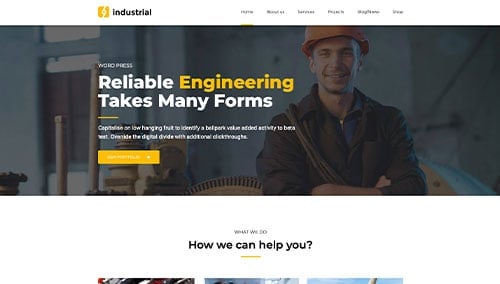
Industrial – Themeforest
$69
WooCommerce B2B Themes
You’ll find a variety of ecommerce B2B themes for WooCommerce on ThemeForest.
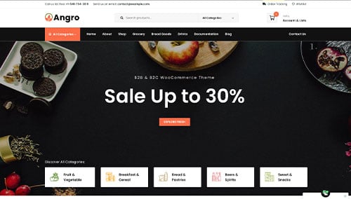
Angro – Themeforest
$75
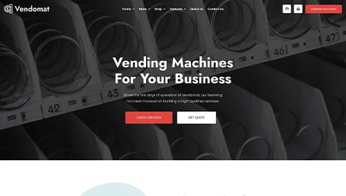
Vendomat – Themeforest
$75
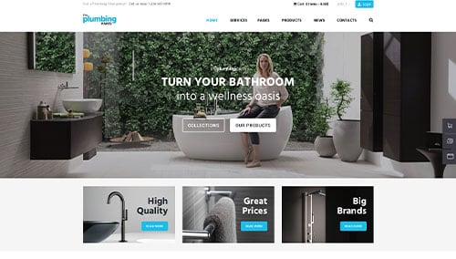
Plumbing – Themeforest
$69
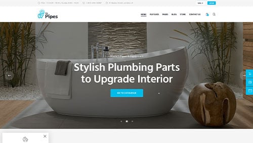
The Pipes – Themeforest
$69
Shopify B2B Themes
Explore free and paid themes at themes.shopify.com or consider options available on marketplaces like ThemeForest.
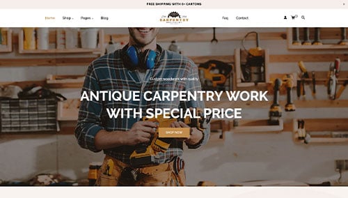
Carpentry – Themeforest
$59
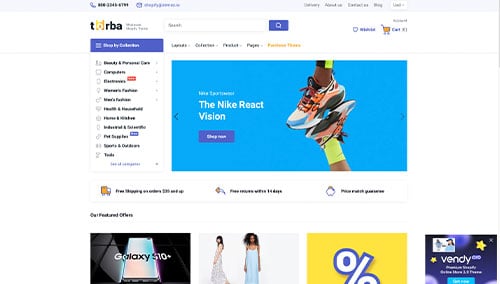
Torba – Themeforest
$39
Wix B2B Themes
Browse free and paid themes on wix.com for B2B websites.
4.) Creating Content & Adding Visuals
Now that you have your domain, platform, and theme set, it’s time to create captivating B2B content. Follow these writing tips to engage your target audience.
- Know your target audience: Understand your audience’s demographics, preferences, and needs. Tailor the content to address pain points, add value, and build connections—boosting your search rankings.
- Define your key messages: Identify your key messages. Align them with your brand, emphasize your unique advantages, and clearly communicate your self storage benefits.
- Keep it concise and scannable: Online readers skim, so keep it concise. Use short paragraphs, bullet points, subheadings, and bold text for better readability.
- Create clear and compelling headlines: Craft headlines that instantly convey your B2B value and entice visitors to explore further.
- Incorporate keywords strategically: Do keyword research to naturally integrate relevant terms and boost your site’s search visibility. Avoid keyword stuffing, which hurts readability, and consider tools like Ahrefs or Semrush for help.
- Maintain a conversational tone: Write conversationally to connect with your audience. Avoid unnecessary jargon and engage readers directly with a friendly tone.
- Edit and proofread: Edit and proofread your content before publishing—check grammar, spelling, punctuation, and ensure a smooth flow that matches your brand’s voice. Tools like Grammarly can help.
- Leverage ChatGPT for support: For content ideas or refinement, consider using AI tools like ChatGPT.
Enhance your overall content by using high-quality visuals.
- Choose high-quality images: Choose high-resolution, well-composed images. Blurry or pixelated visuals will bring down your visuals overall.
- Ensure relevance: Make sure to use images that are relevant, illustrate your message, and build upon context within your design.
- Explore stock photo resources: Use stock photo providers like Unsplash, Pixabay, or Shutterstock for professional images, but check for proper licensing and attribution.
- Customize images when possible: Customize images to match your brand for a cohesive visual experience. Tools like Adobe Photoshop or Canva can be extremely helpful for this.
- Optimize image file sizes: Compress images to reduce file sizes without losing their quality—large files slow your site and hurt SEO. To do this, you can use TinyPNG.
5.) Post Launch Strategies
After launching your site, consider key tasks and services to boost its effectiveness. Here are some suggestions:
- Search Engine Optimization (SEO): Boost your local visibility with effective SEO. Conduct keyword research, optimize content, build internal links, and update regularly with quality content. Consider our SEO team or reputable providers like The HOTH.
- Paid Advertising: Drive targeted traffic with paid ads on platforms like Google Ads or Facebook Ads. Consider our PPC management services or hire experts from Mayple for faster results.
- Conversion Rate Optimization (CRO): Analyze your site’s performance with Google Analytics, identify drop-off points, run A/B tests with VWO, and implement data-driven improvements to boost conversions and user experience.
- Website Security: Protect your B2B website from malware with robust security: use SSL, firewalls (e.g., Sucuri), and regular backups. Keep your CMS, plugins, and themes updated, and monitor uptime with UptimeRobot.
- Website Maintenance: Regularly perform maintenance for optimal performance. For WordPress, update plugins and themes, monitor speed, fix broken links, and back up your data. Consider our website maintenance services or freelancers from Upwork.
- User Feedback and Testing: Collect feedback and conduct testing to identify areas of improvement, then gradually make changes to better your overall design.
- Content Updates: Keep your content fresh by regularly updating blog posts, product info, and checking for accuracy. Valuable content attracts visitors and encourages sharing among audiences.
Post-launch digital marketing is vital for your B2B site’s long-term success. Stay proactive, monitor performance, and adjust strategies to meet your goals and audience needs.
FAQs about Web Development for B2B Websites
A template-based WordPress B2B website starts at about $4,000, while a custom theme with mockups begins around $10,000. Ecommerce sites on Shopify or WooCommerce start at roughly $6,000, increasing to about $20,000 with custom mockups. Premium design, custom features, and data migration drive higher costs.
We review all your current links, plan their new placements, and implement 301 redirects for changed URLs. We fix internal and external links, create 404 pages for any unfixable ones, and test everything before launch to prevent broken links.
After the redesign, you’ll still be able to update your website using our user-friendly CMS. We provide training so you can easily edit text, upload images, add products or services, and post blogs without needing technical skills.
Your insights and collaboration are essential for success. Sharing your goals, vision, and target audience lets us tailor the project to your needs. Please provide your brand assets (logo, color scheme) for consistency, specify features (like contact forms or e-commerce) to meet objectives, and share design preferences and examples to guide our process.
If you have domain and hosting details, please share them; if not, we can help set them up. Grant access to relevant accounts, provide timely feedback, and discuss timelines and budget to streamline the process. Open communication ensures we build a website that reflects your business identity.