Looking to elevate your organization’s online presence? Our guide to the top 49 Church Websites offers lots of inspiration, showcasing great designs, with elements of functionality and user experience.
Ready to connect with your community on a higher level? Explore these examples and gain ideas on how to do just that!
Want more ideas? Check out our blog on Best Website Designs across a variety of industries!
Top Religious Website Designs
1. Renewal
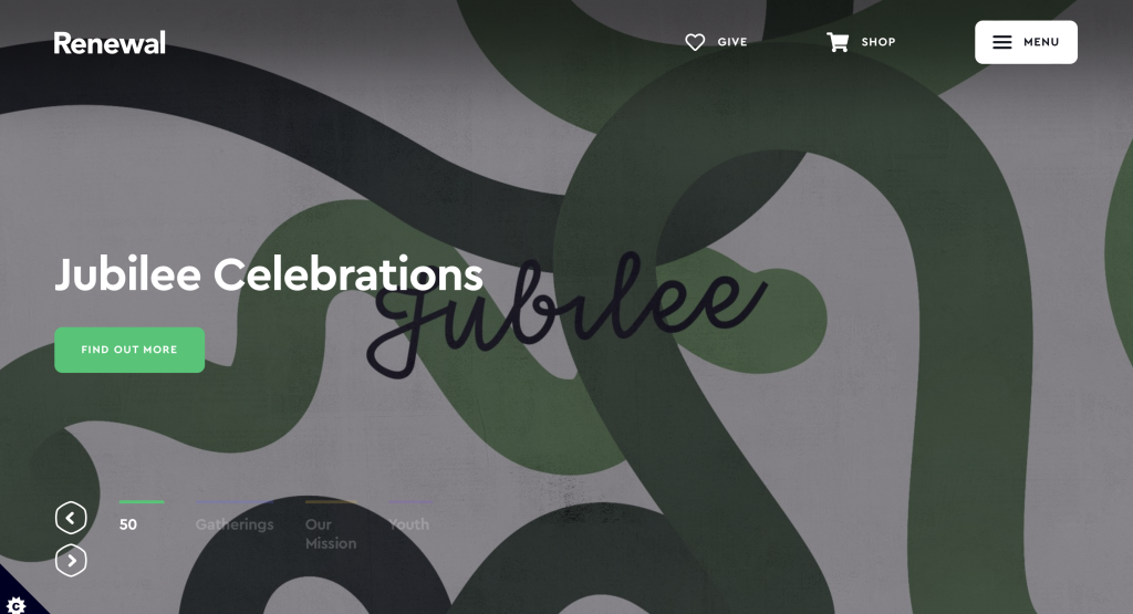
To start us off, we have one that uses interesting photo frames to stand out from competitors. Using a variety of bright colors allows for a youthful feel. Bold lettering was another feature that stood out to us. We liked how they used large rounded buttons to help viewers navigate throughout their pages. Integrating social media right into their landing page was another choice we couldn’t ignore.
2. Alliance Church
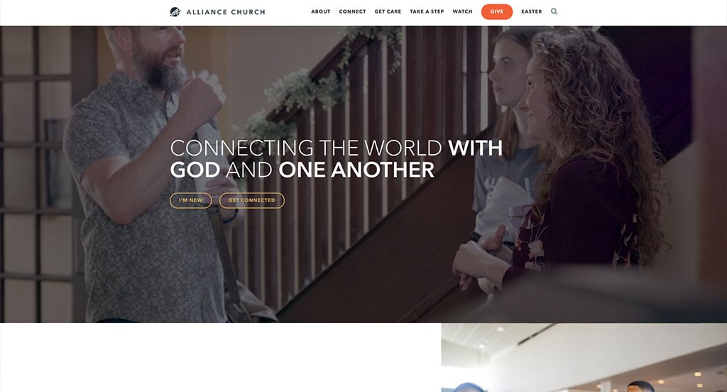
Right away, we noticed how this example used bolded fonts to put emphasis on certain parts of each title. We liked how they repeatedly slipped in “connect” into many of their sentences to show just how important this sense of connection to God and others is to them. It was very helpful to show each of their locations, making them easy to find. A section for updated and upcoming events was also a great addition.
3. Passion City Church
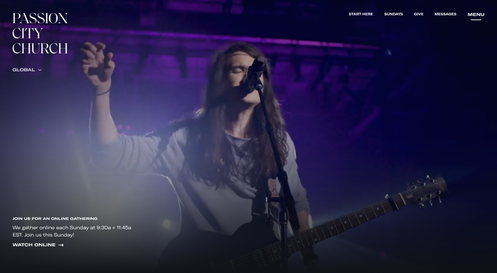
We like how this one makes use of a blue, white and black color scheme. Additionally, their color scheme shows up within their images, which was unique. High quality images that make sense for their group. It was a nice feature to allow for an online service option because not all members can attend in person every Sunday. Passion City Church considered their customers when designing a clearly labeled menu.
4. Church On The Rock
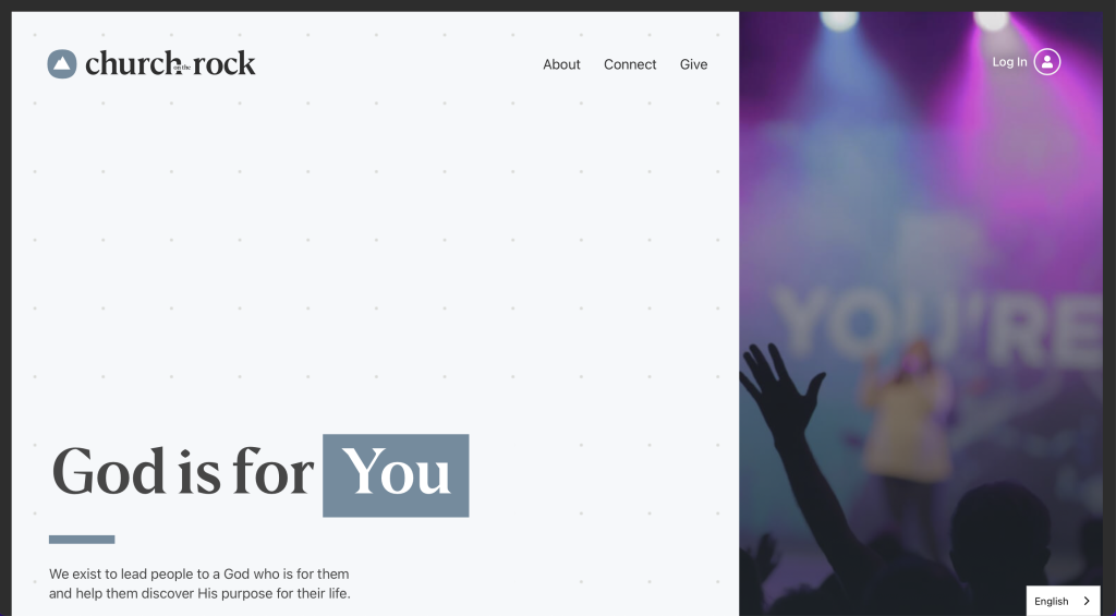
This organization makes use of an interesting template. There is a good balance between images, videos, patterns, whitespace and text, which is always a plus. Showing linked images that take you elsewhere within their site based on if you wish to see kids programs or youth programs was also nice. Having a section to show who their current pastor makes viewers feel a sense of connection. We liked their creative logo that plays around with their name.
5. Sovereign Hope Church
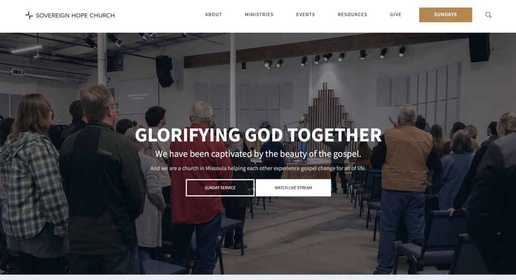
We loved the colors used in this example, especially their gold accents for titles, buttons and links. We liked how images were used as full screen length banners to break up content and blank whitespace. Speaking of whitespace, this example did a great job balancing that out without the content looking squished or too “loose”. Having a resource section was also nice because it allows people to explore other options that they like.
6. ADA Bible Church
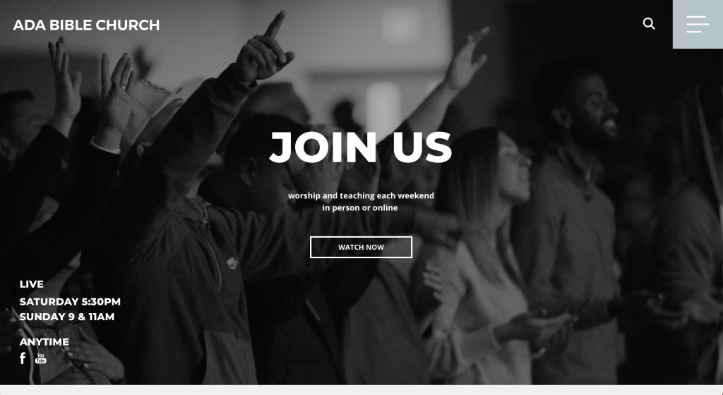
We liked how a video was used right away to grab attention with a monochromatic filter on it so it isn’t too distracting. Occasionally using light blues, light gray and orange as an accent made a stunning look. We thought it was unique how their connect section includes resources for lots of options such as: joining a small group, requesting a prayer, student activities, counseling resources, kids activities and opportunities to give back.
7. The Oaks Fellowship
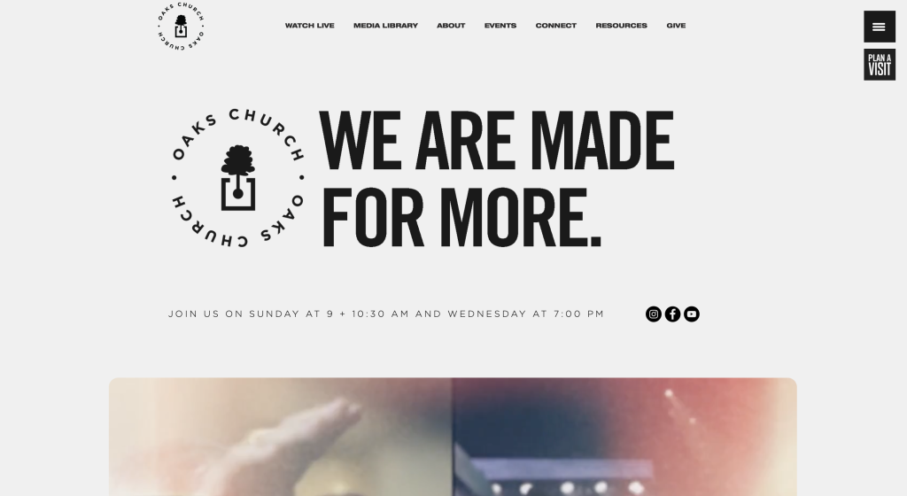
We loved how a completely unique template was used for this church. It was awesome the way their images had unique frames and seemingly “cut-out” fonts because it matches their background color. Their blue and cream colors are not only used within the background but also in their graphics and images. Adding in lots of buttons to guide viewers to every area of their site was extremely smart.
8. Calvary Lutheran Church
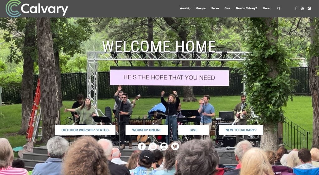
This color scheme grabbed our attention right away, green and blue always look great together, and of course the ombre logo design helps tie it all together. Including shorting paragraphs and bullet points was definitely nice to make everything easier to read. Showcasing their most recent sermon – including what day it was presented – was also a nice choice.
9. Aspire Church
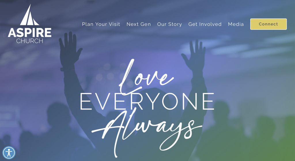
Including a phrase “Love Everyone Always” was both inspirational and logical for an inclusive organization such as this one. A design feature we noticed was how they included their logo design as a background in some pages. Additionally, we felt that their balance of modern and custom-feeling fonts was comforting. Their navigation bar was also very well organized, which is always helpful.
10. FlatIrons Community Church
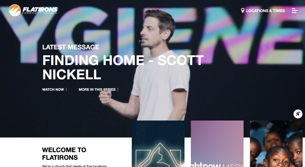
Here’s another one to check out when looking for inspiration. Their small accents of orange is beautiful, plus it ties in their logo. We loved how their buttons and links had interesting hover animations, making it more exciting to click on a link and read more information. Another noticeable thing about FlatIrons Community Church is that they used their name as a domain.
11. Mount Pleasant Christian Church
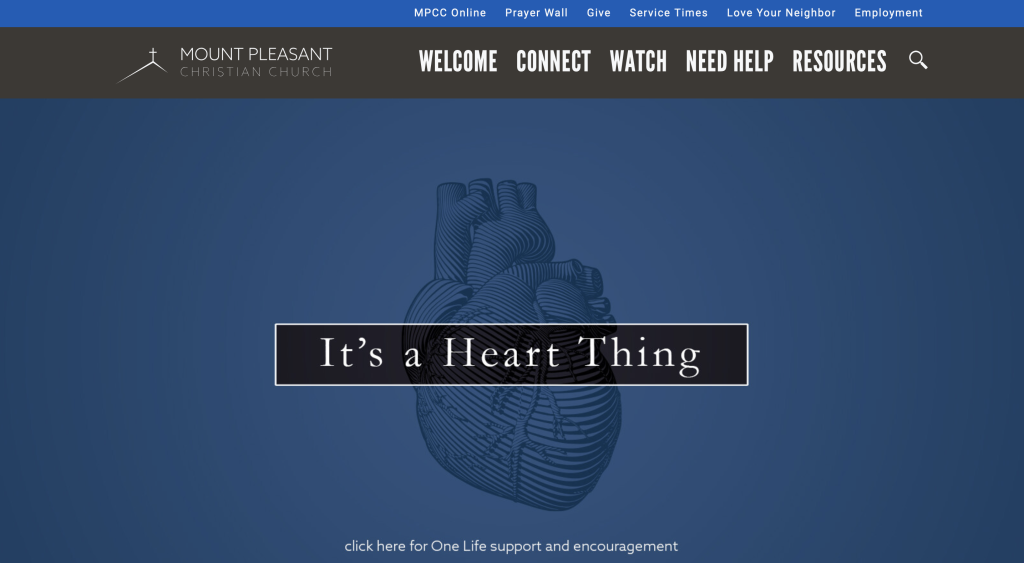
Our favorite part about this site is most likely their large fonts for titles that help them stand out more. Using short paragraphs was another feature that we find very useful, making everything easy to read through. We liked how there was some videos that were used throughout their pages. Although their logo design is simple, it makes sense for them. We loved how their navigation bar had drop-downs to keep everything organized. Having a page dedicated to sermons was something that we enjoyed.
12. Freedom Church
We love how this site makes use of small color blocks to seemingly break up content. Including their very own podcast was unique, setting them apart from competitors. A page dedicated to locations is helpful because people can see where this church can be found worldwide. We liked how they had a red accent that could be noticed in a variety of areas within this example. Having a simple domain that matches with their name was a great choice.
13. 12Stones Church
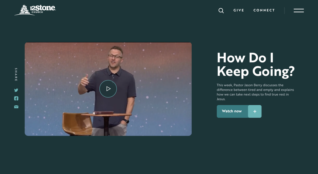
Before exploring their site, we noticed their brilliant logo design that makes use of twelve stones stacked on top of each other. We liked their alternating background colors that helps to break up their content. Having a section to get connected to a group, pastor or a growth track was a good addition. It was also a good idea to sort content by age group – kids, middle school, high school, buddies and young adults – because different interests and connections come with those groups.
14. One Church
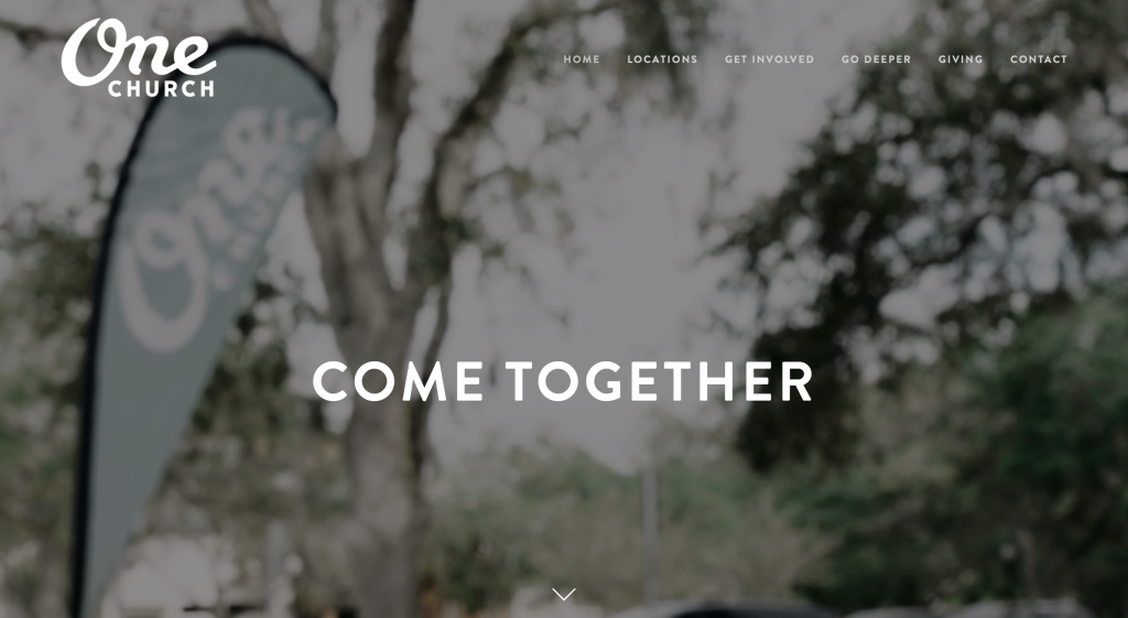
This church does a great job with using lots of images, both as backgrounds and focal points. Buttons are a smart choice to help unfamiliar members explore their site. The tab labeled “Go Deeper” offers lots of helpful information that was nice to have included. It was cool to have almost separate sites for each location. This might include their logo, their services offered, pastor(s) introduction and more.
15. Cornerstone Church (Atlanta)
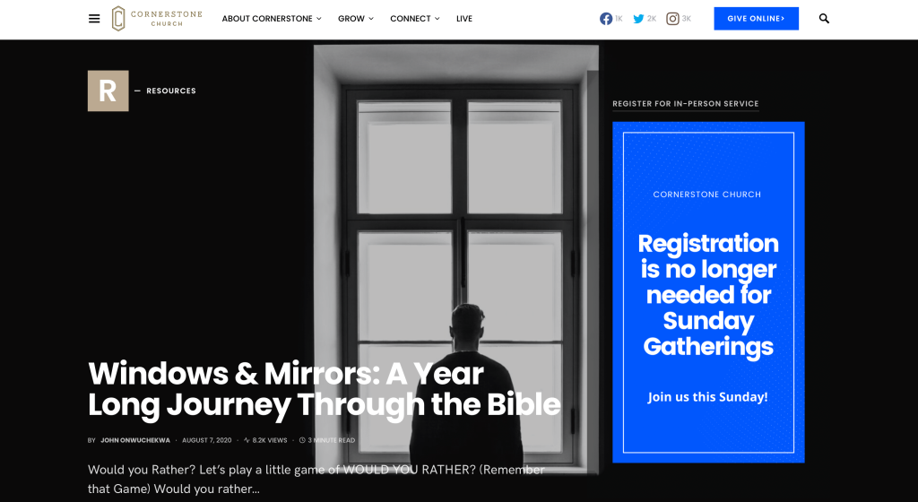
Short paragraphs is very helpful within this example. Using inventive text was a quality that we were sure to enjoy. We thought it was cool to include About Us, Services and a Connect portion all within their footer. Having small icons to illustrate certain areas of their information. We also thought their logo designs looked unique too which was an addition we couldn’t ignore.
16. New Life Rehoboth Church
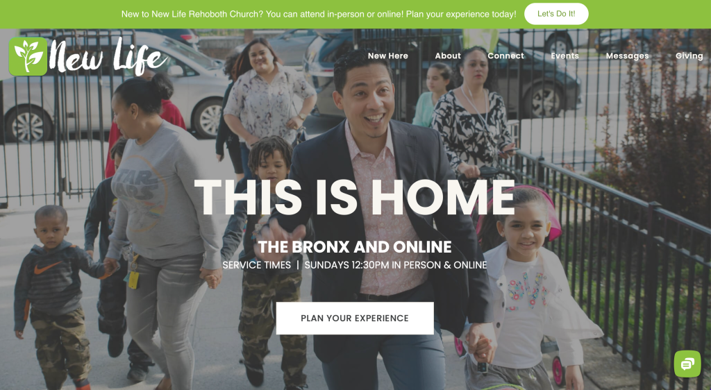
New Life Rehoboth Church used black, white and bright green to display a feeling of renewal. Their logo, though simple, also showcases this sense of renewal. Including videos was another thing that we found useful. Large buttons are also used for better navigation through all this content.
17. Granger Community Church
Related: For larger churches, consider a digital marketing service to help improve awareness in your local community.
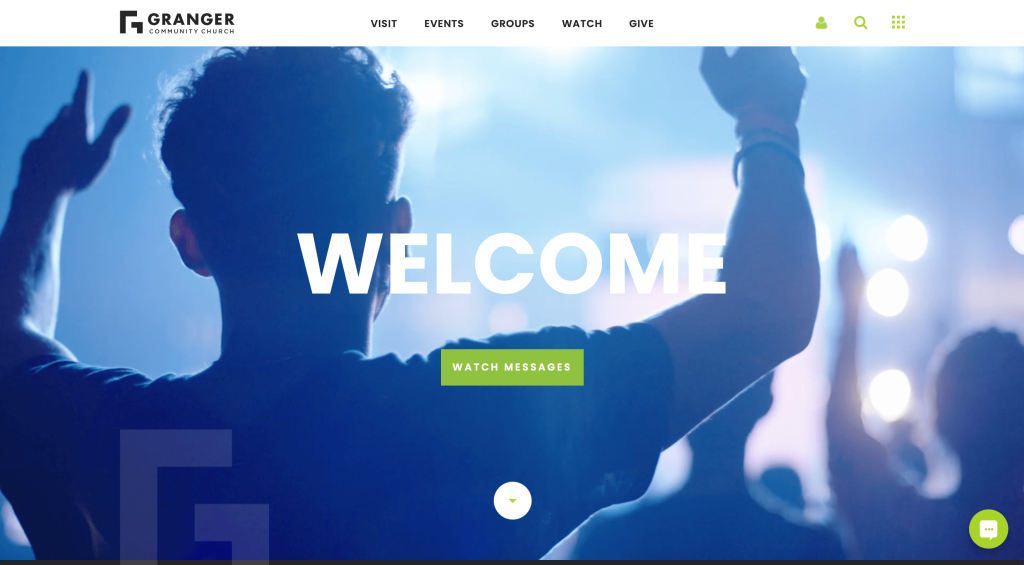
Upon opening this site, you’ll notice a simple animation that displays their logo, which holds the attention of people right away. They certainly had a feature on informing all viewers of current programs, services and opportunities. We thought it was unique to use their logo as a reoccurring pattern for some of their backgrounds. Having optimized content was also extremely helpful.
18. Bethlehem Baptist Church
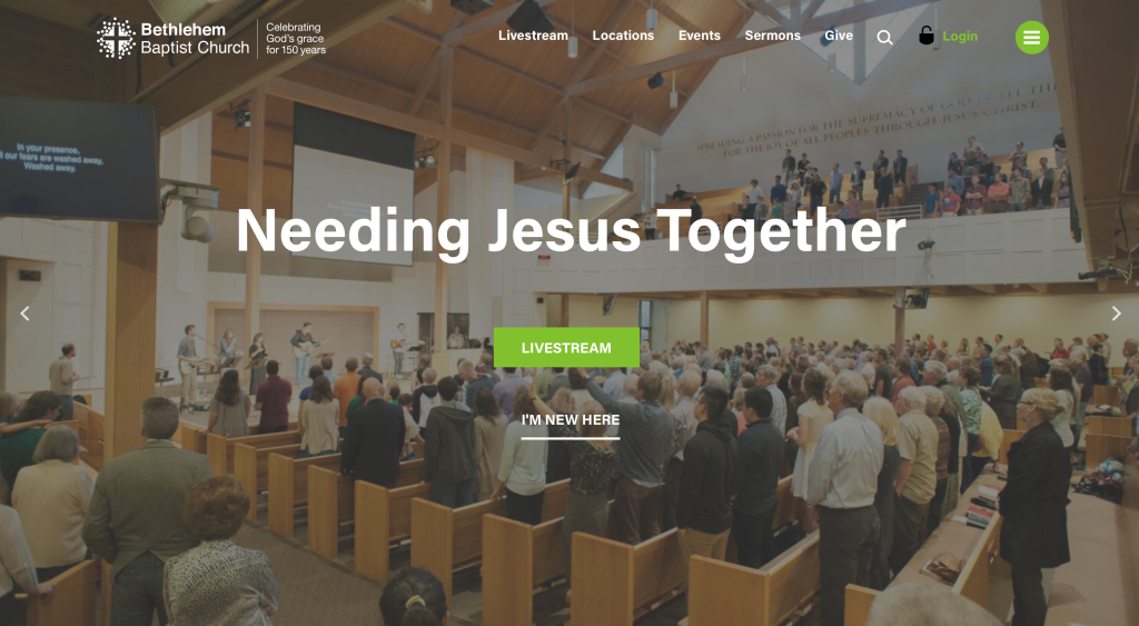
Right away, we were able to tell that this site belongs to a church as their logo includes a cross. We thought it was helpful to use italics in certain areas to highlight content. Having buttons all around this site that changed color upon hover was a nice addition. Including the time and day of their upcoming services was helpful to anyone wishing to attend. Another thing that we noticed was the inclusion of a search bar, making it easy to find specific information.
19. Good News Church
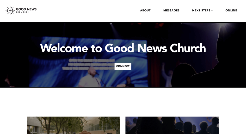
Although there are lots of great things about this example, the first thing we noticed was their automatically playing video. There are lots of high quality images used to pair with content and balance out their white space. A black and white color palette helps maintain a simplistic template. They also did a great job with using a domain that is both simple and matches their brand.
20. Piedmont Chapel
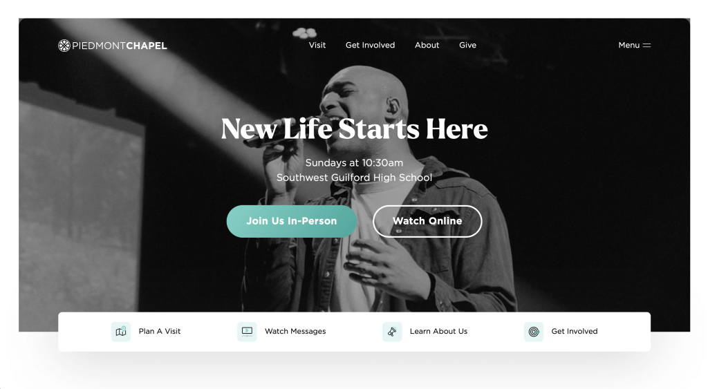
Interesting photo frames are used on different areas, which always adds to a site. We loved the teal accent that covers many bland spots within their templates. We also thought their font was unique, which helped bring their whole site together. Including a countdown for the next online worship experience was smart. Their use of color blocks was another thing that helped with the flow of content.
21. Calvary Chapel
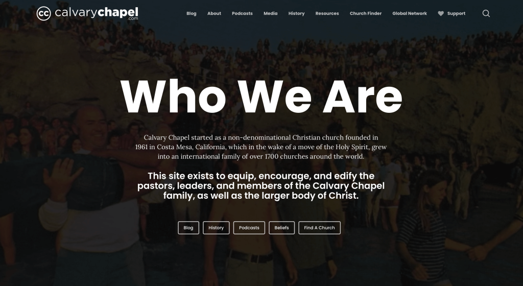
Our favorite part about this one was definitely their focus on articles and current events in the Christian world. They also include a variety of different ways to practice your faith, which is always appreciated. Having promotional information along the right side was also unique. We thought it was cool to have a dark background for anything within the “archives”, making it feel extra special. Additionally, their navigation is very well organized making navigation super easy.
22. Radiant Church
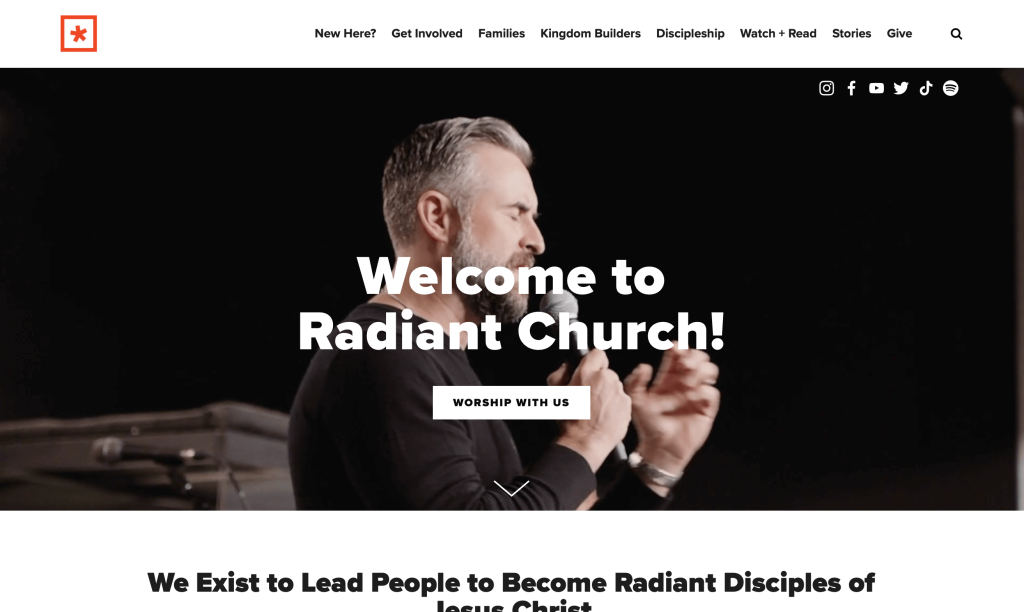
Simplicity shines through Radiant Church with their black and white template with bright orange accents. Bold fonts are used carefully to attract attention to titles. Having little news stories based around God’s radiant power. We also liked how blocks of color alternate throughout these pages, breaking up content. Aside from that, links to their Spotify, YouTube and Apple Music are included.
23. Church On The Move
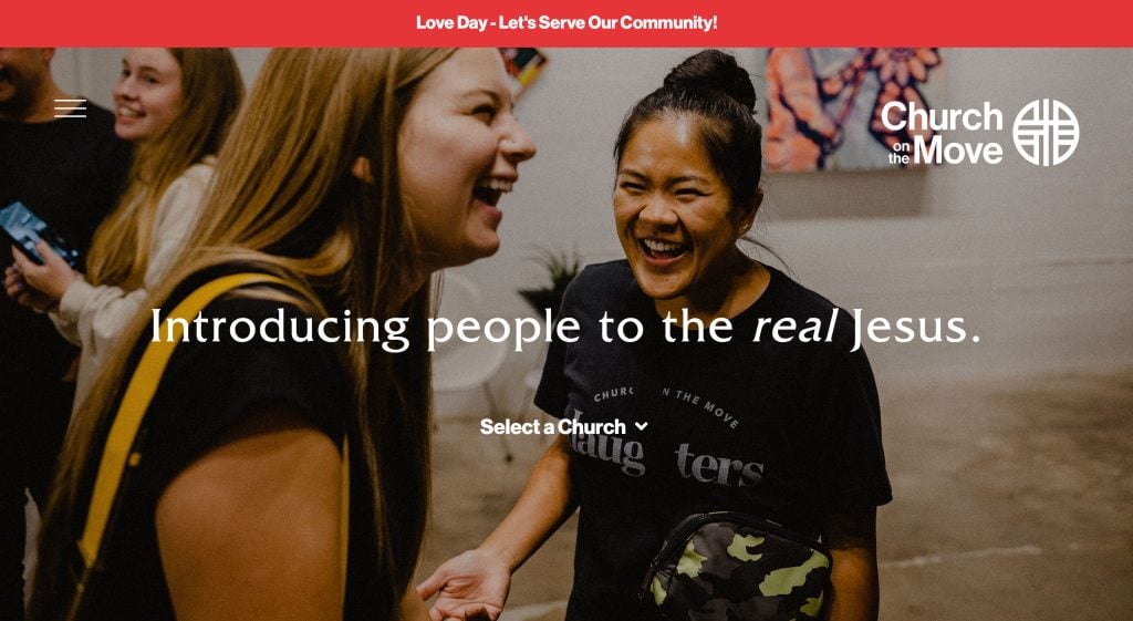
Showing lots of happy, smiling people of all ages was something that was perfect for an organization like this one. Interesting graphics can be noticed within images and behind text all throughout this design. We liked their combination of fonts within this example that builds up to create an interesting design. Their menu – top left – was nice because it included necessary information. Creating a good flow of information was something else that this church did really well with.
24. North Point Community Church
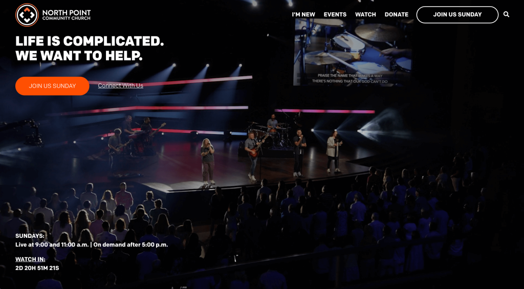
There was lots of different options to find information for you which was helpful. These options help you connect to others like you, along with searching new experience opportunities. Adding in bullet point was very helpful to keep lists organized. Having images that link to their social media pages was also pretty smart. Additionally, their simple domain that matches with their name was also nice.
25. Asbury Church
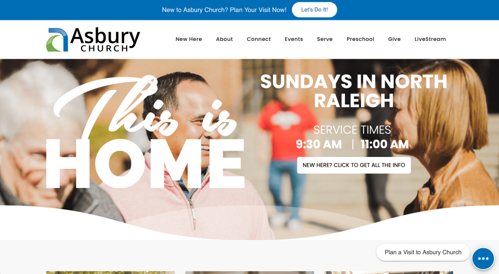
We really liked how there was a variety of different fonts within this example. Additionally, their color scheme of blue, green and white was both relaxing and simplistic. Using rounded corners for most images also helped separate them from competitors. It was a great choice to use color for titles to help them pop on the white background with mainly black text. This group also had an interesting logo that takes advantage of a C shape to create and A standing for their name.
26. Cornerstone Community Church
Related: Search engine optimization can be an effective strategy for improving organic traffic to your church.
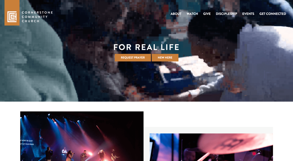
This layout is one to use as inspiration for sure. They made great use of overlapping images and blocks of color to create a different frame. Using a beige, orange, and gray color scheme stood out to us because it feels warm and subtly energetic. We were in love with this clever logo design that makes use of three different C’s. Their navigation bar was also very organized.
27. Red Rocks Church
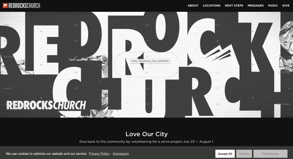
There was lots of great things happening within this one such as simple icons to add a visual for commonly known things such as in-person, online and on-demand options. Having short inspirational phrases such as “we exist to make heaven more crowded” was nice, especially when they are written in bright colors. Lots of buttons were included to help people get to all portions of their site.
28. Highpoint Church
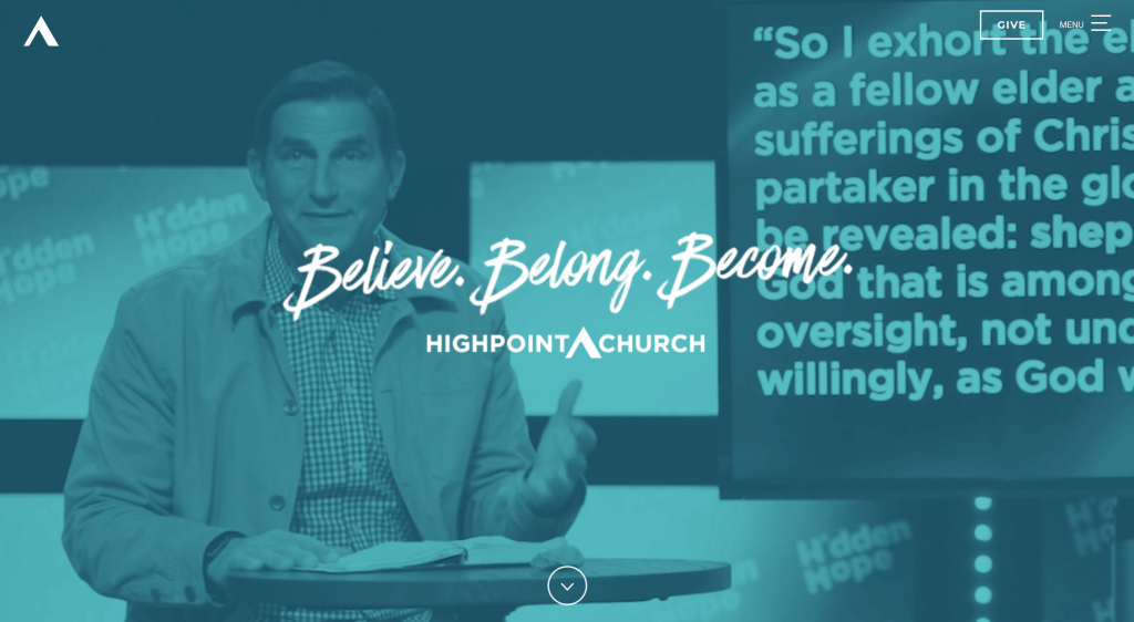
Almost instantly, we noticed how Highpoint Church made use of interesting patterns for backgrounds that don’t distract from their content. We liked their little animation that rephrases the saying “Helping people believe in Jesus” to “Helping people belong to Jesus” to “Helping people be like Jesus”. Having a navigation bar that uses lots of drop-downs to get information to people in any way possible was nice. Shorter paragraphs were also used which makes it easier to skim.
29. Crossroads Community Church
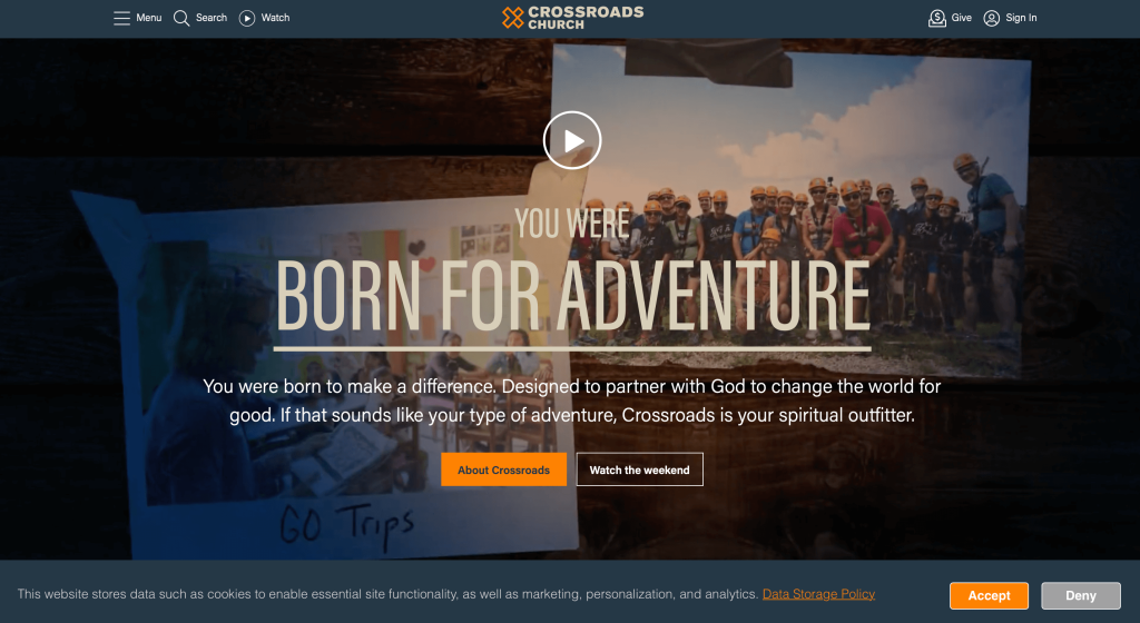
Lots of great features can be noticed related to their simple fonts and perfected images. We also thought it was nice to have a live chat feature that helps questions get answered quickly. Having a variety of different types of content such as podcasts, videos and blog articles was a nice touch. Their use of bright orange against a dark blue was another quality that we couldn’t ignore. A search bar can also be noticed within this homepage that helps find content.
30. Redemption Church
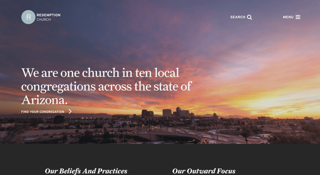
There is lots of written content in this example, but it makes use of semi-transparent block that lets images leak through. Additionally, there is a decent sized photo library with a variety of people and activities. We felt that it was helpful to have underlines on any linked text, making the links easier to find. Having a simplistic feel and template was definitely something that helped this example stand out.
31. Brew City Church
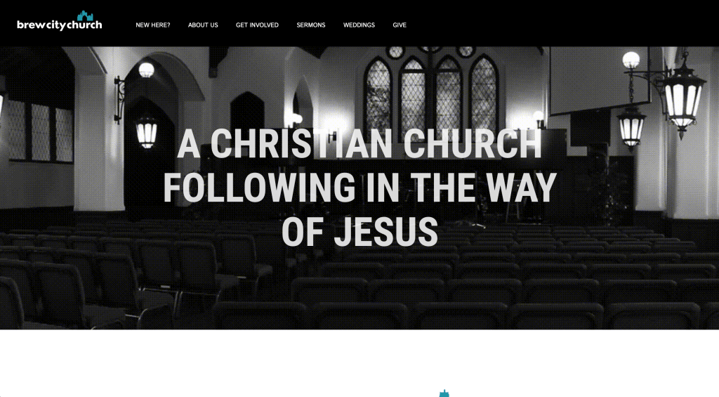
Something that we noticed right away was their black, white and blue color scheme that stays throughout this entire site. Small graphics were used as icons to display commonly known things. Adding in their mission statement and statement of faith along with buttons to learn more was helpful. A page dedicated to new members was interesting, plus it makes them feel more welcome.
32. Loft City Church
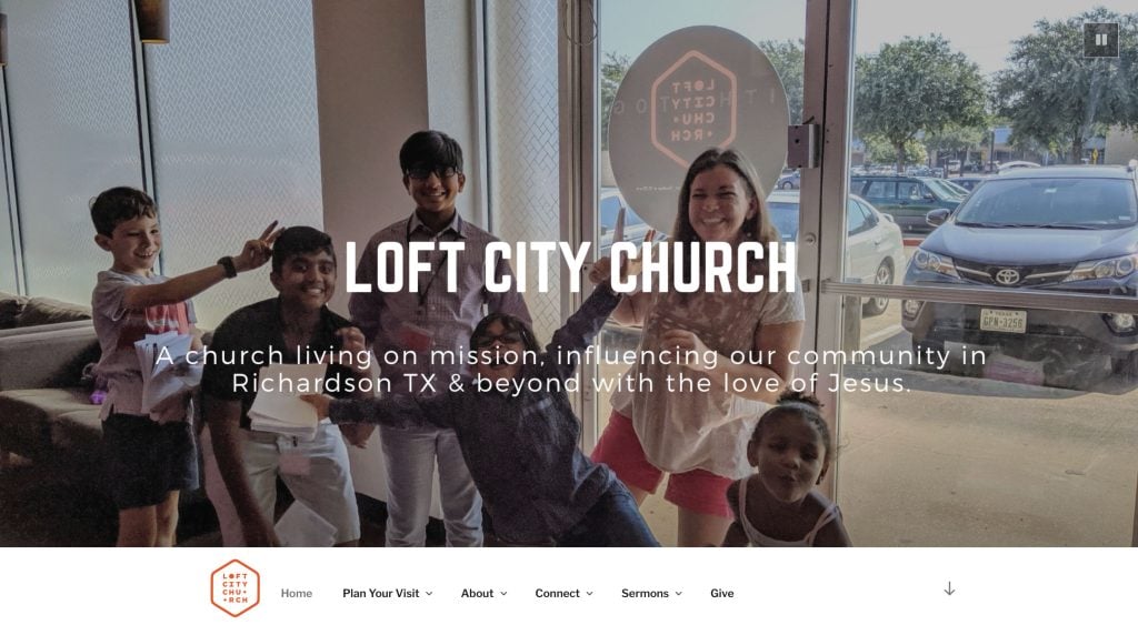
Right away, we noticed this logo that keeps their text within a rectangle, which looked amazing. They also use blue, white and orange, which we like because it creates an exciting feeling. Drop-downs are another helpful addition to help customers navigate their content better. A page dedicated to their team with titles included was a choice that more of these sites should include.
33. South CLT
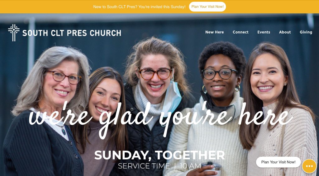
Pop-ups were used effectively for getting very important information to anyone viewing this webpage. We liked how a wave pattern is used with colors and occasionally images. Bold fonts were used for their titles which was of course nice. Another thoughtful feature was their well labeled navigation bar. They clearly had accessibility in mind when including simple buttons.
34. Hope City Church
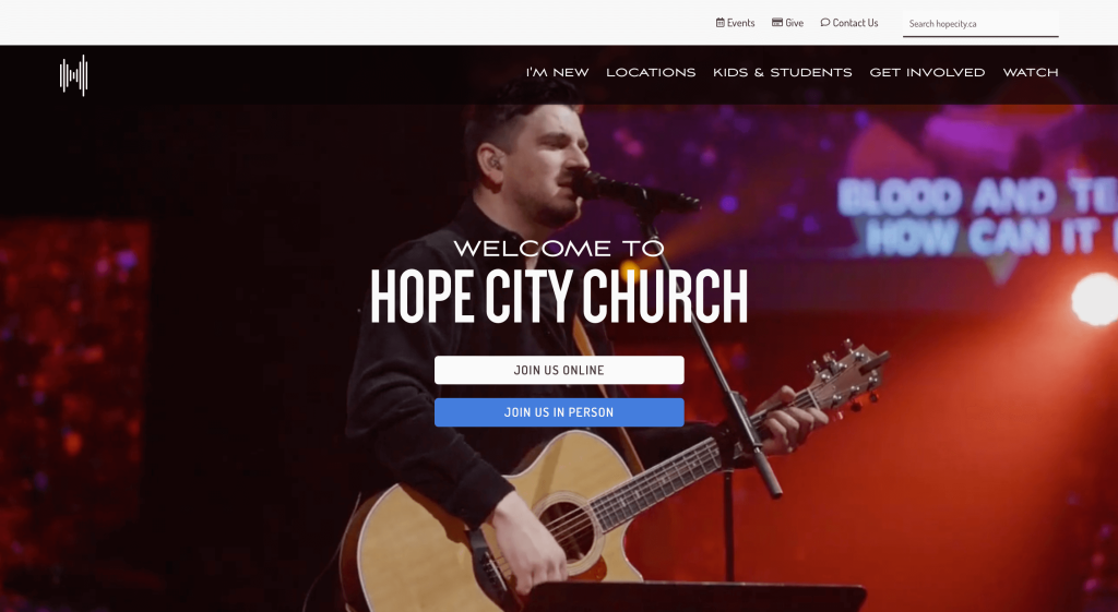
The look and feel of this one caught our attention because of its simple layout. Graphics depicting patterns, buildings was something that certainly sets them apart from competitors. Having a section for kids and students that separates people by age groups. Small accents of blue was another thing we couldn’t ignore.
35. 3Circle Church
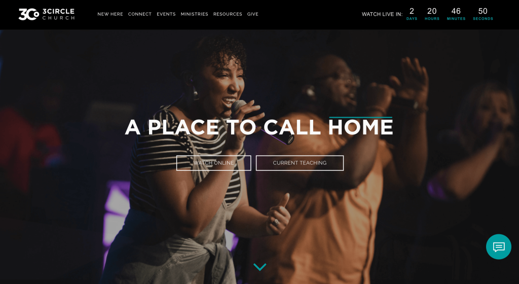
We loved this example, mostly for their placement of images that allows for a perfect balance. A countdown was included for when the next live watch will be posted. We thought their logo was thoughtful because it made use of a small circle to create a 3 and a C. It was also cool how their focus is locally connecting people to God, but also globally.
36. Sonship Bay Ridge
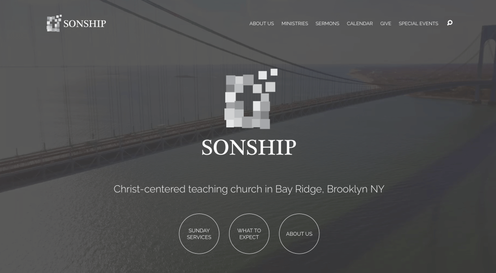
Our favorite part about Sonship Bay Ridge is their use of images for backgrounds. Additionally, circular buttons can be noticed in nearly every section to guide people to other information. Right above this site’s footer, they included upcoming and past events which is always a good idea. Within that same footer, people can find any of their social media links and stay connected with them.
37. The Village Church
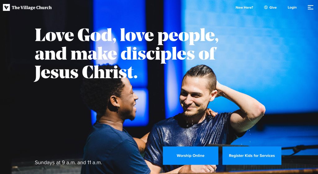
Simple graphics that cross over into images was something this church did really well with. A white and blue color palette stood out to us because of its calm feeling. Their font was simple and professional, which is everything you want from a font. Additionally, our team thought it looked sharp to round the corners of many of their images.
38. Mosaic
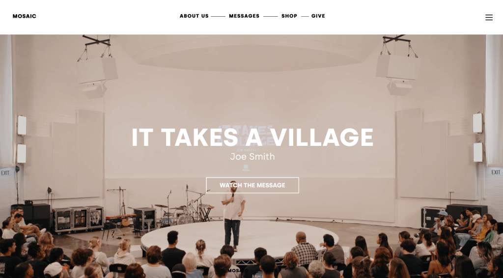
Dropping in an automatically playing video right away was a choice we couldn’t ignore. Their visuals are also of very high quality which is appreciated. Including other media such as podcasts is another feature that adds a little personality to a site like this one. A good balance of white space is also utilized for this example, making everything easier to look at.
39. Bayside Church
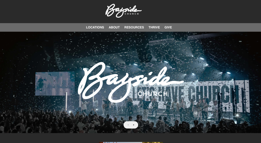
First, we noticed how they used a slider for images to grab attention. We liked how each location included their social media links along with hours and address. Many buttons were used all around their template, guiding people to additional pages. We also liked how videos were embedded in these pages.
40. Second Baptist Church
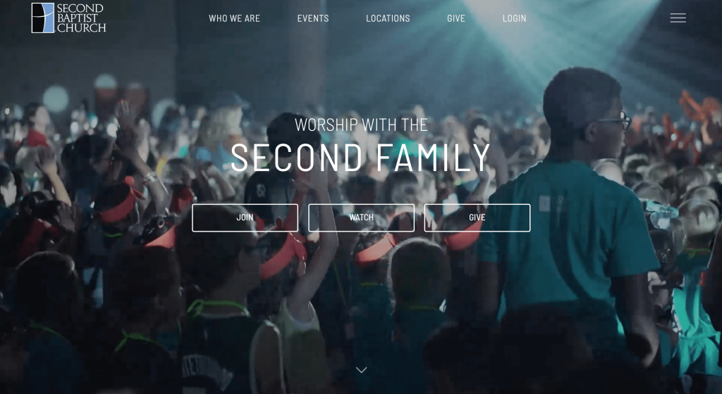
Adding in information for the upcoming Christian holiday and services related to it was helpful. We felt that using light blue accents was another great option. Very brief paragraphs are included about a variety of their content. A page dedicated to giving back was something we liked because that’s often a part of church.
41. Sun Valley Community Church
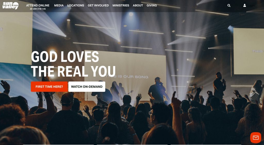
This example seems to have more of a newspaper feel with rectangular buttons that include text and images. We loved their bright accents that highlight linked or important information. Including stories in video format was something else that we enjoyed. An easy template is also used to make sure everything feel more organized.
42. NewSpring Church
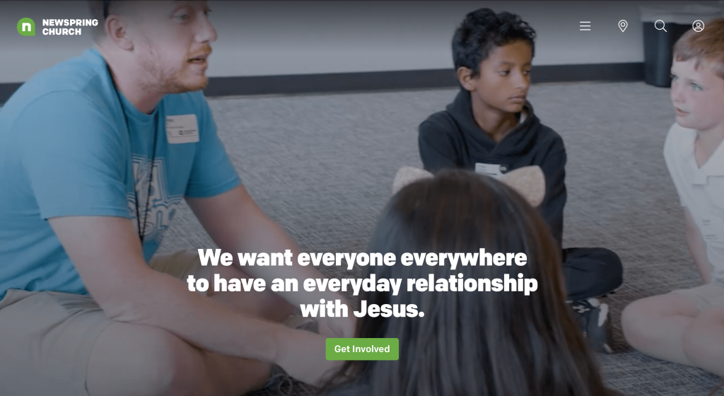
This color scheme was relaxing and evokes a feeling of renewal, perfect for something like this. Being able to browse by topic was another feature that we enjoyed. Aside from that, their domain was very simple and matched their name. We also liked how icons were used within their navigation bar in order to get people to observe their locations, search something or sign in.
43. New Vision Church
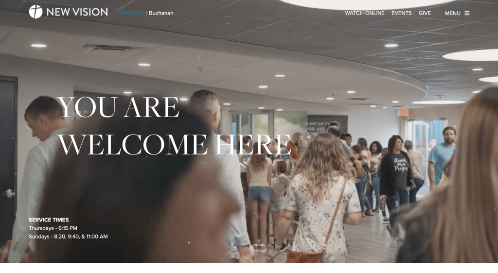
Visuals are a strong part of this site. They not only have an automatically playing video, but also extremely high quality images. Using subtle animations to slide in content was something that we love to see. We thought their professional, modern font was also a nice touch. This logo was also simple and logical for a church.
44. Bay Area Christian Church
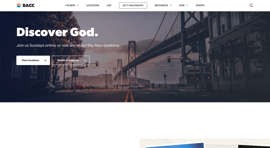
If you are looking for inspiration for your webpage, make sure to check out this one. We feel this is a good source of inspiration because of their balance of white space. It was also nice to use photo frames that are unique (or at least rounded). Their contact information was very simple and easy to use, which is an advantage for sure.
45. Summit Church
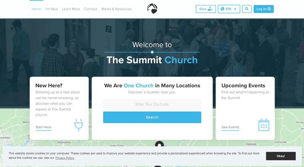
This overall template had us stunned just from entering it. Everything was written simply and a good balance between written content and visuals is maintained. Adding in a map to show their location was a very impactful quality. We also liked how shapes and colored backgrounds are incorporated into their images.
46. Christ Alive Church
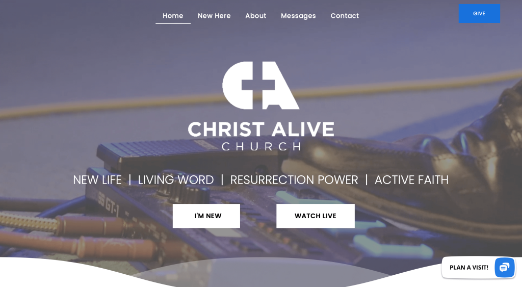
Right away, we noticed how their logo design uses the negative space of a cross to create a G and a A for Christ Alive. We thought having a pop-up with options like planning a visit, new here, watch messages, send us a message, and give online was cool. Standing apart from others, we found it very useful to have a FAQ section.
47. Elevation Church
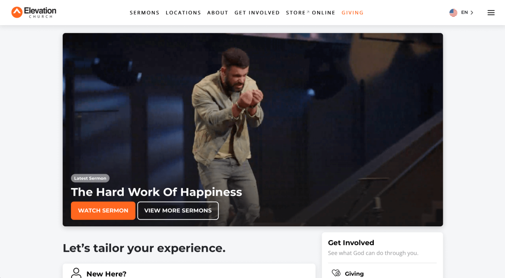
Orange accents light up this example, adding energy to their dark template. Icons are used to add a sense of visuals to their written content. Other bright colors were incorporated into backgrounds for each age ministry. A well labeled navigation bar was also helpful because it keeps everything nice and organized.
48. Faith Community Church
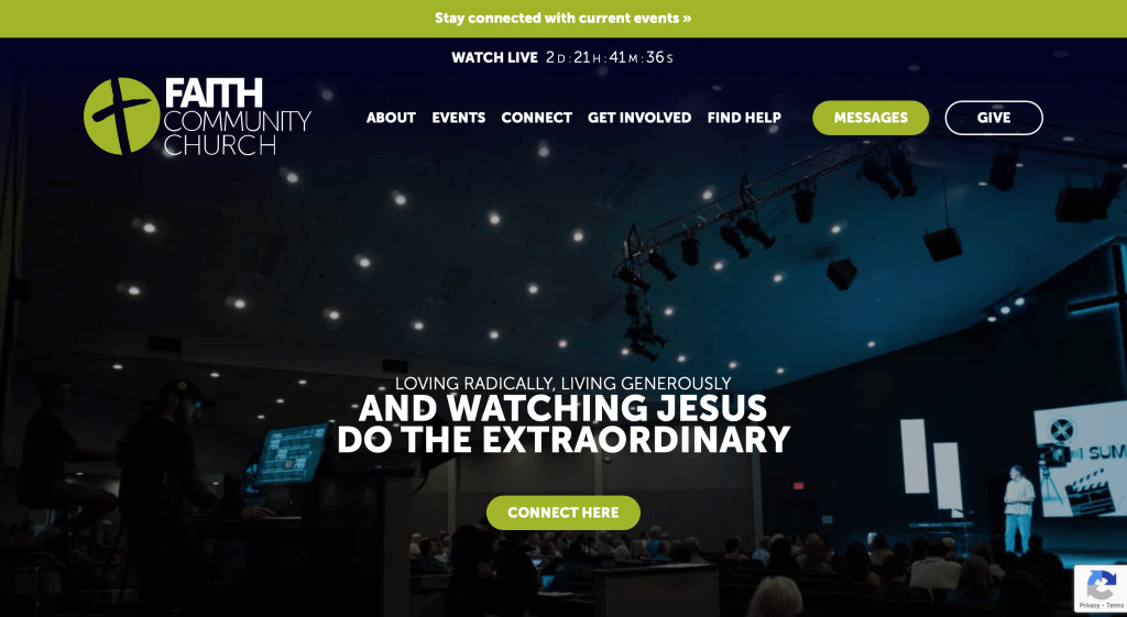
We thought it was a great idea to make their important information banners orange because it stands out in their green accented design. After scrolling for a bit, you’ll notice interesting textures that show up in backgrounds. Social media links were included in their footer, which is easily accessible. We thought it was interesting to have an on/off switch graphic for their menu.
49. Mosaic Church (Virginia)
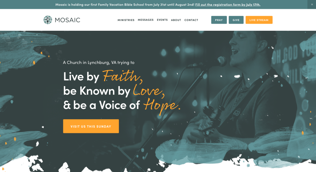
We felt that this example took an idea and ran with it. Their logo design appears to be a cross inside a circle created mosaic tiles. Slivers of photo frames are used as you scroll through their pages. Drop-downs are also used to keep everything easy to find. Buttons are also used perfectly to guide people towards additional information.
How to Build a Great Church Website
If you are planning to build or redesign your church site, feel free to explore these steps!
If you already have a domain, hosting, and platform, you can skip ahead.
1.) Purchasing a Domain Name
Choosing a domain name is very important—it’s your address and a big part of your branding.
Here’s a simple step-by-step guide to help you pick the right one:
- Brainstorm: Start by thinking of domain names using your church’s name, beliefs, and location.
- Simplicity: Keep your domain name simple, clear, and easy to spell—avoid hyphens, numbers, or complex words.
- Consistency: If your church has a recognized name, include it in your domain if possible—for instance, use StPaulChurch.org, not InTouchWithJesus.org.
- Availability: Check if your desired domain is available as many are already taken. If it’s unused and for sale, consider it, but don’t overspend.
- Domain Extensions: Choose a domain extension that makes sense for you—.com is popular, but .org or .church can work well too.
- Legal Considerations: Before registering, do a trademark search to avoid using names tied to other churches or well-known religious groups.
- Register the Domain: Once you’ve chosen an available name, register it through a trusted provider like GoDaddy and Namecheap.
2.) Choosing a Website Platform
Next, you’ll have to choose a website platform. You might want to include donation forms, contact pages, and event calendars.
WordPress will be a great option, but builders like Wix are also there.
- WordPress: WordPress is a flexible, popular CMS ideal for any type of site, even churches—from basic info pages to advanced features like event registration or sermon streaming. With many themes and plugins, it’s great for customization and growth. Most use the open-source version on their own hosting, not the hosted WordPress.com.
- Wix: Wix is a hosted, user-friendly alternative to WordPress with built-in page building tools. It’s a solid option and doesn’t require separate web hosting service, making it another solid choice.
Web Hosting Requirements
If you choose a platform like WordPress, you’ll need to find a web hosting service.
We recommend our own web hosting for its strong WordPress compatibility. If you prefer different options, you can consider these:
- WP Engine: WP Engine is a top pick, with an easy control panel, smooth backups, and staging tools. Just note the PHP execution time limits and rising costs for upgrades.
- SiteGround: We’ve had great experiences with SiteGround. Their support is fast and helpful, backups are easy to use, and pricing is church-friendly.
- Digital Ocean: Digital Ocean offers reliable cloud hosting but may be too advanced and costly for most churches due to added server and management fees. For admin help, try AdminGeekZ.
3.) Choosing a Website Template
Most churches opt for pre-made templates to save time and money. For a unique look, you can hire a custom web developer or custom ecommerce developer to build a custom theme.
For setting up your church website, focus on pre-built templates. Check out these popular theme marketplaces:
WordPress Church Themes
You can find free themes at wordpress.org or consider church-inspired templates at ThemeForest.
Chapel – Themeforest
$79
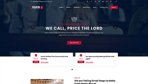
Zegen – Themeforest
$69
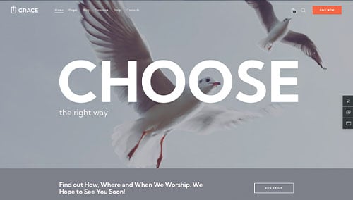
Grace – Themeforest
$69
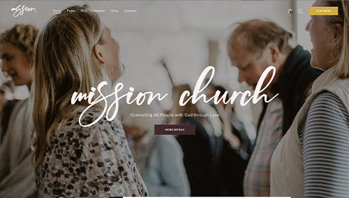
Mission – Themeforest
$69
Wix Church Themes
You can find free and paid themes in their marketplace at wix.com, some of which are suitable for churches.
4.) Creating Content & Adding Images
With your domain, platform, and theme ready, it’s time to start creating content!
Here are some quick tips for writing engaging and useful information:
- Know your target audience: Think about what your audience needs and prefers. Tailor content to that in order to add value and boost search rankings.
- Define your key messages: Highlight your church’s strengths, services, and how they reflect your mission and values.
- Keep it concise and easy to scan: Online readers skim, so this tip is extremely helpful. Use short paragraphs, bullets, subheadings, and bold text for clarity.
- Create compelling headlines: Use clear, engaging headlines that highlight your church’s value and draw visitors in.
- Strategically incorporate keywords: Research and use relevant keywords to boost search visibility—without overstuffing. Tools like Ahrefs or Semrush can help.
- Maintain a conversational tone: Write conversationally and avoid jargon. Speak directly to readers in a friendly, approachable tone.
- Edit and proofread: Always proofread before publishing. Check grammar, flow, and brand voice. Tools like Grammarly can help.
- Leverage ChatGPT for assistance: Need help with content? Try AI tools like ChatGPT for ideas and editing.
Use quality images to break up text. Here are a few tips:
- Choose high-quality images: Avoid blurry or pixelated images because it will ruin your visual appeal.
- Ensure relevance: Use relevant images that support your message and improve your site.
- Utilize stock photo resources: Use trusted stock sites like Unsplash, Pixabay, or Shutterstock for quality images. Follow licensing rules and give credit when needed.
- Customize images when possible: If possible, customize images to match with your branding. Tools like Adobe Photoshop or Canva make this easy.
- Optimize image file sizes: Compress images to reduce file size and boost site speed without losing quality. Tools like TinyPNG can help.
5.) Post Launch Tasks
After launching your church website, focus these tasks to boost its impact:
- Search Engine Optimization (SEO): Boost local search visibility with SEO strategies—use keywords, optimize content, and keep it updated. Need help? Try our SEO team or services like The HOTH.
- Paid Advertising: Attract visitors with paid ads on Google or Facebook. For help, use our PPC management services or hire experts via platforms like Mayple.
- Conversion Rate Optimization (CRO): Use tools like Google Analytics to track performance and spot drop-offs. Run A/B tests with VWO to boost conversions and user experience.
- Website Security: Secure with SSL, firewalls (like Sucuri), regular backups, and updates. Monitor for risks and uptime with tools like UptimeRobot.
- Website Maintenance: Maintain your church website by updating plugins/themes, checking speed, fixing errors, and backing up regularly. For help, try our maintenance services or hire freelancers on Upwork.
- User Feedback and Testing: Gather user feedback and run tests to understand visitor behavior. Use what customers say to improve and optimize your site over time.
- Content Updates: Keep content fresh with blog posts, updates on activities, and overall, accurate information.
Post-launch digital marketing will be essential for success. Stay active, track results, and adjust strategies to meet your goals.