Hello daycare and childcare providers! Seeking web design inspiration for your care center? Check out our guide to the top 48 daycare websites!
Our web design team has curated the best daycare sites based on design, functionality, uniqueness, and user experience. These top-notch sites feature charming designs and easy navigation, perfect for inspiration.
You’ll not only gather ideas for your own site but also learn tips to enhance your online presence.
Boost your daycare business with this guide! Find website examples for childcare centers, home-based providers, after-school programs, drop-in centers, corporate childcare, and non-profits. For other industries, check out our Top Rated Websites article!
Top Childcare Website Designs
1. Bright Horizons
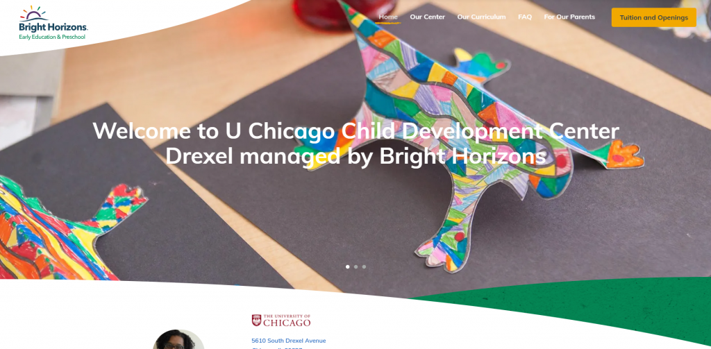
Simplicity was clearly seen here due to the amount of written content that doesn’t feel overwhelming. Having large visuals with small icons really helped to create an organized layout. We also enjoyed how Bright Horizons utilized an extremely professional font. Lastly, it was a great choice to have a well-labeled navigation bar so that possible clients can easily navigate within this site.
2. Children’s Lighthouse
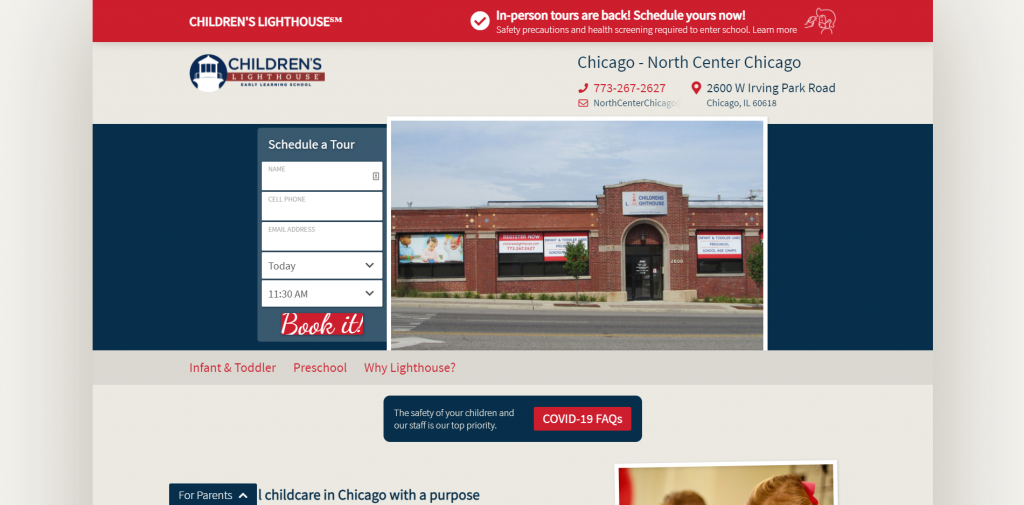
Children’s Lighthouse is covered with a bright red color scheme that is very eye-catching. It’s instantly made clear what they offer as a company so incoming customers can decide if it’s a good fit for their children. Children’s Lighthouse also had clearly labeled pricing which was helpful to see if it’s within their budget. Contact information is visible near the top.
3. Wise Owl
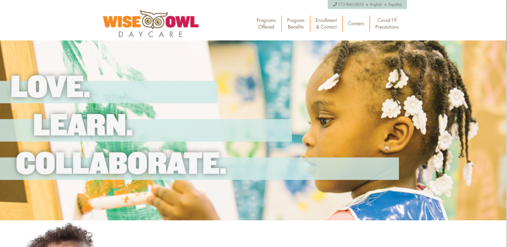
Here we have a stunning design that is simple with plenty of white space. We noticed an alternating pattern of pictures and content, which helped maintain balance in their template. This daycare website design uses bright colors which relates Wise Owl to a happy and cheerful emotion. Including a variety of images helps to prove the company’s focus on children.
4. Blooming Bud
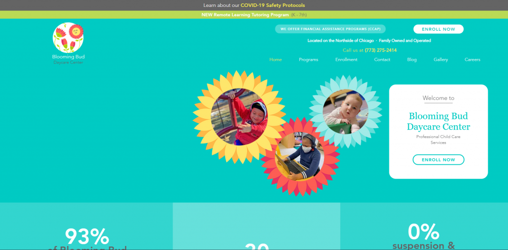
Right away, we enjoyed the theme seen throughout this company’s web design. This theme can be seen by their bright colors, stunning flower graphics, and flower frames. They showcase 30 years in business among other statistics which builds trust with potential customers. It was an interesting feature to include both parent and children testimonials.
5. Kids’ Work
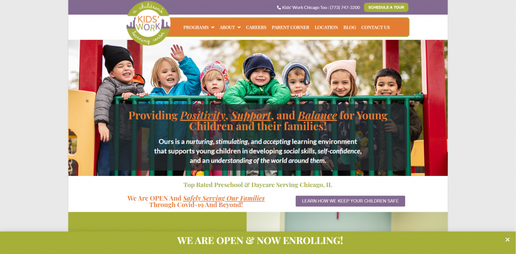
When looking for a daycare website idea, take a look at Kid’s Work because of its very colorful template. It’s very clean and organized with many boxes of information along with pictures. Additionally, they had an interesting looking logo design that helps them stand out from competitor companies. We definitely enjoyed how Kids’ Work choose a domain that matches their company name.
6. Ebenezer Child Care
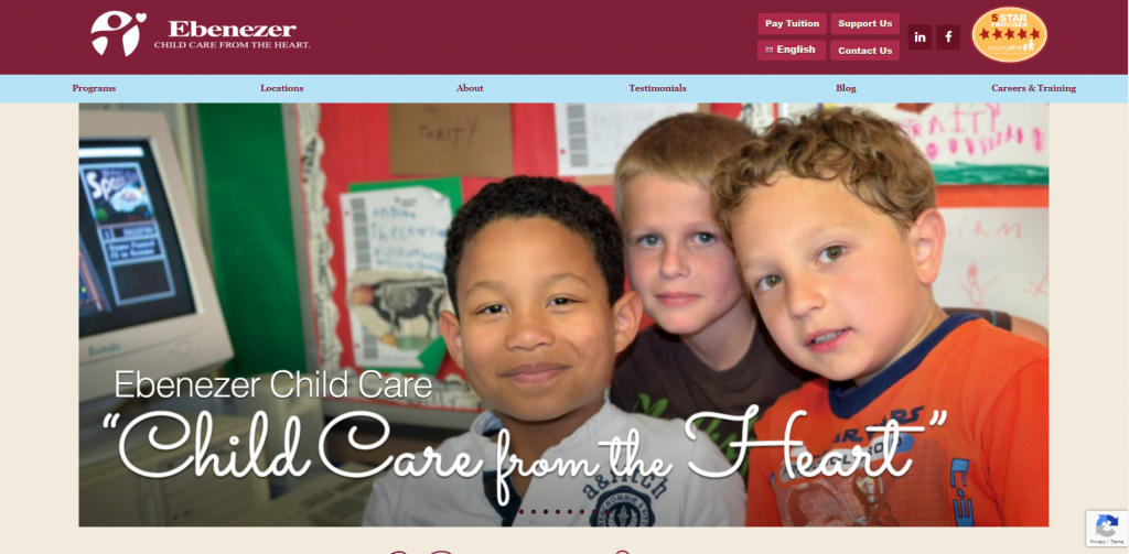
We enjoyed that Ebenezer Child Care has lots of visuals to show off their focus as a company. It was helpful to have a video to get information out to possible clients in a different way. A burgundy color seems to work well for Ebenezer Child Care and is consistent throughout the web design. A cursive font helps to highlight titles, which helps bring attention to that important information.
7. Apple-A-Day
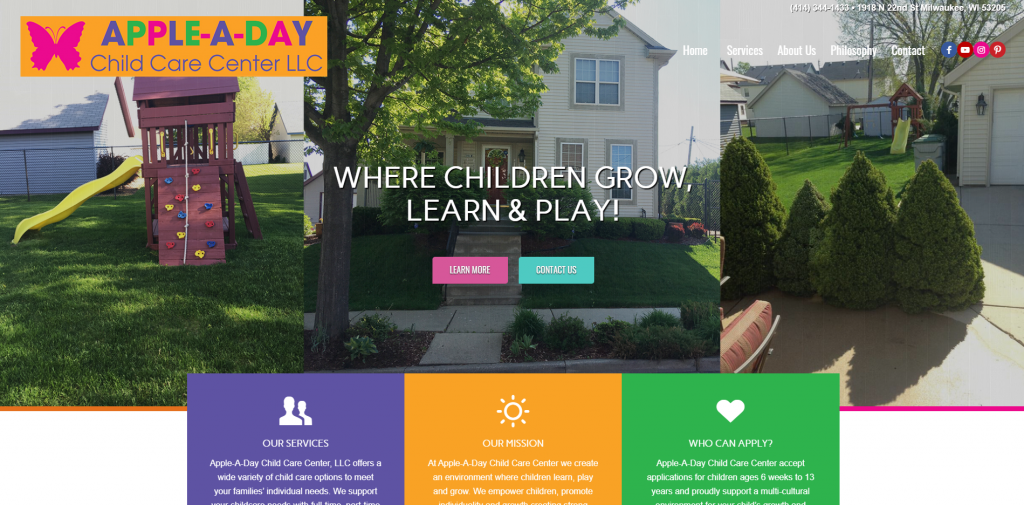
Apple-A-Day uses many different bright colors but still maintains an orderly layout. It was also nice to see some icons used to add a bit of decoration. We noticed how this website shows schedules for the day, so as a parent you’ll know what your children are doing and when. Social media links and contact information are easy to access, allowing more ways to connect to this business.
8. Kid-Tastic
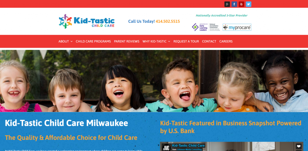
Kid-Tastic is very straightforward daycare website design with lots of information. Having short and to the point paragraphs really helped us when considering placing this company on our list of best child care website designs. As a company, standing out from competitors is something Kid-Tastic clearly wants. Lastly, we thought it was helpful to have client testimonials.
9. TenderCare
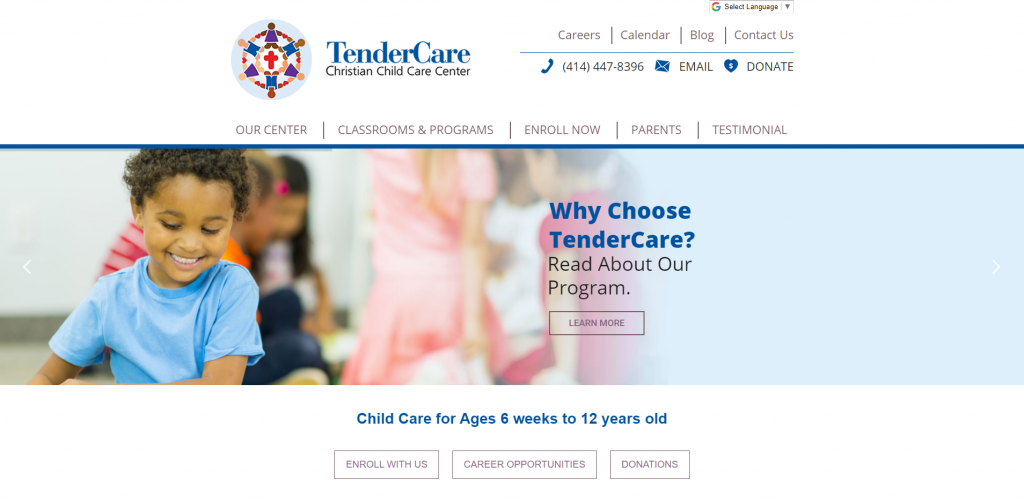
If you are looking for a simple template for your child care company, check out this site with a blue and purple color scheme and plenty of white space. They clearly state client testimonials, a Google Map, phone number and a contact form, which prove willingness to communicate with clients. A small Facebook section allows parents to see what’s going on with updates. We also enjoyed their logo design to show diversity in clients.
10. Grandma’s House
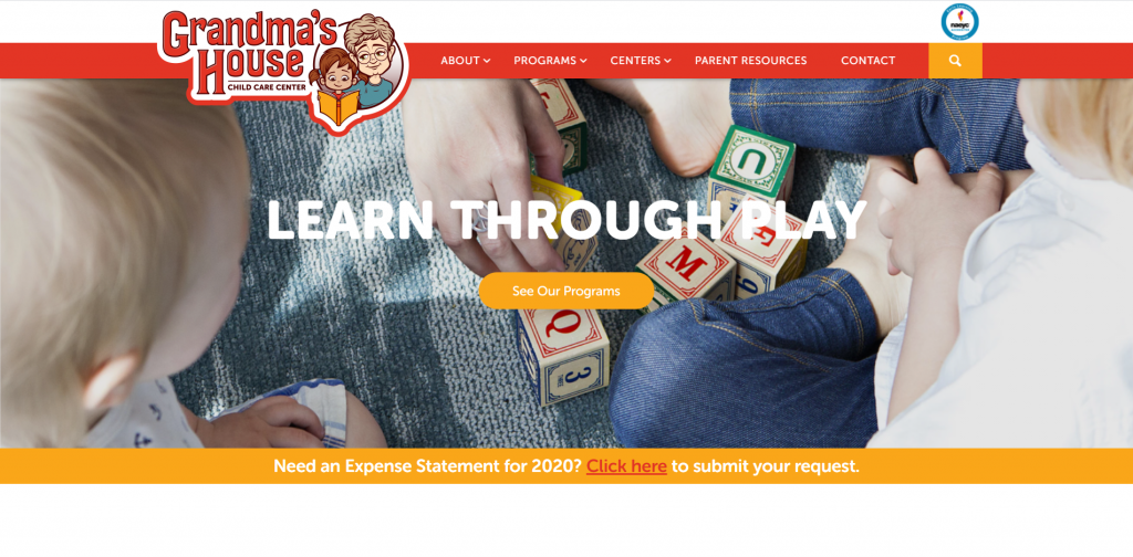
Grandma’s House uses big letters for headlines, creating a straightforward design. We really thought this logo design created a comforting feel. Many visuals are visible in order to explain the information featured. Cartoon pictures of children are used throughout to show programs Grandma’s House offers. Make sure to take a look at this child care center when searching for layouts for your professional company.
11. Daycare Services
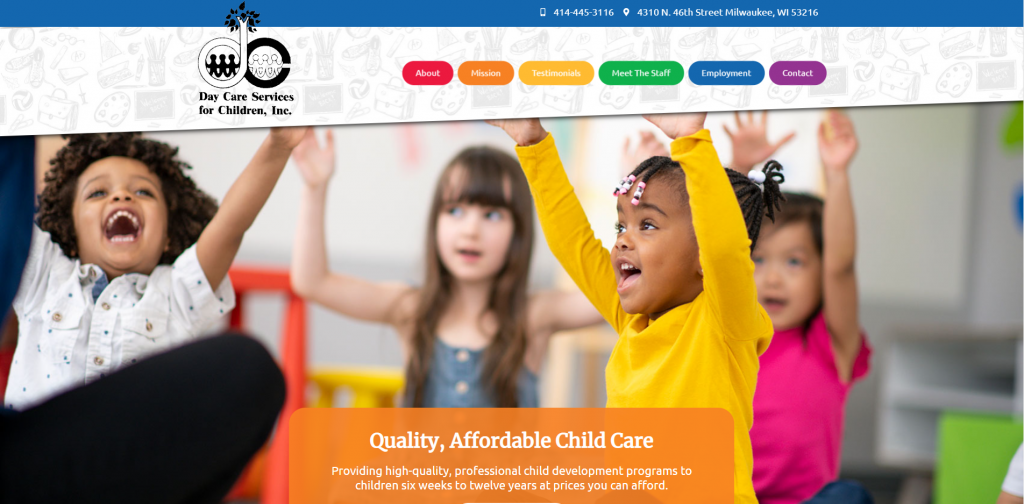
Here we have a layout that showcases a bold, energetic and creative design by using a bright rainbow color scheme. Buttons can be found in different colors to allow for easy access. In order to have an organized design, this company utilized clean boxes with information. We also thought the logo design was unique. Finally, a domain that matches their company’s name was helpful for website marketing.
12. New Horizon Academy
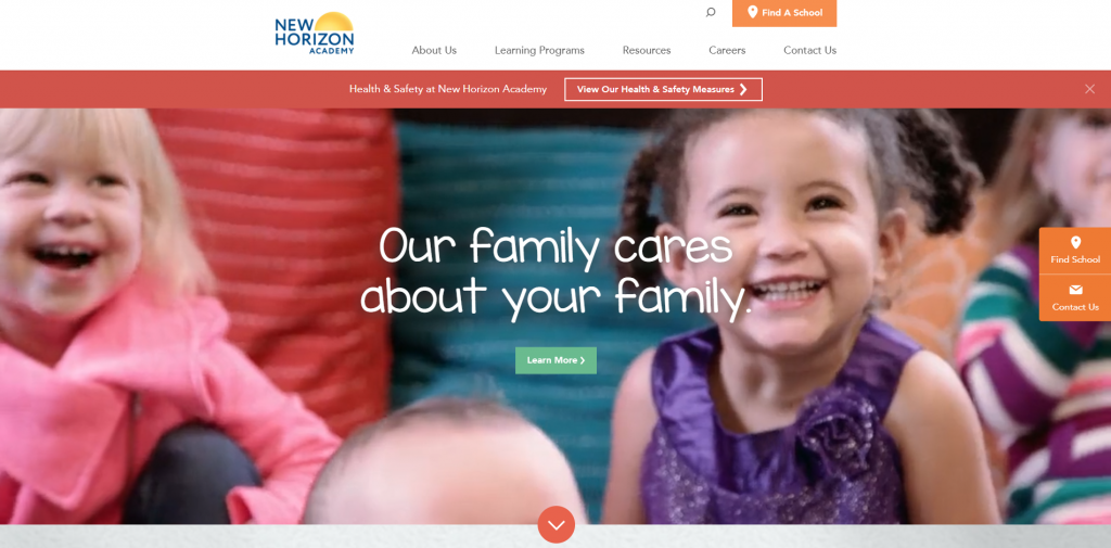
New Horizon Academy features an automatically playing video showing of a variety of children. There was a great balance of images, bright colors, and simple matching icons. A few features that stood out to us were the client testimonials, helpful resources, and a newsletter sign-up option. We also really liked their use of graphics and simple animations. Don’t forget to consider New Horizon Academy when looking for inspiration for your next site.
13. YWCA
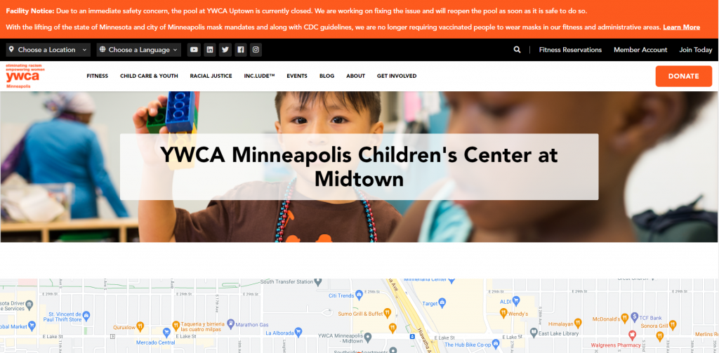
In this site, we really enjoyed how YWCA used a creative color scheme with simple geometric patterns. It was helpful to have a photo gallery of children participating in many activities throughout the day. This company also clearly labeled their pricing which was helpful for potential customers to see if it’s within their budget. We also noticed the bright orange button to donate to their organization.
14. The Cradle Club
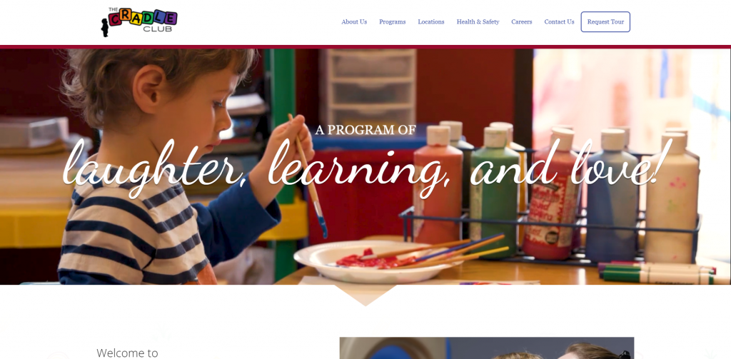
The Cradle Club’s web design starts with an intro clip to sharing their story. Something that elevated their template was the creative animations. It was helpful to include sections to organize program information based on child age. We enjoyed the inclusion of creative color blocks to break up content.
Related: Make this year one to remember. Start a digital marketing campaign for your childcare center to start growing your company!
15. Kinderberry Hill
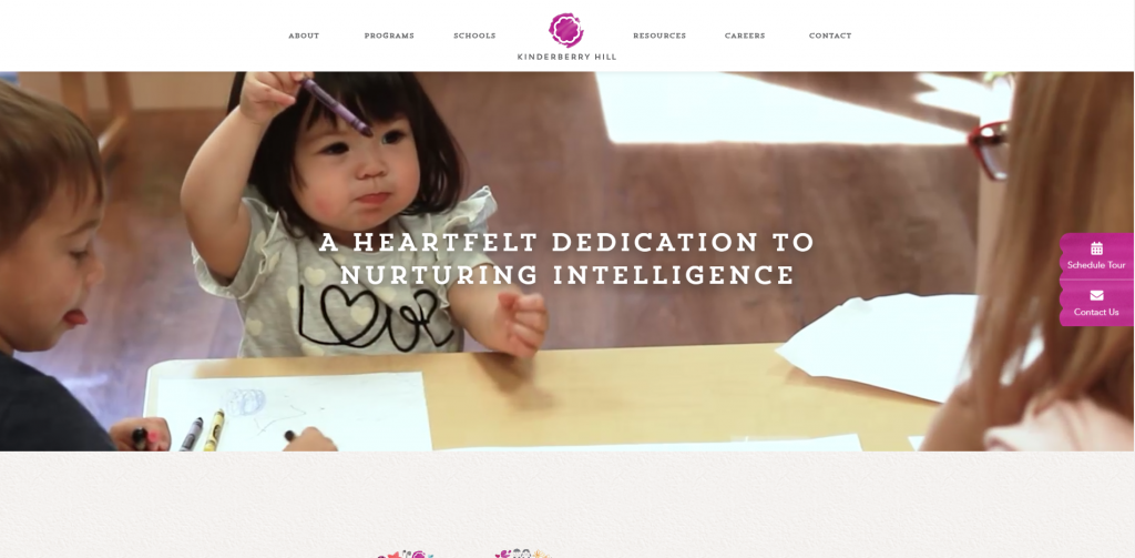
Kinderberry Hill uses headlines and backgrounds to simulate being written out or painted by hand – creating a playful feel. Choosing different background color blocks and many images allows for an easy-to-read design. Using a variety of colors that all work together was another respectable quality about Kinderberry Hill’s template.
16. Little Trailblazers
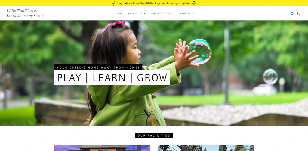
Something we noticed right away was simplicity along with its organization. A bright yellow accented their stunning design, which was helpful to highlight important information. We also liked how Little Trailblazers shares their vision, values, and philosophy. It was a great choice to have introductions of the team, allowing potential customers to gain trust with them as company.
17. MightyKidz
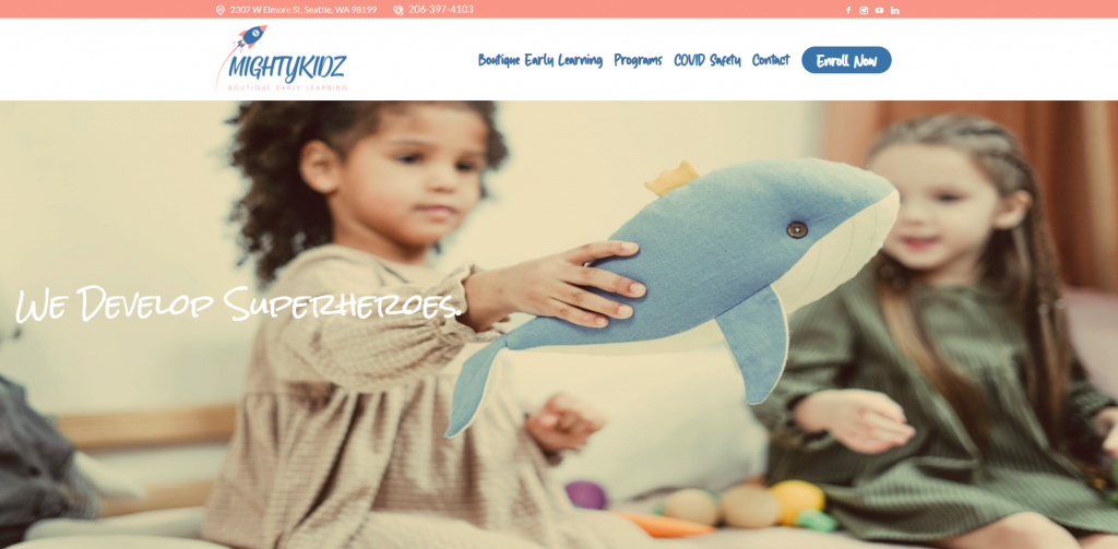
MightyKidz has a very informative website and does a great job showing what their childcare center is all about. Featuring hours, locations, and testimonials were all great additions. Also, introducing the educators helps gain trust. We really enjoyed their creative fonts. It was helpful to have a contact form, along with social media links allowing visitors to connect many different ways.
18. KidsCentre
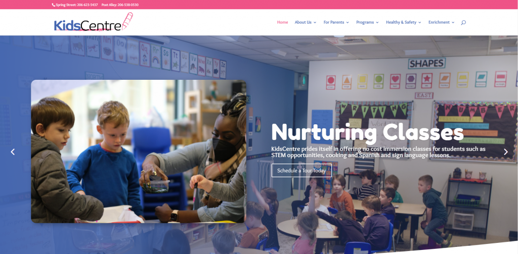
KidsCentre has a great intro header which showcases children gaining new experiences. Allowing for all pictures, buttons, and blocks of information to be rounded creates a simple, clean and seamless design. It was noted that there is a frequently asked questions section that allows potential customers to gain confidence in this business. We also enjoyed the logo design that evokes a creative and childish emotion.
19. Seattle Learning Center
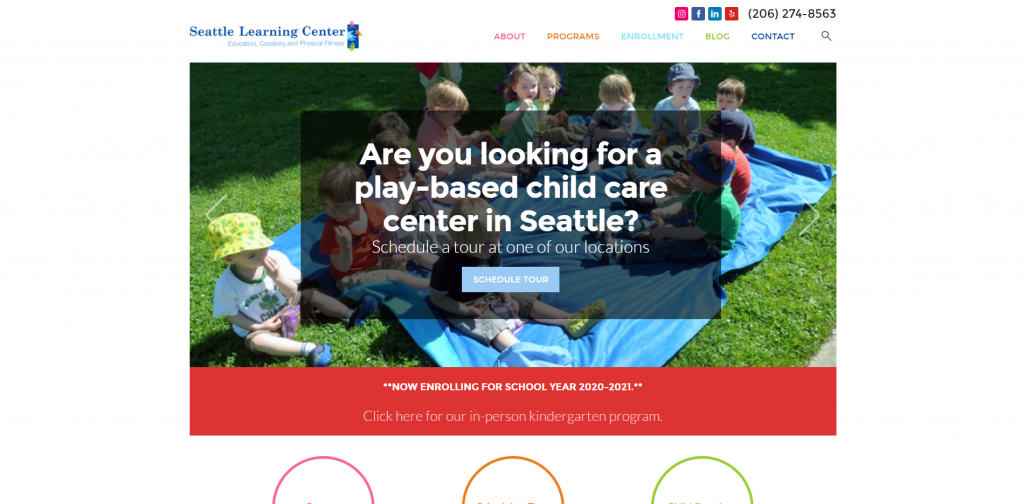
Without delay, we were able to notice how Seattle Learning Center takes advantage of written content, but manages to organize it into blocks of information. Choosing bright colors that aren’t too busy gains creativity while still proving importance of their written content. An Instagram section and contact information can be found to keep clients connected to their company.
20. Kiddie Academy
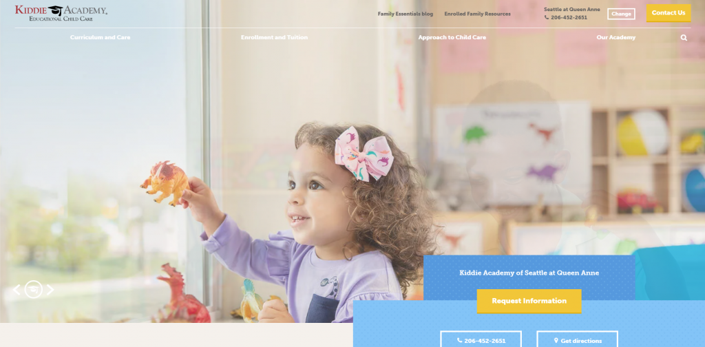
This site uses a simple blue, yellow and white theme throughout along with many pictures. We thought it was smart to add in links leading to more information. Customer reviews and informative posts can be seen throughout this site. It was interesting that Kiddie Academy chose to create a template that is extremely professional and educational looking. Also, social media links for Facebook, Twitter, and Instagram making it easy to connect with the business.
21. Wow & Flutterville
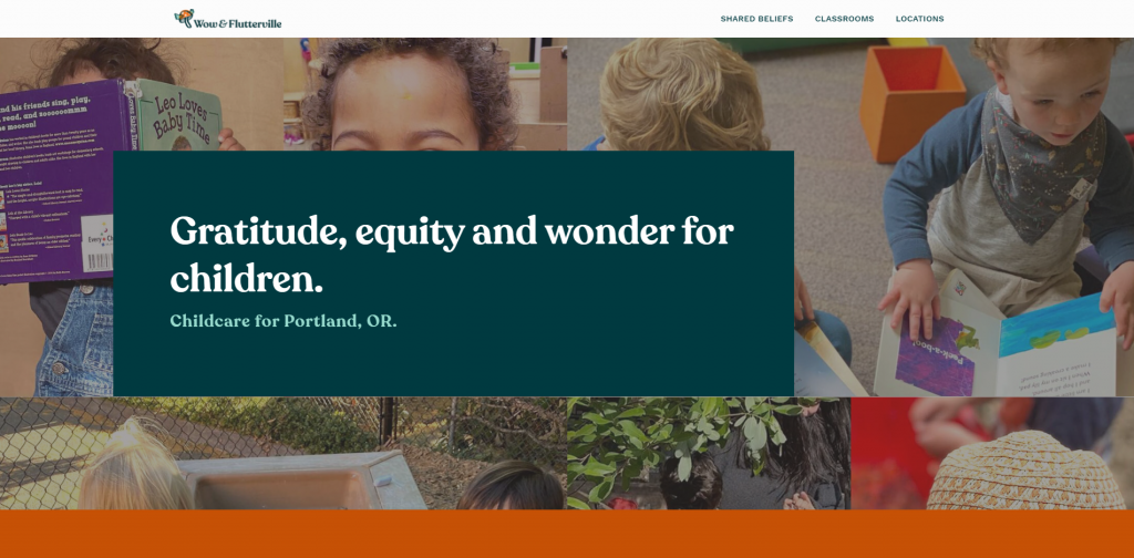
Wow & Flutterville focuses on children right away by showcases many pictures of kids and teachers. Color blocks help to keep information organized and not feel overwhelming. We thought the addition of customer testimonials really helped incoming customers. Something on this site that we haven’t noticed on any competitor site was how they included a playlist for this month. Clearly, this is a great example if you are wishing to be inspired for your next web design.
22. WeVillage
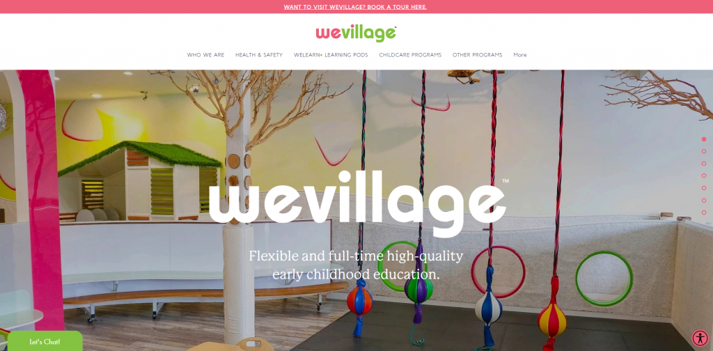
Balance is seen right away in WeVillage between written content and pictures. A short video is shared to show off this daycare along with previewing different activities kids will have the opportunity to do. It was helpful to have programs (even birthday parties) nicely listed. Lastly, we really enjoyed the color combination used throughout this comforting site.
23. KidsPark
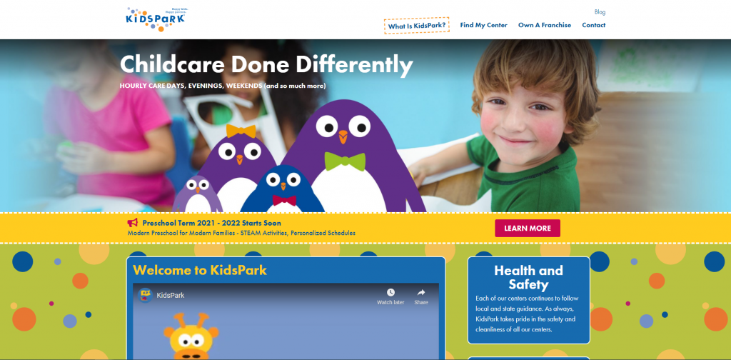
Inviting and fun are two things child care centers should incorporate, and this company understands that. We believe it was smart idea to include a video to explain what they as a business are all about. Text that was slightly slanted created a fun personality for their fonts. Sharing small images and certifications of each team member was also a stellar choice to include. Another amazing quality to add was an informative blog.
24. Childtime
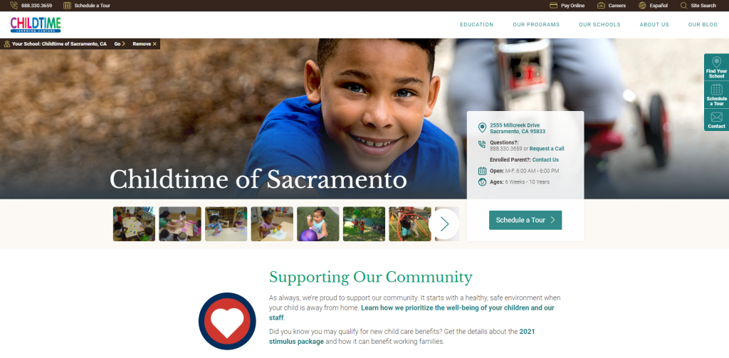
Childtime’s maintains a very welcoming web design. In order to capture possible client’s attention, bright colors are used. Many helpful resources are offered, including but not limited to: scheduling a tour, paying online, and simple contact information. Additionally, Childtime picked out their domain to match their company name which is extremely helpful from a marketing perspective.
25. Le Petit Bebe Daycare
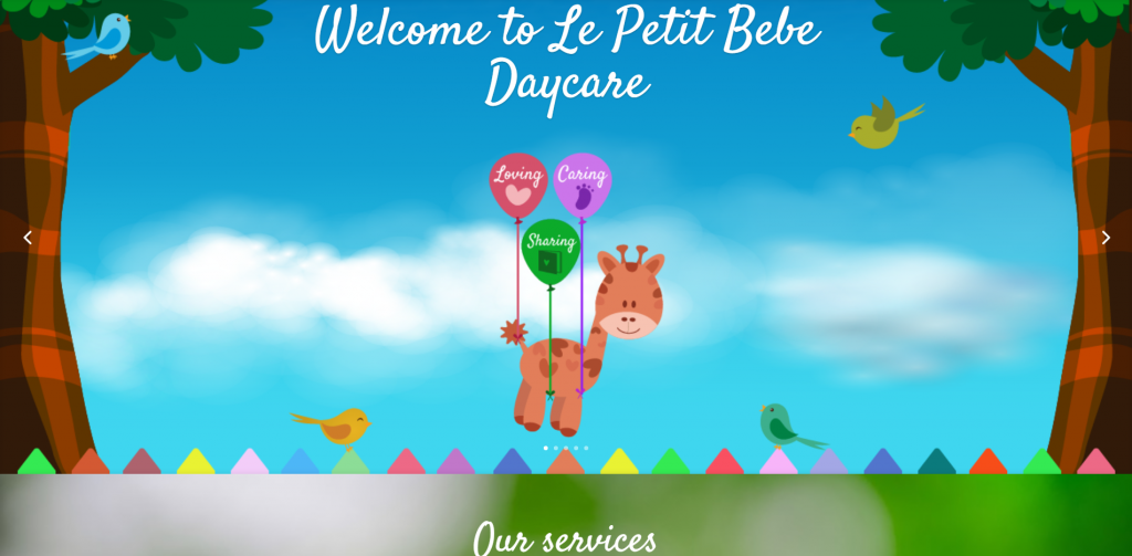
Upon entering this website, cute graphics can be seen in a variety of ways. It was a great choice to include images (of kids, teachers, food offered, etc.) and a creative font. Client testimonials allow for potential customers to gain additional insight on them as a company. Also, there is a Google Map so people can see where they are located.
26. Primrose Schools
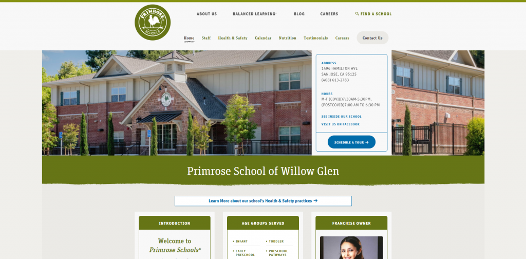
We enjoyed Primrose Schools’ white background with a green color scheme. Important information is shared on the homepage which is definitely helpful. Also, many articles with images provide adults with knowledge on what’s happening in the school. We also thought it was interesting to add in a variety of icons to make it easier to find what you are looking for. Be sure to check out Primrose School when searching for ideas!
27. Kids Are Us
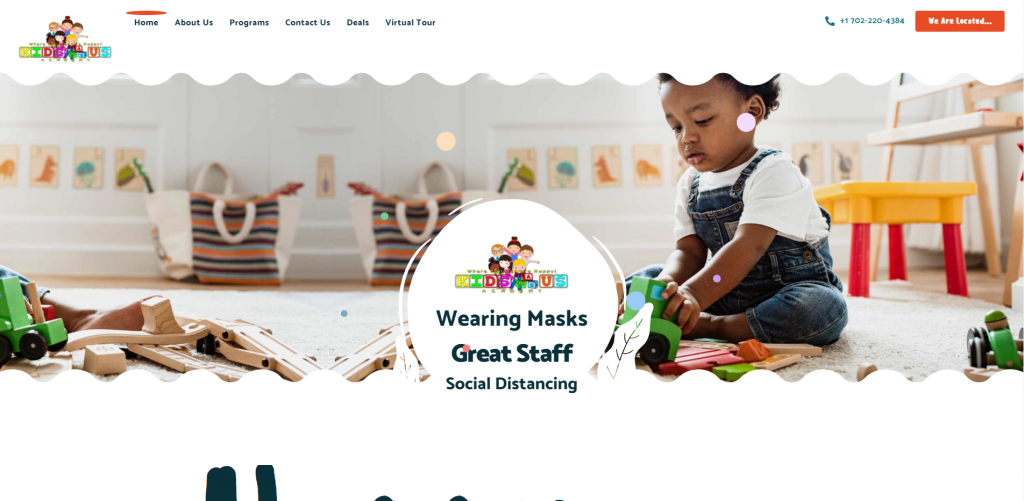
Kids Are Us has a creative website with big, one-word headlines. Clipart can be seen to grab attention of the audience. Another thing that keeps the people interested in the website is transitions, animations, and effects that were added. Focusing on their at-home atmosphere, along with how they keep children safe, happy, and feeling comfortable helped this child care site rise to the top.
28. Watch Me Grow
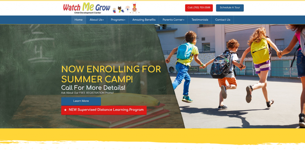
Here we have primary colors as a color scheme, which creates a stunning design for pages. Watch Me Grow is very organized and they show it through their layout and navigation bar. This company’s efforts related to organization makes it easier for people to browse through information to find what they need while also discovering new things. Using color blocks throughout splits up information, helping pages feel less overwhelmed with text.
29. Principrin School
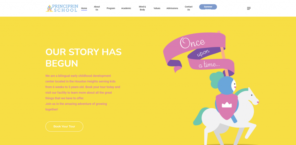
Principrin School was definitely one of our favorite web templates for, and for so many good reasons. Right away, we see a fairy tale theme – built up by graphics – that attracts to young children. We enjoyed all the bright colors that creates an energetic and playful feel. While it might seem strange, explaining why potential customers should choose their company helps highlight what customer’s kids could experience. Lastly, we really liked the playful logo design that also served as a loading icon.
30. Creative Care
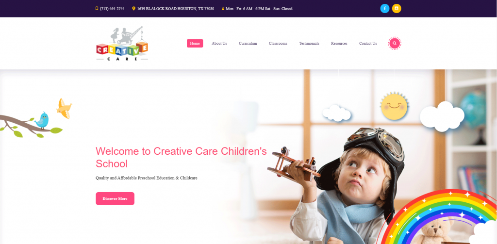
Due to graphics, fonts, colors and imagery within Creative Care’s site, it’s obvious that as a company, they value creativity. It was helpful for them to have short and to the point paragraphs as many parents don’t have time to read entire essays about child care centers. Being able to read client testimonials, quick facts and information from their blog is relaxing for many possible clients to have a good understanding of Creative Care as a company.
31. Museum District Childcare Center
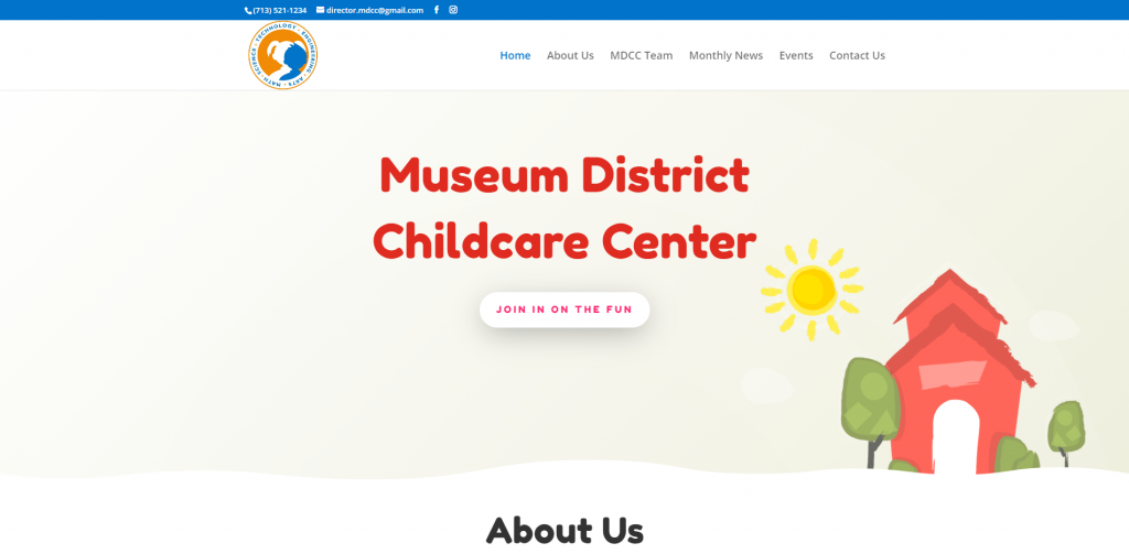
If you’re looking for a very simple, white background website, check out this one! Plenty of white space is used around information and rounded buttons, allowing it to have a nice clean look. We thought it was interesting that graphics give the illusion of a childish chalk drawing. From a market perspective, it was helpful to create a domain that matches their company’s name.
Related: Try out a paid advertising campaign on Google or Facebook to get more leads to your daycare business.
32. Grandma’s House Child Care
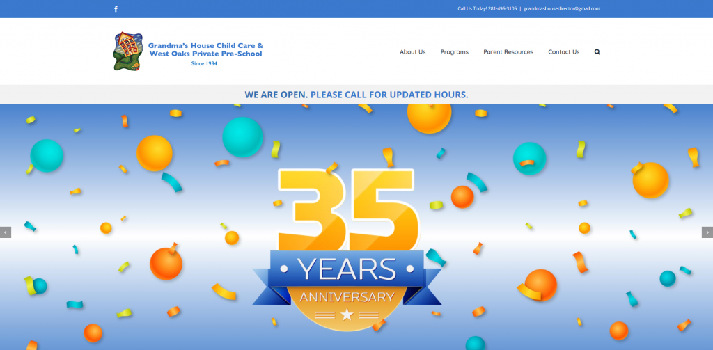
Another example for you to take a look at is Grandma’s House Child Care. Pictures and buttons are included with rounded edges for a nice clean look. Including a video allows for information to be released in a more interesting way. It was also nice to include contact information, a Google Map, and a contact form at near the bottom.
33. The Growing Tree Academy
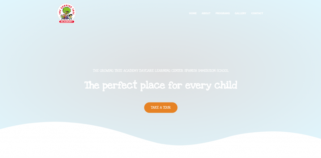
The Growing Tree Academy has a great layout to show programs for each age group. Wavy lines are used to highlight edges of color blocks. A creative feature we noticed was the little doodles accenting their site (and photo frames). Simple icons are used to help point out important information. Including many social media links allows people to stay connected with this company in a variety of ways.
34. The Learning Experience
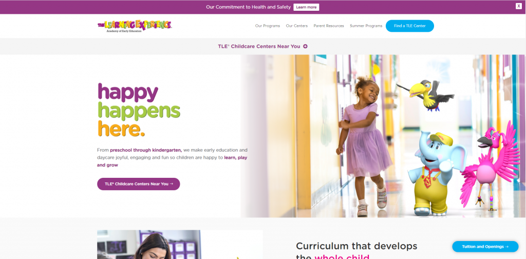
Mainly, we noticed this company’s color choices that are harmonious with each other. It was creative how animal characters are brought to life in their images. These characters are also used as an imaginative way to help children learn. It was a great idea to have buttons to help with navigation. We also liked that this company created their own informational blog.
35. Discovery World Learning Center
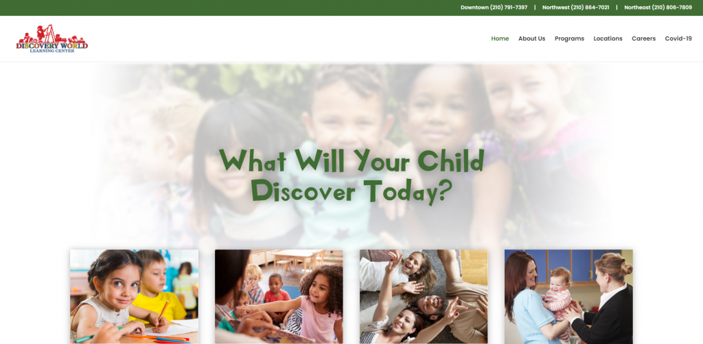
Discovery World’s website design is very simple. White space is well balanced along with images and written content. In this design, they are good at adding in links allowing for customers to reach out if they want more information. Discovery World Learning Center establishes why you should choose them along with awards they’ve won. We also really liked their creative fonts that add to the overall design.
36. Castle Hill
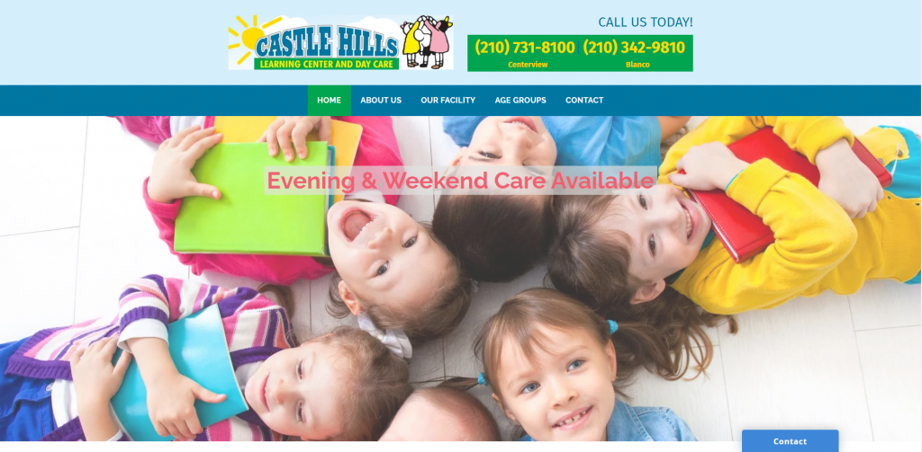
On this homepage, phone numbers and important information are big and easy to find. Castle Hill’s homepage is kept simple so that information isn’t too overwhelming. Within links, there is lots of information with a few images. Making contact information known to possible clients is helpful so they can contact the company if needed. Don’t scroll past this company’s site when looking for inspiration.
37. Country Home
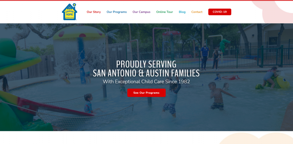
Country Home had a simple layout with lots of different colors. To stand out from competitors, unique scroll and hover effects were added. Including an image and a short written description for each activity they offer helps parents understand what their kid(s) could be doing. Customer testimonials and images of their center helps relieve parents who are on the fence with this company. Having a clearly labeled navigation bar also helps possible clients find information they need.
38. ABC Learning Center
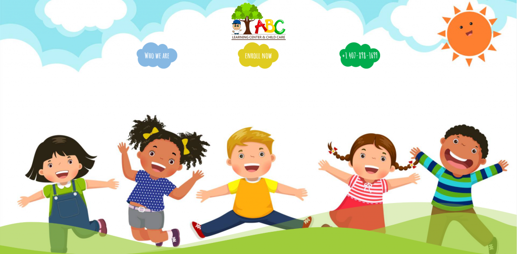
Here we have a cheerful and welcoming homepage with cartoons covering it. We liked how they had an introduction of their center along with their mission as a company. Pictures of their location – inside and out – help parents gain an understanding of ABC Learning Center. Having a sticky header with links makes it easy to browse through information. We thought it was helpful to clearly state all of their contact information. If you are searching for ideas for your next site, make sure to take a look at this one.
39. All My Children
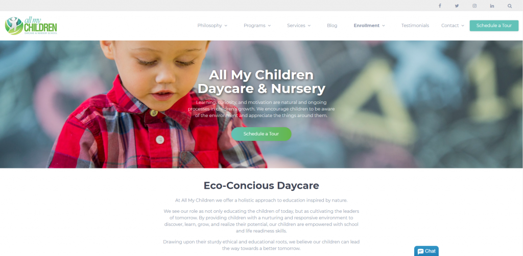
All My Children serves as another great example of a simple design and color scheme. Using a font that is small and simple allows for users to focus on their content. We liked their color scheme, but also that it is consistent throughout the site. From a marketing point of view, it was smart to choose a domain that matches their company’s name. An Instagram section can be seen to share what’s happening around the daycare. Some features that stood out to us were their live chat, contact form, and social media links.
40. Vivvi
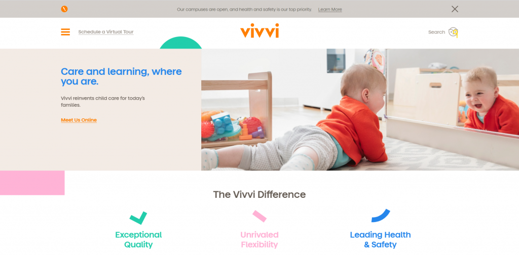
Vivvi utilizes many colors but is still simple. It was useful that this company chose to use bright colors to highlight important information. Images are surely balanced with white space to help maintain flow of content. We immediately noticed a playful loading animation. Adding in upcoming events in a place that can be accessed easily was. a smart choice. Lastly, it was nice that they included buttons for better navigation.
41. Sunshine Learning Center
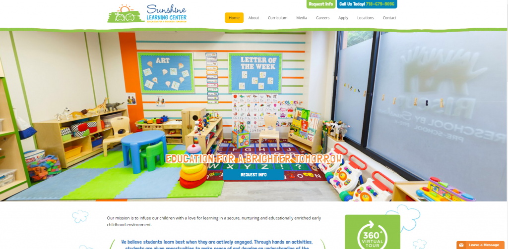
If you are looking for inspiration for a bright, creative and childish site, make sure to check out this one. We though the playful doodles sprinkled around their site really added to it. A brightly-colored playroom shows possible customers what it looks like inside. Due to not having as much written content, it isn’t overwhelming to viewers. A featured section displays curriculum for each targeted age group. Having a bold font for titles was also helpful because it separates content within this site.
42. Broadcasters’ Child Development Center
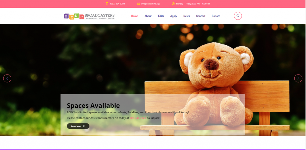
Broadcasters’ Child Development Center picked out a creative font, a handful of colors (that look great together), and small graphics used as icons. Information is well-organized, especially since important information is highlighted with bright colors. We thought it was thoughtful to add in a FAQ page. Finally, we really liked that Broadcasters’ Child Development Center took the time to create a well-labeled navigation bar for their site.
43. The Britleys for Toddlers
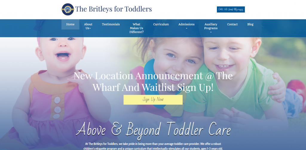
When creating an informative childcare website design, don’t forget this example. Instantly, we noticed images spread throughout this site to break up text and make it less overwhelming. Color blocks of blue and white are used to feature information. We liked how they included awards their company has won to prove they are qualified to watch your children. High quality images help to improve the looks of their site.
Related: Rank higher than the other daycares in town with a local SEO campaign.
44. Home Away From Home
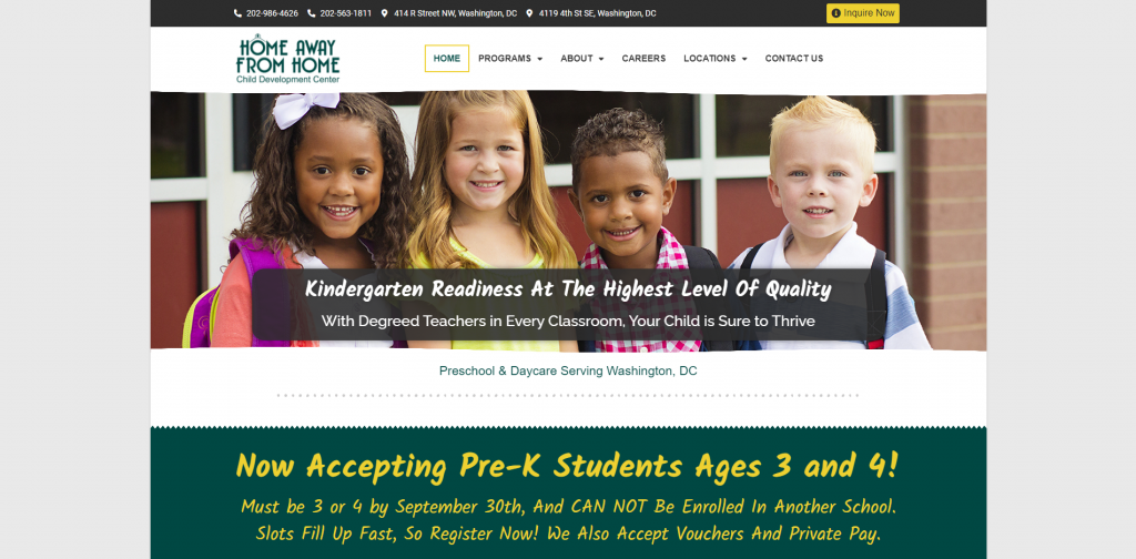
Home Away From Home is another great example of a clean and attractive website. In our opinion, written content to images ratio is perfect. Having a template that alternates content and pictures helps to break up lots of writing. Small graphics and creative photo frames add a bit of character to this site. A header with phone numbers and locations is visible so it can be accessed easily.
45. La Petite Academy
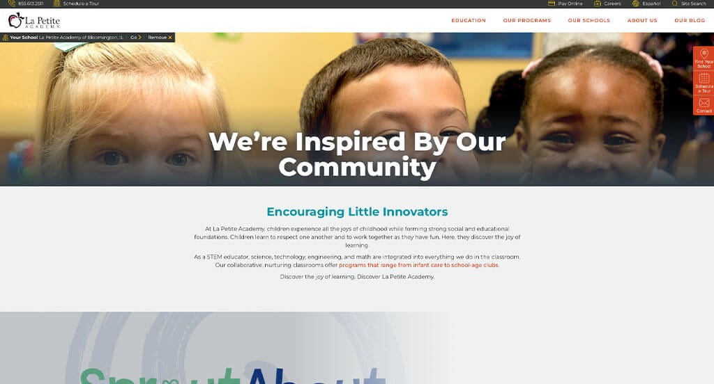
Here’s another good example of a web design for a kids academy looking for a custom layout. After scrolling through this daycare site, you’ll immediately notice how they included images and videos. Also, a relaxing color palette can be seen. They had website usability in mind when utilizing buttons to help clients navigate the pages of their website. Be sure to consider this one-of-a-kind design when developing your next custom website.
46. University for Kids
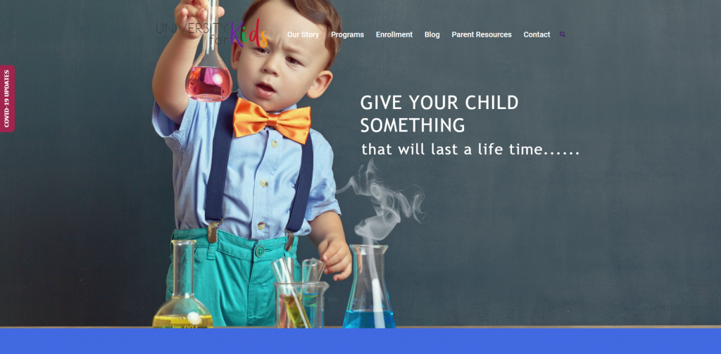
Right away, University for Kids has an eye-catching, high quality intro picture. This grabs your attention and makes you want to keep reading. A good ratio of pictures and written content is maintained to help break up information. They also share both of their locations on a map. We really liked their creative logo design. An Instagram section is featured to help customers to connect in another way.
47. Kidz Stuff
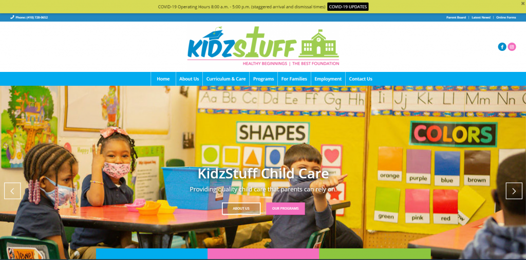
This daycare website’s homepage is straightforward. We thought it was interesting for their logo design to show what is important to them. Important information is visible and more information can be found within all of their links. Listing how many years, how many staff members, and how many students are in their care now helps to build trust with their company. Their phone number and social media links are visible in many different places that can be accessed easily.
48. Tooney Town
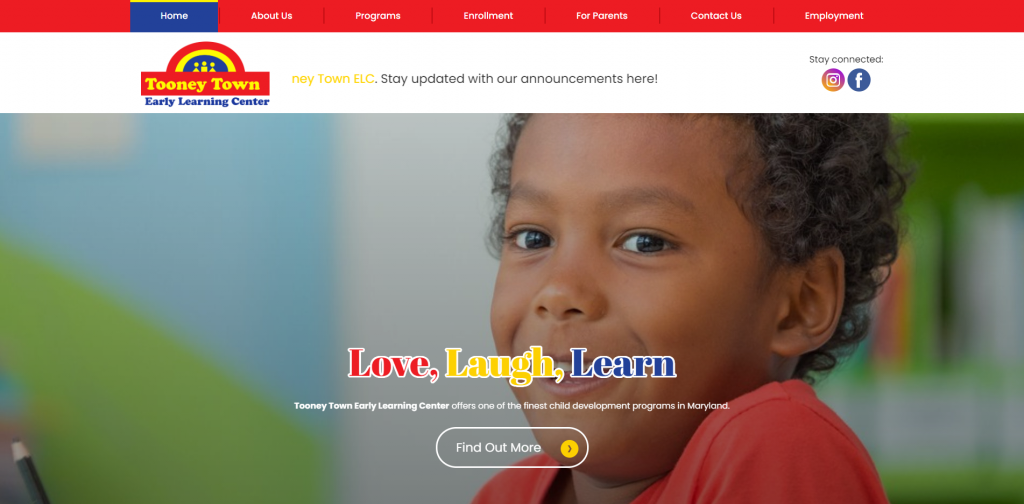
This website uses primary colors for its color scheme which really makes the website stand out from competitors. Because they have more than one location, they make a point to show both locations along with contact information for both locations. Their sticky header makes it very easy to navigate through information. Social media links for both locations are included so customers can stay connected.
How to Build a Great Childcare Website
Are you currently creating a new website for your daycare center? Exciting!
Let’s go over some key steps for building a new daycare center website or redesigning an existing one.
You can skip the first sections if you already have a domain name, hosting service, and website platform!
1.) Purchasing a Domain Name
Choosing a domain name for your childcare website is essential for establishing your daycare’s online identity. It serves as your website’s address and significantly impacts branding and recognition.
Here’s a step-by-step guide to choosing the perfect domain name:
- Brainstorm: Start by generating domain name ideas based on your center’s name, services, and location.
- Simplicity: Keep your domain name simple, easy to spell, and pronounce. Avoid complex words, hyphens, and numbers.
- Consistency: Include your established brand name in your domain. For example, if your business is Jane’s Childcare Center, avoid registering something like JDaycareServices.online.
- Availability: Check if your desired domain names are available early on. Many common names are taken. If a name is for sale but not in use, consider buying it, but don’t overspend.
- Domain Extensions: Choose the best domain extension for your website’s purpose. While .com is the most common, options like .net, .org, or .childcare may also suit your needs.
- Legal Considerations: Conduct a trademark search before registering your domain name to avoid infringing on someone else’s intellectual property. Avoid using names of other childcare centers or popular brands.
- Register the Domain: Once you’ve chosen an available domain name, register it through a reputable registrar like GoDaddy and Namecheap.
2.) Choosing a Website Platform
Next, choose a website platform for your daycare site.
Most childcare centers will create content-based websites with appointment calendars, phone numbers, live chats, and contact forms to drive conversions.
WordPress is a great choice, but Wix and other hosted website builders are also options.
- WordPress: WordPress is a versatile and widely used CMS offering flexibility and customization. It suits all types of childcare websites, from simple informational sites to complex ones with online registration and parent portals via plugins. With thousands of themes and helpful plugins, WordPress lets you create a highly customized website. It’s ideal if you value control and future expansion. While there’s a hosted version, most users prefer the open-source version on a web hosting account.
- Wix: Wix is similar to WordPress, offering many of the same features and a user-friendly page builder. It’s a hosted solution, so no separate web hosting is needed. We recommend it for childcare websites.
It’s uncommon for daycare centers to launch e-commerce websites.
Web Hosting Requirements
If you choose WordPress or WooCommerce, you’ll need a web hosting service.
For reliable web hosting, we recommend our own service, which is excellent for WordPress websites. Alternatively, consider these reputable hosting companies:
- WP Engine: WP Engine is one of our favorite hosting services for childcare providers. It has an easy-to-use control panel, seamless backup, and staging site creation. However, it limits PHP max_execution_time, and pricing can rise quickly for upgraded services.
- SiteGround: We highly recommend SiteGround for its excellent live chat and email support, quick response times, and effective first-contact issue resolution. Their backup tools are user-friendly, and their pricing is very reasonable for childcare centers.
- Digital Ocean: This cloud hosting option is great but likely too advanced for most childcare websites. We’ve had no issues with Digital Ocean, unlike other networks. However, cloud hosting can be costly with droplet, OS, control panel, server software, offsite backup, and management fees. For a server admin recommendation, visit AdminGeekZ.
3.) Choosing a Website Template
Most childcare providers choose pre-designed website templates to save on cost and time. However, if your daycare center prefers a custom design, you can hire a custom web developer or custom ecommerce developer to create a tailored theme.
Here are links to main theme marketplaces for pre-built childcare website templates:
WordPress Childcare Themes
Find free themes at wordpress.org or explore childcare templates on ThemeForest.
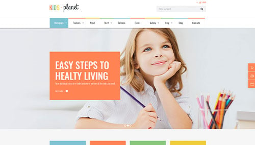
Kids Planet – Themeforest
$69
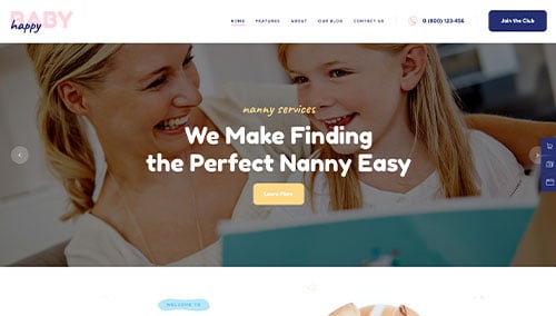
Happy Baby – Themeforest
$69
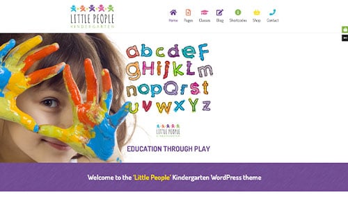
Little People – Themeforest
$59
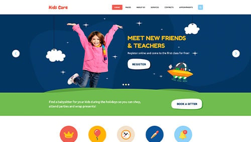
Kids Care – Themeforest
$69
Wix Childcare Themes
Find free and paid childcare themes at wix.com.
4.) Creating Content & Adding Images
With your domain name, website platform, and theme in place, it’s time to start building content for your childcare website!
Here are some tips for creating engaging and effective website copy:
- Understand your target audience: Understand your target audience’s demographics, preferences, and needs before writing. Tailor content to address their concerns and provide valuable information. This helps your website rank well in search engines for childcare-related searches.
- Define your key messages: Define the key messages to convey through your content, aligning with your brand and highlighting your unique qualities and the benefits of your childcare services.
- Keep it concise and scannable: Online readers skim content, so keep your writing concise and easy to read. Use short paragraphs, bullet points, subheadings, and bold text to improve readability.
- Create clear and compelling headlines: Create attention-grabbing headlines that highlight the value and relevance of your childcare business, encouraging visitors to explore your website further.
- Incorporate keywords strategically: Research relevant keywords and naturally incorporate them into your content to improve your website’s search engine visibility. Avoid excessive keyword usage. Tools like Ahrefs or Semrush can help with keyword research.
- Maintain a conversational tone: Write conversationally to connect with your childcare audience. Avoid jargon or technical language unless needed. Engage readers by addressing them directly with a friendly, approachable style.
- Edit and proofread: Always edit and proofread your content before publishing. Check for grammar, spelling, and punctuation errors. Ensure smooth flow and alignment with your brand voice. Tools like Grammarly can be helpful!
- Utilize ChatGPT for assistance:If you need help with ideas or refining your childcare website content, consider using AI tools like ChatGPT.
Enhance your content with high-quality images. Here are some tips:
- Opt for high-quality images: Choose high-resolution, visually appealing images. Blurry or pixelated images can diminish your website’s quality.
- Ensure relevance: Select relevant images that illustrate your message and enhance the text, adding context and visual interest.
- Consider stock photo resources: Use reputable stock photo websites like Unsplash, Pixabay, or Shutterstock for professional-quality childcare images. Follow licensing requirements and attribute images as needed.
- Customize images when possible: Consider customizing images to align with your childcare brand for a cohesive visual experience. Tools like Adobe Photoshop or Canva can help.
- Optimize image file sizes: Compress images to optimize file sizes without losing quality. Large files can slow down your website, affecting user experience and SEO. Tools like TinyPNG can assist with this
5.) Post Launch Tasks
After launching your childcare website, consider these tasks and services to maximize its effectiveness:
- Search Engine Optimization (SEO): Implement SEO strategies to improve your childcare center’s visibility in local search results. Conduct keyword research, optimize content, and maintain a solid internal linking structure. Regularly update with fresh, high-quality content. Consider hiring our SEO team or using third-party providers like The HOTH.
- Paid Advertising: Use paid advertising platforms like Google Ads or Facebook Ads to drive targeted traffic to your childcare business. Consider our PPC management services or hire professionals on websites like Mayple.
- Conversion Rate Optimization (CRO): Use Google Analytics to analyze your website’s performance and user behavior. Identify drop-off points and barriers to conversion. Conduct A/B testing with tools like VWO to improve conversion rates and user experience.
- Website Security: Protect your childcare website from threats with SSL certificates, web application firewalls (like Sucuri), and regular backups. Keep your CMS, plugins, and themes updated. Monitor for security risks and respond promptly. Use services like UptimeRobot to monitor uptime.
- Website Maintenance: Regularly maintain your childcare website for optimal performance. Update plugins and themes, monitor speed, and fix broken links or errors. Consider our website maintenance services or hire a freelancer on Upwork. Regularly back up your website to prevent data loss.
- User Feedback and Testing: Seek user feedback to understand visitor experiences and identify improvements. Implement user testing and use insights to optimize your childcare website.
- Content Updates: Keep your content fresh and up to date. Regularly publish childcare blog posts, update service information, and ensure details are accurate. Engaging content attracts visitors and encourages sharing.
Remember, post-launch digital marketing is crucial for your childcare website’s success. Stay proactive, monitor performance, and adapt strategies to meet your business goals and audience needs.
FAQs about Web Development for Childcare Websites
The timeline for building a daycare website varies by project scope. Using templates can expedite development. A basic template-based site can be done in weeks, while a complex custom site can take months.
Using templates involves customizing the design and layout to fit your daycare’s needs, including color schemes, fonts, images, and features. This cost-effective option reduces development time and resources.
Consider hiring a professional web development company for your daycare website. They can tailor the site to your specific needs, ensure the design reflects your brand, and implement features that make it easy for parents to learn about and enroll in your programs.
A web development company can optimize your website for search engines and help establish a strong online presence through social media, email marketing, and other digital strategies.
To build your daycare website, we’ll need to understand your business goals and target audience, and gather content like text, images, and videos. We can assist with content creation if needed. We’ll also discuss features like online registration forms and photo galleries to create a custom design and development plan.
Lastly, we’ll need access to your domain name and hosting account to set up and launch the website, ensuring it meets your needs and supports your business success.
We recommend a clear, easy-to-navigate layout for your daycare website, highlighting services and contact info. High-quality images and videos of your facilities, staff, and activities can establish trust and credibility.
Optimize your website with relevant keywords and meta descriptions. Offer easy, secure online registration and payment options to enhance user experience, attract more customers, and reduce administrative workload. Prioritize these elements to create a successful daycare website that effectively promotes your business and provides a positive visitor experience.