Your template can surely make or break your business. Simple navigation, fast-loading and trustworthy content are all aspect you’ll need to include. Many other factors can shape success—let’s explore them! Short on time? Scroll down to our Top 47 Ecommerce Websites for examples.
1.) How to Choose your Platform
Test multiple ecommerce platforms before choosing one for your store. Many businesses pick incorrect platform based on recommendations or ads without considering their needs.
Here some factors to consider when selecting your platform:
Product Data Considerations
If you have only a few products, feel free to mocve on. Otherwise, check that your product data imports easily into your chosen platform.
We’ve handled situations where moving from Magento to Shopify or BigCommerce required custom coding. Issues arise from third-party Magento extensions, complex product variations, personalization, or inventory bundling.
For new ecommerce businesses with large catalogs, secure your product data before starting. Many assume manufacturers or distributors provide perfect data—but that’s rarely true. Merging data from multiple sources is often messy, with inconsistent formatting, categories, and images.
Custom Ecommerce Functionality
In this article, the last factor we will discuss is custom functionality.
When transferring to a new ecommerce site, list all custom features, including extensions, plugins, and developer-built functions. Don’t assume identical tools exist on a new platform.
When reviewing custom functionality, compare your current and future platforms. Magento users often dislike Shopify’s or BigCommerce’s product data handling, while Shopify users may find other platforms’ categorization unfamiliar. Research these differences before switching.
New ecommerce businesses should list functionality needs and compare them to shopping cart features and third-party solutions. Any unmet needs may require an ecommerce developer.
2.) How to Start Designing Your Ecommerce Store
Now the fun begins! Once you’ve chosen your platform, it’s time to get creative! Let’s explore your options.
Template-Based Design
The most affordable way to create your new site is by customizing a third-party template. Platforms like Shopify, BigCommerce, Magento, and WooCommerce offer hundreds of designs—some even free!
Third-party templates have some negatives, but they save tons of money compared to custom designs. If a theme requires major changes, reconsider its necessity. For full customization, a custom design may be the better choice.
Custom Design
If budget allows, opt for a custom site over a pre-made theme. The process starts with mockups in Photoshop or Adobe XD, followed by revisions and developer integration into the platform’s base theme. This ensures a tailored look, fewer design compromises, and a faster, more efficient website.
3.) How to Make Your Ecommerce Website Impressive
Once you’ve chosen a platform and design, focus on generating revenue. Stay updated on digital marketing trends or explore our Top 50 Ecommerce Websites (a collection from our top ranked websites on the internet) for inspiration!
These ecommerce stores showcase successful strategies, from great templates and custom designs to engaging homepages, creative product pages, social proof, and sales funnels.
Top Ecommerce Website Designs
1. Decor Outdoor
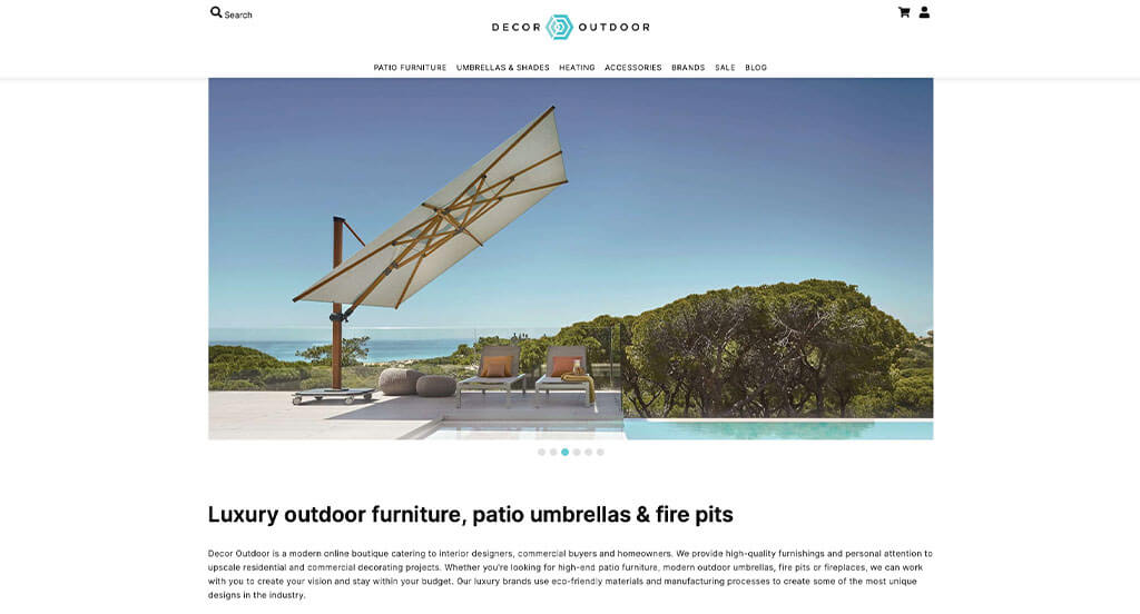
Right away we noticed how Decor Outdoor had a creative logo that seems to match their product. Including helpful information related to their business in the form of a blog was a great choice. Having a section dedicated to their featured products was nice. From our perspective, a simple checkout process is something that is almost a necessity. With so many great reasons to consider them, it’s obvious why we included this company in our list of best websites!
2. Bohemian Traders
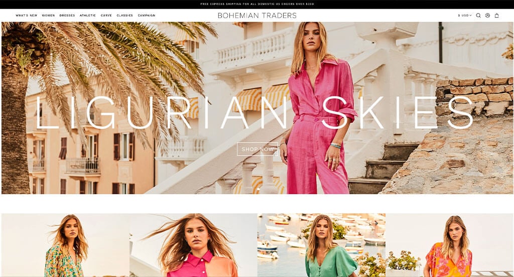
A professional look and feel is clearly displayed for this business. We loved their use of stunning images that match their overall aesthetic. It was nice that each other their products were displayed and upon hover, they were shown on a model. Bohemian Traders includes campaign pages that are unique to them. A well-labeled menu helps make this a great site to gain inspiration from.
3. Space Posters
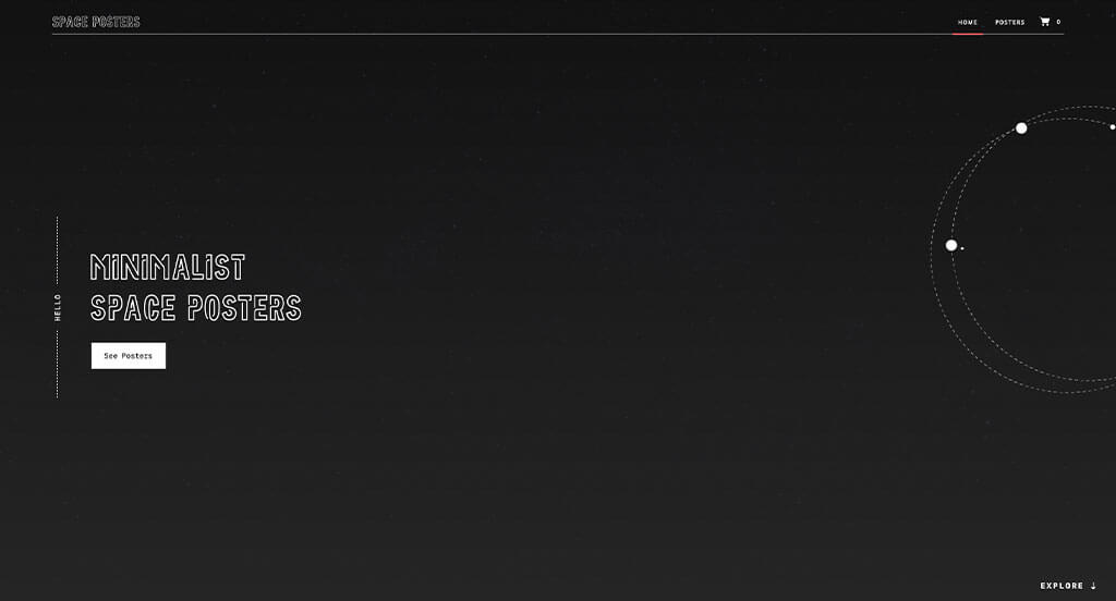
Looking at this, we are sure they wanted to take a minimalistic approach. A simple orbiting animation can be noticed which is both logical and unique. Using fun, captivating fonts was refreshing for a poster business. Although Space Posters doesn’t have very many products, they make it obvious what their products are. We also thought it was helpful to have a basic color scheme.
4. Sierra Designs
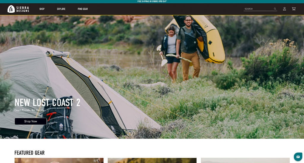
Showcasing a variety of images of people enjoying the outdoors was a great idea for a company selling related products. Sierra Designs includes samples of their best products related to tents and sleeping bags, which makes sense for them. Full-screen images are used to help break up content, making information easier to find. Large noticeable buttons could also be something helpful for viewers to get to content faster.
5. Pura Vida
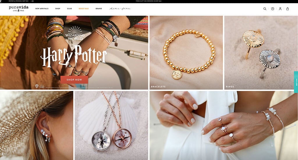
Pura Vida takes advantage of collections for their products. These follow a common theme based on season, holiday or popular shows/movies and such. A subtle pastel color scheme is used throughout which we thought was nice because it seemed positive and fun. We also liked how they had images linked to their social media page allowing customers to stay connected and “shop the look”. They clearly had a focus on ease of use when creating a clean and simple theme.
6. GREATS
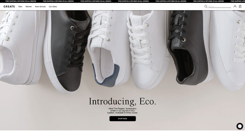
GREATS made sure to mix and match their images and videos to create a stunning look. Customers ability to see a variety of color choices on each shoe was also nice. Another design quality in this online shop site is their integration of social media. Having a bright yellow accent color to draw attention to certain parts was something we loved. It was also a great choice to include little tags for best sellers and buttons for easier navigation.
7. LARQ
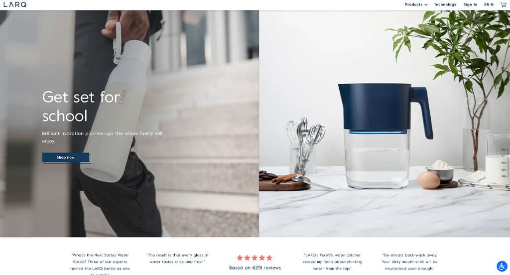
Innovation is something that is clearly displayed through LARQ’s products. We thought it was nice to include this feeling of innovation by using well-planned images, a great color scheme, and interesting graphics. Having an online magazine was something else that we found to be helpful. It was nice to have small little “stickers” that show what is new and what is on sale.
8. Manly Bands
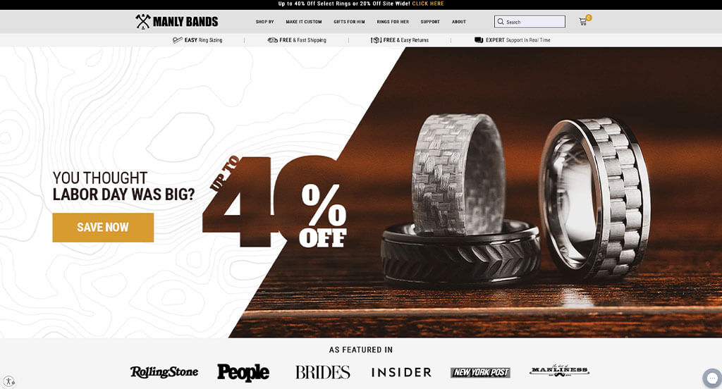
Manly Bands knows their target market, and knows what they want. A natural palette is used in order to maintain their “manly” feel. We definitely think this business did a great job with their well labeled navigation bar. For an online company, it’s very important to stand out – offering a variety of collections and materials, along with custom band options did that.
9. Herschel
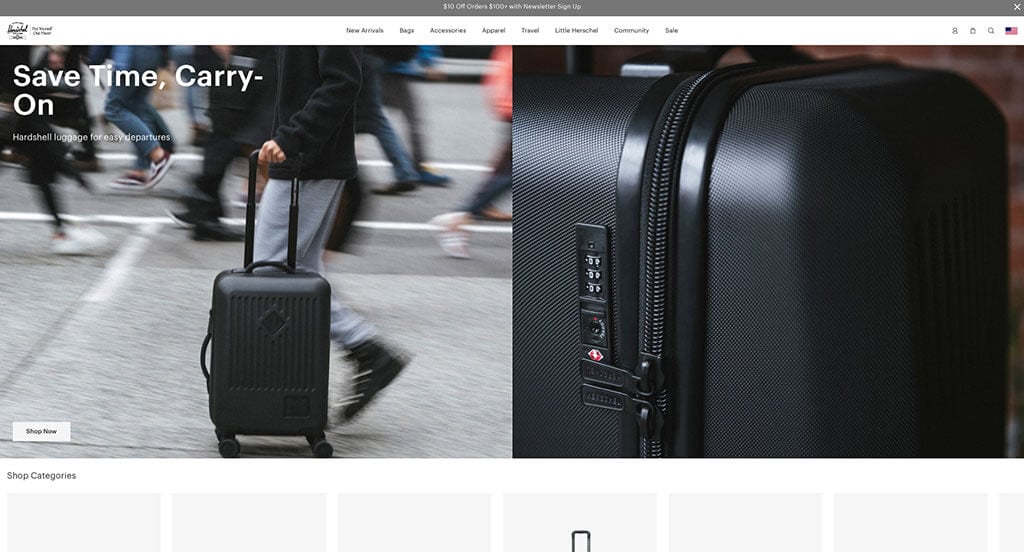
Using a black and white color scheme allows for a modern feel, which we really liked. Their simplistic fonts were also nice to make everything feel more professional and reliable. Filtering products by price, colors, size, and features was extremely useful. Adding in a sale section was another idea that all customers can enjoy.
10. Ratio
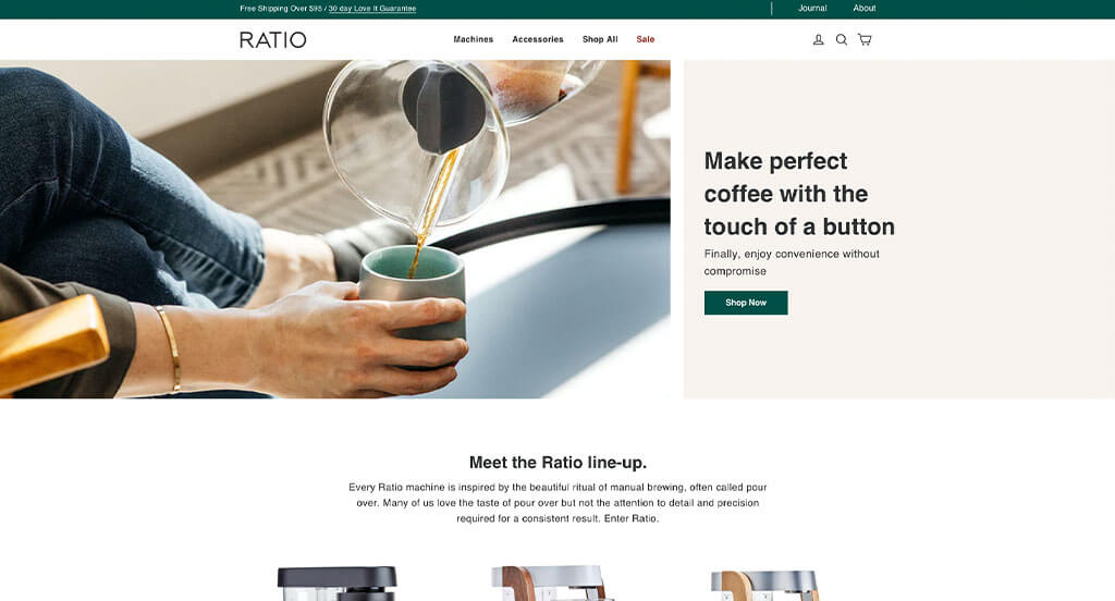
This business made great use of simplistic images and a relaxing color scheme. Additionally, we loved their elegant off-white boxes where some information can be found. All of their written content was formed into short paragraphs, which was helpful. It was also smart to have extra white space evenly balanced in their layout.
11. The Fitness Store
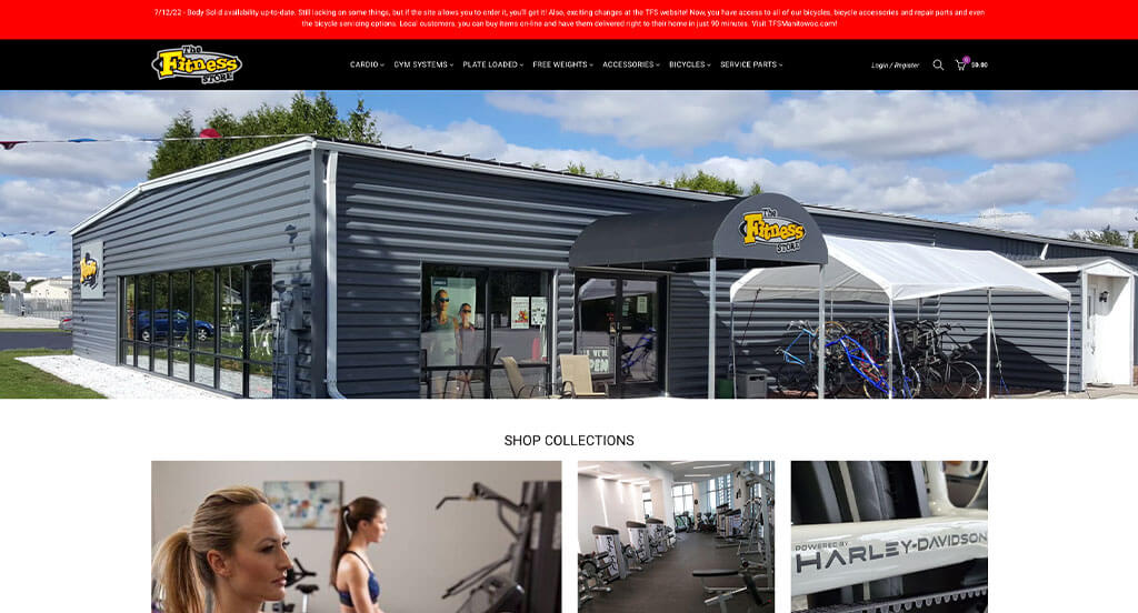
After reviewing The Fitness Store, we noticed that they included short paragraphs on nearly each piece of common fitness equipment. It was cool to have a carousel-like feature to include new products along with store specials & overstock. Creative fonts were used for titles which was brilliant because it creates a sense of visual interest in their template other than their images.
12. Earth Sense Energy Systems Inc.

This is a good example that makes use of a red accent color to help highlight certain areas of their design. A variety of interesting and fun fonts was an impactful feature we noticed. We also thought it was smart to use product images to guide customers through their design. You also might notice how they included a search bar. This was a great choice because they customers are able to find certain products faster.
13. Kettle & Fire
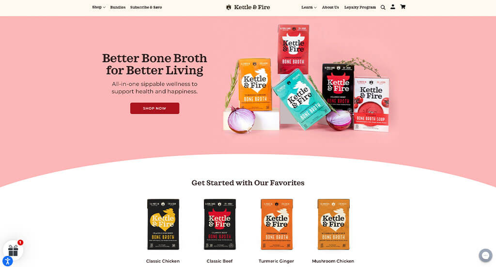
If you are looking for inspiration for your new site, here’s a great example. We appreciated how multiple colors such as pink, yellow and green help to create an attractive layout. Lots of information was included to help people understand why they should buy this product. Their inventive logo was definitely something that helped Kettle & Fire stand out against their competitors. Finally, we love how they show off their artistic packaging on their online platform.
14. Cameron Trading Post
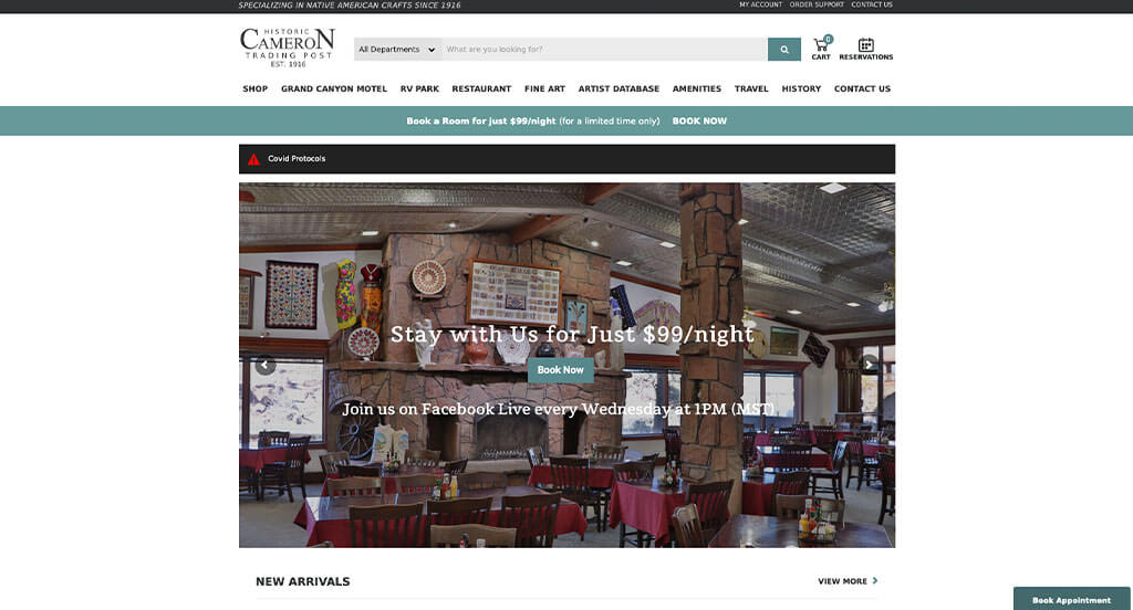
Cameron Trading Post not only is trying to sell their lodging, but also Native American art. Accenting their site with teal colors was a nice choice for them. Including high quality images of their art and hotel rooms was an easy option, but still good practice. A simple text box is used to get customers to join their email list. We thought their back and forth design that created an interesting layout was also smart.
15. P&Co
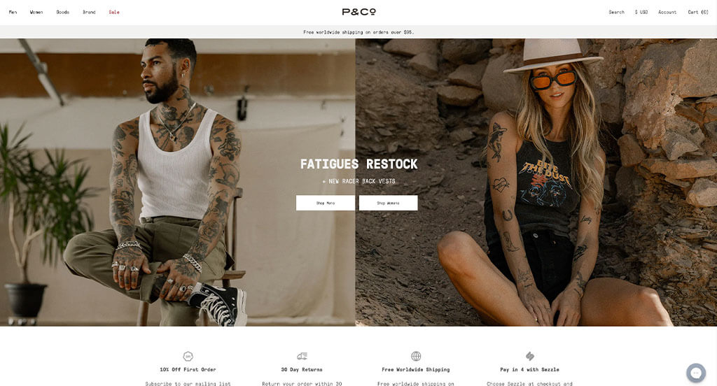
P&Co has a great looking website that makes use of balanced white space to organize lots of stunning imagery. Images are high-quality and showcase an overall feel for their products. It was nice to use small tabs to show what’s new, what’s trending and what’s organic. We liked how longer formatted information can be found in their Lookbook linked right on their homepage. Having a simple checkout process was also something we didn’t ignore.
16. Magic Spoon
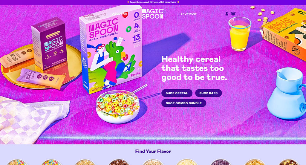
A bright color palette for Magic Spoon stood out to us because it evokes an energetic emotion. Some small animations were included, which might’ve been their most impactful feature. It was also unique to allow customers to buy in packs or create custom bundles of their favorite cereals. We loved how small bits of information are included like customer reviews and nutrition facts. Inventive fonts are used which gets customers engaged with their webpage.
17. Burrow
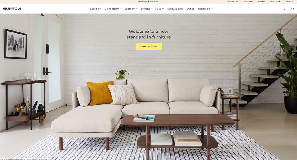
Burrow makes use of a mainly black and white color scheme that lets their images direct the aesthetics. One of our favorite parts about this company’s page is their images that hold unity creating an unforgettable example. After entering this site, you’ll immediately notice how Burrow uses a navigation bar with precise categories. They had digital marketing in mind when creating a showroom booking section for their customers. We loved their reviews that were displayed in a slider, saving room in this template.
18. Echelon
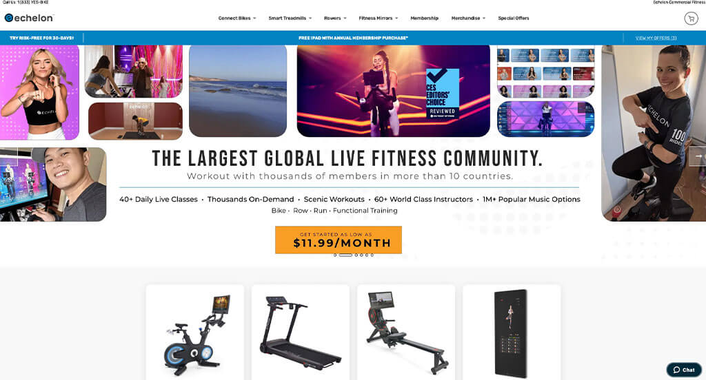
Using an automatically playing video right away that shows this business’s focus on fitness was a great idea. Blue and white colors created a refreshing, almost a sense of renewal. Lots of sale tactics can be noticed, such as showing customers the original price slashed and including the new price to show their rate of saving. Utilizing a live chat was something else that we really loved.
19. Harry’s
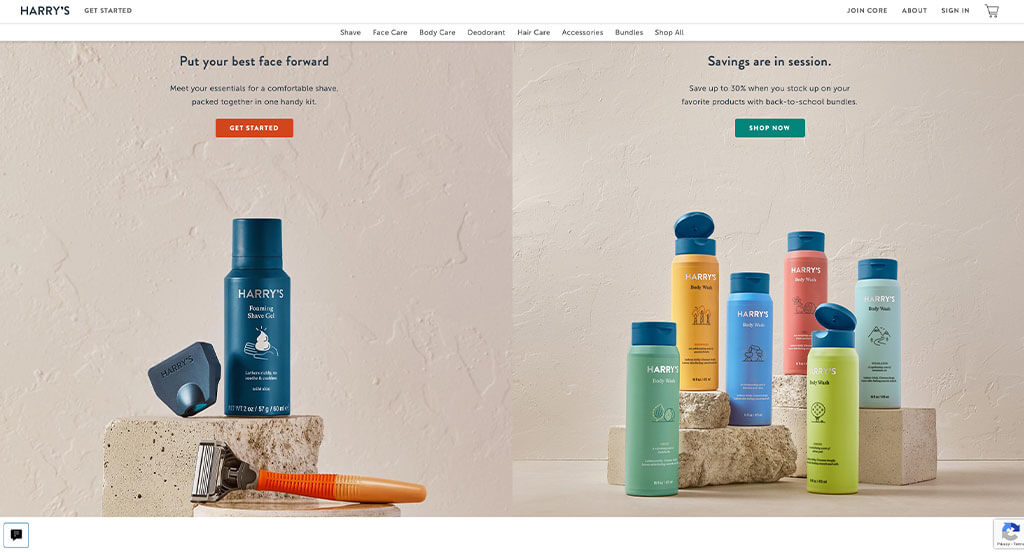
Harry’s does a great job creating a natural feel for their site. They do this by staging their images on natural objects and using a neutral colors for backgrounds. We also thought it was cool how some of their images with multiple items makes use of simple arrows to label products. Being able to send shaving essentials on a monthly, bimonthly or trimonthly schedule was absolutely brilliant.
20. All-Taxidermy
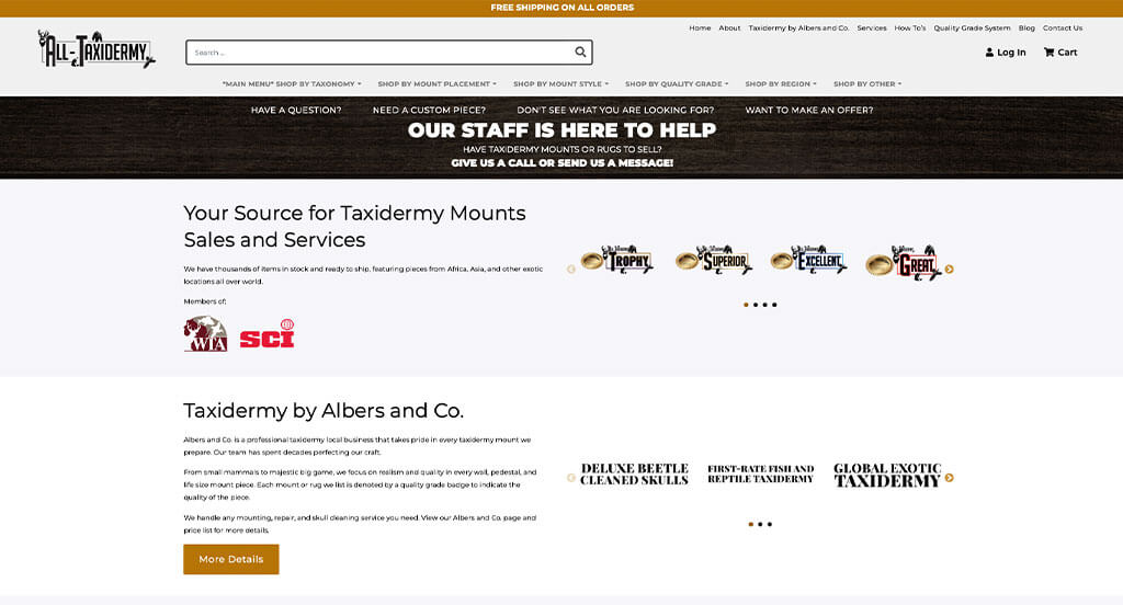
Right away, we noticed how this taxidermy company showcased awards that they won. Short paragraphs are used to organize all their information. Showcasing their different areas such as big game, regal wings, fish & reptile, cleaned skulls, deer, bear, small game, and global exotic was smart. We thought it was nice to include buttons with silhouettes of different animals for better navigation. Another thoughtful feature about All-Taxidermy was a layout that’s easy to follow.
21. Bison Coolers
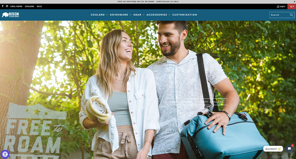
Bison Coolers uses automatically playing videos paired with large images and bold fonts to create the perfect look. Many of their images were well planned, keeping color schemes in mind. We loved how video reels were added into this homepage showing a small image of the featured product. Accessibility is key so when designing their layout, they made sure it was nice and organized.
22. Tess Oral Health
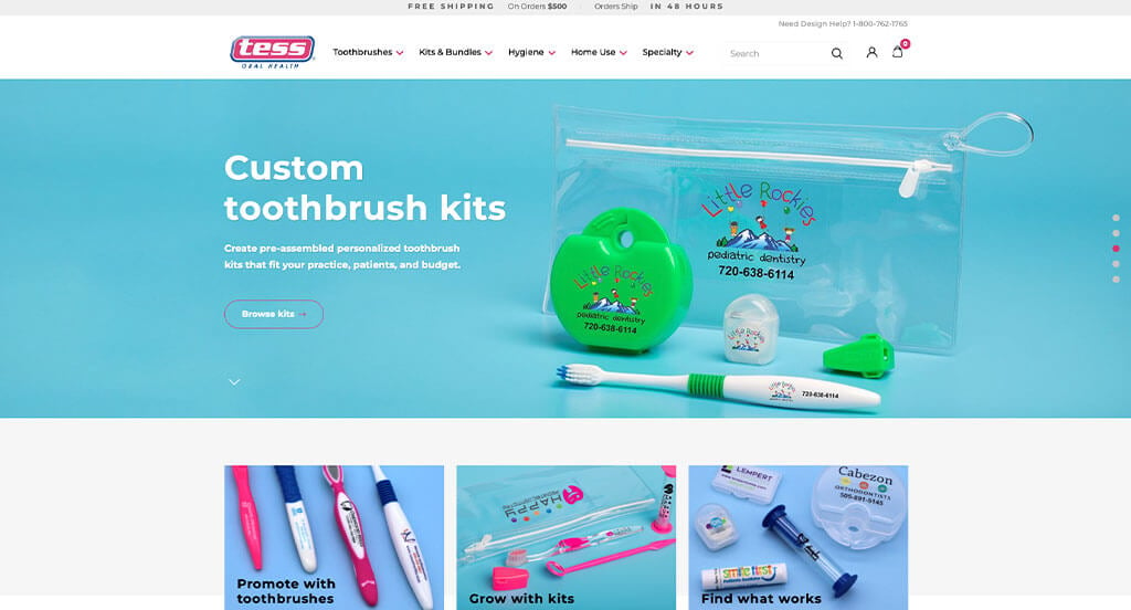
A pastel blue and pink color scheme was used to provide Tess Oral Health with a more kid-friendly look, which was smart. This example likes to put their personalized products out for customers to see because it’s what makes them unique. They clearly planned their site out when allowing for a simple checkout process within this website.
23. Winc
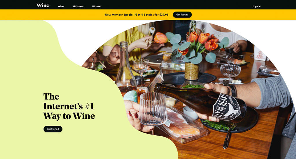
For this example, pastel colors and wavy lines carefully guide viewers eyes. Their imagery was not only professional, but also creative and evokes an elated feeling. Smooth transitions is something else that we loved about this site. Adding in a quiz that suggests products for customers was an interesting choice. Little tabs can also be noticed that are top rated, new releases, or member favorites.
24. SISU
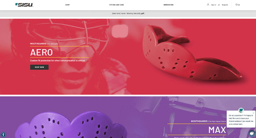
Right away we noticed how SISU used color filters for many of their images for a powerful look. Incorporating helpful information related to fitting instructions for all mouth-guards from this store was great. Creative flipping animations were used to attract attention to information on these products. We also thought it was smart to include their partners like CCM, PennState and NSF.
25. KETNIPZ
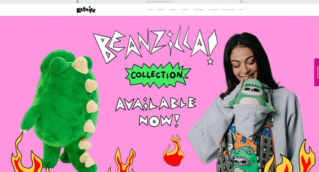
One of the best things about KETNIPZ was their cartoonish graphics that match with their products. Being able to see multiple angles of products without clicking on it was another thoughtful feature we enjoyed. It was also nice to include sizes for stuffed animals because it’s hard to see through images.
26. Outdoor Voices
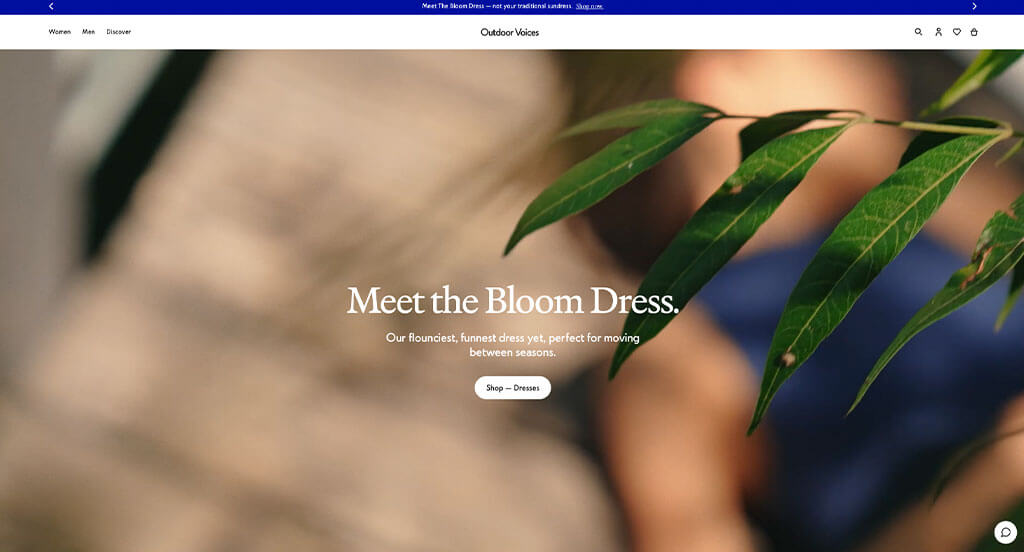
As we scrolled through Outdoor Voices, we liked the pop-ups for any current sales. Freely browsing with filters such as size, category, and color was a nice touch we loved. Their professional font that creates a modern feel was another choice we couldn’t overlook. Finally, we loved how everything seemed to look like a social media post and upon hover, customers can see what product is featured.
27. Bose
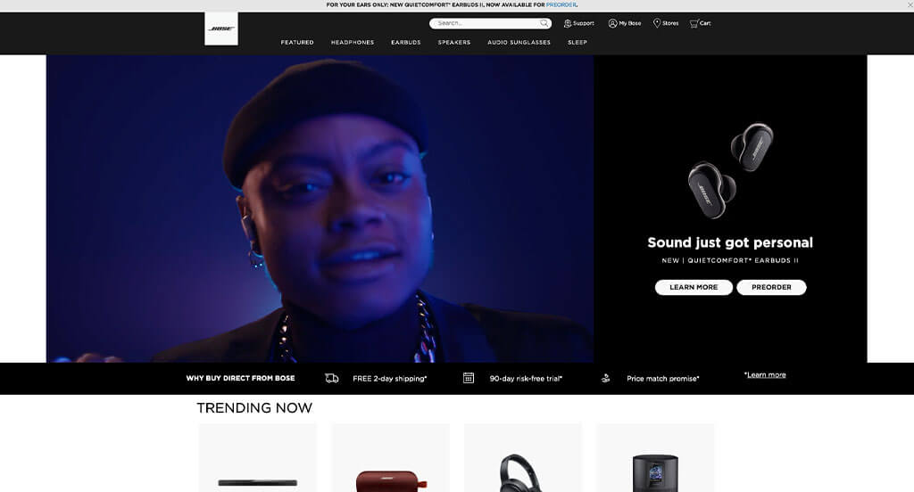
This is a template that focuses on balance of white space, color, and images. We loved how each of their images included interesting frames and stunning fonts. Bose also had large buttons that changed color upon hover that will help customers find whatever products they are looking for. It was also smart to name their domain after their business.
28. Good Robot Brewing
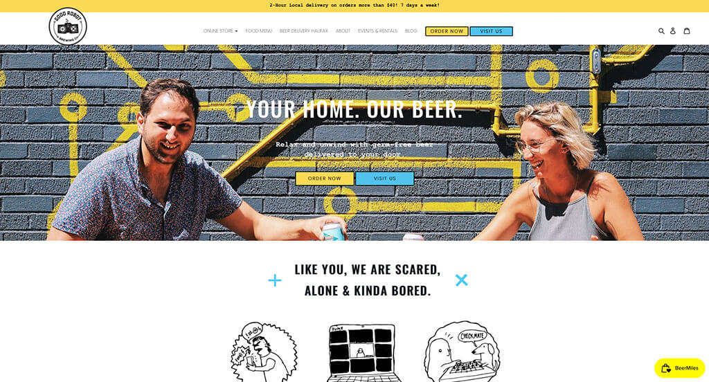
Illustrations cover this design, grabbing the attention of their customers. This fuels people to explore their website more. A combination of yellow, blue and black are used to create a stunning visual appeal. Featuring a black brick pattern on a majority of their pages was something we noticed very quickly. Having a page dedicated to their upcoming events was a great idea.
29. First Lite
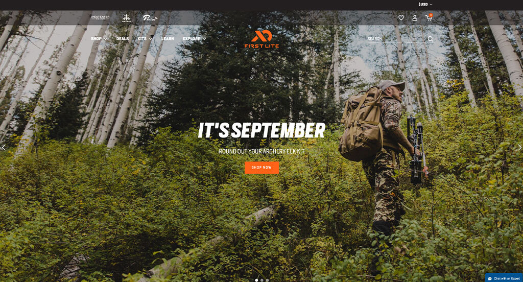
Almost immediately, our eyes were engaged due to First Lite’s color scheme playing with black and white with a bit of orange. Having an interesting logo always helps business rank higher for things like this. We also really liked their helpful and personalized quiz to find perfect hunting apparel. Another great choice was how they allowed customers to “heart” gear that they like or commonly buy, making it easier to find later.
30. KUIU
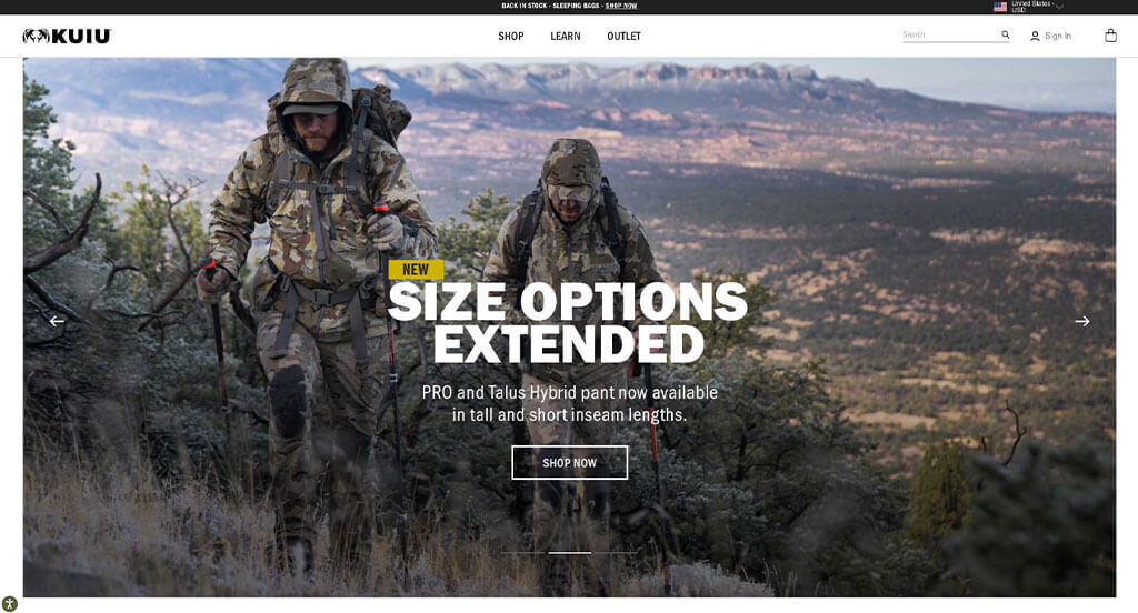
Balance is clearly used in this design, making everything easier to read. We loved how they switched between full screen content and alternating half screens. Making sure everything was written in short sentences or paragraphs was another thing we enjoyed. Showcasing new products, new colors or best sellers was really smart.
31. Northernism
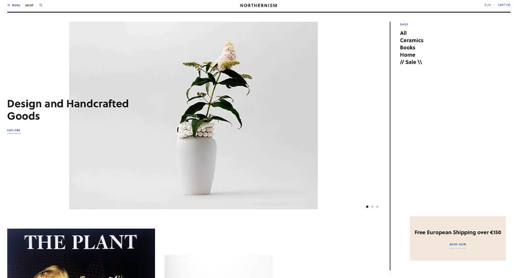
Northernism definitely put some thought into their layout when sizing their images differently and placing them in asymmetrical places. We liked how titles and written content was sometimes overlapped with images. Immersing customers into their social media right through their homepage was also a nice touch. Northernism had ease of use in mind when picking out bold lettering. A simple domain was also useful for a design such as this one.
32. Farrell Equipment
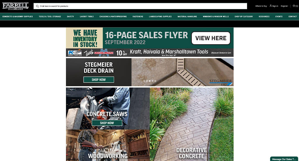
Farrell Equipment does a great job with their product images. For many of these product images, they make use of bright backgrounds and sometimes creative graphics. Creating a metal look for their logo was really smart, especially because it relates to their business. It was a good idea to include their featured brands such as DeWalt, Bosch, and Keson to get customers excited about their products.
33. NordicTrack
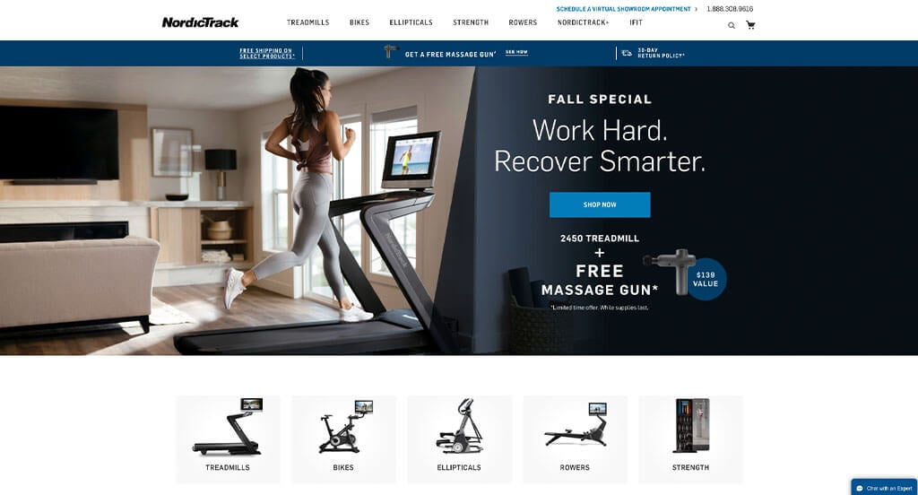
This example is focused on showing movement whether it’s their videos, stop motion photos or just their products. We thought it was cool how they included statistics near their product photos like percent inclines, resistance, and more. Large text helped customers digest all of their content easier, especially the important information. They clearly had a focus on accessibility when allowing for a good balance of white space within this website.
34. Dick Moby
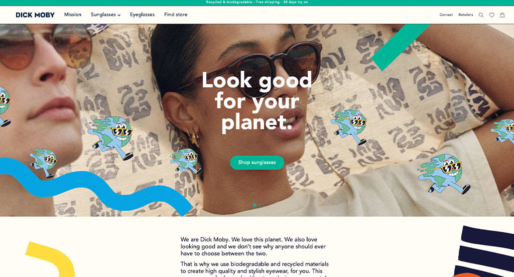
This company shows the importance of bright colors and creative graphics. Their imagery is another thing that helps them stand out due to the feeling of quality it evokes. Colorful buttons can be noticed to help customers navigate through all of their information. It was a great idea to include charts comparing their materials and products to competitors.
35. Hardgraft
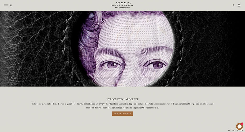
Almost instantly, we noticed Hardgraft’s inspirational loading icon stating “Hold On to the Good”. Showcasing a section dedicated to their recent favorites was a nice touch. We loved their use of white, tan, off-white, brown and deep red. Picking out a font perfect for them was another thing that helped them stand out in the online world.
36. Salty Crew
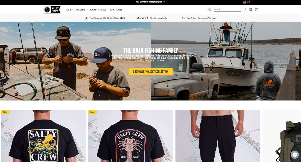
Salty Crew knows how to carefully integrate patterns and designs from their products into their template. Another interesting choice was their backgrounds for products that makes sense for their beachy vibe of their clothes. We thought it was great to include their Instagram account right into this homepage. Thoughtful “salty stories” are sprinkled in to give customers additional information.
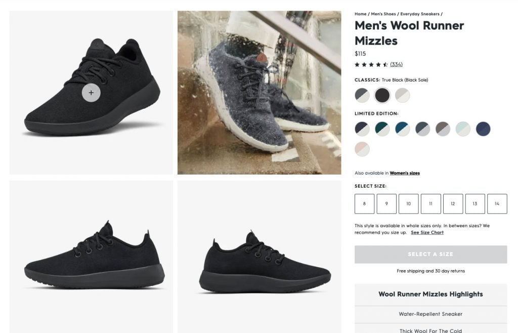
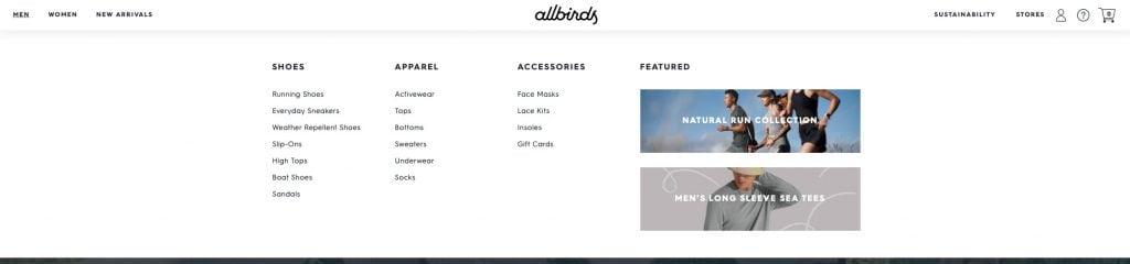
37. Allbirds
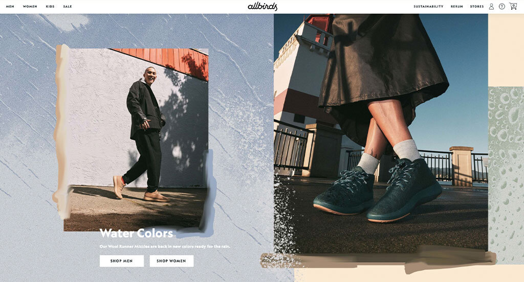
Interesting product images with fun backgrounds and well planned compositions was something we noticed right away. We loved Allbirds use of professional but relaxing fonts that make sense for their brand. Another thing you might see is that their menu only consists of men’s, women’s, and new arrivals. This makes it much easier for people to find the type of shoes they’re searching for. Related to that, it was more helpful to include filters to browse based on features such as size, material and color.
38. Ritual
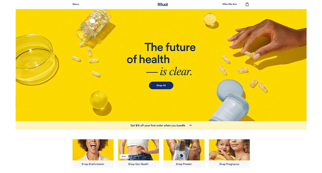
Ritual’s color scheme is a clear advantage for them because it builds brand identity. It was awesome how they made sure that their images matched with their chosen color palette. A customer review section is added in with a creative transition to make it stand out more. Small graphics and geometric shapes are used to improve their visuals.
39. Solo Stove
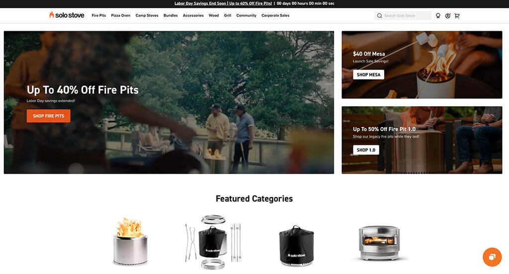
If you are looking to find inspiration for an online store, here’s a great choice. Solo Stove did well with their orange accents throughout their pages, but also in their images. Their logo that is logical for their brand and their products was another helpful piece. Incorporating their social media was something that we couldn’t miss.
40. Chubbies
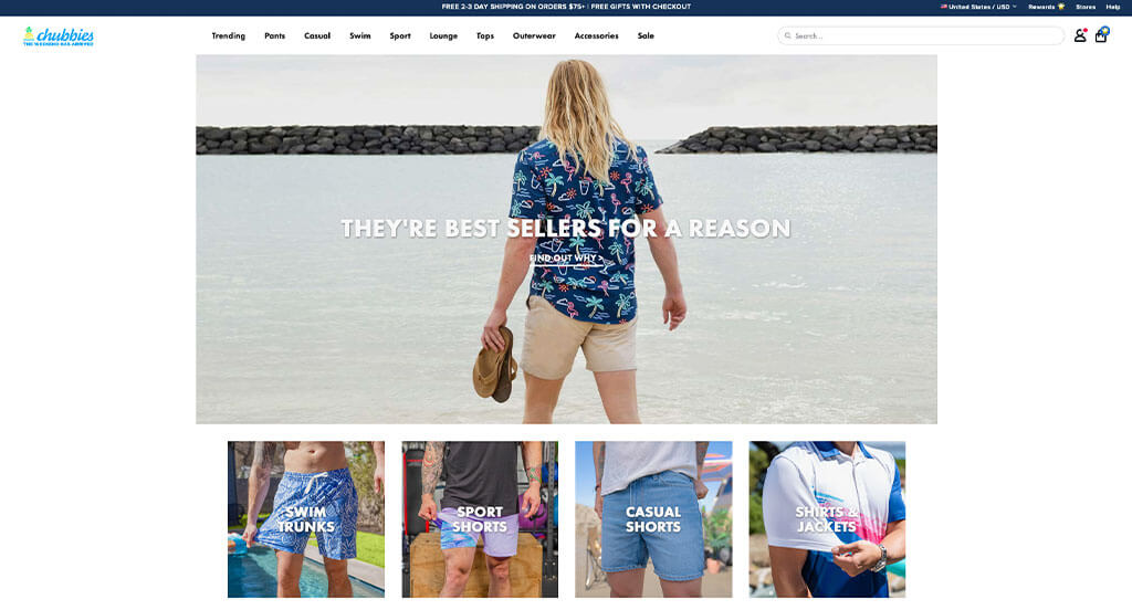
We loved how Chubbies used elements such as logo and images to create a summery vibe. Their variety of products for both in and out of the water was helpful too. Full screen imagery that helps break up content is extremely helpful for organizational purposes. We liked how upon hover they showed what sizes were available along with prices. A clean and simple layout was also nice for customers to navigate through.
41. Grovemade
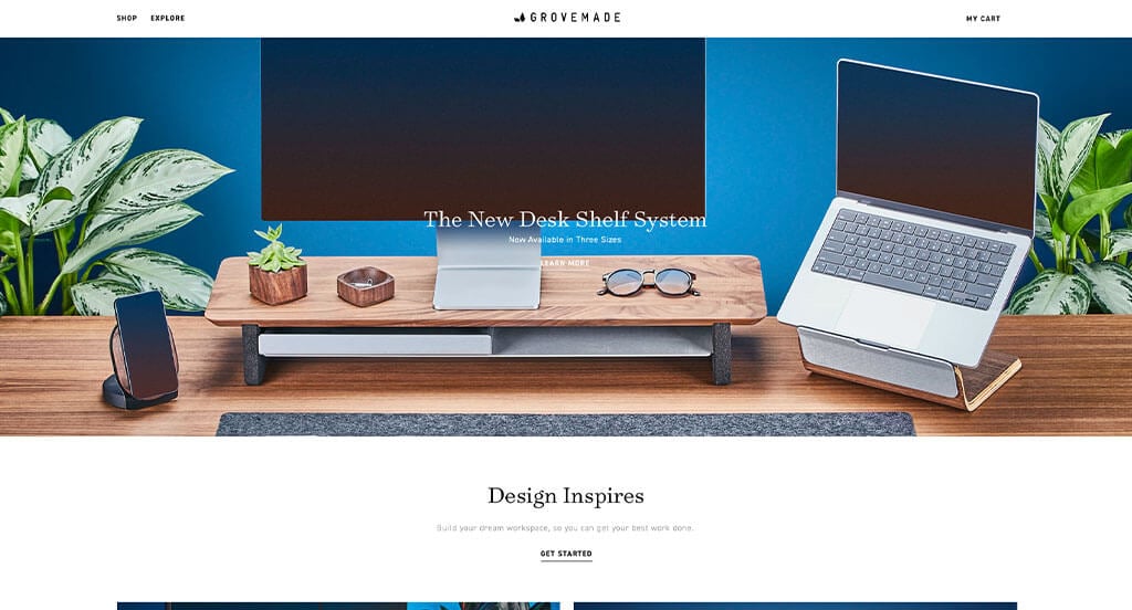
We loved how this example uses large images to show off their high quality products, which was nice. We loved how their was an area to show off their team with images staged to match their aesthetic. Using smaller blocks of images and text to balance content was another great choice for Grovemade. We also liked how they allowed for smaller products to complement their main product.
42. Black Diamond
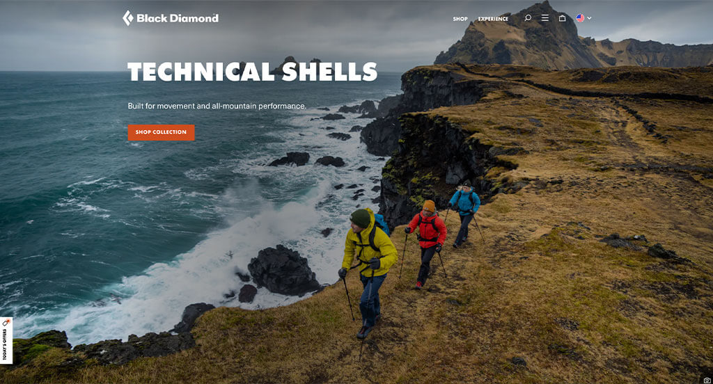
Right away, Black Diamond’s logo stood out to us. A bold orange accent helps to create a feeling of optimism and adventure. It was interesting to add a graphic showing a star rating between one and five for their more popular products. Using all caps for their titles draws attention to different areas which was perfect for navigation. They clearly had a focus on customer usability when designing a simple checkout process.
43. Revelry
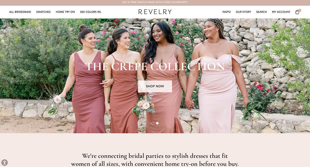
This online wedding shop combined simple colors to create an elegant template. We loved how their menu bar was extremely well organized, making all of their information very easy to find. Having an area for each of their inspiration collections was an idea we loved. Being able to shop by material or color was smart, especially for brides determined to find their dream dress.
44. Curology
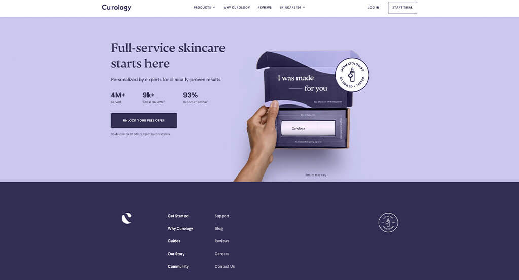
To catch customer’s eyes, a variety of bright colors are used. We liked how they didn’t complicate their backgrounds by using plain colors. We loved how they made use of before and after images showing how long the products were in use. Bold fonts and brightly colored buttons was another great addition to improve usability for customers.
45. YETI
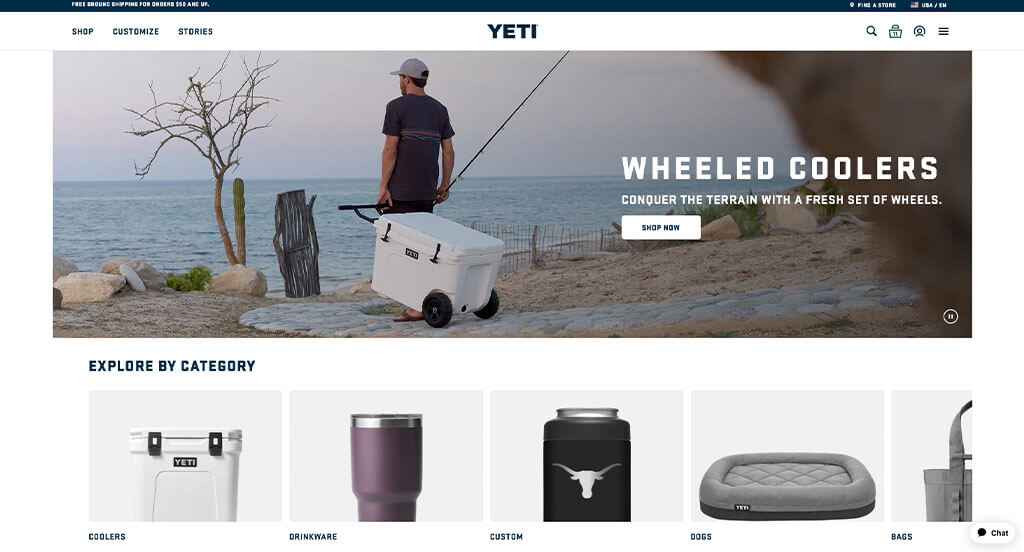
YETI is a wildly popular brand that focuses on selling products for life’s detours. Their images showcasing backgrounds of various adventures was a nice touch. A simple but fitting font helped them stand out against competitors. Offering customization for a selection of these products allows customers to feel like they are getting something special.
46. MVMT
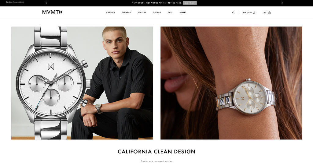
This luxurious brand does a great job with high quality images. We thought it was amazing to showcase materials or things related to the watch style within their image. MVMT created a logo design that looks similar to an hourglass, and creates a classy look. Additionally, we like how they created a unique video showing the history of their products.
47. Dress Up
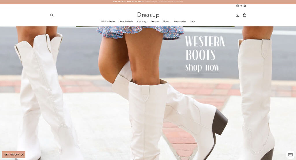
Dress Up makes great use of a light color palette to provide an almost boho theme. Their models who show off their products are shown smiling and laughing to create a youthful feel. Allowing for customers to shop by main categories like bestsellers, shoes, and new arrivals was another great choice. We liked how on their homepage they let viewers see each color option for each item upon hover.
How to Design a Great Ecommerce Website
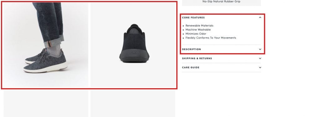
1.) Informative product pages
Make product features clear and easy to find on each page. Include images, videos, or animations to show your product in action and boost conversions.
For example, if you’re selling shoes, show how they fit different foot types (wide or narrow) and always include measurements.
2.) Great product image quality
Product images are what customers notice first—don’t lose them with low-quality photos.
3.) Make navigation efficient
Clear, simple navigation keeps visitors from getting lost and encourages them to keep exploring your site. A search bar can be helpful for people to quickly find what they need—especially useful when offering a wide range of products.
Related: Must try marketing ideas for your ecommerce business
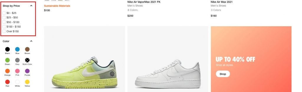
4.) Give customers the ability to sort/filter products by price
Let customers sort products by price and other factors, especially if you have a large inventory. No one wants to browse dozens of pages to find something affordable.
5.) Social proof
Social proof boosts conversions, making product reviews an essential part of ecommerce sites. Make sure to get reviews from real customers for authenticity. You can also run social media contests to encourage customers to share their experiences and engage with your brand—an example is Nike’s #NikeID campaign, which went viral by tapping into their audience’s passions.
6.) Add personality
Pour your personality into your template in order to stand out. Use friendly language and quirky product descriptions to show customers you understand them—not just as a brand, but as people.
7.) Include customer reviews
Allow for customer reviews to appear on your site, not just social media. Reviews build trust and boost confidence, increasing the chance of a purchase.
8.) Social media integration
Make it easy for users to share your products on social media and follow your accounts. This boosts visibility and helps you retarget followers through your SMM strategy.
9.) Always check for 404 errors
Regularly check for 404 errors to prevent losing sales—customers who hit dead pages will leave and often don’t return.
10.) Make sure your website is fast
Fast loading speeds are crucial. Optimize by compressing media, removing extra plugins, and using premium hosting. Test with Pingdom or GTmetrix to find areas for improvement.
11.) Build for SEO
Optimizing search engines to stay visible and attract customers is always a positive. Use clear titles, meta descriptions, structured URLs, H tags, image alt text, and strategic keywords. Internal linking improves indexing and navigation.
If product pages don’t rank well, create blog posts about the best products—long-form content can rank for many keywords and drive sales through product links.
12.) Designing your website with mobile devices in mind
Plan your site for mobile users, as most people browse on phones. Use readable text and avoid oversized images that don’t fit smaller screens.
13.) Provide multiple ways to get in touch
Make it easy for customers to connect by adding an “About Us” page and social media links. This builds trust and encourages them to return.
14.) Use White Space
White space makes content easier to read and helps guide visitors through your design. It highlights key elements, prevents clutter, and keeps users engaged. Use plenty of white space and contrasting colors for a clean, effective design.
15.) Make it Mobile Responsive
With more people browsing on a variety of devices, your site must be responsive on all devices. A mobile-friendly design makes navigation easy, improves user experience, and keeps visitors engaged—leading to more sales. If you haven’t optimized yet, now’s the time. Consider hiring a pro if needed!
16.) Simplify the Checkout Process
Keep checkout simple. A one-page or one-click checkout speeds up the process and keeps customers happy. Fast, efficient hosting also helps—check out our blog on the Best Website Hosting For Ecommerce!
17.) A/B Testing
A/B testing helps you see what works by comparing layouts, pages, or images to find what converts best. It’s a key step to improving your site based on data, not guesswork.
Why is Ecommerce Design Important?
A well-designed site improves user experience, boosts sales, and helps you rank higher on Google. Make shopping simple and enjoyable, so customers keep coming back. If it feels overwhelming, consider hiring a pro to handle the design and A/B testing for you!
Final Thoughts on Design Best Practices for Ecommerce Stores
In conclusion, good ecommerce design is key. A fast, easy-to-navigate site with simple checkout and SEO optimization keeps customers coming back. Use A/B testing to see what works best. Still unsure about going online? Check out our blog on the advantages and disadvantages of ecommerce!
Recommended Ecommerce Themes
WooCommerce Themes
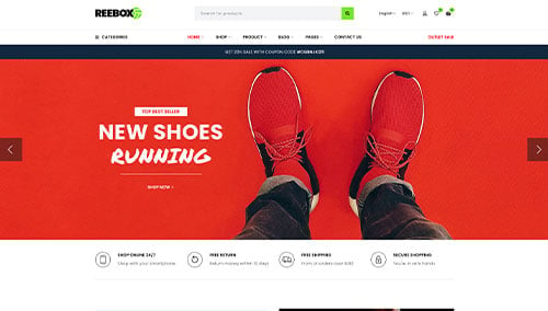
Reebox – Themeforest
$48
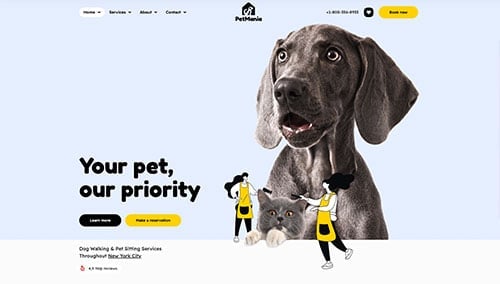
PetMania – Themeforest
$89
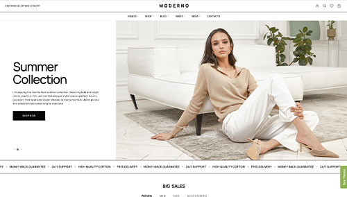
Moderno – Themeforest
$59
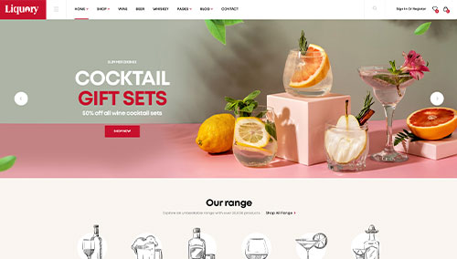
Liquory – Themeforest
$49
Shopify Themes
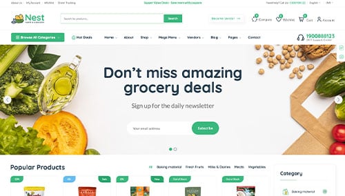
Nest – Themeforest
$59
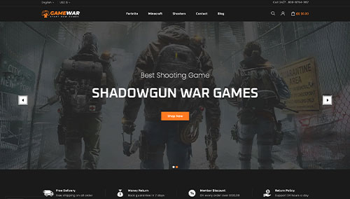
GameWar – Themeforest
$39
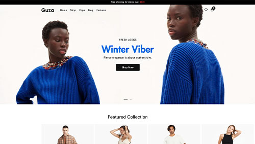
Guza – Themeforest
$39
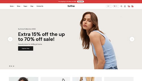
Sofine – Themeforest
$69