Discover some of our favorite ad campaigns that combine stunning visuals with persuasive templates to drive conversions. These examples captivate audiences, encourage action, and offer valuable insights for businesses looking to enhance their Facebook advertising strategy.
1.) accessiBe

Though this version of advertising might not grab your attention for super long, accessiBe knows how to take advantage of a great color scheme. Using lots of white space and strong contrast between text and their background was a great idea. Their simple logo is used multiple times to ensure that customers know where to go if they wish to use this company.
2.) Arby’s
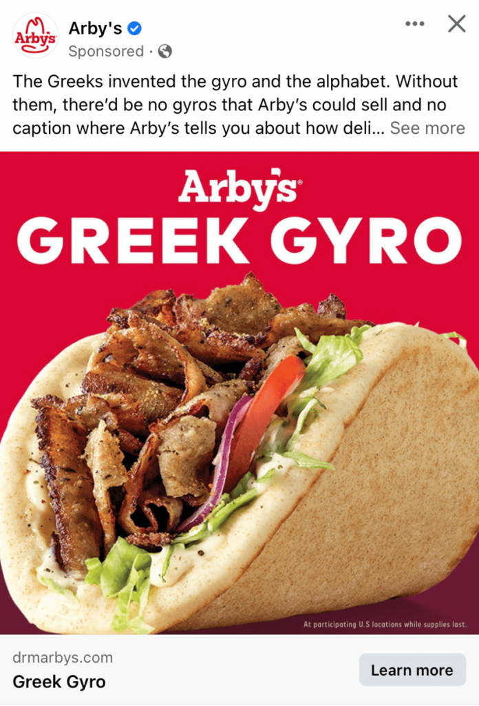
Most everyone is familiar with the popular fast-food chain, Arby’s. But somehow, they as a company have to keep new customers rolling in and old ones coming back. Using a very high quality image to create a mouth-watering ad was amazing and clearly worked. It was also pretty smart to feature their new release because it catches attention to people who go there because they’ve never seen it before. Finally, making great use of their signature red as the background was another brilliant idea.
3.) Ashley Furniture
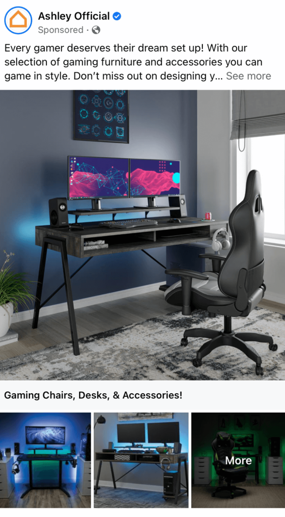
When it comes to purchasing something as large as furniture, most customers like to visualize a space that said furniture could be in. Because of that, Ashley Furniture made great use of full sets for their products. Their interesting lighting setups in their images may also be noticed to create more captivating visuals. We liked how really the only written content was their caption for their post, allowing images to be their main focus.
4.) Aspiration
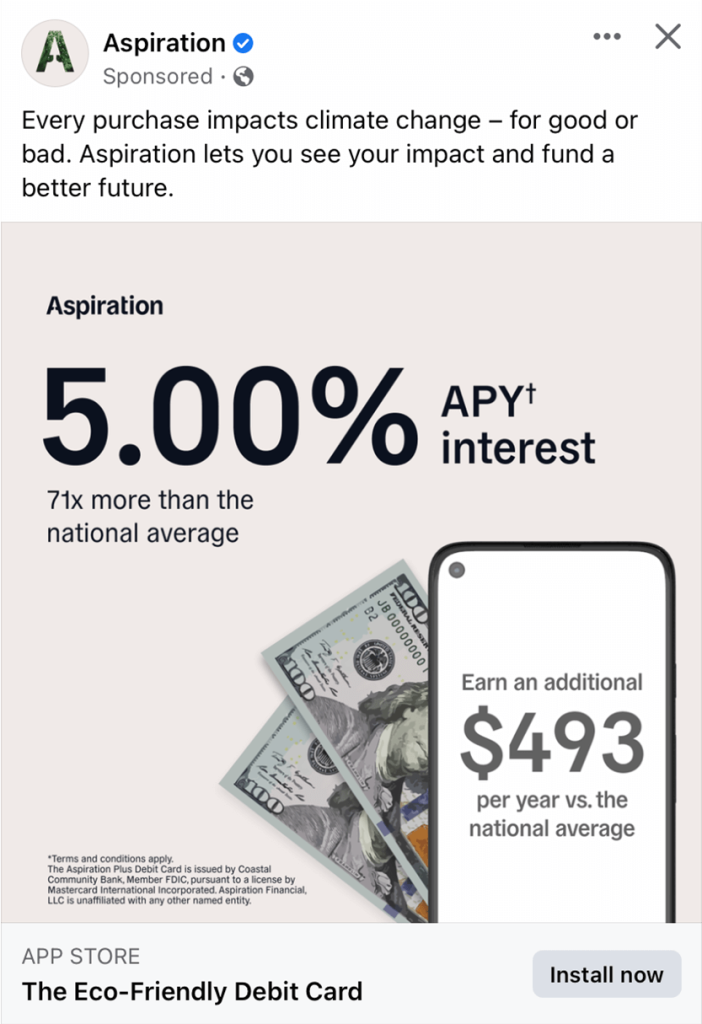
Here we have a simple example with lots of white space, helping their facebook campaign maintain calming. We can see here that they are trying to save money for a specific cause based on the phone and 100 dollar bills. It was also smart to include fine print for their more technical information. Their caption was very short and straightforward which we liked.
5.) Blue Tees
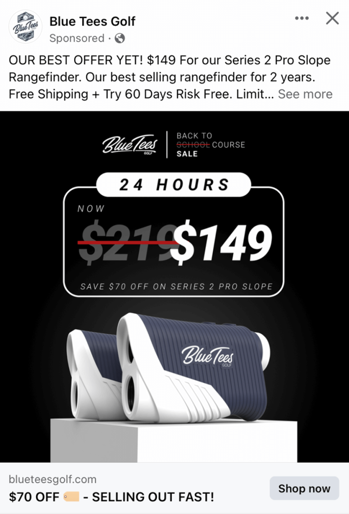
Blue Tees was brilliant to use a large image to display a certain product they sell. It was even smarter to show new prices by slashing out the old price. Their dark background makes this example seem very luxurious. Blue Tees made sure to use all caps for this ad to help information stand out more. We also loved their complex logo design that was used for their profile picture.
6.) Brilliant Earth
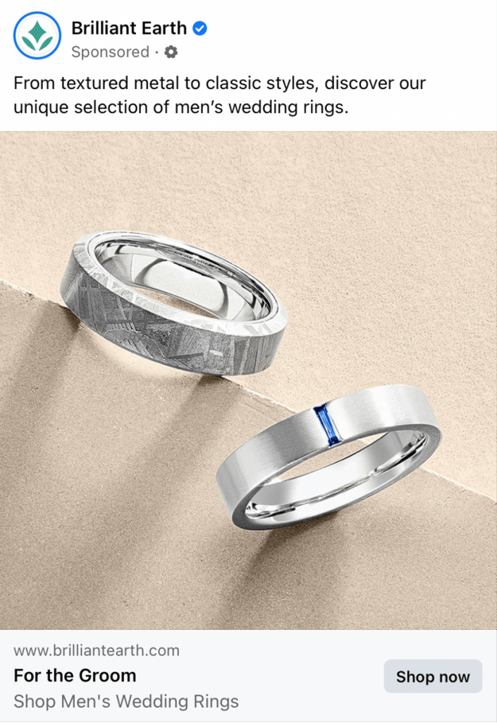
This is another layout of a campaign where their image does all the talking, and it manages to deliver an effective outcome. We liked how they showed off a textured and classic style of rings just like their caption says they sell. Their unique background shows texture to add complexity, but it isn’t distracting.
7.) BroBible
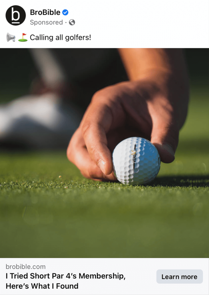
At first we were a bit confused because their company is called BroBible, but we soon realized it is about golf not religion. Their high quality, interestingly focused image helps to clear up that confusion. Though there is very little to this layout, it’s the simplicity that attracts customers. Obviously, there is a link to their site right below their image, which is usual but still smart.
8.) Busch
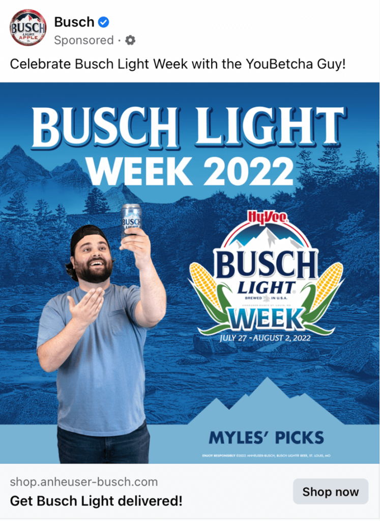
Busch’s Facebook ad campaign is a perfect model because they use graphics that correlate to their product. Their blue color palettes were relaxing and refreshing, just like their beverage. Furthermore, their corny image of a guy holding their product grabs attention. Overall, this was an amazing template that other companies can surely take inspiration from.
9.) Cash Frenzy Cash Casino
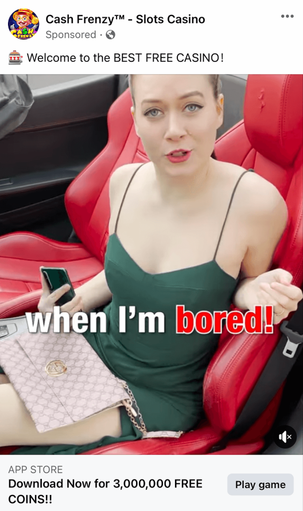
For this business you might notice that they make use of a video and audio which helps them stand out as people scroll through their Facebook feed. It was thoughtful to offer free coins if you download their app. Even though this format of advertising is a bit cheesy, it is sure to grab attention. Another smart feature was to make sure that customers understand that their game is free to play.
10.) Char-Broil
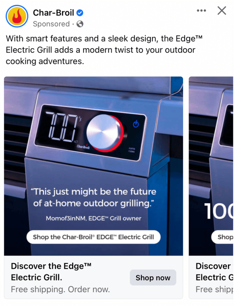
This company does a great job making sure that their customers know that they are very modern. Showing their digital screens on their products along with stainless steel covers was a great way to showcase that. Adding in buttons to get people to information they wish to see was brilliant.
11.) Chewy
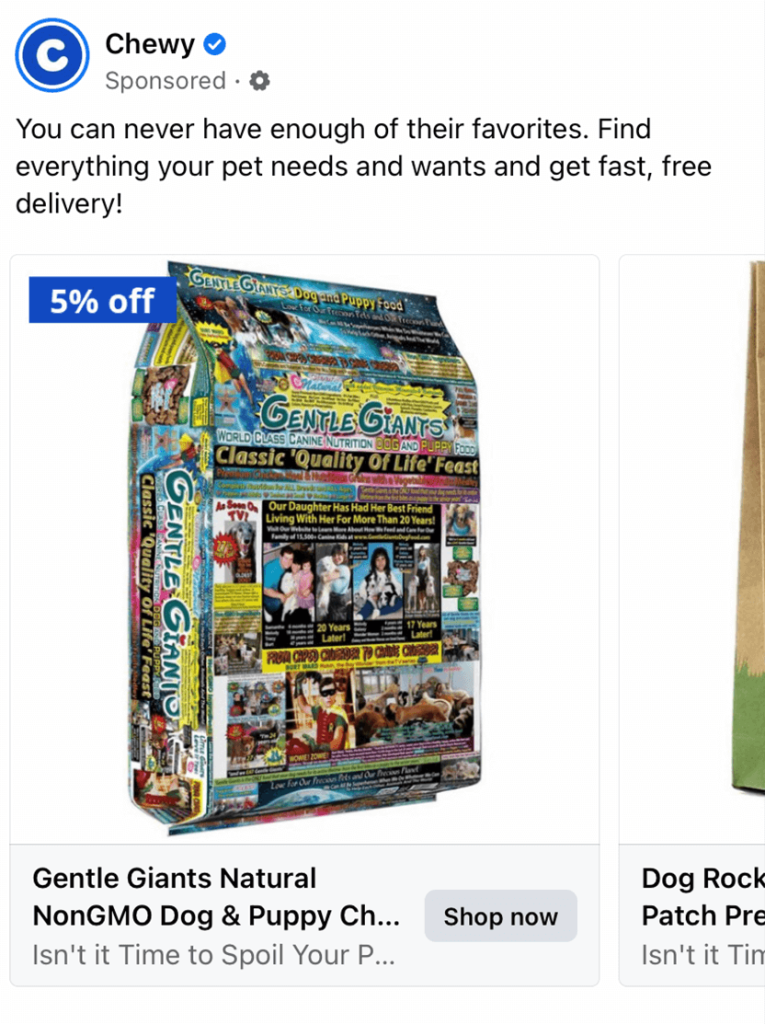
Showcasing a lower price on dog food was an amazing way to hook viewers. Dog food is a necessity for any pet owner and if they can get a small deal, they will usually take it. Soon enough, they’ll be looking at puppy presents for an upcoming pup-birthday or other occasions. Image backgrounds have been kept simple to minimize clutter and make them look coherent with common Facebook feed.
12.) Erbert & Gerbert’s
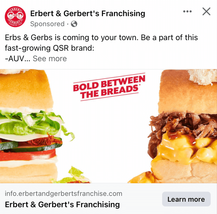
Everything about this layout is engaging but their images stand apart from their other features. The reflection against some of the elements of these sandwiches really elevated their tasty looks. Their use of white space to help bring light to their phrase “Bold Between the Breads”. Sometimes, simple is better.
13.) Fortnite
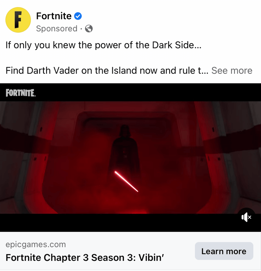
Fortnite made sure to release lots of social media posts to get their new and upcoming games out for their players. Here we have a very captivating video that harnesses the dark mysterious feel of Star Wars’ famous Darth Vader. This will get many fans of Star Wars excited for the upcoming release.
14.) Fox Cities RetroFoam
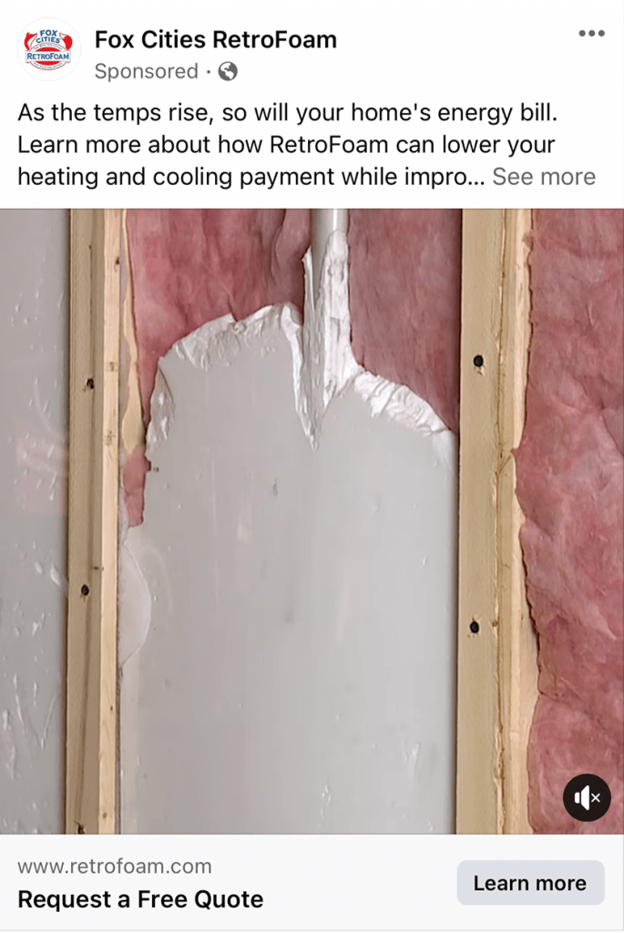
Though Fox Cities RetroFoam isn’t the most exciting example, it is very straightforward. People who are their target market will easily be intrigued if this is something they need done to their home. We liked how their caption correlates to the face of saving money on energy by paying for their service. Overall, this was a great one to look at for inspiration.
15.) Full Sail University
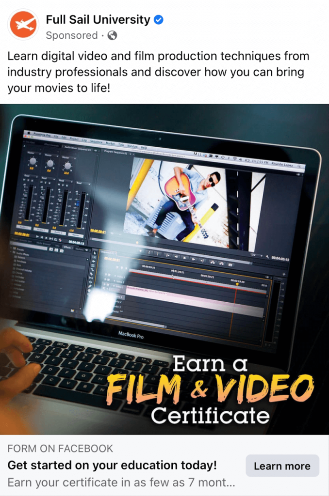
This company really grabs attention with their bright yellow and orange writing used for their words that contrast nicely against their mainly black background. It was clear that they offer a service to help people expand skills related to video production. It was even better that there was no distractions on the ad, so everything felt simple, clean and uncluttered.
16.) GolfPass
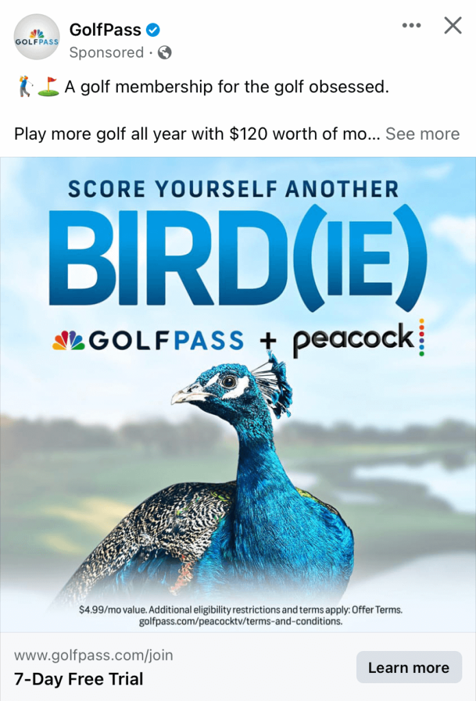
Here we have a thought provoking and creative message. Though this attracts golfers because of their golf membership, they also include a Peacock subscription. It was a great way to play on words by using Bird(ie) for golf purposes and Peacock’s logo. Another striking feature about this was their use of a superb color palette.
17.) hims
Hims does a great job with a minimalistic and modern template that will appeal to their young male target audience. Accents of pastel yellow were not what is expected so in generates more attention online. We thought it was perfect because even just this short advertisement matches their websites feel, making returning customers recognize their ads faster.
18.) Mantra
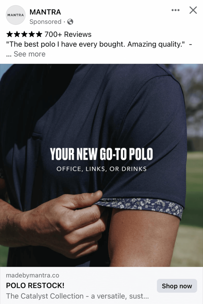
Right away, people will notice that this is a brand that screams quality. Their bold, uppercase lettering creates a sense of stability and modernism. Additionally, we liked how they included a star rated review right in their caption. A simple image of one t-shirt has been used to convey the quality and comfort to potential customers.
19.) Marvel Studios
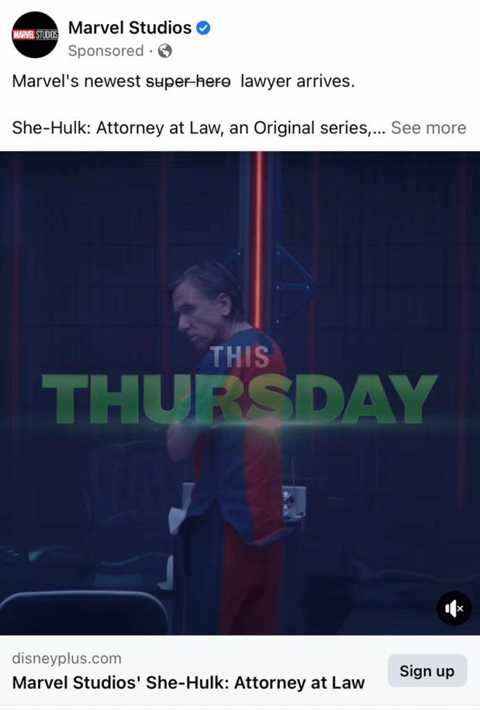
Marvel is another company that dominates the advertising playing field. Here they simply just posted a segment or trailer video of their upcoming show. But what really grabbed our attention was their use of the strikeout feature in their text. While she is a superhero, she hides her identity by being a lawyer. Including a call to action button to sign up for Disney+ was also common, but helpful.
20.) MC Walk-in Showers
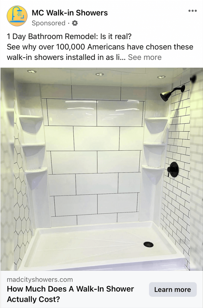
Here’s another option where their advertisement shows you what you will be getting. We love that different tiling patterns are displayed so that people can see their options. They also picked a shower to display that is very spacious and has large shelves which is something lots of people find intriguing. Having detailed text is quite helpful for potential customers to know the relevancy of their product and business.
21.) Meta
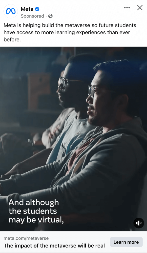
Because Meta is a large company, they certainly don’t disappoint. This captivating cover image for their video really plays with light and facial expressions. Because of their facial expressions we can guess that they are looking at something big and shocking. Their phrases are built to seem very inspirational.
22.) Miller Lite
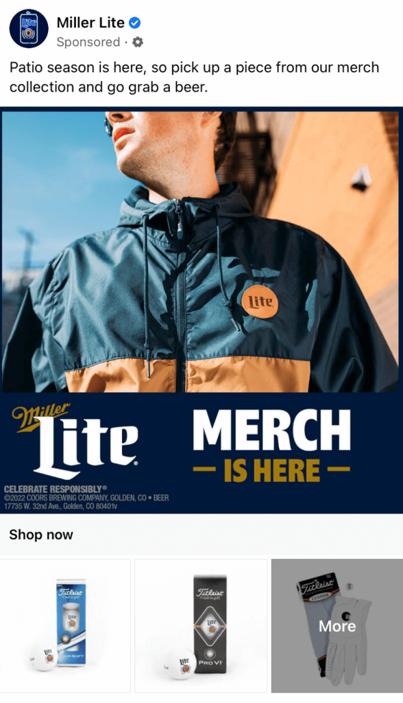
Are you looking for a way to display your company merchandise while still remaining clean and professional? If you take this company as an example you can see that they are able to include multiple images of different sizes while still looking cohesive. We liked how they made sure to use their brand colors to decorate this design. We also like how their web link is placed in between their two sizes of images.
23.) Nitro Circus
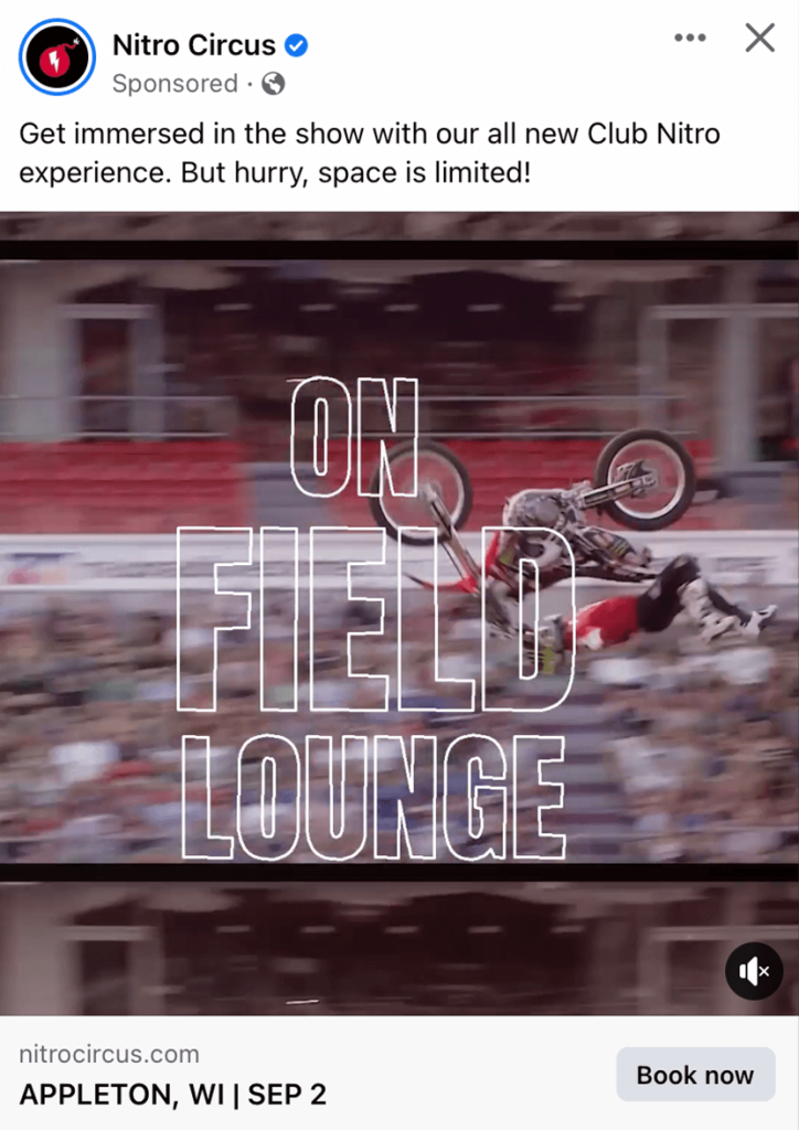
Here’s a company that makes a stunning video that captures viewers. We liked how their primary text has been used to create a sense of rush to match their feel of an adrenalin rush provided by their video. It was also very helpful to include the location and date so customers already know if they can attend before clicking the link.
24.) Novo Insurance
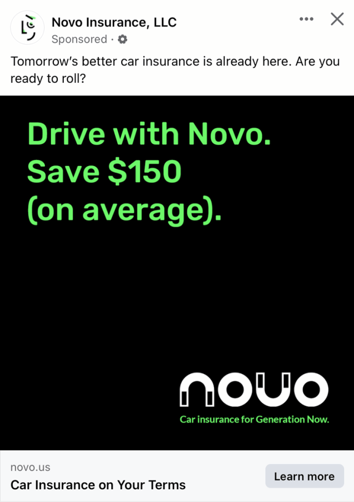
Financial companies often try to play it safe with their ads to maintain a professional image. But they must still be a bit creative or nobody would look at them. This company plays around with strong contrasts because of their black background paired with their white and neon green fonts. Plus, placing the logo on the opposite corner of their short text makes an impact.
25.) OGIO
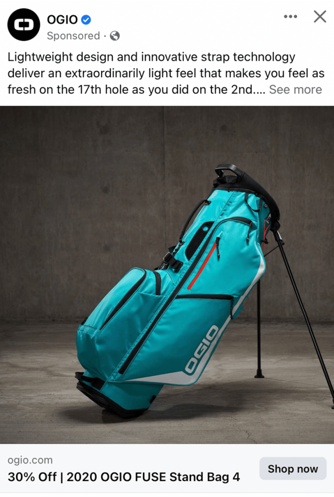
OGIO solely uses one image to highlight its unique turquoise blue golf bags, which looks more noticeable due to this dull background. Their caption also showcases some of the benefits of this item. Customers will notice that there are lots of pockets in this golf bag which will keep them interested.
26.) Pick ‘n Save
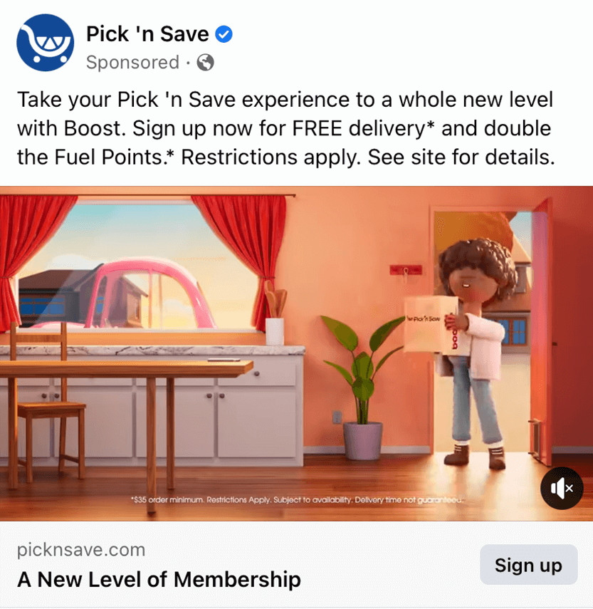
This company stands out because of their creative and memorable animated people. These are used in many of their commercials and print ads which helps create unity. What makes this Facebook ad impressive as that the brand has moved away from using plain, boring graphics, or images. Additionally, a bright color palette is quite welcoming, so most users who come across this ad will stop scrolling and check out the whole thing.
27.) PXG
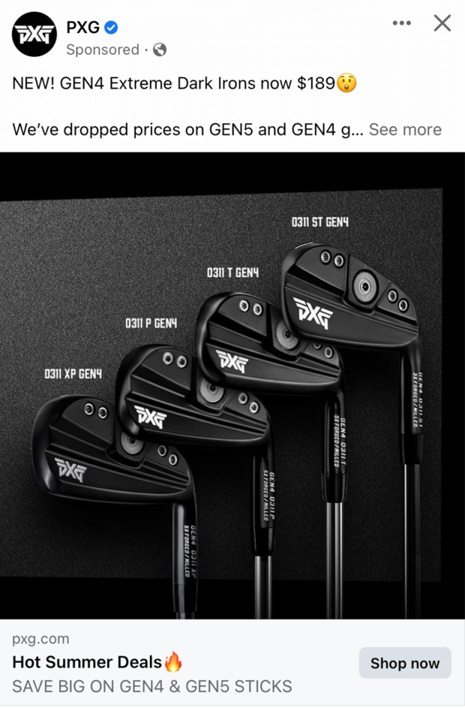
PXG is yet another golf-based brand that knows how to effectively use color. Making their backgrounds and products black creates a luxurious feeling with a touch of mystery. Labeling each product properly was something else that we really liked. The brand also mentions “hot summer deals” in the image headline, which is always smart to get more people to check out the displayed products.
28.) Rare Carat
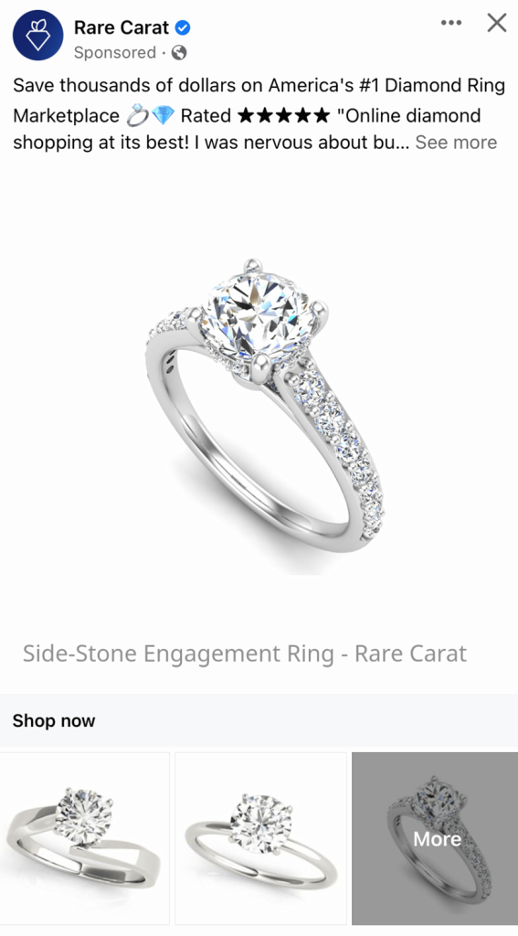
Right away we noticed this brands cute and creative logo that seems to be a diamond turned into a carrot. They clearly show their products, which is something that should always be done. This ad is a prime example of a straight-to-the-point design. It was helpful to include a “more” image that allows customers to see additional designs that don’t find on this small template.
29.) Rolling Meadows Golf Course
This ad catches attention of lots of people due to their interesting caption. It is not only engaging, but it is unique to golf companies. We thought it was smart to use an image of a sunset rather than a picture of the brightly colored putting greens because it adds another dimension of beauty. Another thing that stands out is how they mention prices and dates with each photo so that customers can click on packages suitable to their schedule and price range.
30.) Russel Brunson
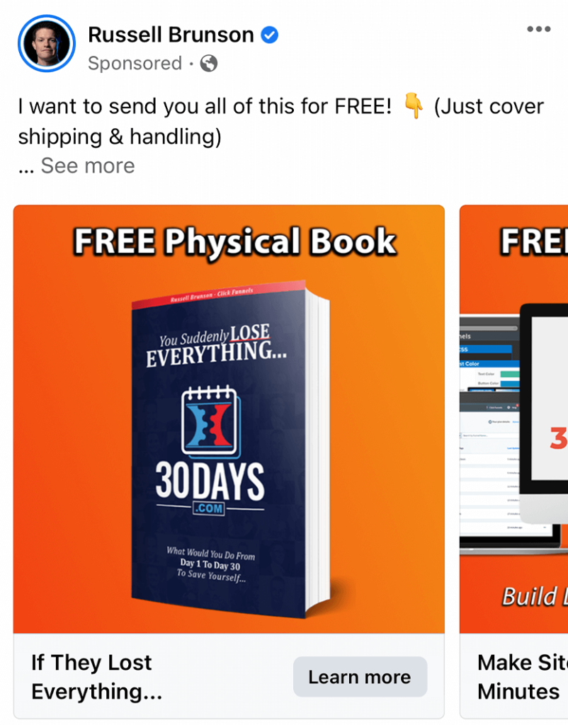
Here we have a carousel-style Facebook ad from Russel Brunson that presents a perfect amount of information. We thought their bright orange background will definitely catch viewers eyes as they are scrolling through Facebook. Offering a “free” physical book was a great marketing technique because it gets people interested in their products.
31.) Short Par 4
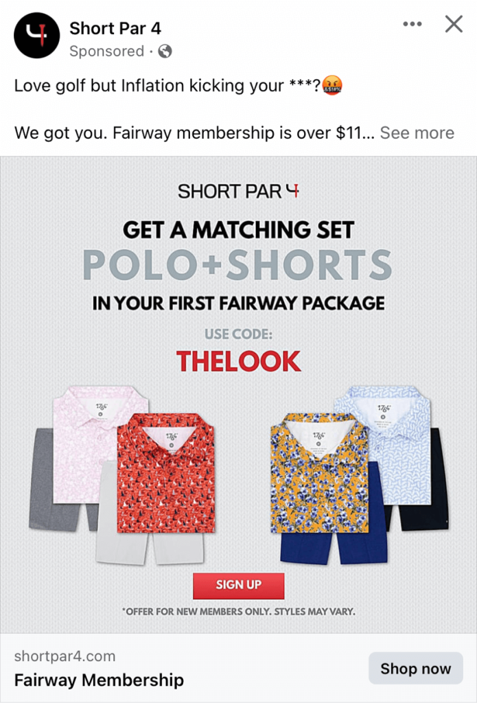
First off, this company connected with its target market by raising awareness toward expensive golfing clothing. They soon explain that their company is a solution for inexpensive golfing apparel. Short Par 4 does an excellent job making the most of a simple image-based Facebook ad format. Using a variety of different colors to their text was an easy but stunning choice. We particularly liked how they used red for a coupon code to help it stand out more.
32.) ShutEye Sleep Tracker
Ads don’t need to be boring, as proven by Shut Eye Sleep Tracker. We thought it was fun to add in memojis to show different things you did while you slept. We thought it was cool that they created an example of what information you’ll gain if you use their product. Their creative animations also made this ad even better. On another note, the placement of text in this example is worth mentioning as it doesn’t clash with their primary message.
33.) The North Face
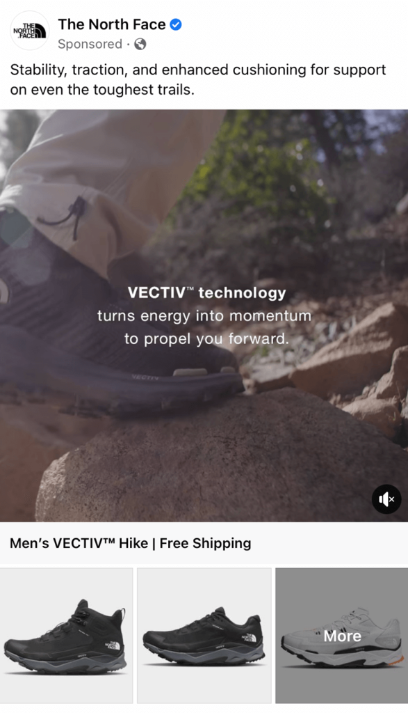
The North Face has always had a innovative way of showcasing products by portraying their abilities. Their video does exactly that but is also aesthetically pleasing. Rather than using extremely bold lettering, this video includes well-balanced text chunks highlighting lots of new of features. We can also notice from their images their interesting shape for their shoes.
34.) Underdog Fantasy
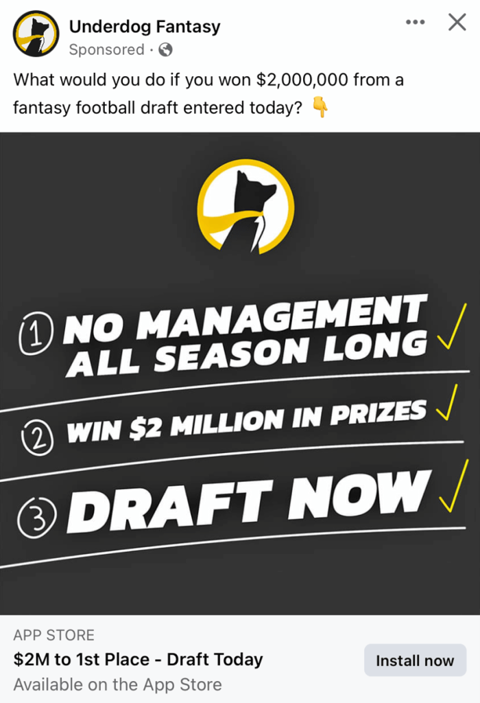
Even though we were a bit confused with this this company because of their logo, their logo attracted us to learn more about them. Their bold fonts giving information will clear up any confusion that you have. Having a bright yellow accent and their handwritten graphics were creative and stunning. Additionally, mentioning prizes are worth “$2 million” allows for a strong CTA that will bring positive responses.
35.) VALORANT
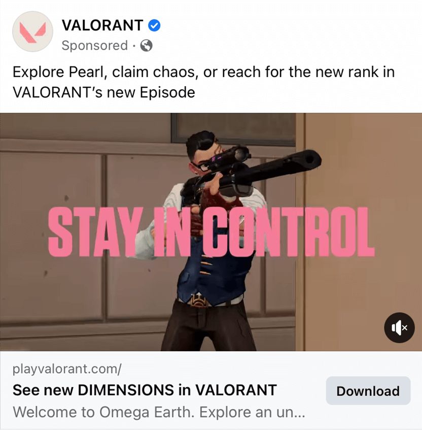
Here we have a video game ad that makes great use of animated videos just as their game appears. Their brightly colored fonts up to contrast with their more muted colored animations. We thought it was helpful to use capitol letters for certain words in their ad to help in stand out. Another great example to gain inspiration from.
36.) Virgin Voyages
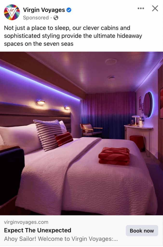
Love, love, love! This company did an amazing job with their imagery and playing with interesting lightings. When it comes to booking accommodations, many customers prefer to look for options with a proper ambiance, and this is a perfect example. Including a neatly done bed and folded towels also conveys a message of cleanliness, which increases trust in their company for potential customers.
37.) VistaPrint
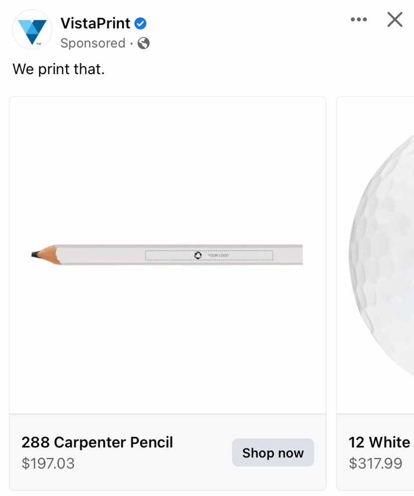
Here we have a perfected white color scheme that allows for a clean, professional feel. Prices are placed right underneath their product images. VistaPrint made sure to take advantage of a carousel ad format, including images, titles, prices and links. We also really enjoyed their white space that is used well to take a minimalistic approach.
38.) Webull
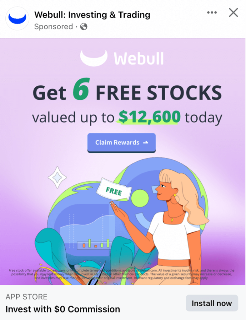
WeBull adds a unique touch to this example by using graphic illustrations instead of basic stock images. Lots of bright and fun colors have been used to become more approachable for a younger audience. This ad has been linked to the App Store which was smart because it lets interested users to download their app promptly.
39.) Yatta Golf
We liked this ad Yatta Golf that takes advantage of unique imagery to attract customers. Their extreme black and white color scheme with brightly colored accents was a great choice. Also, having a continuous line through all of their images to create unity was a great idea.
Facebook ads help you to reach your specific customers based on demographics, interests, and behaviors. It’s effective for brand awareness, lead generation, and driving conversions.
Facebook offers many pre-designed formats that include images, videos, carousel templates, slideshows, and more. Each format serves a purpose for a variety of different goals that will engage audiences in unique ways.
Facebook Pixel is a code snippet you can add into your website to track user interactions and gather data. All of this will help you to measure ad effectiveness, track conversions, and retarget your users.
A/B testing involves running multiple versions of your ad to multiple segments of your audience to see which performs better. This will help you find the best ad for your customers.
Yes, these types of ads are built to effectively promote events, webinars, or product launches. This is only one of the positives of Facebook ads.
To optimize your ads for mobile users, make sure to have captivating visuals, concise copy, and easy-to-click buttons.