Hello, painting professionals! Looking to enhance your online presence and attract more customers? Our guide to the top 49 painting websites is here to help.
Our team of digital marketers has meticulously evaluated the best painting sites, taking into account factors such as design, functionality, uniqueness, and user experience. From visually appealing designs to seamless navigation, these sites embody excellence in the painting world.
Not only will you find inspiration for your own website, but also gain valuable tips on how to make your online presence stand out from the competition.
Elevate your painting business with the help of this guide, and create an online presence that showcases the beauty and uniqueness of your painting services! You’ll find website examples of home & commercial painters, interior designers, speciality painters, and paint supply companies in this list! For examples within other industries, head back to our award-winning website designs article!
Top Painter Website Designs
1. Emerald Pro Painting
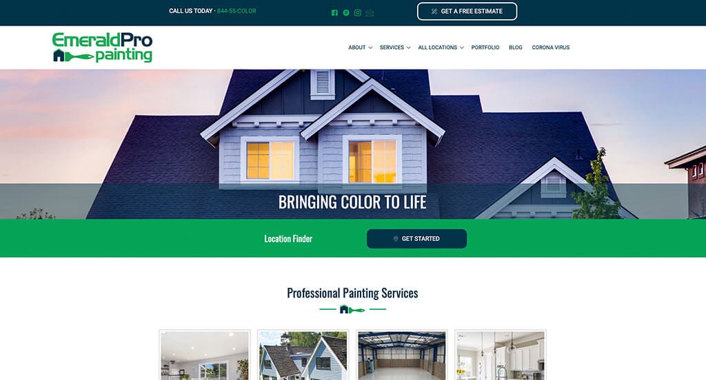
This is a good example of a painting website design to see when looking for inspiration for a professional looking website. The blue, green, white and black color scheme was definitely the most impactful feature in the homepage of Emerald Pro Painting. The interesting logo design that was repeated throughout the site was definitely refreshing for a professional website. The customer review section helped make this one of the best painting websites we reviewed. Give some thought to the great design of this painting website when building out your next website.
2. Beach Painting Contractors
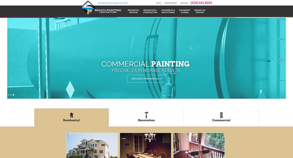
This is a great painting web design example for someone who is looking to develop a professional website. The most attention grabbing aspect in this painting website was definitely their use of buttons to enhance usability. The ability to look at painting ideas for different types of buildings was refreshing for a unique website. They had website usability in mind when building the simple contact information for their website. Talk about a great website to have included in this list of top websites!
3. Five Star Painting
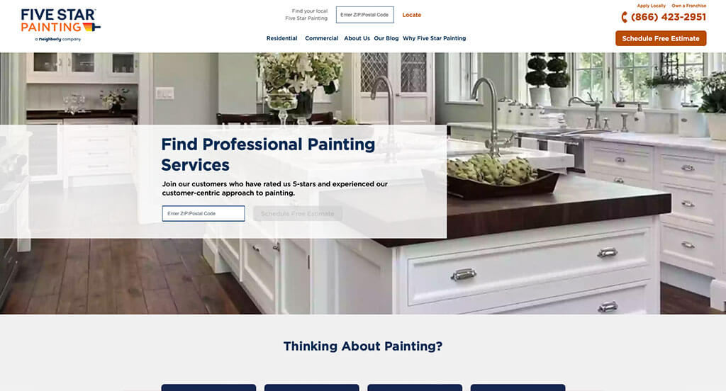
This is a great website example for painters to check out when looking for custom web design ideas. The template with a good balance of white space was likely the most impactful feature in the homepage of Five Star Painting. Another thoughtful quality we noticed in this creative painting site was the bulleted information. Five Star Painting had internet marketing in mind when designing the domain for their website that matches their company’s name. Be sure to consider the creative design of this painting website when developing your next custom website.
4. Paint Denver
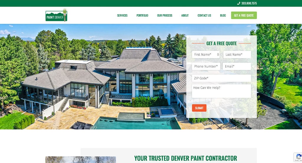
This is a good example of a website design for painters looking for a professional layout for their next site. The layout of this painting website was thoughtful because of their logically organized information. The simple sign-up for a free quote helped this website make it into our list of the best template ideas for painters. They clearly had a focus on ease of use when creating the clearly labeled menu for their website. For painters looking for examples for their next website layout, this example will for sure be one to consider.
5. Hedlund Painting
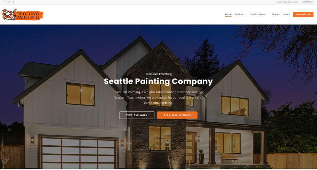
This is a good example of a website design for painters to take a look at when searching for a professional website design idea. The accent of orange used in their logo and their pages was probably the most impactful quality of the homepage of this website. Another thoughtful quality we liked in this creative painting site was the professional text. Hedlund Painting clearly had a focus on internet marketing when creating the display of awards their company has won. With so many good reasons to consider this painting website, it’s no wonder we included it in this list of the best websites!
6. Fresh Coat Painters
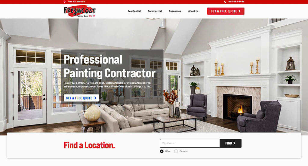
The black, white, red and blue color palette used in this custom painting website stood out to us because it creates an alluring template. The use of buttons to enhance usability was probably the most impactful feature in the homepage of Fresh Coat Painters. The short and to the point paragraphs were refreshing for a custom painting site. Fresh Coat Painters had internet marketing in mind when creating the use of different icons throughout their website. Don’t forget to check this website out while looking through our list of the best painting sites!
7. Edina Painting Co.
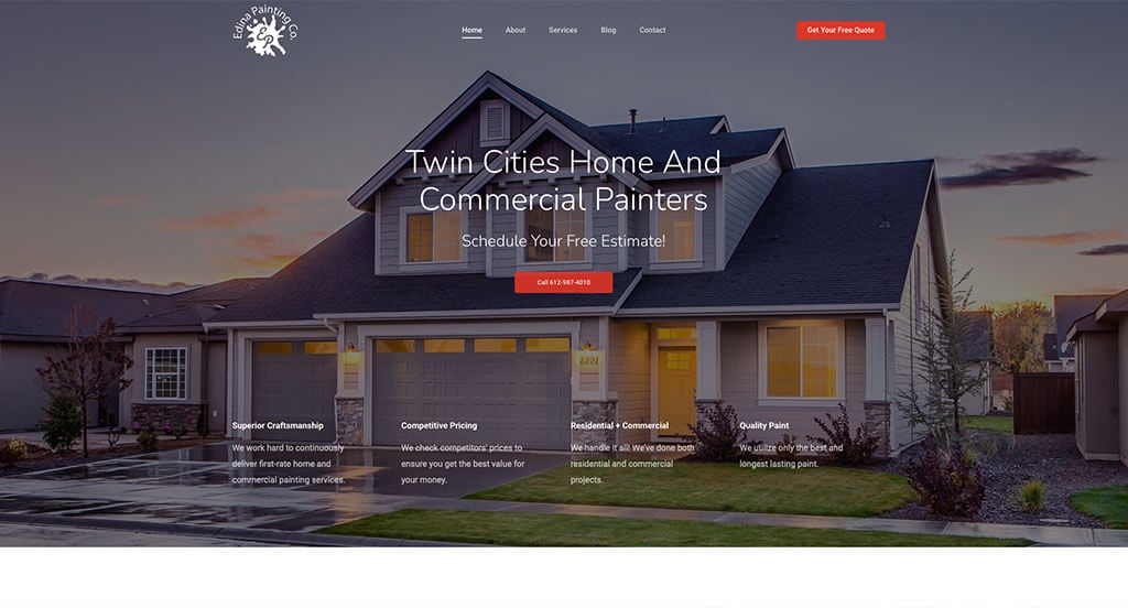
This is a great website example for painters to check out when looking for a custom web design. After scrolling past the navigation of this painting site, you’ll notice the creative layout for their images. Another thoughtful quality in this professional painting website was the different sized fonts to create a statement. Edina Painting Co. clearly had ease of use in mind when creating the fun logo design for their website. Don’t scroll past this website when hunting for design ideas for your next painting website!
8. Enviro Painting
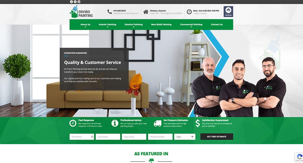
We appreciated how this painting site used the colors of black, white, green and blue to create an attractive website design. The use of different icons to ease navigation was likely the most impactful quality in the homepage of Enviro Painting. Another thoughtful quality in this professional painting website was their unique before and after sliders for previous homes. They clearly had a focus on website marketing when creating the navigation bar with organized categories for their website. There was no shortage of reasons to include this website in our list of websites for painters to consider when developing their next website.
9. Arizona Painting Company
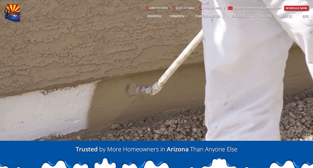
This is a good example of a website design for painters to check out when looking for a professional website design. One of the homepage features in Arizona Painting Company we noticed was the subtle animations because that isn’t something you find on most painting websites. The unique textures displayed throughout their site was another thoughtful feature in this professional painting website we enjoyed. Arizona Painting Company clearly had digital marketing in mind when creating the simple contact information for their website. Give some thought to the creative design of this painting website when developing your next custom website.
10. Frank Nolte Painting
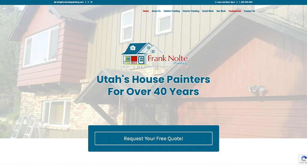
The white, blue and red color palette seen in this custom painting website stood out to us because it catches the eyes of customers. Our web designers thought this was a good example of a homepage layout for painters because of their layout that was easy to navigate. Another thoughtful feature in this creative painting site was the bulleted information. From a marketing perspective, for a painting website we really liked the way they utilized a well-labeled navigation bar. What a great website to review when building out your next website!
11. Precision Painting Plus

This is a good website example of a template design for painters who are looking for a custom look and feel for their next site. The variation of colors seen throughout their site was definitely the most impactful quality in the homepage of Precision Painting Plus. The slanted color blocks create a unique feel that was refreshing for a professional site. They clearly had a focus on website marketing when designing the domain for their website that matches their company name. For painters looking for examples for their next website layout, this example will for sure be one to take a look at.
12. Fillo Painting
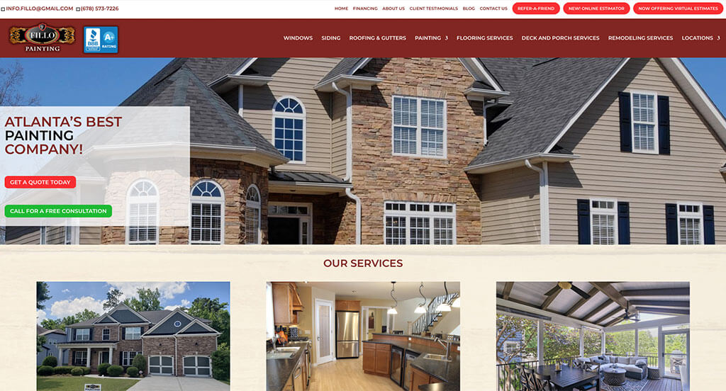
Fillo Painting has a great painting website that uses red, tan, white, black and gray for a color scheme. The interesting logo design was definitely the most impactful quality in the homepage of Fillo Painting. Another feature in this creative painting website we liked was their use of imagery for backgrounds. They clearly had website marketing in mind when designing the buttons to enhance usability throughout their website. With so many quality reasons to consider this painting website, it’s no wonder we included it in this list of the best sites!
13. New Life Painting
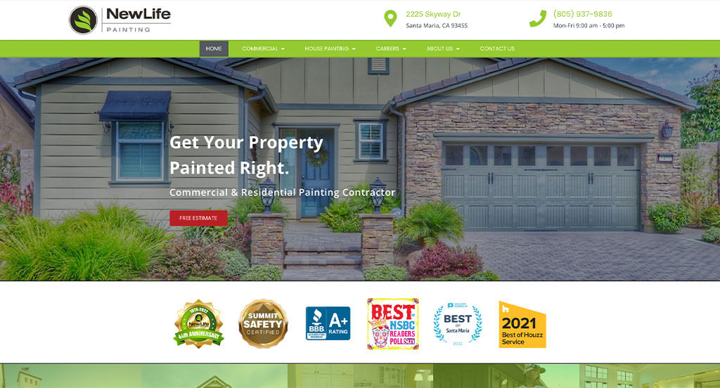
This is a good example of a painting website design that can give inspiration to other companies for their professional website. The beautiful green accent was likely the most impactful feature in the homepage of this website. The contact information and location that was easy to find helped this website make it into our list of the best designs for painters. New Life Painting clearly had a focus on digital marketing when building the optimized content for their website. If you are looking for template options for your next painting site, give some thought to this one.
14. All Bright Painting
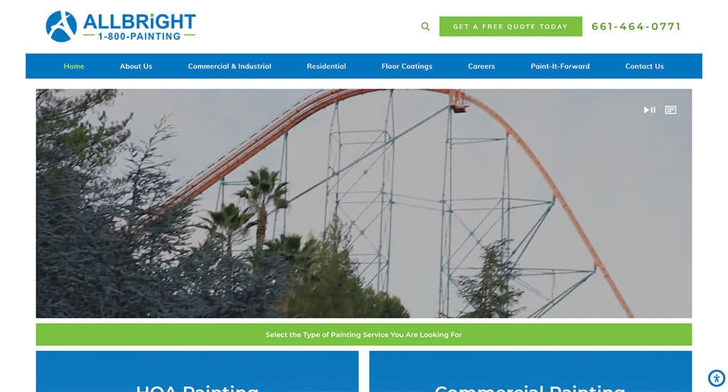
This is a good example of a website for a painting company that is looking for a custom look and feel for their next site. Our web designers thought this website was a good example for painters because of their clearly labeled menu. Another feature in this creative painting site we enjoyed was their use of large buttons for simple navigation. They clearly had website marketing in mind when designing the feeling of unity throughout all their pages. Be sure to consider the creative design of this painting website when building your next website.
15. Phinney Ridge Painting
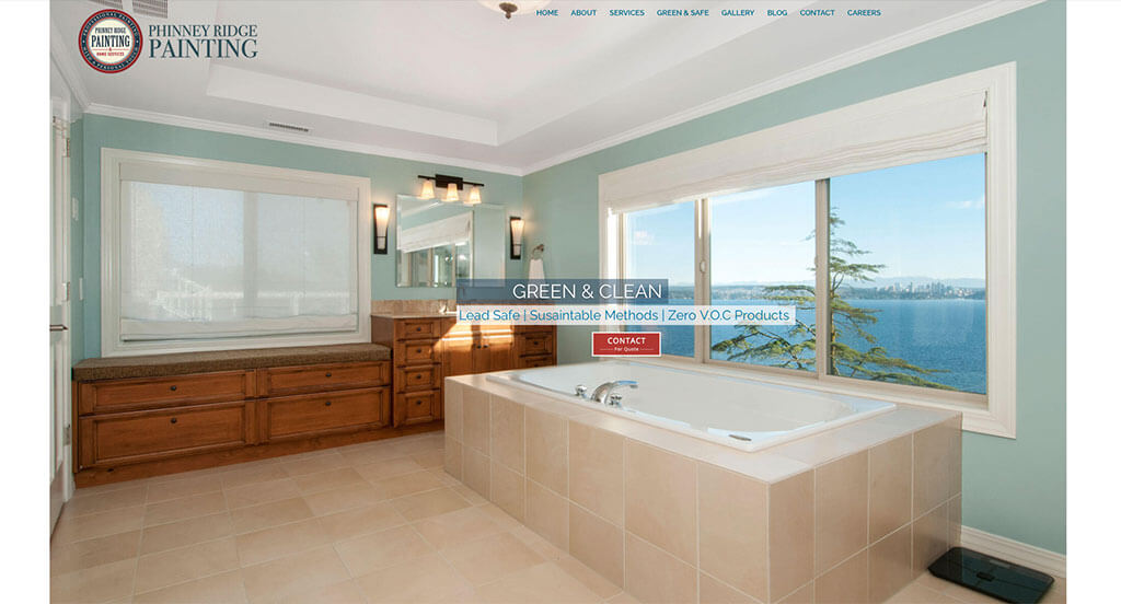
This is a great web design example for painters to see when looking for a professional layout for their next site. The different size fonts to help important information stand out was definitely the most impactful feature in the homepage of this website. The use of icons was refreshing for a unique painting site. Phinney Ridge Painting had website markketing in mind when building the high-quality images for their website. There was no shortage of reasons to include this website in our list of websites for painters to consider when building out their next website.
Related: Painting contractors often look to local search engine optimization to improve website traffic and generate leads.
16. Andrew Picone Painting and Paperhanging
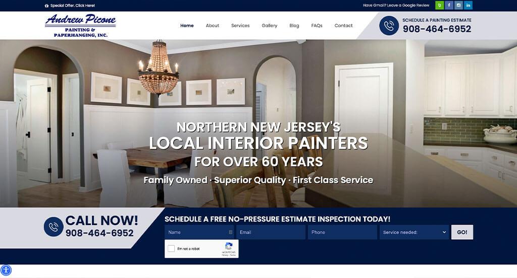
This is a good example of a web design for painters to check out when looking for a custom layout for their website. As you scroll through the homepage, one of the qualities you’ll notice right away is the template with a good balance of white space. Another thoughtful feature in this creative painting site we noticed was their customer review section. Andrew Picone Painting and Paperhanging clearly had a focus on conversions when creating the professional text for their website. Talk about a great website to have included in this list!
17. Ace Painting
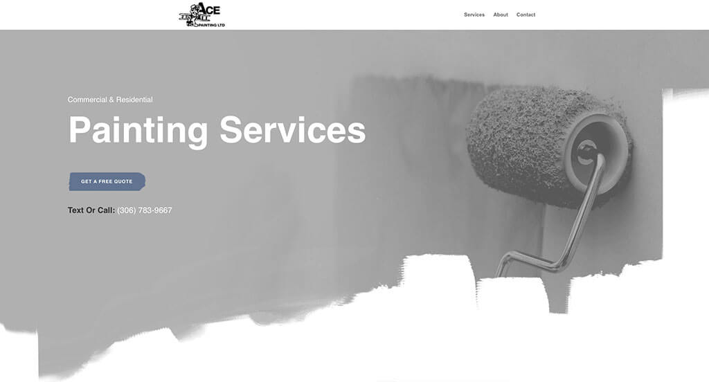
This is a good example of a website design for painters looking for a professional website layout idea. The look and feel of the homepage of this painting website caught our attention because of the creative edging for their visuals. Another thoughtful quality in this professional painting site was how they built a template that feels authentic to their website. They clearly had a focus on website accessibility when creating the domain for their website that matches their company’s name. Give some thought to the unique design of this painting website when developing your next custom website.
18. Walls Painting
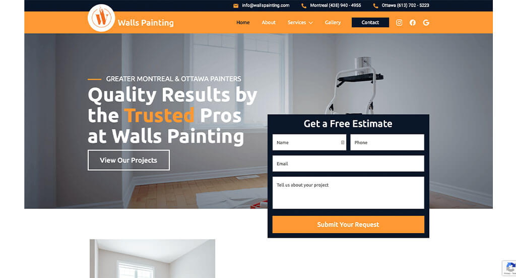
We chose Walls Painting because of its nicely organized painting website that uses a black, white and orange color scheme, which we like because it seems simple but adds an energetic feel to the pages. After scrolling past the header of this painting site, you’ll notice their thought provoking logo design. Their professional text was refreshing for a unique site. They clearly had website usability in mind when creating the photo library for their recent work within their website. Any website designer building websites for painters will want to consider checking this website out.
19. Ashford Painting
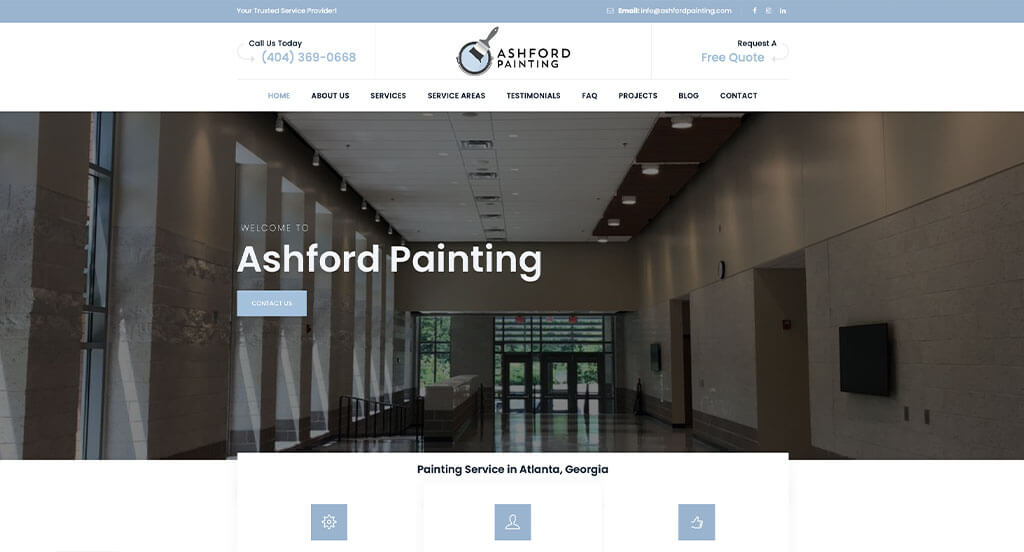
This is a good example of a website design for painters to see when looking for a professional look and feel. The clean template with a stunning accent color was definitely the most impactful quality of the homepage. The addition of an informational blog was another feature in this custom painting site we enjoyed. They clearly had website usability in mind when creating the well-labeled navigation bar for their website. Don’t skip past this website when hunting for design ideas for your next painting website!
20. Painter Bros
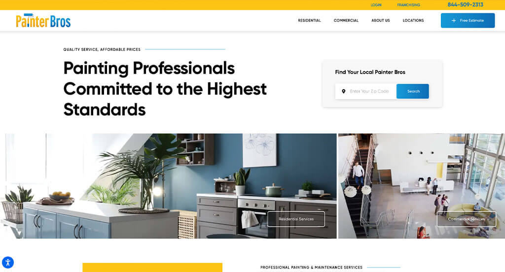
This is a great painting company web design example for someone looking for a professional layout. The use of fun icons was probably the most impactful quality in the homepage of Painter Bros. The creative framing for their imagery was another feature in this professional painting website we enjoyed. They clearly had digital marketing in mind when designing the simple navigation for their website. Be sure to consider the one-of-a-kind design of this painting website when developing your next custom website.
21. Colossus Painting
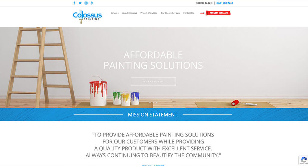
This is a creative website design example for a painting company to check out when looking to build their next website. After scrolling past the navigation of this painting site, you’ll notice the high-quality visuals. The unique project showcase page was absolutely a consideration when ranking Colossus Painting in this list of the most professional painting websites. Colossus clearly had a focus on ease of use when creating the clearly labeled menu for their website. With so many great reasons to consider this painting website, it’s obvious why we included it in this list of the best websites!
22. Elkins Painting & Wallpapering
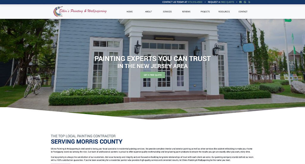
This is a creative website design example for a painting company to see when looking to build their next professional website. After scrolling past the navigation of this painting site, you’ll notice their creative logo design. The professional font was another design quality in this professional painting site we enjoyed. From a marketing viewpoint, we liked the way this painting website utilized a variation of colors that look great together. For painters looking for ideas on their next website, this example will definitely be one to take a look at.
23. Atlanta Painting Company
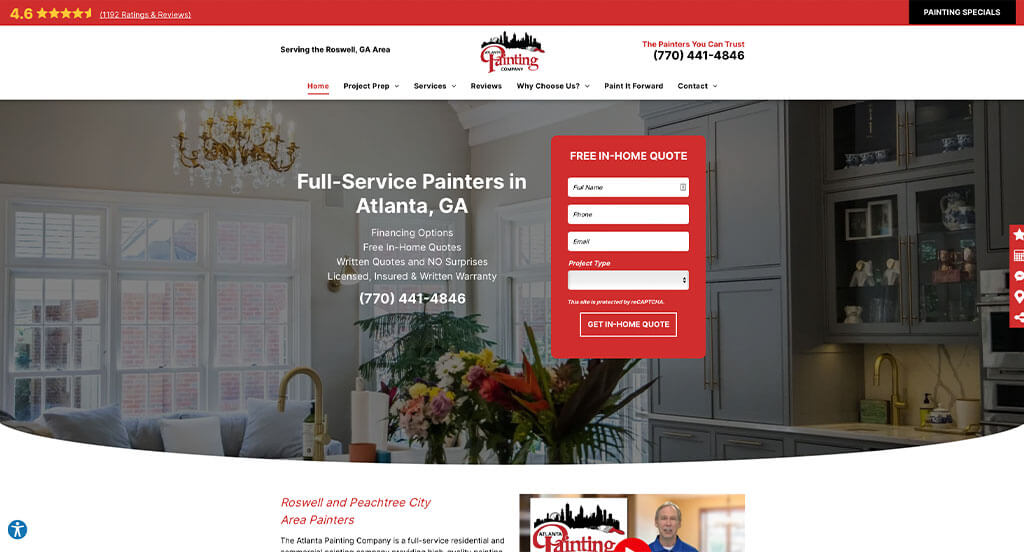
For a painting website, they did a great job utilizing the red, white, black and gray colors throughout their site. The simplistic design was likely the most impactful feature of the homepage of this website. Another design quality in this creative painting website we enjoyed was the navigation bar with more precise categories. They clearly had a focus on website marketing when creating the easy to find contact information. What a great website to review when designing your next painting website!
24. Sisu Painting
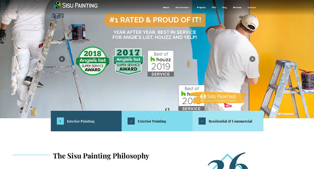
This is a good example of a painting website design for someone who is looking for a professional layout. After scrolling past the header of this painting site, you’ll notice the geometric accent graphics. The monochromatic blue colors were refreshing for a unique website. They clearly had a focus on digital marketing when creating the Frequently Asked Questions page for their website. If you are looking for template options for your next painting site, give some thought to this one.
25. Paragon Painting
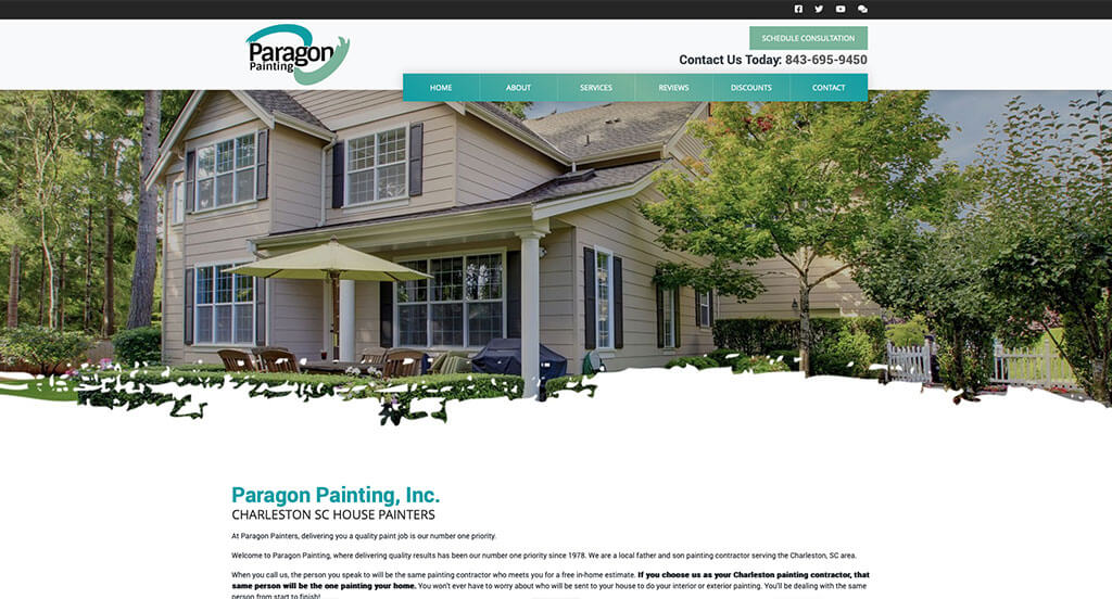
The greens, blues, black and white colors used in this custom painting website stood out to us because it creates a relaxing design. After scrolling past the header of this painting website, you’ll immediately notice their creative logo design. Another thoughtful quality seen in this clean painting website was their use of buttons to enhance usability. They clearly had digital marketing in mind when creating the clearly labeled menu for their website. These were just a few of the numerous qualities in this website we had to consider while we were putting together this list of top websites for painters.
26. Custom Coatings Inc.
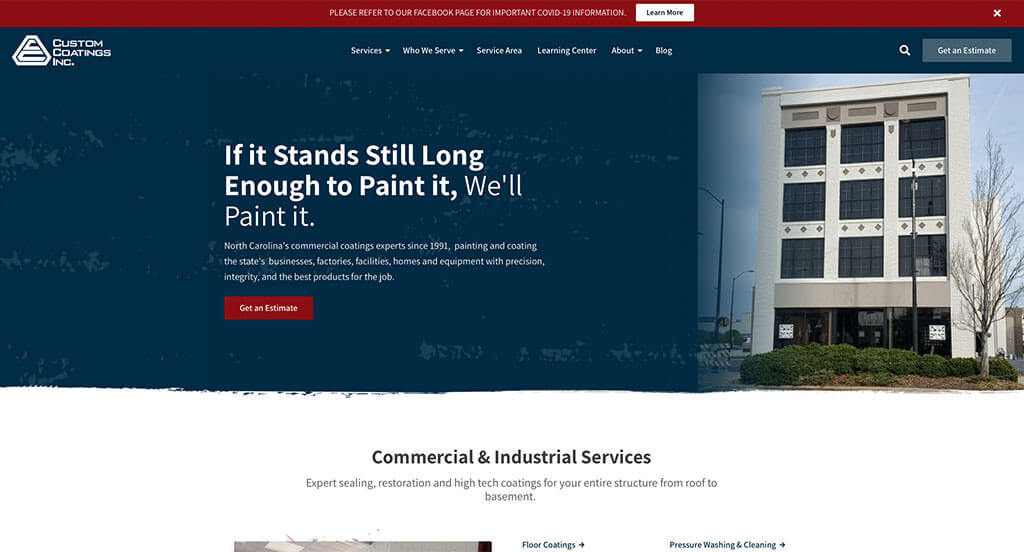
This is a great web design example for painters who are looking for a professional layout for their next site. After scrolling past the navigation of this painting site, you’ll notice their sliders showing before and after pictures. The use of bullet points to make information more organized was definitely refreshing for a unique site. From a marketing perspective, we liked the way this painting website utilized a large button for an estimate button. Don’t scroll past this website when considering design ideas for your next painting website!
27. DJ’s Painting & Remodeling Inc.
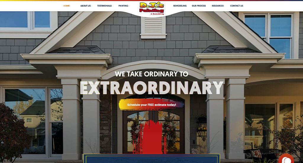
We chose DJ’s Painting & Remodeling Inc. because of its nicely organized painting website that uses a blue, red, orange, yellow and white color scheme, which we like because it catches the eyes of customers. After scrolling past the navigation of this painting website, you’ll immediately notice their logically organized information. This custom painting website also does a good job with their easily accessed contact page. DJ’s Painting & Remodeling Inc. had website marketing in mind when building the customer review section for their website. Give some thought to the great design of this painting website when developing your next custom website.
28. London Painting Group
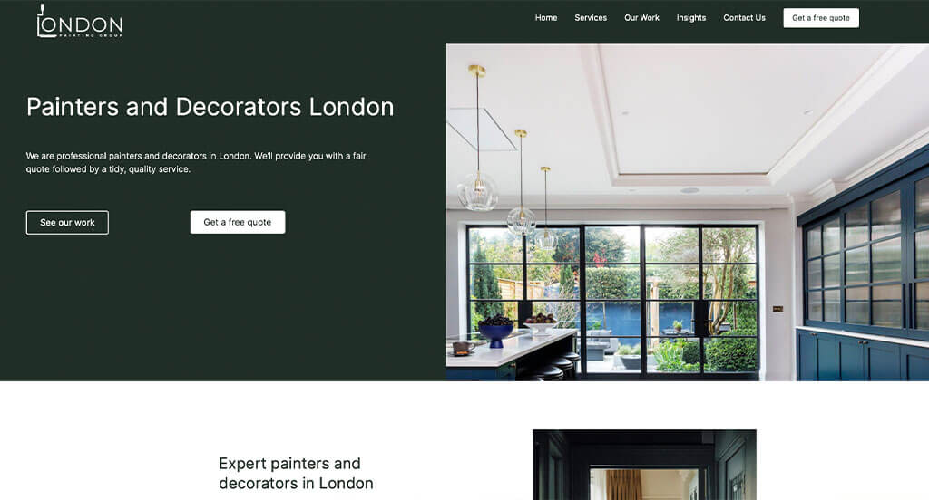
This is a good example of a website design for painters that are looking for a professional look and feel for their next website. The aesthetically pleasing visuals were likely the most impactful feature in the homepage of this website. The layout that was free of distractions helped this website make it into our list of the best layouts for painters. London Painting Group had conversions in mind when designing the ability to look at their recent projects. Another amazing website to add to this list!
29. Nolan Painting
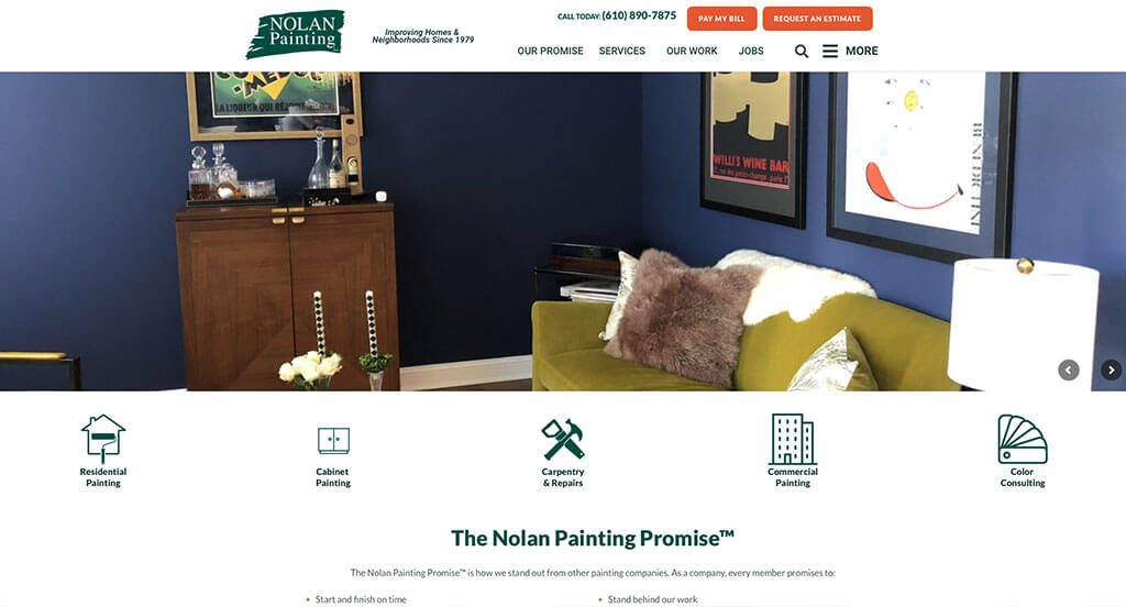
We liked how this painting site combined the colors of white, orange and green to create an attractive website design. As you scroll through the homepage of this website, one of the qualities you’ll notice right away is their simple navigation. Another feature in this creative painting site we liked was their use of icons and graphics. The professional font helped make this one of the best painting websites we considered. For the painters out there searching for website examples, make sure to check this one out!
30. Fox Pro Painting

This is a great website example for painters to check out when looking for a custom look and feel for their next site. The inventive logo design was likely the most impactful feature in the homepage of this website. The different sized fonts to emphasize a statement was a unique choice for a professional painting site. They clearly had a focus on website accessibility when integrating social media into their website. With so many reasons to consider this painting website, it’s obvious why we included it in this list of the best websites!
Related: Jump start your painting company’s online marketing through lead generation, reputation management, and conversion funnels that increase your bottom line.
31. Purely Paint
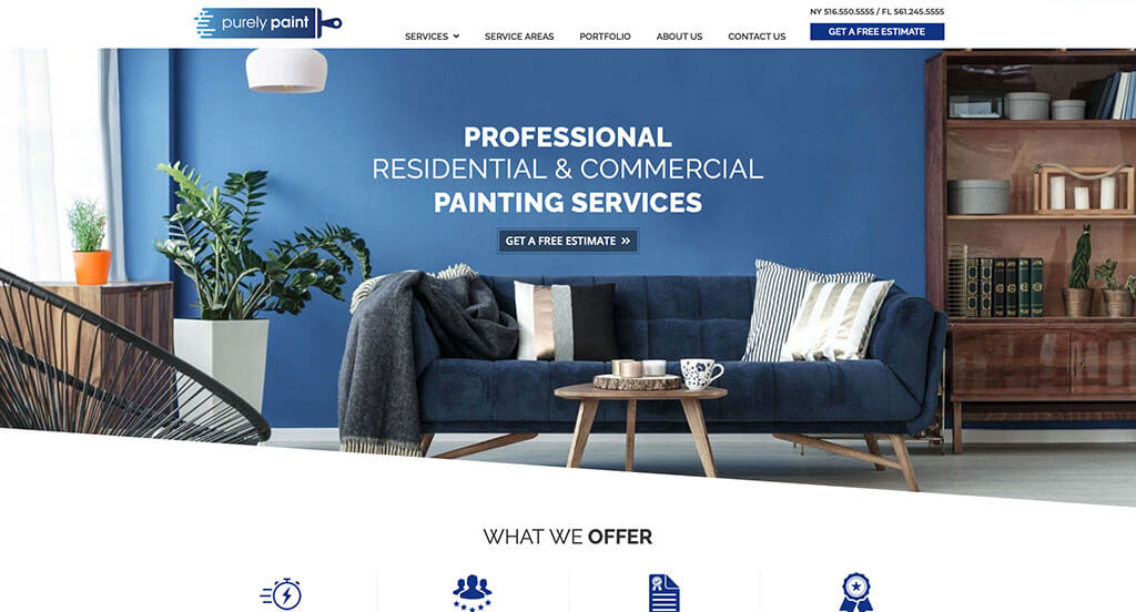
This is a great website design example for a painting company that’s looking for inspiration on a custom look and feel. One of the design features we liked most in the homepage of Purely Paint was the stunning color palette. Another thoughtful quality in this custom painting website we noticed was well-labeled navigation bar. Purely Paint clearly had internet marketing in mind when designing the ability to explore their services by clicking on images. Be sure to consider the creative design of this painting website when developing your next website.
32. CertaPro Painters
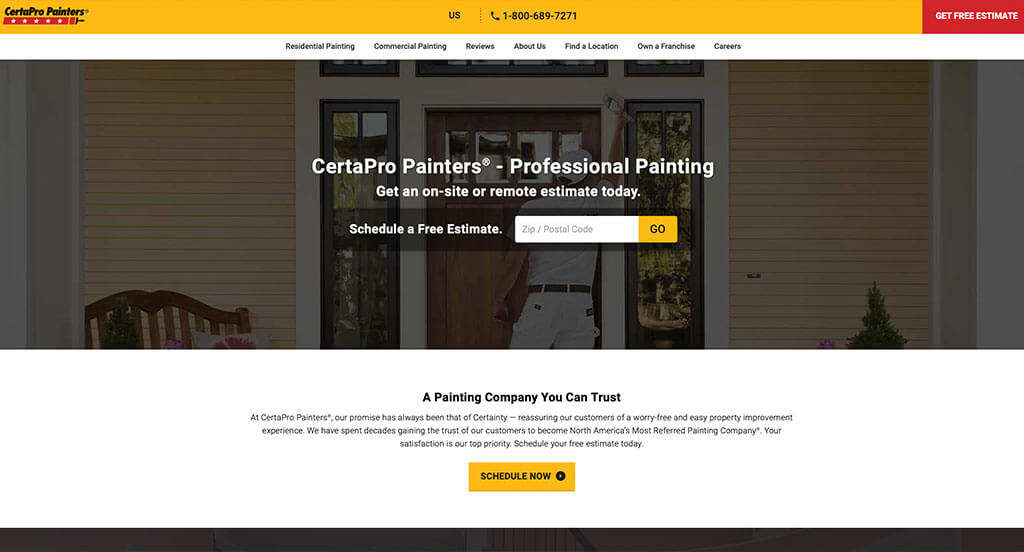
This is a good website example of a website design for painters to look into when searching for a custom site design. As you scroll through the homepage of this website, one of the qualities you’ll notice right away is their template that has a balance of white space. The buttons to enhance usability was a unique choice for a custom painting website. Their professional text helped make this one of the top painting websites we considered. Don’t forget to check this website out while looking through our list of the best painting website layouts!
33. Walls-N-All Painting
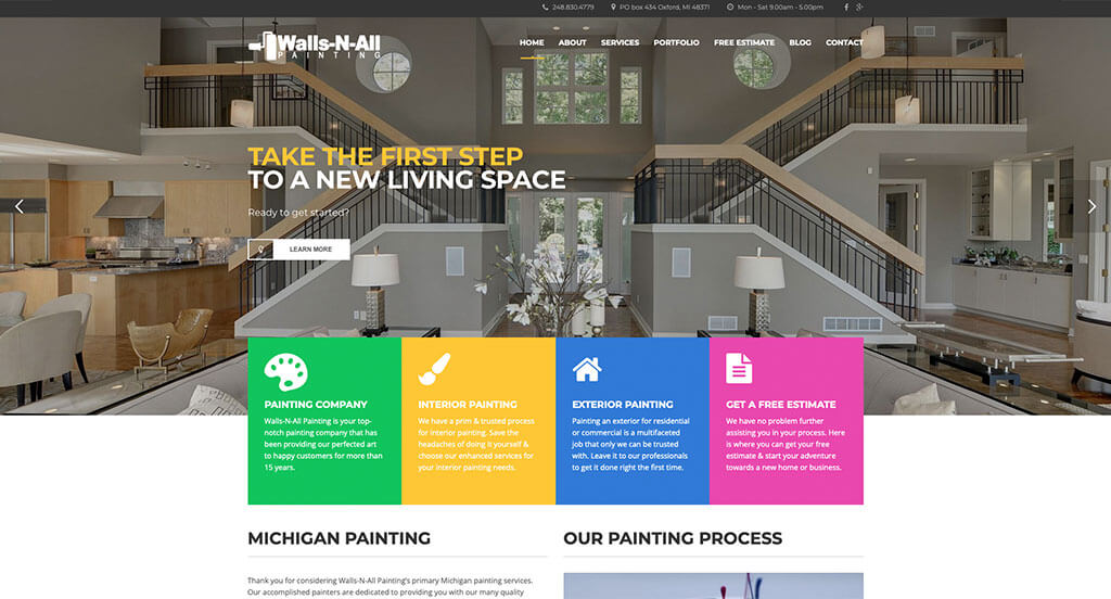
The white, green, blue, yellow, pink and black color palette seen in this custom Painting website stood out to us because it creates an energetic feel. The most refreshing part of this painting website was their optimized content. The informative blog was another feature in this custom painting site we enjoyed. From a marketing viewpoint, for a painting website we really liked the way they utilized high-quality imagery. So many attractive qualities to consider when ranking this website.
34. Straight Edge Painting
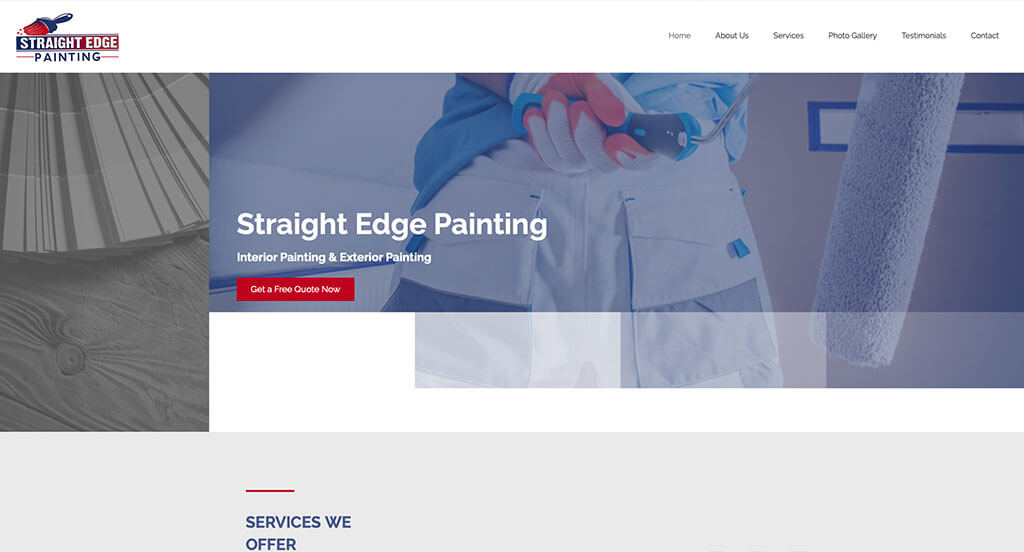
The black, blue, red and white colors seen in this painting website stood out to us because it creates a nice color harmony. Our web designers thought this website was a good example for painters because of their unique textures used throughout the page. This professional painting site also does a good job with the buttons for simple navigation. They clearly had a focus on ease of use when designing the easily accessed contact page for their website. What a great website to review when building out your next website!
35. J Stevens Painting
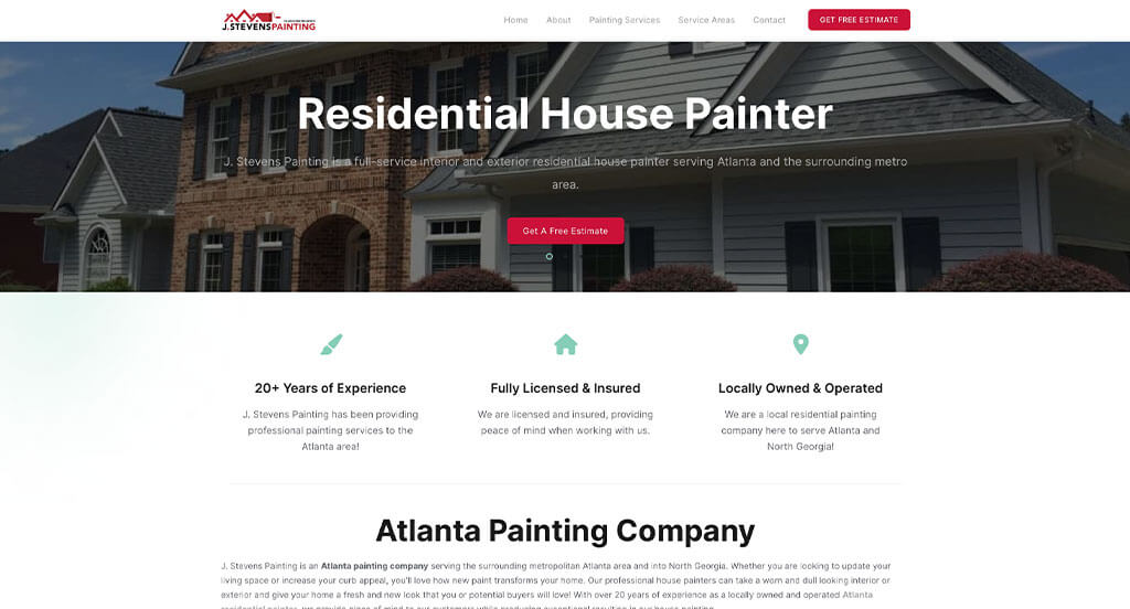
This is a great web design example for painters who are looking for a professional website. The unique logo design was likely the most impactful quality in the homepage of this website. The detailed gallery for their recent work was a unique choice for a custom painting website. They had ease of use in mind when designing the informational paragraphs of their website. If you are looking for template options for your next painting site, give some thought to this one.
36. AMC Painting
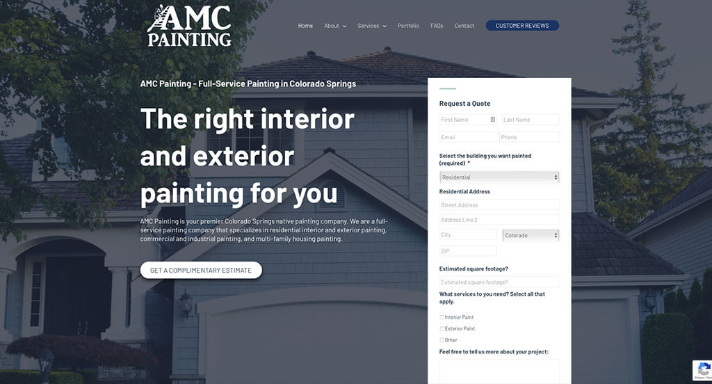
This is a great website design example for painters who are looking for a custom look and feel. We thought this website was a good design idea for painters because of their beautiful color choices. The professional font was a nice touch for a unique site. From a marketing point of view, we really liked the way this painting website utilized a domain that matches the company’s name. With so many quality reasons to consider this painting website, it’s obvious why we included it in this list of the best sites!
37. Durapro Painting
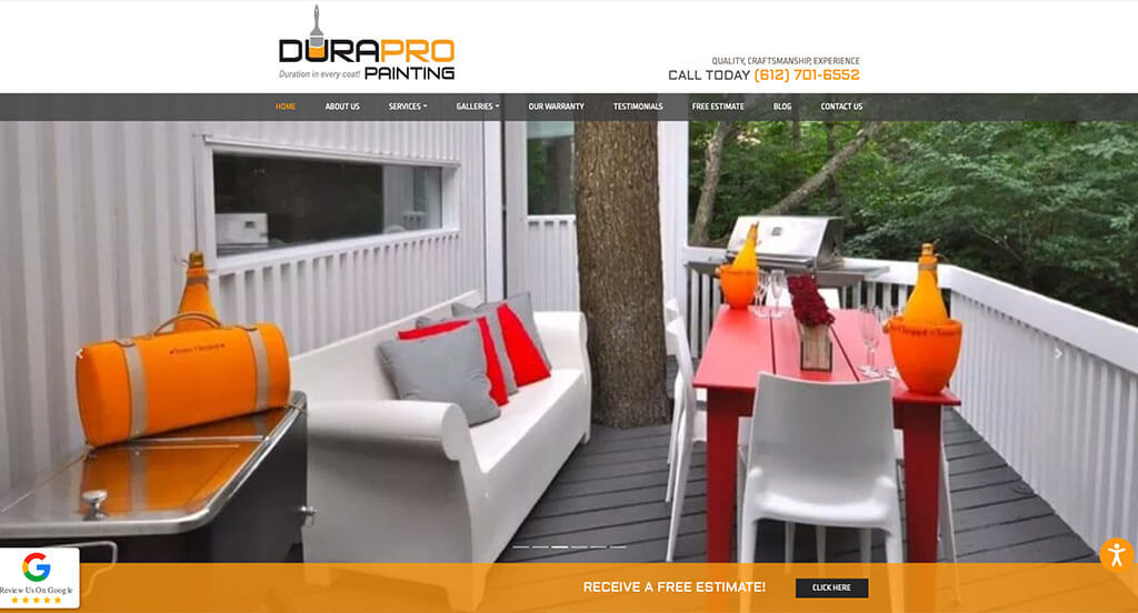
This is a good example of a web design for painters who are looking for a custom look and feel. The black, white, orange and gray color scheme used in their site was definitely the most impactful feature in the homepage. The nicely organized template was another feature in this custom painting site we enjoyed. Durapro Painting clearly had a focus on conversions when designing the links to direct viewers to other areas within their website. Be sure to consider the one-of-a-kind design of this painting website when developing your next website.
38. ASAD Painting

This is a good example of a painting website design to check out when looking for inspiration on a professional looking website. The use of icons for their design was likely the most impactful feature in the homepage of this website. Another design quality seen in this clean painting site was the optimized content. The simple sign up for a free quote helped make this one of the top painting websites we reviewed. For painters looking for examples for their next website layout, this example will for sure be one to take a look at.
39. Olympic Painting Pros
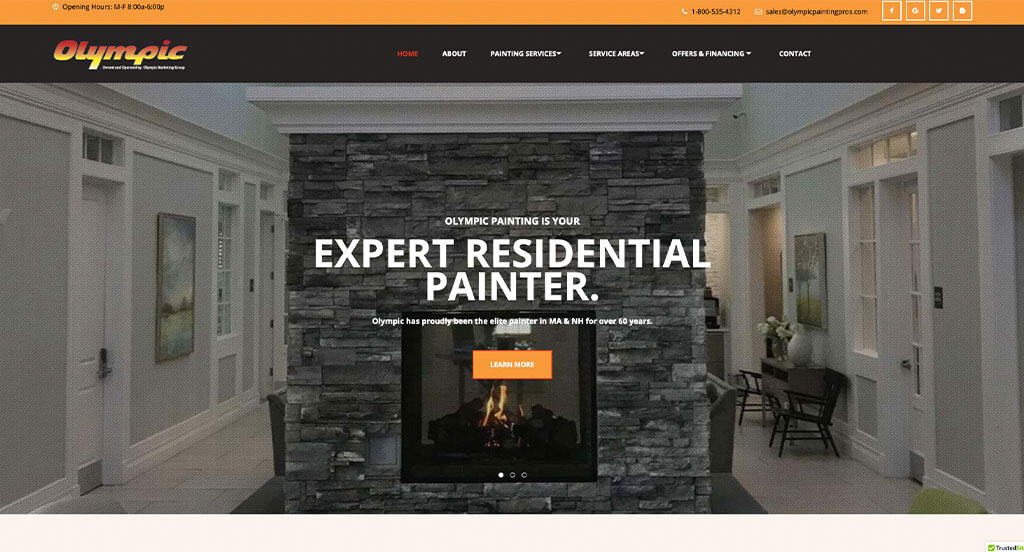
We liked how this painting site combined the colors of white, red, orange and brown to create an attractive website layout. The most refreshing part of this painting website was their professional font. Their contact information that was easily accessible was definitely refreshing for a custom site. From a marketing point of view, for a painting website we really liked the way they utilized a well-labeled navigation bar. Give some thought to the one-of-a-kind design of this painting website when developing your next website.
40. Brady Paint
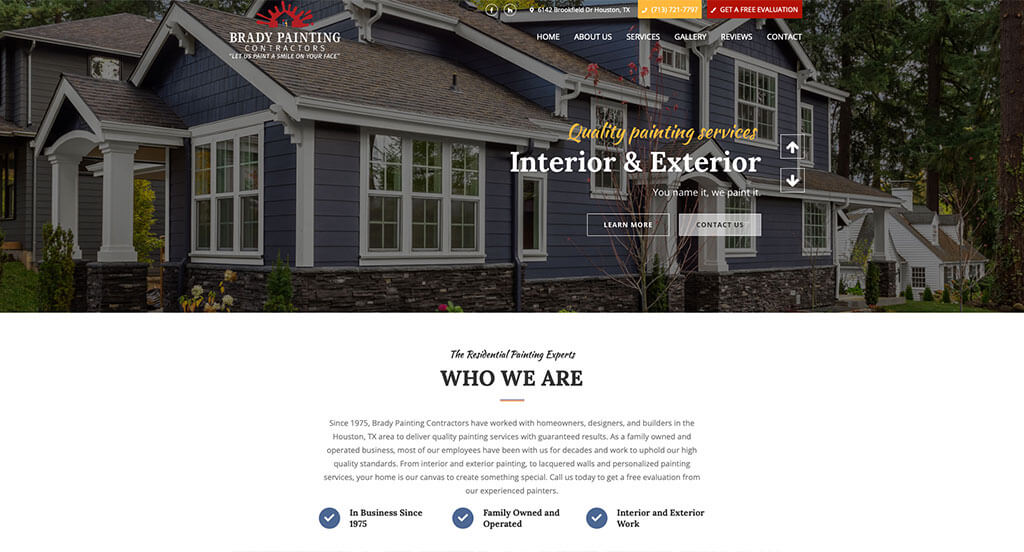
The white, yellow, blue, red and black color palette used in this custom painting website stood out to us because it allowed for a colorful and harmonious design. One of the homepage features in Brady Painting we noticed was their unique use of texture throughout the design because it was rather refreshing for a painting website. The large buttons to enhance usability was a unique choice for a professional website. Brady Painting had internet marketing in mind when building the creative logo design for their website. Don’t skip past this website when hunting for design ideas for your next painting website!
41. Wow 1 Day Painting
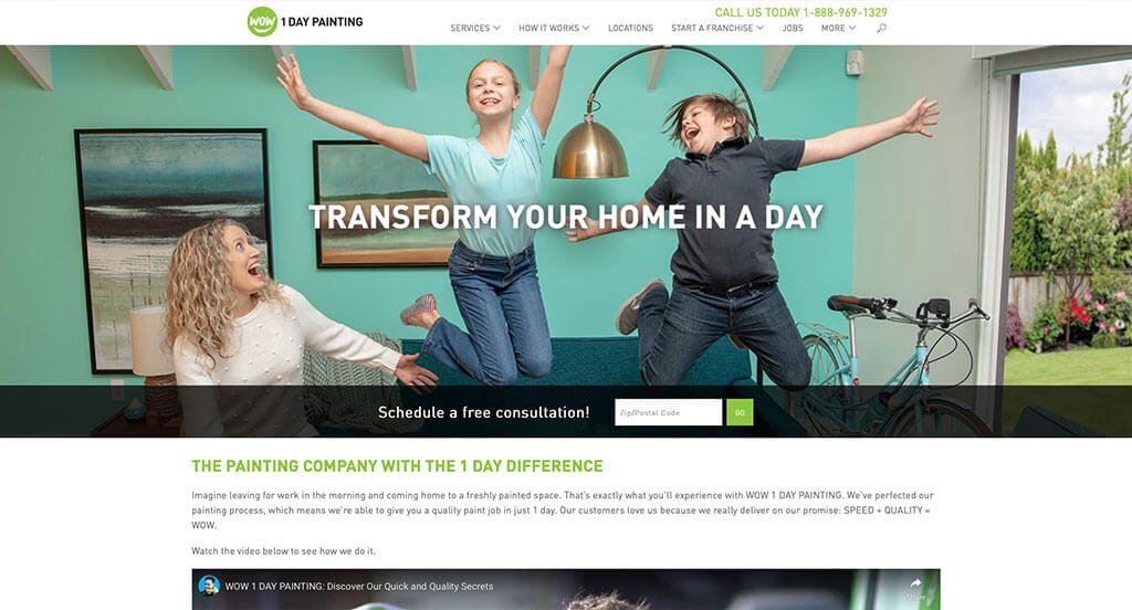
This is a good example of a painting website design for a person to review when looking for a professional look and feel. One of the design features we liked most on the homepage of Wow 1 Day Painting was their design with a balance of white space. Their green accent color was another feature in this custom painting website we enjoyed. Wow 1 Day Painting clearly had a focus on ease of use when creating the simple navigation for their website. What a great website to review when designing your next painting website!
42. Paintzen
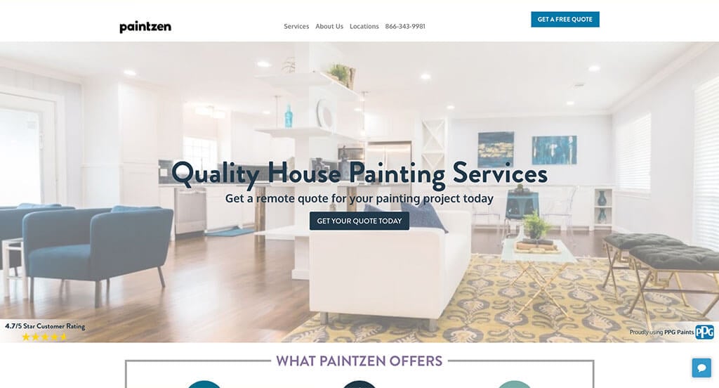
This is a great web design example for painters to check out when looking for a professional layout. One of the homepage features of Paintzen we noticed was their stunning layout because that isn’t something you find on most painting websites. Another thoughtful quality in this website we noticed in this clean painting website was their use of different shades of blue. Paintzen had website accessibility in mind when designing the domain for their website that matches the company’s name. These were just a few of the numerous qualities we had to consider while we were putting together this list of top websites for painters.
43. Captial City Painting
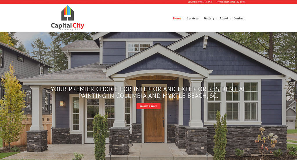
Showcasing a clean and intuitive layout, this website keeps things simple for a painting site. The clearly labeled menu was definitely the most impactful quality in the homepage of this website. The added section for customer reviews was a nice touch for a custom painting website. Capital City Painting clearly had website accessibility in mind when choosing the high-quality images for their website. Be sure to consider the one-of-a-kind design of this painting website when developing your next custom website.
44. Allied Painters
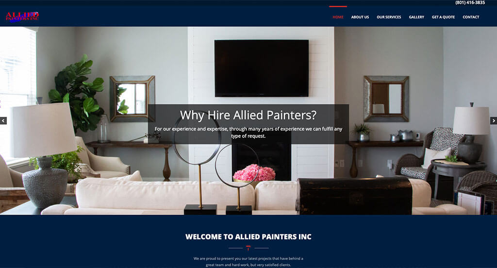
This is a great website design example for painters who are looking for a custom layout. Of all the custom painter websites we reviewed, one of the features in this custom website we liked was their alternating color blocks. Another feature in this clean painting site we noticed was their hours that are clearly stated at the bottom of the page. The domain for their website that matches their company’s name helped make this one of the top painting websites we considered. If you are looking for template options for your next painting site, give some thought to this one.
45. 360 Painting
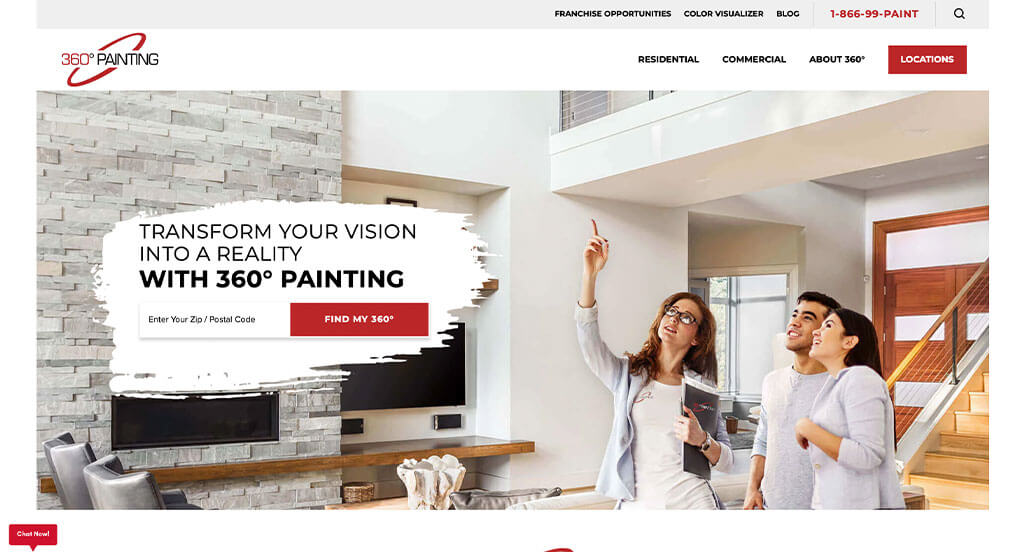
For a painting website, they did a great job utilizing white, gray, black and red colors throughout their site. As you scroll through the homepage of this website, one of the qualities you’ll notice right away is their professional template design. Their use of large colorful buttons was another reason why we included this website in our list of the best websites for painters. They clearly had a focus on digital marketing when creating the professional text for their website. With so many good reasons to consider this painting website, it’s obvious why we included it in this list of the best websites!
46. First Place Painting
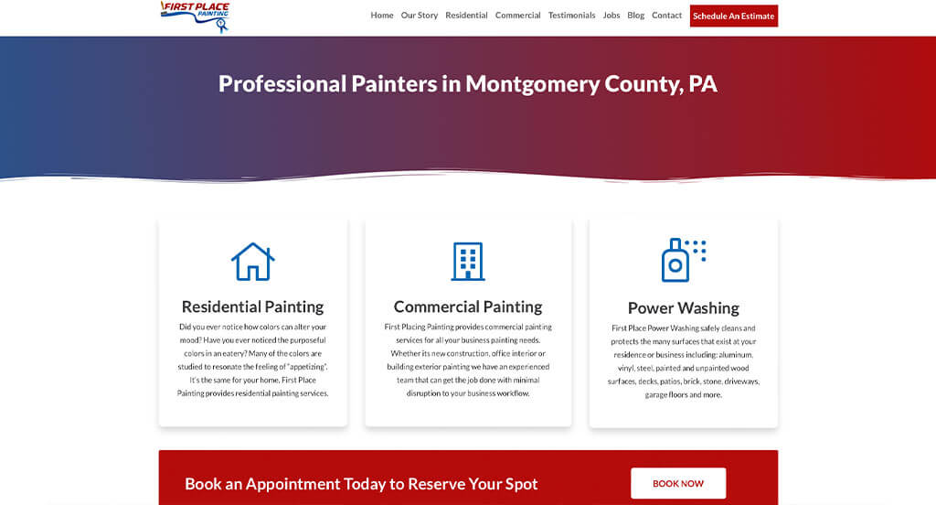
This is a good website example of a website design for painters who are looking for a custom look and feel for their next site. As you scroll through the homepage of this website, one of the qualities you’ll notice right away is their use of different graphics. The larger images and color blocks to break up their content was another thoughtful feature in this professional painting website we enjoyed. First Place Painting clearly had a focus on internet marketing when building the simple booking technique for their company. You won’t be disappointed after reviewing this website for design ideas for your next website!
47. Paint Works
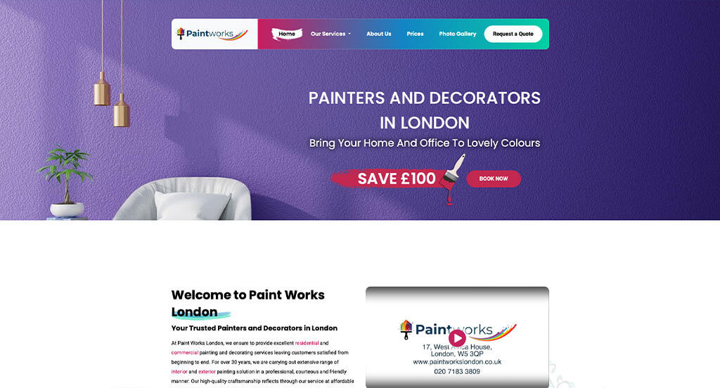
This is a great website design example for painters who are looking for a custom layout. After scrolling past the header of this painting site, you’ll notice the creative paint related graphics. The scatter of colors was another thoughtful feature in this custom painting site we enjoyed. Paint Works clearly had a focus on internet marketing when organizing their content in a logical order. Give some thought to the one-of-a-kind design of this painting website when developing your next website.
48. Super Painting
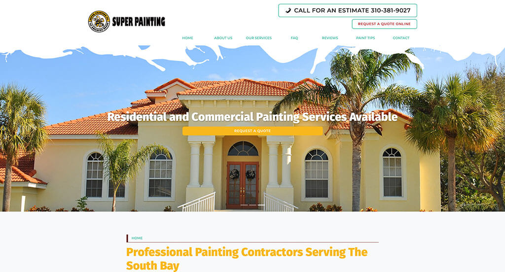
We chose Super Painting because of its nicely organized painting website that uses a black, white and yellow color scheme. Of all the custom painters websites we reviewed, one of the features in this custom website we liked was their fun and inventive logo design. Another feature in this creative painting website we enjoyed was the frequently asked questions section. Super Painting clearly had a focus on website usability when building the navigation bar with individual categories for their website. Another amazing website to add to this list!
49. Atomic Painting
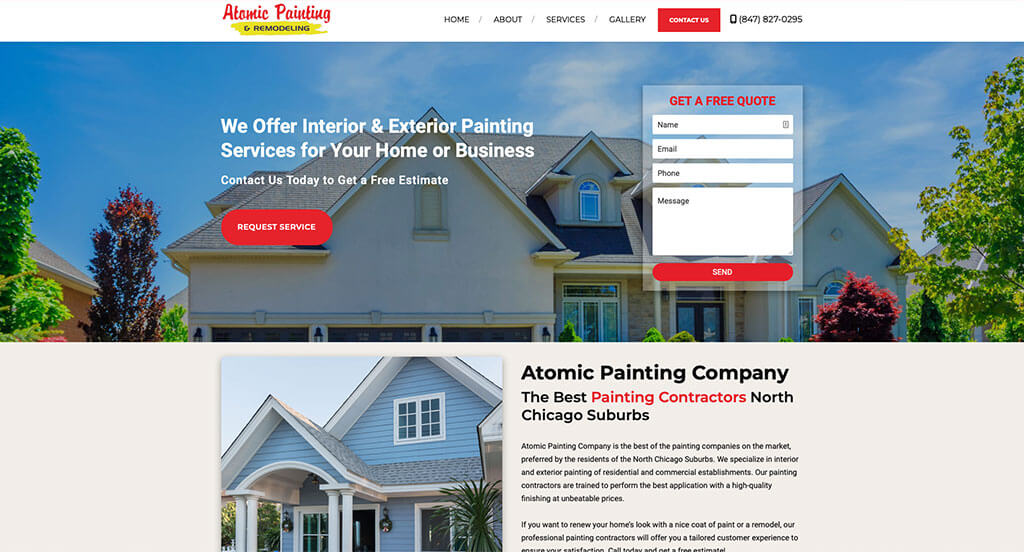
The blue, yellow, white, orange and black colors used in this painting site stood out to us because it creates a balanced design. As you scroll through the homepage of this website, one of the design qualities we liked was their use of buttons to enhance usability. The display of awards their company has won was refreshing for a custom site. They clearly had website accessibility in mind when designing the domain for their website that matches their company name of their website. These were just a few of the numerous good qualities we had to consider when we were putting together this list of top websites for painters.
How to Build an Outstanding Painting Company Website
Are you in the process of building a new website for your painting company? How exciting!
Let’s walk through some of the most important steps in building a new, or redesigning an existing, painting company website.
Feel free to skip the first few sections if you already have a domain name, hosting service, and website platform picked out!
1.) Acquiring a Domain Name
Choosing the right domain name for your painting company’s website is a crucial step in establishing your online presence. It serves as the address that visitors will use to access your website and plays a significant role in branding and recognition of your company.
Here’s a step-by-step process to help you select the perfect domain name:
- Brainstorm: Start by generating ideas for your domain name, considering your company name, the services you offer, and your location.
- Simplicity: Aim to keep your domain name simple, easy to spell, and pronounce. Avoid using complex words, hyphens, or numbers.
- Consistency: If your company has an established brand name, it’s generally a good idea to include it in your domain name. For example, if your business name is Jason’s House Painting, avoid registering a domain name like Call4Painting.net.
- Availability: Check the availability of your desired domain names before proceeding too far. Many common domain names have already been registered. If that’s the case, see if your desired domain name is being used and available for sale. However, be cautious not to invest too much money in purchasing a domain name.
- Domain Extensions: Consider which domain name extension best suits the purpose of your website. While .com is the most common and widely recognized extension, there are many other options available, such as .net, .org, or industry-specific extensions like .painting.
- Legal Considerations: Before registering your domain name, conduct a trademark search to ensure that your chosen name doesn’t infringe upon someone else’s intellectual property. For example, avoid registering a domain name that includes another painting company’s business name or the name of a popular paint brand.
- Register the Domain: Once you’ve settled on an available domain name, it’s time to register it through a reputable domain registrar. Based on our experience as a digital agency, we recommend GoDaddy and Namecheap as user-friendly domain registrars.
2.) Selecting a Website Platform
After figuring out your domain name, the next step is selecting a website platform for your painting website.
Most painting contractors are going to develop content-based websites with appointment calendars, live chats, and contact forms to drive conversions.
The following platforms are highly recommended: WordPress, and Wix.
- WordPress: WordPress is a versatile and widely used content management system (CMS) that offers tremendous flexibility and customization options. It caters to all types of painting company websites, from simple websites to more complex sites that integrate third-party plugins for project portfolios and customer testimonials. With thousands of painting-inspired themes and useful plugins available, WordPress allows you to create a highly customized website tailored to your painting company. It’s an excellent choice if you value control and scalability. Although there is a hosted version of WordPress, most users prefer the open-source version installed on a web hosting account.
- Wix: The Wix platform is similar in terms of page building features, but it is a hosted solution. We have also worked on painting websites built on Wix and find it to be a solid page builder. With Wix, you won’t require a separate web hosting service.
It isn’t common to see painting companies add ecommerce to their website.
Web Hosting Requirements
If you choose a platform like WordPress or WooCommerce, you’ll need to find a web hosting service.
As a suggestion, we often recommend our own web hosting service, which is excellent for WordPress websites. For recommendations of reliable web hosting services from other hosting companies, consider the following:
- WP Engine: This is one of our favorite web hosting services for painting companies. WP Engine provides a great control panel that makes it easy to create staging websites. Their backup process is seamless. The only downside we’ve ever encountered is the limits they place on PHP max_execution_time. Their pricing can also increase quickly if you need upgraded services.
- SiteGround: We’ve always enjoyed working with SiteGround. Their live chat and email support are exceptional compared to more well-known hosting firms. We’ve never had to wait long to get in touch with someone, and the first person we’ve interacted with usually solves the issue. Their backup tools are very user-friendly. They also offer reasonable pricing for painting companies.
- Digital Ocean: This is a great option for cloud hosting but may be too advanced for most painting company websites. We’ve never encountered issues with the Digital Ocean cloud network, unlike other cloud networks we’ve tried. Cloud hosting can be expensive when considering droplet (server instance) costs, operating system, control panel, server software, offsite backup, and server management fees. For server administration, you can check out AdminGeekZ.
3.) Choosing a Website Template
Many painting contractors opt to purchase and customize a pre-designed website template as it significantly reduces web development costs and turnaround time. However, if your painting company prefers a custom design, you can always hire a custom web developer or custom ecommerce developer to build your theme from scratch.
For setting up a painting company website, let’s focus on suggestions for finding a pre-built website template! Here are some links to the main theme marketplaces to consider:
WordPress Painting Themes
You can find free themes at wordpress.org, or explore painting-inspired templates on ThemeForest.
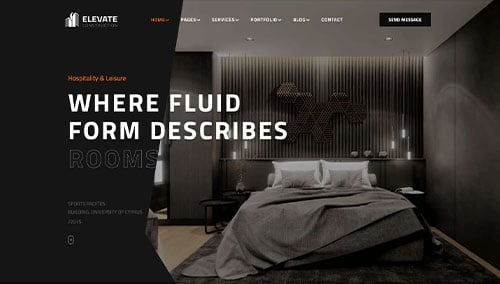
Elevate – Themeforest
$39
Constructo – Themeforest
$59

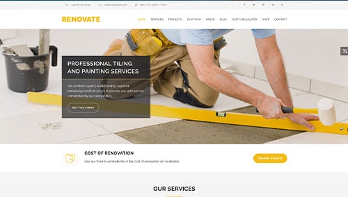
Renovate – Themeforest
$69
ProRange – Themeforest
$69

Wix Painting Themes
You can find free and paid themes in their marketplace at wix.com, some of which are suitable for painting contractors.
4.) Creating Content & Adding Images
Now that you have your domain name, website platform, and theme in place, it’s time to start building engaging content for your painting company’s website!
Here are some useful tips to help you craft compelling website copy:
- Know your target audience: Before writing, have a clear understanding of your target audience’s demographics, preferences, and needs. Tailor your content to address their pain points, provide value, and resonate with them. This will help you rank in search engines for painting-related queries relevant to your business.
- Define your key messages: Determine the main messages you want to convey through your website content. These should align with your brand, highlight your unique advantages, and clearly communicate the benefits of choosing your painting services.
- Keep it concise and scannable: Online readers tend to skim content, so make sure your writing is concise and easy to digest. Use short paragraphs, bullet points, subheadings, and bold text to break up the content and improve readability.
- Create clear and compelling headlines: Craft attention-grabbing headlines that immediately convey the value and relevance of your painting company. Well-crafted headlines can encourage visitors to explore your website further.
- Incorporate keywords strategically: Research relevant keywords and incorporate them naturally throughout your content. This can improve your painting company’s visibility in search engine results. Avoid keyword stuffing, as it can negatively impact readability and user experience. Tools like Ahrefs or Semrush can assist with keyword research.
- Maintain a conversational tone: Write in a conversational manner that resonates with your painting audience. Avoid jargon or overly technical language unless your target audience specifically requires it. Engage your readers by addressing them directly and using a friendly, approachable style.
- Edit and proofread: Always edit and proofread your content before publishing. Check for grammar, spelling, and punctuation errors. Ensure the flow of your content is smooth and logical, and that it aligns with your brand voice and style guidelines. Tools like Grammarly can be helpful in this process!
- Utilize ChatGPT for assistance: If you’re struggling with generating ideas or need help refining the content on your painting website, consider leveraging AI tools like ChatGPT.
Additionally, incorporating relevant, high-quality images into your content can enhance your painting company’s website. Here are some tips:
- Choose high-quality images: Opt for visually appealing, high-resolution images that are well-composed. Blurry or pixelated images can detract from the overall quality of your painting website.
- Ensure relevance: Select images that are relevant to your content and help illustrate your message. Images of completed painting projects, before and after comparisons, or your team in action can enhance the text and provide visual interest.
- Consider stock photo resources: Utilize reputable stock photo websites like Unsplash, Pixabay, or Shutterstock to find a wide range of professional-quality images related to painting. Ensure compliance with licensing requirements and attribute images as necessary.
- Customize images when possible: If you have the skills or resources, consider customizing or branding images to align with your painting company’s brand. This can help create a cohesive visual experience for your visitors. Tools like Adobe Photoshop or Canva can be useful for image customization.
- Optimize image file sizes: Compress images to optimize their file sizes without compromising quality. Large image files can slow down your painting website’s loading speed, impacting user experience and SEO. Tools like TinyPNG can assist with image compression.
5.) Post Launch Tasks
Once you have built and launched your painting company’s website, there are several important tasks and services to consider for maximizing its effectiveness. Here are some essential suggestions to help you navigate post-launch activities:
- Search Engine Optimization (SEO): Implementing effective SEO strategies is crucial for improving your painting company’s visibility in local search results. Conduct keyword research, optimize your content, and ensure your website has a solid internal linking structure. Regularly update and create fresh, high-quality content to attract organic traffic. Consider hiring our SEO team or exploring third-party providers like The HOTH for assistance.
- Paid Advertising: Drive targeted traffic to your painting business by utilizing paid advertising platforms like Google Ads or Facebook Ads. Consider hiring our PPC management services or finding talented professionals on websites like Mayple for effective paid advertising campaigns.
- Conversion Rate Optimization (CRO): Analyze your website’s performance and user behavior using tools like Google Analytics. Identify areas where users may drop off or encounter barriers to conversion. Conduct A/B testing using tools like VWO to make data-driven changes that improve your website’s conversion rates and overall user experience.
- Website Security: Protect your painting website from malware and other security threats. Implement robust security measures such as SSL certificates, web application firewalls (e.g., Sucuri), and regular backups. Keep your CMS, plugins, and themes up to date to minimize vulnerabilities. Monitor your website’s uptime using a service like UptimeRobot.
- Website Maintenance: Regularly maintain your painting website to ensure optimal performance. If you are using WordPress, this includes updating plugins and themes, monitoring website speed and performance, and resolving any broken links or errors. Consider hiring our website maintenance services or finding freelancers on platforms like Upwork to handle website maintenance tasks. Don’t forget to regularly back up your painting website to protect against data loss or technical issues.
- User Feedback and Testing: Actively seek user feedback to understand visitor experiences and identify areas for improvement. Implement user testing and gather insights on how users interact with your painting website. Use this feedback to make iterative enhancements and continuously optimize the user experience.
- Content Updates: Keep your website content fresh and up to date. Regularly publish new blog posts related to painting, update product or service information, and ensure that all information is accurate and relevant. Engaging and valuable content not only attracts visitors but also encourages them to return and share your content with others interested in painting.
Remember, post-launch digital marketing activities are crucial for the long-term success of your painting website. Stay proactive, monitor performance, and adapt your strategies to achieve your business goals and meet the needs of your audience.