Calling all plastic surgeons! Are you looking to enhance your online presence and attract more patients? Check out our guide to these top 50 plastic surgery websites.
Our expert web designers have evaluated many surgeon sites for design, functionality, uniqueness, and user experience. From sleek designs to easy navigation, these sites exemplify online excellence in their field.
You’ll find inspiration for your company and find valuable tips to make your online presence stand out.
Boost your plastic surgery practice with this guide featuring website examples from plastic surgery, dermatology, hair transplant clinics, and non-surgical cosmetic providers. For other industries, visit our inspirational website examples blog!
Top Plastic Surgeon Website Designs
1. Care Plastic Surgery
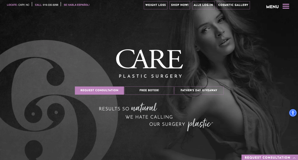
To start off this list, we have a nice and organized look with a basic color scheme. Adding in some nice boxy fonts helps maintain that professional design. Contact information of this business is always visible due to their sticky header, which was a great choice. Including an online agent allows customers to get any simple questions right away. It was a smart idea to include a “transformation photo gallery”.
2. Willow MedSpa
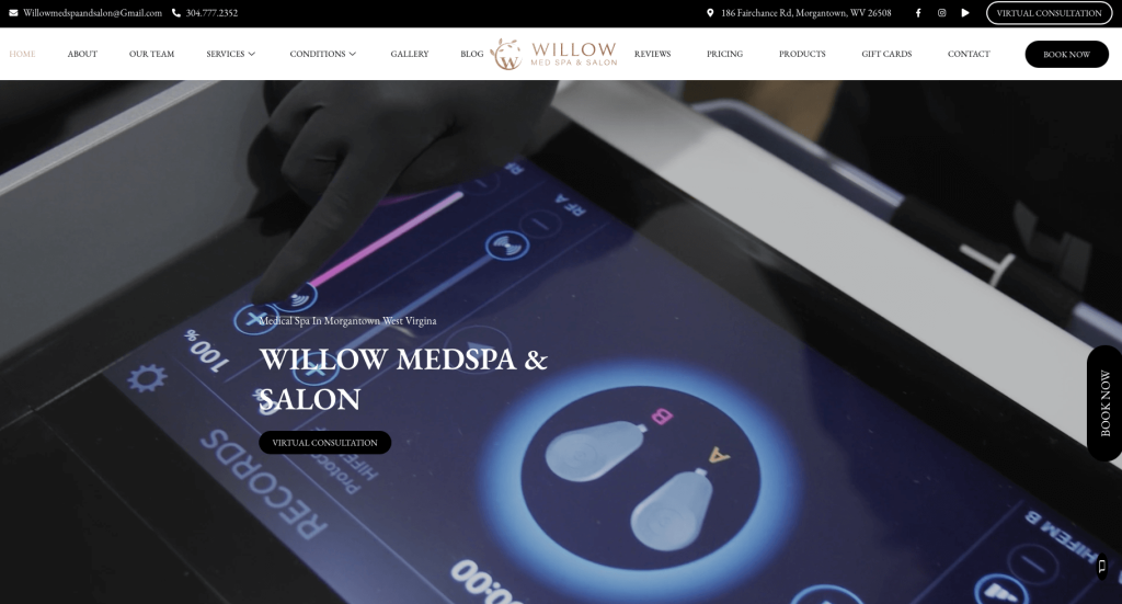
Likely, this company’s best feature was their luxurious feeling logo. This logo was also used in a variety of different places throughout, which made it even better. Attention is almost automatically drawn to their automatically playing video. This well labeled menu makes navigating seamless for visitors which insures they’ll stay on this site for a longer period of time. Square photos are displayed to show off their featured treatments. Having a section for their team was another great choice.
3. Shafer Clinic
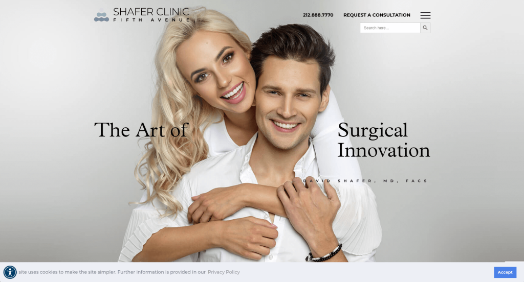
Using crisp and high-quality images to break up white space was amazing. Using black alongside light grey for titles creates a stunning feel. It was helpful to include a domain that is similar to their company’s name. A few simple transitions are used to help their titles stand out a bit more. It was smart to include a search bar, along with an easily accessed request an appointment button.
4. LaserAway
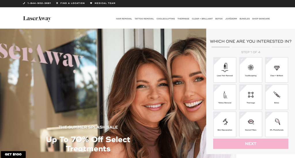
Here was another great example of a unique design. Some of LaserAway’s features that sets them apart from their competitors was their bright color schemes, creative fonts, rectangular shaped boxes and small graphics. Visitors are greeted with a short quiz allowing for additional information about pricing for your treatment. Including drop downs for their menu allows for possible clients to search this site in a simpler and faster manner.
Related: Launch an internet marketing plan to implement lead generation, social media marketing, conversion funnels, and online reputation management for your plastic surgery center.
5. Beautyfix MedSpa
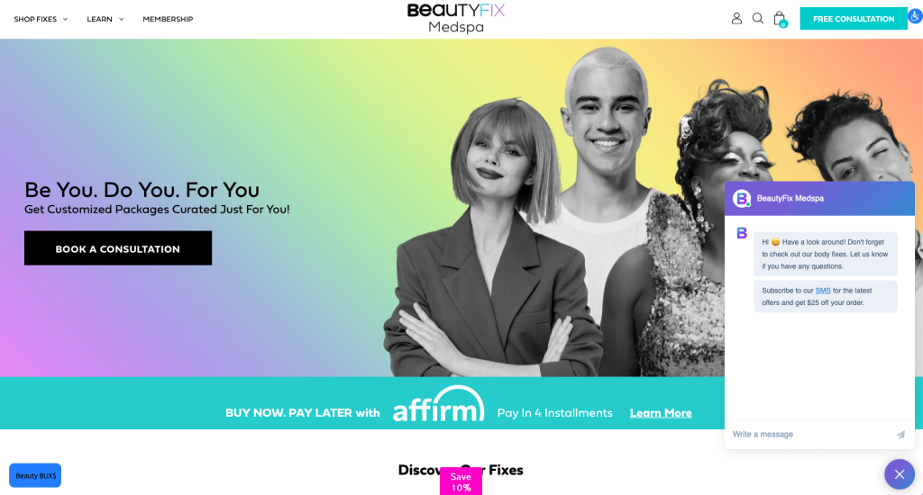
Overall, Beautyfix MedSpa uses a variety of bright colors to attract. Another great feature we really enjoyed was their high quality visuals that display what you could look like after paying for their services. It helped to include clearly labeled pricing for their services. Having many buttons to make navigation even better. Lastly, adding in blog posts was another marketing feature that keeps people engaged.
6. Sieber Plastic Surgery
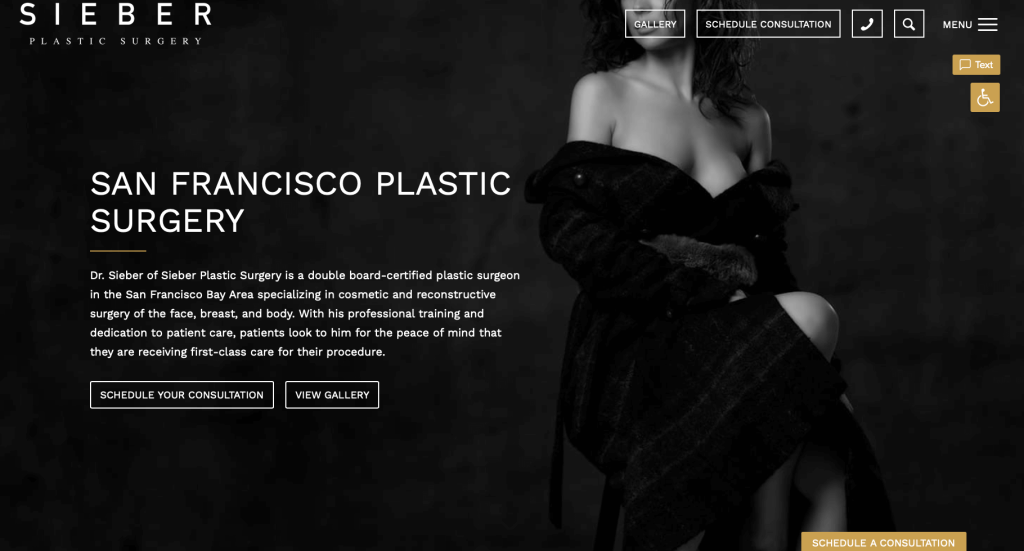
Attractive images balanced out with a stunning color choice is something that all sites should include. Small arrows are helpful because they show that there is more information linked within. We loved their before and after galleries showing different treatment types and what fits inside those categories. Golden buttons can also be noticed against their bold black background to help them stand out. Another appealing addition was having a search bar so past clients can find what they wish to gain more knowledge on.
7. Cure Daily
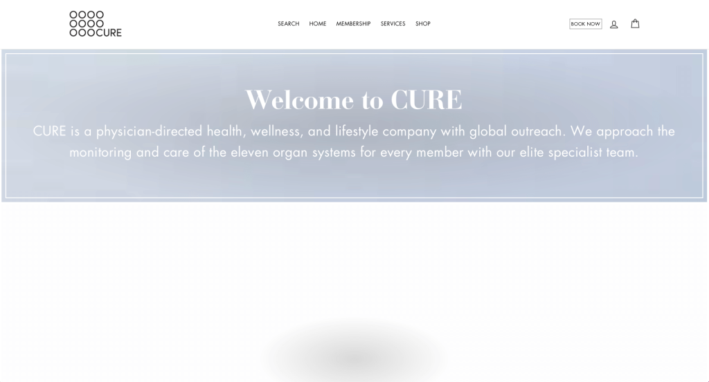
Making use of imager slider as their hero header was a great choice. We loved their use of boxy, basic but professional fonts mixed with loopy, creative fonts. Showing this company’s 11-organ care approach with a visualized circle was a great look. Making sure to note popular papers and such that this business is featured in was another aspect we enjoyed. Short and straightforward paragraphs are added in so that viewers don’t get lost in information.
8. Dream Medical Group
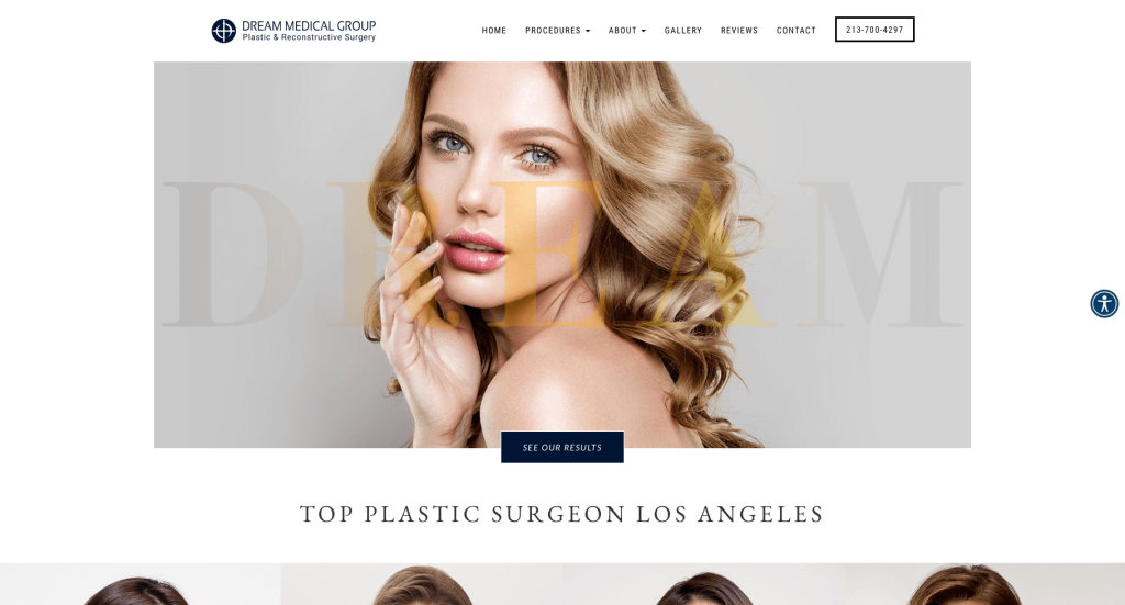
Hands down, Dream Medical Group’s leading quality is their high-quality images with a diverse group of models included. Before and after comparisons are also used to give customers an impression of what their own transformation might look like. Adding in video testimonials really helps people feel like they really are understanding this business as a whole. Finally, Dream Medical Group’s navigation bar was clearly labeled and was helpful for organizing information.
9. Cosmetic Surgical Center
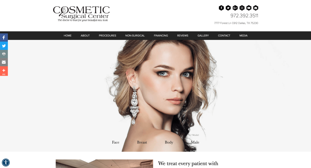
Right away we can see that this plastic surgeon website design focuses on their web layout. Here we have lots of images displayed in a variety of different ways, along with rectangular boxes to frame some information. Plenty of patient testimonials are also included into this design along with lots of buttons to help viewers find their way to different pages. We found before and after images to be quite shocking and most likely potential customers would be shocked too.
10. Roy Kim, MD
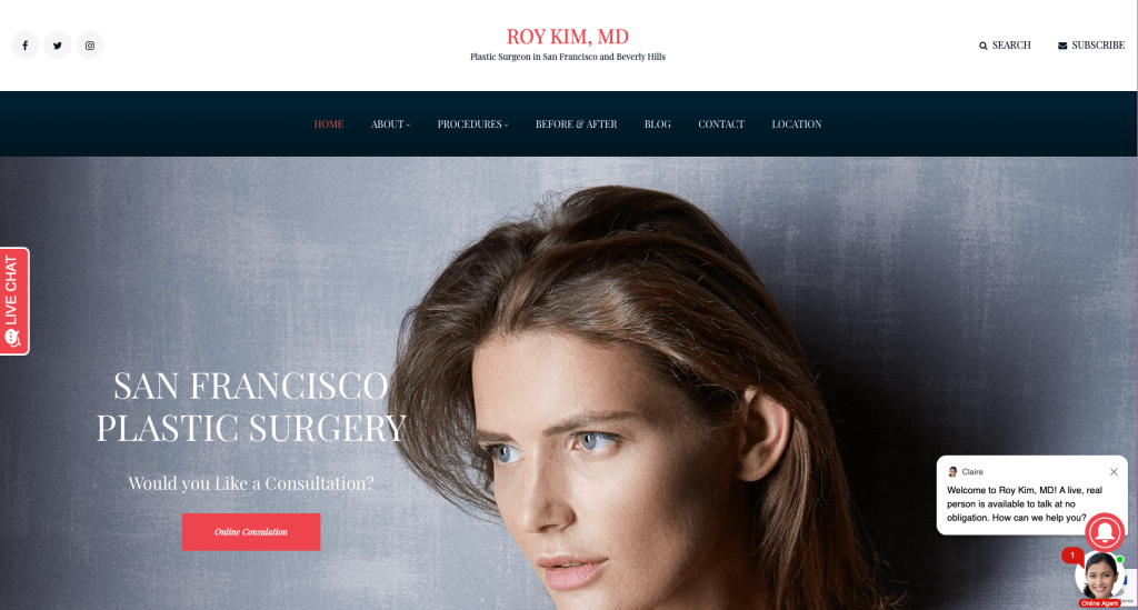
A noticeable difference in this plastic surgery website design is their professional, but colorful and elegant look. Their curly font that still screams high quality helps to bring that elegant look towards their site. Additionally, less images are added and more emphasis is placed on balance of images, graphics, buttons and textual content. Having a contrasting color palette of dark blue, white, and bright red red makes these pages more visually appealing. Also, we enjoyed how this company included a blog to add in more information for customers to access.
11. Carmony Oral, Facial & Implant Center
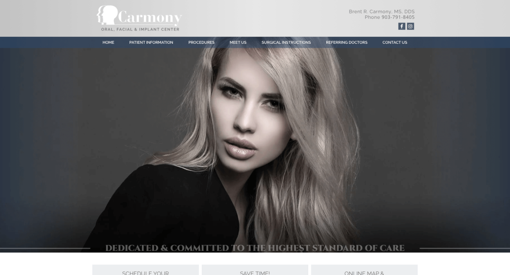
This site has a pretty clean design that isn’t information-heavy, and you won’t need to scroll for too long or read chunks of texts. Instead, large images are included to attract viewers to visual proof of their results… after all, a picture can say a thousand words. In this homepage, images are used as backgrounds for rectangles for each service they offer which was a great way to balance out an area that was a little more wordy. Having a simple contact form was another thing that could prove to be extremely useful for many clients.
12. Elite Plastic Surgery
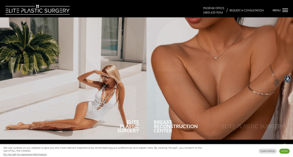
In Elite Plastic Surgery’s webpage, they heavily focused on having an aesthetically pleasing design. This feeling was displayed with their use of rounded rectangular frames, natural browns, grays and white for their colors. One of many reasons that Elite Plastic Surgery is so unique is that all of their surgeons are brothers which somehow makes for a more “homey” feel. Another feature that spoke to us was how information was included for “out of town patients” to make sure they have a great time in Phoenix. Even though their full menu is hidden at first, clicking on it opens all tabs displayed in a classy format.
13. Kansas Plastic Surgery
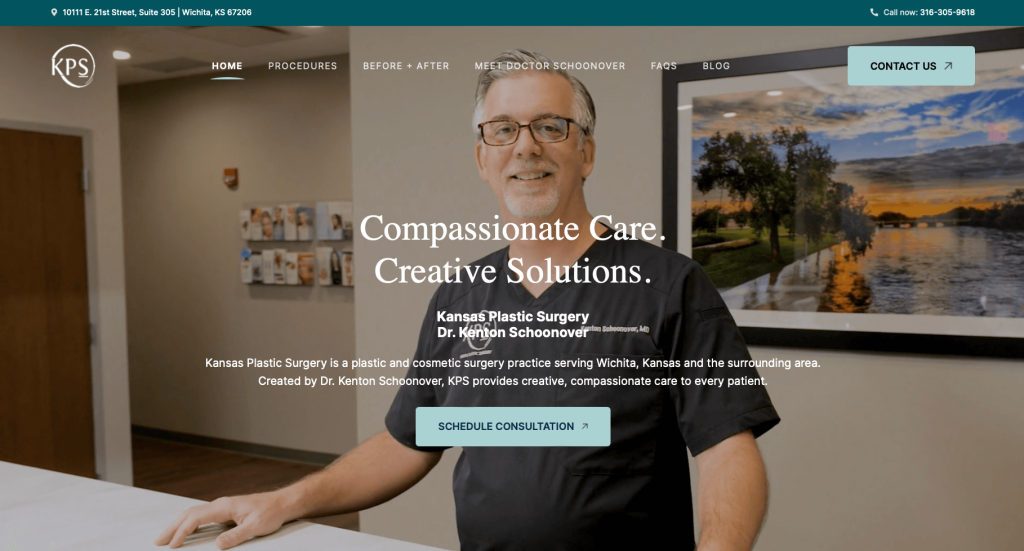
Upon visiting this site, you’ll be greeted with a comforting video portraying many happy clients in consultations with Dr. Kenton Schoonover. This surgeon center took a basic approach with their color palette and amount of white space in their web template. Kansas Plastic Surgery had a clearly labeled navigation bar leading to some of their often accessed and less common features. We enjoyed how this business made a whole page for before and after transformations along with frequently asked questions and their blog.
14. Union Square Facial Plastic Surgery
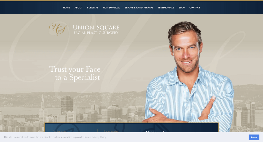
First thing that comes to mind with this design is most likely luxury. Dark blue paired with gold and scribbly designs are just a few things that help define this luxurious feel. We loved how this business used simple, basic, but beautiful background image designs once in a while. Additionally, subtle animations were included to help make their information seem more engaging. Many client testimonials are also added which really helps incoming clients feel they will get a great experience.
15. New York Group for Plastic Surgery
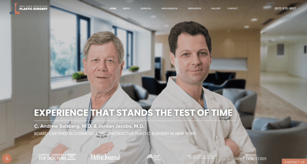
Almost instantly, we can notice high-quality and engaging images that generates interest within their incoming visitors. Adding in content related to post op care, financing, fly-in patients was a smart decision. A section for meeting their surgeons helps customers to feel connected to their company. Contact information is simple and can be accessed very easily, urging possible clients to reach out with their questions or concerns. It was also helpful to have a gallery of before and after images that are organized by treatment types, making it easier to find whatever would be beneficial for customers to see.
16. Wave Plastic Surgery
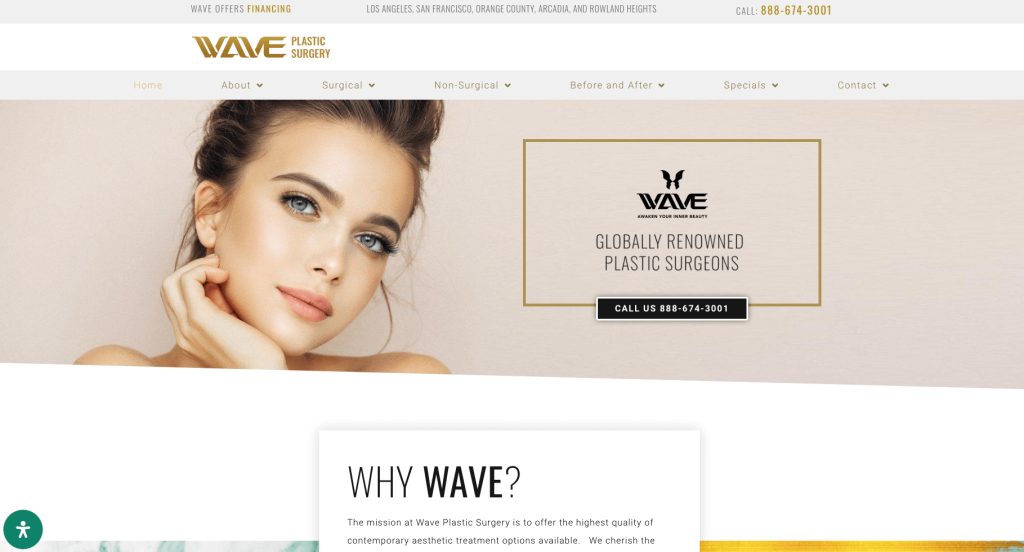
What’s interesting about Wave Plastic Surgery’s layout was their color palette, which reminds you of summer and youth. We really enjoyed how their logo design glimmered as it was made of gold. An easy-to-navigate menu is used for helping visitors quickly get to any relevant page they wish to visit. Using a white background helps to achieve a seamless and clean look. Potential clients can learn about any procedure by hovering over an image, which is an excellent way to minimize text blocks on the homepage.
17. Visage Surgical Institute
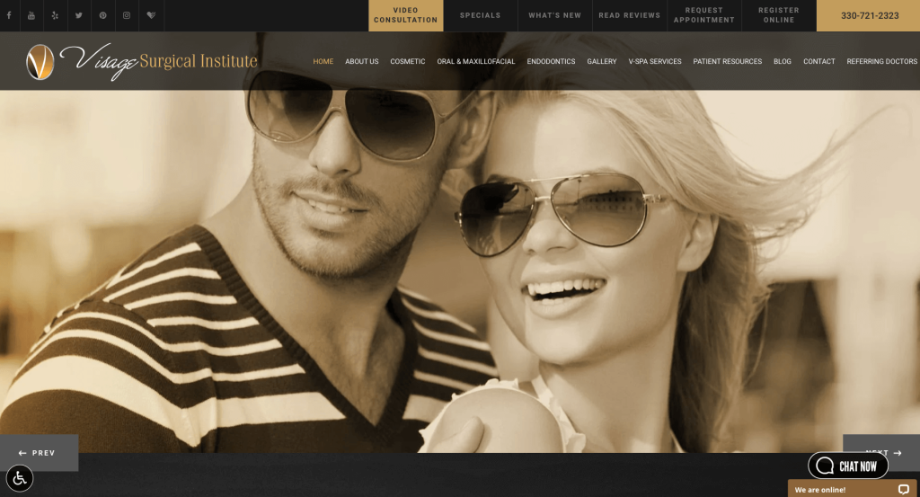
Black and gold creates a color combination that guarantees to grab attention of anyone checking out Visage Surgical Institute. It was creative that all their images looked almost vintage with their filters. Inclusion of a testimonial section was quite refreshing because it slowly builds credibility. Every part of their navigation bars are extremely well organized making it simple to find whatever you wish to find.
18. Marc Malek, MD
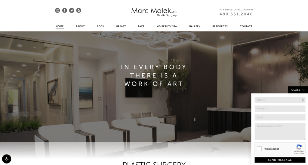
Right away, viewers might notice their balance of white space, making for a feeling of cleanliness. However, another highlight was adding in short and straightforward paragraphs, keeping it simple. A photo gallery was included to ease customers ideas of how they will look and feel after a procedure. This footer was also well-designed as it includes contact information, address, social media handles, and a second navigation bar.
19. Scottsdale Plastics
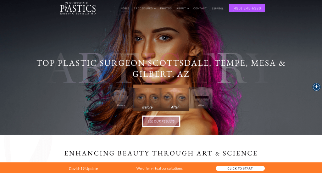
No one can deny this company has an extremely attractive design due to use of bright pictures and contrasting highlights. Before and after images are placed onto a slider to display in a small scale. We really liked how each individual procedure had lots of information, each page having their own table of contents. Logo design was also something that was legendary for Scottsdale Plastics. Allowing the “l” in plastics to form the shape of a woman. Adding in a few buttons also really helps to create a better navigation system.
20. Graper Harper Cosmetic Surgery
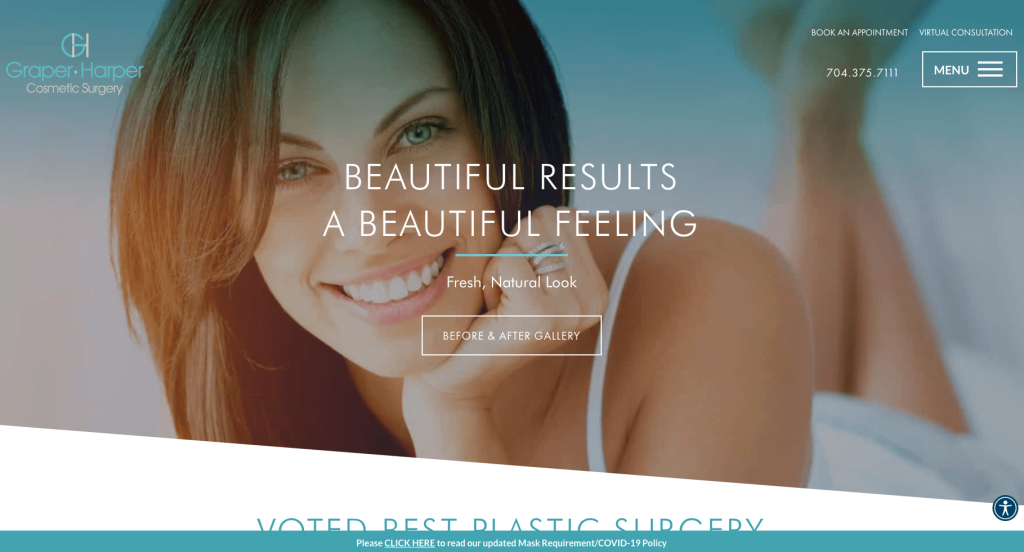
Here’s an ingenious design when looking for Cosmetic Surgery examples that features a shade of cyan to make pages more appealing to visitors. High quality images create a feeling of perfection in their treatments. Including Graper Harper Cosmetic Surgery’s variety of awards raises awareness to how well their business treats patients and performs their services. A section can be found to provide information on “The Doc Dudes Podcast”, presented by experts from this company.
Related: Improve your online search traffic by getting higher placements with the help of SEO services for cosmetic surgery practices.
21. Regency Specialties
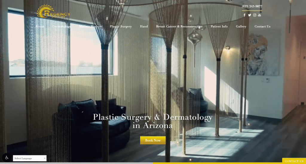
Regency Specialties disrupts the typical, formulaic style chosen by many medical professionals by adopting a distinct design focusing on their golden accents with tints and shades to create illusion of shining metal. An automatically playing video of this center along with their different departments, all points to luxury. Additional awards are included to help possible clients feel better about their decisions. Lastly, Regency Specialties used their brand name as their domain name which was helpful from a marketing perspective.
22. Dr. Shaun Parson Plastic Surgery & Skin Center
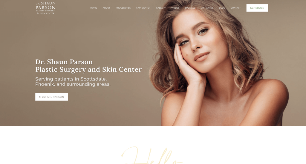
This company utilizes a simple look to take visitors through what to expect from them as a business. Small bits of curly, fancy writing are used to accent small sections of text, raising more awareness towards those sections. Using green and beige colors along with high-quality images of different models proves successful in engaging potential clients. Having a large green sticky banner with their company’s name and a button to schedule an appointment was another brilliant choice.
23. Eppley Plastic Surgery
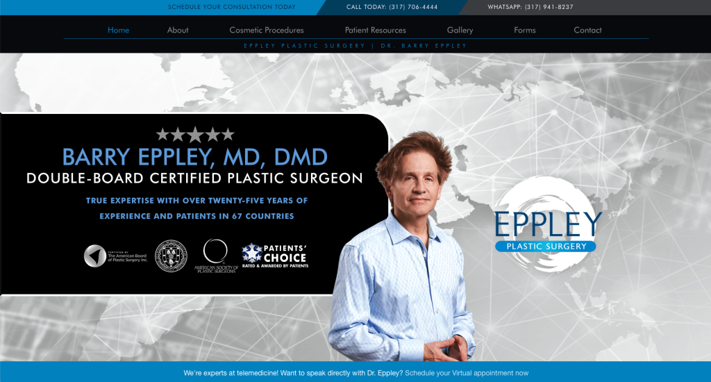
Color is everything, and this color scheme portrays a trust worthy, clean surgical center. Eppley Plastic Surgery has a straightforward layout to reduce overwhelming clutter and help visitors quickly determine if their business is what customers are looking for. We thought adding in a creative map as a background for Eppley Plastic Surgery’s hero image to ephasise that he provides for patients all around the world. They also had a unique but simple logo design.
24. Austin Cosmetic Surgery
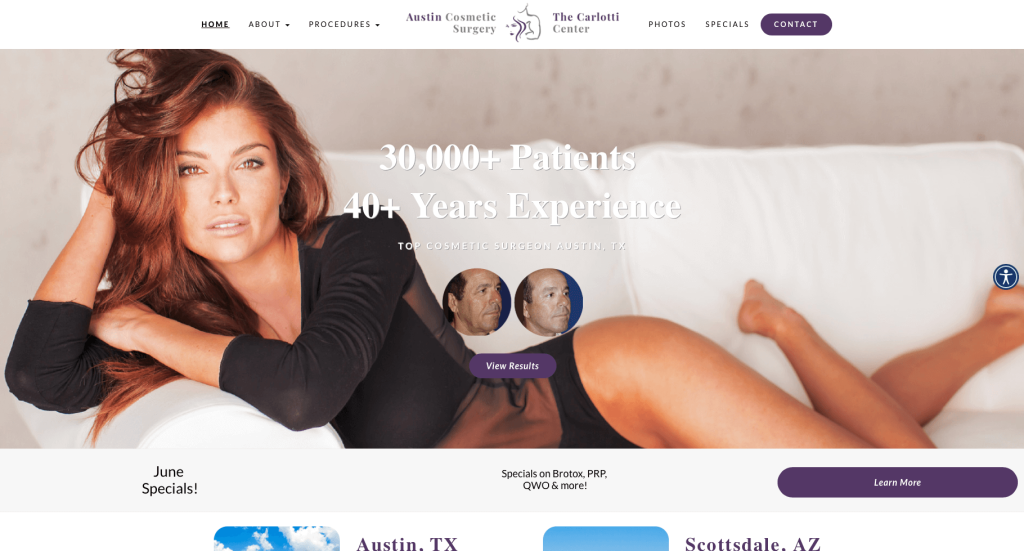
Using a dark purple color creates a luxurious feeling, but it also draws attention to points of interest such as CTA and contact buttons. Unlike most competitors, Austin Cosmetic Surgery caters to both males and females, which was amazing. Their logo design was mind-blowing, showcasing that they provide for males and females, for beauty and strength reasons. Another highlight of this homepage was their “Success Stories” section, which provides reviews from actual patients and includes high-quality photos of them to create trust.
25. Donaldson Plastic Surgery & Aesthetic Solution
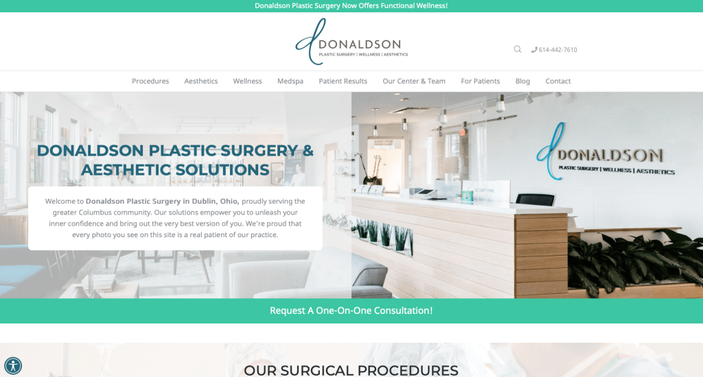
Here we have a more information-based example that’ll satisfy potential clients, due to all the knowledge they’ll gain about this business. We also noticed their creative little icons, that show off some of their features. However, a careful placement of CTA buttons helps guide viewers straight to them. Short paragraphs are added in which allows for customers to read information carefully, and get to what they need faster.
26. Phoenix Liposuction Center
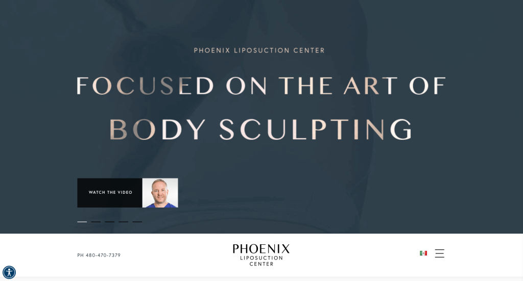
Immediately, we noticed a full-page of a photo slider previewing different parts of common treatments. We loved their professional fonts. Before and after sliders were also shown throughout this homepage to raise awareness to how much of a difference their services could be to you. A section may also be noticed that focuses on patient stories and meeting this company’s team.
27. Amirlak Plastic Surgery
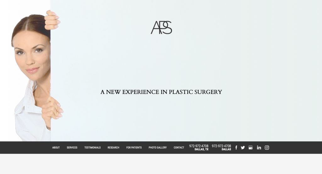
Amirlak Plastic Surgery has another simple and clean design with balanced white space between different sections. Something unique for a plastic surgery center was that they provide 3-D imaging and print modeling, in order to strengthen their quality of work. Many client reviews are added in to insure incoming customers can get a good feel of the experience they’ll be getting. Finally, having a tab that organizes all important information for patients in one place was also a great idea.
28. Illume Cosmetic Surgery
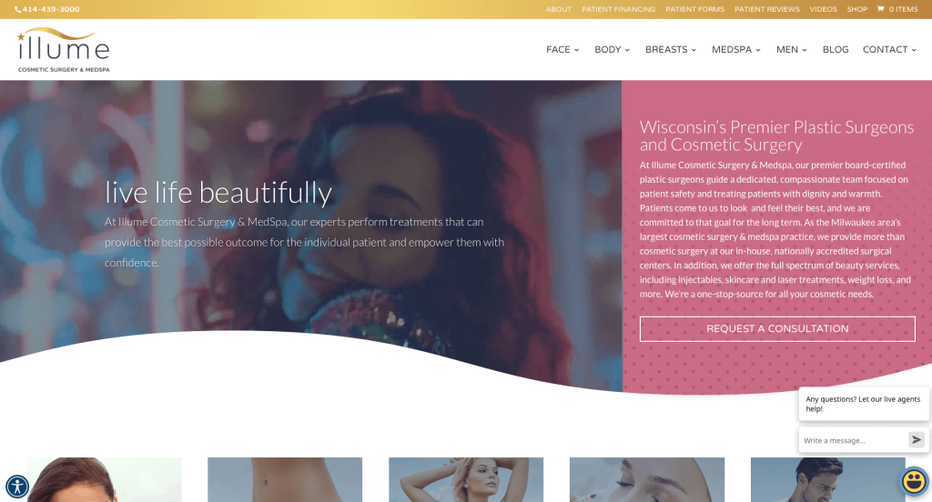
Illume is certainly a lively template, sure to stand out from competitors. We loved how their swoosh from their logo is incorporated as a design element throughout this site. A short but useful video is used to help grab attention of viewers. Illume’s color scheme is another thing that helped them become outstanding. We thought it was amazing that each location has additional information located in their footer.
29. Prischmann Facial Plastic Surgery
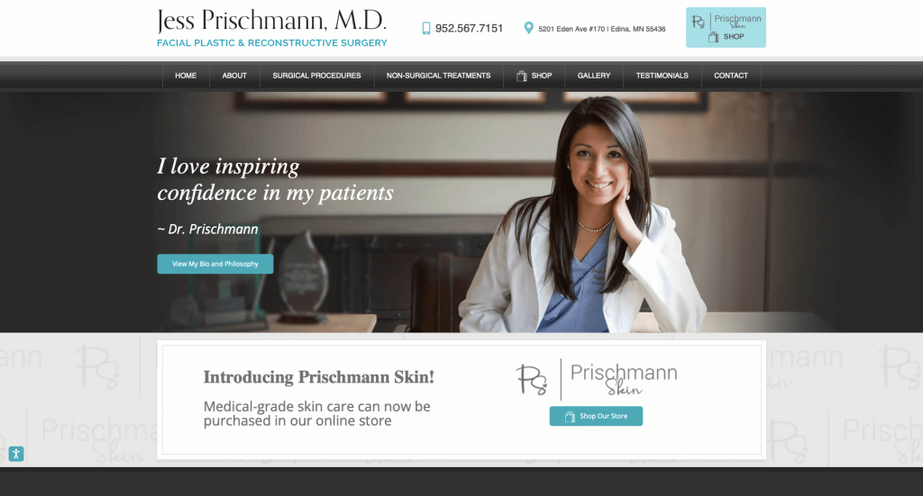
What makes this template stand out was its radiance, due to use of bright and beautiful pictures of smiling team members. These pictures make potential clients more comfortable, especially when they’re going to opt for a major operation like plastic surgery. Additionally, this company allowed for many links and buttons to help customers get to whatever piece of information they’re looking for. Plus, using such a soothing teal color along with line art and white space definitely makes this layout more eye-catching.
30. Natural Results Plastic Surgery
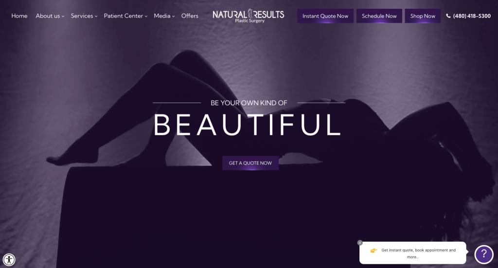
To be honest, using a purple accent helped create a luxurious, mysterious feel. This purple and black color theme is maintained throughout, even in their images, creating a unique and intriguing aesthetic. High quality images of both men and women are included to allow both men and women into their company. Adding in darkened images as backgrounds was a great choice. It was also great to include a 3D simulation of their location.
31. Marina Plastic Surgery
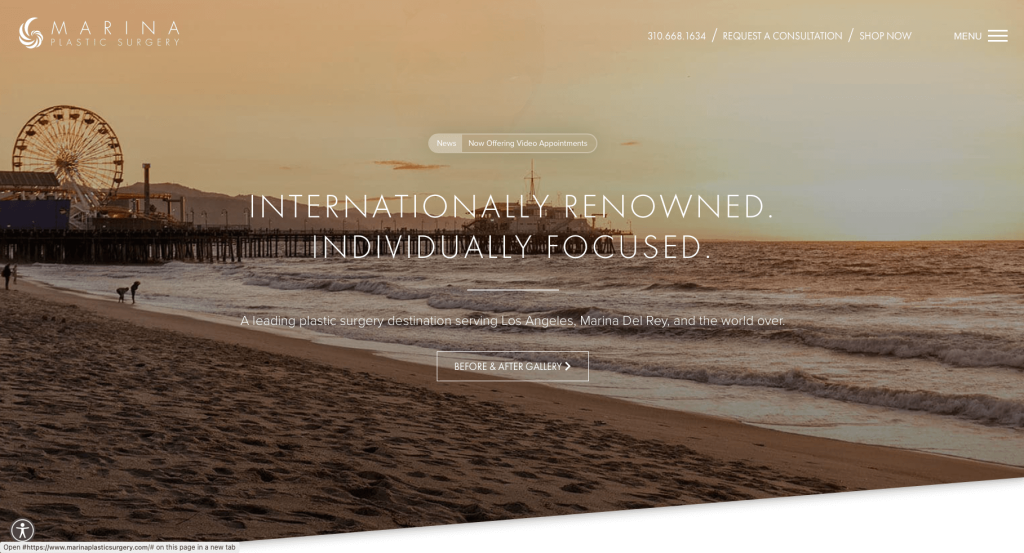
Marina Plastic Surgery used a blue accent color to create that clean feel. It was helpful to include awards and popular newspapers that they were published in. A lot of high-quality visuals are included to help people really understand what customers may feel like after their procedure. Including a hamburger menu at the top-right section unveils a detailed menu with easy-to-access informative sections that have everything from transformation pictures to real patient stories.
32. Elite Dermatology & The Oaks Plastic Surgery
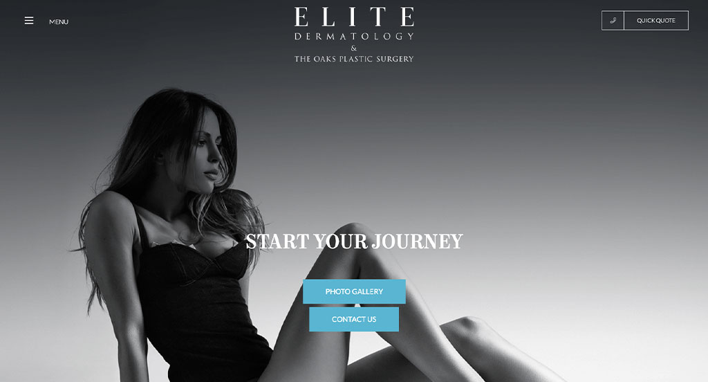
The monochromatic aesthetics of this site with the teal highlights are able to instantly grab the attention of visitors. Rather than beating around the bush, the “Contact Us” and “Photo Gallery” buttons are present on the opening page. The latter is especially interesting as it leads visitors to a beautifully laid out gallery with high-quality before and after photos of procedures accompanied by case details.
Furthermore, the rest of the homepage is quite interesting due to the use of loop images, leading visitors to learn about the procedures. There’s also an integrated video section right before the end, which is meant to increase interaction and generate response from potential clients.
33. Siegel Facial Plastic Surgery
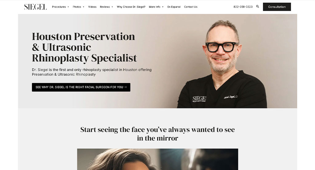
This is another plastic surgery page where the design maintains a nice balance between bright and monochromatic colors to help visitors focus on the text. While there are blocks of texts on the homepage, they’re often contrasted with an additional pop of colors in the background.
One element of the on-site design that stands out is the placement of the virtual consultation button above the menu. Due to this unique and upfront placement, many visitors almost instantly click on the button to book a consultation after visiting the page.
34. DFW Plastic Surgery
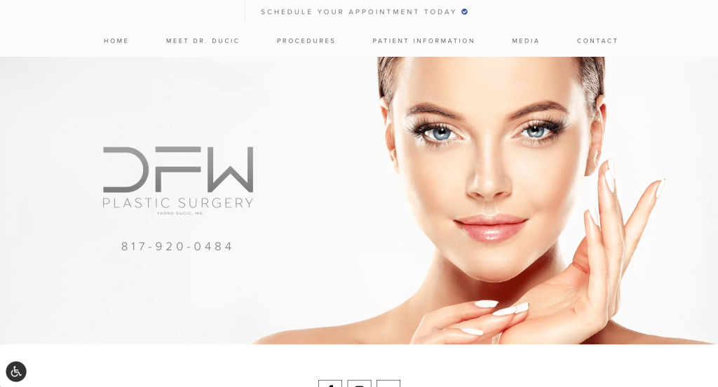
Most likely, DFW Plastic Surgery’s best quality was their stunning images all over this design. Social media handles can also be found quickly, this will let visitors connect with them as business. Additionally, a stunning layout can be noticed to balance out their images and written content. Another element we liked was their section dedicated to their lead plastic surgeon.
35. Brandon Adams Cosmetic & Reconstructive Plastic Surgeon
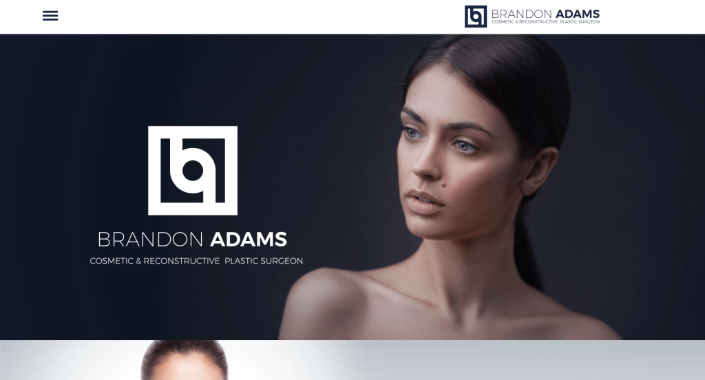
Brandon Adams did a great job with their logo design, including their initials along with looking alluring. Dark blue is used to achieve a classy and aesthetic look. High quality images with minimalistic backgrounds are used to create extreme personality. Their written content is also placed in a way that allows viewers to find important pieces. Additionally, many buttons are shown to help with navigation.
36. North Texas Plastic Surgery
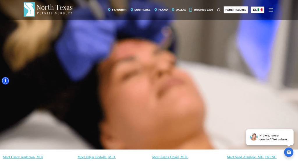
While reviewing North Texas Plastic Surgery, we noticed great visuals including automatically playing videos, images of their team, and their unique feature to show their services. Adding on their social media page, really helped to show that their company makes a difference to their customers. You’ll get information about their surgeons as well as information about their experience as a business, which helps to build credibility.
37. Toronto Cosmetic Surgery Institute
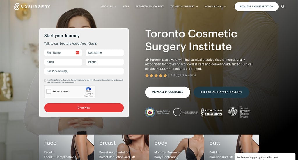
When building a plastic surgery facility site, it’s essential to choose a design that’s comforting to a visitor as they’re going to opt for major procedures. The majorly white background and the soft theme of this webpage work well to convey the message of care to potential clients. Moreover, the large yet delicate headlines, along with the use of bright images, seem fitting for the business.
Another unique aspect of this page is the card-based design of various sections that can be accessed by clicking on the hamburger menu. They become even more interactive for the visitors, thanks to the animations, which makes navigating the page less confusing.
38. VIP Plastic Surgery
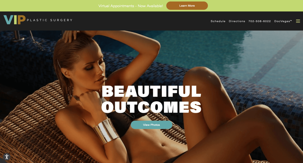
As soon as someone opens this site, they’ll know what they are targeting, women who want to feel good about their body. Every one of their images depicts a feeling of richness, tying tightly to their name, VIP Plastic Surgery. It has a pretty straightforward information-based design meant to help potential clients find a desirable cosmetic procedure. Large fonts are utilized for titles, creating a stunning, professional feel. We also thought it was a great idea to match their domain with their business name.
Related: Paid advertising can be tricky for medical practices, but they can provide a valuable source of leads for your plastic surgeons.
39. John E Sherman MD
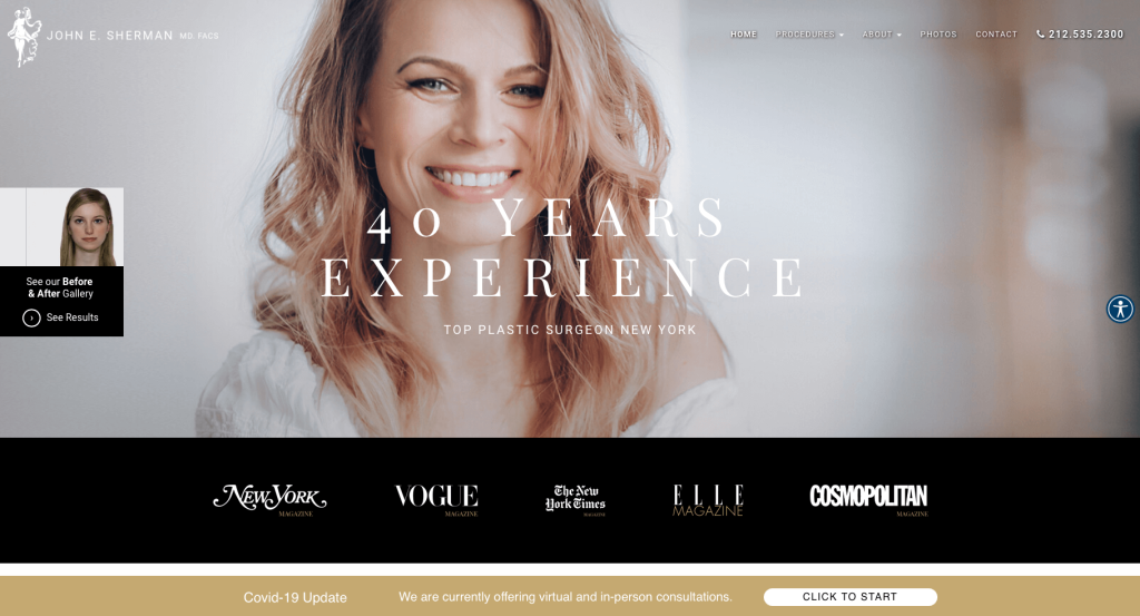
Color palettes might be this company’s most impactful feature. Additionally, professional fonts and a creative layout are used to make it even more interesting. This informative homepage includes everything that a potential client may need, like proof of a quality surgeon, available procedures, and a section to book an appointment. Also, a white background is balanced out with black buttons, fonts, and color blocks, to create an aesthetic contrast. A before and after gallery section is integrated into their opening image, directing clients to a full gallery with transformation pictures arranged in well-designed segments.
40. Gotham Plastic Surgery
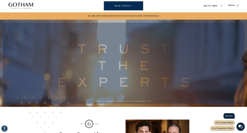
This is yet another business that values the importance of having a clean design. It was great to include a section showing affiliations, social media, podcasts, and doctor apps. A dark blue color is used as a highlight along with gold to help extent their visual appeal. Adding in a map to help customers find their facility was a great choice. A search bar was another great addition to this professional design. A large font throughout makes reading their content easier and draws focus toward essential information.
41. Cangello Plastic Surgery
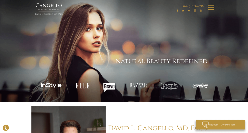
This company proves that including that perfect amount of information is essential to increase trust among potential clients. Plus, attractive and high-quality images are used to separate information and highlight their relevant procedures. Adding in images in groups of 4 to display similar services was a great choice. It was also helpful to have short and straightforward paragraphs.
42. Olivia Hutchinson, MD
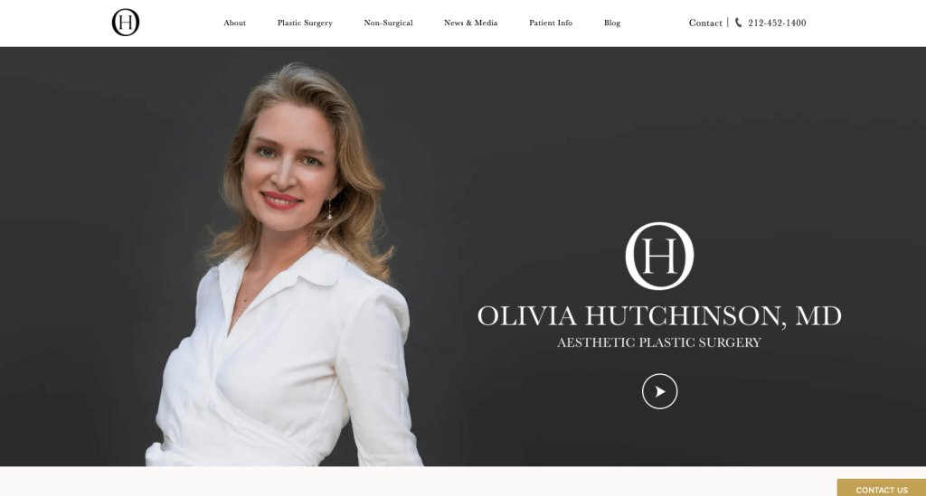
Layering images over basic image backgrounds was a great decision to improve their visual appeal. We enjoyed how their logo design was simplistic, but it included an O and a H to represent Olivia Hutchinson. Their large intro slider to show off their company was useful and looked great. Additionally, you may notice how customer reviews were included, building trust with incoming customers. Gold accents might also be noticed to help add a feeling of loyalty.
43. Pacific Plastic Surgery Group
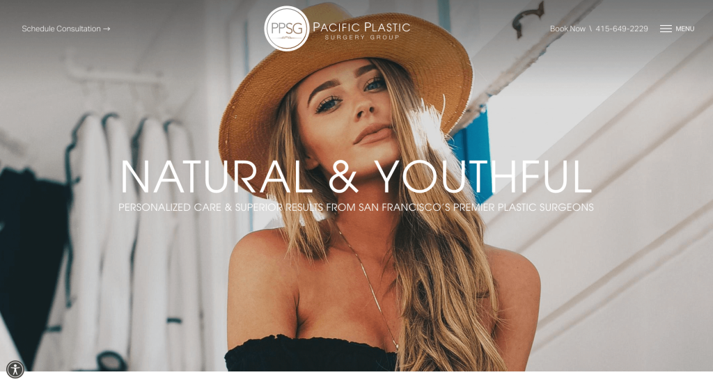
We’re sure that including high-quality visuals was surely this company’s strong suit. While we reviewed this example, we noticed their font styling sets. Lots of bigger fonts and brighter colors are used for larger headings and a simple, black font is used for their paragraphs. Along with that, we liked that all their paragraphs were extremely short and straightforward. Even after utilizing many design elements, their web designers have clearly been able to keep a perfect balance of white space to create contrast and separate individual sections.
44. Gawley Plastic Surgery
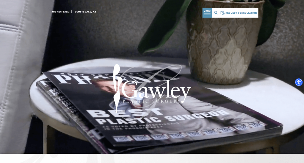
It’s delightful to visit this surgical center’s website since their layout is comparable to a piece of art. Rectangular boxes are utilized to organize information into sections, alternating from left to right. Scrolling lettering can also be used as accents to attract attention. You might notice videos from past clients, along with before and after sliders and a live chat feature. Every section stands out due to their beautiful soothing blue that matches their logo design.
45. Dr. Elyassnia Plastic Surgeon
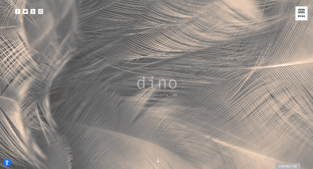
By far, this was one of our most creative and attractive websites on this list. Using a variety of grayscale images helps create a universal feeling, connecting their whole page together. We loved this layout that allowed for bold fonts to help organize content. Furthermore, simple animated arrows act as guides to show customers that there is more content below. Adding in a blog was something else that stood out to us about this business’s page.
46. Dr. James Anthony Plastic Surgery
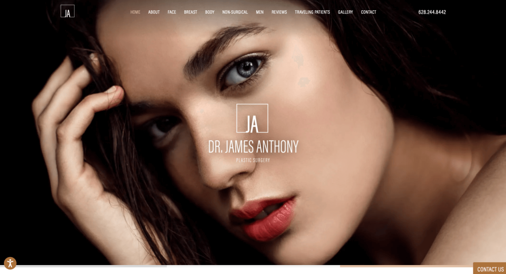
One of this company’s best features was their balanced layout that prioritizes organization. A welcoming and beautiful full-page image accompanies a minimalistic menu and facility’s logo. Many buttons and links are found to help customers find additional information. This company had a stunning navigation bar that was well organized to allow for easy access to possible clients. Their gallery was another aspect that was outstanding, not only did it showcase past outcomes, but it was organized into 5 categories organized into groups.
47. Capizzi, M.D.
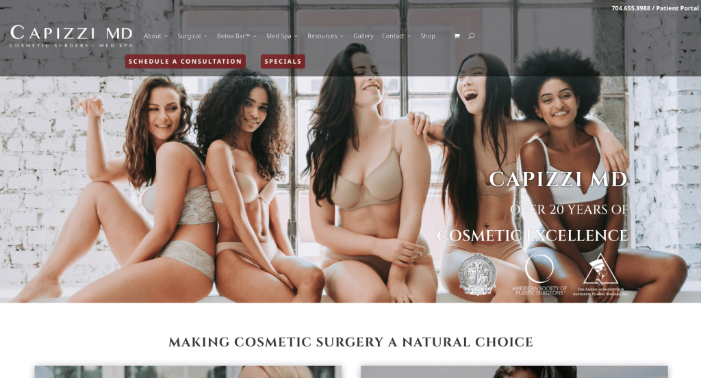
Capizzi, M.D. has a practical design that maintains a balance between text and images to convey information. We loved their natural seeming color palette, with lots of white space. An excellent addition was their “Schedule A Consultation” button found right away so that potential clients don’t need to look all over for it. Aesthetically pleasing images are included to help maintain that happy, feel good energy.
48. Miami Plastic Surgery
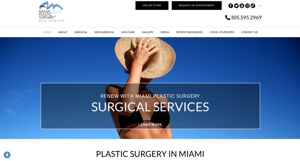
Many features instantly stand out when looking at a site like this, but we picked up on their stunning color palette first. Their creative logo design was another thing that stood out to us because it was simple, unique but somehow still extremely elegant. They also utilized an uncomplicated page design without compromising on user engagement. This design is free from any large bodies of text and rather serves as a platform to provide links to relevant pages. There was also great use of boxes to break up their presentation styles for their written content.
49. Miami Aesthetic
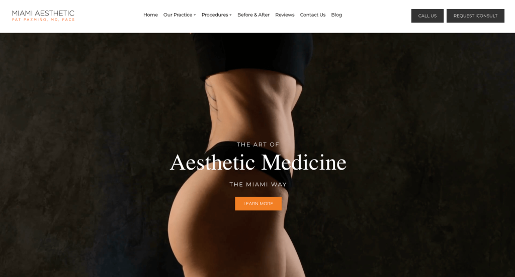
Utilizing before and after sliders really helps customers to understand just how drastic of a change this service could make to their body. Their section for client reviews was another section that really showed us that this company cares about their incoming customers. We thought it was a unique addition to have a 4 step progression line, allowing customers to click on each number for more information. Overall, this layout is quite simple, but having an opening video acts as a hook for a visitor.
50. Rapaport Plastic Surgery
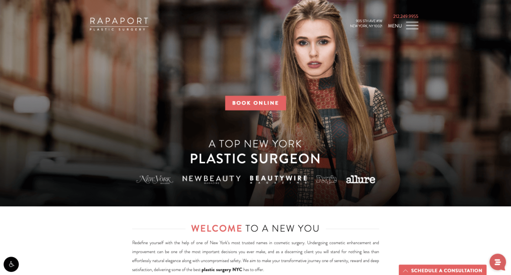
Serving as another great example for mixing and matching different design elements while still looking cohesive is Rapaport Plastic Surgery. Even though a dominant white is chosen for this page, a lovely coral pink has been used to help highlight buttons, contact information, and headlines. We thought it was a great choice to include popular publications that support this company.
Building an Impressive Cosmetic Surgery Website
Building a new website or wishing to recreate a design for your cosmetic surgical facility? That’s exciting!
Let’s explore some key steps to create or redesign your site. If you’ve already selected a domain, hosting, and platform, feel free to skip ahead!
1.) Acquiring a Domain Name
Selecting a domain name is an essential step for your business. It will define your online identity and greatly influence branding and recognition.
Here’s a step-by-step process to help you select a breath-taking domain name:
- Brainstorm: Begin thinking about domain name ideas by incorporating your business name, services you provide, and your location.
- Simplicity: Choose a domain name that is straightforward, easy to spell, and pronounce. Steer clear of complicated words, hyphens, or numbers.
- Consistency: If you have an established brand, include it in your domain. For example, if your business is Jackson Cosmetic Surgery Center, avoid domains like ACutAboveTheRest.net.
- Availability: Before proceeding, check if your desired domain name is available. If it’s taken, see if it could be purchased, but avoid overspending on it.
- Domain Extensions: Choose a domain extension that fits your website’s purpose. While .com is popular, options like .net, .org, or .surgery may also be suitable.
- Legal Considerations: Before registering your domain, check for trademarks to ensure you won’t be dealing with other companies’ lawyers. Steer clear of names that resemble other cosmetic surgery centers or other established brands.
- Register the Domain: Once you’ve chosen a domain, register it with a trusted provider. We recommend GoDaddy and Namecheap for their ease of management.
2.) Selecting a Website Platform for Your Cosmetic Surgery Center
After choosing a domain, you’ll have to dive into the world of website platforms.
Most cosmetic surgeon sites feature content, patient galleries, forms, and live chats for conversions. WordPress is popular, but alternatives like Wix are also available.
- WordPress: WordPress is a flexible and popular CMS, perfect for websites of any size, from simple pages to advanced sites with appointment scheduling. With industry-specific themes and plugins, it allows for a customized, expandable site. Most users opt for an open-source version installed on their own hosting for greater control.
- Wix: Wix is similar to WordPress with robust page-building features and operates as a hosted solution, eliminating the need for separate web hosting. Which is why we also recommend it for plastic surgery websites.
Web Hosting Considerations
If you choose WordPress or WooCommerce, you’ll need a web hosting service. We recommend our own web hosting for optimal WordPress compatibility, but some other reliable options include:
- WP Engine: We highly recommend WP Engine for anyone creating a site due to its user-friendly control panel, easy staging, and seamless backups. However, PHP max_execution_time limits and higher costs for upgrades can be drawbacks.
- SiteGround: We’ve had great experiences with SiteGround. Their support is excellent, with minimal wait times and efficient issue resolution. They offer user-friendly backup tools and competitive pricing for your center.
3.) Selecting a Website Template for Your Cosmetic Surgery Center
Most cosmetic surgery centers use third-party templates to save on development costs and time. For a custom design, consider hiring a custom web developer or custom ecommerce developer to create a unique theme.
Next, let’s explore options for finding a pre-built website template for your business. Check out these top theme marketplaces:
WordPress Cosmetic Surgery Themes
You can find free themes at wordpress.org, or explore cosmetic surgery-inspired templates on ThemeForest.
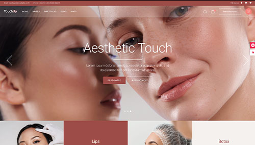
TouchUp – Themeforest
$79
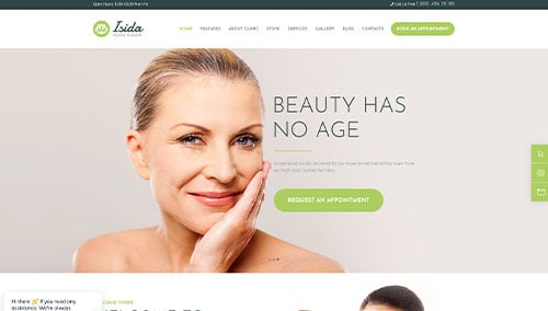
Isida – Themeforest
$69
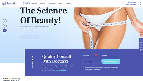
Renewal – Themeforest
$69
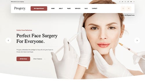
Progery – Themeforest
$69
Wix Cosmetic Surgery Themes
Discover both free and paid themes in wix.com‘s marketplace. Some of these themes are well-suited for cosmetic surgery centers.
4.) Creating Content & Adding Images for Your Cosmetic Surgery Center
With your domain, platform, and theme set, it’s time to create compelling content for your cosmetic surgery website! Here are some tips for crafting engaging copy tailored to your practice:
- Understand your target audience: Understand your target audience’s demographics, preferences, and needs before writing. Create content that addresses their concerns and provides valuable information to improve your search rankings.
- Define your key messages: Define key messages that align with your brand, showcase your strengths, and highlight benefits of choosing your center.
- Keep it concise and scannable: Keep content concise and easy to skim. Use short paragraphs, bullet points, subheadings, and bold text for better readability.
- Create clear and compelling headlines: Create compelling headlines that highlight your values as a company, encouraging visitors to explore further.
- Incorporate keywords strategically: Use keyword research to optimize your content, but avoid overuse to maintain readability. Tools like Ahrefs or Semrush can assist with keyword research.
- Maintain a conversational tone: Write conversationally, avoiding jargon unless needed. Engage readers directly with a friendly, approachable tone.
- Edit and proofread: Edit and proofread your content for errors, smooth flow, and brand alignment. Tools like Grammarly can be helpful!
- Leverage ChatGPT for assistance: If you need help with ideas or content refinement, try using AI tools like ChatGPT.
Use high-quality images to break up long text. Here are some tips:
- Choose high-quality images: Use high-resolution, well-composed images. Avoid blurry or pixelated visuals that reduce website quality.
- Ensure relevance: Choose images that complement your content and enhance engagement by adding context or visual interest.
- Consider stock photo resources: Use stock photo sites like Unsplash, Pixabay, or Shutterstock for quality cosmetic surgery images. Follow licensing rules and provide attributions.
- Customize images when possible: Customize images to match your brand using tools like Adobe Photoshop or Canva for a cohesive look.
- Optimize image file sizes: Compress images to improve page speed and SEO. Use tools like TinyPNG to reduce file size without losing quality.
5.) Post Launch Tasks for Your Plastic Surgery Center
After launching your plastic surgery website, focus on these key tasks to maximize its effectiveness:
- Search Engine Optimization (SEO): Boost your plastic surgery center’s visibility with SEO strategies. Use keywords, optimize content, and build a strong internal linking structure. Update regularly with quality content. Consider our SEO team or providers like The HOTH.
- Paid Advertising: Use Google Ads or Facebook Ads to drive targeted traffic. Consider our PPC management services or find experts on Mayple.
- Conversion Rate Optimization (CRO): Use Google Analytics to track performance and identify drop-offs. Optimize with A/B testing tools like VWO to improve conversions and user experience.
- Website Security: Secure your website with SSL, firewalls (e.g., Sucuri), and regular backups. Keep everything updated, monitor for risks, and use tools like UptimeRobot for uptime monitoring.
- Website Maintenance: Maintain your website by updating plugins, monitoring speed, fixing errors, and backing up data. Consider our website maintenance services or freelancers on Upwork.
- User Feedback and Testing: Collect user feedback and conduct testing to improve your website’s user experience. Use insights to make ongoing enhancements.
- Content Updates: Update your website regularly with fresh content and accurate service information. Engaging posts attract visitors and encourage sharing.
Post-launch digital marketing is key to your website’s success. Stay proactive, monitor, and adjust strategies to meet your goals and audience needs.
FAQs about Web Development for Cosmetic Surgery Websites
Your website will have an easy-to-use CMS, allowing you to update content, images, and more without technical skills.
We can improve your existing website without a full rebuild, optimizing its design, user experience, and performance.
Template websites are a cost-effective way to create a professional look, showcase services, display photos, share testimonials, and enable scheduling.
A redesign aligns your site with modern trends, improves user experience, and optimizes for mobile. It enhances aesthetics and functionality, boosting credibility and engagement.
We offer training on managing your website, showing you how to use the CMS to update content and images easily.
Template-based WordPress sites start at $4,000. Custom themes with design mockups start around $10,000. Costs rise with premium design, custom features, and data migration.