Attention real estate pros! Want to boost your online presence and reel in more clients? Check out our guide to the top 95 realtor websites!
Our expert team has scoured the web, evaluating top realtor websites based on design, functionality, uniqueness, and user experience. From sleek designs to intuitive navigation, these sites set the industry standard.
Discover inspiration for your website and valuable tips to make your online presence shine.
Elevate your real estate business with this guide! Explore website examples from agencies, associations, investment firms, lenders, and developers. For design ideas across industries, see our Top Top Website Designs of 2023 article!
The Top Real Estate Website Designs
1. Mark Allen Realty
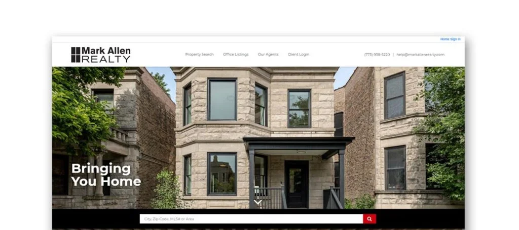
Mark Allen Realty has a clean and simple template with many links near the top to help a potential customer search for property, view office listings, and learn more about the team. There was also a link to bring you to a form in order to find out how much your house is worth. Also, a client login is added to get more in-depth content about their company.
Need a professional website? Schedule your free consultation!
2. Chicago Premier Realty, INC.
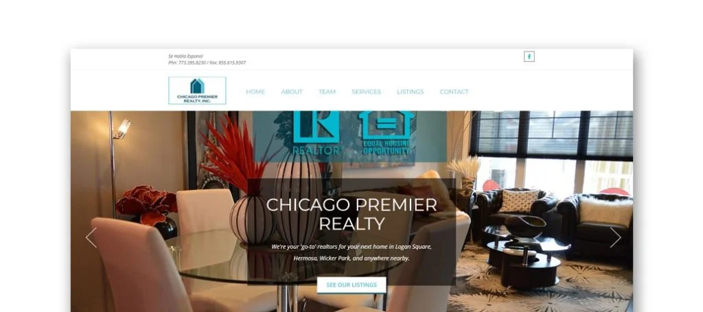
Chicago Premier Realty, INC. utilizes a creative design that holds all the information on one page. Links given at the top of the page help to ensure simple navigation. Chicago Premier Realty has listings that are available organized into 4 categories making it easy to find the exact listing that you are looking for. Some features that we also enjoyed was using a contact form, Google Map, and Facebook link as another way to connect with the company.
3. 606 Brokers
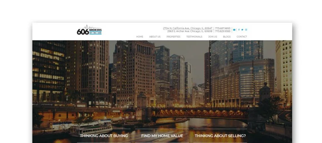
606 Brokers make it really easy to get into contact with them by displaying an address, phone number, and social media links. This homepage was kept simple with many links offering more content, which was helpful. Along with that, we enjoyed how this site added featured listings, customer testimonials, and a contact form. Offering a few different forms to fill out made it easy to receive information about buying, selling, and valuing your house.
4. Kale Realty

When looking for best real estate agent website ideas, take Kale Realty as an example by using big, capital letters throughout most of the site. Videos are also featured to explain the business in 60 seconds, keeping it short and sweet. Simple icons and a few cartoon pictures bring attention to important information and engage the audience. A few unique features that can be found are podcasts, a commission calculator, and FAQs. Lastly, we noticed high quality visuals which really adds to their design.
5. Realty of Chicago
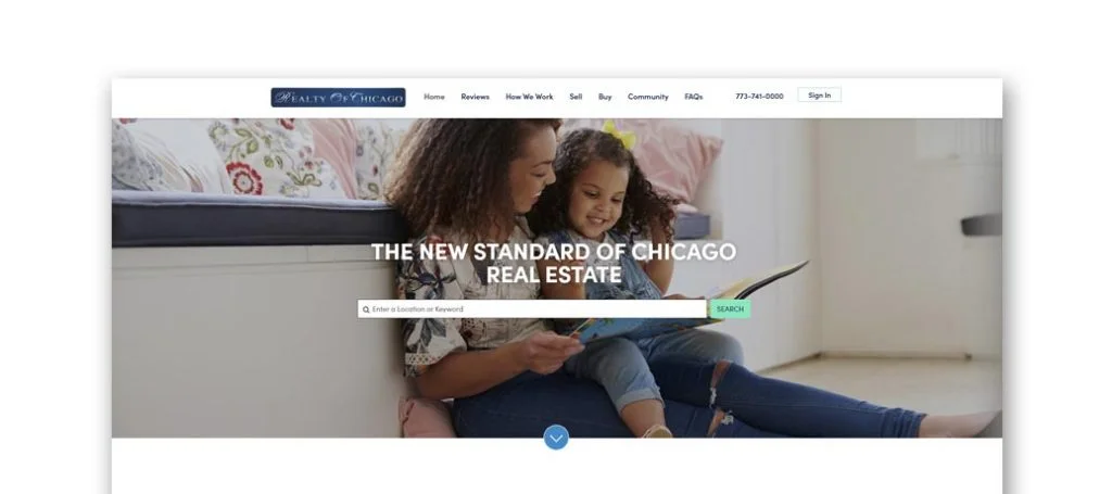
To catch customers’ eyes, Realty of Chicago chose a great design with a good mix of pictures and written text. Also, there is a good amount of white space, helping separate information. Additionally we liked how graphics were seen in the form of icons to liven up the site. Also, you can find happy customer testimonials, FAQs, along with a contact form.
6. Rethought Real Estate
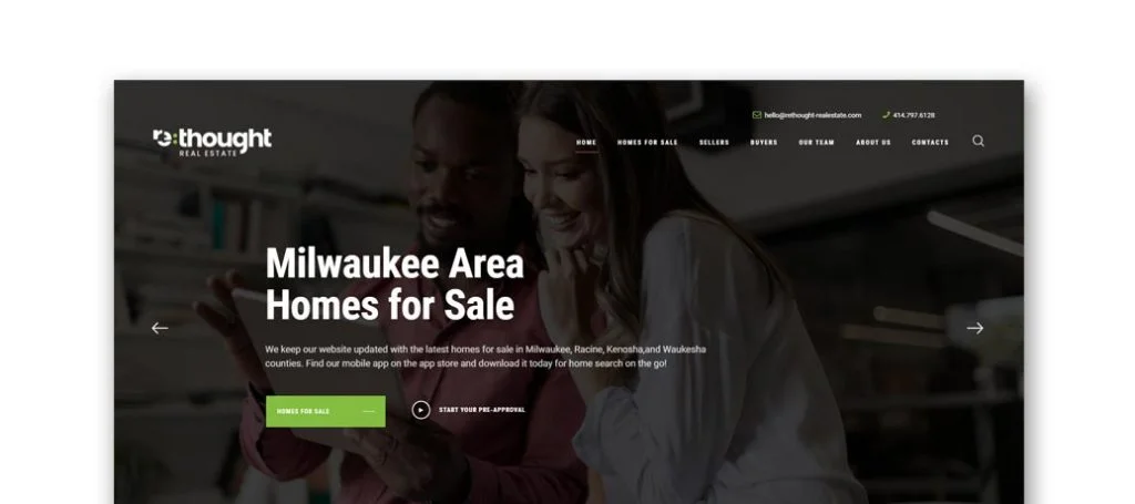
Rethought Real Estate has a great blueish-greenish color scheme to draw attention to important content, which is always helpful. Testimonials are showcased on a slider, allowing clients to read what past customers have experienced. A few other things we enjoyed about the template for Rethought Real Estate was buttons for better navigation, a creative logo design, and a form to value your current home.
7. Rockmor Realtors
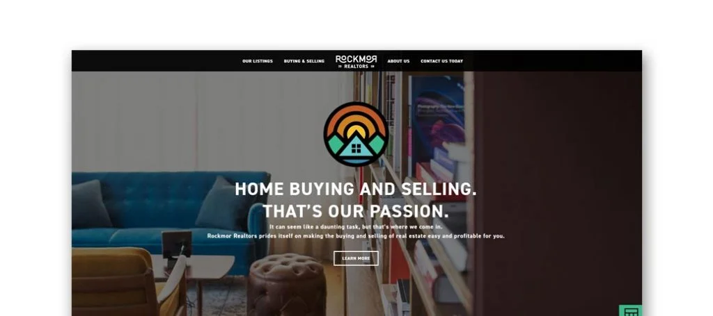
Rockmor Realtors has a creative template that sets them apart from competitor sites. The colors seen here are based off an image of a sunset and a blue house seen on the homepage. Though there isn’t much written information, there are many CTAs to receive more information. Also, a mortgage calculator and contact form are both available. Lastly, we really liked the simple and professional font choice.
8. Homestead Realty, Inc.
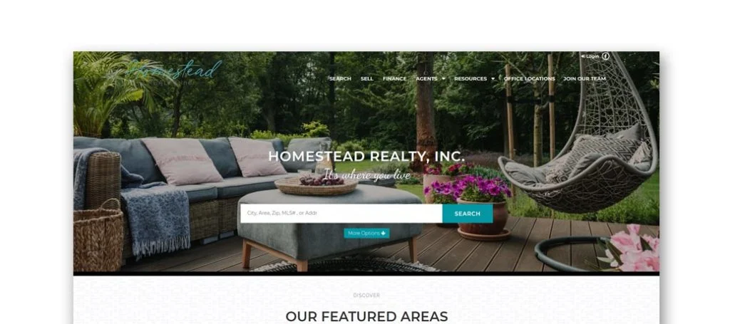
Including a feature that allows customer to pick an area for your desired home was brilliant. To add on, it includes a page with a map showing you all available houses in that area. It was also helpful to show off towns they specialize in. Using textures for the background helps make it more interesting without adding a ton of color.
9. Matt Lill and Partners
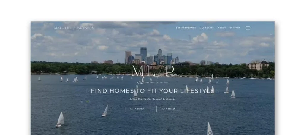
Another site to serve as an example for your real estate site is this one with a modern feel to it. A black and white color scheme is used with a good amount of space between content. A small, skinny font was picked, which we liked it creates a delicate feel. Bigger pictures are displayed to attract attention towards the team members, and areas they have houses for sale in. They feature an Instagram section, allowing you to see new listings and other important information.
10. Lakes Sotheby’s Realty
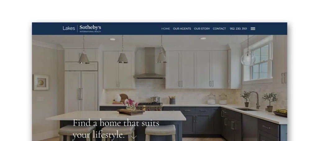
Lakes Sotheby’s Realty has a very simple design, which allows for easy navigation. Including visuals were a good idea to give a better understanding of what they as a company have to offer. Also, a short video clip shows off and explains what their business is about. Lakes Sotheby’s Realty doesn’t only offer realty, they also offer a few different auctions for wine, jewelry, cars, and more.
11. Anderson Realty
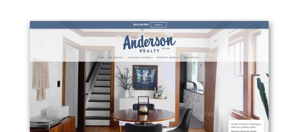
Customers attention is automatically focused to the main page and the company successfully shares important information right away. A video is helpful for the potential customer to get a better understanding of the business. We also enjoyed the relaxing color palette used for Anderson Realty. Lastly, another feature that stood out to us was a section dedicated to upcoming or recent listings.
12. Lakes Area Realty
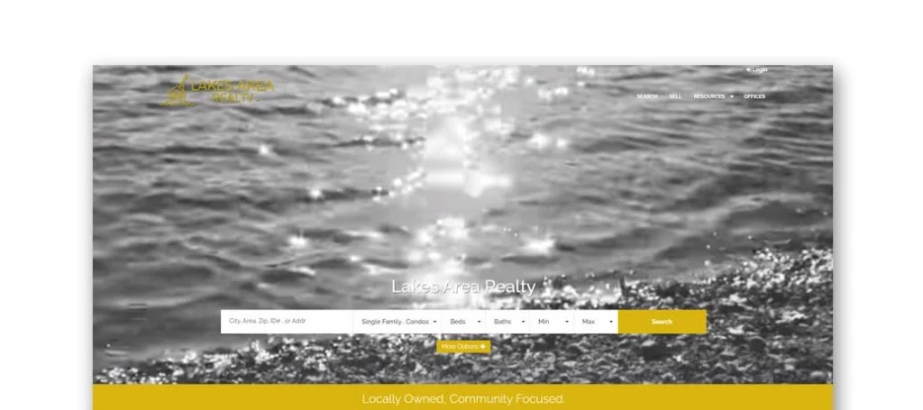
Here’s another example with many useful resources available for whoever needs it. Also, a search bar narrows down the results making it easy to find houses to fit your needs. It also helps that everything is listed into multi family, houses, condos and land. Including a section for homes that were just listed is another great idea for a real estate company.
13. REIS Residential
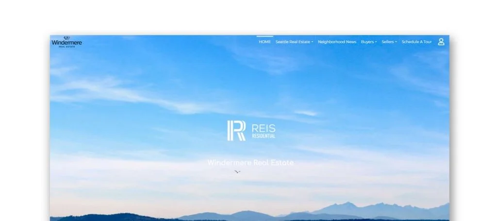
Another example site that has everything it needs to be a great example. There is a video sharing different statics about Seattle. A contact form, Google Map, updates about the market, and many social media links also improves this one. Reis Residential showcases an Instagram section which is important to show information such as open houses, houses for sale, and real estate updates. Finally, it was a great addition to have large images and a creative logo design.
14. Team Diva

Team Diva has a blue and purple color scheme, which is different from their competitors, setting them apart. Simple icons are seen throughout the pages to help explain different links. Additionally, they offer an informative blog, testimonials, newsletters, and videos on YouTube. We also enjoyed their graphics and buttons spread throughout the pages.
15. JL Seattle Real Estate
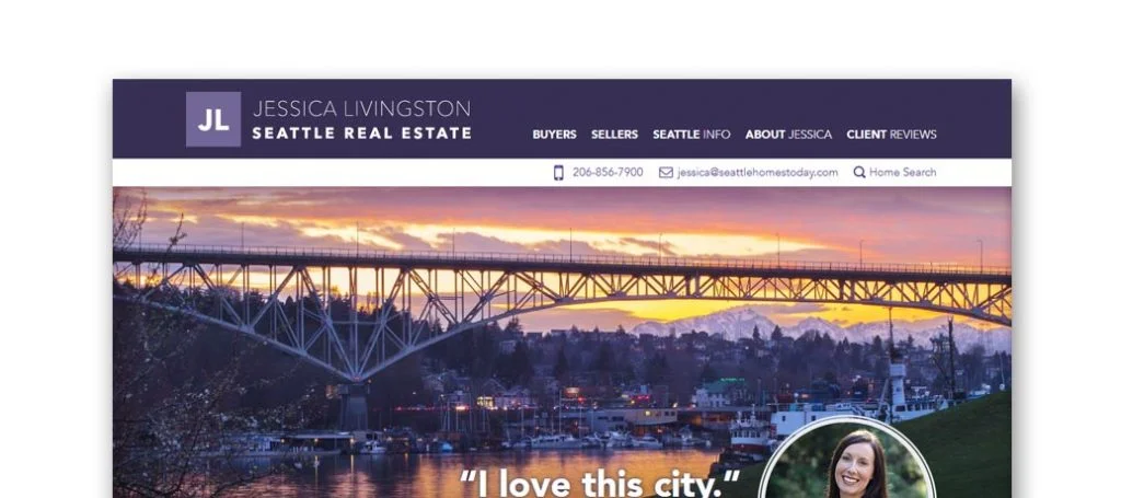
JL Seattle Real Estate developed a design that is simple but shows off personality. Each link shares short and to the point paragraphs about a variety of information. The client testimonials are also very detailed, which allows newer customers to have less doubts in the company. We also thought it was a good idea to include awards won by JL Seattle Real Estate.
16. KW Greater Seattle
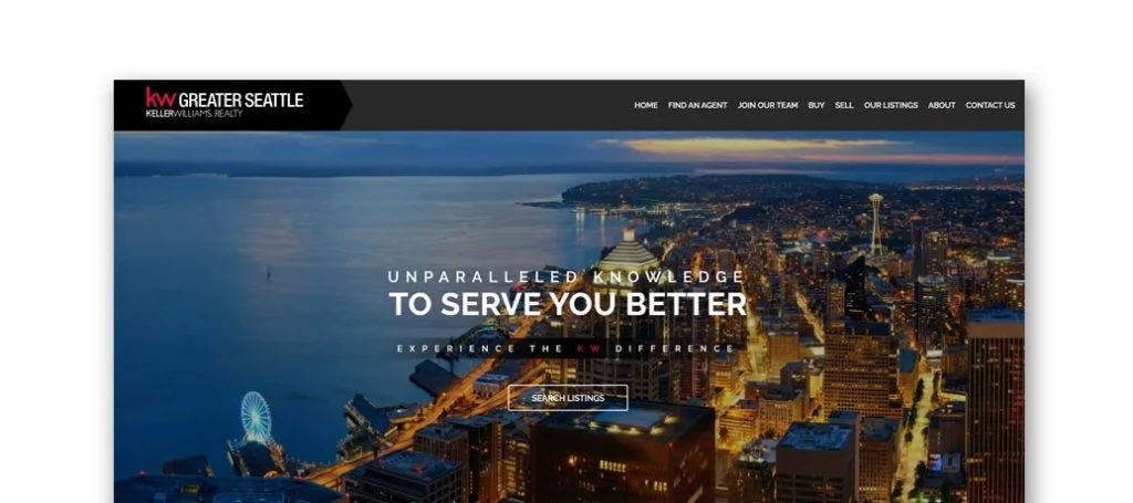
KW Greater Seattle’s template creates a balanced design between images, white space and text. A bright red color helps to make the site pop, and highlight the important parts. Having an entire page dedicated to their team and each agent’s contact information was extremely useful. There is a contact form, social media links, and contact information to help calm potential customers.
17. Realogics Sotheby’s International
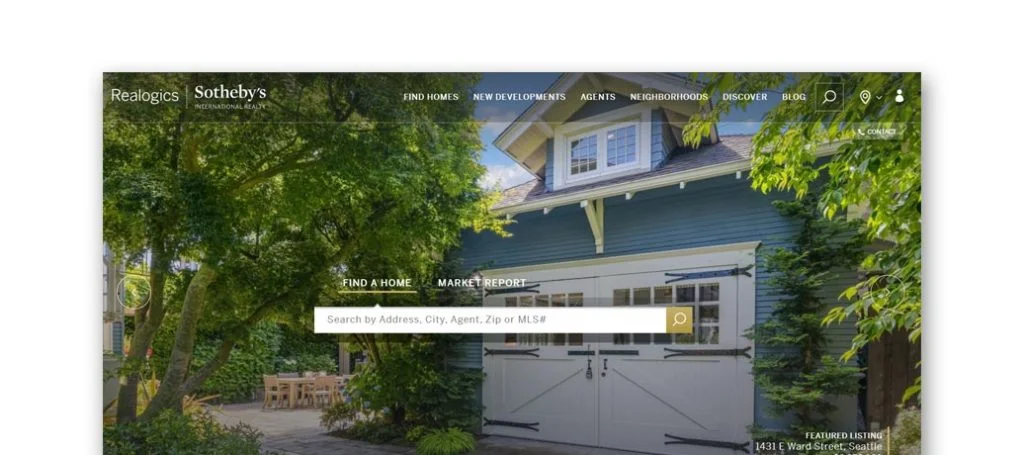
Realogics Sotheby’s International is another great example, with its very simple design including a search bar, property listing pictures, news, and what’s popular. Offered by this company is also a sign-in option allowing visitors to save houses and much more. Also included in here is a live chat, search bar, and many ways to connect with them through social media links.
18. Lake & Company
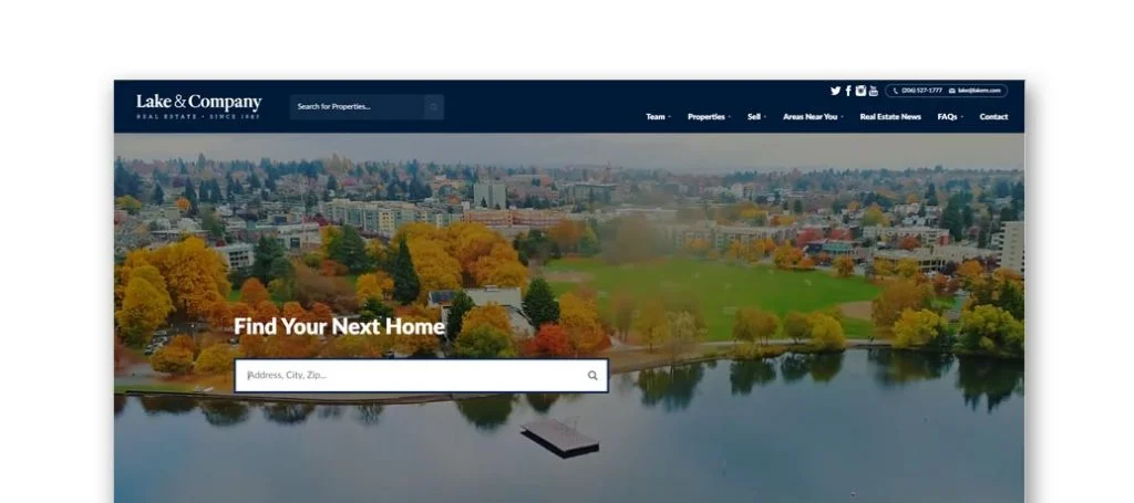
Immediately in this site we see an automatically playing video to attract attention. Lake & Company makes it super easy to contact them with information posted on every page. Also on the homepage, they feature testimonials and informative articles. Additionally, all links are sorted into categories near the bottom of the page to make additional information simple to find.
19. Home Team Realty
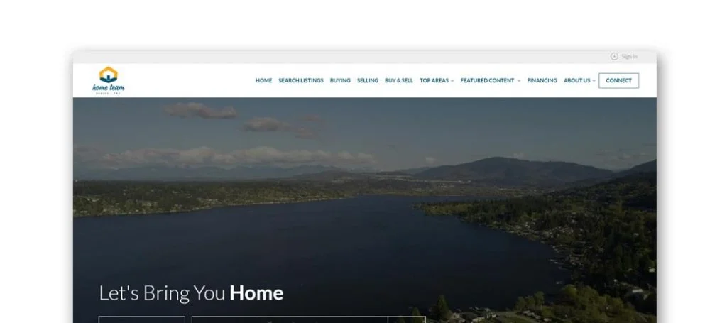
Home Team Realty’s developed a very welcoming homepage that takes pride in taking care of their clients. It’s easy to find information with a search bar, along with links to buy, sell, and contact them for additional questions. On a different note, the photo frames seen throughout different pages was unique. Also, it was nice to have a creative logo that helps customers remember their brand.
20. Urban Nest Realty
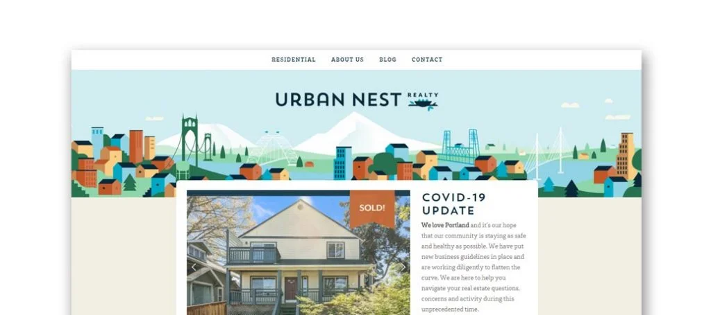
Bright and cheerful colors are used here, along with simple icons and colors to create an exciting template. In their intro clip, showing pending and sold houses helps update viewers who are searching for a new home. Having a layout that different than most other websites helps makes them unique. The content is placed in the middle of the page with a tan background, which focuses the viewer towards the middle of the page.
21. Farrell Realty
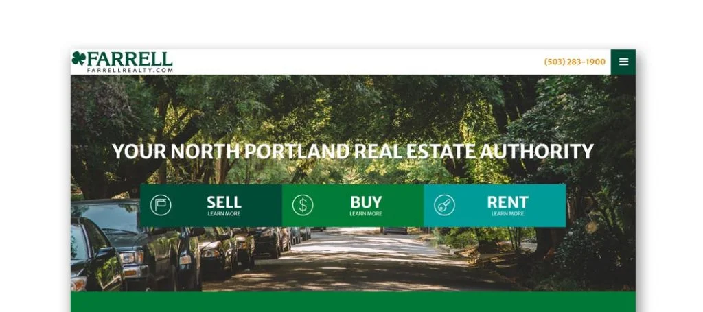
Farrell Realty has a very simple design, offering links at the top to sell, buy, or rent in north Portland. A green color scheme is used because the colors work well together. The menu bar is organized well which makes it easy for visitors to discover different aspects of the site. They also offer an informative blog, testimonials, a Google Map and contact information. We also noticed how their house listings are clearly labeled, sharing information such as how many bathrooms, bedrooms, square feet and dollars per month.
22. Eleete Real Estate

Great visuals are given for their company, along with helpful information related to buying and selling your house. On the homepage, they share customer testimonials, recent news related to home buying, and social media links. These features help potential customers get information they need. Using red colored buttons to help customers navigate through their site was also helpful.
23. Living Room Realty
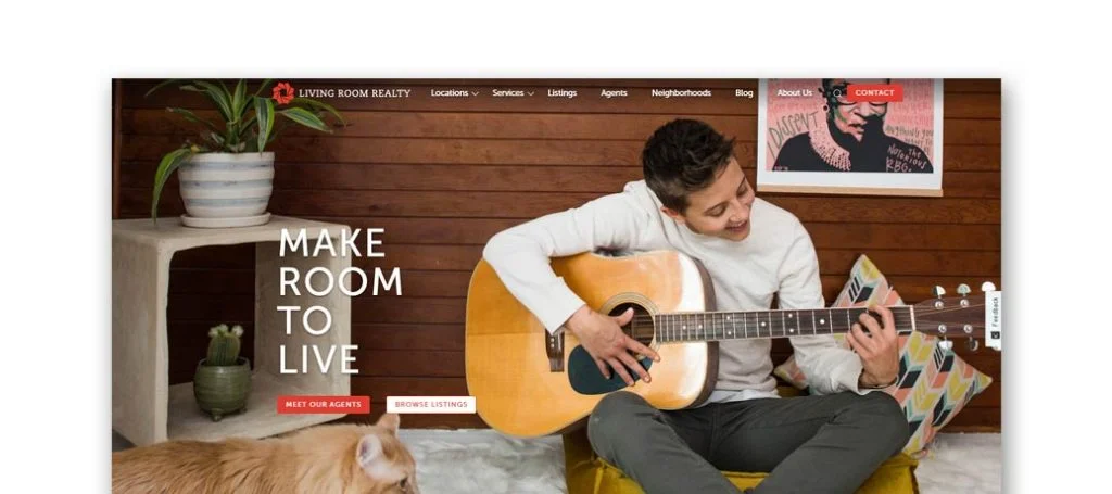
Living Room Realty has a basic design with many pictures to show many different people who are happy and smiling. On the homepage, they include services offered, listings, what they do, testimonials, and an introduction for each team member. We liked how they added in a blog to share stories, adventures, and tips. Having links located at the top and bottom of the page makes them extremely easy to find. Also an interesting logo design sets this website apart from its competitors.
24. The Hasson Company
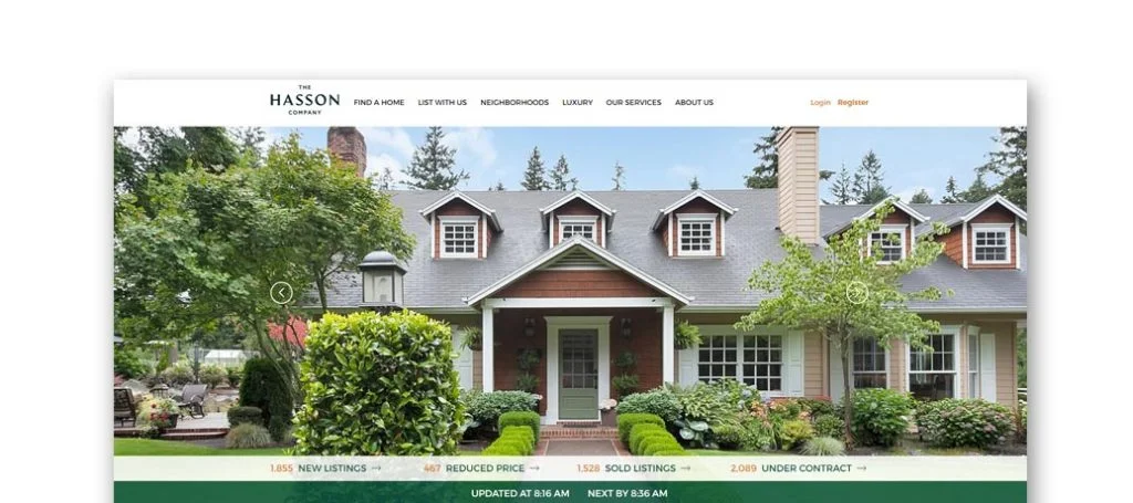
The creative design helps The Hasson Company stand out from other real estate websites. We liked how circular pictures are used along with showing when the post was last updated to prove the information is relevant. Right at the top of the page, they share the number of listed properties and which ones have reduced price to help narrow down results on houses.
Related: Looking for help managing a paid advertising campaign for a property management company? Check these services out.
25. Cook Realty
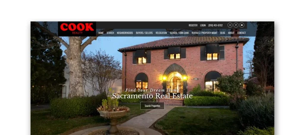
Here’s another example site that does a great job getting their information out to potential customers. It was helpful for Cook Realty to chose bold fonts for their design. They also have a simple design drawing attention to resources that are offered. One of the best things about this site was the domain that matches their company name which is a great marketing feature.
26. House Real Estate
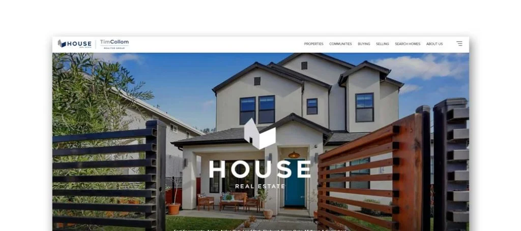
House Real Estate has a variety of pictures to showcase their work and information. Right at the top of the page, they introduce the owner and the rest of the team. Testimonials along with pictures of satisfied past customers brings comfort to upcoming clients. At the bottom of the homepage, they feature areas in which they serve. Something else this company had to offer was a handful of helpful links for people trying to buy or sell a house.
27. Realty One Group Complete
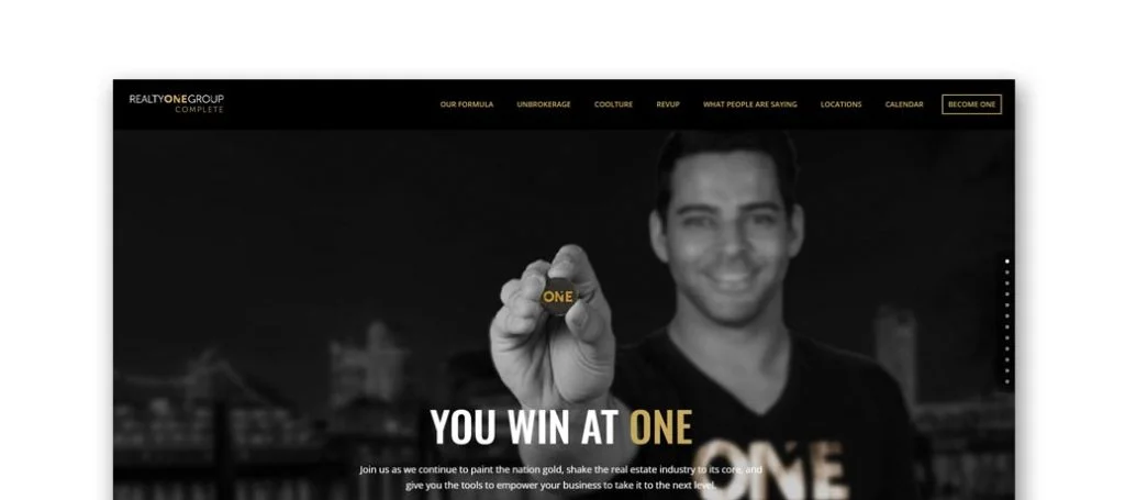
A black and gold color scheme covers the majority of this site, which makes the page stand out and grabs your attention. Realty One Group developed a design that is very easy to navigate because of the sticky header, which helps organize the site. We enjoyed how they chose to talk about their philosophy that everyone has a voice, and everyone wins. Also, using bold, capital letters throughout the whole template really bring the site to life.
28. KindredSF Homes
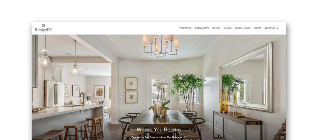
For this company, simplicity is key. They show that by getting important information out to the reader as soon as possible. Showing off their team, and their smiling faces, right away also creates a welcoming feeling. A few other features that stood out to us are customer testimonials, social media links, and informative blogs. Something else we noticed was the use of patterns in small color blocks.
29. DL Real Estate
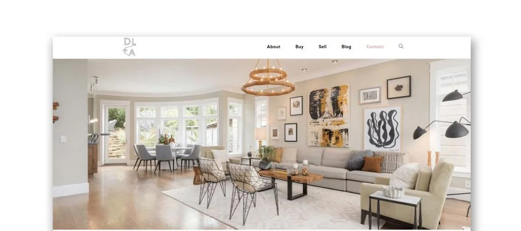
This is a great example to take a look at because of its modern pictures of houses, along with plenty of white space and simple black text. We liked the boxes around written text and plenty of separators to enhance readability. This also helps people not feel so overwhelmed when browsing through information. Testimonials are displayed from many different places, such as Yelp and Zillow. Along with that, they created an interesting logo design that stands out from its competitors.
30. Compass
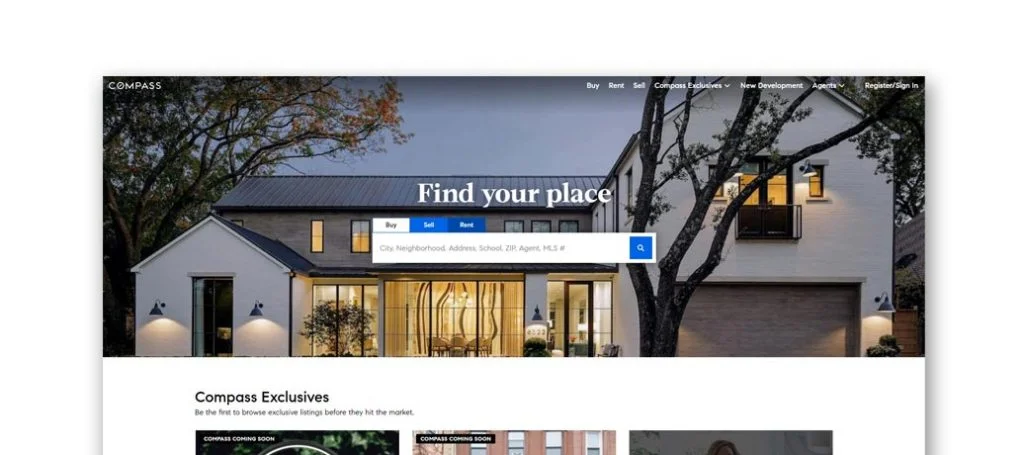
Compass’s goal is to find a house for their clients right away, because of that goal, they show off the available houses. Including a search bar to show locations for available homes (for sale or rent). It was also helpful to have lots of information related to different towns and neighborhoods. The best marketing feature we found was the domain name that was the same as their company name.
31. Beverly Barnett
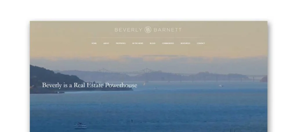
Overall, the template for Beverly Barnett is very informative featuring different news articles and blogs. Also, many helpful resources can be found at the top of the homepage. We did enjoy that this company chose a unique logo design that they displayed all around this site. Also included was simple contact information, information about the company, and available property. Adding in client testimonials also creates a new dimension to customers so they can get a better understanding of the company as a whole.
32. Krishnan Team
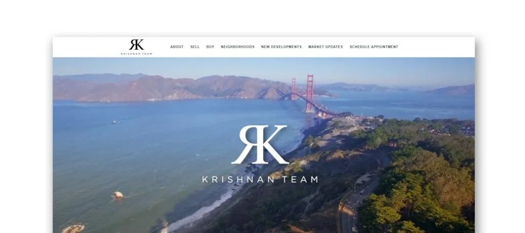
Krishnan Team’s website is very clean and attractive, helping it stand out from their competitor sites. The intro clip catches customers eyes and shows them areas Krishnan Team specializes in. Using an automatically playing video really captivates people entering the site. Some other notable features that helped this template make it onto the list of best real estate agent websites were a contact form, a live chat option, and a video clip explaining the business.
33. The Agency
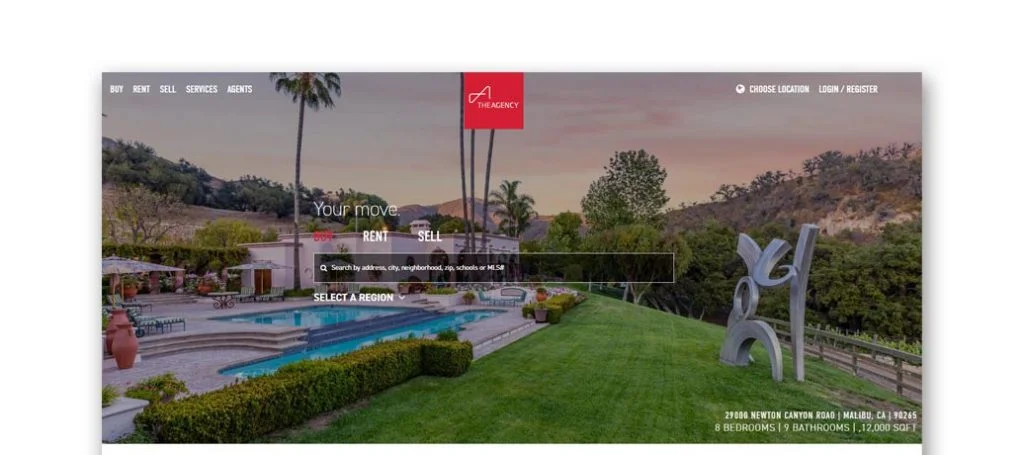
Having a simple layout allows for better navigation on the client’s end. They achieve this by having a search engine allowing people to find properties in a specific area, neighborhood, and even schools nearby. Attention is captured with many boxes including an image to showcase different information, accented with a bold red color. The combination of all these features make for a great professional custom design.
34. Ashby & Graff Real Estate
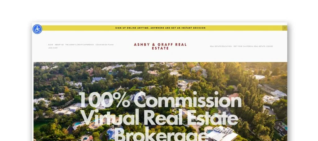
Here we have another simple web design with plenty of white space balanced image placement. As a company, focus is aimed at their written content to get a good explanation of who they are and what they do. Ashby & Graff Real Estate is a virtual real estate, so a video can be found to explain their company. Not to mention the accessibility feature, a help button and a website domain that matches their company name.
35. The Homecourt Real Estate
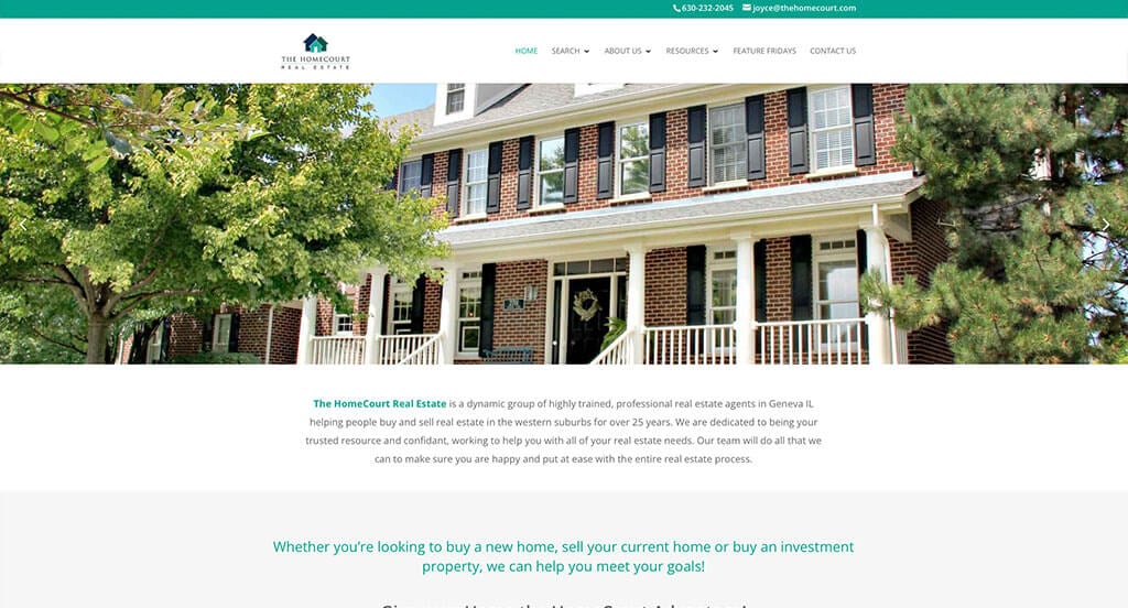
We quickly noticed the teal, blue and white color scheme used in The Homecourt Real Estate’s website. The use of white space was definitely the most impactful quality we could find. The creative logo design was refreshing for a custom site like this one. Clearly they had digital marketing in mind when creating the customer review section for their template. Be sure to consider the great design of this custom template when developing your next real estate design.
36. Josh V. Realty
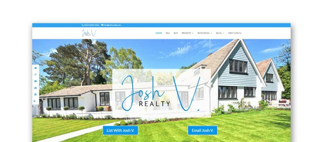
Josh V. Realty does a great job getting information out to the reader. This site offers a blog with many videos to answer questions and also explain information to know when buying or selling. Also, many useful resources can be found, such as a section to explaining the different types of loans, or the requirements for different services and loans. We also enjoyed how they chose to use creative fonts throughout the pages.
37. Keyes Real Estate
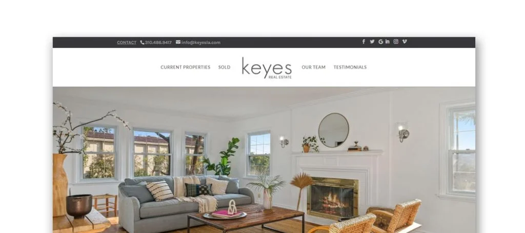
This site’s home page has many pictures which allows you to get to know the business. There is a section featuring tweets about properties available to purchase or lease. On top of that, there is an Instagram section to showing plenty of social proof. A sticky header helps keeps everything organized and straightforward making it easy to follow. Make sure to consider this web design when looking for template ideas.
38. Market Real Estate
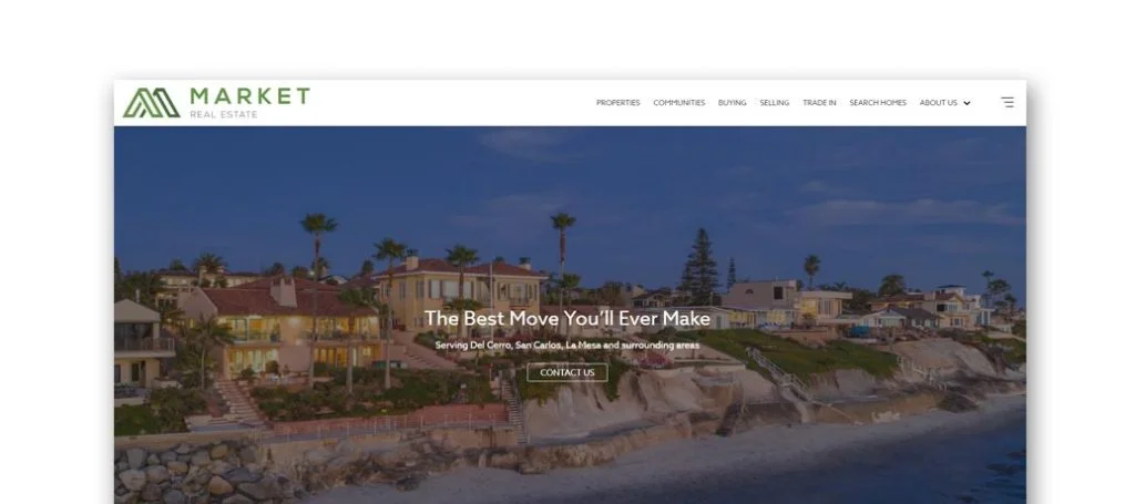
Simplicity reigns over this design with oversized and full-length pictures. Many strong CTAs allow people to reach out in order to discover more information. We also liked how a search bar is used to help customers find the perfect home in their selected destination. They have an amazing logo design that really brings attention to their company.
39. Home Smart Realty West
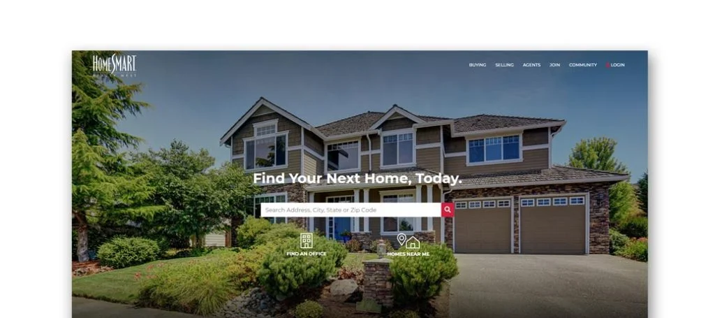
This custom layout is all about getting as much information to the reader as possible without confusing them. Explaining what their business does and how they’re different from competitors was something Home Smart Realty West did well. A picture of the United States can be found on the homepage displaying where they are located, along with how many offices and agents they have, which were all great ideas. Don’t forget this stunning custom template when searching for ideas for your realtor website.
Related: Get help with lead generation, social media marketing, sales funnels, and more from a digital marketing agency with experience helping real estate agents.
40. Premier Homes Team
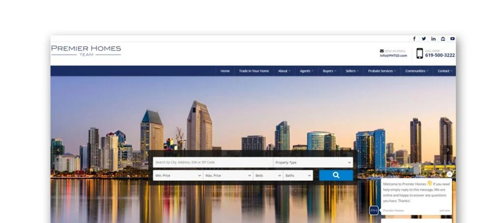
Premier Homes Team makes it easy to be able to get into connection with them. Included right away is contact information, a live chat, customer reviews and social media links all within the homepage. Utilizing bold fonts for titles and smaller fonts for the regular text was also helpful. The team members information is added in a scrolling feature on the homepage to help customers get in touch.
41. AZ Real Estate
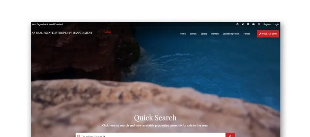
AZ Real Estate is simple but yet well-designed. Many responsive headers and strong CTAs make it easy for buyers to see information they need. Some features that improve this design are testimonials, social media links, and a great intro clip. Having their phone number placed right in the homepage adds a sense of reliability. Along with all that, this site also uses creative backgrounds and photo frames, which we enjoyed.
42. Realty Executives
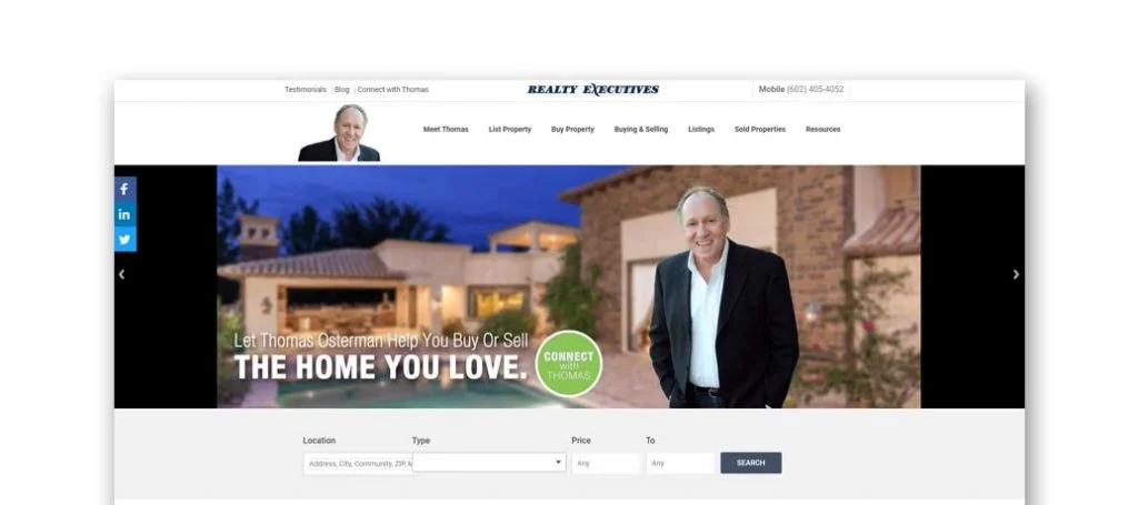
This site uses a green, blue and white color scheme in a way that is easy to read and isn’t overwhelmed with information. In order to do that, they added features such as helpful resources, testimonials, and an informative blog. We also liked how there was a map with a narrowing option to allow customers to find areas that they want. Another feature that was helpful in this layout was the use of bullet points for information.
43. Knox Realtors
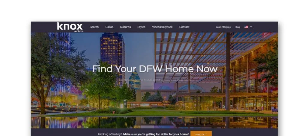
Knox Realtors chose to use white and black to create a sophisticated design. Though there is lots of whitespace, it is balanced nicely with images, text and charts. The feature to “heart” a home when looking through the listings. Additionally, they clearly list information about the homes such as price, address, city, state, bedrooms, bathrooms, and square footage. Lastly using large imagery throughout the page also helps customers feel more welcome.
44. JPAR Real Estate
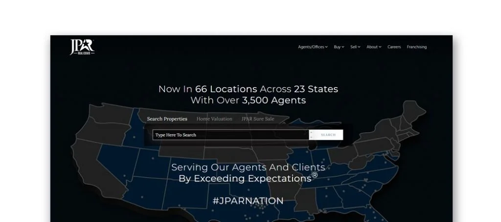
Showing off their locations all over the United States by featuring a map, was a unique feature we noticed. Having a live chat feature was something else we really enjoyed. Aside from that, client and agent testimonials each with a star rating can be seen allowing you to get a better understanding of the company. It was also helpful that this company chose a domain that will easily identify with their company.
45. Dallas Contemporary Homes
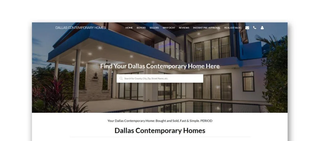
Dallas Contemporary Home utilizes a design that is very clean and organized well. There is clearly a good balance of whitespace, pictures and written text. Another thing that helped this company make it onto the list of best real estate agent websites was their images used as buttons to guide viewers to popular areas within Dallas, Texas. Short and to the point paragraphs help clients get information without being annoyed by the overcomplicated wording.
46. Only 1 Realty Group
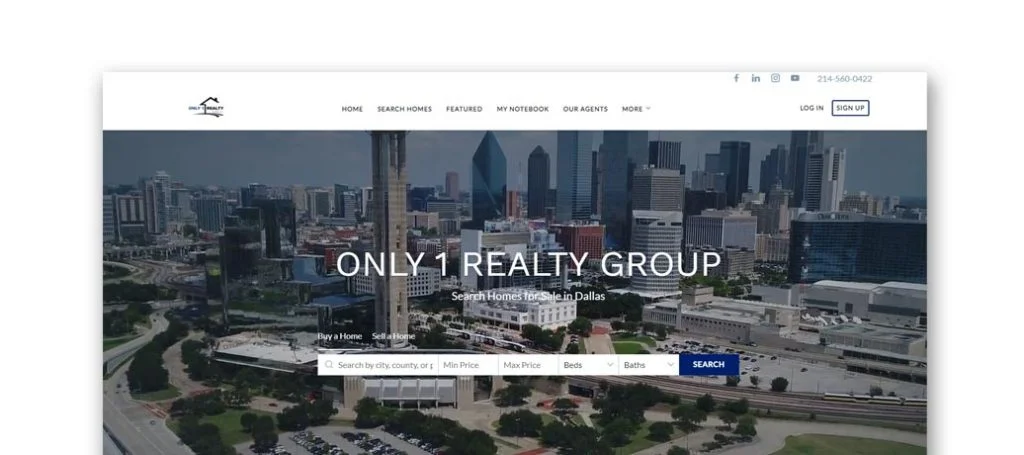
Everything seen in Only 1 Realty Group is arranged in straight lines, with each box matching up with the other. The result of this is both attractive and makes the information easy to read. We really enjoyed was the extensive search bar allowing clients to add in more specifications than just city to allow for better results. Outstanding features we saw were Google Reviews, social media links, and a search for finding homes.
Related: Looking for more leads from prospective home buyers or land purchasers? Consider adding expert SEO services into your advertising budget.
47. Allie Beth Allman & Associates
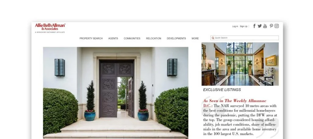
Allie Beth Allman & Associates successfully shows off what properties they have to offer. We thought it was creative to use an automatically playing video to capture customers attention. Extraordinary visuals were used in addition to videos to improve their site. Sophisticated text is used to create a sense of luxury throughout their design.
48. Dallas Luxury Realty
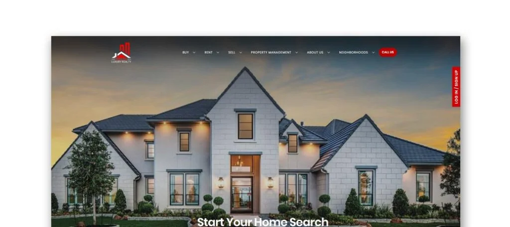
Having bold red color for an accent really draws attention to the page. The homepage is simple with a bunch of links at the top of the page, organized into 6 categories which makes for easy navigation on a customer’s side. An interesting logo design was chosen for this website which helps it stand out from other similar sites. The variety of methods to reach out to them and their team shows that they are a friendly group willing to answer any questions you might have.
49. Zillow
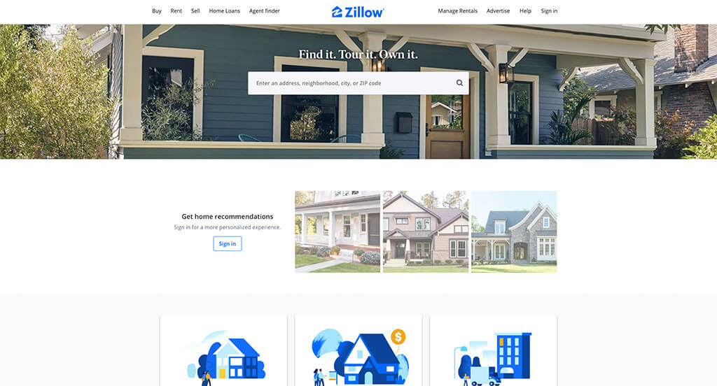
There were numerous real estate sites to choose from, but Zillow was the perfect example of a well-designed website with a white and blue color scheme. Our web designers thought this website was a good example for real estate agents because of the fun graphics. The clearly labeled menu was definitely nice to provide simple navigation. From a marketing perspective, we really liked the way this realtor website utilized a professional text.
50. Realtor.com
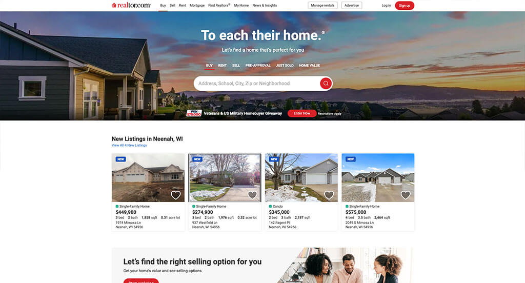
Realtor.com has a great template that uses mainly gray and white for a color scheme. As you scroll through the homepage, you’ll see a search bar to narrow down homes based on address, school, city, zip or neighborhood. The easily noticeable loan information was a nice touch for a professional real estate site. Realtor.com had website marketing in mind when creating the domain that matches the company’s name. Give some thought to the unique design of this layout when building your next website.
51. Homes for Heroes

This is a creative website design example for a real estate agent looking to build their next custom website. The large buttons for simple navigation was probably the most impactful feature in this website. Another feature we enjoyed was the incorporation of news stories related to their business. Homes for Heroes had internet marketing in mind when building up a patriotic color palette. Talk about a great website to have included in this list of top real estate websites!
52. Redfin
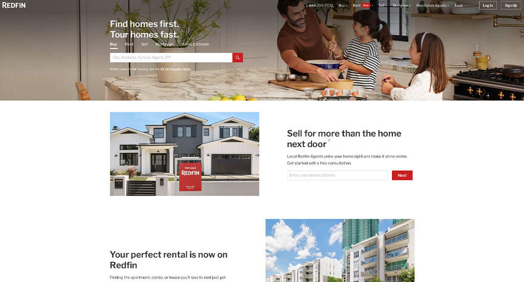
This is a great example for a realtor to take a look at when looking for inspiration for their next professional website. The staggered imagery was the most impactful quality we could find. QR codes throughout the site to download their app was a thoughtful choice for a custom design. Redfin clearly had a focus on website usability when creating the navigation bar with organized sections. With so many great reasons to consider Redfin, it’s no wonder we included it in this list of the best websites!
53. Movoto
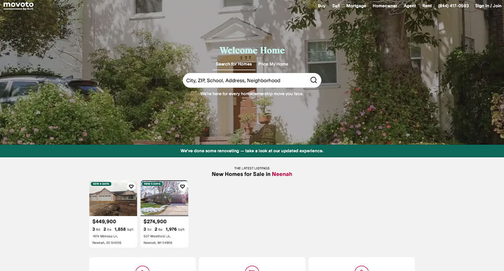
Sporting a clean and intuitive layout, this site keeps things simple for a real estate website. As you scroll through the homepage, one of the design qualities you’ll see is the high-quality imagery. The ability to see agents for your area was refreshing. Movoto chose to build a simplistic template, and it paid off. If you are looking for template ideas for your next realtor site, give some thought to this one.
54. Homes.com
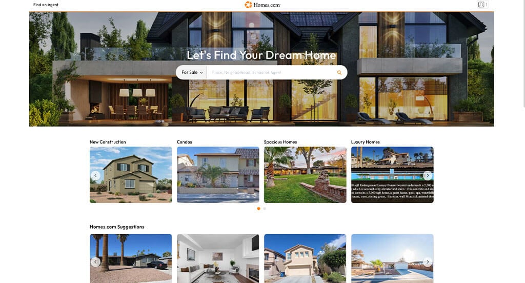
This is a great website design idea to see when looking for custom layout ideas. The basic orange accent color was definitely a great choice for Homes.com. Another thoughtful quality in this custom we saw was the clearly labeled information related to listed houses. Another interesting feature was the ability to heart a home showcased within their website. Be sure to consider this one-of-a-kind design when developing your next custom website.
55. Remax
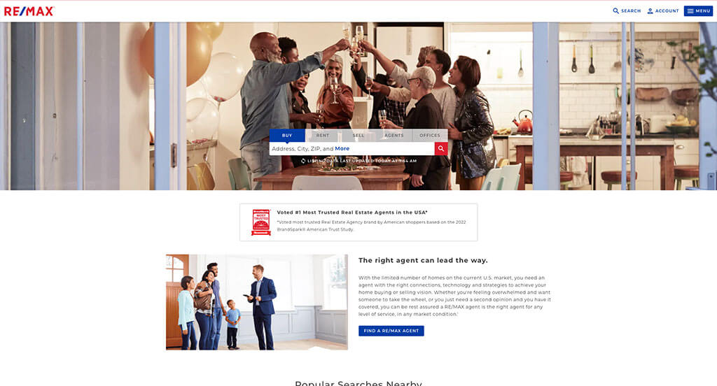
We liked how this real estate website combined red, white and blue to create a custom web design. The ability to see information related to what is for sale or rent, how to sell, along with real estate agents and offices was definitely the most impactful quality in the homepage. Another design quality we liked was their memorable logo design. Remax clearly had marketing in mind when designing the domain that matches their company name. Any web designer developing websites for real estate agencies will want to consider checking this website out.
56. Point2Homes
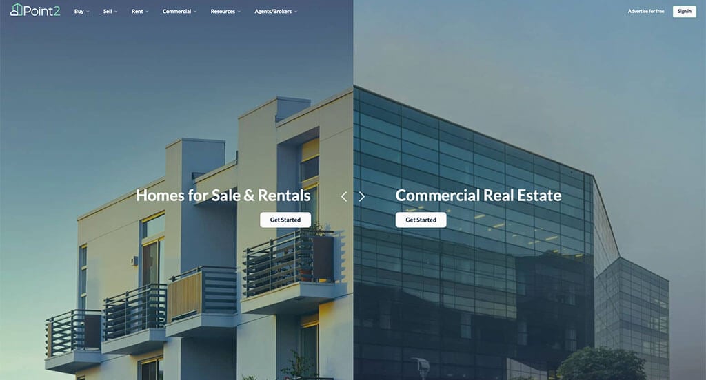
This is a good example for real estate firms to consider when looking for web design ideas. One of the design features we liked in the homepage of Point2Homes was the automatic ability to navigate the site based on either commercial real estate or homes for sale and rent. Their thought-provoking logo was another aspect of this custom website we enjoyed. Point2Homes definitely thought about internet marketing when building a menu with organized categories. For realty agents looking for examples for their next website layout, this will for sure be one to consider.
57. Century21
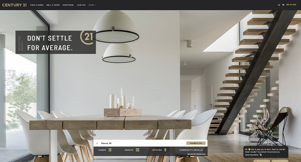
Our team liked the natural color scheme seen in Century21, because it makes viewers focus on the homes not the background. The easy-to-follow layout will be helpful for possible clients of Century21. Another thoughtful feature in this clean realty website was their alluring font choice. They had ease of use in mind when building the buttons to enhance usability throughout their website. What a great website to review when designing your next website!
58. The Legacy Group
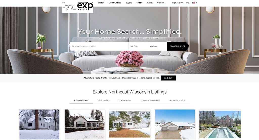
The black and white color scheme seen in this custom website stood out to us because it makes for a sleek and professional design. A search bar that allows a minimum and maximum price was definitely the most impactful feature for the homepage. The overall use of white space was another reason why we included The Legacy Group in our list of the best realty agent sites. Don’t forget to check this website out while looking through our list of the best real estate website layouts!
59. Acre Realty
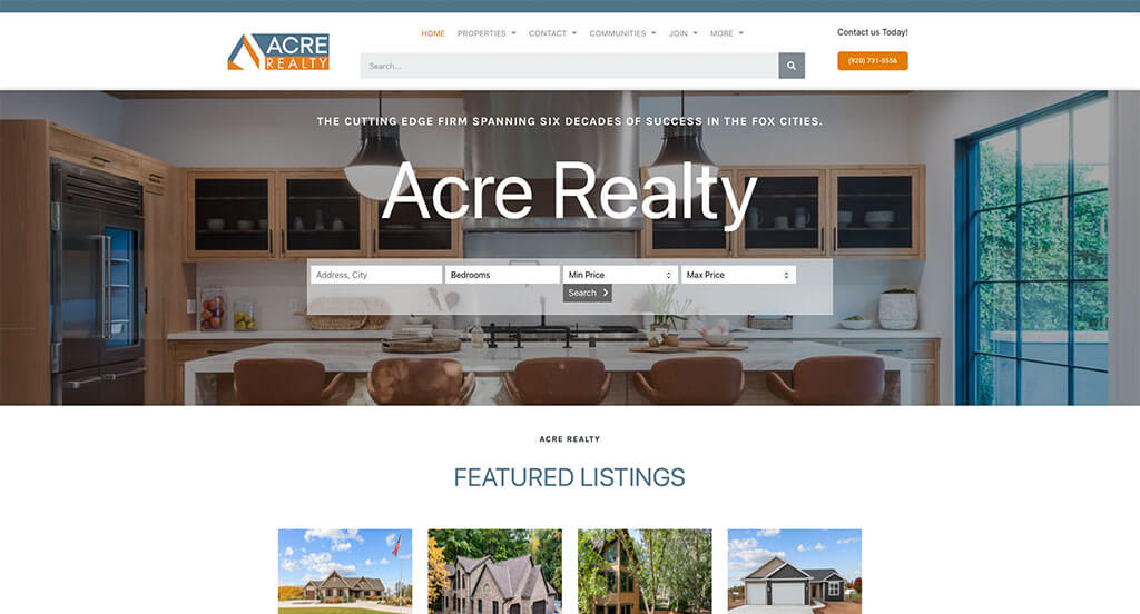
The blue, gray, white and orange color scheme used throughout this custom real estate website stood out to us because it catches the eyes of viewers. The slanted orange color accents were likely the most impactful design aspect of Acre Realty’s homepage. Another feature in this professional real estate website we noticed was their use of short phrases. They clearly had a focus on internet marketing when building the customer testimonials area for their website. These were just a few of the numerous qualities in this website we had to consider while putting together this list.
Related: Start ranking your property management company higher in search results with an SEO agency that serves your industry
60. Tiffany Holtz
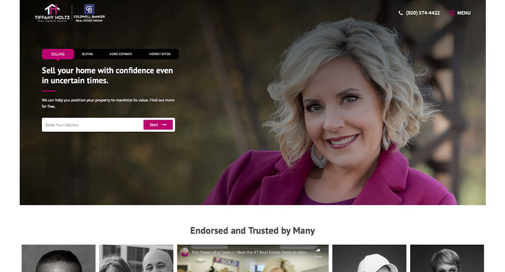
This is a good real estate website to check out when searching for ideas. The interesting logo design was the most impactful feature to us. Another quality we liked in this professional site was the pink accent both in images and throughout the pages. From a marketing perspective, we liked the way they utilized simple contact information. If you are looking for template ideas for your next real estate site, be sure to check this one out.
61. RealtyTrac
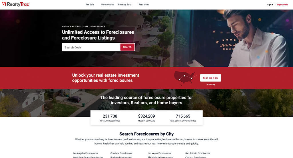
This is a great design for a real estate firm to check out when looking for inspiration for their new site. The homepage of RealtyTrac caught our attention because of their smooth transitions. This professional realtor site also does a good job using bulleted information to make it easier for viewers to read. To add on to simple usability, this real estate website utilized bright colored buttons which helped point out important information. Be sure to consider the unique design of this real estate agent’s website when developing your next custom website.
62. Kellar Williams
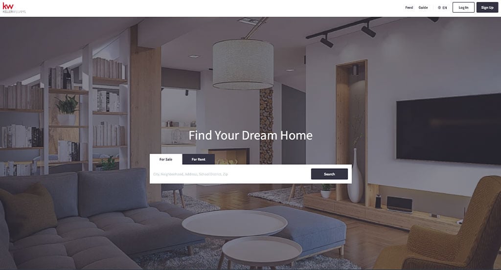
When real estate firms are reviewing websites to finding layout ideas for their next custom site, they should make sure to take a peek at this one. In Kellar Williams’s site we noticed the simple phrases because it was a creative way to guide through their information. Including a large search bar was another design quality in this custom realtor site we enjoyed. Website usability was obviously important to them and it’s evident in their simple layout. For real estate sellers looking for ideas for their next website, this example will definitely be one to consider.
63. New England Real Estate Company
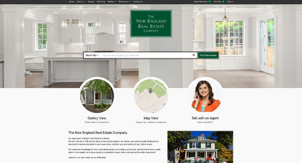
For a real estate website, green, white and gray colors were used fantastically throughout their site. Brightly colored bars to show how long a house has been listed for was definitely the an interesting feature we noticed. Having clearly labeled information about the houses was refreshing. They clearly had website usability in mind when choosing the professional font seen throughout their website. Don’t scroll past this website when considering design ideas for your next realtor website!
64. Dawn McKenna Group
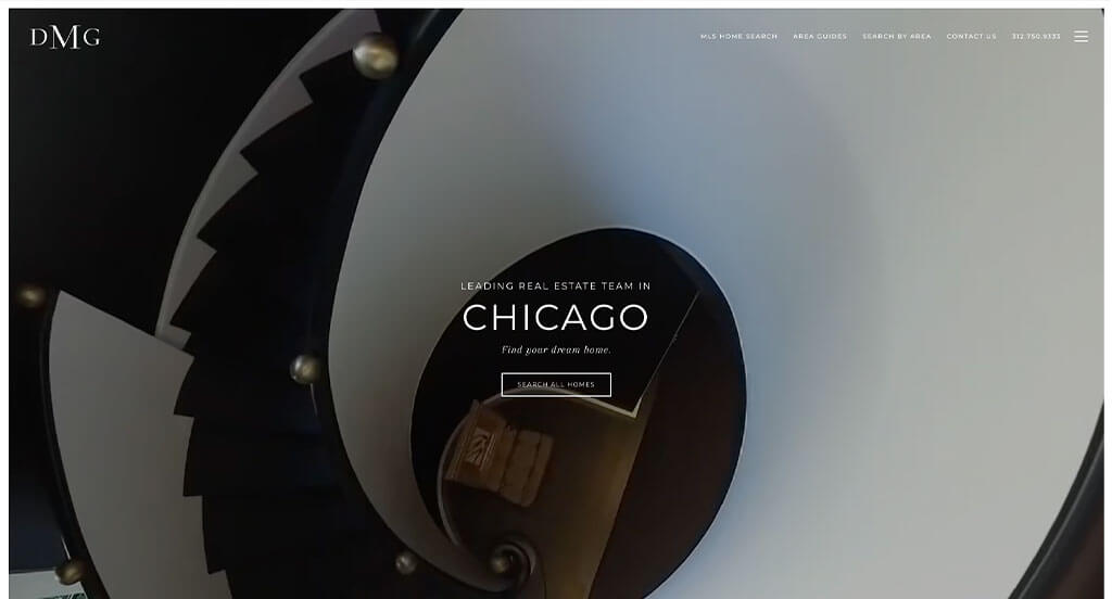
This is a design idea for a real estate firms who wish to radiate a professional and modern feel. The high-quality visuals were definitely the most impactful quality in the homepage. Along with that, Dawn McKenna Group does a good job with their organized information. They clearly had a modern theme in mind when creating the black and white color palette, bold but professional font, along with outlined buttons. What a great website to review when designing your next website!
65. Barrett Sotheby’s
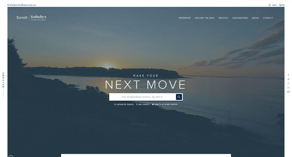
Barrett Sotheby’s did a great job utilizing blue, white and gray throughout their site. From a design standpoint, we liked the use of typography in this custom design. We thought this was a good homepage example for real estate agents because of their simple and subtle graphics. We also enjoyed how this clean real estate website has a chat to improve usability throughout their site. Barrett Sotheby’s had conversions in mind when building the customer review section. Talk about a great website to have included in this list!
66. Sweet Living Realty
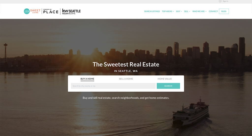
Here’s another great web design example for agents looking for a professional layout. After scrolling past the header, you’ll immediately notice the beautiful teal accent color. Another thoughtful feature in this custom site we noticed was the professional photography. Conversions were in mind when clearly labeling prices of homes in the form of lists throughout their site. Any website designer building websites for realtors will want to consider checking this website out.
67. Oyler Hines
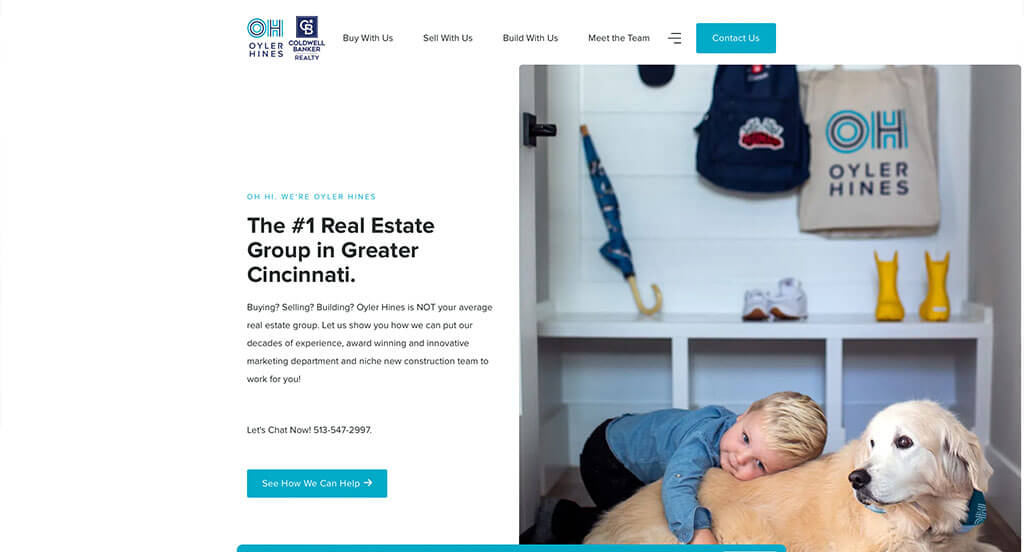
This is a good example of a web design for real estate agents to see when looking for a custom look and feel. This homepage layout is a good example for real estate firms because of their template that was free of distractions. The domain to match the company’s name was a great marketing choice. They clearly had internet marketing in mind when designing a well-labeled menu. For realtors who are looking for examples, this design example will absolutely be one to keep in your back pocket.
68. Ryan Serhant

We chose Ryan Serhant because of its nicely organized real estate website that uses a gray, white and blue color scheme, which seems to match the company. Of all the real estate firm sites we reviewed, one of the features in this one that stood out was the use of video clips that automatically play. Simple navigation was definitely refreshing for a professional website. They had website marketing in mind when choosing a professional font. Be sure to consider the creative design of this realtor website when building out your next template.
69. The Coley Group
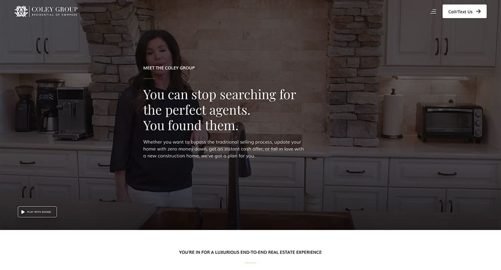
The Coley Group is another quality example of a website design for estate agents looking for a professional design. The optimized content was likely the most impactful quality in the homepage. Adding in a creative logo design was refreshing for a custom site. They clearly had conversations in mind when designing their color palette. Give some thought to the one-of-a-kind design of this real estate site when developing your next custom website.
70. The Coloradan
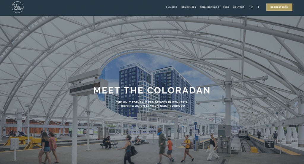
Yet another good example of a website design for realtors looking for a custom site design. After scrolling past the navigation, you’ll immediately notice the large imagery. Another feature in this professional real estate site we enjoyed was the layout that was easy to follow. Having a domain that matches the company’s name helped make this one of the best realtor websites we looked at. With so many great reasons to consider this one, it’s no wonder we included it in this list of the best custom designs for real estate agents!
71. Property Club
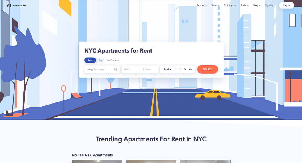
The blue, white, yellow and black colors seen in this real estate website stood out to us because of the beautiful harmony it creates. One of the parts in this website’s homepage that caught our attention was definitely the creative graphics. Another thoughtful quality we saw was their way of separating out homes based on different categories. The navigation bar with organized categories helped make this one of the top realtor websites we reviewed. You won’t be disappointed after reviewing this site for design ideas for your next template!
72. S&P
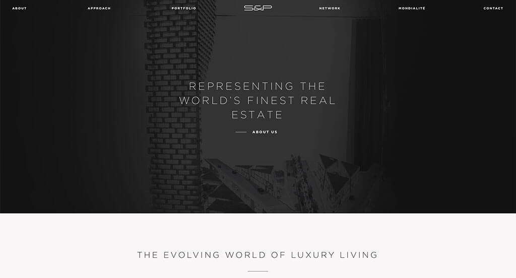
The black and white colors covering this real estate’s layout stood out to us because it creates a simple background that allows images to be the main focus. One of the design features we liked most was their balance between text and images. Subtle animations were another unique quality found in this custom site we enjoyed. S&P had conversions in mind when designing the well-labeled navigation bar. What a great design to review when building out your next custom template!
73. Ripco Real Estate
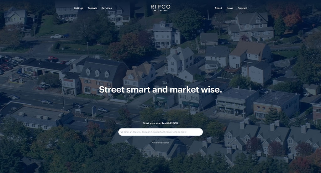
Our web designers thought this website was a good design idea for real estate agents because of their smooth transitions. The accents of red seen throughout the site was another feature we enjoyed. They clearly had internet marketing in mind when building the simple contact information. For real estate firms looking for ideas for their next website, this one will definitely should be in the back of your mind.
Related: Master the art of paid advertising on social media and search engines with the help of an agency that often works with Reators.
74. Jonathan Radford
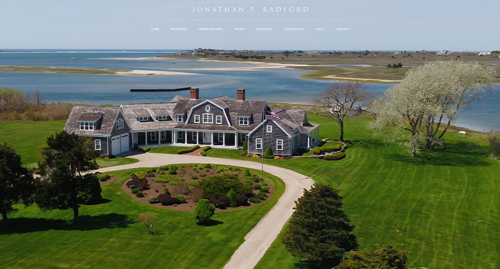
Here’s another good web design example for real estate agents looking for a professional layout. After scrolling past the header, you’ll immediately notice the professional font. Client testimonials were refreshing o have included. They clearly had a focus on website accessibility when building a large image display for their website. If you are looking for template examples for your next real estate site, give some thought to this one.
75. ORO Realty
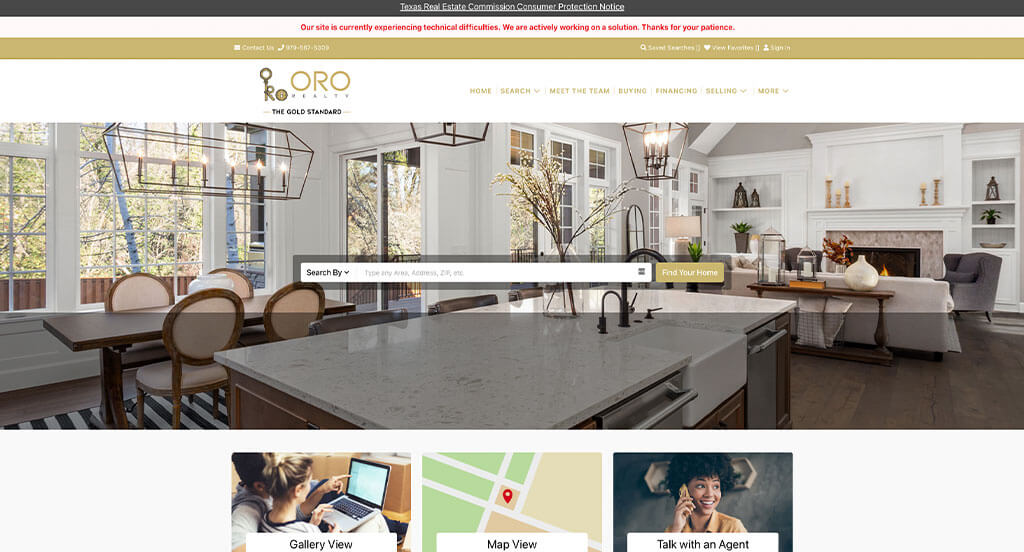
ORO Realty has a great looking website that uses a white, yellow and gray color scheme. After scrolling past the header in this example, you’ll immediately notice their creative logo design. Another feature you’ll notice is their well-planned mission statement. ORO Realty clearly had customer usability in mind when designing the ability to favorite properties within their website. These were just a few of the numerous qualities we had to consider when putting together this list of top real estate agent templates.
76. CB Realty Team
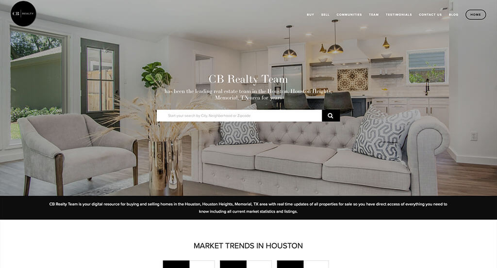
This is a good example of a website design for real estate agents to look at when creating their custom web design layout ideas. The simple navigation was the most impactful feature in the homepage that we could see. Their small icons were another feature in this custom real estate website we enjoyed. They had website marketing in mind when creating geometric patterns for the background to liven it up. Be sure to consider this creative design when developing your next website.
77. Fredericksburg Realty Group
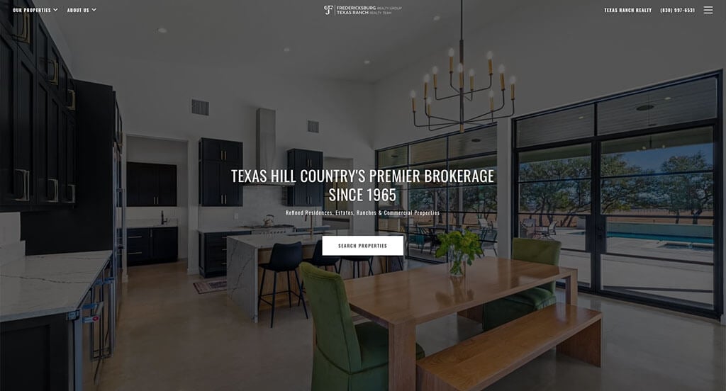
Never fear, another web design is here! This one stood out to us and we hope real estate agents find it helpful as an example site. After scrolling past the header, you’ll immediately notice their use of buttons to enhance usability. The simple contact information was another feature in this professional real estate site we enjoyed. Individuality is clearly something they strive for as a company, you can tell by the creative fonts they chose. Don’t scroll past this website when hunting for design ideas for your next realtor design!
78. Realty Austin
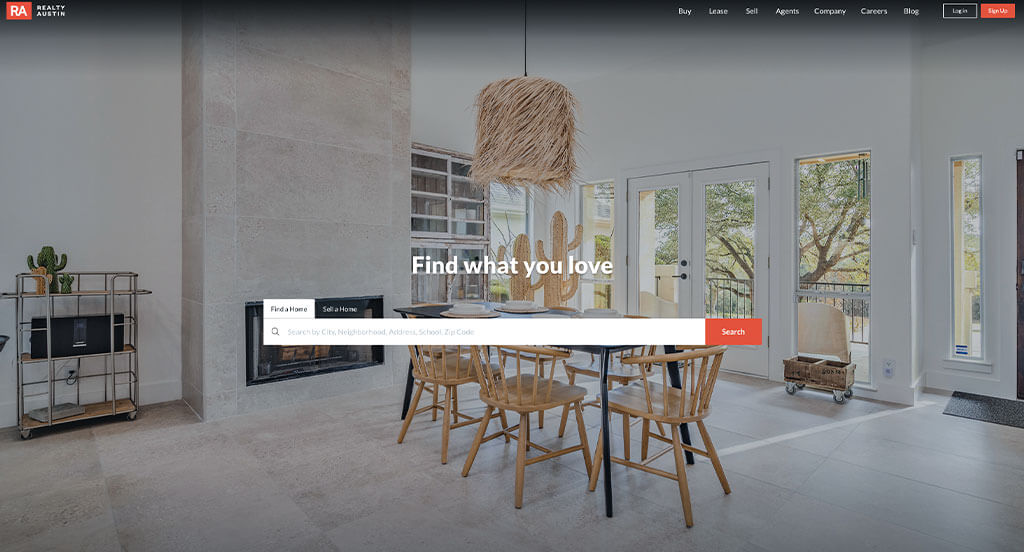
This is a creative website design example for a real estate firm looking to build their next professional website. One of the design features we liked in Realty Austin was having smooth transitions. Their staggered imagery was definitely refreshing for a unique touch. They had internet marketing in mind when creating buttons leading to other pages. Give some thought to the one-of-a-kind design of this real estate website when developing your next website.
79. Big Sky Brokers
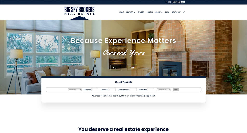
The white, blue and yellow colors plastering this custom real estate website stood out to us because it adds some color without being distracting. The large and professional images were definitely the most impactful quality in the homepage of this website. This clean real estate layout also does a good job with their use of icons. From a marketing perspective, we really enjoyed how they utilized a clean and simple font. With so many quality reasons to consider this example, it’s obvious why we included it in this list of the best sites!
80. Tamara Williams & Company
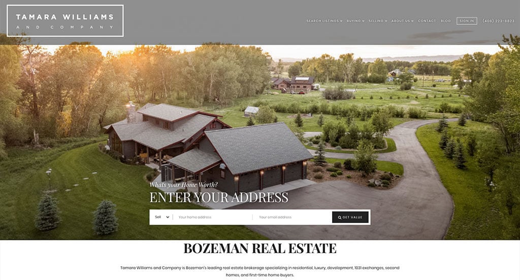
Here we have another example for a realtor to check out when looking for a professional look and feel for their new site. The creative balance of white space was the most impactful quality we noticed. Their informational blog was another reason to include this one in our rankings for the top web design ideas for realty firms. Tamara Williams & Company clearly had a focus on website accessibility when creating the simplistic template. If you are looking for examples for your next realtor site, be sure to check this one out.
81. Green Homes NY Realty
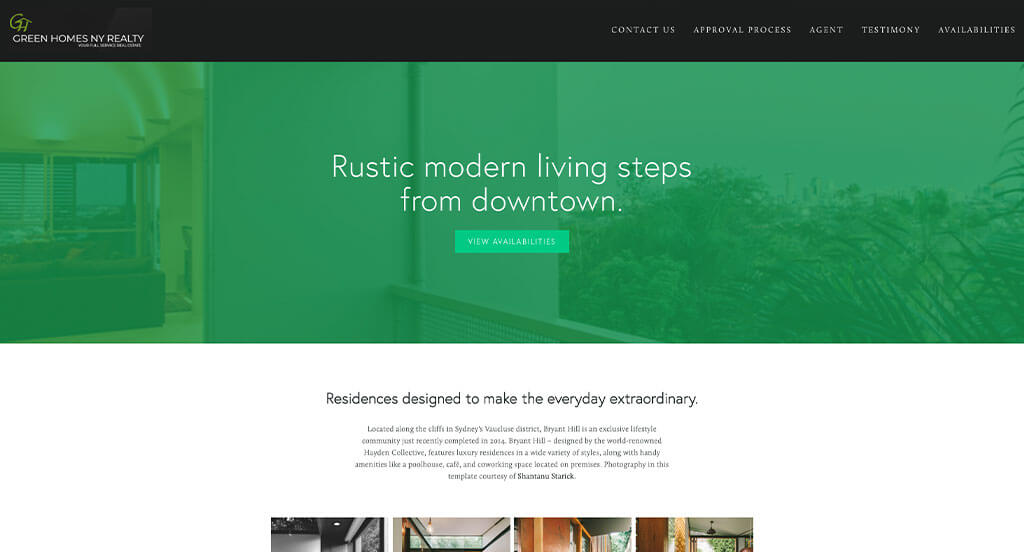
One of the design features we noticed in the homepage of Green Homes NY Realty was the large banners to break up content. The green color scheme that stays prominent throughout the whole site was another thoughtful feature we enjoyed. They clearly had a focus on website marketing when building the thoughtful logo design for their company. For real estate firms looking for ideas for their next template, this example will definitely be one to consider.
82. R New York
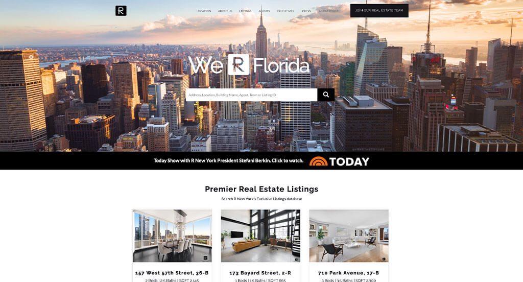
As you can see we have another example of a website design for real estate agents to view when looking for custom ideas. After scrolling past the navigation, you’ll notice the subtle animations. A template that seems authentic to the company was definitely refreshing to create a unique feel. From a marketing point of view, we really liked the way they utilized a clearly labeled menu. What a great website to review when designing your next custom template!
83. Alpha Properties
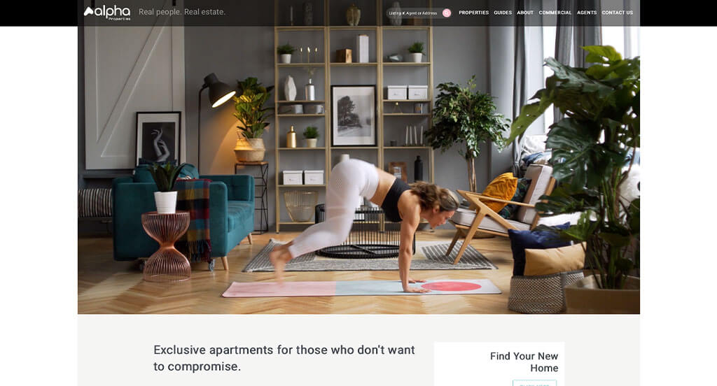
This is a great design example for a real estate agent to review when looking for inspiration for a custom look and feel. One of the features of Alpha Properties we liked most was their balance of white space. The creative display for their client reviews was another reason why we included this company into our list of the best website ideas for realtors. They had customer usability in mind when choosing simple phrases to place into their layout. Be sure to consider the unique design of this real estate website when building out your next web design.
84. SPiRAL NY
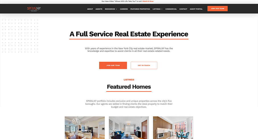
We appreciated how this real estate site used the colors of black, white and orange to create an attractive design. Another aspect that caught our attention was definitely the use of orange underlines to distinguish titles. Using buttons to enhance usability was another reason why we included this design into our list of the best website ideas for realty firms. SPiRAL NY had marketing in mind when choosing the domain that matches their company’s name. Give some thought to the one-of-a-kind design of this realtor company when building out your next website.
85. Byson Real Estate Co.
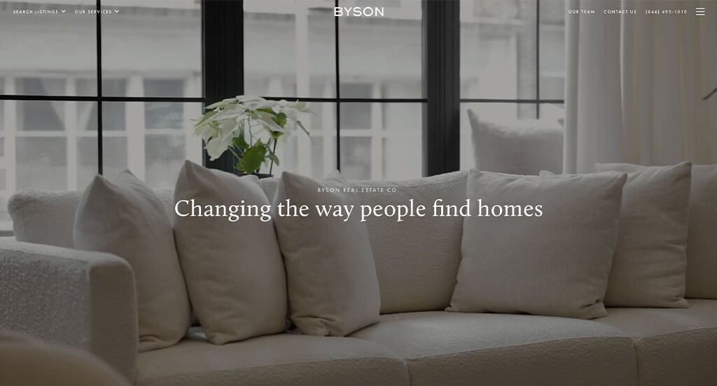
One of the homepage features in Byson Real Estate Co. we noticed was their captivating font choice. The ability to learn more about the business’s agents added a sense of personality to their company. Ease of use was definitely on their mind when building the well-labeled navigation bar. These were just a few of the numerous amazing qualities we had to consider when putting together this list of top websites for realtors.
Related: Reach a wider audience, improve your inbound leads, and manage your online reputation with the help of digital marketing services for property management firms.
86. Mirador

Different shades of teal along with black and white immediately draw the eye to this company’s information. The optimized content was definitely the most impactful quality in the homepage of Mirador. Another feature we enjoyed was the simple but fitting logo design. Mirador clearly had internet marketing in mind when creating maps to show off their locations. With so many reasons to consider this example, it’s obvious why we included it in this list of the best realty layouts!
87. Columbia Vitolo Team
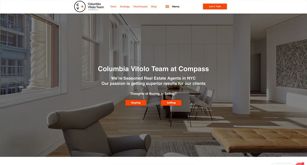
There were numerous realtor sites to choose from, but the website for Columbia Vitolo Team was the perfect example of a well-designed website with a white, blue and orange color scheme. The well organized template was probably the most impactful feature overall. Large and colorful buttons were another thoughtful feature in this custom real estate site we enjoyed. Columbia Vitolo Team had internet marketing in mind when designing the bulleted information, making it easier to comprehend. For realty agents looking for examples for their next layout, this example will for sure be one to keep in your back pocket.
88. Bograd New York
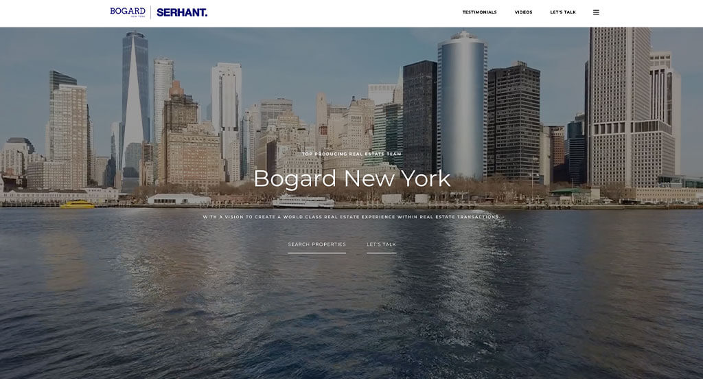
Bogard New York ranked because it’s one of the nicer real estate designs we have encountered. The most attention grabbing aspect we saw was definitely their formatting allowing them to include a lot of information in a way that isn’t overwhelming to viewers. Their simple contact information was helpful for any type of company. Bogard New York clearly had a focus on conversions when creating a clearly labeled menu. Any website designer mocking up sites for real estate agents will want to consider checking this one out.
89. Elegran
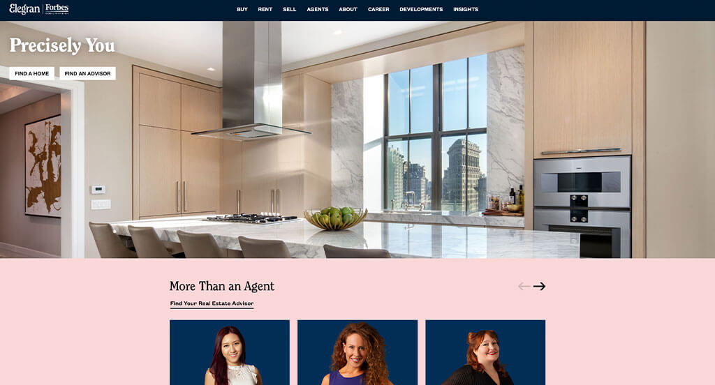
Sporting a clean and intuitive layout, this website keeps things simple for a real estate company. The creative font was a feature we noticed right away. They clearly had digital marketing in mind when choosing a domain that matches their company’s name. If you are looking for template idea options, be sure to check this one out.
90. Noble Black Real Estate
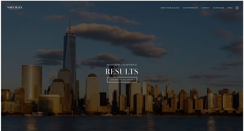
Noble Black Real Estate has a very classy feel to it, thanks to its use of black and white to emphasize the images. The large imagery was an impactful feature you’ll notice in the homepage. The simple contact information was another reason we included this site in our rankings for the top web design ideas. Noble Black Real Estate had usability in mind when designing the well-labeled navigation bar. Be sure to consider this one-of-a-kind design when developing your next custom template.
91. Red Oak Realty
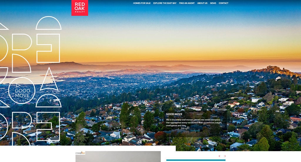
We liked how this company combined the colors of red, white, black and blue to create a custom web design layout. We thought this was a good homepage example for real estate firms because they created a layout that appears to have ads, but really it links to other areas within their page. Bright red accents paint the majority of this site. Red Oak Realty clearly had website accessibility in mind when building the optimized content. You won’t be disappointed after reviewing this one for design ideas for your next site!
92. Darwin Wall Team
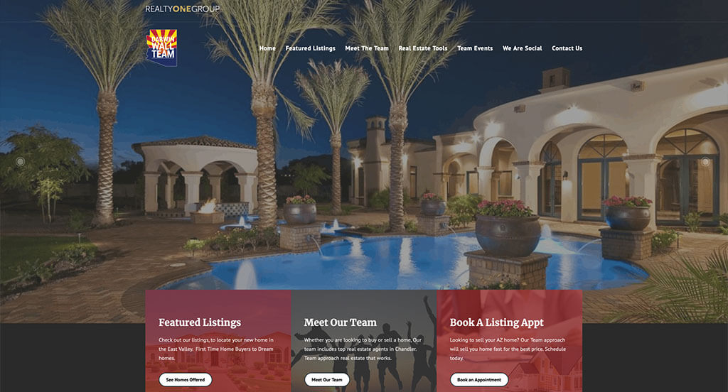
Here it is, the last example we searched out for all you realty agents! After scrolling past the header, you’ll immediately notice the interesting logo. The smooth transitions in this website helped it make it into our list of the best design ideas for real estate firms. They had internet marketing in mind when using the large images for backgrounds. What a great website to review when building out your next custom template!
How to Build an Impressive Realtor Website
Are you creating a new website for your real estate business? Exciting!
Let’s dive into essential steps for building or redesigning a realtor website.
Skip ahead if you already have a domain, hosting, and platform.
1.) Selecting a Domain Name
Selecting a domain name for your realtor site is vital for your online presence. It’s the address visitors use to reach you and impacts your branding and recognition.
Follow these steps to pick the ideal domain name:
- Brainstorm: Start brainstorming domain name ideas based on your business name, service area, and real estate terms.
- Simplicity: Choose a simple, easy-to-spell domain name. Avoid complexity, hyphens, or numbers.
- Consistency: Incorporate your established brand name into your domain, like using “Appleton Realty” instead of unrelated options like “HouseSoldByMe.net.”
- Availability: Before moving forward, ensure your desired domain names are available. Many common ones are already taken. If unavailable, explore purchasing options without overspending.
- Domain Extensions: Select a domain extension that fits your site’s purpose; options like .com, .net, .org, or industry-specific ones such as .realtor or .properties work for realtor sites.
- Legal Considerations: Before registering your domain, do a trademark search to avoid infringement. Avoid using names from other agencies or popular brands.
- Register the Domain: Register your chosen domain through a reputable registrar like GoDaddy or Namecheap for a smooth process.
2.) Selecting the Right Website Platform
After figuring out your domain name, the next step is selecting a website platform for your real estate website.
Realtors often build content-focused sites with property listings and contact forms to drive conversions. Integrating property listings is typically done through plugins in WordPress or similar platforms.
Realtors have excellent options like WordPress for building property listing areas.
- WordPress: WordPress is a highly flexible CMS, perfect for real estate sites. With numerous themes and plugins, it enables you to create a personalized and feature-rich website. Most prefer the self-hosted version installed on a web hosting account.
Web Hosting Requirements
For platforms like WordPress or WooCommerce, you’ll need reliable web hosting for your real estate site.
Although we recommend our web hosting for WordPress sites, here are some reputable options from other providers:
- WP Engine: WP Engine is a favorite for real estate pros due to its user-friendly control panel and seamless backups. However, watch out for PHP max_execution_time limits and potential price increases for upgrades.
- SiteGround: Consider SiteGround for reliable hosting tailored to real estate needs. They’re praised for exceptional support, easy backup tools, and reasonable pricing.
- Digital Ocean: Consider Digital Ocean for robust cloud hosting, though it might be complex for typical real estate sites. Be mindful of potential costs and consider AdminGeekZ for server administration.
3.) Selecting a Website Template
Realtors often choose pre-designed website templates to save time and money. But if you prefer a custom design, hire a professional web designer or custom ecommerce developer for a unique theme tailored to your real estate business.
WordPress Realtor Themes
You can find free themes at wordpress.org, or explore real estate-inspired templates on ThemeForest.
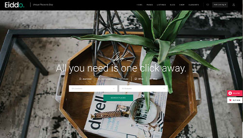
Eddio – Themeforest
$85
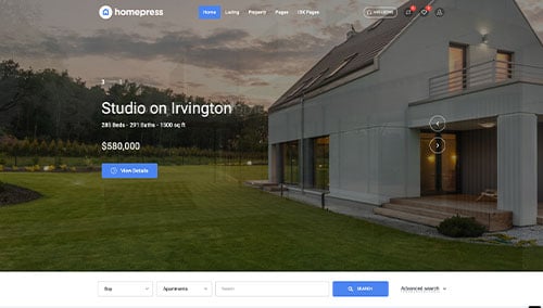
HomePress – Themeforest
$59
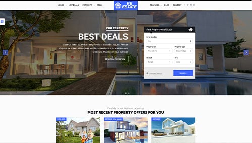
ReEstate – Themeforest
$39
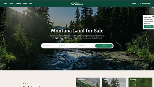
WP Residence – Themeforest
$69
Wix Realty Themes
You can find free and paid themes in their marketplace at wix.com, some of which are suitable for realtor websites.
4.) Creating Content & Adding Images
Now that you’ve got your domain, platform, and theme sorted, it’s time to craft engaging content for your real estate site!
Here are key tips for crafting engaging website copy for realtors and agents:
- Know your target audience: Understand your audience’s demographics and needs to tailor your content, boosting search engine rankings for relevant real estate queries.
- Define your key messages: Define your key messages to align with your brand, highlight unique advantages, and communicate real estate service benefits clearly.
- Keep it concise and scannable: Online readers skim, so keep your writing concise. Use short paragraphs, bullet points, subheadings, and bold text for readability.
- Create clear and compelling headlines: Create attention-grabbing headlines that convey your real estate business’s value. Compelling headlines can draw visitors into exploring your site further.
- Incorporate keywords strategically: CDo keyword research and integrate relevant keywords naturally. This boosts your site’s visibility. Avoid keyword stuffing, as it harms readability. Tools like Ahrefs or Semrush can help with research.
- Maintain a conversational tone: Write conversationally to connect with your real estate audience. Avoid jargon unless necessary. Engage readers directly with a friendly, approachable tone.
- Edit and proofread: Proofread your content thoroughly for grammar, spelling, and flow. Ensure it aligns with your brand voice and style. Utilize tools like Grammarly for assistance.
- Leverage ChatGPT for assistance: Use AI tools like ChatGPT for generating ideas or refining content on your real estate site.
Incorporate relevant, high-quality images into your real estate content to break up text and enhance visual appeal.
Consider the following tips:
- Choose high-quality images: Choose visually appealing, high-resolution images. Avoid blurry or pixelated ones that may lower your real estate website’s quality.
- Ensure relevance: Opt for relevant images that enhance your message. They should provide additional context and visual interest for realtors and clients.
- Utilize stock photo resources: Search reputable stock photo sites like Unsplash, Pixabay, or Shutterstock for professional real estate images. Ensure compliance with licensing and attribution requirements.
- Customize images when possible: Consider customizing or branding images to match your real estate brand. This creates a cohesive visual experience. Tools like Adobe Photoshop or Canva can assist you.
- Optimize image file sizes: Compress images to optimize file sizes without quality loss. Large files slow down your site, affecting user experience and SEO. Try tools like TinyPNG.
5.) Post Launch Strategies
After launching your real estate site, there are key tasks to maximize its effectiveness. Here’s guidance for post-launch activities:
- Search Engine Optimization (SEO):
Boost your real estate site’s visibility with effective SEO strategies. Conduct keyword research, optimize content, and update regularly. Consider our SEO services or third-party providers such as The HOTH. - Paid Advertising: Attract targeted traffic with paid ads on platforms like Google Ads or Facebook Ads. Consider our PPC management services or talented professionals via platforms like Mayple for effective campaigns.
- Conversion Rate Optimization (CRO): A
Analyze your real estate site’s performance and user behavior with tools like Google Analytics. Identify drop-off points and barriers to conversion. Conduct A/B testing with tools like VWO for data-driven improvements in conversion rates and user experience. - Website Security: Secure your real estate site from malware and threats. Use SSL certificates, web application firewalls (e.g., Sucuri), and regular backups. Keep CMS, plugins, and themes updated. Monitor uptime with services like UptimeRobot.
- Website Maintenance: Regularly maintain your real estate site. Update WordPress plugins and themes, monitor speed, and fix errors. Consider our website maintenance services or hire freelancers such as Upwork. Backup regularly to prevent data loss.
- User Feedback and Testing: Gather user feedback and conduct testing to improve your site’s user experience continuously.
- Content Updates: Update your site content regularly with fresh blog posts, property info, and services. This not only attracts visitors but also encourages them to return and share with others interested in real estate.
Post-launch digital marketing activities are crucial for your site’s long-term success. Stay proactive, monitor performance, and adapt strategies to achieve business goals and audience needs.
FAQs about Web Development for Realtor Websites
A real estate business doesn’t need to operate locally to have a website developed. Web development companies can create sites for businesses anywhere, expanding their reach and attracting new clients. It’s essential to work with a company experienced in real estate websites to showcase properties effectively.
As a web development company, we can enhance your real estate website without building a new one. We improve performance, speed, user experience, update content, and enhance SEO.
We’ll analyze your website thoroughly to pinpoint areas for improvement and offer recommendations to enhance functionality and usability. Our experts can implement changes to boost performance and attract more visitors and clients. Whether you need minor updates or a complete overhaul, we’ll create a customized solution to meet your goals.
Consider hiring a professional web development company for future assistance with your real estate website. They’ll ensure your site is maintained and updated by skilled experts for optimal functionality.
Working with a web development company ensures a dedicated team keeps your site up-to-date, reducing technical issues. They offer services like maintenance, design, SEO, and social media marketing to enhance your online presence and attract more visitors, fostering real estate business growth.
Yes, you can update your real estate website yourself after it’s built. Your control level depends on the platform and CMS used. For instance, with WordPress, you can usually log in and make content changes like adding listings, updating photos, or editing pages and posts.
While you can update most content on your real estate website yourself, some changes, like layout modifications or code updates, may need technical expertise. Hiring a web developer for such tasks could be more efficient. Your control level depends on the platform, CMS used, and your technical expertise.