Are you ready to boost your online presence? If so, look no further than this page to give you inspiration and tips!
Our team of experts have searched to find and evaluate examples based on design, functionality, uniqueness, and user experience. From dynamic and energetic designs to intuitive navigation, these represent the peak of online excellence in the world of sports.
If you’re interested in other industries, check out our article for our best web design examples!
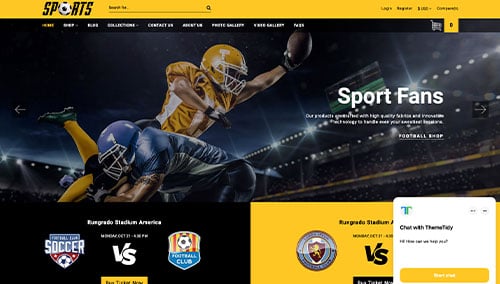
Top Sports Company Website Designs
1. Oakley
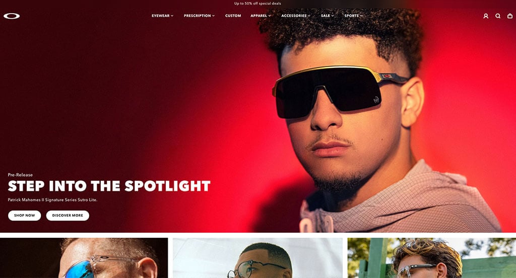
Right away, we noticed how Oakley used an automatically playing video that grabs attention quickly and effectively. Their vibrant backgrounds and creative imagery was another aspect that stood out to us. Allowing customers to shop by the sport that they enjoy was another perfect example of what could be done in a web page like this. Additionally, our web designers felt the use of typography here was good. Definitely don’t skip past this company when hunting for ideas for your next site!
2. Speedo
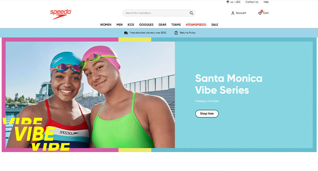
There were lots of great qualities in this design that we really enjoyed. Bright colors, and smiling faces were only the beginning of Speedo. We loved how a variety of products were displayed throughout all of their pages. Additionally, we liked their section that displayed their instagram posts because it keeps customers involved. A quick buy feature for favorites was a nice touch for this unique site. Finally, we thought it was brilliant to pick a domain name that matched with their business.
3. ATU Mobile
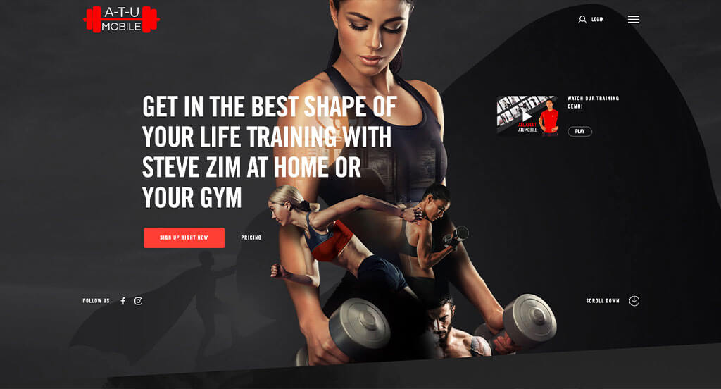
This site was amazing, mostly due to their creative imagery. Overlapping images and allowing for cutouts showing images beneath were all creative qualities that we enjoyed. We appreciated how they used red, black, and white to create their web design layout. We thought it was nice to include creative backgrounds that don’t distract from their design. Another great feature about this example was how they utilized different plans with prices attached to them.
4. Nike
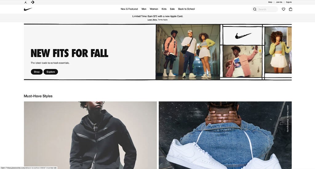
This company obviously knows about brand recognition. Throughout their entire page they use fonts and designs that can be seen in their stores and anywhere their brand is sold. We liked their automatically playing video that is captivating in all ways. Their high-quality images of their products with basic backgrounds really allow for a great look. Additionally, we loved their buttons that were rounded and simplistic. It was smart to include a sorting feature that allows people to find the products that they’re looking for.
5. Race Face
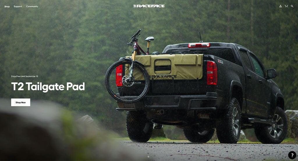
High-quality and well thought out images was something that definitely stood out here. It was a great choice to include their color options for each product. We really liked that their buttons change upon hover. After scrolling past the navigation, you’ll notice the great use of organization throughout their pages. Having the ability to click on a ride style with small animations was another cool feature. Finally, we liked their black and white color scheme.
6. Black Sheep Studio
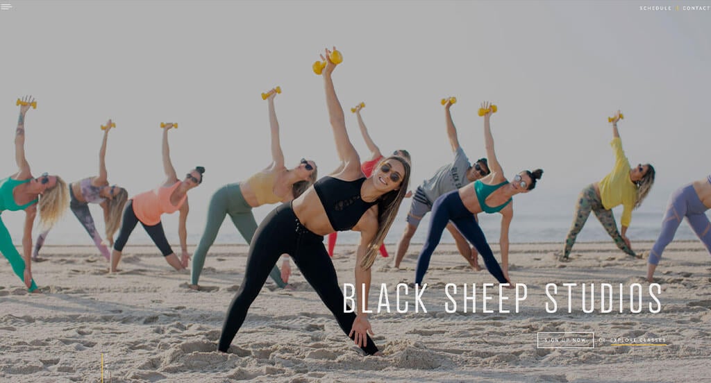
We loved how this company’s logo design makes sense with their name. Their high quality images really stood out, making this example even better. The basic color palette of this custom workout studio stood out to us because fits in with their brand identity. Their nice fonts for their titles was another great choice that we liked. Additionally, a good balance of images, videos and content was also perfect. Having a full page drop down menu was also refreshing. All of the information in their footer was also helpful to give customers more about the company. There was clearly no shortage of reasons to include it in our list of sports sites to consider.
7. CamelBak
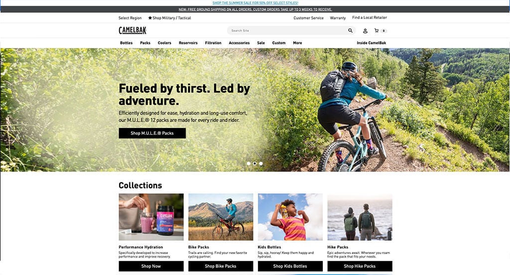
We loved how CamelBak included a variety of different products that excites a variety of age groups. From a design perspective, we liked their use of creative typography. We thought it was smart to add an ability to customize products with images, graphics and colors. Including a lifetime guarantee on their products helps them to offer an advantage to their customers. A search bar is another thing that helps them stand out against their competitors.
Related: Kickstart your digital marketing by implementing an effective plan for social media marketing, lead generation, conversion funnels, and email marketing for your sports group.
8. Adidas
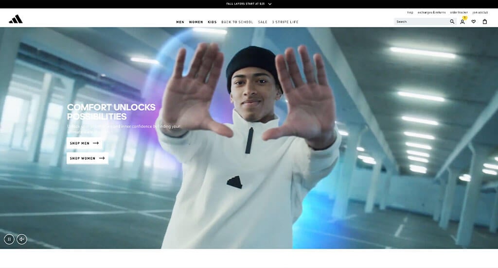
Adidas ranked high in our list because it’s one of the nicer sites we took a look at. Making sure to use their admirable logo anywhere they can was another brilliant idea. The power of their logo design is clearly shown because they rarely ever put their business name on the pages. We loved their paragraphs that tell the story of their business, showing they’ve been in business since 1949. A section to display Adidas’ most popular models was also smart. Another feature in this professional template was their large amount of aid for purchasing products.
9. Runners Fix
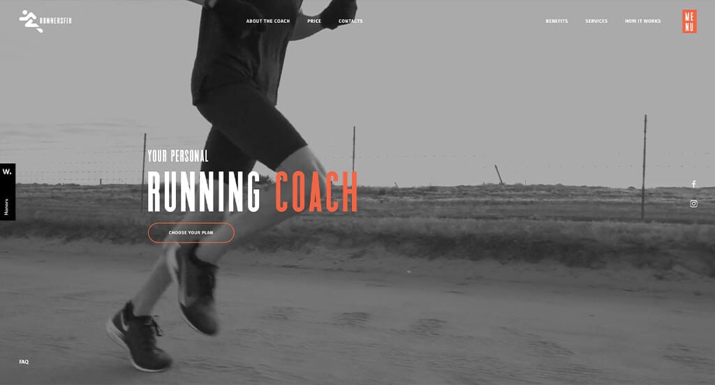
Runners Fix had lots of creative things going on here. First off, we loved the fonts they used that sometimes were outlined and others they were filled in. Additionally, using a simple color scheme with bright accent colors was a choice we couldn’t ignore. It was great to include information about the coaches since they are the people customers will interact with. Full screen videos were definitely refreshing for a professional coaching business. Aside from that, their graphics were on a whole other level, and we loved that.
10. Callaway
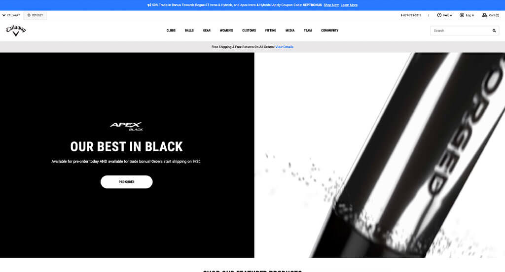
Though this company only sells golf equipment, there is plenty of it to go around. Callaway does a great job offering products that look special or unique, helping you stand out on the greens. After a quick look, you’ll notice performance guarantees and warranties everywhere. Plus, their logo is placed in many areas to build brand recognition. Additionally, they do a good job with allowing for a variety of price points. Another thing that we enjoyed was their star-rated reviews for a variety of their products.
11. LeBron James
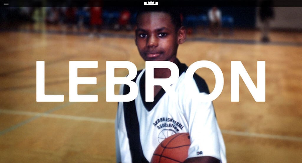
Here we have a design that is sure to inspire you. Right away, we noticed that this company had great transitions to display all of their content. We loved how timelines were included featuring images, videos, dates and written content about LeBron James’ path. Additionally, it was awesome to include a well labeled menu that helps viewers find information. LeBron James clearly had a focus on internet marketing when creating the layout. Finally, choosing a domain that matches with this brand was a smart marketing move.
12. Kinective Fitness Club
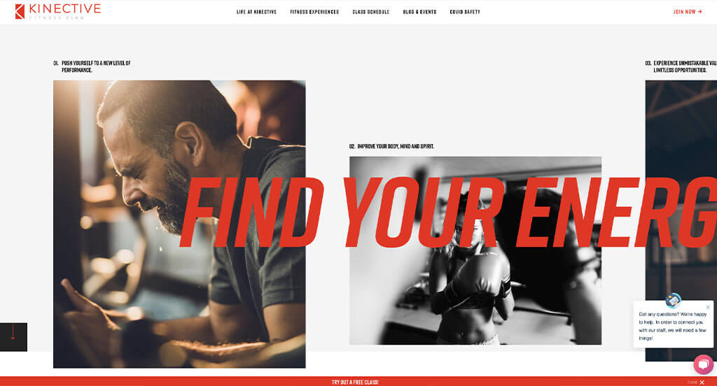
Our first instinct of this example was its luxury feel. Mainly black and white is used for their color scheme creating a very modern look. A refreshing part was their inclusion of a live chat. We loved how their logo design was very simple but reflected their brand. Contact information is easily attainable, which is obviously helpful for customers. An inspiring arrangement is used to include more images without it looking overwhelmed. Additionally, different fonts and text sizes are used to help separate titles.
13. BodyBuilding
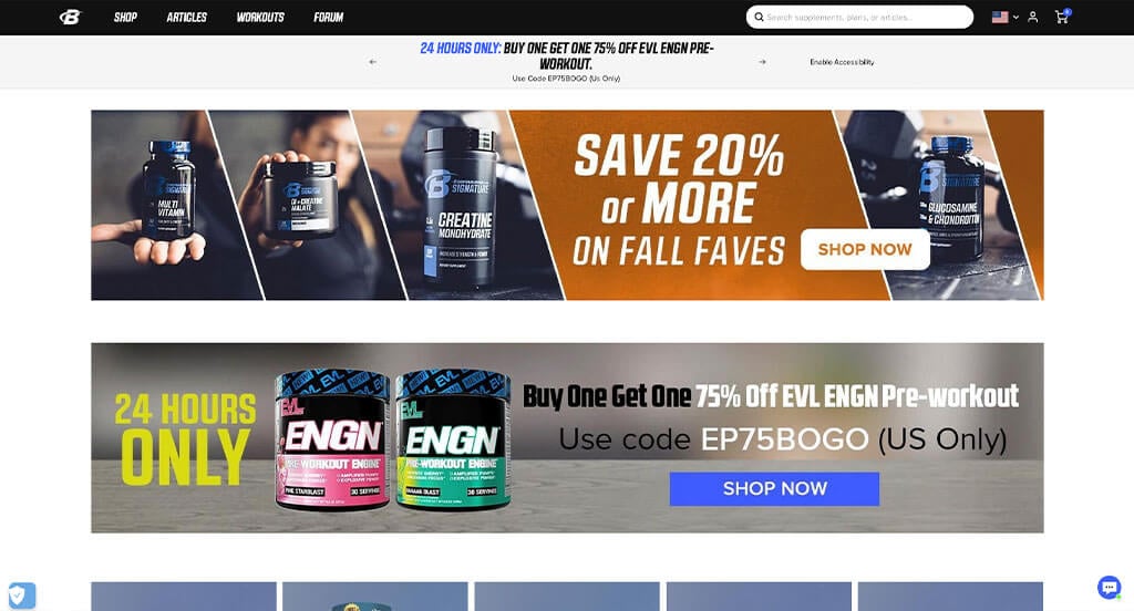
BodyBuilding knew what to do to give off the impression of high energy. Using lots of bright colors in their site but also on their packaging was a great idea. But, overall having a clean and organized site was their most impactful feature. We also thought their logo design was unique using a B and including a ring to signify speed or strength. A little blue banner can be noticed at the top to show how much more you must purchase before you earn free shipping.
14. NOBULL
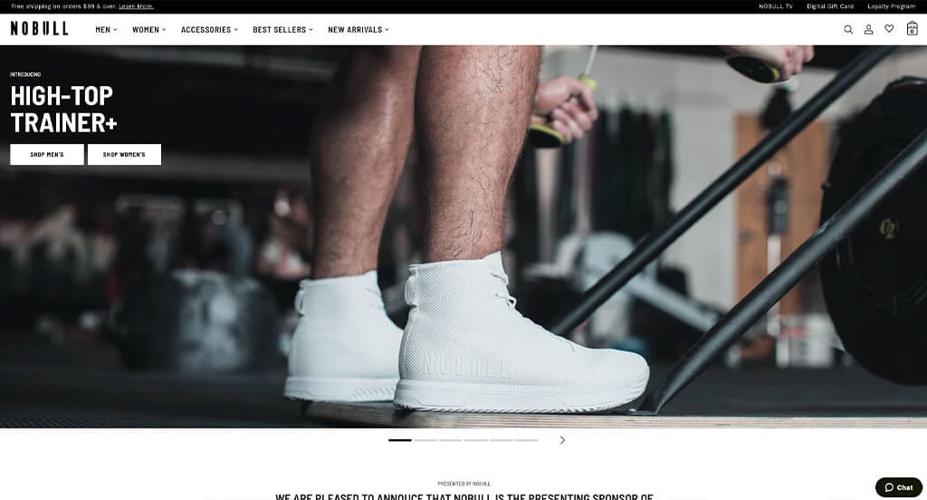
Here’s another outstanding example for sports retailers looking for a professional look and feel for their next website. We loved how their mission statement was placed in multiple places throughout this example. Having short phrases used as titles was another thing that we noticed in this example. It was also a smart idea to include their social media page right in the site. Finally, their little sliding banner was another cool feature to get more information across to customers.
15. ASSOS
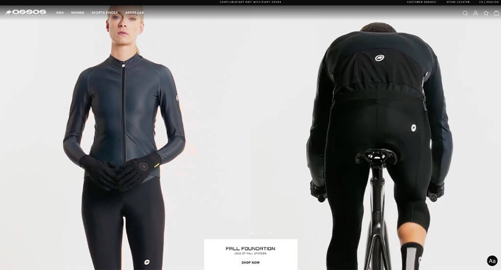
Almost instantly, a video was used to showcase the work that goes into these products. We liked how their display of images wasn’t perfectly symmetrical, but it still felt balanced. Showing a variety of different people using their products was another great idea. Simplistic buttons are used to help people navigate to the important information. Our team thought the use of typography was good. You might also notice how there was a logical structure to all of this content. Using videos and images to break up lengthy content was refreshing. Any website designer mocking up for similar businesses will want to consider checking this one for inspiration.
16. Injinji
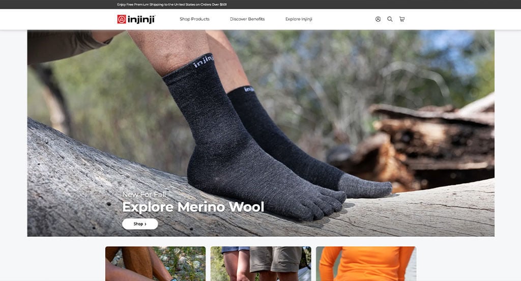
This product is a very specific product that is marketed well. Expanding a variety of their product aspects makes them a more unique brand. Changing the color, sizes and uses for their products made them more widely used. Showing little tabs in the corner of each product if it’s new was an idea we didn’t ignore. After scrolling through, you’ll immediately notice their clearly labeled menu. High-quality visuals were definitely refreshing. We also thought it was nice to include graphics to show each product’s unique features. Finally, we loved how they displayed a price for each product.
17. PLAE
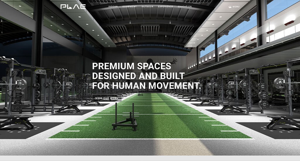
The look and feel of PLAE caught our attention because of their arrangement that is very easy to follow. We liked how they used fonts that were all caps to embrace a different mood. Paragraphs are written short and straightforward which was resourceful for any business hoping for customers to read their information. It was nice to break down their product so customers can see why it is so special. Plus, including lots of case studies from all around builds trust with this business. Overall, this is a great idea for anyone wishing to build up an athletic flooring institution.
18. Easton
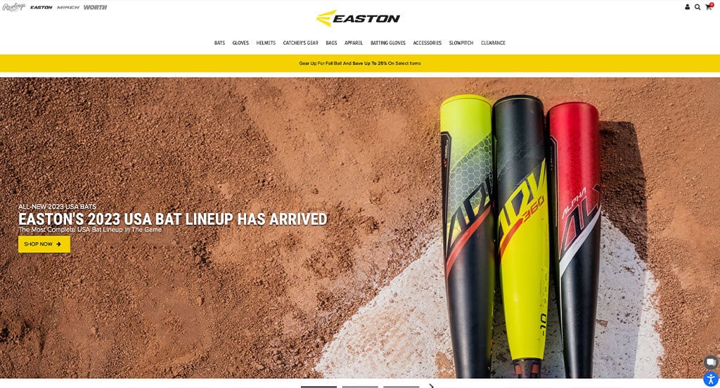
Color is a big thing for Easton. There are lots of bright colors showing up in their products and their layout which was perfect. We thought it was very important to include blog posts, which allows customers to get involved with them as a business. Something else that helps Easton stand out is their unique product names such as: Ghost, Hype, etc. Lots of creative imagery and typography was used, which is something we never ignore. Finally, we really enjoyed their yellow accents, creative logo and use of buttons.
19. Hydracup
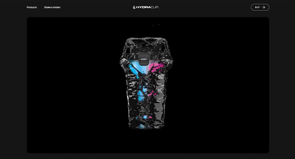
Visuals are everything, and this site proves it. Combining bold fonts with high-quality images really helps bring this one to life. Although there was white space, everything was well balanced so it didn’t feel empty or overwhelming in any area. We thought displaying their recent innovative projects was a great addition. Along with that, we noticed a slider that was used to show old and new images of a popular product. Another helpful addition to their products was small little features like the Houdini Hook or the Spout Shield, to consider customers a bit more.
20. YETI Cycles
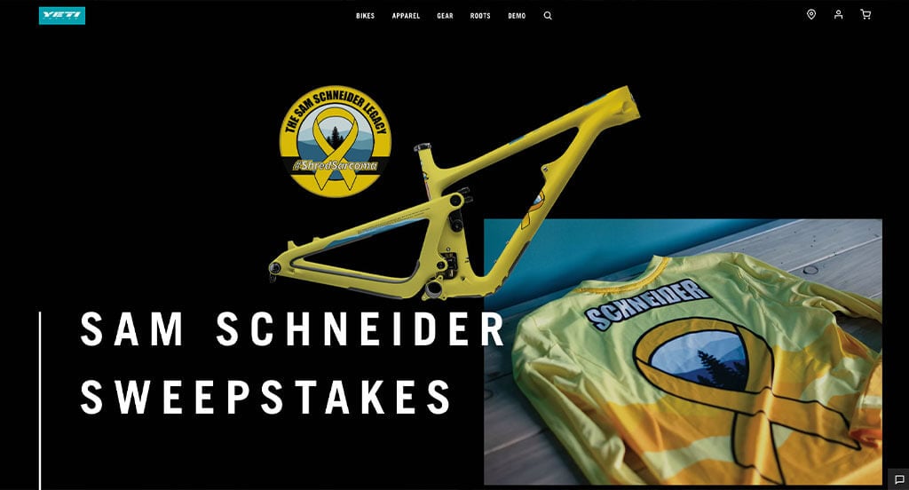
Everything about YETI Cycles attracted our attention. Not only did we love their decorative lines leading people to more content, but we also loved their large visuals. A focus on events and people they support through their blog posts was something else that we very much enjoyed. Some simple but smooth animations guiding customers through this entire site was creative and engaging. We thought it was cool to show underlined or circled emphasis on their titles. What a great website to review when building out your next sports business!
21. Bear Walker
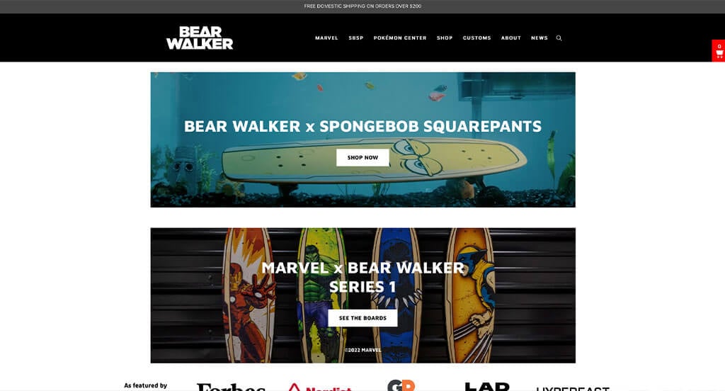
Bear Walker is a company that will always stand out. This business is very unique because of its carefully handcrafted products. Being able to let their products be the focus of their pages was brilliant on its own. Being able to collaborate with popular brands and series will give them an advantage because kids and young adults will see the characters they love. Simple navigation is another quality of this professional skateboarding gear site that’s on another level. Adding in a search bar to help customers find the character they are searching for was another thing we enjoyed.
22. Robin Golf
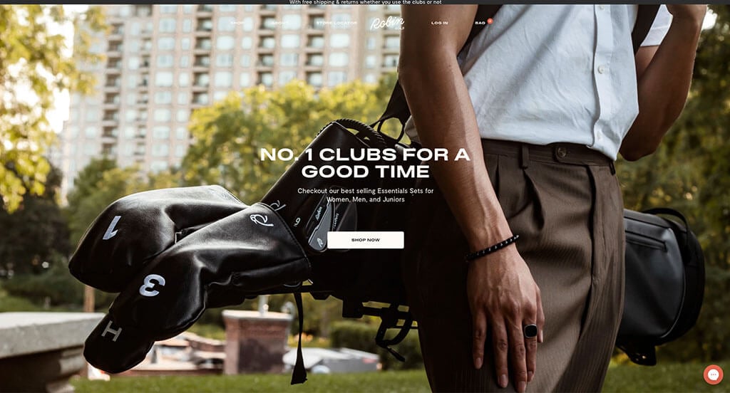
There were numerous golfing supplies websites to choose from, but the website for Robin Golf was the perfect example of a well-designed sports equipment website with a complementary color scheme of black and white to create a clean look. The simple phrases carefully placed throughout the page was probably the most impactful quality of the homepage in this website. Another thoughtful feature of this creative athletic goods website is the clean and elegant design. Robin Golf had website marketing in mind when creating the blog of their website. Give some thought to the unique design of this sports gear website when building your next website.
23. Boosted USA
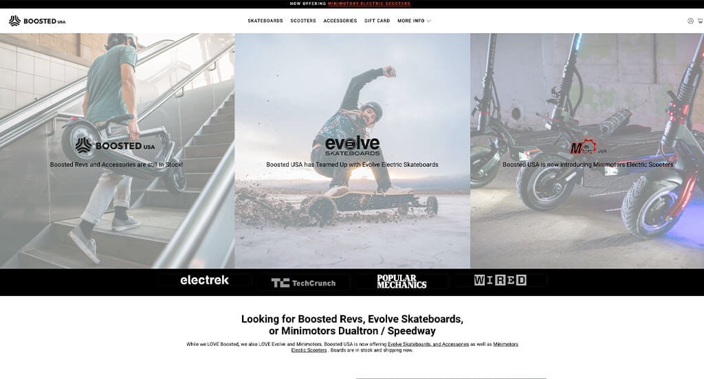
We loved how Boosted USA edits their images just a little to get a sense of unity throughout their site. We believe that the most attention grabbing aspect was their captivating and unique fonts. We also liked how all of their paragraphs were written in a short-and-sweet manner. Boosted USA also took advantage of white space to help their information feel less cluttered. Their domain seemingly matched with their brand so that’s always a plus. Finally, we liked that the only color in their site was their buttons and their images because it draws more attention to those things.
24. LIV Golf
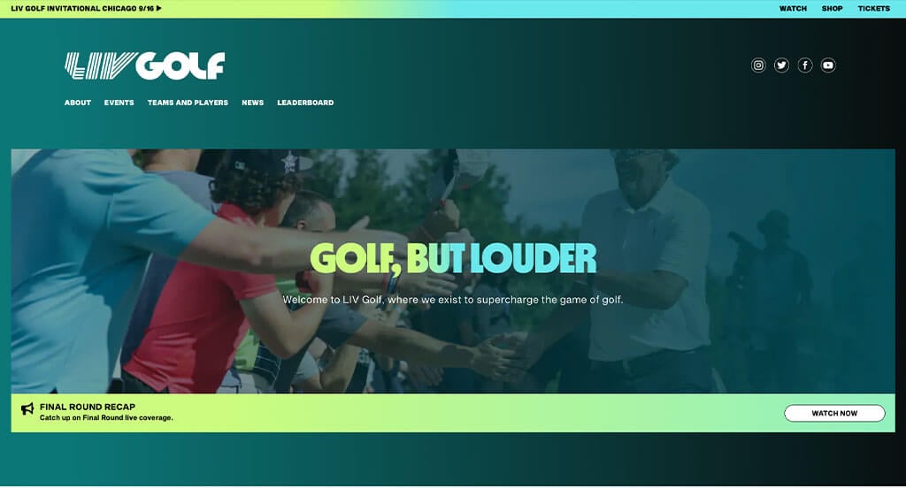
LIV Golf wanted to feel energetic, so they went with bold fonts and bright colors, something that never can go wrong. Including lots of interesting and high-quality images is something that always takes an example to the next level. Their logo was flashy but still classic, helping them stand out from the minimalist designs out there. Lots of written content was included for customers but it never felt overwhelming due to their thoughtful organization. LIV Golf clearly had a focus on conversions when creating their web pages.
Related: Your sports organization can use SEO to get ranked higher in search results, thereby driving more traffic and sales!
25. Reebok
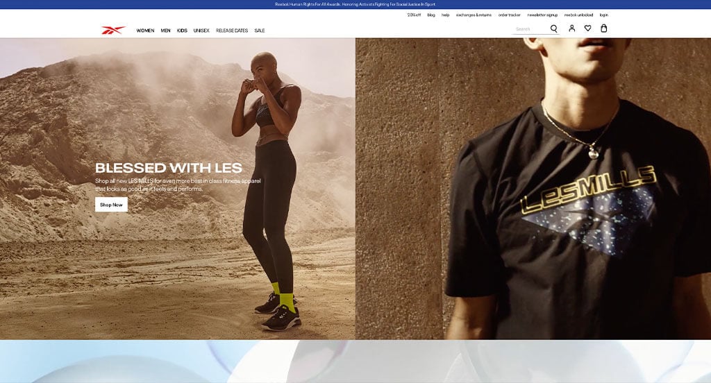
Here is yet another example that has a great logo, but does even better incorporating that logo into their products. We thought this was a good example of a homepage layout for activewear because there are big, bold text to emphasize a statement and short phrases to help guide users navigation. Lots of small images for individual products can be noticed, but they aren’t all that’s on this site, making it much more interesting. Allowing customers to shop by men, women or kids was another feature that shouldn’t go unnoticed. Reebok had accessibility in mind when designing the simple navigation.
26. Overtime
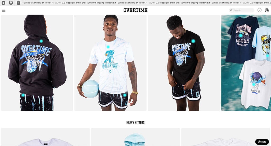
Allowing their company to be taken over by the upcoming holiday was the first thing we noticed. We thought their creative little cursor was a good addition. They had a variety of different products which helps people find what they’re looking for better. Though we always love buttons, we thought their animations and “pop” of color really helped those buttons add another dimension. Overtime also made use of images of their products off and on people which gives customers an understanding of what they’ll be getting. This was definitely a site to take a look at when looking to get inspired.
27. Hyperlite
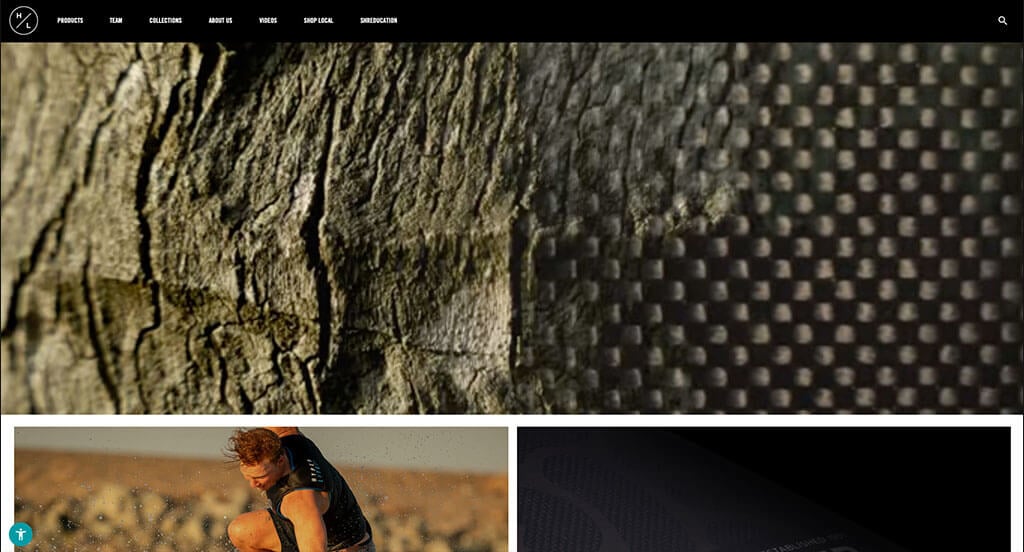
If you are a sports business, there is no better way to capture your customers with a high quality video with creative animations. Images packed with action was a brilliant idea because it allowed for an energetic feel. This is a great sports wear web design example for someone looking to develop a professional website. Additionally, bold capital fonts are used to help attract additional attention to their content. We also thought features like a well labeled navigation bar and an informational blog was also helpful.
28. Icelandic Mountain Guides
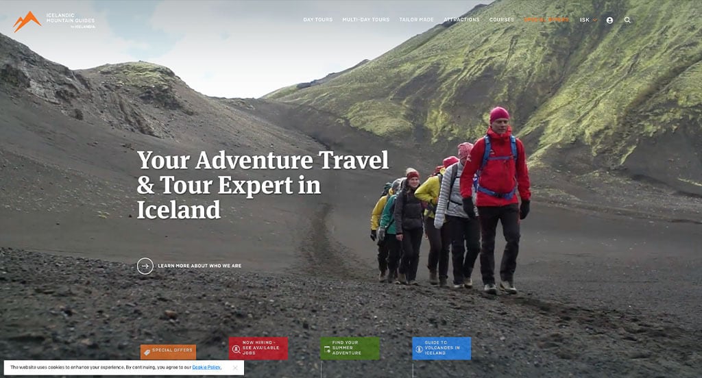
We loved this example due to their automatically playing video. This helps to display the true joys of Iceland, and will help draw in their customers. Next up, we had their stunning balance of white space that maintains cleanliness. You’ll also notice videos and captivating images that are extremely eye-catching. Orange was a great choice for an accent color for a business like this wishing to evoke an energetic emotion. Icelandic Mountain Guides made sure to use a select a simple logo design that makes sense for their product.
29. RedBull TV
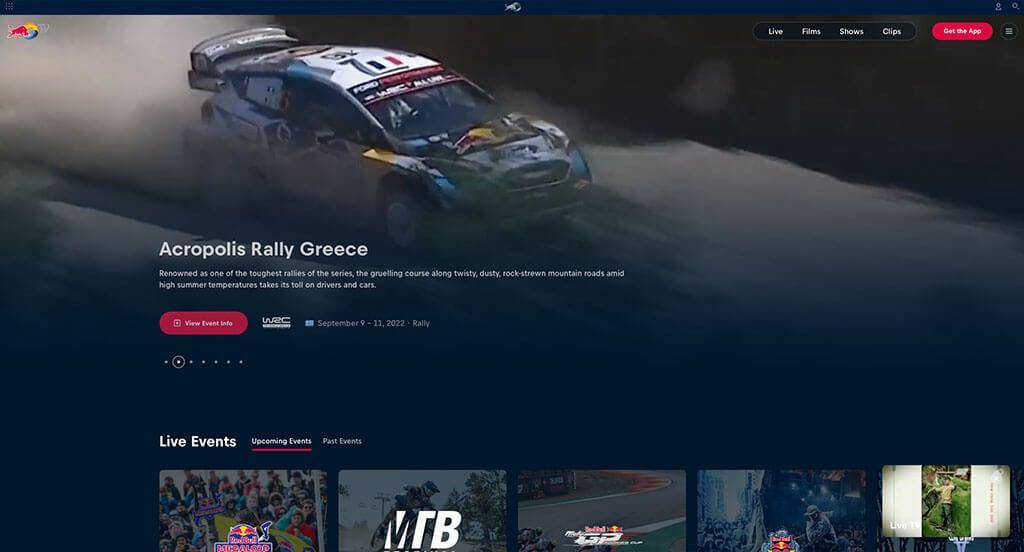
We appreciated how this sports TV company used dark blue for a background paired with white text boxes. Obviously, High quality images and videos were a must for this type of business. Showcasing the time, day and location for their live events was a feature that was on-point. Additionally, it was nice to be able to click on shows or events to get more information. The professional and simple touch is another unique quality for RedBull TV was something that we enjoyed.
30. Wrigley Rooftops
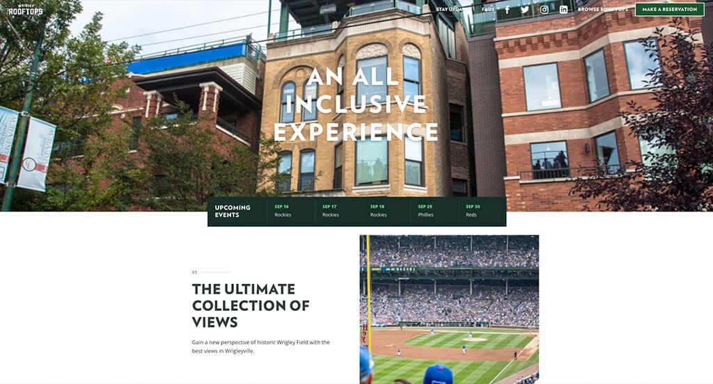
If you want to stand out in a market like this, use Wrigley Rooftops as an example. First off, we loved how their loading animations mashed together graphics that are related to baseball. Another thing we enjoyed was their captivating layout to balance all of their elements. 3D images were used throughout this template to help customers understand where they will be going. Wrigley Rooftops clearly had a focus on marketing when building the interactive aspect of their website.
31. Roval Components
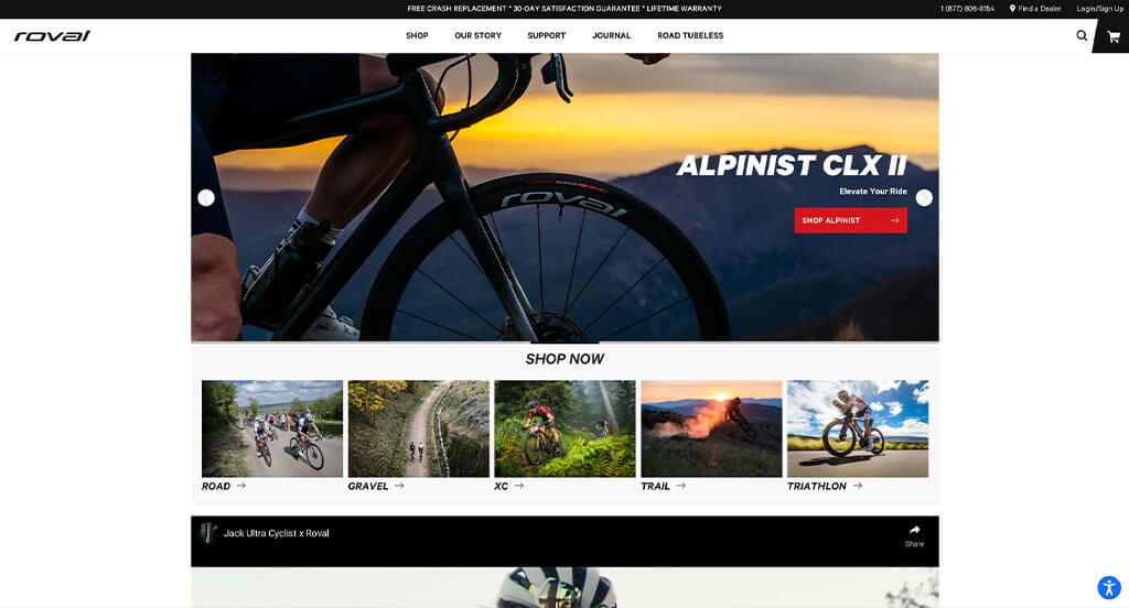
This is a great website design example for recreational gear retailers looking to get inspired for their custom layout. The most attention grabbing aspect of this sporting goods website was definitely the way the content tells the story of their bikes. The pleasing imagery is another feature of this custom recreational goods website we enjoyed. They clearly had website accessibility in mind when designing the unique layout of their website. Give some thought to the one-of-a-kind design of this biking gear website when developing your next custom website.
32. Puma
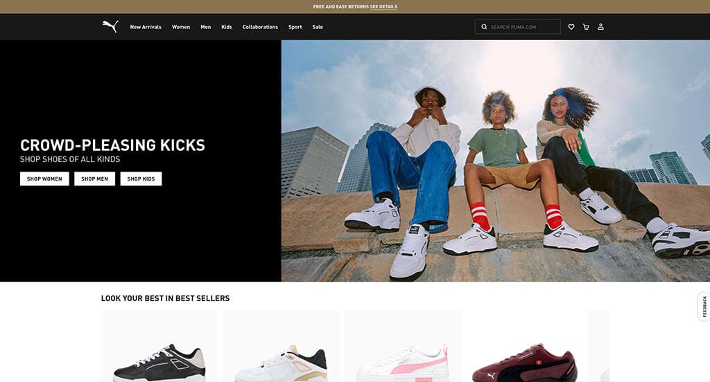
This is an example of a company that is well-recognized just by their logo. Puma tends to reuse their logo throughout their page and on their products which was an amazing ideas. A basic, clean and elegant design was their most impactful feature. Additionally, there was lots of images that include models wearing their products. A clearly labeled menu also helped make their products and information easier to find. Finally, we really liked that a whole page was dedicated to their collaborations.
33. Golf Galaxy
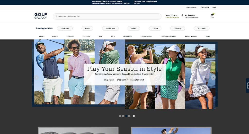
Here is another example that takes advantage of high quality images. Plus, their use of creative text was something else that stood out to us. We loved the addition of a search bar and buttons for better movement through their template. Another design quality was their simple navigation. From a marketing point of view, they were smart to utilize a quick and easy checkout process. Event their domain had thought put into it, using their company name.
34. Cascade XRS
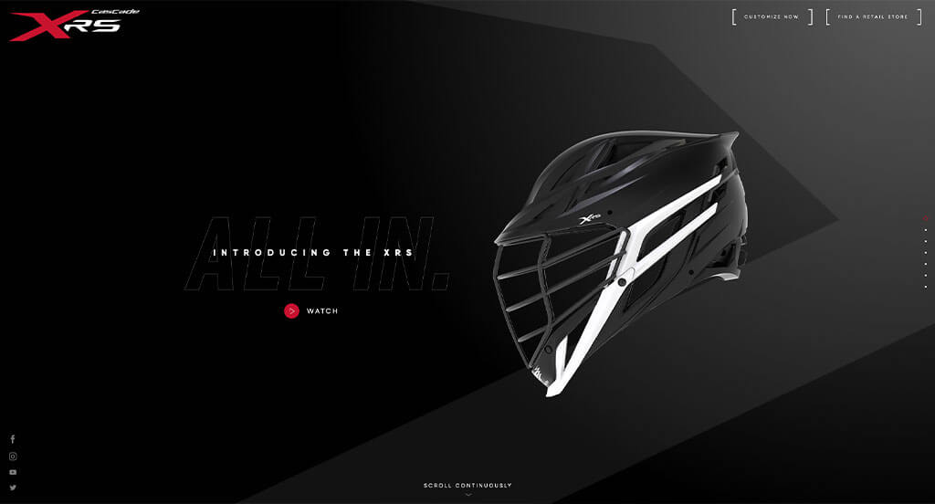
The best part of this design was how well they display their products. We also liked how starting prices were included with products. We also loved the short video clips to showcase different features within their products. As you scroll through, you might also see that they used images, videos and graphics to help break up the content. Big, bold and colorful text help emphasize a statement and was extremely professional.
35. Bauer Hockey
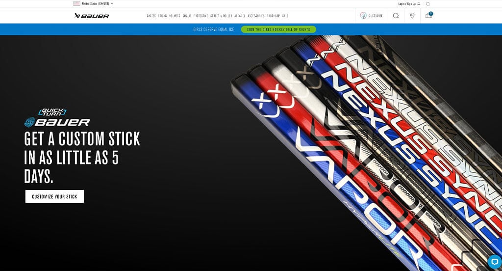
Our first impression was that they knew how to use creative typography to create an amazing design. They used high quality images and cool hover animations to create an outstanding look. Simple navigation and ease of use was another reason why we included this example in our list. There was certainly no shortage of reasons to include Bauer Hockey in our list of sites for sports equipment to consider when building out their next website.
36. FootJoy
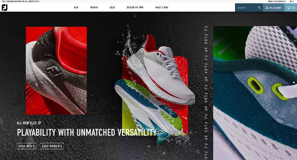
FootJoy’s best feature was their high quality visuals that showcase their unique products. Another part of this homepage that caught our attention was their smooth transitions. We also liked that it was clean, basic and simple layout. Additionally, we can notice their use of links and buttons to maintain an organized template. FootJoy used beautiful green accents to display a trustworthy mood for their design.
37. Washington Huskies
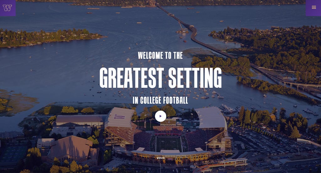
Our web designers immediately noticed the complementary color scheme of purple and yellow with white backgrounds used here because it shows outstanding school spirt. We thought it was smart to use bold fonts to highlight their titles. Their stunning images were also a great addition that we loved. This football team’s site also does a good job with making their contact information easy to access. Washington Huskies clearly had digital marketing in mind when creating their smooth transitions.
38. HOKA
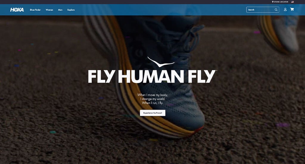
We can tell based on their action photographs that this company is a sports based business. We loved how their product images showcase every detail about their shoes. Additionally, their logo was both unique and relaxing, and it was a great choice to include it into their shoe. Another thing we noticed was their creative feature to recommends shoes for you based on a short survey. All in all, this is a great site to check out when looking for more inspiration.
39. Prevail Boxing
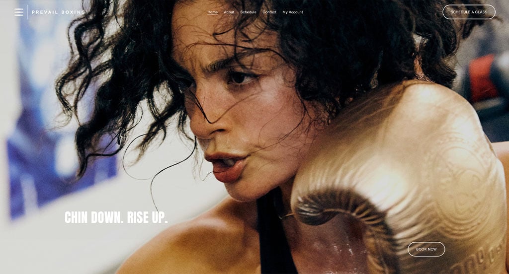
Here’s another example that we love due to their basic color scheme that allows their videos and images really speak. As you scroll through, you’ll be sure to notice how their content told their story throughout each page. All their written content is formatted into short paragraphs, which helps to keep viewers engaged. We also thought their logo design was cool because it utilized a P and a play button signifying action. Lots of great features to think about when taking a look at Prevail Boxing.
40. ACES Baseball
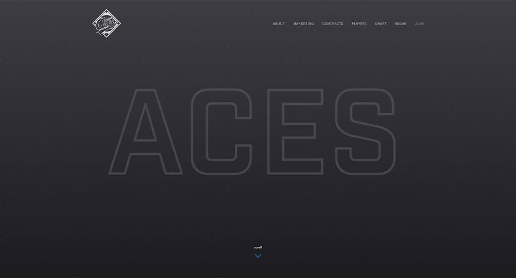
Right away, we loved how this site used an interactive timeline to showcase the history of baseball. We liked how they used a well-labeled navigation bar to help customers find the information they want. ACES Baseball also created a logo that included a baseball diamond, baseball, and a creative font. Additionally, we thought that their cutouts of baseball players was another great aspect. A bright blue accent against a dark background is another feature that easily grabs our attention.
41. Eleven
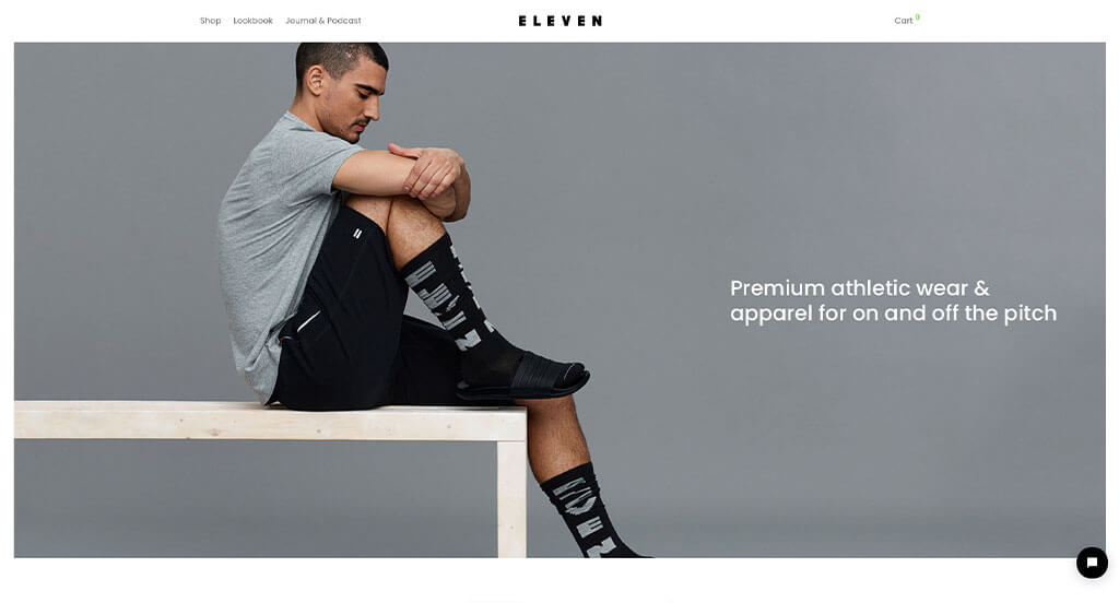
Unity was something that was top-tier in this design. Creating images with similar backgrounds was a great idea. We also liked their interesting layout of images, buttons and written content. While most athletic attire websites share this quality, we thought Eleven did a nice job incorporating neutral colors to create a sleek design. We also thought that a page for journals and podcasts was another good idea.
42. Top Golf
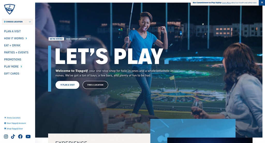
First off, we loved their bright blues and greens and white used as a color scheme that was energetic and fun. Their images even matched with their template’s mood with bright colors and excited expressions. The optimized content was refreshing for a golfing site such as this one. Bold fonts and unique photo frames were included to make it look even better. Additionally, we think it is smart that Top Golf made use of their name for their domain.
43. lululemon
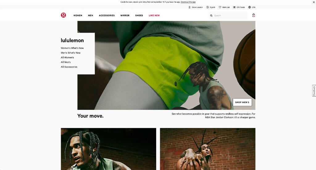
The popular brand lululemon does a great job appealing to both men and women just by scrolling through their homepage. Right away, we can notice their golf apparel which might interest guys a little more, but as we continue to scroll down, new releases in women’s clothing can be seen. Additionally, having Pro Golfers endorse their clothing lines was another smart idea. Choosing a simple background and layout helps make their overall feel modern and classy.
44. DICK’S Sporting Goods
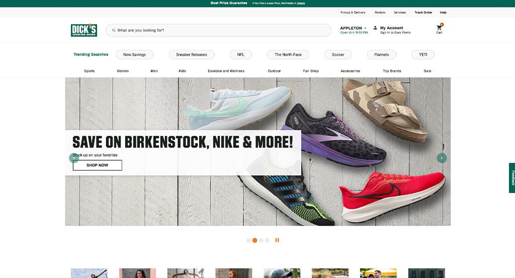
Dick’s is another site that knows how to take advantage of upcoming holidays for their seasonal merchandise line. Having simple navigation that links to other pages was another impactful feature for them. White space is also used and balanced effectively here. We thought it was nice to include posts from their Instagram page right on their homepage. The simple checkout process was another feature that really stood out to us.
45. Fitbit
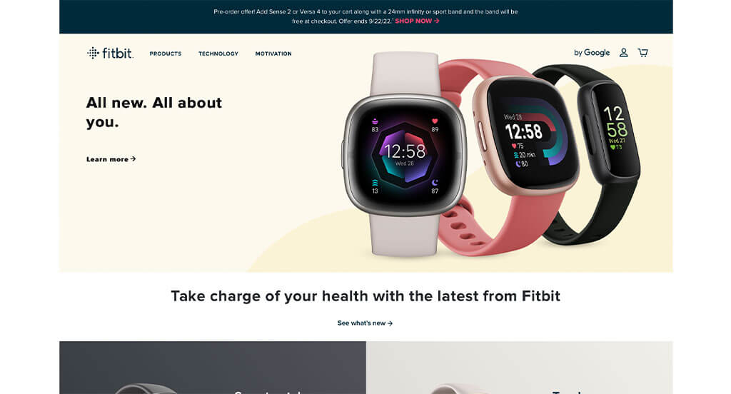
Sporting a clean and intuitive layout, this site keeps things simple for a watch website. The look and feel of the homepage of this sports watch website caught our attention because of the pastel color scheme causing a calming feel. Another thoughtful quality of this creative watch and accessory site is a quiz to help you find your recommended watch. The professional imagery helped make this one of the best athletic watch websites we looked at. Be sure to consider the great design of this watch website when developing your next website.
46. Trimester Fit Body
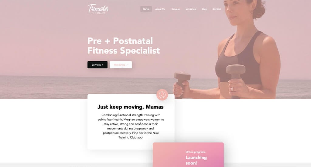
Trimester Fit Body was a business that was smart by creating a small niche of customers. Their use of pink, blue, white and gold made for a stunning design. We liked how their images showed that they care about their customers athletically and physically during their pregnancy. Including customer testimonal was another feature that brought them to another level. Trimester Fit Body clearly had conversions in mind when designing easy navigation for their website.
47. Mile High Golf Trail
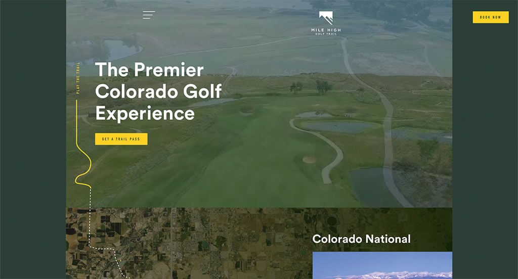
Mile High Golf Trail had a very professional feel to it, thanks to its blended use of greens, yellows, cream and white. We thought their animations leading through the locations of the trail was a cool idea. Beautiful imagery also helps brighten up this example and showcases the landscape of their golf course. Their creative logo design made great use of negative space to create a mountain range.
48. Under Armour
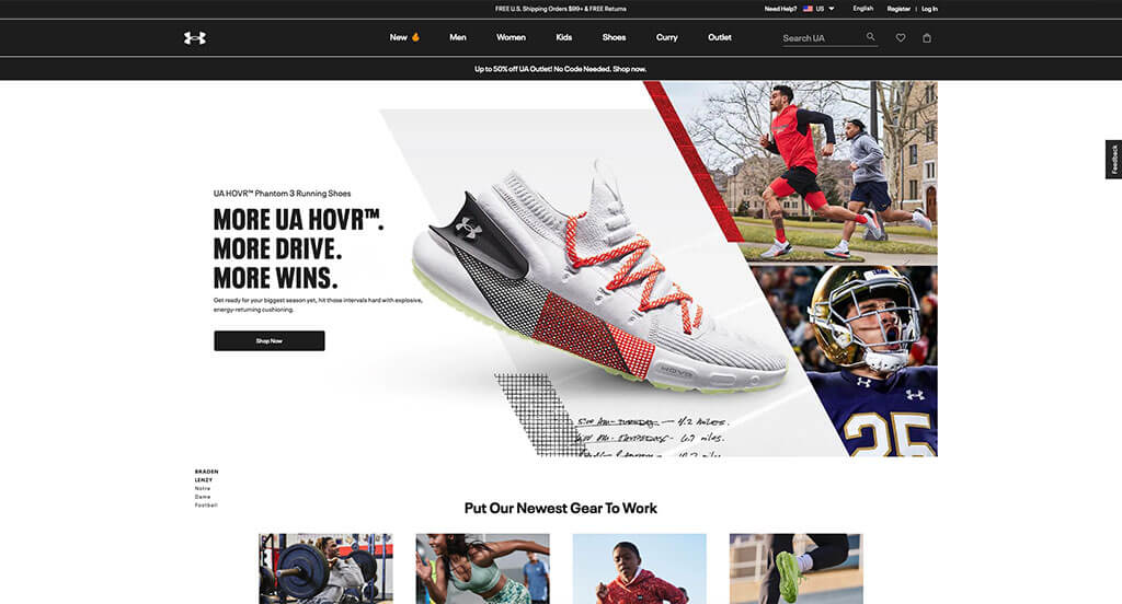
Under Armour is another option that visually stands far apart from its competitors. Their imagery was not only high quality, but it also had creative backgrounds and layers to create an interesting friend. We also loved how many action shots are used to prove that their brand is athletic. Their color scheme was also simple so it allowed customers to focus on content about their products.
49. Patrick Mahomes
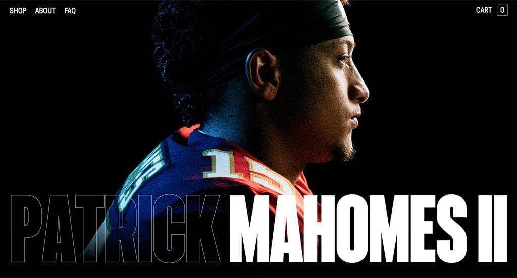
There was some stunning little animations related to football that really elevated their design. The professional and creative photos showcased were probably the most impactful feature here. Aside from that, their black background with sharp yellow, orange and white graphics and text was a nice touch. We also thought it was nice to include 15 and the Mahomies, his foundation to help children. We also thought it was nice to use color schemes that makes sense with the Kansas City Chiefs.
50. Rory Mcilroy
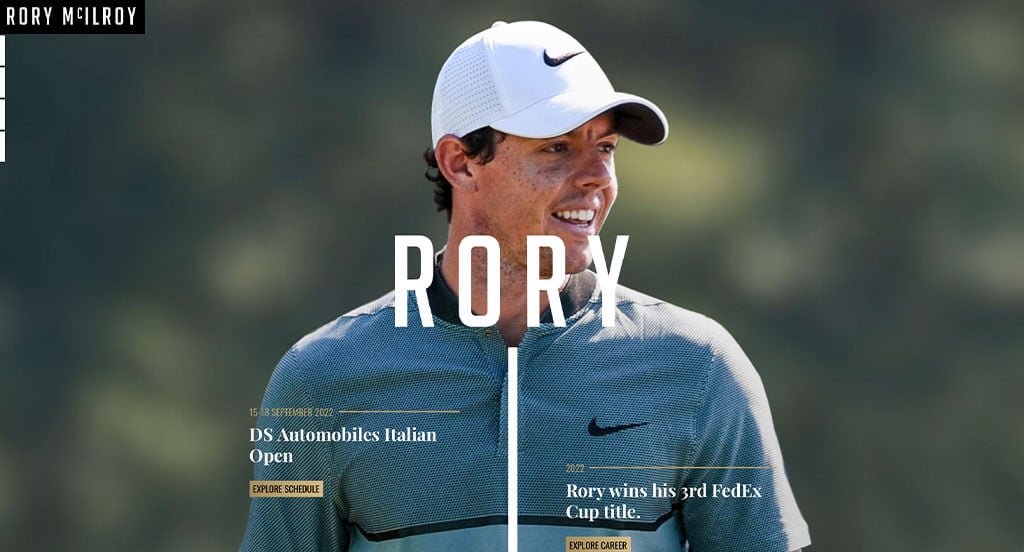
First off, we loved how Rory Mcilroy included interesting imagery that paired golf scenery with his silhouette. We appreciated how they used white and gold for the text, and allows photos to be calming backgrounds. Additionally, it was nice to display the information in the form of a timeline. They had usability in mind when creating simple transitions for their website.
Building an Impressive Sports Company Website
Are you building a new design for your sports company? Exciting!
Here are some key steps for creating or redesigning your site. If you’ve already chosen a domain, hosting, and platform, feel free to skip ahead!
1.) Choosing a Domain Name
Choosing a domain name is so important for your website’s identity, branding, and recognition—it’s basically the address that visitors will use to find you online.
Here’s a step-by-step process that will help you find the perfect domain name:
- Brainstorm: Generate domain name ideas based on your company name, services, and location.
- Simplicity: Choose a simple, easy-to-spell domain name. Avoid complex words, hyphens, and numbers.
- Consistency: Include your brand name in the domain. For example, if your company is Red Sport Agency, stay away from names like Call4SportsContracts.net.
- Availability: Check that the domain is available first. If not taken, see if it’s for sale, but avoid overpaying.
- Domain Extensions: Use the best domain extension for your site. While .com is most common, options like .net, .org, or .sports may fit your needs.
- Legal Considerations: Conduct a trademark searches before registering in order to avoid infringing on other sports brands or well-known companies.
- Register the Domain: Register your chosen domain with a reputable registrar like GoDaddy and Namecheap.
2.) Selecting a Website Platform
Next, you’ll have to find a website platform. There’s usually a focus on content, memberships, and contact forms, but eCommerce can be useful for for selling memorabilia, souvenirs, or apparel.
For Content Websites:
WordPress is ideal for most sports companies, but options like Wix and other builders are available.
- WordPress: WordPress is a versatile CMS ideal for sports businesses, offering flexibility, customization, and scalability. It supports everything from simple sites to complex features like course registration and third-party integrations. With sports-themed templates and plugins, it’s a great choice for control and growth. Most users prefer the self-hosted version over the hosted one.
- Wix: Wix offers similar page-building features as WordPress and is a hosted solution. It’s a solid choice for sports websites that doesn’t require separate hosting.
For Ecommerce Websites:
If you wish to sell products online, consider eCommerce platforms like WooCommerce or Shopify.
- WooCommerce: For a WordPress-based online store, WooCommerce is the best choice. It has seamless integration, offers extensions, includes payment gateways, and inventory management for sports companies.
- Shopify: Shopify is another choice for eCommerce platforms, offering easy setup, customizable themes, security, and built-in inventory, payment, and shipping features.
Web Hosting Requirements
If using WordPress or WooCommerce, you’ll need web hosting. We recommend our own service for WordPress, but here are some other options:
- WP Engine: WP Engine is a top choice for sports website hosting, offering staging, backups, and a user-friendly control panel. However, it has PHP execution time limits, and pricing can rise with upgrades.
- SiteGround: SiteGround offers excellent support, quick response times, user-friendly backups, and reasonable pricing—making it a great option.
- Digital Ocean: Digital Ocean is a solid cloud hosting option, but it might be too advanced for most non-techies. It’s reliable but can be costly with added server and management fees. Another source to check out is AdminGeekZ.
3.) Selecting a Website Template
Many sports companies use pre-built templates to save time and money, but custom designs are also an option with the help of a custom web developer or custom ecommerce developer.
If you want some suggestions for finding pre-built website templates, here are some links to take a look at:
WordPress Sports Themes
You can find free themes at wordpress.org or explore sports-inspired templates at ThemeForest.
Oxigeno – Themeforest
$69
Campo – Themeforest
$69
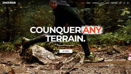
Endurer – Themeforest
$79
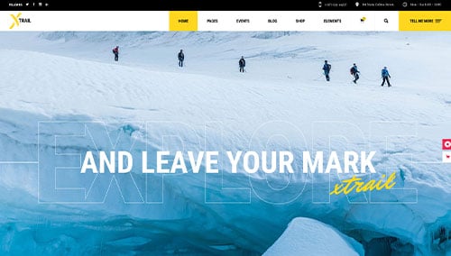
Xtrail – Themeforest
$85
WooCommerce Sports Themes
Find a wide selection of ecommerce sports themes for WooCommerce on ThemeForest.
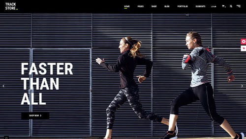
TrackStore – Themeforest
$85
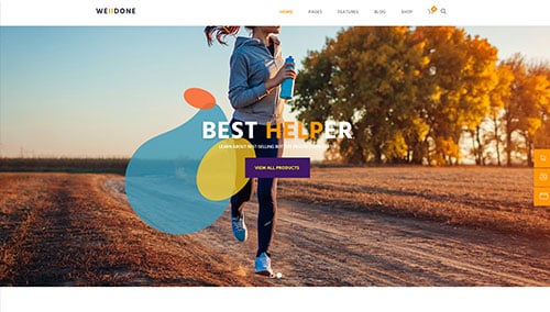
Welldone – Themeforest
$69
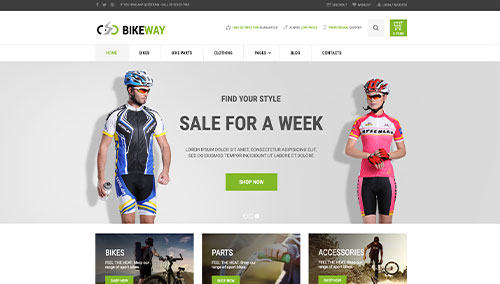
Bikeway – Themeforest
$55
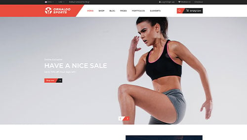
Ornaldo Sports – Themeforest
$59
Shopify Sports Themes
Discover free and paid themes at themes.shopify.com or explore options through marketplaces like ThemeForest.
Random – Themeforest
$59
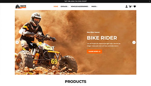
Rayz – Themeforest
$59
Sports – Themeforest
$84
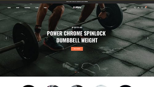
AIRN – Themeforest
$56
Wix Sports Themes
Explore free and paid themes in the Wix marketplace at wix.com, where you can find templates suitable for sports companies.
4.) Crafting Content & Adding Visuals
Now that your domain, platform, and theme is set, it’s time to create compelling content! Follow these tips to do exactly that:
- Know your target audience: Understand your audience’s demographics, needs, and preferences. Tailor content to address their pain points, provide value, and improve search visibility.
- Define your key messages: Define key messages that align with your brand, highlight unique advantages, and showcase the benefits of your products or services.
- Keep it concise and scannable: Keep content short and simple. Use short paragraphs, bullet points, subheadings, and bold text for better readability.
- Create clear and captivating headlines: Create compelling headlines that highlight your company’s value and engage visitors to explore further.
- Incorporate keywords strategically: Research relevant keywords and use them naturally to boost search visibility. Avoid overuse to maintain readability. Tools like Ahrefs or Semrush can help.
- Maintain a conversational tone: Use a conversational, engaging tone. Avoid jargon unless needed and address readers directly for a friendly connection.
- Edit and proofread: Edit and proofread for grammar, spelling, and flow. Ensure alignment with your brand voice. Tools like Grammarly can help!
- Leverage ChatGPT for assistance: Need content ideas or refinements? Use AI tools like ChatGPT for assistance.
Pair engaging content with high-quality images. Here are some tips:
- Opt for high-quality images: Use high-resolution, well-composed images. Avoid blurry or pixelated visuals because it will lower your site’s quality.
- Ensure relevance: Make sure you have relevant images that enhance your message and add visual interest.
- Explore stock photo resources: Use stock photo sites like Unsplash, Pixabay, or Shutterstock for high-quality sports images. Follow licensing and attribution rules.
- Customize images when possible: Customize images to match your brand for a cohesive look. Use tools like Adobe Photoshop or Canva for edits.
- Optimize image file sizes: Compress images to maintain quality while improving page speed and SEO. Use tools like TinyPNG.
5.) Post-Launch Activities
After launching your sports website, follow these key steps to maximize its effectiveness:
- Search Engine Optimization (SEO): Enhance local SEO with keyword research, optimized content, and strong internal links. Regularly update content to attract traffic. Consider our SEO services or providers like The HOTH.
- Paid Advertising: Use Google Ads or Facebook Ads to drive traffic. Consider our PPC management services or hire experts on Mayple.
- Conversion Rate Optimization (CRO): Use Google Analytics to track performance and identify drop-offs. Improve conversions with A/B testing tools like VWO.
- Website Security: Protect your sports website with SSL, firewalls (e.g., Sucuri), and regular backups. Keep software updated, monitor security risks, and use UptimeRobot for uptime tracking.
- Website Maintenance: Maintain your sports website by updating plugins, monitoring speed, fixing errors, and backing up data. Consider our website maintenance services or hire a freelancer on Upwork.
- User Feedback and Testing: Gather user feedback and conduct testing to improve your sports website. Use insights to refine and optimize the experience.
- Content Updates: Regularly update your sports website with fresh content, blog posts, and accurate info to attract visitors and encourage sharing.
Post-launch digital marketing is key to your sports website’s success. Stay proactive, monitor performance, and adapt strategies to meet your goals.
FAQs about Web Development for Sports Company Websites
Redesigning your sports website enhances product showcase, user experience, and competitiveness. A modern design improves navigation, highlights key offerings, and ensures mobile optimization for a growing audience.
We audit and fix broken links during the redesign, using 301 redirects, updating internal links, and reviewing external links. Custom 404 pages guide users when needed.
A great sports website features engaging visuals, intuitive navigation, and easy access to team info, schedules, news, and merchandise.
Before launch, you’ll preview the design and provide feedback. We’ll refine it to ensure it aligns with your vision and goals.