Hello, tech innovators! Seeking inspiration to boost your online presence? Check out our list of 35 best IT websites!
Our experts have searched out many examples that showcase stunning designs, functionality, uniqueness, and user experience for online excellence.
You might find ideas for your own site, but you’ll also valuable tips on how to make your corporation stand out.
Get ready to take your webpage to new heights with the help of this guide! You’ll find examples of software companies, hardware manufacturers, cloud computing providers, IT consulting firms, cybersecurity companies, and telecommunications companies in this list! For additional examples, head back to our sleek web design examples article!
Top Technology & IT Website Designs
1. Fuse
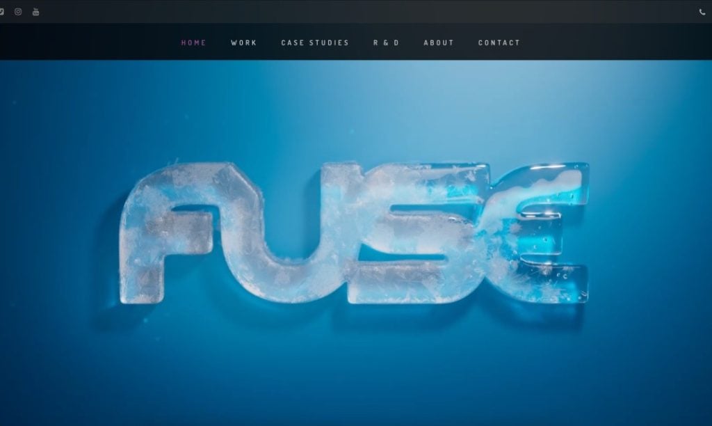
Fuse grabs our attention right away with their automatically playing video that includes many creative animations to display their brand name. Their shortly written paragraphs was another feature that stood out to us. Adding in a slider providing companies that they have worked with was another great choice. Their simple and professional fonts was something we really enjoyed. Though it is simple, being aware of their domain name and matching it to their business name was really smart.
2. Synthesia
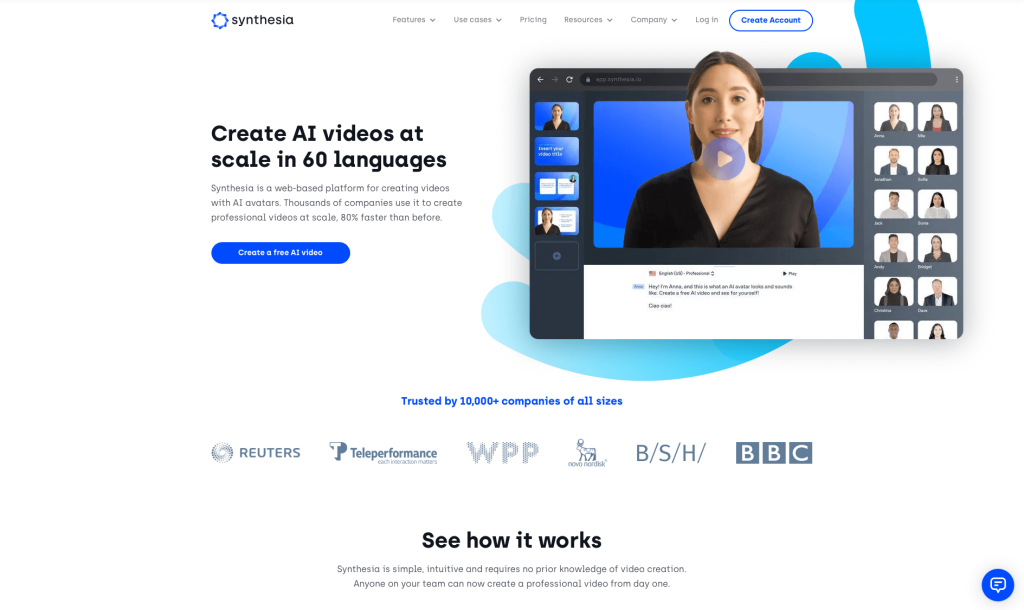
Here’s an example that is super modern and sleek, with a blue and white color scheme. Overall, it’s a pretty minimalistic design, which leaves customers feeling refreshed and not overwhelmed. Including dropdown categories for their menu makes navigation extremely easy. Written content is short and sweet, sometimes even utilizing numbers to order their information. We thought it was smart to add in lots of videos so people don’t spend their whole time on this site reading. Finally, having a domain that matches their company name was a great marketing feature.
Related: Technology companies are often looking at digital marketing solutions as a way of incorporating lead generation, email marketing, and social media management into a single service handled by an outside agency.
3. Skykick
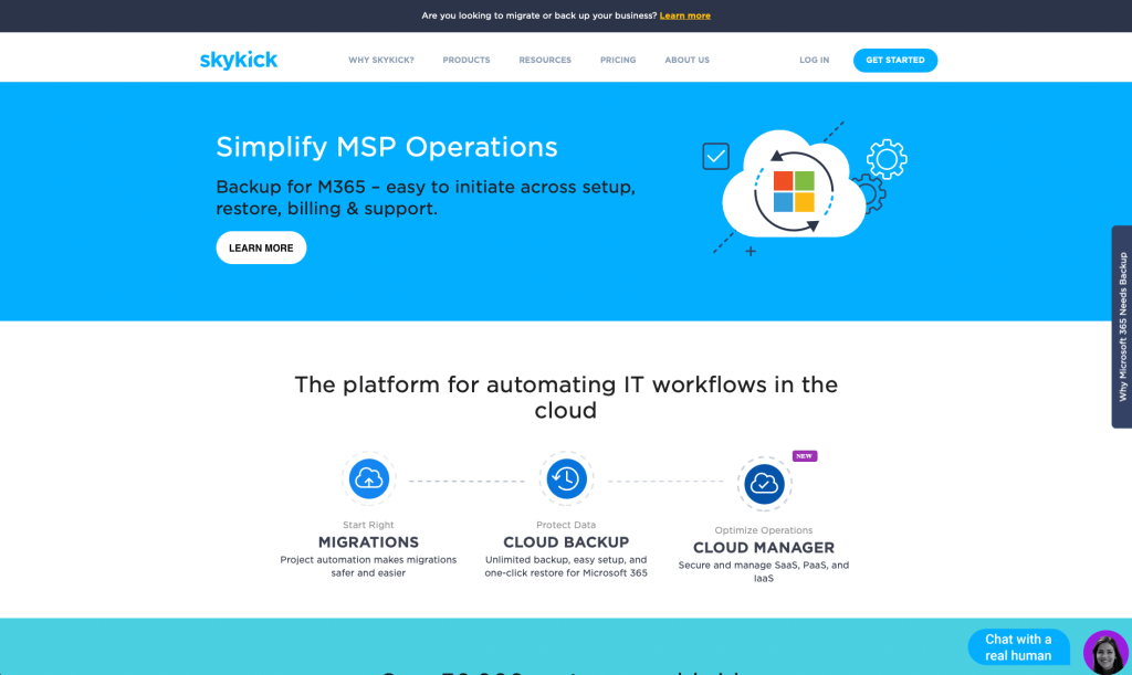
Skykick makes great use of simplistic graphics and a trustworthy color palette. Having a section dedicated to customer reviews was a feature we didn’t scroll past. Everything in this site is well-organize and easy to look at, making navigation uncomplicated. We also noticed that Skykick included lots of buttons to help people get to various resources and pages. Font choice also played a significant role in this example.
4. Link Tree
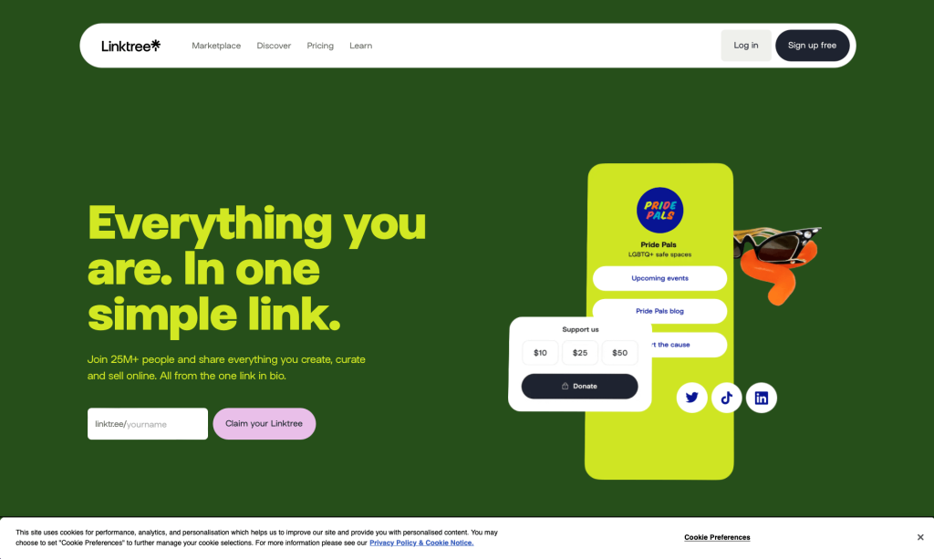
What sets this business apart from its competitors is their bright colors and creative graphics. We thought their unique photo frames and grouping of element was outstanding. Link Tree has a very timeless logo that uses two simple shapes to create an object looking like a tree. It was unique to have lots of small animations to attract customers to certain areas of this site. Don’t look past their bold fonts that really help customers to see important information.
5. Rapidops
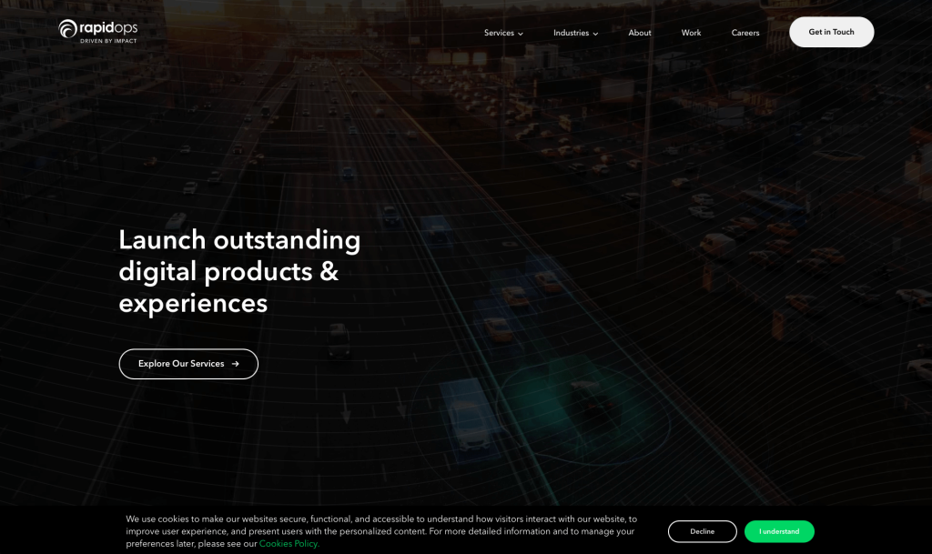
Simplicity shines through this design from their color scheme to their font choice. We loved their graphics and their outstanding logo design. Though not many images are included, their short paragraphs let customers know what this business is all about. Adding in customer reviews is always a feature we enjoy. We also liked their accents of bright green, that are nice but don’t overpower their layout. Finally, Rapidops made sure their webpage would be easy to find by making their domain name match their company.
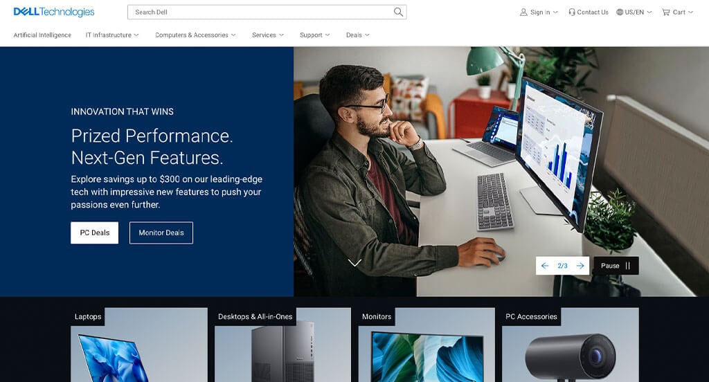
6. Dell Technologies
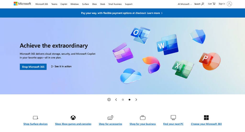
7. Microsoft
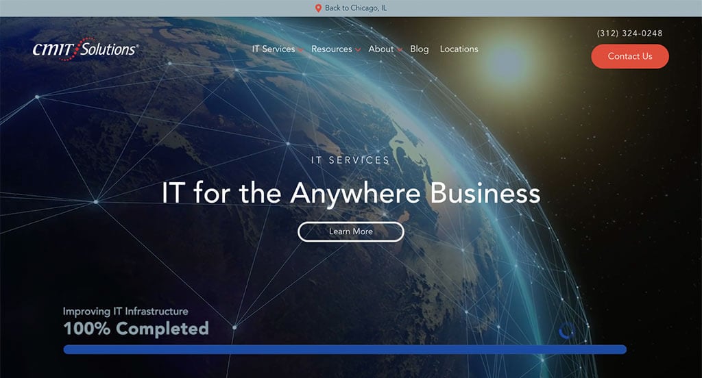
8. CMIT Solutions
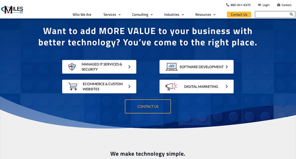
9. Miles IT
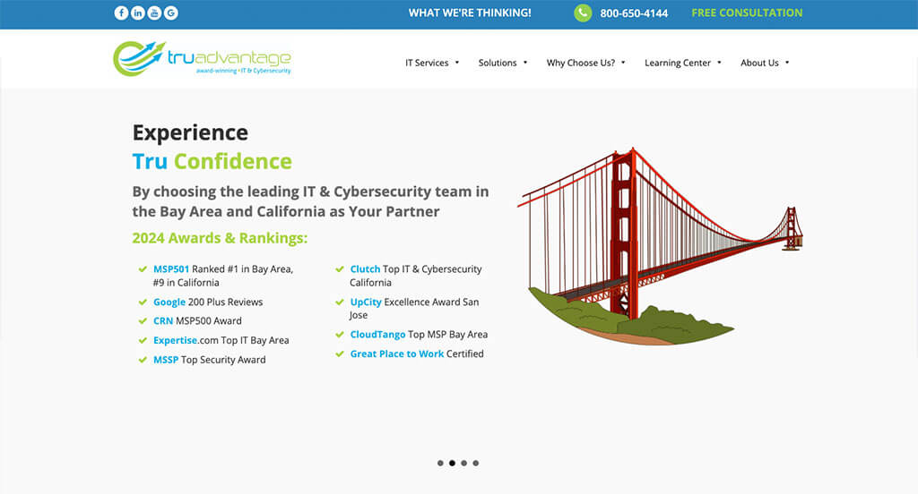
10. TruAdvantge
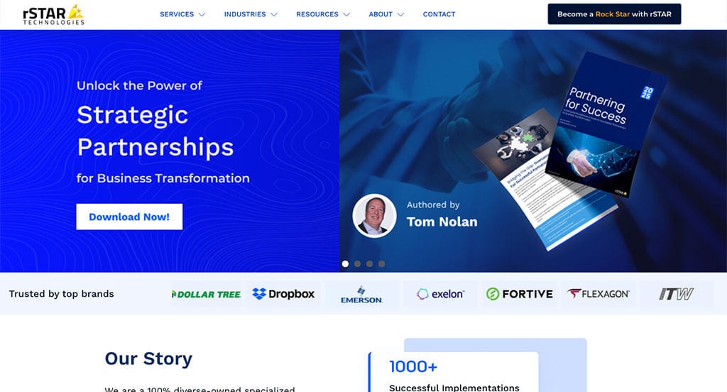
11. rStar Technologies
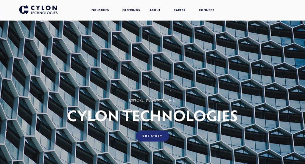
12. Cylon Technologies
13. MSI
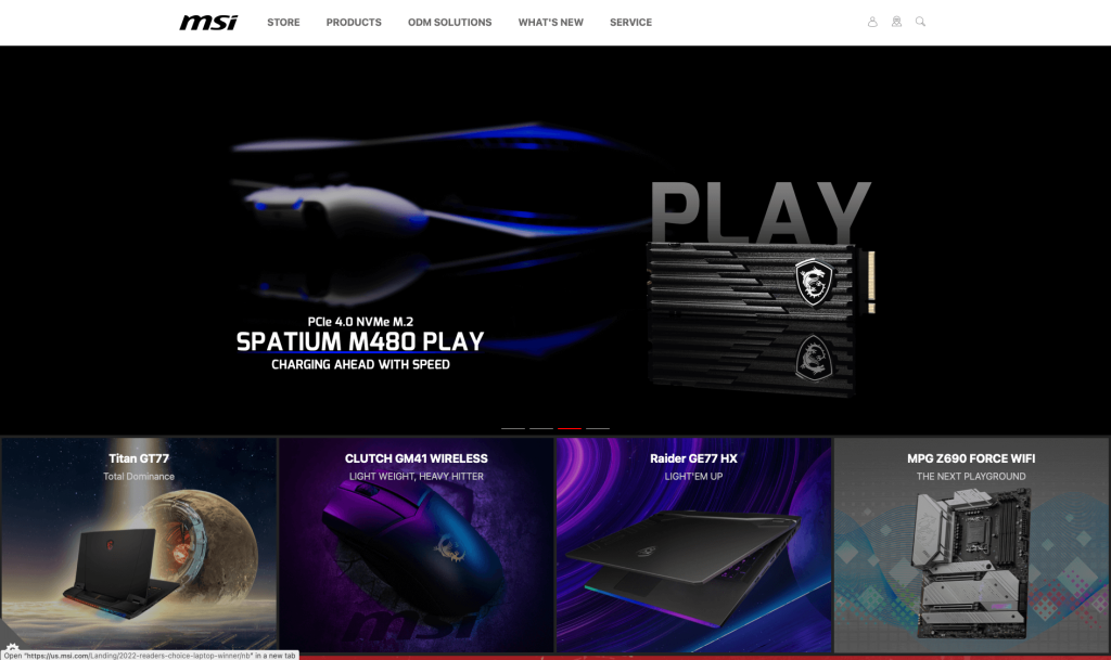
Imagery is the outstanding quality in this example. Lots of high quality, bright, unique images are used to engage customers. Using basic black and white backgrounds is smart because it allows for those images to do the talking. Almost all images lead to a link of some sort to provide viewers with additional information. Their navigation bar was also well-labeled making it easy to find information that you are looking for.
14. Field Edge
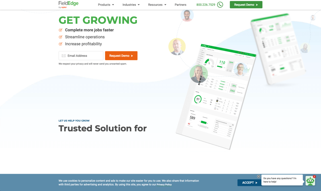
Here’s another example you won’t want to miss! You’ll notice right away that they took some time to create transitional animations as you scroll through. Information was clearly organized and had a great flow, sometimes they even used bullet points. Including a live chat will help customers feel they are connected to this business. Having a page dedicated to pricing was an extremely smart choice. We liked how Field Edge offers three different plans and clearly states what that plan will get you.
15. FirstFit
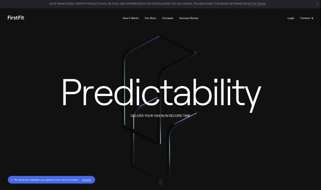
If you are looking to create a clean and modern webpage, make sure to take a look at this example. Allowing for We thought their logo reflected them well because it was very modern looking. Adding in videos about what doctors and customers say about this company was smart (though they could have had english subtitles). We liked how they compared their product to traditional veneer treatments in many areas such as time, accuracy to digital display, temporaries, and more. Some occasional basic animations were included to engage viewers. It was useful to link their social media links in this site’s footer.
16. Workspace 365
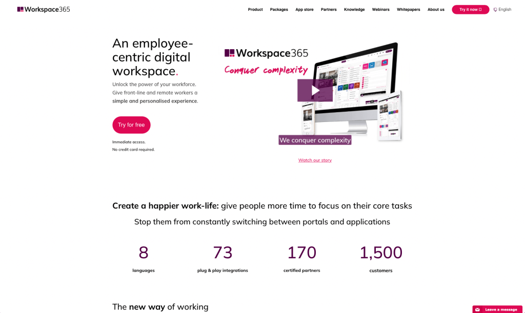
Workspace 365 is a perfect example that stands out but isn’t overwhelming. Their photo frames really makes them feel different from competitors. Organizing much of their written content into clean bullet points was something we noticed. Overall, this example is clean and modern, and their color selection is eye-catching and professional. Adding little “handwritten” notes towards their images was unique. We really liked how their font is easy to read and sticks with that modern, professional feel we noticed in this design.
17. Open Node
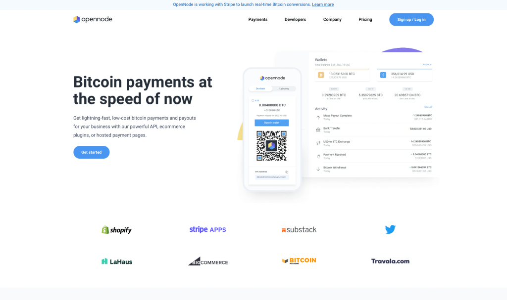
Simplicity, simplicity, simplicity. White space is clearly used in this design to create a clean, simplistic look. Small bursts of color can be seen in icons, logos, and buttons to help highlight that important information. Adding in a blog to keep customers informed on current news was a great choice. A brief overview of their services and a few testimonials can be noticed in this homepage. Open Node also used their name as their domain, which we found useful.
18. Marvel
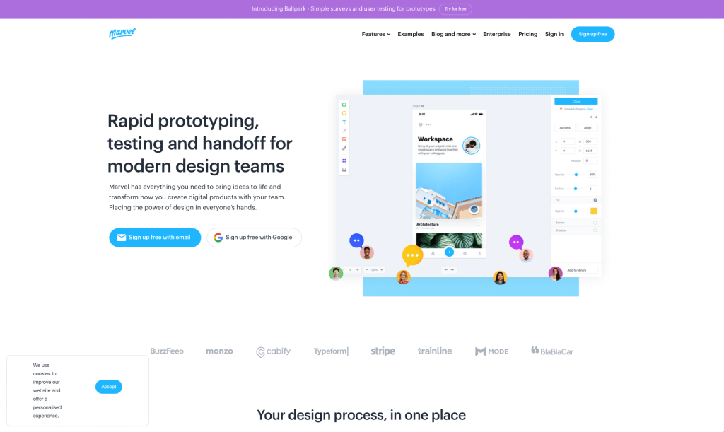
Marvel is set apart from similar companies because of their high-quality visuals (both images and graphics). They did a great job balancing their white space to help provide more information with less clutter. We like how a straightforward navigation bar was used to organize content. Many short paragraphs are used to keep people involved with their site. Overall, this was a great example if you are looking for simplicity.
Related: Your tech company can make use of SEO to get more organic traffic. Just focus on quality content writing, authoritative link building, and exceptional web development.
19. Meltano
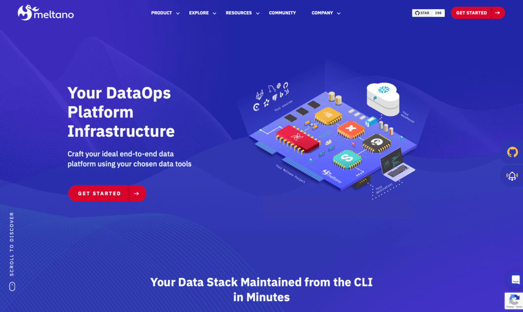
Our favorite feature of Meltano was their cute dragon that travels throughout their entire design. Their dark backgrounds with accents of purple really stood out because many of their competitors use light color themes. We thought their buttons were cool because their ombre color scheme switches upon hovering. Their little dashed line to create a sense of flow in their information was amazing. Don’t scroll past this example when looking to build a tech related template.
20. Mixpanel
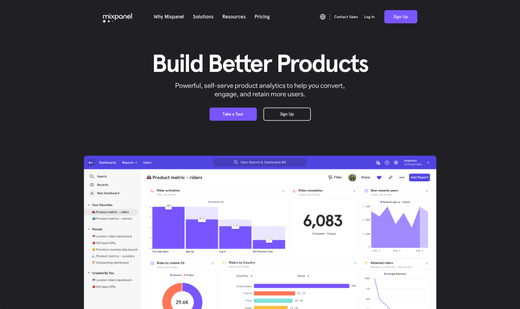
Mixpanel’s most notable feature is their bold fonts that helps their titles stand out from other written content. This company made great use of different graphics to boost their visual appeal. We thought having a sliding answer bar with common questions was creative. Using various buttons to help guide customers to other areas helps a lot. In terms of design, Mixpanel has a clean and modern interface that is easy to navigate. To top it all off, their domain matches their company name.
21. Klarity
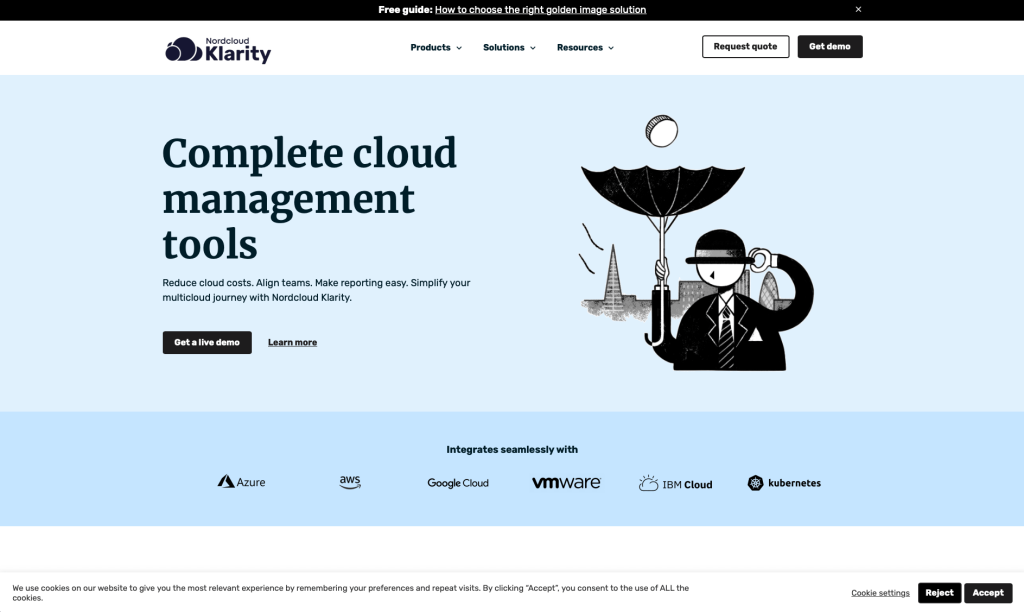
Nordcloud’s Klarity utilizes a basic template that isn’t overwhelmed with unnecessary things. Including awards they have won as a company was a great choice. Everything is well-written and informative, providing readers with a valuable resource for staying up-to-date on some current trends. A clearly labeled menu might also be noticed because customers will be able to find information they are searching for faster.
22. HYAS
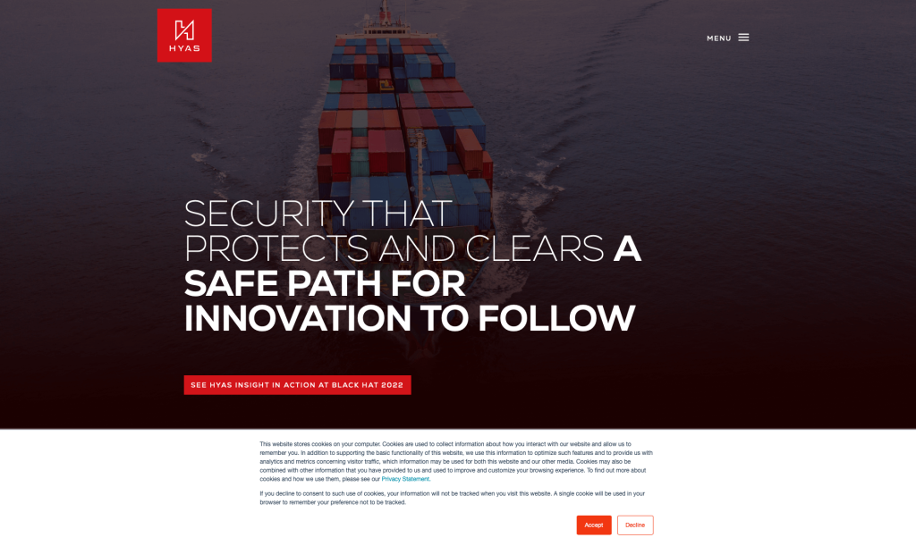
HYAS brings attention to their information using bright red accents. We liked how they added statistics to convince viewers to purchase their products. Displaying all of their awards was another feature that didn’t go unnoticed. HYAS made use of a unique logo design that really stood out to us. We liked how almost everything was formed into short paragraphs to keep people happy.
23. Axcient
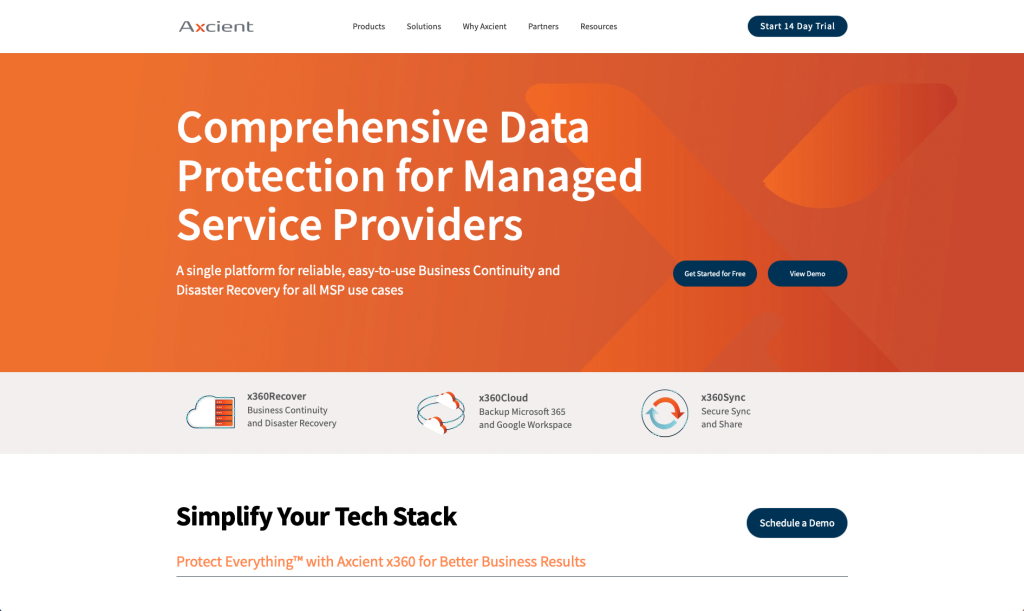
Axcient uses a complementary color scheme that is sure to grab some attention. Simple icons were used which is helpful for people to put visuals in their head to go with their written content. In terms of design, Axcient has a professional and polished look that is easy to navigate. Having a simplistic navigation bar also helped viewers to find information in their site.
24. Mint
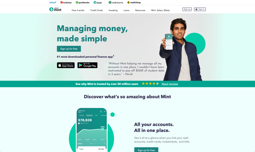
Mint most creative feature is their monochromatic scheme that creates a sense of unity. We liked how they used repeating design elements such as circles, phone screens and their font. Speaking of fonts, they picked out one that matched their company and was very professional looking. We have a soothing design that makes it easy to navigate. Additionally, their logo was simple, matched their color scheme and made sense with their business’ name.
25. PandaDoc
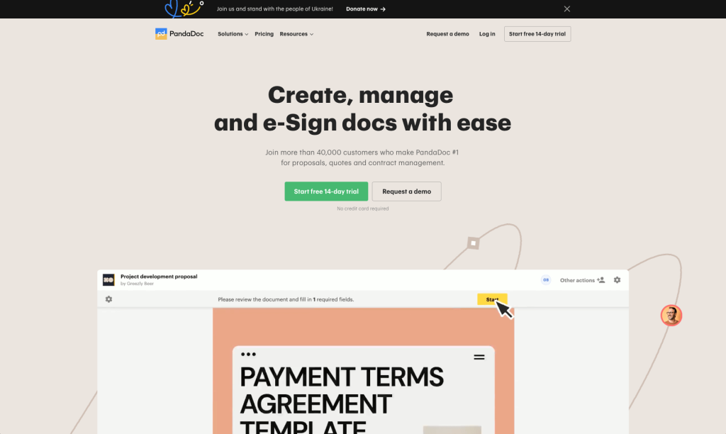
Pandadoc uses similar fonts but in different sizes and bolded was smart to attract attention to certain information. We thought it was unique to have company logos to add in links to additional tools. Having a bunch of awards to display throughout this homepage was a cool idea. Pandadoc has a light, subtle theme in soft tones that are easy on the eyes. Overall, Pandadoc is a great resource for anyone looking for document management solutions.
26. Credera
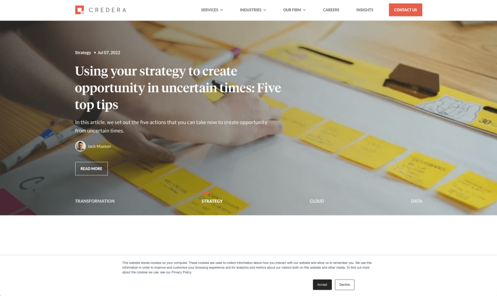
Credera was another great example we found while searching through. All of their written content was broken up into short paragraphs so it is easier to read. Their way of displaying images was both creative and helpful. This company did a great job with their logo design that says strong and connected. Adding in links to give customers other information was a choice we won’t forget. We thought including a search bar was an interesting feature. This company used their name as a domain which we helpful for lots of people.
27. WeHype
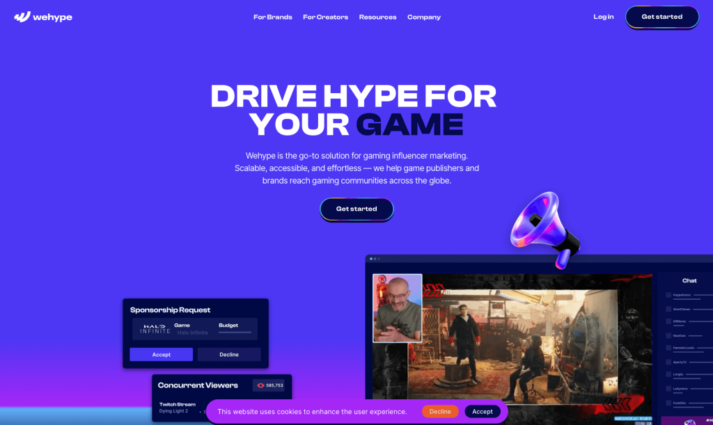
Wehype utilizes aa stunning color scheme with lots of ombre effects. We loved their font choice that was unique while still being professional. Having many buttons with simple hover animations was something else we noticed. Lots of small graphics in the form of icons help to add a bit of visuals without being overpowering. Including automatically playing videos was a great idea. Overall, their navigation bar was very organized so customers can easily find what they’re looking for.
28. Insight
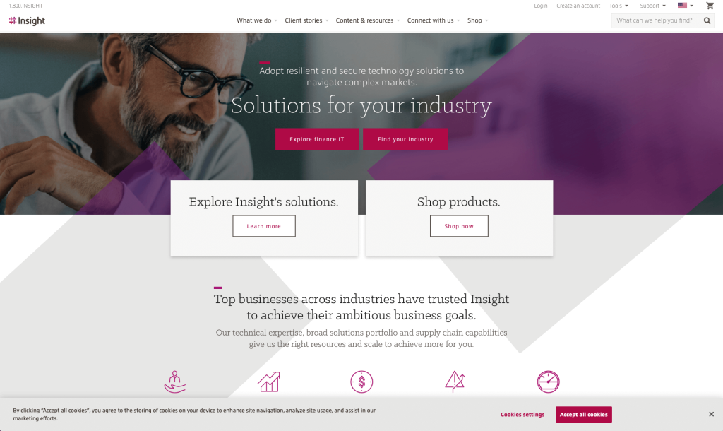
We liked how Insight created a logo that evokes a sense of connectedness. A smart choice was their font choice that seemed different than many of their competitors. Their images were high quality and made great use of simple accent colors. Adding in pink icons was another great idea. All their written content was organized and phrased into short paragraphs, which we loved. Their page dedicated to client stories was something we thoroughly enjoyed.
29. Leadpages
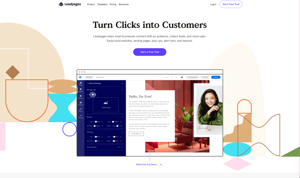
Leadpages makes great use of bright accent colors and bold fonts. We also liked how lots of customer reviews are sprinkled throughout their homepage. We noticed how Leadpages reused a simple rectangular grid with oppositely rounded corners. This webpage also used a navigation bar with lots of drop downs which was smart because everything seemed more organized. Overall, Leadpages is an excellent choice for anyone looking for a template example.
30. Safeguard Cyber
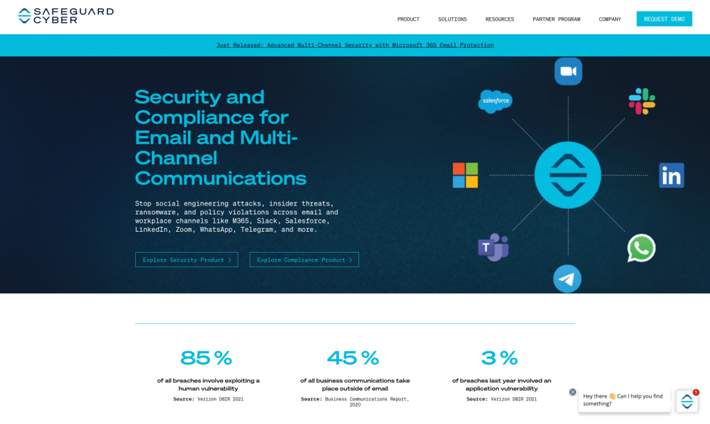
Safeguard Cyber has a team of experts that can help you secure your online presence, as well as provide training and support. This design makes great use of whitespace to balance all of their content. Having a blue and white color scheme is soothing and gives it a professional look. Safeguard Cyber included lots of buttons to help customers reach additional information. We also loved how they made sure to share customer reviews on their homepage.
31. Volley
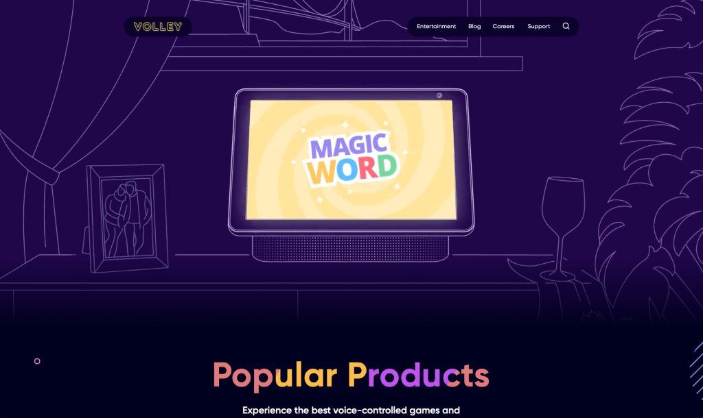
Volley uses lots of little graphics and shapes to help them stand out. Additionally, we liked their animations and of course their hover designs. We thought using purple and yellow to contrast each other was a smart choice. Having a clean design that is well organized is another thing we really enjoyed. Including a blog was also helpful because customers can gain more information. Simplicity was key in this design, and it paid off.
32. Intercom
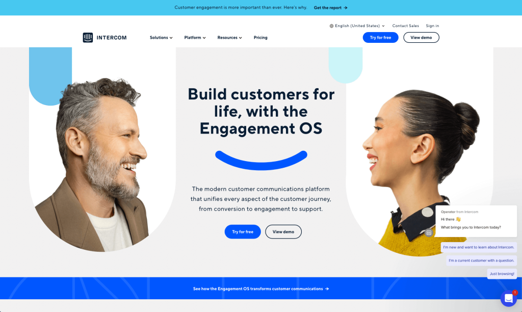
Intercom includes lots of creative images and graphics which we liked a lot. We really enjoyed their use of a grid-like organization for images and occasional content. Their creative backgrounds also added to the overall look of their site. Intercom’s logo design was innovative using repetitive lines and a little smiley face. We loved their simple menu that makes for easy navigation. Everything about this website is clean and modern, with great color choices and use of whitespace.
33. Limelight
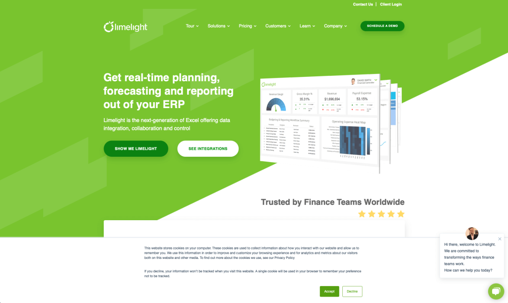
Right away, you’ll notice Limelight’s interesting logo design. Though they mostly use white, accents of blue and green can be noticed throughout this template. They have a live chat support option which makes them seem more willing to communicate with customers. A page is dedicated to customers filled with case studies and reviews. It was also a smart choice to add in their award in their footer so that they seem more reliable.
34. Hopscotch
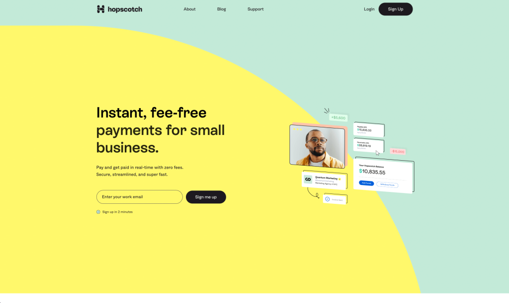
Hopscotch uses lots of pastel colors to excite clients. We really liked how little graphics and colored underlines are used to emphasize certain areas. This company organized their information perfectly so no page seems overwhelming. We like that their web team hand-picks each and every article that appears, so you can be sure that you’re only seeing the best, most relevant articles. Hopscotch also had a FAQ section, which we thought was helpful.
35. Mainline Delivers
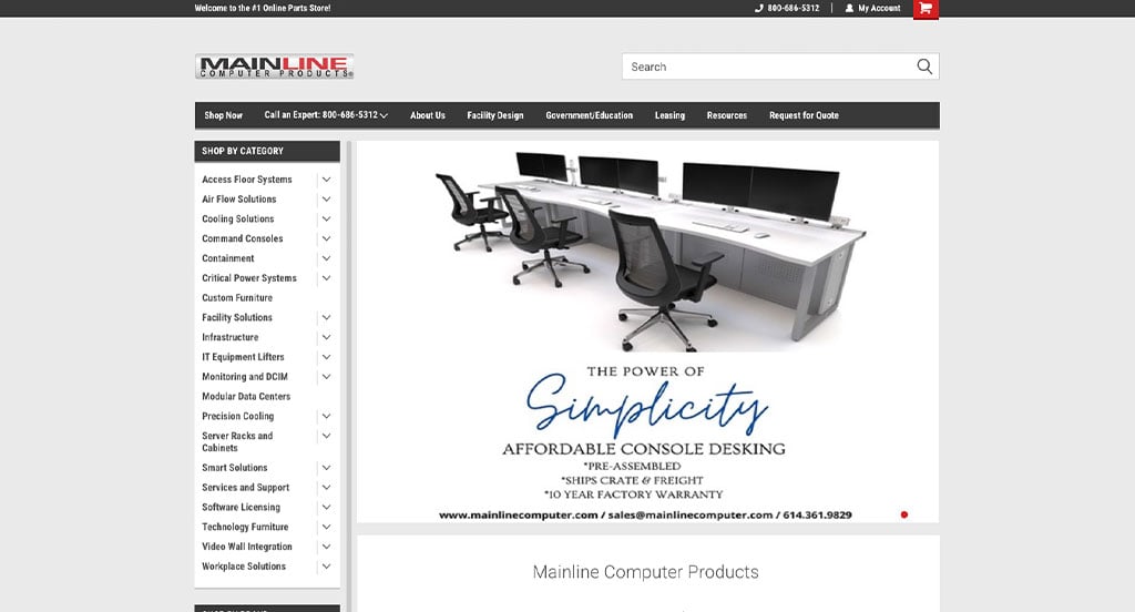
This website has a nice grayscale design, which you don’t see as often as you used to. It is also powered by BigCommerce and has hundreds of data center and computer workstation products organized into an intuitive navigation. We were even impressed by the speed of the website.
How to Build an Impressive Technology Website
Building a new webpage for your IT company? Exciting!
Here’s a guide to some key steps to follow when creating or redesigning your site. Already have a domain, hosting, and platform? Feel free to skip ahead!
1.) Acquiring a Domain Name
We know picking out domains might seem overwhelming, here’s a step-by-step process to help you out:
- Brainstorm: Think about possible domain names based on your business, services, and unique qualities.
- Simplicity: Aim for a simple, memorable domain without hyphens or numbers.
- Consistency: Include your brand name if possible. For example, Anchor Sail Technologies shouldn’t use A1Software.online.
- Availability: Check availability early, because many are already spoken for. If your preferred domain is available, consider it but avoid overspending.
- Domain Extensions: Choose an extension that fits your purpose, like .com, .net, .org, or .tech.
- Legal Considerations: Search for trademarks before registering to avoid infringing on intellectual property or using trademarked terms.
- Register the Domain: Register your chosen domain with a reputable registrar like GoDaddy and Namecheap.
2.) Selecting a Website Platform
Next, you’ll have to choose a platform.
Most of your competitors will use written content, contact forms, and live chat to boost conversions.
Competitors might also add eCommerce, but only if selling proprietary gadgets, as it’s a competitive space.
For Content-Based Websites:
For IT content websites, WordPress is popular, but options like Wix and hosted builders are also worth considering.
- WordPress: WordPress is a versatile CMS that is ideal you, offering extensive themes, plugins, and customization. It supports everything from simple sites to complex platforms, with control and scalability over time. Most prefer the open-source version on their own hosting.
- Wix: Wix, like WordPress, offers page-building tools but is a hosted solution. It’s user-friendly and doesn’t require separate hosting.
For Ecommerce Websites:
If you plan to selling products online, WooCommerce or Shopify are great options.
- WooCommerce: For a WordPress online store, WooCommerce is ideal. It integrates seamlessly, adding eCommerce features with extensions, payment gateways, and inventory tools.
- Shopify: Shopify is an eCommerce platform with tools for managing online businesses. It offers an intuitive interface, customizable themes, built-in security, and features for inventory, payments, and shipping.
Web Hosting Requirements
With WordPress or WooCommerce, you’ll need to find a web hosting platform.
While we recommend our web hosting for WordPress, you could consider these reliable alternatives:
- WP Engine: WP Engine is a top choice with a user-friendly panel and seamless backups. However, it limits PHP max_execution_time, and pricing rises with upgrades.
- SiteGround: We’ve had great experiences with SiteGround. Their support is quick and effective, backup tools are easy to use, and pricing is reasonable for IT companies.
- Digital Ocean: Digital Ocean is a reliable cloud hosting option but may be too advanced for most tech designs. While dependable, costs can add up with server, software, backup, and management fees. For server admin help, consider AdminGeekZ.
3.) Choosing a Website Template
Most IT companies save time and money with pre-built templates, but custom designs are an option with a skilled custom web developer or custom ecommerce developer.
Here are some great theme marketplaces to find pre-built templates:
WordPress Tech and IT Themes
You can find free themes at wordpress.org, or explore IT-inspired templates on ThemeForest.
Networker – Themeforest
$69
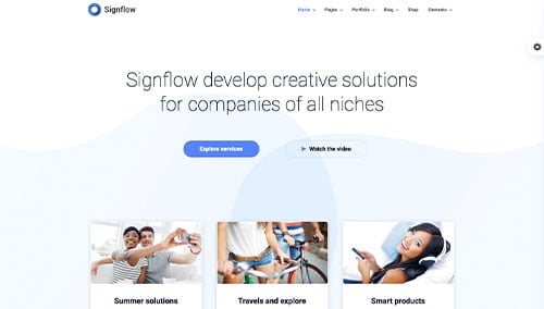
Signflow – Themeforest
$49
WooCommerce Tech and IT Themes
You’ll find a wide selection of ecommerce IT themes for WooCommerce on ThemeForest.
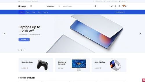
Gizmos – Themeforest
$89
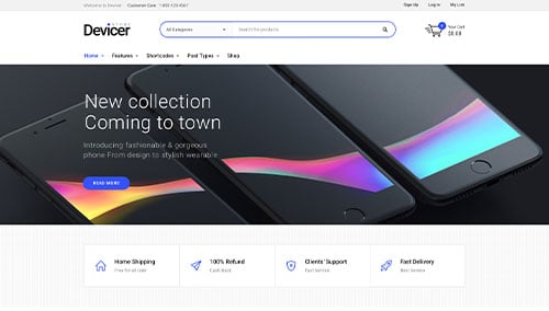
Devicer – Themeforest
$59
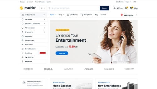
Machic – Themeforest
$39
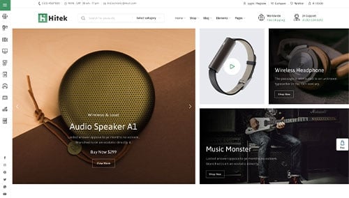
Hitek – Themeforest
$48
Shopify Tech and IT Themes
Shopify IT Themes: Explore free and paid themes at themes.shopify.com, or consider options available on marketplaces like ThemeForest.
Electrolyte – Themeforest
$59

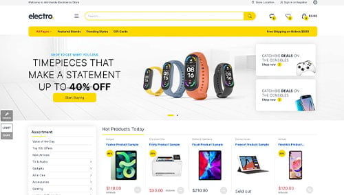
Electro – Themeforest
$89
Wix Tech and IT Themes
Browse free and paid themes in the marketplace at wix.com, some of which are well-suited for IT companies.
4.) Crafting Content & Adding Images
With your domain, platform, and theme ready, it’s time to create compelling content!
Here are some tips for creating engaging material:
- Know your target audience: Understand your audience’s needs and tailor content to address their needs, add value, and improve IT-related search visibility.
- Define your key messages: Clearly convey your brand, unique advantages, and benefits your products or services can provide.
- Keep it concise and scannable: Keep content concise and easy to skim by utilizing short paragraphs, bullet points, subheadings, and bold text.
- Create compelling headlines: Create inspiring headlines that highlight your company’s value and encourage visitors to explore further.
- Strategically incorporate keywords: Use tools like Ahrefs or Semrush to find relevant keywords and include them naturally into your pages to boost search visibility.
- Maintain a conversational tone: Write conversationally, avoid jargon, and engage readers with a friendly, approachable tone.
- Edit and proofread: Edit and proofread for errors, flow of information, and brand alignment. Tools like Grammarly can help!
- Leverage ChatGPT for assistance: Use AI tools like ChatGPT to overcome challenges in your written material.
To improve the visual appeal of your pages, incorporate relevant and high-quality images.
While searching for images, follow these tips:
- Opt for high-quality images: Use high-resolution, well-composed images to maintain your website’s quality.
- Ensure relevance: Choose images that complement content that already exists in your site to raise awareness on your company’s message.
- Explore stock photo resources: Use stock photo sites like Unsplash, Pixabay, or Shutterstock for images. Follow licensing rules and provide attribution if needed.
- Customize images when possible: Customize images to match your brand using tools like Adobe Photoshop or Canva for a cohesive visual experience.
- Optimize image file sizes: Compress images with tools such as TinyPNG to improve page speed without losing quality.
5.) After Launch Tasks
After launching your website, you’ll need to focus on these key post-launch tasks to maximize its effectiveness:
- Search Engine Optimization (SEO): Boost local visibility with SEO by researching keywords, optimizing content, building strong internal links, and updating regularly. Consider our SEO team or providers like The HOTH for help.
- Paid Advertising: Use platforms like Google Ads or Facebook Ads for targeted traffic. Hire our PPC management services or find experts on Mayple.
- Conversion Rate Optimization (CRO): Use tools like Google Analytics to analyze performance and VWO for A/B testing to boost conversions and user experience.
- Website Security: Protect your site with SSL, firewalls (like Sucuri), regular backups, and updates. Monitor security risks and uptime with tools like UptimeRobot.
- Website Maintenance: Maintain your site by updating plugins, monitoring performance, fixing errors, and backing up data. Consider our website maintenance services or hire on Upwork.
- User Feedback and Testing: Gather user feedback and conduct testing to improve and optimize your website’s user experience.
- Content Updates: Keep content fresh with updated blogs, accurate info, and relevant topics to attract and retain visitors.
Post-launch digital marketing is key to your IT website’s success. Stay proactive, monitor performance, and adapt strategies to meet goals.
FAQs about Web Development for Tech/IT Websites
Template-based WordPress tech websites start at $4,000. Custom themes with design mockups start around $10,000. E-commerce sites in Shopify or WooCommerce start at $6,000, with custom themes starting around $20,000. Costs will rise with premium designs, custom features, and data migration.
Design or content updates are simple, but major changes may need planning and expert help.
Website redesigns can impact SEO, but proper planning, redirects, content quality, and optimization can maintain or improve rankings.
We provide training to help you manage your website, including using the CMS to update content and images.