Hello, travelers! Looking for inspiration to boost your online presence and attract more clients? Check out our guide to the top 50 agency examples!
Our experts analyzed different sites for design, functionality, uniqueness, and user experience. These outstanding sites set the standard for excellence.
Get inspired and discover tips to make your website stand out.
Dig out that passport and prepare to elevate your layout with the help of this guide! Here, you’ll find lots of examples for leisure, business, adventure, luxury, and online travel agencies! For examples related to other industries, find our creative web development ideas article!
Top Travel Agent Website Designs
1. Micato Safaris
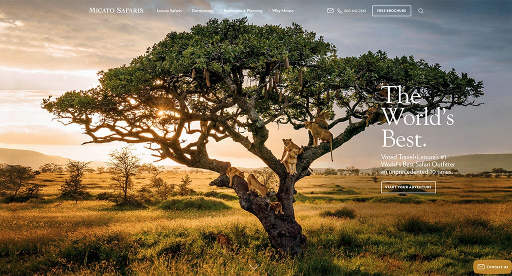
For any safari guides who are looking to create web pages, Micato Safaris is an example to consider for sure. All of their imagery was thoughtful and purposeful which was nice. Adding in a blog is something else that will always help any type of business in the virtual world. We also liked how everything is organized very well into a nice layout. Each of their paragraphs are short but informative, which helped customers scan their information. Additionally, we liked how full-page images were used sometimes to create a more appealing look.
2. Maine Campah Rentals
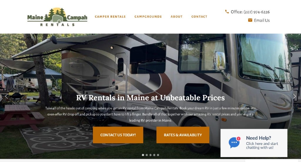
Right away, we noticed how this company messed around with a playful “Campah” for their name. Additionally, we really liked their simple but logical logo design. Their ad layout that allows customers to see pictures of a variety of different campers without even clicking on them was a great idea. It was helpful that lots of the ads included a floor plan of their camper. Adding in a page dedicated to camp grounds near the area was another choice that helped them stand out more. Finally, a blog can be noticed along with a contact page.
3. WildChina
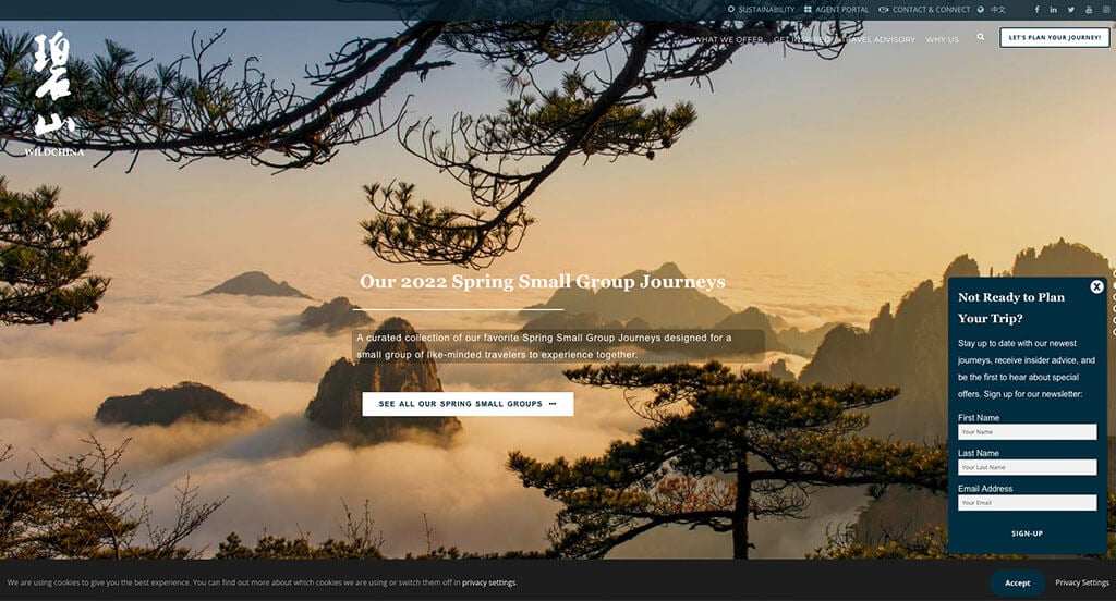
Our favorite part about this site was their creative and professional fonts. As you scroll through, you might also notice their optimized content. Using a relaxing black, dark blue and white color scheme was an idea that shouldn’t be ignored. We liked how they utilized columns to organize their information effectively. It was smart to have a section for recognition awards.
4. Wild Frontiers
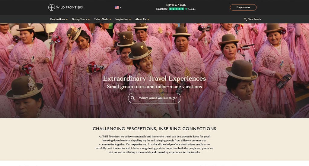
We really loved how Wild Frontiers made good use of high quality visuals including their videos. Additionally, their use of buttons and links, making their navigation better was a great choice. Showcasing little stars to show off their signature trips was something that customers will appreciate. They clearly had conversions in mind when building the aesthetically pleasing configuration for their website.
5. Linara Travel
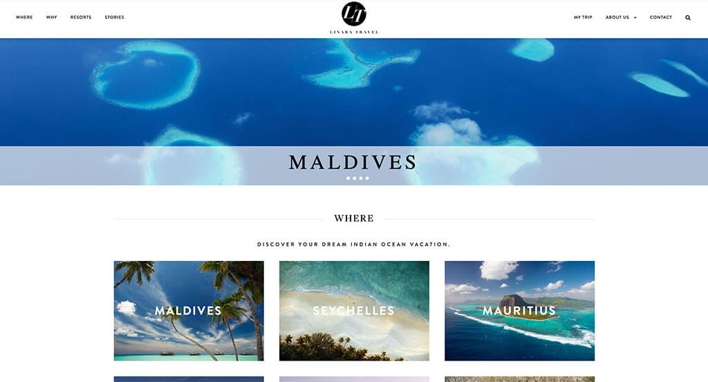
Linara Travel knew how to appear as a modern corporation and that was stunning. Their color scheme was simple and relaxing. This allowed for their images to take over the pages in a good way. Stunning images of dream destinations can definitely be found here. Everything was written in short paragraphs which is great for customers because it’s more scannable. Another thoughtful quality of this clean site is the way the design appears authentic to this brand’s mission.
Related: Get noticed in online searches by improving your ranking with SEO services geared toward travel agencies.
6. Southern Crossings
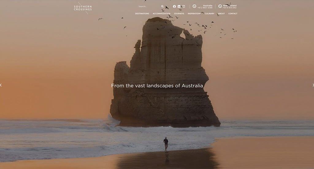
We liked how this travel agency site used neutral colors to create a simple design. We loved how images, videos, buttons and short content are used in unison to create a stunning look. Another feature that we enjoyed was how their images and content alternated to give a comforting layout. Additionally, awards and testimonials are included which was another helpful feature.
7. Visit Humboldt
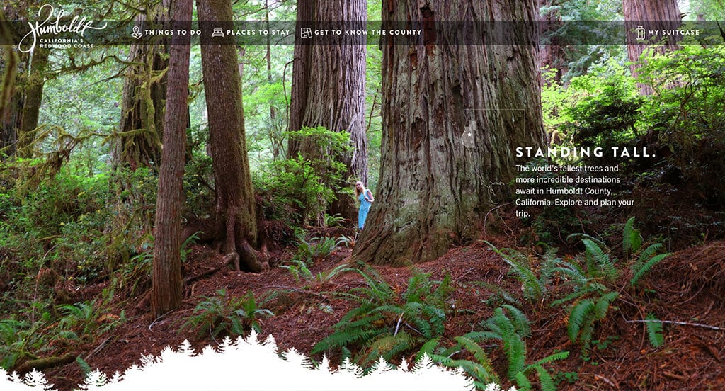
Once again, images are the focal point of this example. We loved their map that was interactive, allowing for This is a great example for travel agents who are looking for a custom site layout. Big, bold, and creative text to emphasize a statement was likely the most impactful feature in Visit Humboldt. We also liked their occasionally patterned backgrounds that add uniqueness. We also loved their videos that are used to create compelling templates.
8. Context Travel
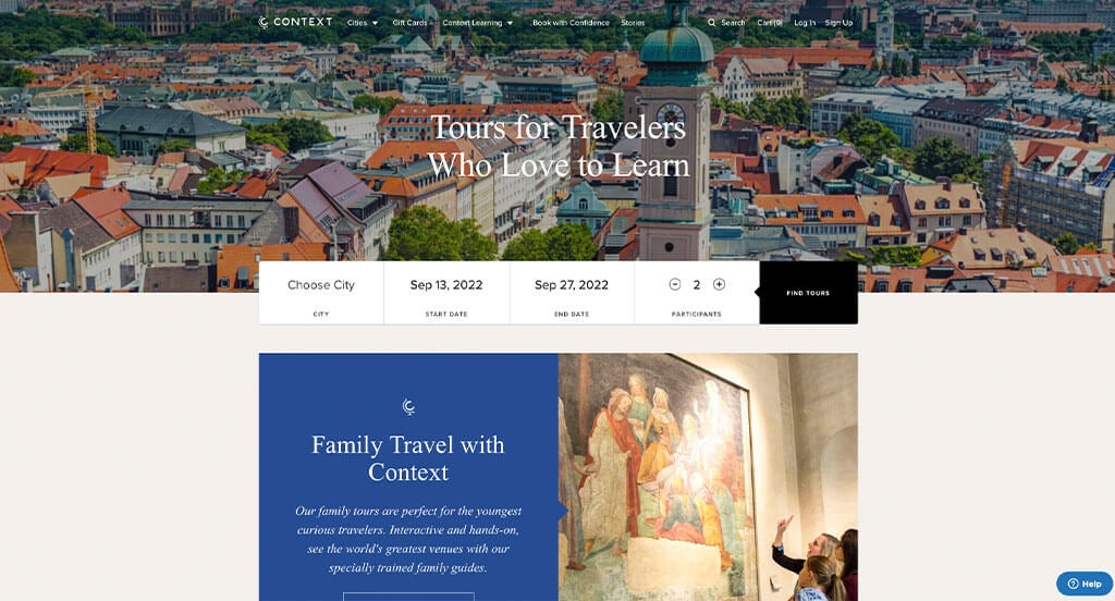
Right away, we noticed their simple logo design shaped like a globe. Reusing this logo in many areas was something else that we thought was smart. Their simple booking feature including city, date and number of participants was an aspect we couldn’t ignore. The logical structure for the content was another perfected quality of Context Travel. Be sure to consider this unique design when developing your next website.
9. With Locals
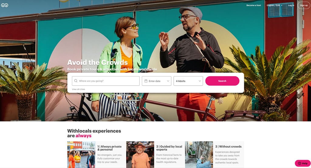
First off, the pink, yellow and peach color scheme used in this site stood out to us because of the warm exciting feel that comes with it. We thought the arrangement for their images helped created a stunning template. We thought that their logo design was cool because it included the aspect of people along with an infinity symbol. Including a search bar was another feature that all customers love.
10. Thrillophilia
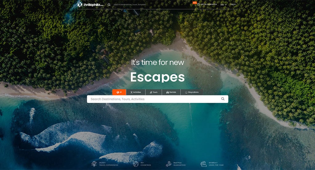
First off, we loved how Thrillophilia used small creative graphics in different areas. Another thing that really made this example better was their logical flow to all their information. Using bright orange as an accent color was smart because it highlighted important information. Their high quality visuals of different destinations was an obvious choice, but still noticed. We also thought it was cool to include star ratings to help comfort clients.
11. Agoda
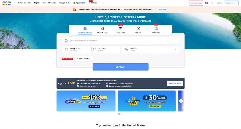
White space allowed for balance and was something that really helped their overall look. We loved the use of frames and rounded corners for a clean feel. As we scrolled through, a design quality we saw was the simple, elegant and enlightening color scheme. Agoda also did a good job with their red tags showcasing new information. Finally, it was smart for their business name to be the make-up of their domain.
12. Travel Pirates
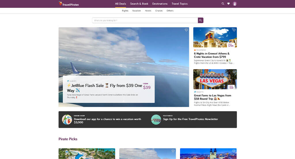
We appreciated how Travel Pirates used white, purple and black to create their custom web design layout. Of all the professional sites we reviewed, one of the features that helped them stand out was their simple graphics and clever logo. Allowing customers to heart certain trips was another feature we enjoyed. From a marketing perspective, we really liked the way a simple layout was utilized.
13. AirBnB
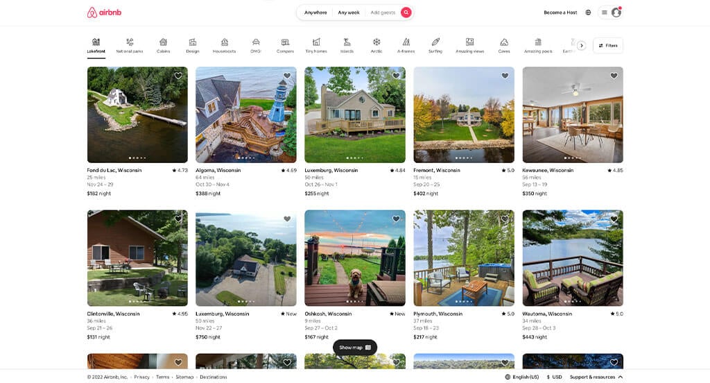
AirBnB is obviously a well known business, but their web page maintained a perfect layout. Allowing for small but helpful features such as “guest favorites”, favorite buttons, and bolded fonts for their location and price. Allowing viewers to click through images without even clicking on the rental was a great idea. We also liked their small graphics help customers find the type of rental they are looking for.
Related: Paid advertising with agencies experienced in vacation rentals can help improve your advertising ROI.
14. Rome2Rio
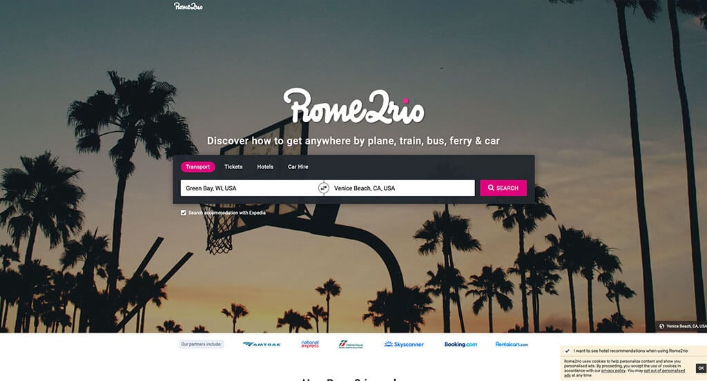
Rome2Rio first captured us with their company name that suggests they offer a vast amount of locations. Having bright pink accents stood out to us because it causes contrast with images included in this site. We liked how they included some statistics related to transportation options. Their section featuring popular trips was another perfect option.
15. Bouteco
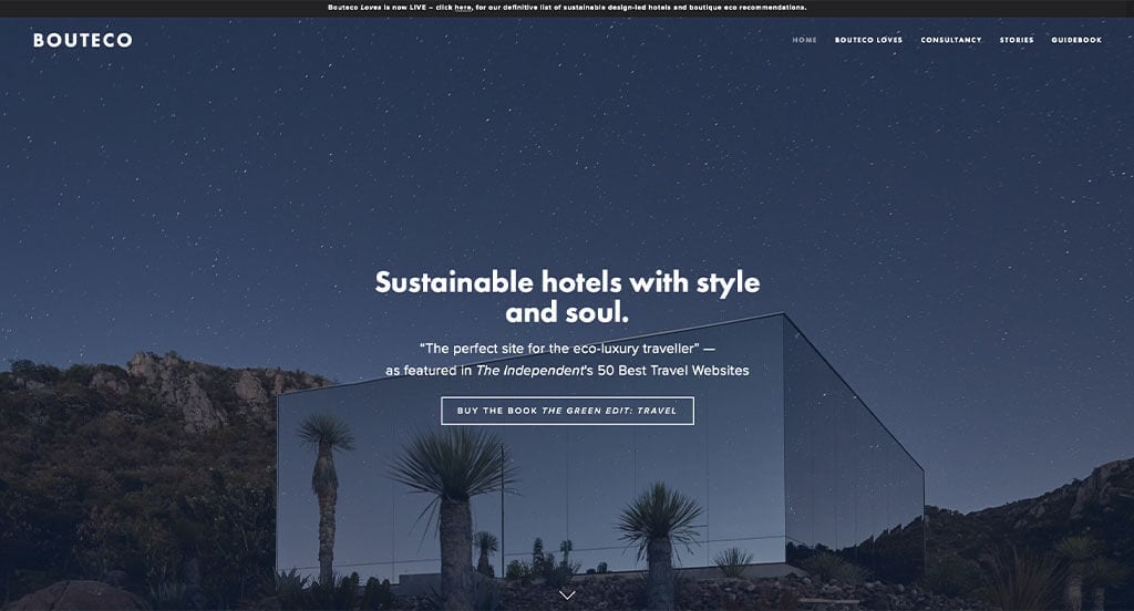
Relaxation is an emotion that is very distinct in this template due to their photographs and simple fonts. We also loved how their titles were bolded to draw attention to them. Additionally, Bouteco made use of a well labeled navigation bar. The smooth transitions were helpful for a custom vacation hotel website. It was also smart to pick a short, simple domain for their page.
16. Get Your Guide
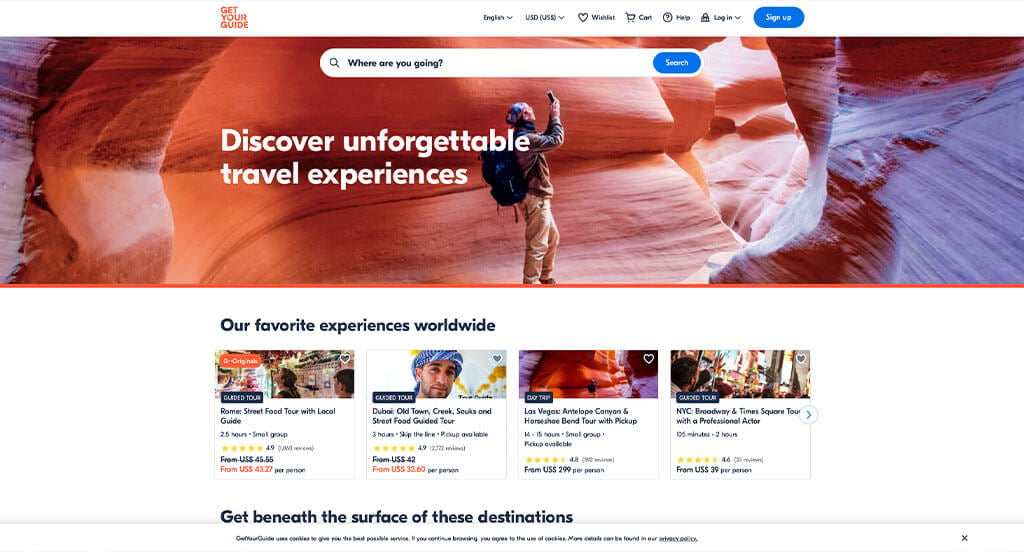
We loved how Get Your Guide used a layout looking like blog posts. It was nice to share “originals” and a favorite button. Our team liked the basic white, dark blue and orange color scheme because it allows for an interesting look focused on the photos. It was smart to highlight the monumental cultural sites. The ability to write and read reviews is another quality of this custom travel experience site we enjoyed. If you are working on creating designs for your travel website, don’t miss out on this one-of-a-kind example!
17. Liberty Travel
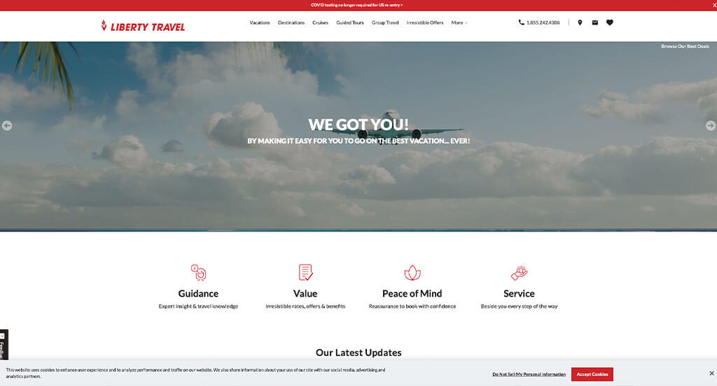
Although this site uses lots of whitespace, everything is balanced well and has a stunning red accent. Using optimized content was likely the most impactful quality for this website. It is also very smart to use a simple font that keeps customers focused on the content. We loved their creative logo design that makes use of a torch and a location pin. Allowing for short, simple paragraphs was another smart option that keeps viewers engaged.
18. Global Work & Travel
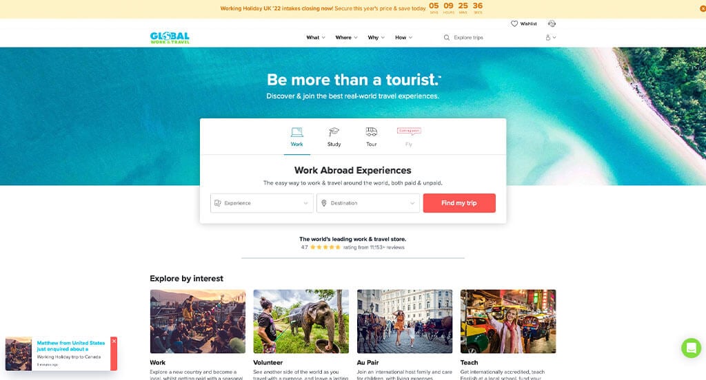
Global Work & Travel ranked because it’s one of the nicer travel agency websites we reviewed. We loved how lots of tropical images were included to show that they are a travel agency. Another quality we liked was their customized content based on age, destination and time traveling. The quality information spread throughout was a unique choice for a custom travel business. From a marketing viewpoint, we really liked the way this travel agency website utilized simple navigation.
19. Travelocity
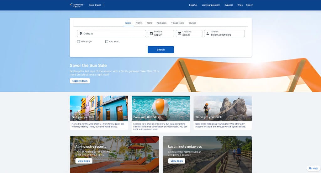
Lots of information was included into this site which is of course something visitors will enjoy. The search feature allowing for location, dates and travelers was another smart choice. Having an organized flow of content was likely the most impactful feature for Travelocity. Additional information related to hotels, vacation packages, cruises, travel deals, flights and cars were also helpful to include. Also adding in buttons made sure customers could find the information they were looking for.
Related: Improve your vacation rental’s search engine result placements with the help of expert SEO services.
20. Zicasso
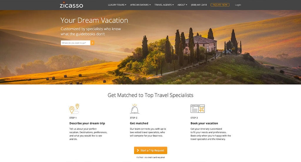
Visual appeal is the best part about this design. We loved how they used a good mixture of beautiful images and creative icons. It was also smart to include reviews from notable businesses to gain trust with their customers. A live chat is also helpful because customers can get answers quickly to simple questions. Another smart choice was how they laid everything out into a step-by-step guide to plan your vacation.
21. Cruises.com
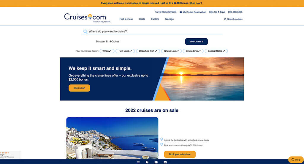
The complementary color scheme of blue and yellow with white backgrounds used in this cruise planning site stood out to us. After scrolling past the header of this vacation cruise website, you’ll notice their clever and creative logo. We also thought it was a great idea to include this logo as bullet points throughout their site. A search bar was something we would never ignore. Being able to look at cruise bookings by certain cruise lines was another feature we enjoyed.
22. Hotwire
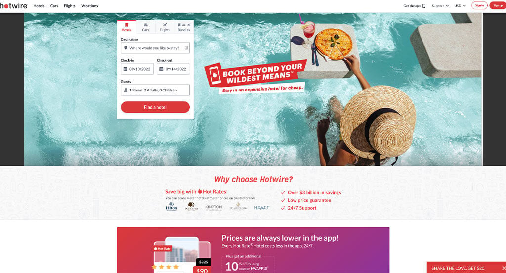
Hotwire took advantage of all aspects of travel. Hotels, cars, flights and giving an option for a bundle including all three. We loved how they use bright red as an accent to grab attention. It was great to include a search feature to dump all of your travel information into. Though their starting page is rather boring, upon using the search feature you’ll be guided to the best services for your travels. Another thoughtful quality of this clean design was how they show you the best deals.
23. Orbitz
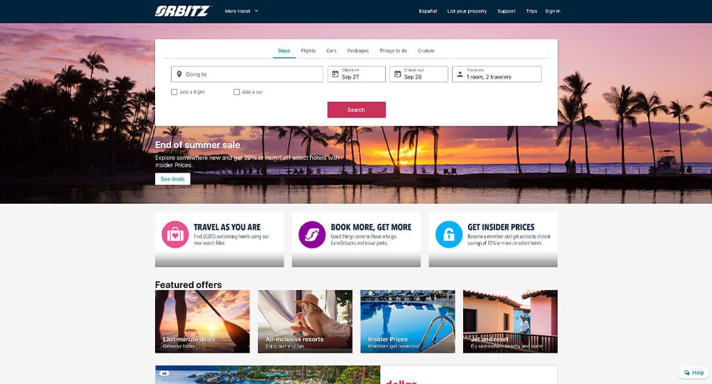
We thought it was brilliant how bright colored their icon backgrounds are. It was smart to use lots of rounded photos to create a cleaner look for this design. Orbitz’ logo design was also unique because it showcased a trip that is an endless cycle of beginning and ends. Each location offers lots of options for hotels which is nice. We thought it was smart that when customers are searching for hotels, they can use filters for cost, neighborhoods, ratings and included amenities. They clearly had a focus on website accessibility when adding in smooth transitions for their website.
Related: Launch an extensive digital marketing campaign to start building awareness and leads for your vacation rental business.
24. Outward Bound
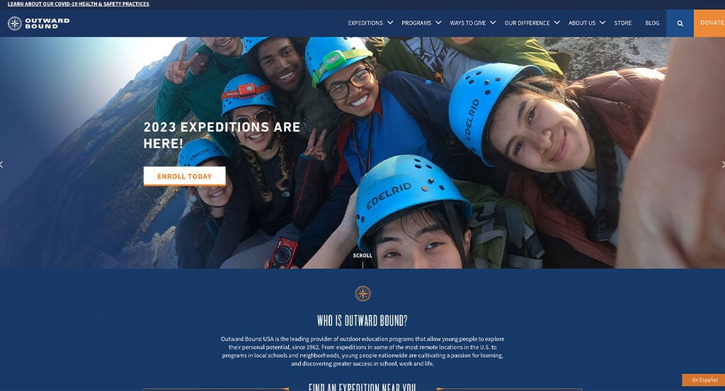
Adventure spills out from every part of this delicate template. White, orange and dark blue were carefully chosen to create an amazing look. Additionally, their creative fonts also allowed for better readability and a more aesthetically pleasing design. The reoccurring compass graphic that served as their logo was also smart for a professional site. Adding in videos and maps was something else that stood out to us. We also thought it was very helpful to have a navigation bar with drop-down menus to organize content better.
25. Tour4fun
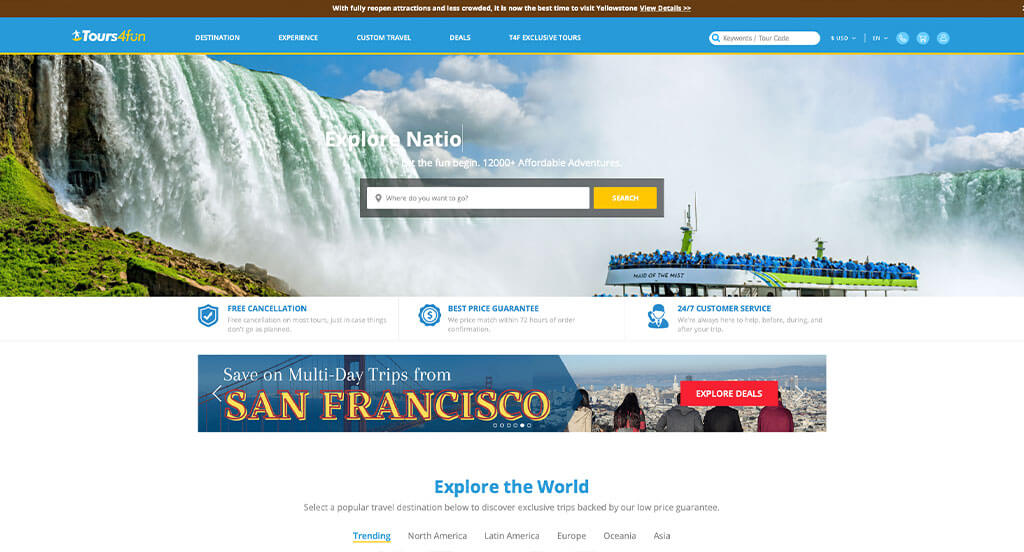
Visuals such as images and videos were definitely the features that stood out most in this example. We also liked how videos are used as backdrops in different areas. Including banners to show their deals was another option that we thought was cool. The email list pop-up to save money and learn about exclusive offers was another great option for this company. We also really loved their use of buttons to help navigate through all of their information. Showing a section for last minute details that displays the original and slashed price along with a timer for the offer ending. Additionally, we loved their use of balanced white space that keeps everything looking sharp.
26. Cruises-n-More
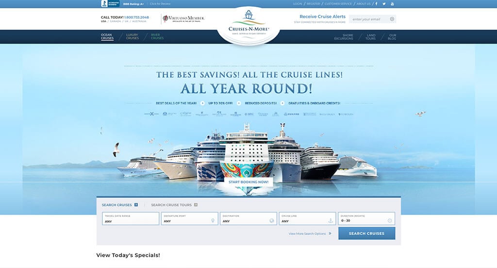
Our favorite part about Cruises-n-more was their wavy lines that are used in their logo design because it’s sleek and symbolizes water. Showcasing “ads” to show that this business has great senior citizen and military rates. A relaxing blue color scheme was also adapted into this design, which makes sense due to their industry. Picking out a domain that makes sense with their business name was another choice we couldn’t ignore. It was also nice to include a page for ocean cruises, luxury cruises, and river cruises.
27. VIP Traveler
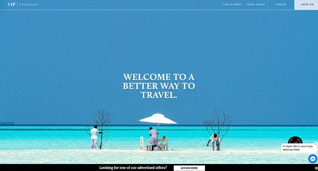
There are lots of good things going on in this site. Good use of images, videos, graphics and creative fonts help to create a beautiful harmony. We loved their section that shows their processes numbered. Showcasing the differences between VIP and VIP+ was another great choice we couldn’t forget. It was also a good idea to include an area to show notable businesses that have featured VIP Traveler. Additionally, having short paragraphs helped keep everything clear and brief, making it easier for customers.
28. Audley Travel
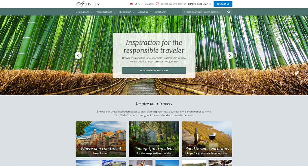
Right away, we noticed how this business has a search bar for finding your dream destination. Lots of visuals are used on this site which is smart because it helps convince people that they “need” their service. Prices were clearly posted which is beyond helpful for anyone checking out this site. Making sure their contact information is included in many areas was smart because customers will for sure be able to find it. Showing off all of their awards in the footer was something else that we really enjoyed. Small graphics help to depict icons above some of their information blocks. Finally, an organized layout was utilized which is something that we are always grateful for.
29. One Travel
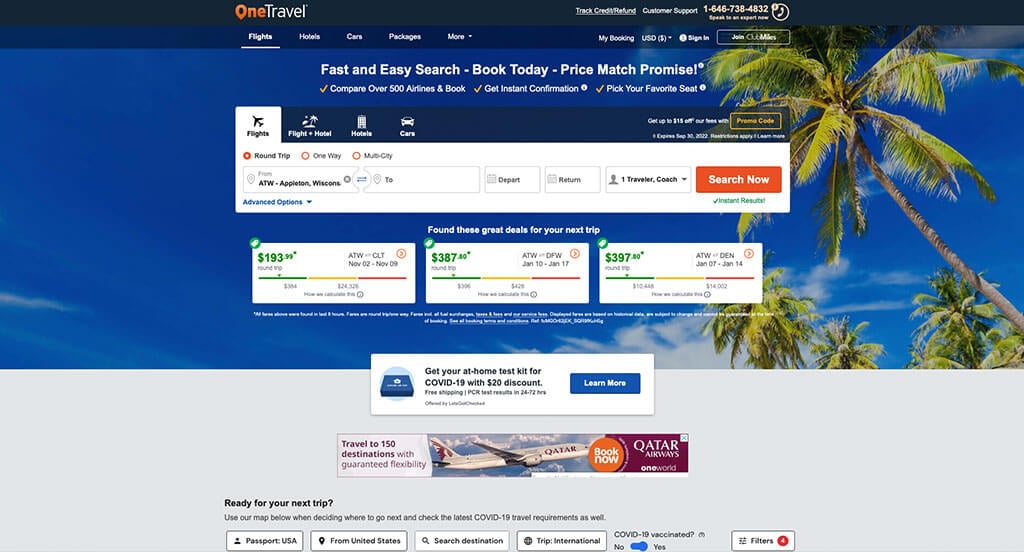
Here’s another good example for travel agents that are looking for a professional website. Using information such as location and recent search results to suggest trips was another great idea. Their search feature was helpful because it included filters for what services you want, your locations, dates and round trip/one way. We thought it was nice to have check marked bullet points to organize the information. The simplicity of OneTravel was another feature that helped them stand out even more. It was also interesting to create “ads” throughout their pages to get customers involved with their deals or contacting the business.
Related: Online marketing of travel agencies works better when you choose an agency with experience in the industry.
30. Egencia
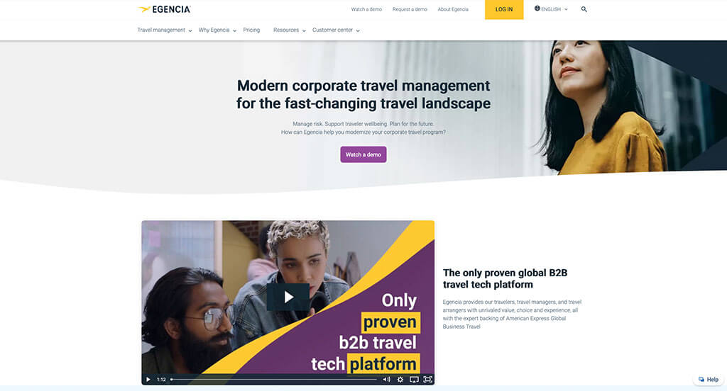
Accents of yellow and blue (even in their images) helped take this example to the next level. We loved how there was a use of bullet points to keep everything organized well. Another cool feature was their unique photo frames. Our web designers thought this was a good example for travel agencies because of the way they use videos to break up the content. Also, their professional text was refreshing for a custom site. Egencia had internet marketing in mind when creating the request a demo portion of their website. Give some thought to the great design of this business travel website when building your next website.
31. Cox & Kings
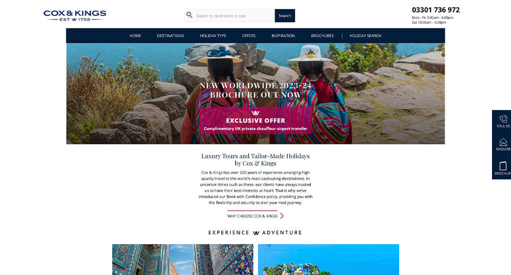
It was amazing to use Trustpilot rating to help customers gain trust with their business. Their high quality visuals of a variety of locations was another choice we couldn’t ignore. Their bold, professional lettering helped their overall design look appealing. Sharing a vacation guide based on the month is a creative idea that any customer would enjoy. We also noticed how they included a short informational blog. As you scroll through the homepage, one of the qualities you’ll notice is their short and straightforward paragraphs. Another feature in this clean site is how they’ve separate sections depending on how many travelers there are.
32. Trivago
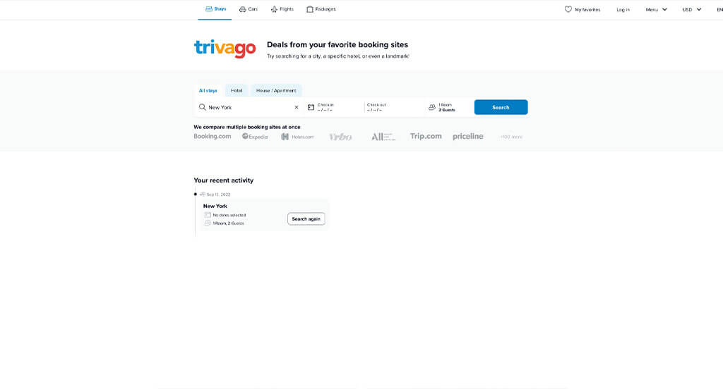
Trivago did a great job utilizing three primary colors throughout this design. Using lots of stunning graphics and images to build up their visuals was smart. Showing popular cities with their average hotel costs and amount of hotels available. Hot hotel deals was a brilliant idea because it gets clients excited. We thought it was smart to only focus on hotels instead of all the traveling bundle. Trivago also does a good job with their customized searches based on budget and other factors. They also clearly had conversions in mind when building the sleek customer usability for their website.
33. Susans Travel Service
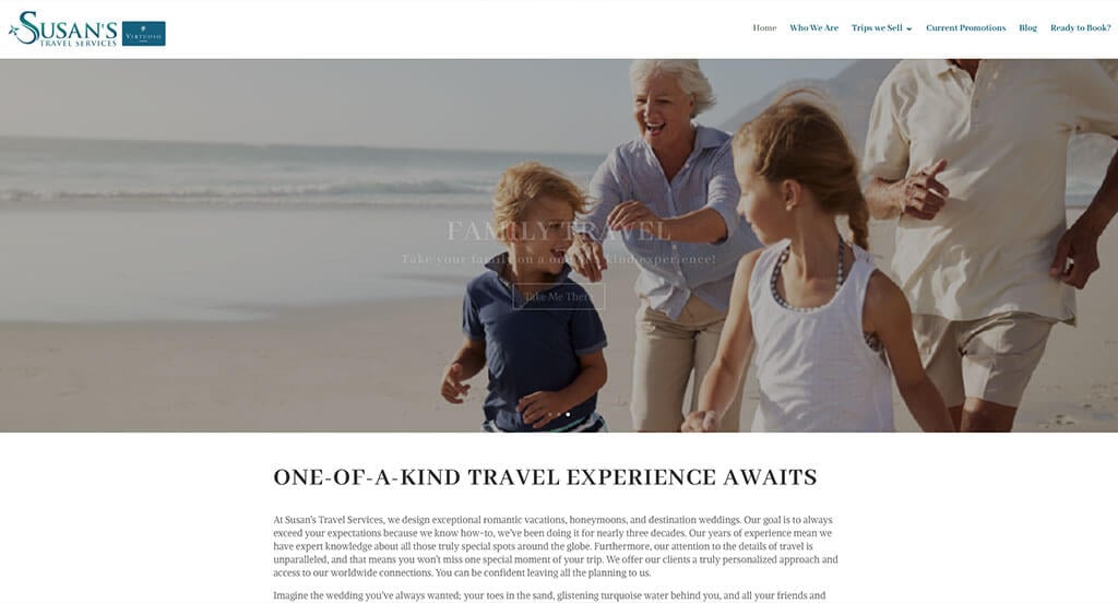
Right away, a nice balance of white space can be noticed keeping everything looking sharp. Their organized layout was something else that is always helpful. Another thing we enjoyed was their unique and creative logo design that made use of their name and an airplane. We also loved their frames looking similar to polaroid frames with additional information. Susan’s Travel Services clearly had a focus on digital marketing when placing the preferred resorts & vendors section into their website.
34. Cire Travel
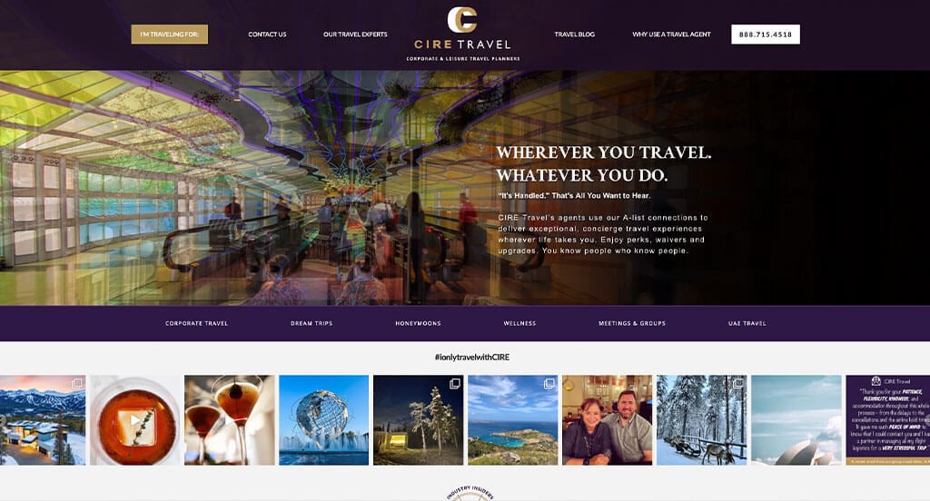
First off, we noticed that images of abstract travel monuments are used to show off less popular locations. However, the most attention grabbing aspect of Cire Travel was definitely their use of dark purple, white and gold creating a luxurious feeling. We loved their little icons such as a key or a compass used to improve their visual appeal. Another thing we enjoyed was their modern lines drawn around buttons, information and sometimes images. They clearly had a focus on ease of use when allowing for easy customer usability.
35. Petry Travel Agency
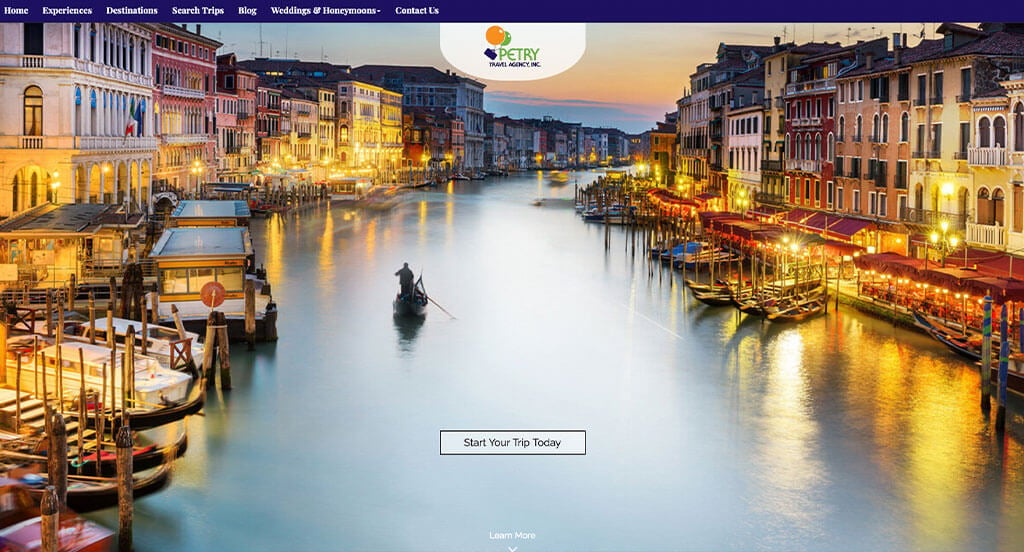
Here’s another example for anyone looking for a professional look and feel. As you scroll through, one of the design qualities you’ll see is the fun and almost childish logo. We liked how they organized vacations into the following categories: Family Vacations, Culinary Adventures, Disney Vacations, Luxury, Escorted Vacations, Well Being Travel, LGBT, and Religious Travel. The inclusion of a blog and buttons to help customers navigate was another great choice.
36. River Oaks Travel Concierge
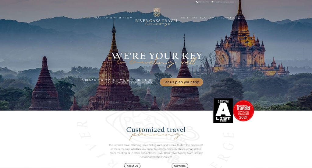
Luxury is for sure displayed within this design. First off, we loved their bold fonts mixed with cursive text. Gold accents are used in lots of areas to show that one of a kind feeling. We quickly noticed the white, dark blue and gold color scheme for River Oaks Travel Concierge, which always works well. High quality images are used as content fillers and stunning backgrounds. Their logo design also was complex while still looking professional, which we loved. All their paragraphs are written in a straightforward manner.
37. Evan’s World Travel & Cruises
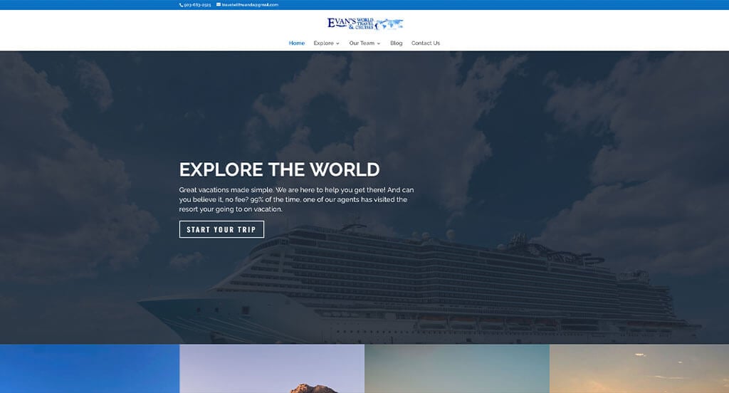
High quality and aesthetically pleasing images clearly have the power in this example. Using a pastel blue all throughout their design which is relaxing and adventurous. Using short and informative paragraphs was another reason why we included this trip planning site. Evan’s World Travel & Cruises had ease of use in mind when designing the well labeled navigation bar for their website. Dark blue buttons are also used to help organize all of the information. Any website designer making websites for travel agencies will want to consider checking out this one.
38. Virtuoso
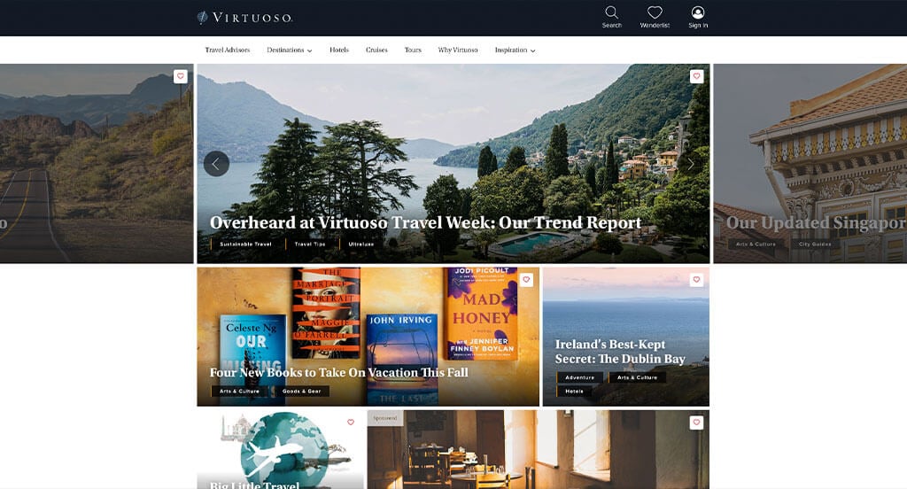
Font is an important part in this company. Using thin, professional fonts allows for customers to read it and create a great look. We loved their use of colorful buttons that organize all of their content. Using check marks to form bullet points was another great choice. Another thoughtful feature in this stellar example was their unique way of searching for a location based on customers likes. From a marketing point of view, for a vacationing website we liked the way they utilized culturally relevant images.
39. Abercrombie & Kent
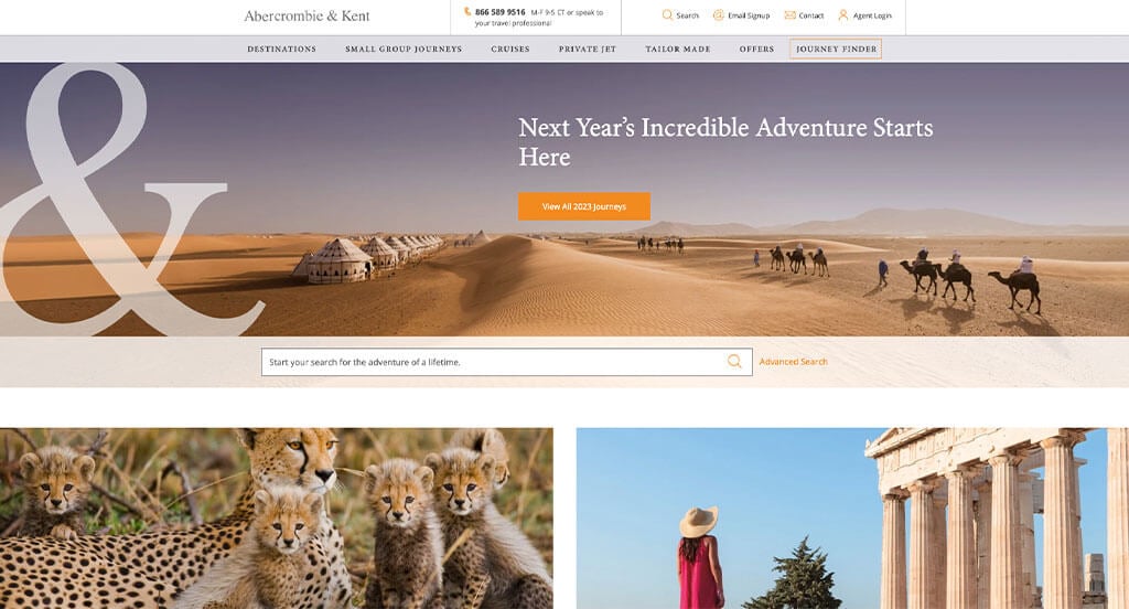
We love how this business makes use of videos for their backgrounds to make it look better. A variety of images from different locations and cultures is always a good idea for a company like this one. As you scroll through, one of the qualities you’ll notice right away is their large font revealing the travel agents contact information. Multiple fonts are also used to help emphasize titles so customers can skim easier. Abercrombie & Kent had website accessibility in mind when designing the eChat Consultant for their website.
40. Black Tomato
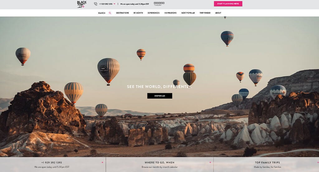
Large images are an essential part of this design. But that didn’t distract us from their their black and white color scheme with an accent of bright pink. Another feature we liked about this custom design is their well labeled navigation bar that included a search bar. Allowing for their domain to match their business name was something else that was helpful. We also thought it was cool to include reviews from popular businesses. They clearly had ease of use in mind when designing the simple navigation for their website.
41. Essentialist
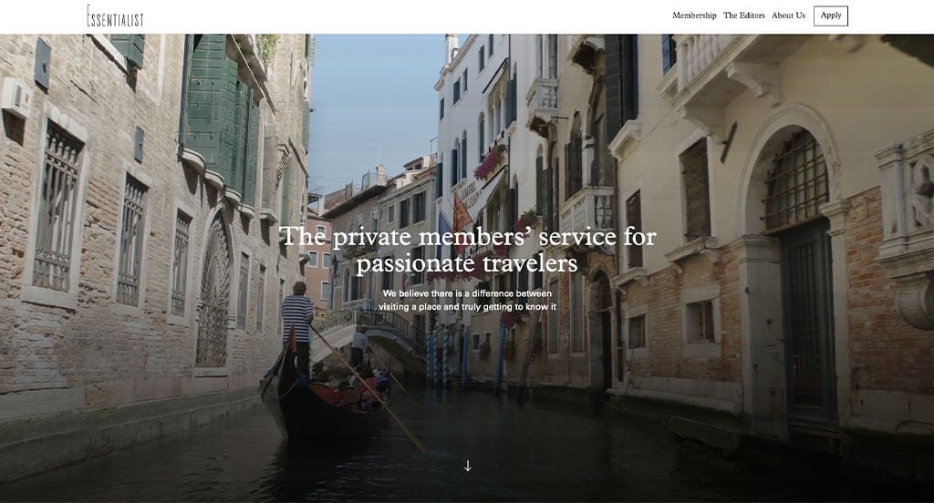
Essentialist has a very professional feel to it, thanks to use of monochromatic grayscale. Smooth and simple transitions was a very impactful quality in this website. We loved their use of stunning photo frames and layout. It was nice to include automatically playing videos used as backgrounds for some additional visual interest. All their paragraphs were short, simple and readable which was a good idea because customers could skim better. Essentialist had website usability in mind when building the well-organized navigation bar for their website.
42. Marchay
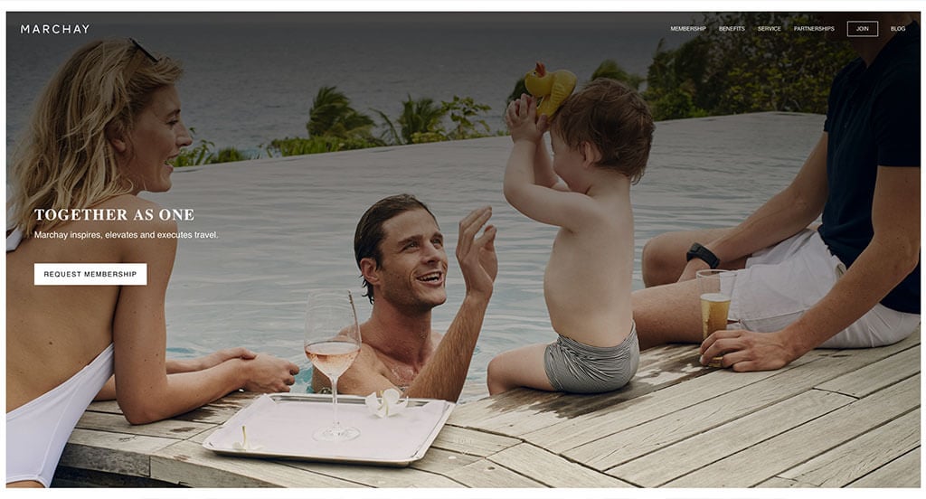
Simplicity is clearly this businesses number one feature. We loved their basic color scheme paired with bold, modern fonts. We loved their use of high quality and large images that improve the quality of this entire design. It was also smart to include buttons that are large enough to stand out. These buttons will help guide customers to the information they wish to find. They clearly had a focus on internet marketing when choosing bold fonts for their titles to make sure they stand out. There was no shortage of reasons to include this example in our list of best vacation designs to consider when creating your next one.
43. Inspirato
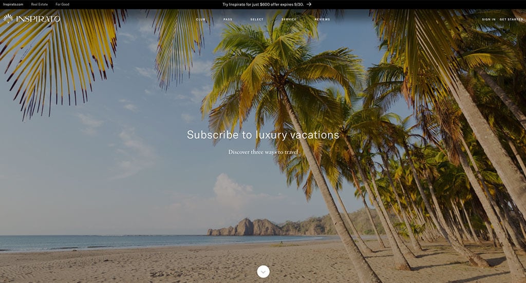
Right away, we noticed this business’ creative logo design. It is simple and professional, while showcasing a hint of the tropics. We loved their navigation bar that seems simple but includes lots of information. Adding in a customer review section was refreshing for a professional company. They clearly had website usability in mind when designing the Inspirato Pass subscription. We also loved how they organized lots of information into bullet points making it easier to read. Finally, we thought it was a great choice to pick their business name as their web domain, making them easier to find.
Related: Launch a paid advertising campaign to start getting leads and inquiries for your travel agency.
44. TrueTrips
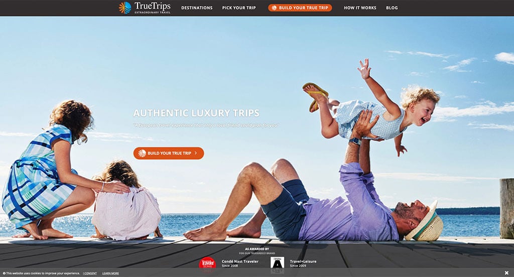
The first thing that we really liked about this design was their survey that allowed customers to design their perfect vacation. We loved how they had different sections for different vacation outcomes like family, romance, friends, single traveler, pride, culture & heritage, culinary, sea & sun, religion, and health & wellness. Additionally, orange and tan was used as a color scheme, which we loved because it seemed exciting. Their logo design utilized the sun and the sea which are big symbols of travel for most people. They had website usability in mind when creating their simple navigation for this website.
45. Agave Travel Creative
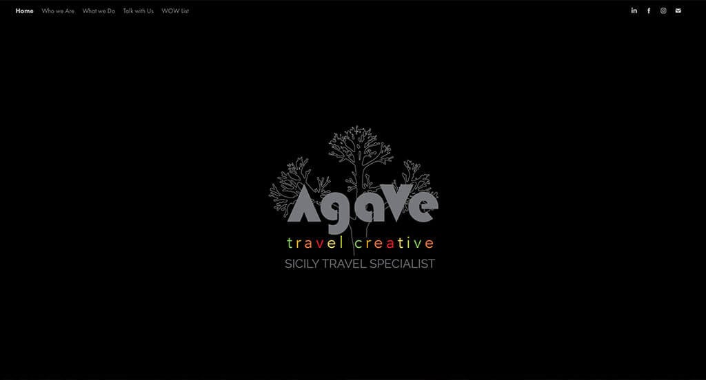
First off, this design makes great use of a stunning color palette due to their bright colors placed onto a dark background. It was unique to only have an image for their landing page. We could notice their navigation bar at the top which helps lead clients to the rest of their information. Another great quality about Agave Travel Creative is how they reuse their creative graphic over and over in each page. Although this was a good site, they could have used a few more visuals to guide along viewers’ eyes. They clearly had ease of use in mind when creating simple contact information for this business. What a great website to review!
46. Embark Beyond
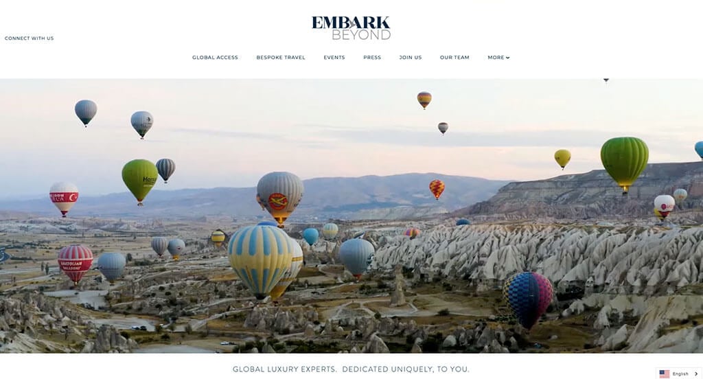
Automatically playing videos are for sure a plus in this example. As you scroll through this web template, one of the qualities you’ll notice right away is the seamless transitions. We loved how both people and sights are displayed in their images which shows off the true experience that people are gaining. Their bold titles with translucent backgrounds was another feature that stood out to us. It was creative to see a little bird as a cross in the A of their logo.
47. Costa Adventures
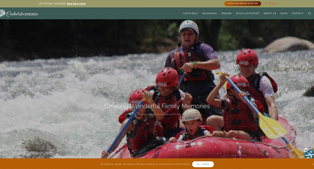
Costa Adventures has a great adventure tour website that uses orange, brown and green for a color scheme. We loved how they made use of stunning images that help break up content in the best way possible. Creating a tailor-made trip option was another unique quality in this custom travel agency site we enjoyed. Showing popular businesses that enjoy their company was something else that they did well through this design. Adding in an area to join their newsletter was also a great choice. We also noticed their section for vacation packages, day tours and their office hours. Costa Adventures had internet marketing in mind when creating the large and creative graphics seen in their website.
48. Explore Inc.
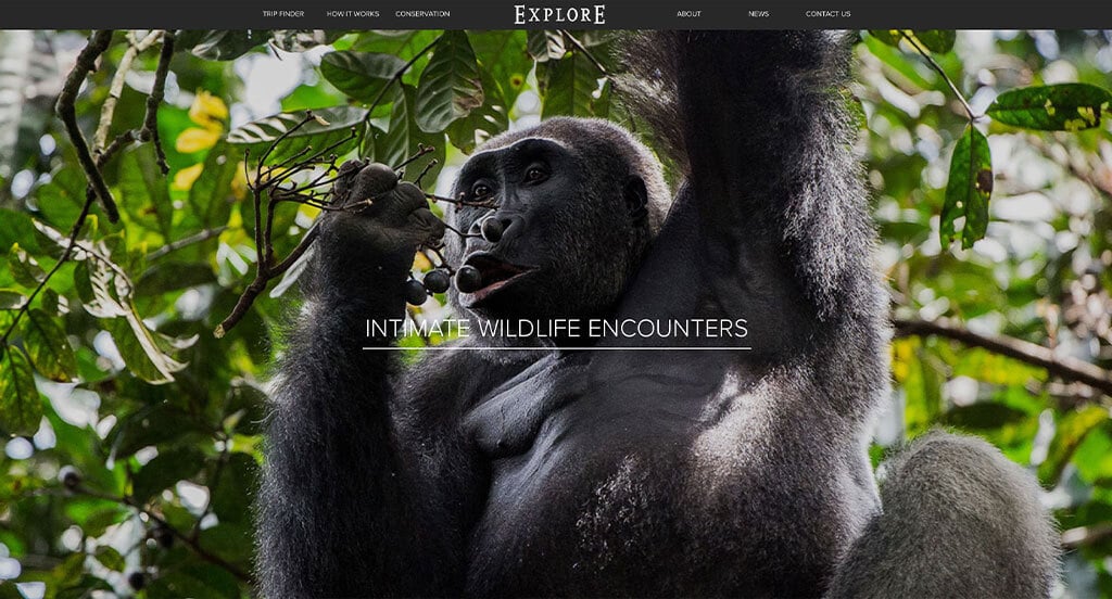
High quality and large images are added into this site which we thought added a whole new level of visual appeal. We appreciated how this African safari site used gray, black and white to create an attractive look. Adding in media coverage of safari travel was another feature we couldn’t ignore. As you scroll through, you’ll notice their simple layout. Explore Inc. clearly had their customers in mind when they created their organized menu. We also thought it was brilliant to have a page dedicated to their contact information and the form to contact them.
49. Lonely Planet
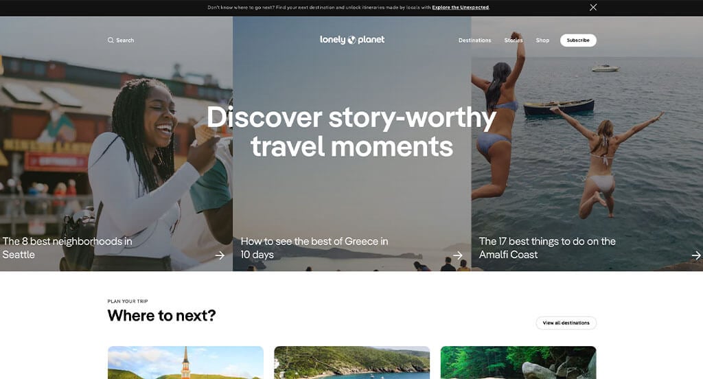
Here’s another example to serve as inspiration for your upcoming web pages! Our web designers really liked Lonely Planet because of their thoughtful blocks that help break up all of their content. We loved their inclusion of buttons and tags showing popular destinations. Another design quality that you can’t ignore is their innovative logo. Utilizing the L and the P from their name to create “land” on the earth was a cool idea. Additionally, it was smart to have a domain that matches their company name.
50. Touring Israel
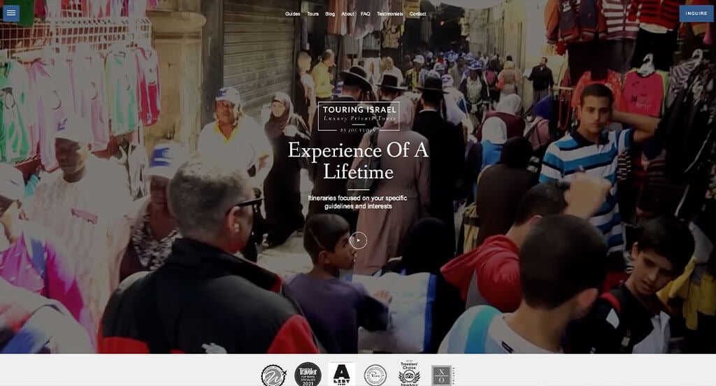
Touring Israel does a great job showcasing past awards they have won, allowing customers to trust them more. This thoughtful layout was probably the most impactful feature in their homepage of this website. Their balance of high quality images and videos was something else that helped them stand out against competitors. It was really nice that all their written content is formed into short and straightforward which is helpful for anyone who is reading their content.
How to Build a Great Travel Agency Website
Building a new travel agency website? How exciting!
Let’s explore a step-by-step guide to create or redesign your site.
Skip ahead if you’ve already chosen a domain, hosting, and platform!
1.) Purchasing a Domain Name
Picking out the right domain name is key for your travel agency’s online identity, branding, and recognition. It’s the address visitors use to access your site.
Follow this process to help you find that perfect domain name:
- Brainstorm: Create a list of domain names based on your agency’s name, services, and target audience.
- Simplicity: Maintain a simple domain name that is easy to spell and pronounce. Avoid using complex words, hyphens, or numbers.
- Consistency: If possible, include your agency’s brand name. For instance, WanderlustTravel.com instead of 4TravelTips.net.
- Availability: Check out domain availability early. If your domain isn’t available, explore alternatives or see if it’s for sale. Avoid overspending on the “perfect” domain.
- Domain Extensions: Choose a relevant domain extension. While .com is most common, .travel or country-specific options may be available for your business.
- Legal Considerations: Before registering, check for trademarks to avoid infringement on existing brands.
- Register the Domain: Register your chosen domain through a trusted registrar like GoDaddy or Namecheap.
2.) Choosing a Website Platform
After choosing your domain, you’ll need to select a website platform.
Most travel agencies need content-driven templates that include event calendars, live chat, contact forms, and package details. Ecommerce is rare unless selling vacation packages, which can be complex.
WordPress is a solid choice, but Wix and other builders are options too.
- WordPress: WordPress is a versatile CMS offering flexibility for travel agency websites, from simple sites to those with booking systems. With travel-themed templates and plugins, it allows customization and expansion. Most use the open-source version on web hosting rather than the hosted option.
- Wix: Wix offers a solid hosted solution with built-in page-building tools, eliminating the need for separate hosting.
Web Hosting Requirements
If using WordPress or WooCommerce, you’ll need a web hosting service. We recommend our hosting service, but other reliable options include:
- WP Engine: WP Engine is a top choice for travel agencies, offering easy staging and seamless backups. Downsides include PHP execution time limits and rising costs for upgrades.
- SiteGround: SiteGround offers excellent support, quick response times, user-friendly backups, and reasonable pricing for travel agencies.
- Digital Ocean: Digital Ocean is a reliable cloud hosting option, but it may be too advanced for most travel agencies. Costs add up with droplets, software, backups, and management. For server admin, consider AdminGeekZ.
3.) Selecting a Website Template
Most travel agencies use customizable templates to save time and costs, but a custom web developer or custom ecommerce developer can create a unique design if needed.
For setting up a travel agency website, here are top theme marketplaces for pre-built templates:
- WordPress Travel Themes: You can find free themes at wordpress.org, or explore travel-inspired templates at ThemeForest.
- WooCommerce Travel Themes: You’ll find plenty of ecommerce travel themes for WooCommerce once again on ThemeForest.
- Shopify Travel Themes: Explore free and paid themes at themes.shopify.com, or even conveniently on ThemeForest.
- Wix Travel Themes: Explore free and paid themes in the marketplace at wix.com, some of which are well-suited for travel agencies.
4.) Creating Content & Adding Images
With your domain, platform, and theme set, it’s time to create engaging content! Here are some tips:
- Understand your target audience: Make sure to define customer needs, preferences, and points of interest. Curated content helps to provide value and improve you company in google search rankings.
- Define your key messages: Define key messages that align with your brand, highlight unique advantages, and showcase why travelers should choose your agency.
- Keep it concise and scannable: Keep content concise and skimmable formatted into short paragraphs, bullet points, subheadings, and bold text for better readability.
- Use clear and compelling headlines: Create compelling headlines that highlight your agency’s value and encourage visitors to explore further is a good quality for sure.
- Incorporate keywords strategically: Research and use relevant keywords naturally to improve search visibility. Avoid stuffing in unnecessary information as it harms readability. Tools like Ahrefs or Semrush can help you with this process.
- Maintain a conversational tone: Write conversationally, avoiding jargon. Use a friendly, engaging tone that resonates with your audience.
- Edit and proofread: Always edit and proofread all of your content before publishing. Check for grammar, spelling, and punctuation errors. This helps your flow of your content stay smooth and logical, and helps align to your brand voice and style guidelines. Tools like Grammarly is a great tool we recommend to help with this.
- Leverage ChatGPT for assistance: If you’re struggling to generate ideas or need help to refine the content in your web page, consider leveraging AI tools like ChatGPT.
Make sure to incorporate relevant, high-quality images. Here are some tips:
- Use high-quality images: Choose high-resolution, well-composed images in order to enhance your travel agency website. Avoid blurry or pixelated visuals.
- Ensure relevance: Use logical images that pair nicely with your content, highlighting popular destinations, landmarks, or travel activities to help provide visual context.
- Consider stock photo resources: Use trusted stock photo sites like Unsplash, Pixabay, or Shutterstock for high-quality travel images that match your theme. Make sure to follow licensing rules and provide attribution when required.
- Customize images when possible: Don’t forget that you can customize images to match your branding for a cohesive look. Use tools like Adobe Photoshop or Canva.
- Optimize image file sizes: Compress images to reduce file size without losing quality, which will improve speed and SEO. Use tools like TinyPNG.
Remember, well-crafted travel content and high-quality images work together nicely to effectively deliver your message to customers.
5.) Post Launch Strategies
After launching your travel agency website, consider these key post-launch tasks to maximize its effectiveness:
- Search Engine Optimization (SEO): Boost local SEO strategies with keyword research, optimized content, and strong internal linking. Regularly update with high-quality content. For help, consider our SEO team or The HOTH.
- Paid Advertising: For quick traffic, use Google Ads or Facebook Ads. Consider our PPC management services or hire experts through Mayple.
- Conversion Rate Optimization (CRO): Use Google Analytics to track performance and identify drop-offs. Optimize with A/B testing via tools like VWO to boost conversions and user experience.
- Website Security: Secure your travel agency website with SSL, firewalls (e.g., Sucuri), and regular backups. Keep software updated, monitor threats, and track uptime with tools like UptimeRobot.
- Website Maintenance: Maintain your site by updating plugins, monitoring speed, fixing errors, and backing up data. Consider our website maintenance services or hire freelancers on Upwork.
- User Feedback and Testing: Gather lots of user feedback to continue to improve your site. Use testing and insights to refine and optimize the experience.
- Content Updates: Regularly update content related to blog posts and maintain accurate service details. Customers will be happy with accurate and up to date information.
Post-launch digital marketing is key to long-term success. Stay proactive, monitor performance, and adjust strategies to meet your goals.
FAQs about Web Development for Travel Agent Websites
Template websites are a cost-effective way for travel agencies to create a professional online presence. Many include travel-specific layouts, booking forms, galleries, and contact features.
With our user-friendly CMS, you can easily update text, images, and travel offerings on your own—no technical expertise needed.
With something like WordPress, basic updates are easy, but major changes may require additional expertise. You’ll have to assess your site’s structure and goals to determine whether updates.
Yes, it will most definitely be mobile-friendliness is key. Our responsive designs ensure a seamless experience on all devices.
We provide maintenance packages covering updates, security, performance optimization, and support. Our team ensures your site stays updated, secure, and running smoothly.