Welcome, wine enthusiasts! Ready to elevate your online presence and attract more people? Our guide including our favorite 50 winery webpages includes inspiring templates related to vineyards, wineries, distributors, retailers, and wine tourism companies.
We selected sites of outstanding design, functionality, uniqueness, and user experience—to offer you practical tips to refine your website.
Raise a glass and uncork your winery’s potential with our curated guide! For inspiration in other industries, check out our web design ideas article.
Top Winery Website Designs
1. Bradshaw Vineyards
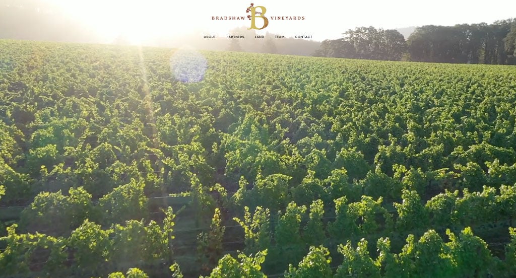
Stunning visuals and interesting fonts work in harmony to build a beautiful feel for this company. A simple color scheme helps Bradshaw Vineyards stay sleek and professional. This interesting logo takes their business name and colors, and mixes it with relaxing plants. Simple navigation was another thing that helps them stand out from their competitors.
2. Oliver Winery & Vineyards
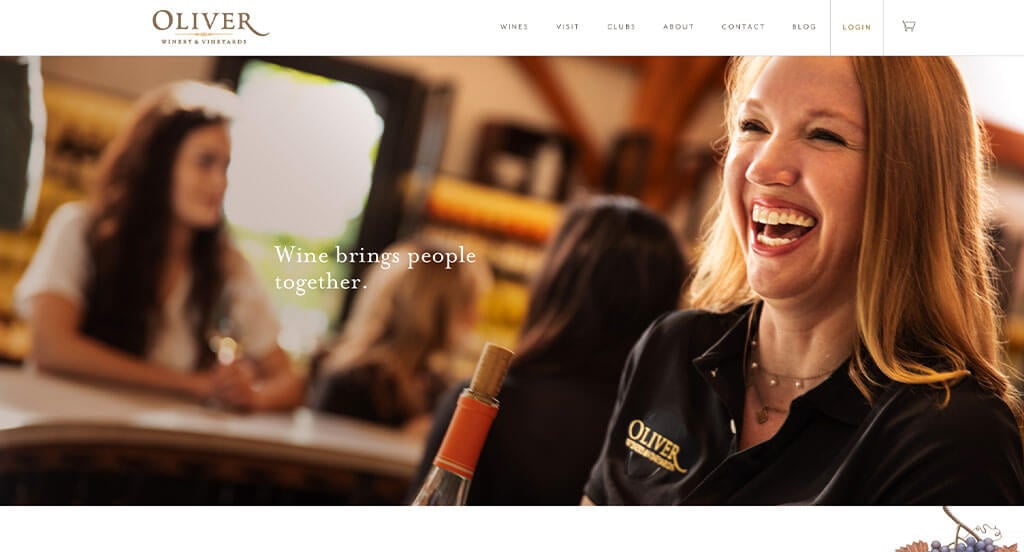
We loved how cute graphics are used in many areas of their site. It was unique to use their little hot air ballon graphic on pages and their packaging with fruits making up the ballon portion. Subtle animations can also be noticed to add a bit of flare for their viewers. An informative blog was helpful for any person. A clearly labeled menu allows customers navigate better.
3. Whitehall Vineyard
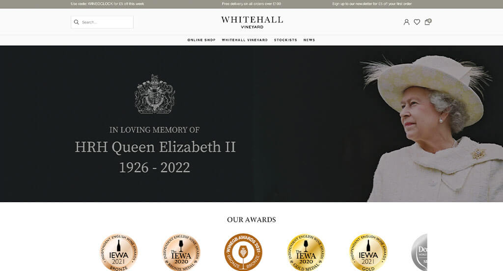
Right away we noticed how their awards are clearly displayed, to help prove their worth. Using fun and creative graphics behind each wine bottle was visually pleasing, and made sense for their flavors. Including an opportunity to adopt a vine was a unique choice that we noticed. Additionally, we loved that there was an option to personalize your case for you or a friend.
4. Rombauer Vineyards
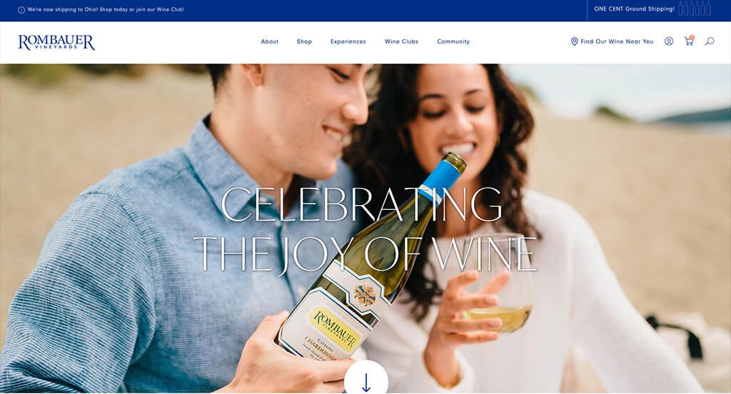
Right away, we noticed how this site requires your birthday to verify you can legally purchase alcohol. Their rich blue colors help create a relaxing feel. Carefully integrating social media was a consideration when ranking Rombauer Vineyards in this list of best wine sites. Bold fonts are also used to highlight certain parts of their content. Don’t forget to check out this one when looking for inspiration for your upcoming webpage.
5. Haus
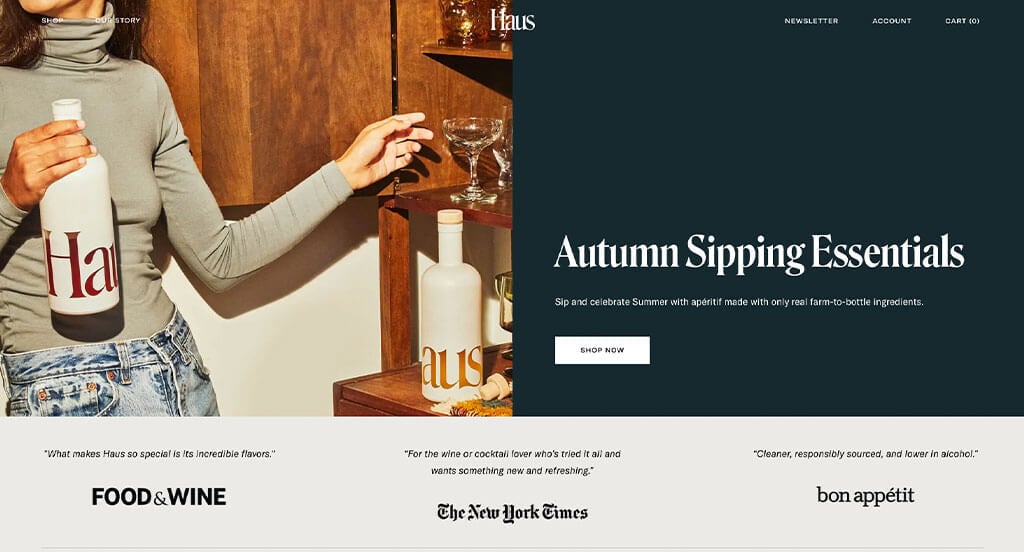
Haus clearly spent lots of time perfecting their packaging because of its sleek nature. This is something that they show off very well within their site. We thought alternating color blocks to break up content was a great idea for wine sellers. Including a simple email list was another thoughtful feature we enjoyed. With so many good reasons to consider Haus, it’s obvious why we included it in our list!
6. Jordan Vineyard & Winery
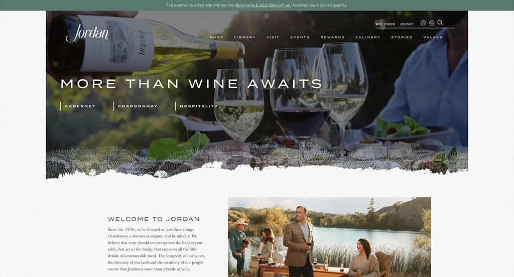
We loved the overall layout of this website using overlapping images and balanced white space. Visually appealing images are included to create a more professional feel for this company. After scrolling for a while, you might notice their use of an alluring font. They made great use of buttons (that also looked really cool) to help customers navigate through all their content.
7. Newton Vineyard
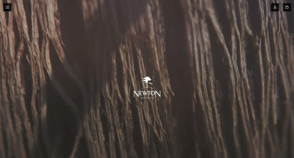
Our favorite part about Newton Vineyard was their use of darker backgrounds, allowing for a seemingly luxurious feel. We also liked how when this website opens, it uses a full page image with their logo on it. Adding in their social media page was helpful for people to stay connected online. Plus, there is an option to subscribe to their newsletter. Newton Vineyard clearly had a focus on marketing when picking a domain that matches their company name.
8. Traveling Vineyard
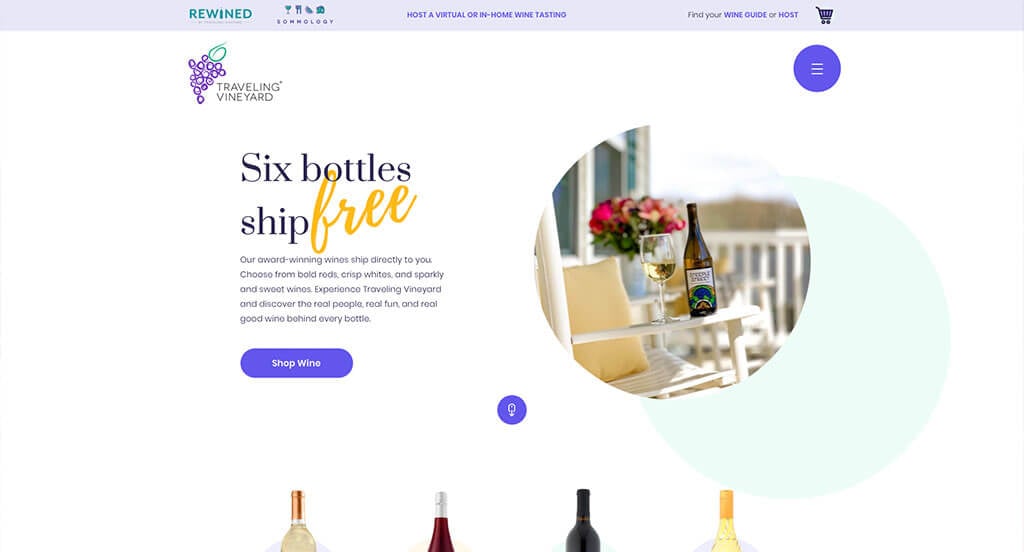
Traveling Vineyard has a well-designed vineyard website that uses cool hues for a color palette, which we like because it feels relaxing and playful. As you scroll through the homepage, one of the design qualities we liked was the large buttons to enhance usability. The informative blog was a nice touch for a custom wine website. Traveling Vineyard clearly had a focus on conversions when creating the unique and fun logo for their website. For wine sellers looking for examples on their next website layout, this design example will absolutely be one to take a look at.
9. Lightfoot & Wolfville Vineyards
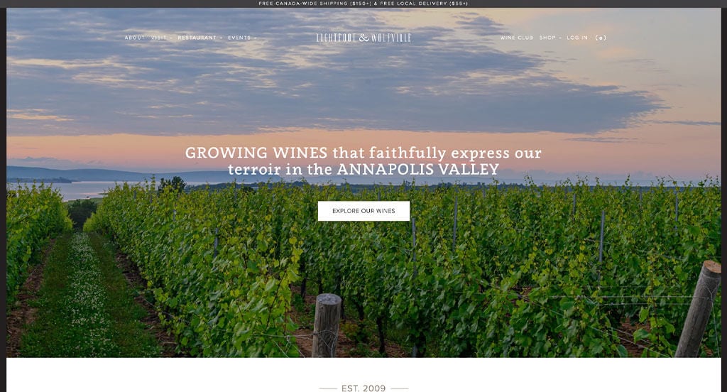
Overall, this example was simplistic and focused on only displaying the most important content. We loved their use of different sized images to create a great sense of organization. Additionally, we liked how all of their paragraphs were reworded so it’s shorter. We liked how creative graphics were seen behind their wine bottles. Lightfoot & Wolfville Vineyards clearly had usability in mind when making a well-labeled navigation bar.
10. Andante Vineyard
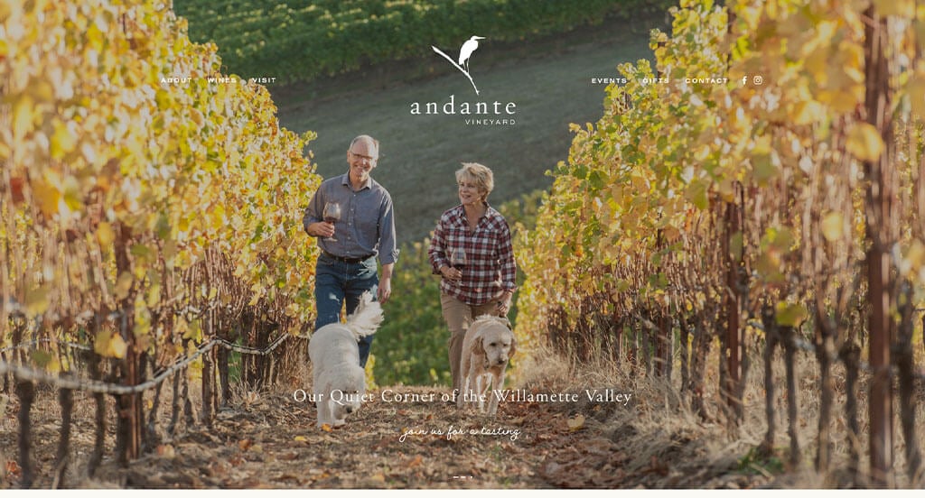
Andante Vineyard made good use of unique, personal fonts that create a “homemade” feel, while still remaining professional. Their logo design was simple and memorable, two things that are essential for a good logo. We loved how little crow tracks were found in red all over their pages. Another thing we thought was smart was their use of linked buttons, taking visitors to other pages. A simple checkout process was also used, which is always a good choice.
Related: We love helping wineries with their digital marketing efforts – anything from conversion funnels, social media management, email marketing, and more!
11. Italics Winegrowers
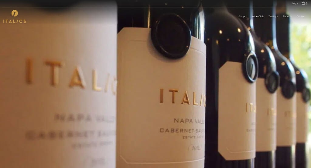
This is a great website design example for wine shop looking for a custom layout. Our web designers thought this website was a good example for wine sellers because of their luxurious black, white and gold color scheme. The large buttons for simple navigation was refreshing for a professional site like this one. Italics Winegrowers clearly had a focus on digital marketing when adding the simple mailing list sign-up into their website. What a great website to review when designing your next wine website!
12. Castello di Monsanto
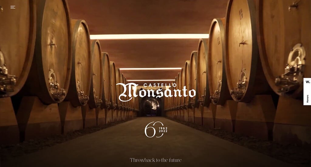
We loved how mainly black and white are used for a color scheme, making it feel classy. It added to their visual appeal by including stunning images. Each paragraph was reduced a short size, making it easier to browse through their information. Subtle animations might also be noticed, and we loved it. Castello di Monsanto had conversions in mind when having nicely animated buttons.
13. Shannon Vineyard
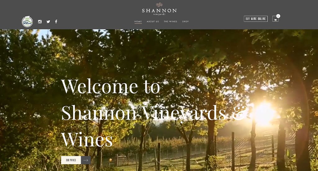
Right away, we saw how this business did a great job with their stunning fonts. Beautiful photos were used as a hero header with multiple images included. We also thought it was interesting to have a very simple navigation bar, making it easy to find whatever you’re looking for. It was nice to have both a photo and video collection. We also liked their relaxing and simple logo that was made for them.
14. Frog’s Leap Winery
If you are looking for ideas that will help you create an engaging, professional look, check out this one. Our favorite part was their logo design that seemed to match with their company name. Frog’s Leap Winery did a great job including that logo in many areas within this site (header, wine bottle labels, images, etc.). A tan and white color scheme allowed for a sophisticated feel. Simple navigation was another feature that we absolutely loved.
15. Clos Pegase Winery
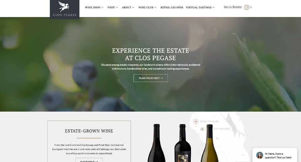
This example makes great use of an automatically playing video to engage people. Our team thought this was another good one for you to take a look at because of their creative layout. Being able to navigate through their information by utilizing their dropdown menu was also helpful. Clos Pegase Winery clearly had a focus on digital marketing when picking a domain that matches their company name.
16. Gallica
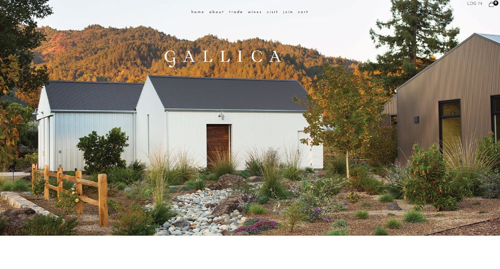
We loved how Gallica made good use of interesting fonts that are simple and pleasing. Their stunning imagery was something else that stood out to us. Balancing white space well was helpful, and all types of companies should consider thinking about this feature. Showcasing all of their vineyards and locations with an image and some short information was alluring.
17. San Antonio Winery
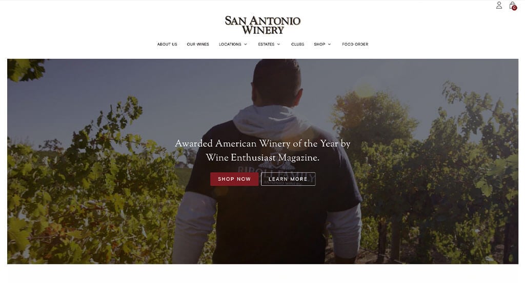
Using a black background was one of our favorite choices, due to its elegant feel. Their balance of bold and modern fonts was a choice we couldn’t ignore. Having a layout that seems authentic to their brand was absolutely a consideration when placing San Antonio Winery into this list. We also thought their small accents of gold helped add to that elegant feel.
18. Sweet Wine Club
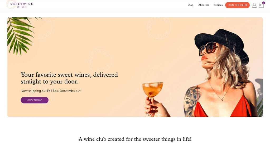
We loved how this business used stunning colors such as purple, orange, white and peach. These colors are unique to their market and help them stand out. Their use of relevant and stunning graphics that match with their color palette was smart. Including a blog and recipe pages was another choice that was too good to ignore.
19. Menada Winery
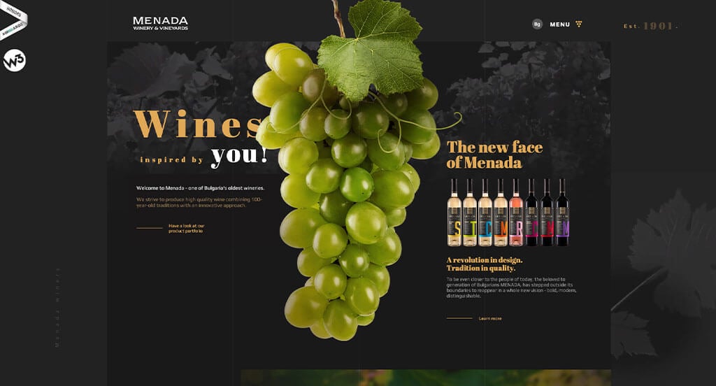
Right away, we noticed how this business created a unique loading animation that makes sense for what they are selling. Having a layout that utilizes layered images and graphics to create a template customers will love. Another quality that we thought was nice was their subtle animations. Menada knew what they were doing when creating their visual menu. Finally, we thought it was nice to include a small display of their awards on the left hand side.
Related: To get some quality traffic to your winery website or business, consider running paid ads to your target audience.
20. Opus One
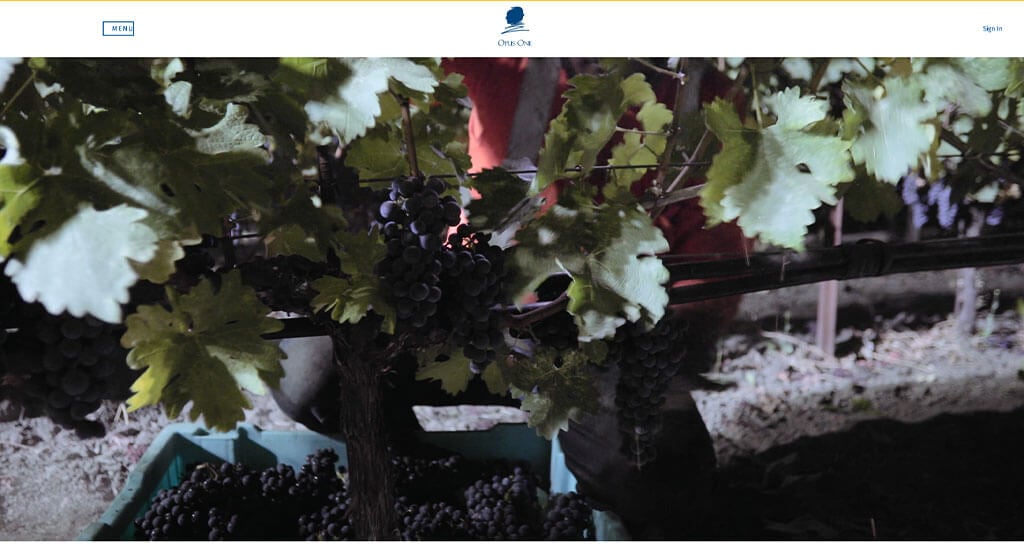
Lots of whitespace is carefully used to make everything seem more organized. Having a few little quotations was a smart idea too. A feature we liked in Opus One was their images that aren’t always in a direct pattern. A creative logo that doesn’t necessarily use icons relating to their market. We also thought it was unique to have a timeline following their growth as a business.
21. Charles Krug
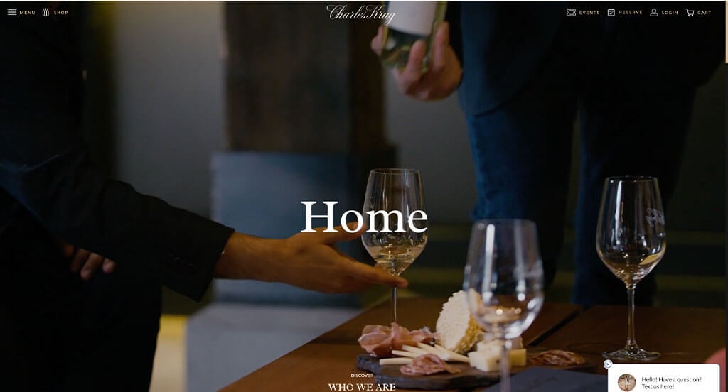
Upon entering this site, we can tell that this is an example that is hoping to bring a luxurious feel. Their dark backgrounds, well-planned images and automatically playing videos were the first features that we noticed. Using a fun and interesting animation that seems as if viewers are seeing their wine beneath their vineyard. An innovative font was yet another piece we loved.
22. Door Peninsula Winery
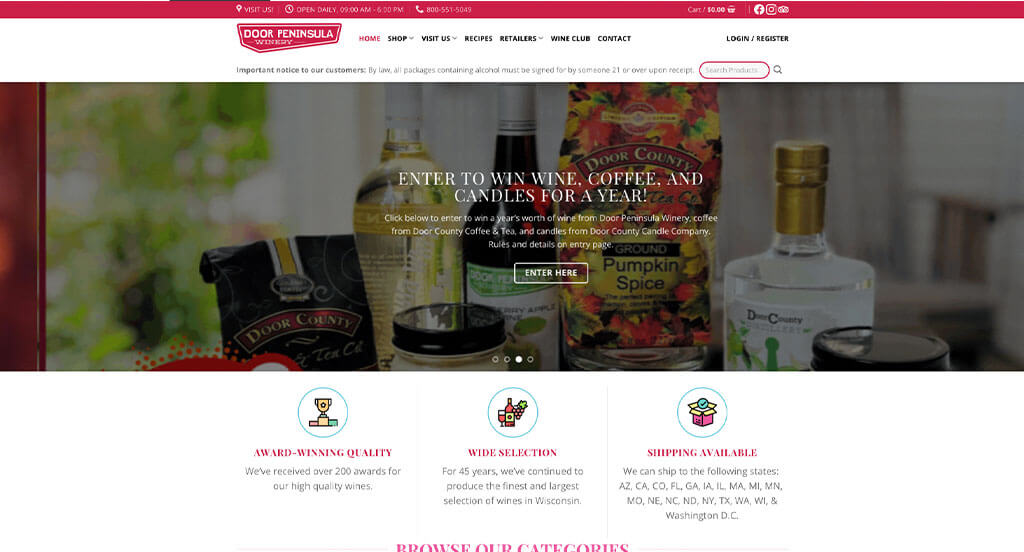
This brand does a great job with their unique packaging that is different for each of their items. Door Peninsula Winery uses red, pink and white to create a fun and striking look. It was also nice to have an area that shows their latest, best selling and featured wines. Many other things can be noticed, such as their wine club. Additionally, we thought it was amazing to have very short paragraphs making it easier to browse.
23. Benziger Family Winery
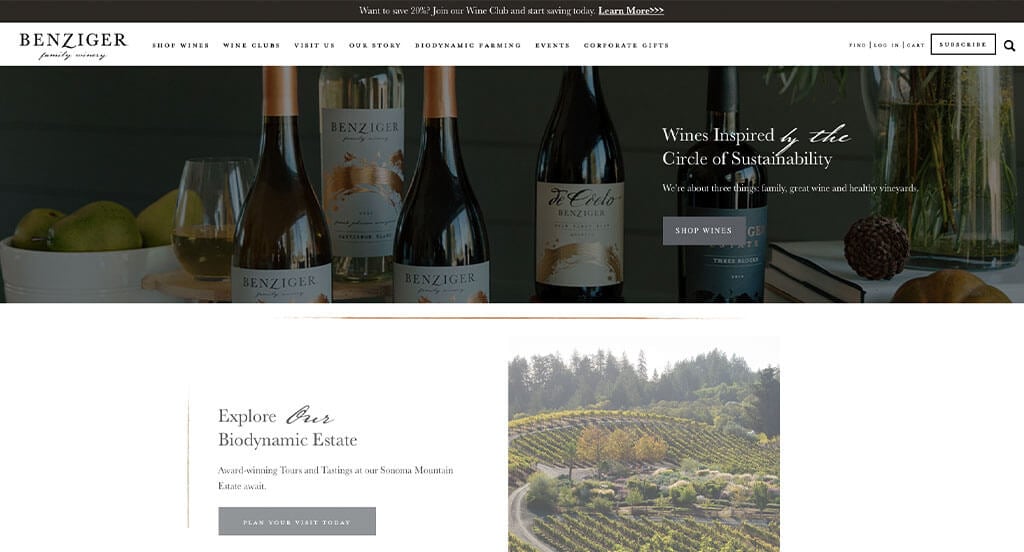
The most powerful part about this site was their balance of modern and fancy fonts. Beautiful imagery was definitely helpful in this one, because it creates a stunning visual appeal. We loved how they allowed for buttons to change color upon hover. Casually showcasing their benefits of their membership service in a bulleted list was a great idea. Lastly, it was smart to include their awards to help build trust with new comers.
24. Mitchell Harris Wines
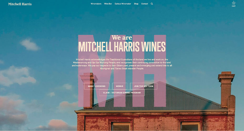
Mitchell Harris Wines has a great website that uses mainly a cream color scheme and varied colors for accents throughout the site. As you scroll through the homepage of the website, one of the design qualities we liked was the scrolling banner showing off free shipping and bookings. Another thoughtful feature of this custom wine site is the simplistic layout. Mitchell Harris Wines clearly had a focus on website marketing when building the simple contact information for their website. Don’t scroll past this website when hunting for design ideas for your next wine website!
25. Silver Oak
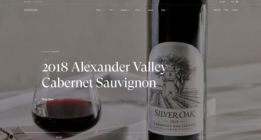
Silver Oak did a great job with their high-quality, prestigious looking images. Our team thought they had a good example because of its balanced use of white space. Multiple different fonts that are used to emphasize statements was another thing we enjoyed. We also liked how their was an inclusion of four different information groupings to show the making of their company.
26. Primal Wine
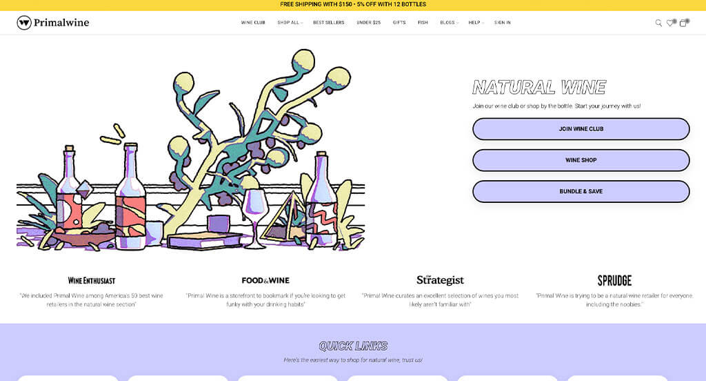
Primal did a good job with their pastel color choices and interesting imagery. Their simplistic fonts that still allowed for a professional feel was also helpful. We liked how different images were displayed after hovering over win bottle images. They clearly had a focus on ease of use when using large buttons to enhance usability in this site.
27. Harbor Ridge Winery

Having a balance of cursive fonts and modern ones was helpful to make this stunning design come together into something great. We liked how labels for their wine bottles looked like phone dials, postcards and art pieces. Using balanced white space was another feature we enjoyed. Adding in a map near the bottom was helpful for all customers to locate them.
28. Hedges Family Estate
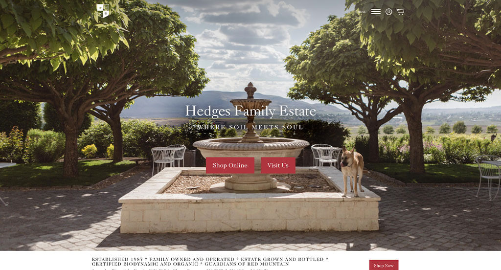
Hedges Family Estate carefully places their images, videos and graphics to create the best layout possible. We thought that because their logo that seems prestigious and elegant. Large colorful buttons were also used to grasp attention, and guide people to different pages within this design. Another great idea was their addition of a creative blog. We also thought it was nice to have a whole menu within their footer, giving viewers multiple areas to navigate from.
29. Penfolds
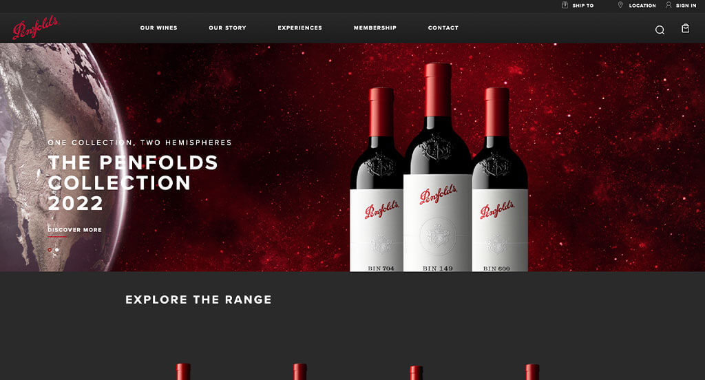
Bright backgrounds can be noticed within this example, and within their images. Exciting imagery that was uniform, while still being unique enough to stand out against their competitors was another great choice. We loved how their content was well organized, making it easy to find what you are looking for. Their menu is well organized, which helps with navigation too. Penfolds clearly had a focus on digital marketing when building a domain that matches their company name.
30. Marchesi Antinori
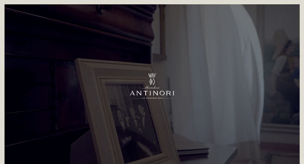
We appreciated how black and white were used to create an attractive look. Marchesi Antinori made good use of a stunning logo for their loading icon, and sprinkled throughout. Having a clearly labeled menu with professional fonts was also a nice touch. An automatically playing video was alluring, gesturing customers towards new parts of their design. A simple checkout process was also helpful to ensure usability is at its peak.
31. Barefoot Wine
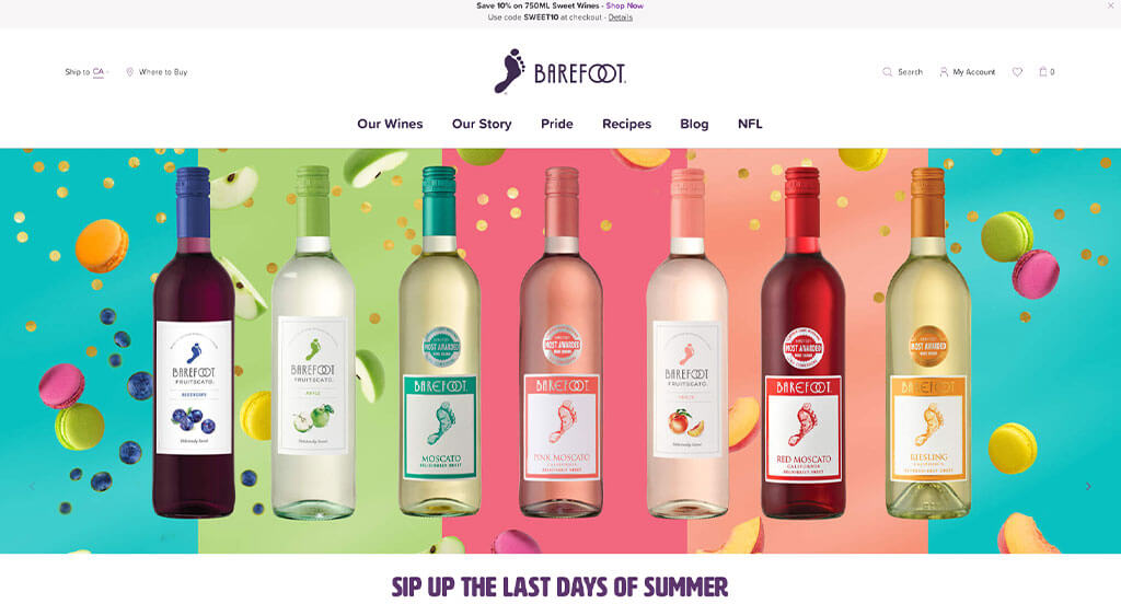
As anyone could notice, bright colors fill in the cracks of this already beautiful example. We liked how their logo not only made sense with their name, but their typography of this logo also connects two O’s to mimic rings. Small animations for their graphics engaged customers and got them excited about all of this content. Additionally, fun printed looking fonts added a whole new sense of dimension to their example. Barefoot Wine had website accessibility in mind when designing the clearly labeled menu for their website.
32. Yellow Tail Wine
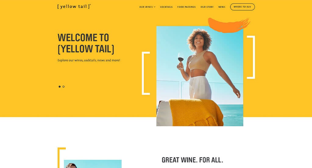
We loved how repetitive lines and brackets are used to highlight certain areas of this design. Showing their Instagram page right within their very own template was something else that we thought was nice. A bright yellow helps to tie everything together. Having a variety of different sized images was nice for an interesting look. We liked how occasionally, lines were drawn over the top of images to convey motion.
33. Benza Vineyards
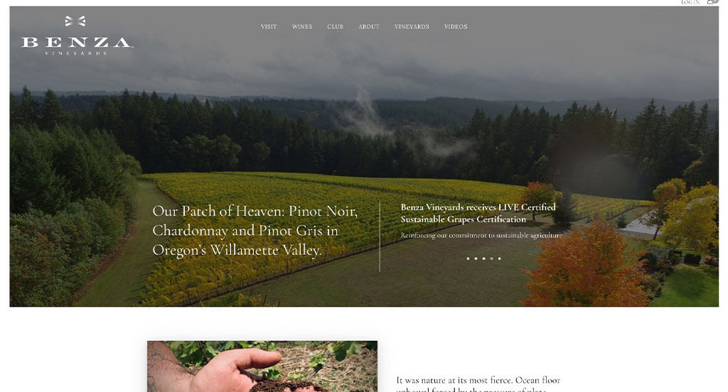
If you are hoping for a custom look and feel, check out this one. Our team thought this was a perfect use of white space, both because it’s balanced and it makes for a relaxing template. Using bullet points to organize information and make it all easier to read was a great choice. A good blend of images and videos allow for their visuals to be on peak. A stunning logo is mixed with their professional font, which looked amazing.
34. The Family Coppola
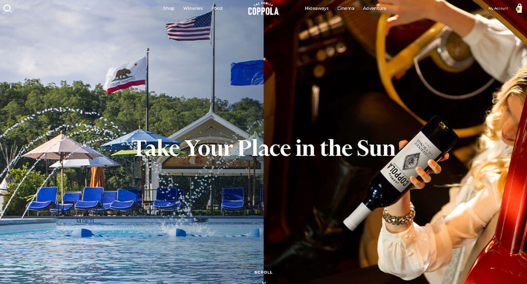
We enjoyed how this business redesigned their site to open to a black and white hero image. Showcasing that this company is focused on familial love was an emotionally impactful feature. The Family Coppola certainly thought about their font choices. It was helpful to make use of drop downs within their menu in order to organize everything. Another thoughtful aspect was how they incorporated other companies within these pages.
35. Woodbridge Wines
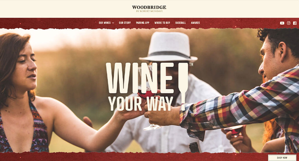
This company did a great job with many of their elements. Right away we noticed their stunning accents of bright and dull reds along with white and gray. There was graphics that created silhouettes of bottles to create a sense of motion. Including a customer service area was really smart, and we really liked how they used seemingly handwritten fonts for “signatures”. Allowing their social media to be immersed right into their pages was extremely smart.
36. Brooks
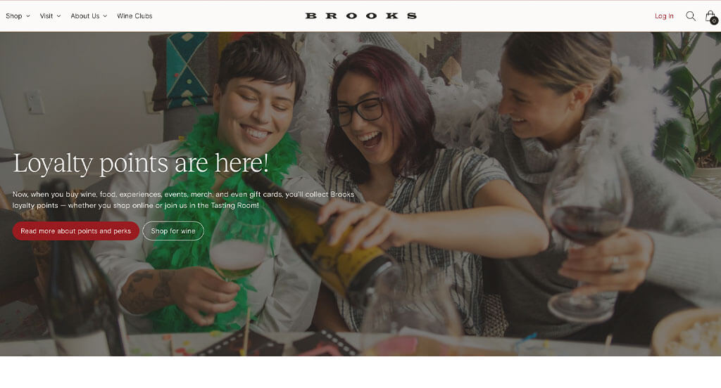
This was a very modern design due to their black and white color scheme along with small red accents. Having a unique logo was another extremely impactful quality for their business. We loved how their titles are bigger and more bold, drawing people’s eyes to information that they need to know. Including buttons to help navigate through their content was a brilliant idea. Simple navigation was another thing that helped this example stand out.
37. Écluse
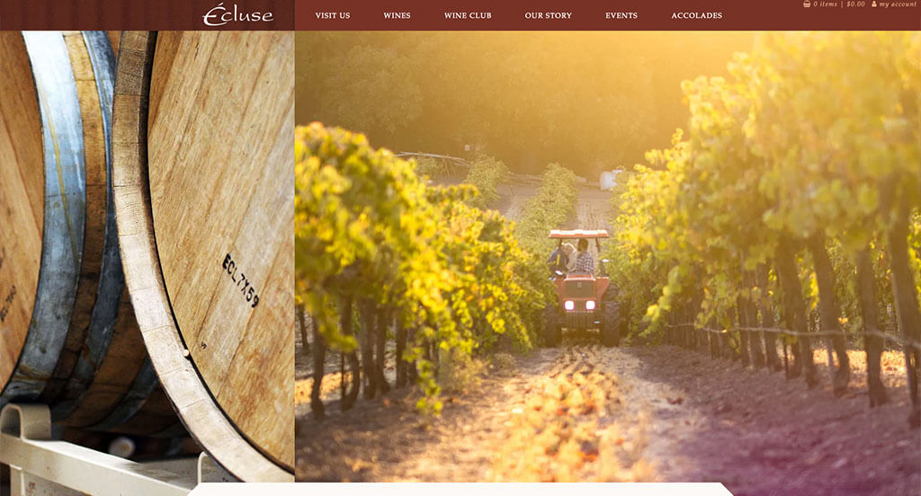
Their organization is laid out in a way that guides viewers through all information that is important to know. Their stunning logo can be seen all around this template which is very very smart. Balancing their whitespace carefully is something that we thoroughly enjoyed. Imagery that speaks for this design is very helpful for their visual appeal.
Related: Your winery can consider search engine optimization to get more organic traffic from online search results.
38. Kerrigan Brothers Winery
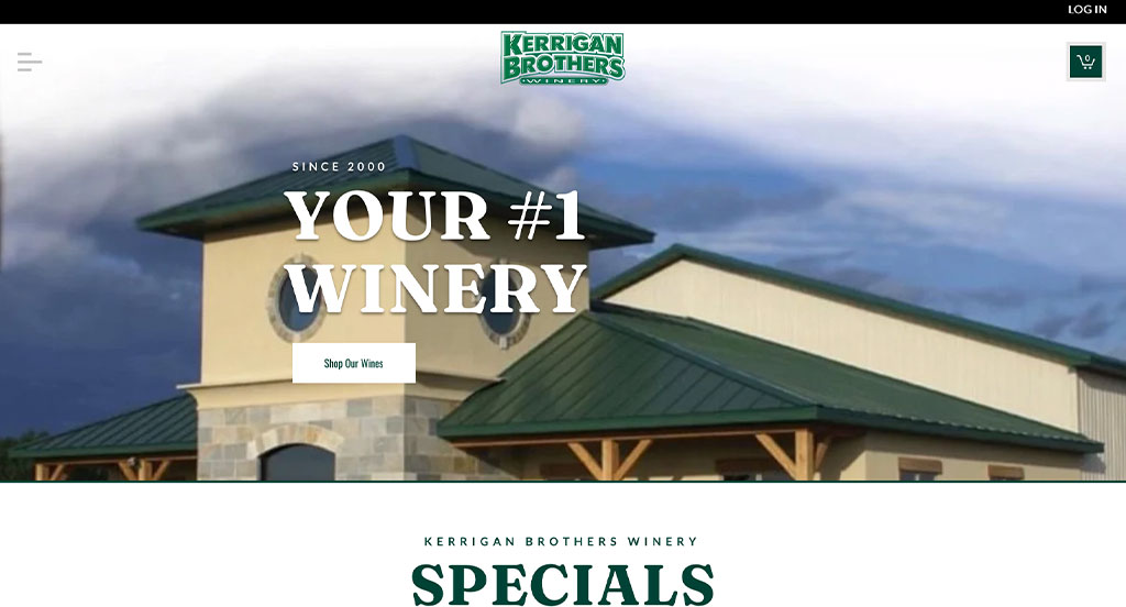
There was lots of images featuring both buildings and products, which was smart. Additionally, a small accent of green was brilliant to create a natural appeal. We liked how modern professional fonts are used to help certain content stand out more. Another thoughtful part of this wine site was how a cart feature was included to maintain a simple checkout process. Having a well labeled menu is another thing that we couldn’t ignore.
39. G.D. Vajra

Almost instantly, we noticed how G.D. Vajra used inspiring phrases to get customers interested in them. We liked how occasionally black and white images were used to add a bit of variety. Adding in lots of videos was nice because content could be delivered to customers in a new way. A nice navigation bar was included to make everything easier to find. Likely this business’s best feature was their well constructed, high quality images. A classy and elegant logo was rather refreshing.
40. Radikon
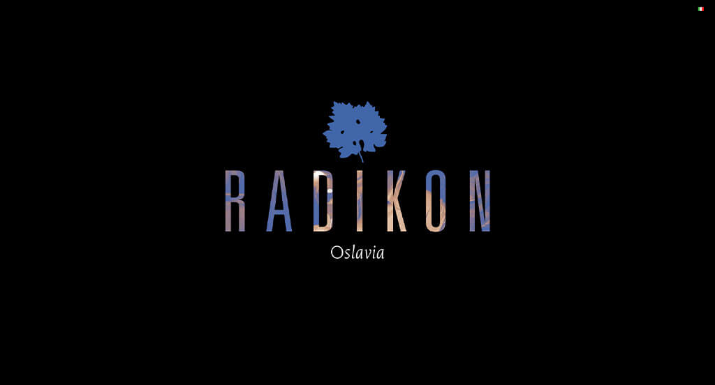
Here is another example that you cannot scroll past! Upon entering Radikon, dark backgrounds are paired with alluring cutout letters revealing an image beneath it. Throughout our reviewing process, we noticed how they used bright colors back and forth to create balance, unity and harmony within. Another thoughtful feature that was nice for this wine website was their smooth transitions. Finally, their domain was simple and matched with their business, making it a great marketing tactic.
41. Ridge Vineyards
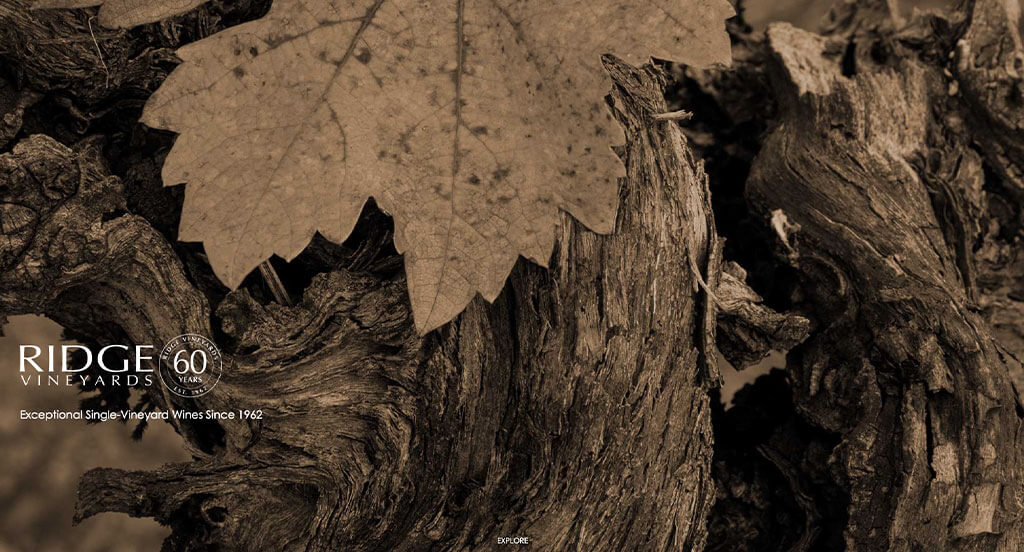
There were definitely lots of pluses that can be found in this site. We loved how their images used a brown filter that matched with their natural feel used throughout the entire layout. The best part about their images is upon hover, they slowly transform into colorful beauties. Allowing an option to search for a specific wine was another design quality we really enjoyed. Simple contact information was a piece of their site that doesn’t always get recognition but it’s always appreciated.
42. Presqu’ile Wines
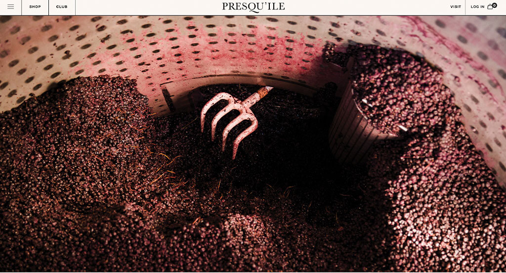
One of our favorite parts about this example was how they showed off which popular companies have featured them before. Having a staggered layout for imagery was very impactful, and helped to direct eyes around all their information. Including other happenings related to their vineyard was another area we thought they showed strength in. Don’t forget their high quality images of course, this is a must for anyone.
43. Trimbach
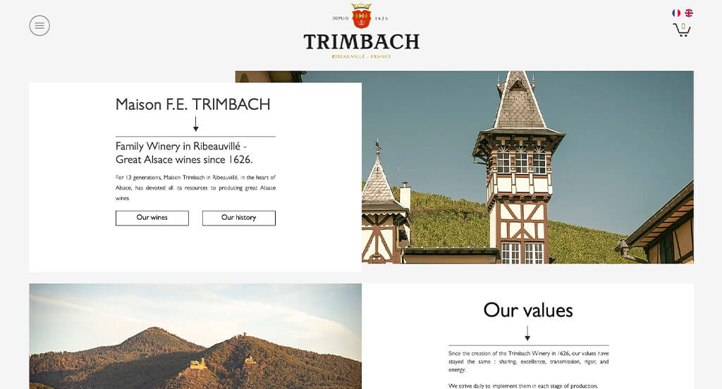
There was lots of information from their values to their team, which is absolutely perfect. We liked how their buttons often used interesting catch phrases. Having an alternating pattern helps maintain balance and professionalism. A simple layout was brilliant because it allowed for easier navigation.
44. Walla Walla Vintners
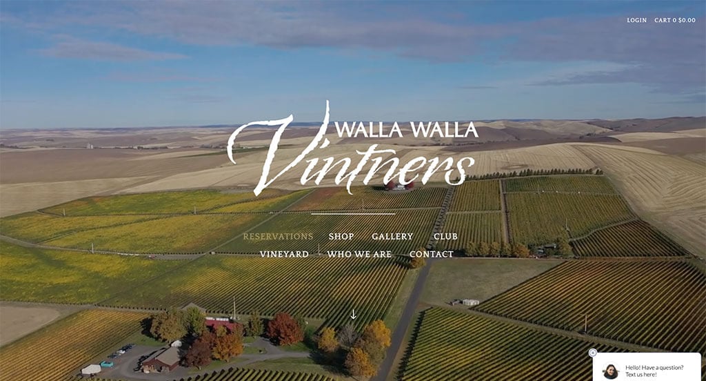
We liked how Walla Walla Vintners did a great job mixing delicate and bold fonts. Of all these custom websites we reviewed, we thought it was nice to include a mailing list application. It was also unique to overlap their images and text in order to create a more visually appealing look. A nice marketing feature was when they picked a domain that matches their company.
45. Champagne Vilmart
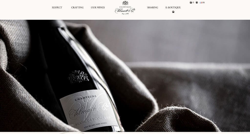
A video right in this hero header was great because it shows what is important to this business. We loved how their logo is both elegant and simple, plus it can be found repeating throughout to remind customers where they are. Smooth transitions were clearly an addition to enjoy. We loved how their titles were simple and their paragraphs were short.
46. Robert Mondavi

We could tell that this example was meant to look elegant and expensive. Pairing dark red with black, white and gold was a very important part of this template. Having small gold frames around many of their images was also a feature we enjoyed. We also loved how sometimes images of wine bottles with transparent backgrounds making them feel more professional. Bold fonts for both their titles and paragraphs was a great choice.
47. Stella Rosa
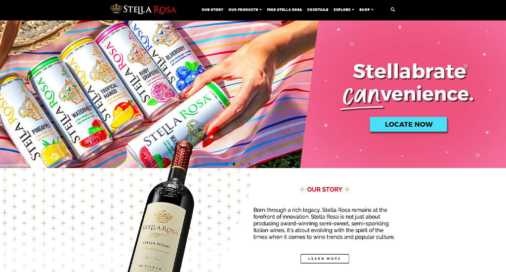
This layout did a great job with their balance of colors and graphics along with plain Jane whitespace. Their crown logo could also be seen all around, which was a great choice. Having drop downs within their navigation bar was helpful for customers searching for something in specific. We thought it was helpful to include buttons that change color on hover because it attracts more attention, making customers want to explore more. It was also a good choice to include a search bar.
48. Apothic
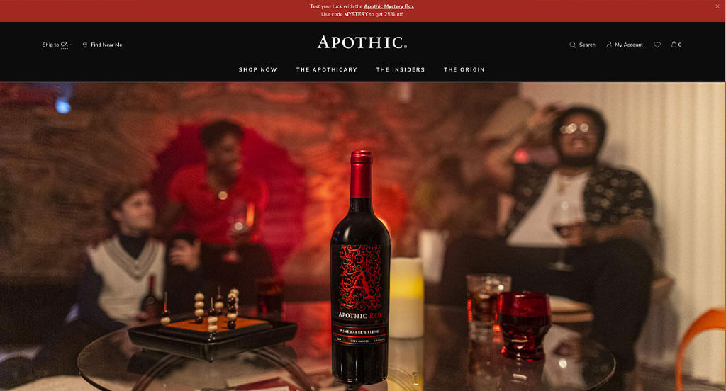
This logo clearly reflects this business’ desired feel because the same elegance is displayed throughout this entire arrangement. Large images and videos that take up much of this page was very nice to create an alluring look. Using a stunning black background adds to their element of elegance. We like how their buttons are displayed as bright underlines, and once you hover over them, they turn into outlined buttons. It was really smart to integrate social media for customers to stay connected.
49. Westmount Wine Co.
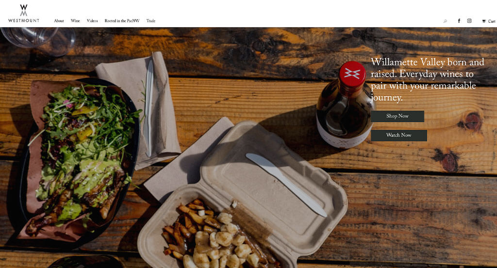
Upon entering this link, we were instantly interested by their simple logo design that uses both a W and a M, which makes sense based on their name. It was really cool how they used slanted color blocks for additional visual interest. Another thing that we liked about this example was their “learn more” buttons formatted in italics with a small arrow. As we scrolled through, we also enjoyed their inclusion of lots of videos.
50. 7 Deadly
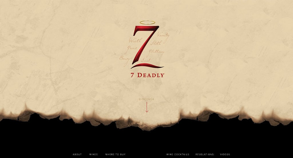
We loved this company’s logo that incorporated interesting colors, a 7 and interesting fonts to have the seven deadly sins. 7 Deadly’s best feature that totally helps them stand out is their seemingly burnt paper look. We thought it was nice to have a domain similar to their name to make it easy to find them. We love how their old feel and color scheme was incorporated into every area of their site.
How to Build an Outstanding Winery Website
Are you wishing to build or revamp your winery site? How exciting!
Here are some key steps in order to get started. Feel free to skip ahead if you’ve already chosen your domain, hosting, and platform!
1.) Acquiring a Domain Name
Choosing a domain name is an essential step for establishing your online identity. It’s your online address and an important part of your branding.
Here’s a simple process to help you pick a fitting name:
- Brainstorm: Start by listing off possible domain names that use your winery’s name, wine types, or location.
- Simplicity: Choose a simple, easy-to-spell domain—avoid complex words, hyphens, and numbers.
- Consistency: Include your brand name within your domain. For example, use MapleValleyVineyards.com, not FastWinesOnline.biz.
- Availability: Check if your desired domain is available. If it’s taken, see if it’s for sale—but avoid overpaying.
- Domain Extensions: Choose a domain extension that fits you! While .com is popular, options like .net, .org, or .wine work too.
- Legal Considerations: Before registering, do a trademark search to avoid infringing on copyrights or a protected brand.
- Register the Domain: Once you’ve chosen an available name, register it with a trusted registrar. We recommend GoDaddy and Namecheap for easy management.
2.) Selecting a Website Platform
Next, you’ll have to choose a platform. Most need content-focused sites with calendars, contact forms, and maps. WordPress is a great choice, but Wix and other builders work too.
- WordPress: WordPress is a widely used CMS that’s ideal for winery websites. It offers flexibility, winery-themed designs, and plugins for features like wine sales. The open-source version on your own hosting gives you more control and room to grow.
- Wix: Wix is a hosted platform with page-building features similar to WordPress. We’ve built sites using Wix and found it reliable—plus, no separate hosting is needed.
Ecommerce for wineries is rare due to alcohol regulations, but many sell apparel, drinkware, and décor online. Here are some platforms for those businesses.
- WooCommerce: If you’re building a winery store on WordPress, WooCommerce is the go-to plugin. It adds ecommerce features, with extensions, payment options, and inventory tools for selling online.
- Shopify: Shopify is a top hosted ecommerce platform with built-in hosting, security, and tools for managing inventory, payments, and shipping. It’s easy to use and customizable.
Web Hosting Requirements
If you use WordPress or WooCommerce, you’ll need a hosting service. We recommend our reliable web hosting or these trusted providers:
- WP Engine: WP Engine is a fan favorite that offers easy staging and seamless backups. Downsides include limited PHP max_execution_time and higher costs for upgrades.
- SiteGround: We’ve had great experiences with SiteGround. Their support is fast and helpful, backups are easy to use, and their pricing is reasonable for wineries.
- Digital Ocean: Digital Ocean is a solid cloud hosting option but often is too advanced. It’s reliable, but costs can add up with droplets, control panels, backups, and management. For admin support, check out AdminGeekZ.
3.) Selecting a Website Template
Many wineries choose pre-built templates to save on time and costs. If you wish for a custom design, you can hire a custom web developer or custom ecommerce developer.
Here are top theme marketplaces to explore for your winery website:
WordPress Winery Themes
You can find free themes at wordpress.org or explore wine-inspired templates on ThemeForest.
Vino – Themeforest
$85
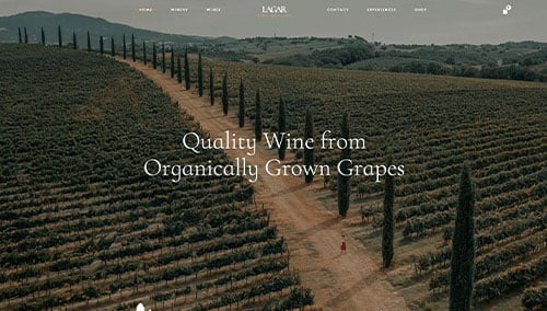
Lagar – Themeforest
$89
WooCommerce Winery Themes
You’ll find a wide range of ecommerce winery themes for WooCommerce on ThemeForest.
Aperitif – Themeforest
$85
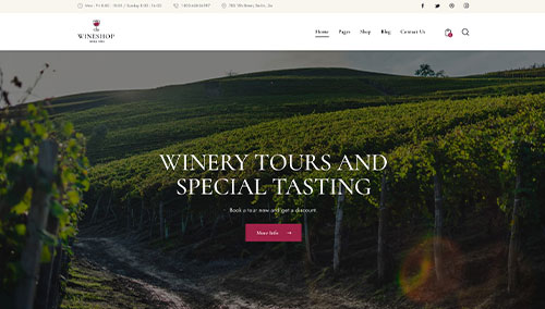
WineShop – Themeforest
$69
Kowine – Themeforest
$59
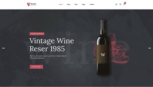
Wicky – Themeforest
$59
Shopify Wine Themes
Discover free and paid themes at themes.shopify.com or explore options through marketplaces like ThemeForest.
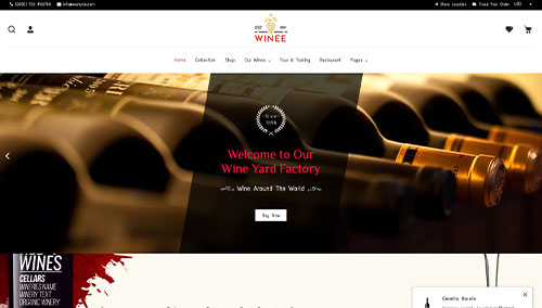
Winee – Themeforest
$59
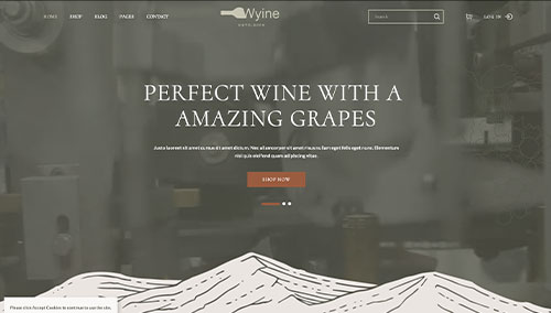
Wyine – Themeforest
$29
Wineryn – Themeforest
$59
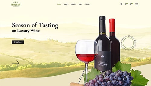
WineBar – Themeforest
$58
Wix Winery Themes
Discover free and paid themes in their marketplace at wix.com, some of which are ideal for wineries.
4.) Creating Content & Adding Images
With your domain, platform, and theme ready, it’s time to start creating content!
Here are some tips for writing engaging, effective copy:
- Know your target audience: Know your audience’s demographics and needs. Create content that addresses their interests and adds value to boost your winery’s search visibility.
- Define your key messages: Define your key messages. Highlight your winery’s brand, unique features, and the benefits of your wines or experiences.
- Keep it concise and scannable: Online readers scan, so keep content concise. Use short paragraphs, bullet points, subheadings, and bold text for easy reading.
- Create clear and compelling headlines: Create catchy headlines that highlight your winery’s value and encourage visitors to explore more.
- Incorporate keywords strategically: Research keywords and naturally include them to boost search rankings. Avoid keyword stuffing. Tools like Ahrefs or Semrush can help.
- Maintain a conversational tone: Write in a friendly, conversational tone. Avoid jargon and engage readers by speaking directly to them.
- Edit and proofread: Always proofread before publishing. Check grammar, spelling, flow, and ensure it fits your winery’s brand. Tools like Grammarly can help.
- Utilize ChatGPT for assistance: For help with ideas or refining content, try AI tools like ChatGPT.
Break up long text with high-quality, relevant images.
- Opt for high-quality images: Use clear, high-quality images. Blurry or pixelated photos will hurt your visual appeal.
- Ensure relevance: Choose images that match with your content and improve your overall feel.
- Consider stock photo resources: Use stock photo sites like Unsplash, Pixabay, or Shutterstock for quality winery images. Follow licensing rules and give credit when required.
- Customize images when possible: If possible, customize images to match the feel of your brand for a cohesive look. Tools like Adobe Photoshop or Canva can help.
- Optimize image file sizes: Compress images to reduce file size without losing quality. Large files slow your site and hurt SEO. Tools like TinyPNG can help.
5.) Post Launch Tasks
After launch, focus on these tasks to maximize its success:
- Search Engine Optimization (SEO): Boost local visibility with SEO—optimize content, use keywords, and update often. Consider our SEO team or The HOTH.
- Paid Advertising: For quick, targeted traffic, try Google or Facebook Ads. Use our PPC management services or hire experts on sites like Mayple.
- Conversion Rate Optimization (CRO): Use tools like Google Analytics to track performance and spot drop-offs. Run A/B tests with VWO to boost conversions and enhance user experience.
- Website Security: Protect your winery site with SSL, firewalls like Sucuri, and regular backups. Keep everything updated, monitor for risks, and use tools like UptimeRobot for uptime checks.
- Website Maintenance: Regularly maintain your winery site—update plugins, fix errors, monitor speed, and back up data. Consider our website maintenance services or hire freelancers on Upwork.
- User Feedback and Testing: Gather user feedback and run tests to understand visitor experience. Use insights to improve and optimize your winery website.
- Content Updates: Keep your content fresh—post blogs about winemaking, update products, and verify that details stay accurate. Engaging content attracts visitors and encourages shares.
Post-launch digital marketing is key to your winery’s long-term success. Stay proactive, track performance, and adjust strategies to meet your goals.