In today’s digital age, having a well-designed site is crucial for building a strong online presence and engaging visitors effectively.
Are you seeking inspiration for your next template? Explore some prime examples we’ve found that carefully consider their customers.
We’ve found some of our favorite ones based on quality, uniqueness, and functionality, and placed them right here for you to explore. With 20+ years of experience reviewing countless designs daily, our web design agency has seen it all!
Whether you’re a small business owner, freelancer, or creating a personal site, this list offers plenty of ideas to inspire your web design. Let it help bring your vision to life!
Our Top Ranked Websites of 2024
1. Eden Reforestation Project
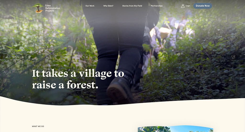
Eden Reforestation Project’s website clearly focuses on creating a layout that meshes well with their target market. We thought their use of a natural palette was smart because of what they stand for. Their logo design was also creative and memorable, which is always good to have. Including green for fonts helps their titles stand out, for sure a plus.
Ranked in our Best Non-Profit Websites Article
2. UPLIFT
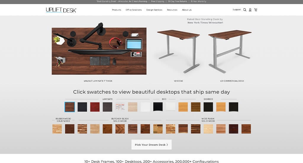
Here’s another great example that has resurfaced. This is a great one to take a look at when looking for inspiration because they clearly showcase their products right away. It was cool to have an interactive design that shows their different patterns on their product. There was also lots of great use of white space which was great for navigation.
Ranked in our Best BigCommerce Websites Article
3. Field Edge
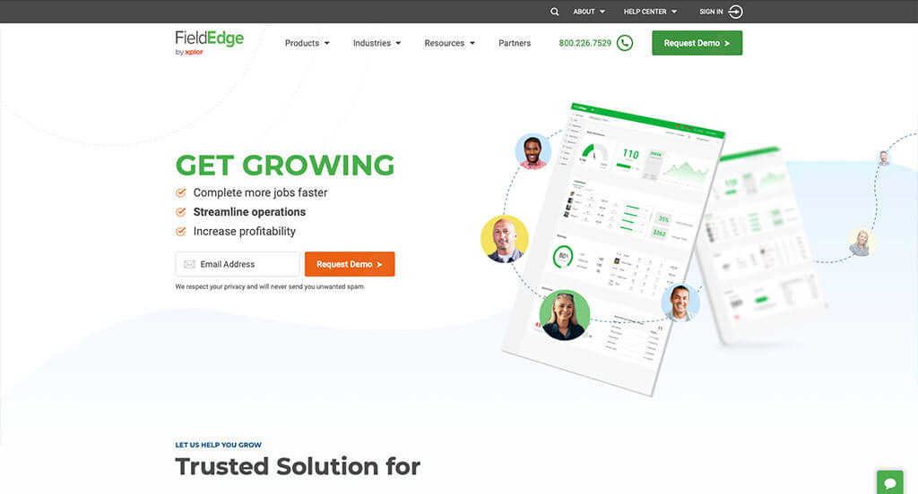
FieldEdge is a unique example because of their interesting photo frames and graphics sprinkled throughout. We liked how they had a very professional font that is easy to read. This business also made sure to make great use of white space so everything felt balanced. While it is easy on the eyes, every inch of their main page is also highly utilized.
Ranked in our Best Tech/IT Websites Article
4. CBH Homes
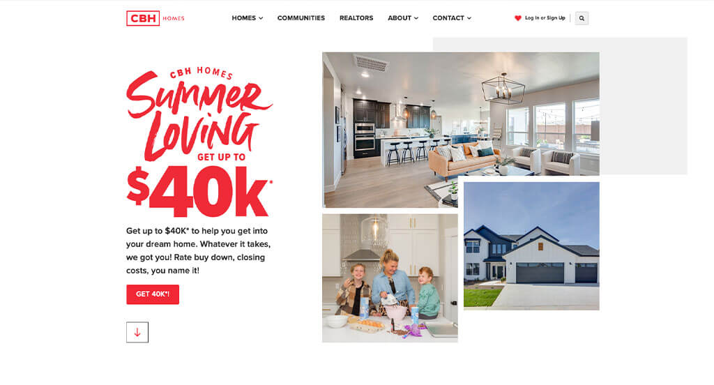
CBH Homes does a great job reminding customers of the current season. For instance, around Christmas, they feature a festival of homes. We loved how red was used as an accent to help important information stand out more. Having a few different fonts that all look cool when put together was another good choice.
Ranked in our Best Home Builders Websites Article
5. The Smokehaus
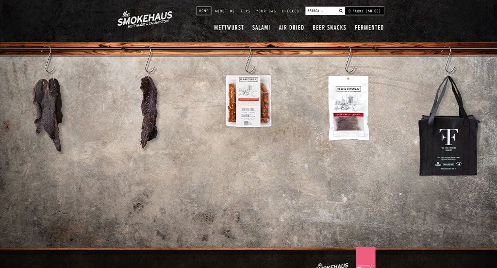
The Smokehaus is an Australian-based online store that specializes in selling smoked meats and meat-smoking products.
Many avant-garde web designs use cutting-edge design characteristics to dazzle & impress visitors. However, these interesting features can often be met with confusion as they stray away from the functionality that the general public may be used to seeing. The developers of the Smokehaus website have preemptively included a splash page to educate the visitor on how to use the website more effectively.
An interesting design characteristic this website uses is a sideways scrolling feature, which makes it easy for mobile visitors to view their products. Another unique design characteristic is a wooden plank image as the divider between the header and the body of the site.
Ranked in our Best WooCommerce Websites Article
6. Kinective Fitness
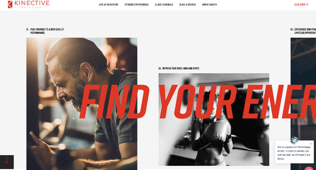
Right away in Kinective Fitness’ page we say their innovative scrolling title to suprise customers into reading more content. Their bright red accents against their normal black and white color scheme really creates a nice pop. Additionally, this template features many high quality and professional photography and typography.
Ranked in our Best Sports Websites Article
7. Lillian Wu Studio
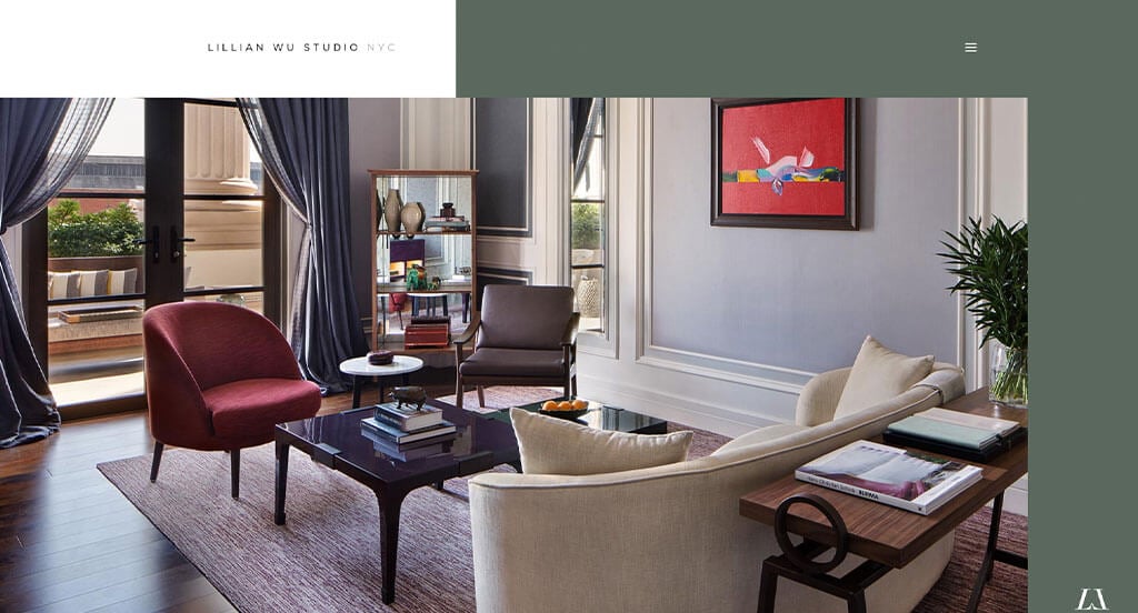
Lillian Wu Studio is a very modern looking template that attracts lots of attention. Their color choices stand out on their own. We loved how black and white images of their team are added in. Their placement of images, sliders and background colors was creative because it wasn’t always directly in the middle. Lillian Wu Studio did not fail when designing their logo. It makes great use of two L’s to form a W standing for their name.
Ranked in our Best Interior Design Websites Article
8. Handel Architects
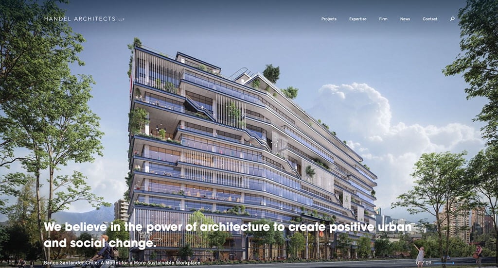
We loved Handel Architects’ website because of their high quality visuals. We thought it was creative to have image frames that change pictures when you hover over them. Using bold fonts for certain texts was another thing about this example that we enjoyed. Adding a sea-foam green accent to guide viewers to links, important information and more was a good idea.
Ranked in our Best Architect Websites Article
9. Oshkosh Corporation
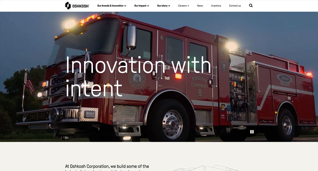
Oshkosh Corp made great use of alternating background colors to help break up content. Additionally, lots of high quality images are used in many areas of this example. It was smart to have so many links bringing customers to information. Everything in their design is extremely organized, making it easy for customers to find what they are looking for.
Ranked in our Best B2B Websites Article
10. Aurate
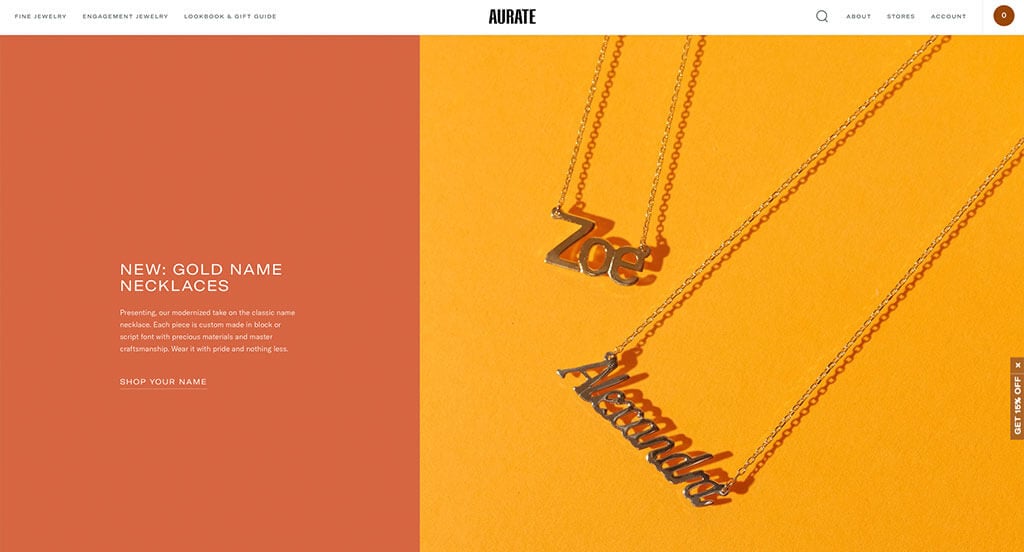
Aurate is another amazing example that we wanted to revisit. Their imagery was amazing with their dark backgrounds. Including a few things based on the current holiday was another thing we really enjoyed. Lots of sparkly diamonds are used to attract customers who like that sort of thing. Adding in short videos to showcase many of their pieces. Adding that element also allows for the true sparkle of their products.
Ranked in our Best Jewelry Websites Article
11. Baptist Health
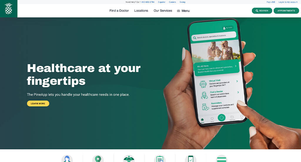
Likely one of Baptist Health’s best features was their image frames. It was even cooler because similar shapes were used as buttons and more. Here’s an example that is easy to navigate, with clear links to popular topics such as provider search, bill pay, and health resources. We really liked how their colors are subdued and professional, and everything is clean and uncluttered. Lots of links could be found to direct customers to more information.
Ranked in our Best Medical Websites Article
12. The Dallas Mavericks
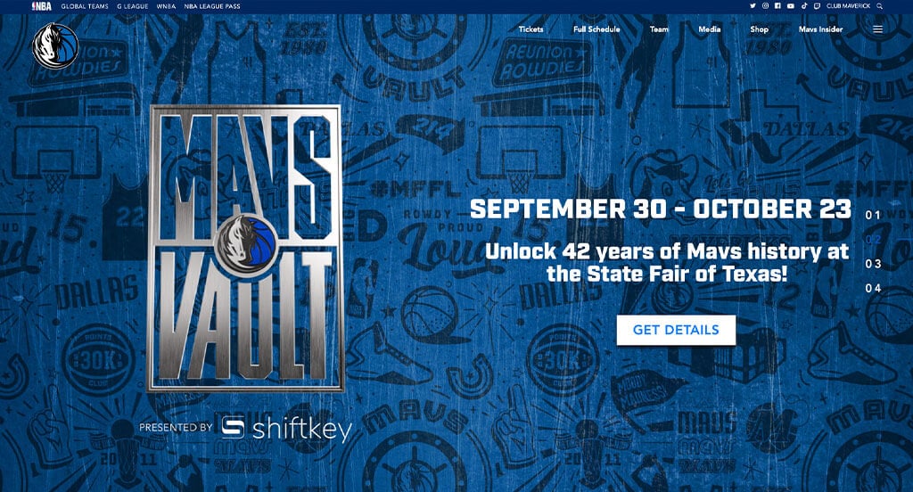
Everything about this site is stunning. Their bright blues, their metallic illusions in areas, their use of buttons. It’s clean and straightforward, which helps any true fan get excited about their favorite team. Including clear links to social media accounts, full schedules, their pro shop, tickets, and more was a great choice. We loved their logo design that showcases their mascot and a basketball.
Ranked in our Best WordPress Websites Article
13. KBDfans
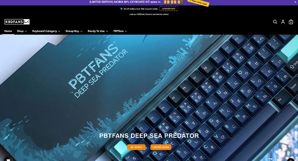
This keyboard company made it their mission to stand out from typical keyboard sellers. These keyboards have lots of unique patterns that we love. We loved how they added in little red ribbons to show discounts on certain products. Having a section for new arrivals and ready to use products was another thing that stood out to us.
Ranked in our Best Shopify Websites Article
14. Peterbilt
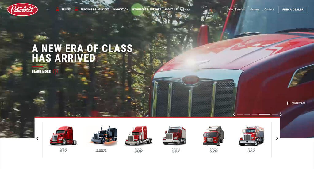
Peterbilt creatively uses images of their original trucks to show pride in the fact that they’ve been a company for 85 years. We loved all of their high quality visuals that make this site even better. Showing all of their truck models in a unique display was something we really liked. Adding a little side menu also helped to organize all of their information. This is truly a great site that was worthy of inclusion in our favorite articles from 2024!
Ranked in our Best Automotive Websites Article
15. Embassy Dental
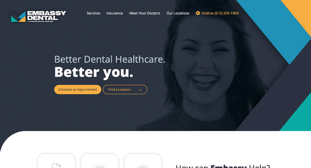
Here we immediately noticed vivid and bold colors, which helps set this example apart from its peers. Many simple shapes and such are used as graphics to spice up their looks a bit. Offering a special for new customers was another choice that viewers will see and understand. A live chat feature was also noticed and helpful for people looking for a short answer.
Ranked in our Best Dental Websites Article
16. Crows Nest Barbershop
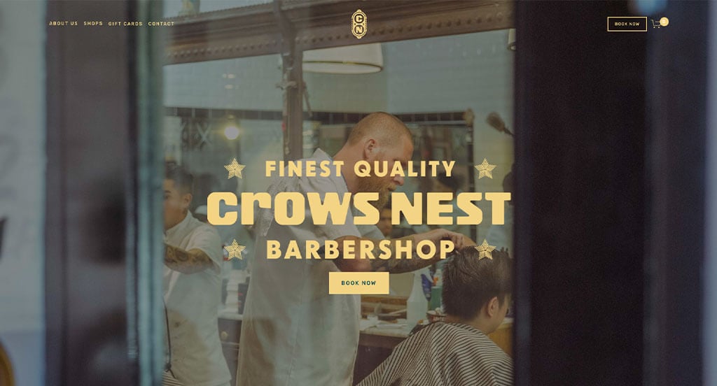
Right away, this example stands out of because of their yellow color with creative fonts. This one breaks the norm of what you might see on other hair stylist websites, which helps customers stay on their web page longer. Adding in a video that explains how Crows Nest Barbershop got to what it is now was a nice touch. They clearly displayed their locations by having links to book appointments and street signs as a background for that location.
Ranked in our Best Hair Salon Websites Article
17. Sonoco
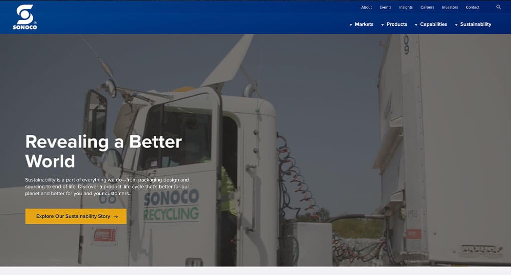
Sonoco was no exception to our list, it embraces excellence for sure. Their yellow and blue accents really helped highlight this site definitely. Lots of images are used to help link content in their pages. Their clearly labeled menu was another choice that always helps customers to find information quickly. Having all of their social media accounts linked into their footer was another thing that we loved.
Ranked in our Best Manufacturing Websites Article
18. Nelson Global
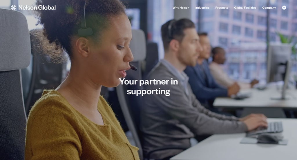
Nelson Global started right away with an automatically playing video to grab attention. They used white space very effectively which was nice because everything felt more balanced. Something else that we loved was their simple but bright blue accents. Nelson Global also does a great job with their staggered images to create an interesting template. We thought it was also nice to add in a few statistics related to their business.
First time ranking in our lists!
19. Gulfstream
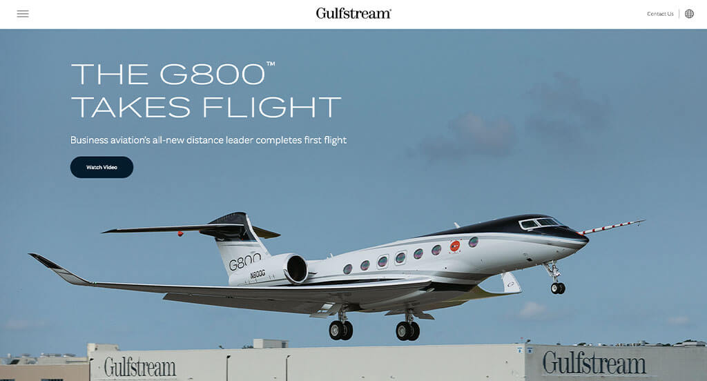
This company clearly makes great use of white space to make this design look so good. Professional fonts are used to create a stunning template. There was lots of short paragraphs in this design which helps customers stay engaged with their design even longer. Beyond all that, we also enjoy their use of creative photography, colors, and videography throughout the site.
Ranked in our Best B2B Websites Article
20. Good Start Packaging
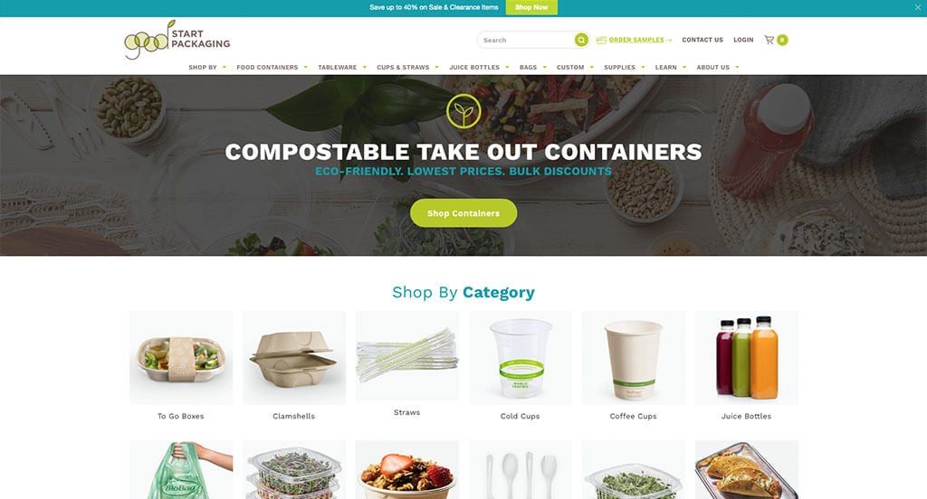
Here’s another example that surely shows that they are a eco-friendly brand. Their color scheme and logo design is sure to show that. We loved that they had the option to shop for products by category. Brightly colored buttons might be noticed as viewers go through this example to help find additional content. We also liked how videos were included to help add in more information.
Ranked in our Best B2B Websites Article
21. Runners Fix
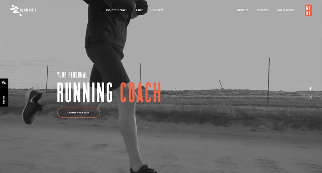
We noticed right away that this company makes good use of automatically playing videos for a background. This company has a creative logo design that features a running figure and also a mountain looking shape. We loved their buttons that are both filled and outlined to have interesting looks. Their title fonts were amazing and really helped their information seem more organized.
Ranked in our Best Sports Websites Article
22. NOBULL
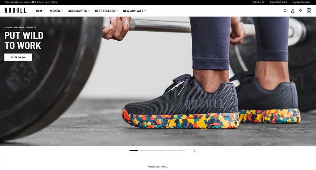
NOBULL attracts customers by displaying their brightly colored products right away in this site. It was smart to add in little fonts that show products on sale or their final sale. Showing Honorable Mentions from places such as Awwards.com was another great idea. We liked how they had an option to favorite some of their products.
Ranked in our Best Sports Websites Article
23. LARQ
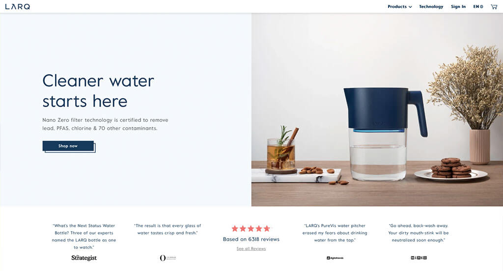
Instantly, we are intrigued by this clean and simplistic design. Their imagery also revolves around the current holiday which we thought gave a more personable feel. The colors used here is also minimal, which adds to that clean and simple feel we mentioned before. Adding in a section that showcases their customer reviews was a good touch.
Ranked in our Best Ecommerce Websites Article
24. Kettle & Fire
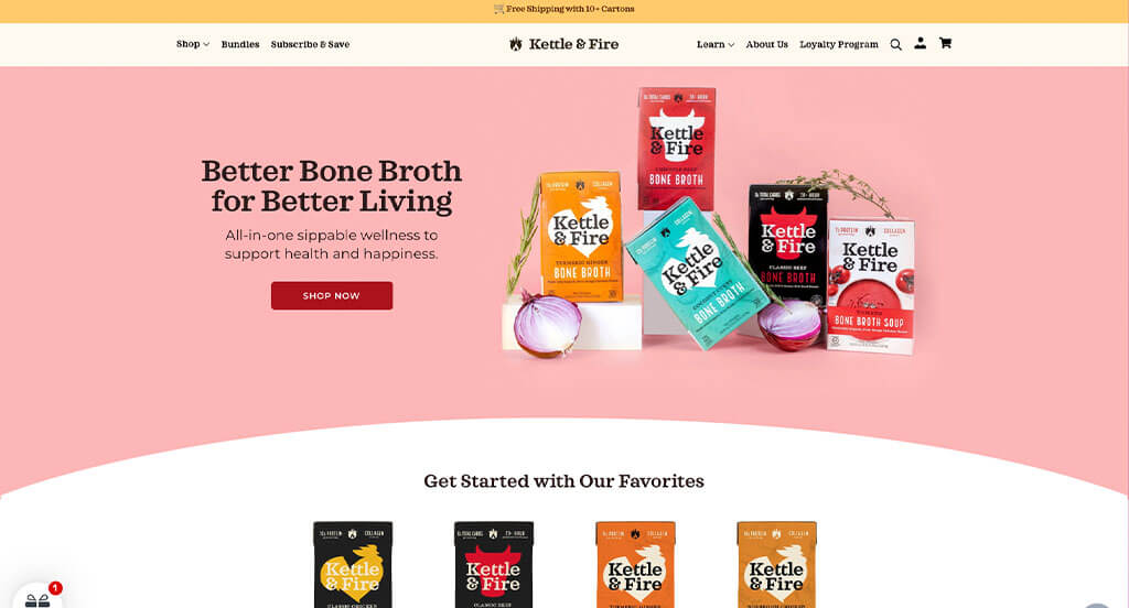
Kettle & Fire does a great job displaying their packaging which is unique for an online store. Using a few different pastel colors to decorate this example was something else we enjoyed. Aside from that, we loved their logo design that cleverly used a flame and a kettle within one design. It was helpful to have customer reviews showing verified customers.
Ranked in our Best Ecommerce Websites Article
25. Magic Spoon
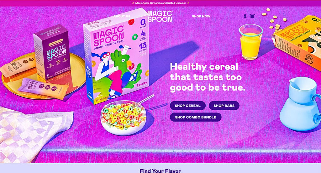
Right away, Magic Spoon grasps the attention of young children due to its bright colors. Also having spinning animations for cereal bites was something that stood out to us. Offering cereal and treat packs along with a build your own bundle helps customers feel they are getting more for their dollars. We also liked how Magic Spoon made great use of short video clips and buttons to engage customers into their content a bit more.
Ranked in our Best Ecommerce Websites Article
26. Winc
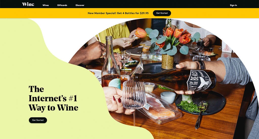
Likely our favorite part about this example was their squiggly frames and background colors that create a dun and inviting template. Additionally, we really thought Winc did a good job with their stunning packaging for their variety of wine flavors. Every one of their images was high-quality and professional looking which brings them into the next tier of web designs. Another feature that we noticed was their pop-up that asks about your age prior to opening this site.
Ranked in our Best Ecommerce Websites Article
27. Acumen
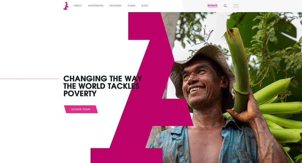
Here’s another one that really stood out to us as we moved through our long lists to pick from. We really loved their automatically playing videos. Bright color accents also help this company highlight the important areas of this template. Many high quality images also improve visual aspects of this design. Acumen’s logo design made use of white space to have an interesting look. Finally, everything is written in nice short paragraphs so people can read it easier.
Ranked in our Best Non-Profit Websites Article
28. Planet Fitness
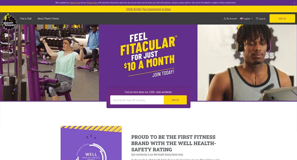
Planet Fitness is very successful chain company and that is obvious in their website. Unity is something that is for sure found in this site. No matter where you are in their site, the same colors are used effectively, which also happen to be the colors for their logo. Adding in small little graphics to serve as icons was something else we found helpful. Automatically playing videos was something else we liked in this example.
Ranked in our Best Fitness Websites Article
29. .strandberg*
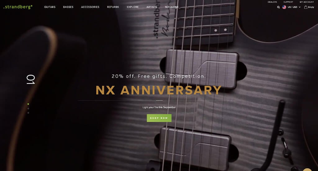
This example clearly taps into a luxurious feel. We loved their high quality visuals that almost seem 3D. Those images also use strategically dark backgrounds that help make their guitar colors pop a bit more. Accenting this site with a lime green was a feature that we definitely didn’t miss. As viewers scroll, they’ll find social media links. Make sure to check out this one if you want inspiration when creating your unique site for custom products.
Ranked in our Best Corporate Websites Article
30. JOCO Cups
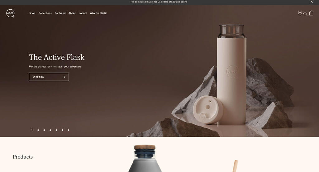
This is a natural seeming template that utilizes a neutral color palette. Having small animated graphics to prove their mission of reducing waste was something we loved. Including a line of their social media posts really helps bring a little bit of life to their pages. Additionally, graphics of their products are stacked together so customers can compare sizes of certain products. It was also helpful to have multiple pages dedicated things such as their impact, plastic reduction and product support.
Ranked in our Best WooCommerce Websites Article
31. The Ridge
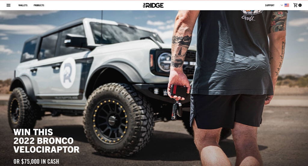
The Ridge clearly showcases who they are and their simplistic but modern products. Creating a logo with angled edges allows for a unique look that seems to match their company. Sorting everything so customers can shop by the specific thing that they are looking for is really nice. Having football and baseball team items that will attract customers who are fans. We also thought it was a great choice to pick a domain that matches their business name.
Ranked in our Best Shopify Websites Article
32. Black Diamond
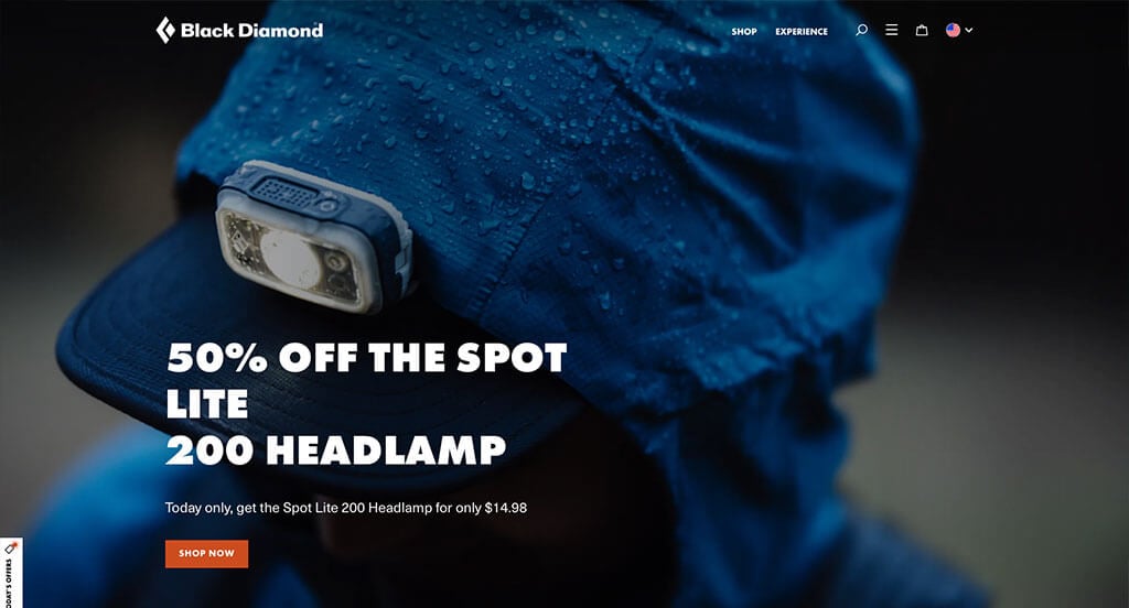
Black Diamond is sure to make an impact with their bold fonts and basic backgrounds. Adding in small splashes of orange color was helpful to create a stunning design. Though their logo design is simple, it’s memorable and makes sense for their brand. Having lots of buttons was a choice that was extremely smart. We also noticed how there was a search bar within their design.
Ranked in our Best BigCommerce Websites Article
33. Marucci
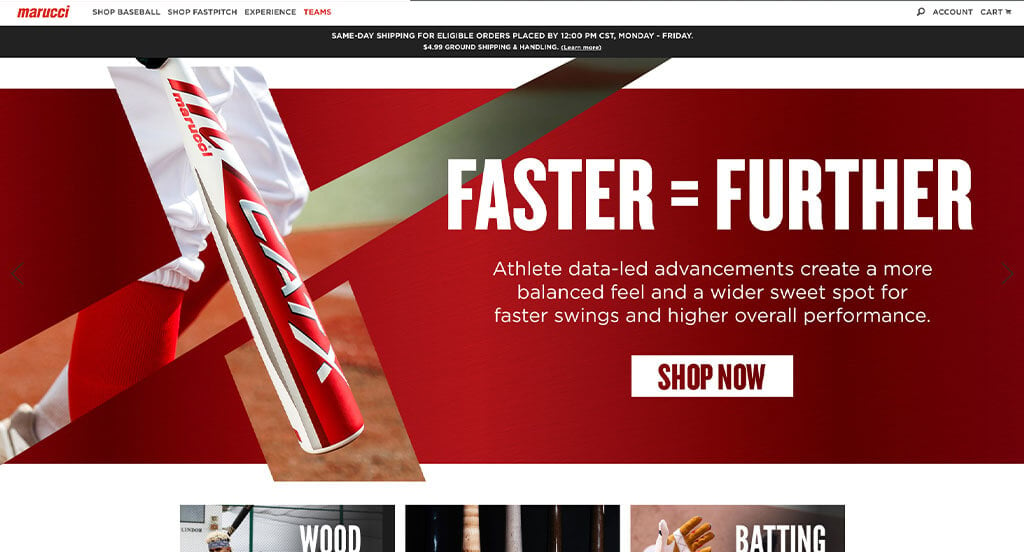
We really felt that this example was a business of high quality due to their clean white color palette that is everywhere. The bold bright red really pops against the white of this company. Adding in photos in black and white was another cool idea. We loved how their menu helped to organize all of their content. Allowing customers to customize nearly every detail of their new baseball bat and see it update in real-time was amazing.
Ranked in our Best BigCommerce Websites Article
34. Insurify
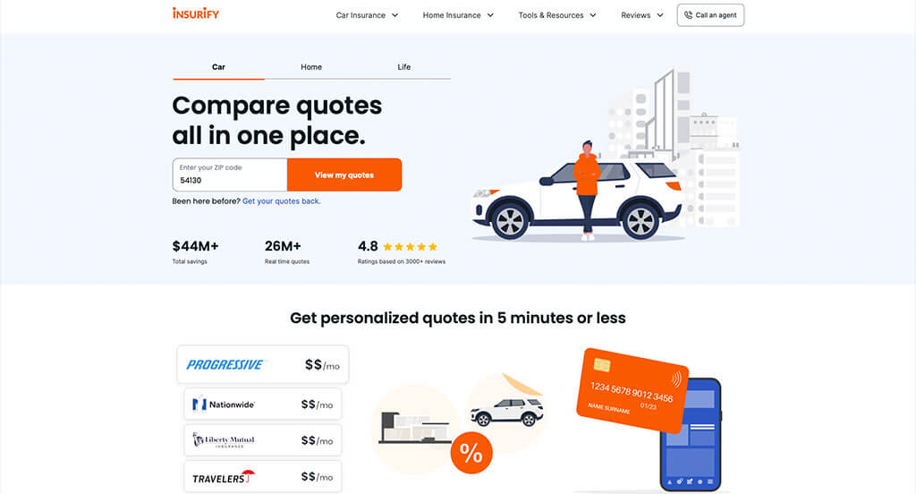
We love how this company uses lots of balanced white space to make everything seem less cluttered. Being able to compare a variety of insurance types was something that is helpful to every customer. Having the ability to connect with an expert in just a click of a button was considerate. Another feature that was amazing was their large frequently asked questions section.
Ranked in our Best Insurance Websites Article
35. The Cool Club
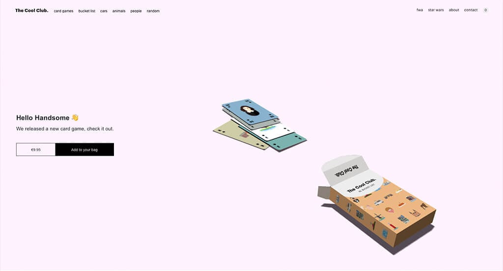
The Cool Club designs and sells unique playing cards. The uniqueness doesn’t stop at their cards though! Their website is something to behold and has a feature you may not have seen before.
After loading their homepage, you’re greeted with a box of cards that begin spitting out the playing cards hidden inside. As you move your mouse around the page, you’ll quickly notice that the box begins to move. However, if you go ahead and click on the box, a card will jump out and land near the other cards that have already shot out! It’s a cool party trick, something a bit more avant-garde than what a more traditional ecommerce website might have, but it’s fun nevertheless!
Scrolling past that fun, interactive feature you will come across some of the different styles of playing cards and posters they offer. The Cool Club relies heavily on negative space on this website, but all that negative space highlights the products!
The Cool Club’s website is aesthetically pleasing and quite possibly one of the least cluttered websites on our list (except when you make a mess with the playing cards of course!). We also recommend checking out the collections they have in the top/right menu bar, as those offer something fun to look at as well!
If you’re interested in having a cool website like this, you’re going to need to hire an expert web developer. Make sure you talk with your web designers to see if they are capable of something like this before embarking on the project!
Ranked in our Best WordPress Websites Article
36. AllBirds
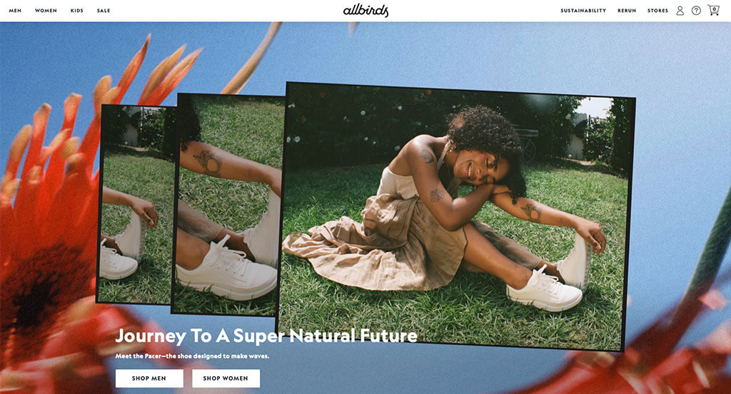
We really do think this site is a winner in the web world. Allbirds has outstanding imagery that is unique and simple, but manages to still show off their product. We love how they have a well-labeled menu that makes their content nice and organized. A simple domain was another great choice that will always help out a company like this one.
Ranked in our Best Ecommerce Websites Article
37. Secrid
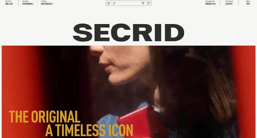
We really liked how as viewers scroll down, the company name goes into the site’s search bar. This color scheme is very basic but follows a very natural feel. We liked how their products had little animations upon hover. As you scroll through, you’ll find there’s lots of white space but it’s filled with large product images. Small graphics are found to be used as a bit of visuals. This is a great website to gain inspiration from.
First time ranking in our articles!
38. Tillamook
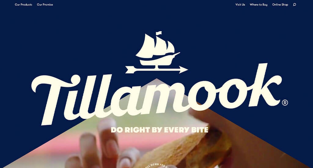
High quality visuals is our favorite part about this example. Their creative packaging was displayed well which was a good choice because of how it stands out from their competitors. We thought even their brand name was a plus because of its uniqueness. As you scroll through, you’ll gain an understanding of their company, culture, and products. Even this footer has a minimal, yet appealing design to it.
First time ranking in our articles!
39. Zwift
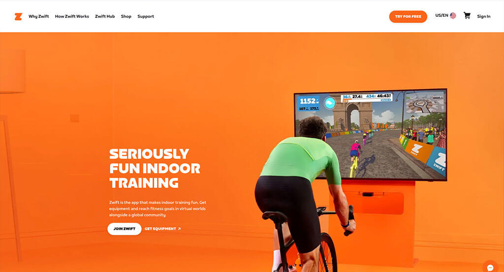
Zwift created a usable product that even has an element of motivation with their TV animations. We love their bright orange accents that really grab the attention of this site’s viewers. There were lots of buttons which was a smart decision because people will be able to navigate better. One of our favorite aspects was their customer reviews from professional cyclists. Their product page was something else that was well designed.
First time ranking in our favorites lists!
40. Rad Power Bikes
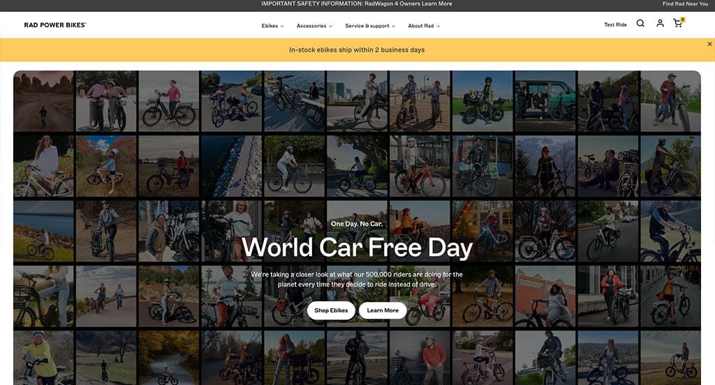
This example was definitely clean and simplistic. We loved how their font wasn’t boring but didn’t look extremely complex. Adding in small graphics for little icons really improves their visual appeal. A store locator can be seen in the top right which was really helpful for visitors looking for a store. If you’ve got a large budget for a premium website design, check this website out for inspiration.
Ranked in our Best Corporate Websites Article
41. Irvins
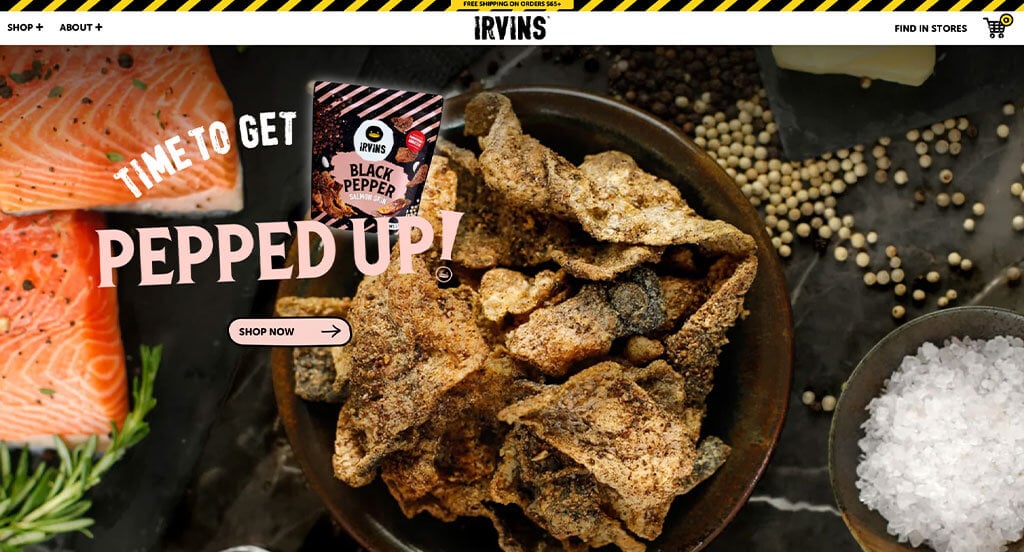
Here is an example that truly stands out to us. We loved their interesting color palette because it looked stunning. Another creative thing about this design is their graphics that move around this template. Aside from all of that, we loved how they used interesting fonts. Their high quality images and their use of videos was very smart. Finally, including their social media posts right into their page was something we didn’t miss.
First time ranking in our list!
42. Aro
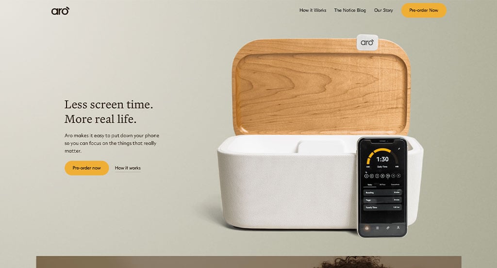
Aro has an extremely clean and minimalistic site. Showcasing customer reviews and small paragraphs to add more content was amazing. We thought it was a cool idea to use alternating images and text boxes to allow for an easy to read layout. It was also nice that they offered a podcast featuring a variety of people from different backgrounds. Additionally having a whole page dedicated to their product so customers can better understand it was another great idea.
First time ranking in our list!
43. HydraCup
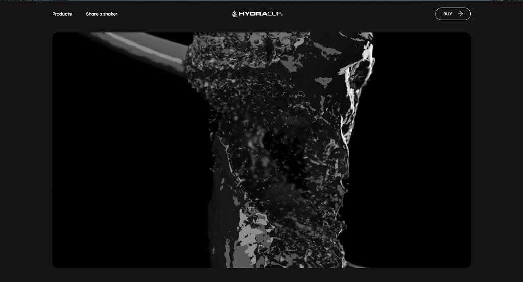
We noticed how this company added in a before and after slider for their product. Additionally they have unique ideas such as a phone holder (for a water bottle with a handle) and shaker bottles. Having videos to show off these innovative ideas was an idea that didn’t slip through our fingers. Hydracup had a stunning logo design that makes use of their brand’s name. Including all of their social media links within their header was smart.
Ranked in our Best Sports Websites Article
44. Perfy
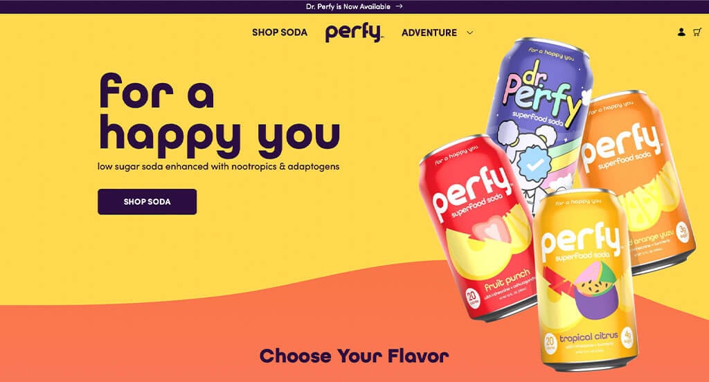
This is yet another fun example with bright and bold colors. We love how they take advantage of their interesting package and place it throughout their template. These days, so many examples focus on minimalism and simplicity, that when an exciting site like this one comes along, we couldn’t be more grateful. Small graphics can be noticed all throughout to accent this already perfect design.
First time ranking in our list!
45. Slate
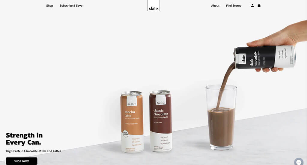
Now we’re back to an incredibly modern, minimalistic example. Though their color scheme is almost boring, it helps their product stand out more due to their brown color. It was cool to have graphics that were animated a bit because it added a sense of uniqueness. Slate’s fonts were amazing because they were bold and stunning. Everything is very crisp with this website, even how they integrate reviews and social media accounts.
First time ranking in our list!
46. Vibrants
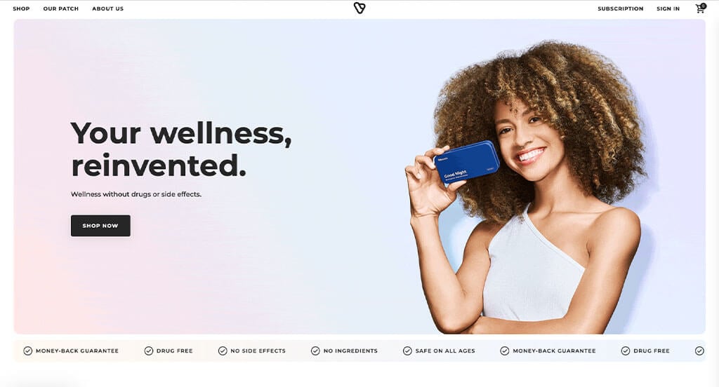
To show off an innovative product, you must have an interesting website. Vibrants chose to use pastel colors as accents to create a calming environment for their template. Images are used in sequences to create a sort of animation of customers interacting with their product. It was unique to add in a feature that tells you when another person purchases their product. This company also did a great job with visuals and content to explain their product quickly so people aren’t confused.
First time ranking in our list!
47. Krave
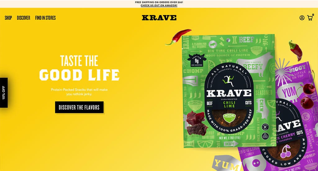
Krave is another fun website in terms of colors and imagery, due to their unique. Lots of bright colors are used and contrast well with each other. We liked how small little graphics of certain foods were placed around this example so people can understand their flavorings. Including creative fonts, buttons and such was something else that was stood out to us. Additionally, we really liked how their was some interesting photo frames to help accent their images.
Ranked in our list of interactive web templates!
48. Windmill Air
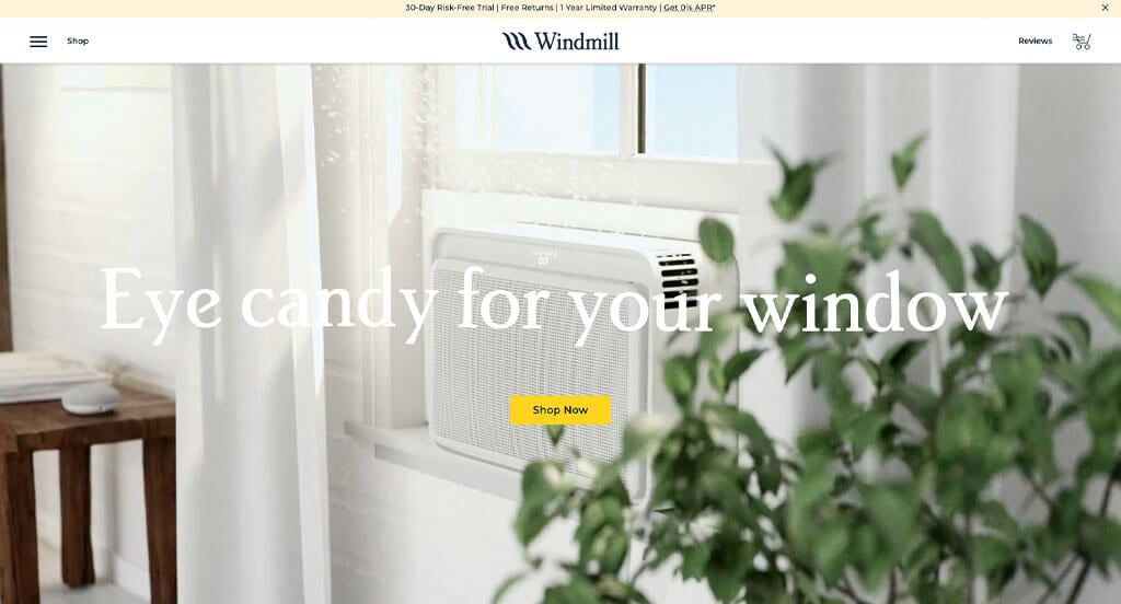
This modern and clean template is one to use as an example for sure. Having all corners of color blocks and images being rounded creates a more simplistic look. We thought it was helpful to have a good mixture of photography, illustrations and whitespace to showcase their company and products. Using a specific section to showcase all their awards was a choice that we certainly didn’t ignore. Don’t forget this example when looking for inspiration.
First time ranking in our list!
49. Jot
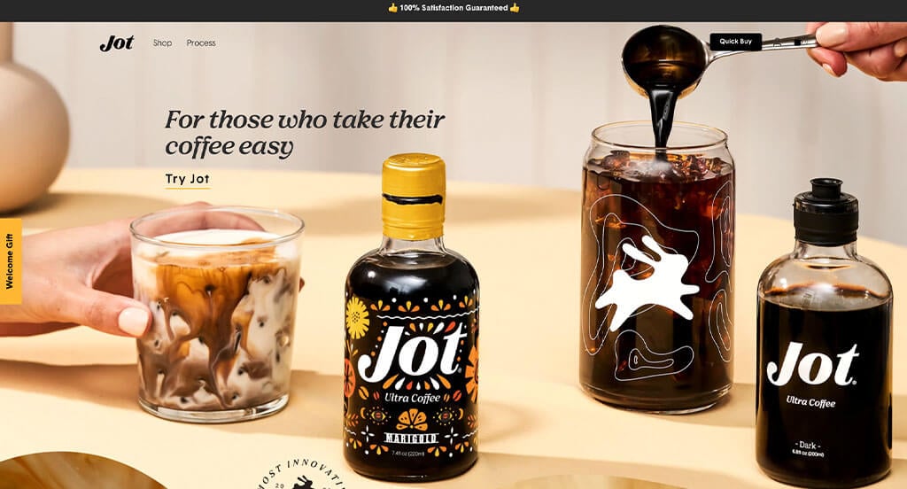
Jot certainly takes advantage of colors and imagery to give off a relaxed coffee enthusiast vibe. We loved how there was short animations related to their business to add a bit of interest. They also made sure to use a simple and professional font that looks amazing. Another thoughtful feature was their prices that utilize the strikeout feature to show current discounts. For anyone looking for design styles that relate to coffee websites, this is one to review for sure!
First time ranking in our list!
50. Robin Golf
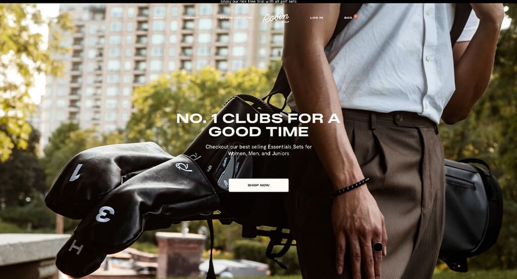
Why not end off with a golfing website? This website design goes for a classic, modern-traditional look and feel. It uses pleasing colors of an earth-tone feel and has smooth contemporary fonts.
As you scroll on the website, you’ll find all kinds of nice product photos and lifestyle photos. In some areas, the images are even shaped like golf courses to make everything seem more stitched-together.
The shopping category pages use a nice hover effect for product images. The product pages have a two-column photo grid, like AllBirds website. In this area, you’ll find product images and lifestyle images. As you scroll through the product page you’ll even be introduced to the story and features of the products and company. This is altogether a great website design example to review when building out your next website!
Ranked in our Best Sports Websites Article
More Best Website Design Examples
To help inspire you for your upcoming project, we’ve curated collections of top-quality sites by CMS, layout, and industry.
These articles will help you explore web design strategies and aesthetics, offering insights into creating engaging user experiences.
Best Website Designs by Platform
A website’s look isn’t defined by its CMS or platform, but many ask for top sites built on specific platforms—so start with these examples!
Best Web Designs by Layout Type
Focus beyond just your homepage—conversion paths often start on other landing or product pages. Make sure to prioritize design and user experience throughout your entire template.
The articles below discuss visual elements to look out for when building exceptional web pages.
Best Examples by Industry
Another common ask is to see examples of perfected sites in their competitive space. We’ve got almost every business sector covered, so don’t hesitate to check them out!
Professional Service Web Designs
If you are in the professional services industry, don’t be afraid to get creative on your next website design by looking into some of these exciting examples.
Construction & Home Service Web Designs
Top-performing home service layouts tend to prioritize lead generation, so they often feature contact forms, service area maps, discounts, reviews, and schedulers.
We’ve tried to find websites that do a great job of incorporating these lead generation design elements into their websites. Find some examples below!
- 50 Best Roofing Websites
- 50 Best Contractor Websites
- 49 Best HVAC Websites
- 51 Creative Landscaping Website Examples
- 50 Best Home Builder Websites
- 42 Best Cleaning Company Websites
- 35 Creative Pest Control Web Designs
- 52 Awesome Concrete Company Websites
- 23 Professional Locksmith Website Examples
- 50 Best Electrician Websites
Health & Medical Website Designs
Most health web pages tend to lean towards a clean-cut, professional website layout. However, we were able to find several that think out of the box.
Food & Beverage Website Designs
We’ve found hundreds of mouthwatering examples related to food & beverage for you to review!
Other Website Designs
Not finding what you’re looking for? Explore some more stellar designs, organized by industry, for your inspiration!
- 50 Corporate Website Design Examples
- 50 Best Small Business Websites
- 50 Best Manufacturing Web Designs
- 50 Best Industrial Website Designs
- 50 Top-Ranked Non-Profit Websites
- 50 Awesome B2B Website Examples
- 50 Top Ranked Church Website Examples
- 50 Best Consultant Website Designs
- 50 Great Educational Websites
- 50 Awesome Informational Websites
- 50 Best Wedding Website Designs
- 50 Great Subscription Website Examples
- 25 Best City Website Layouts
- 40 Inspiring Woodworking Website Ideas
- 47 Best Dispensary Website Examples
- Top 25 Computer Repair Sites
- 40 Awesome Auto Dealer Websites
- 55 Best Hotel Websites
- 47 Best Finance Websites
- 28 Best Funeral Home Sites
- Top 42 Mortgage Broker Websites
- 50 Best Auto Repair Websites
- 50 Unique Hair Salon Example Websites
- 50 Best Daycare Web Designs
- 25 Awesome Tattoo Websites
- 50 Unique Sports Websites
- 50 Best Jewelry Website Examples
- 50 Creative Photographer Sites
- 50 Top Ranked Travel Agency Websites
- 50 Creative Fashion Websites
- 50 Interesting Museum Website Designs
- 50 Best Software Website Designs
- 50 Captivating Tourism Web Designs
- 46 Best Florist Web Design Examples
- 45 Best Automotive Website Examples
- 20 Intriguing Artisan Websites
- Top 49 Ranked Agricultural Sites
- Our 20 Favorite Web Design Companies
- 46 Best Staffing Agency Websites
- 42 Best Catering Websites
- 24 Best Limo Websites
- Best 49 Self Storage Websites
Did we miss an industry? If so, let us know in the comments so we can find some more amazing examples!
How to Build a Great Website
Are you building out a new website? How exciting!
Let’s cover the key steps to create or redesign your existing site.
Fell free to skip ahead if you’ve already chosen your domain, hosting, and platform!
1.) Purchasing a Domain Name
If you already have a domain name, just scroll down to the next step.
Choosing a domain name is extremely important to your online identity, serving as your website’s address and playing a vital role in branding and recognition.
Here’s a step-by-step process to help you choose the perfect domain name:
- Brainstorm: Generate domain name ideas based on your business, niche, or related keywords. Aim for something memorable, relevant, and reflective of your brand.
- Simplicity: Keep it simple, easy to spell, and pronounce. Avoid complex words, hyphens, or numbers to ensure it’s memorable and user-friendly.
- Consistency: Include your brand name in your domain for better recognition and consistency. Surprisingly, many businesses overlook this, by using irrelevant options.
- Keywords: Using keywords can boost search visibility, and also prioritize readability and brand appeal over keyword stuffing.
- Availability: Make sure that this domain is available. If a domain is purchased but unused, consider contacting its current owner to buy it. Avoid spending over $500 on a domain.
- Domain Extensions: Pick out an extension that fits your website’s purpose. While .com is most recognized, options like .net, .org, or industry-specific extensions can also work.
- Legal Considerations: Before finalizing, conduct a trademark search to avoid infringing on intellectual property and future legal issues.
- Register the Domain: After finding your available domain, register it with a reputable registrar. Based on our experience, GoDaddy and Namecheap are very easy to manage.
2.) Choosing a Website Platform
If you’ve already arranged your domain and platform, proceed to the next step.
We will explore some popular options that are available. Some of our favorites are WordPress, SquareSpace, Wix, WooCommerce, Shopify, and BigCommerce. Let’s explore the process of choosing the right platform for your needs:
For Content Websites:
- WordPress: WordPress is a popular, flexible CMS suitable for all websites, from blogs to e-commerce. With thousands of themes and plugins, it enables tailored customization and scalability. Most users opt for the open-source version hosted on their web accounts.
- SquareSpace: SquareSpace, an alternative to WordPress, offers similar page-building features. It’s a solid platform for editing and SEO and doesn’t require separate hosting.
- Wix: Wix, similar to SquareSpace, offers page-building features as a hosted solution. It’s user-friendly for editing and SEO and doesn’t require separate hosting.
For Ecommerce Websites:
- WooCommerce: To build an online store on WordPress, use WooCommerce. It integrates seamlessly, adding e-commerce functionality with extensions, payment gateways, and inventory tools, ideal for online businesses.
- Shopify: Shopify is a leading hosted e-commerce platform with customizable themes, built-in security, and tools for inventory, payments, and shipping—no separate hosting needed.
- BigCommerce: BigCommerce, a Shopify competitor, offers similar features but has a smaller developer community and app marketplace. Its extensive API supports advanced customizations.
Web Hosting Requirements
If you use a platform like WordPress or WooCommerce, you’ll need to find a web hosting service.
As a shameless plug, we often recommend our own web hosting
We highly recommend our web hosting for WordPress sites. For other reliable options, consider these:
- WP Engine: WP Engine is an overall favorite because of its user-friendly control panel, seamless backups, and easy staging. Downsides include PHP time limits and steep pricing for upgrades.
- SiteGround: We love SiteGround for its excellent support, quick response times, and effective first-contact resolutions. Its easy-to-use backup tools and reasonable pricing are added perks.
- Digital Ocean: Digital Ocean is another reliable cloud hosting option, with a dependable network. However, costs can add up with server instances, software, backups, and management fees. For server admin help, try AdminGeekZ.
3.) Picking out a Website Template
Once you’ve chosen your platform, start planning your website design!
Most opt for customizing third-party templates to save time and cost, but you can hire a custom web developer or custom ecommerce developer for a fully custom-built theme.
For this article, we’ll focus on tips for finding pre-built website templates. Here are links to top theme marketplaces:
WordPress Themes
You can find free themes at wordpress.org, or consider options through marketplaces like ThemeForest.
Kitchor – Themeforest
$49
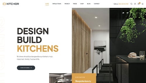
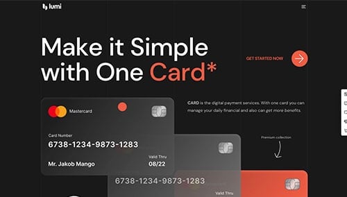
Lumi – Themeforest
$59
WooCommerce Themes
You’ll find plenty of themes for WooCommerce on ThemeForest.
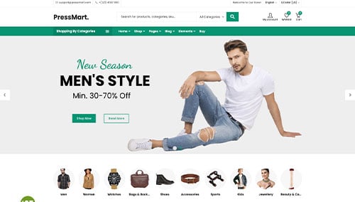
PressMart – Themeforest
$35
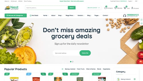
Nest – Themeforest
$39
Shopify Themes
You can find free and paid themes at themes.shopify.com, or consider options through marketplaces like ThemeForest.
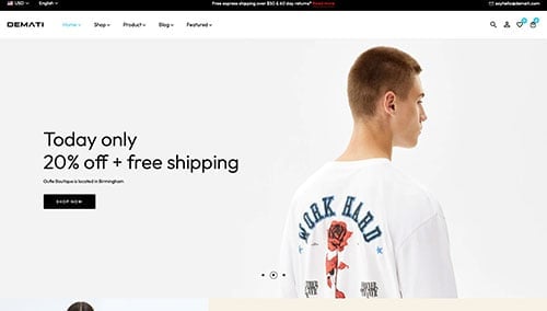
Demati – Themeforest
$48
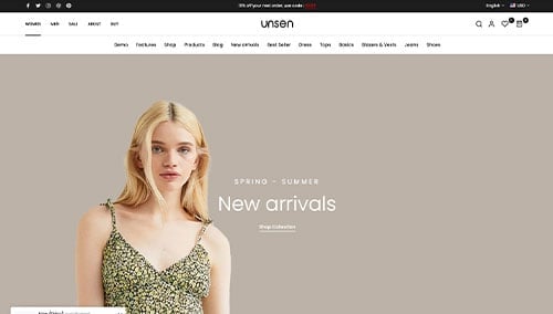
Unsen – Themeforest
$69
BigCommerce Themes
You can find free themes at bigcommerce.com, or consider options through marketplaces like ThemeForest.
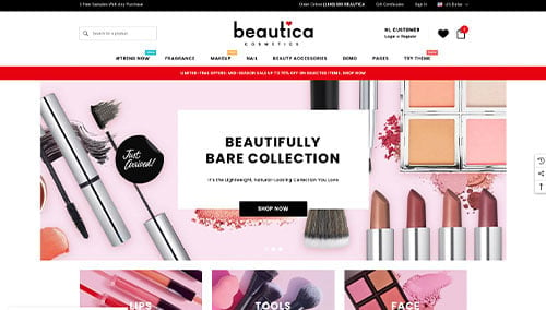
Beautica – Themeforest
$139
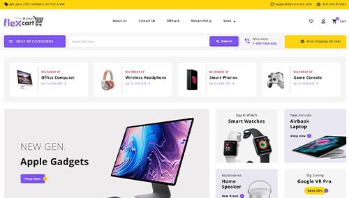
FlexCart – Themeforest
$99
Wix Themes
You can find free and paid themes in their marketplace at wix.com.
4.) Writing Content & Adding Images
Now it’s time to start building up your written and visual content!
Here’s some tips you can follow to create engaging and effective website copy. Let’s go over a few:
- Understand your target audience: Understand your audience’s demographics, preferences, and needs before writing. Tailor content to address their interests to provide value and boosting search rankings and conversions.
- Define your key messages: Notice key messages that align with your brand, showcase your unique selling points, and highlight the benefits of your products or services.
- Keep it concise and scannable: Online readers skim, so keep content simple. Use short paragraphs, bullet points, subheadings, and bold text for better readability.
- Use clear and compelling headlines: Create headlines that highlight your content’s value, encouraging visitors to read on and explore your site.
- Incorporate keywords strategically: Use tools like Ahrefs or SEMRush to research keywords and naturally include them in your content to boost search visibility. Avoid keyword stuffing to maintain readability.
- Maintain a conversational tone: Avoid complex jargon unless absolutely necessary. Use a friendly, engaging tone to connect with your audience.
- Edit and proofread: Revise all your content before publishing. Check grammar, spelling, and flow to make sure your site has a professional feel. Tools like Grammarly can help!
- Leverage ChatGPT for assistance: Struggling with ideas? Use AI tools like ChatGPT for inspiration and content refinement.
Images can help break up long sections of text. Here are some tips for doing so:
- Use high-quality images: Use high-resolution, visually appealing images. Make sure to avoid blurry or pixelated ones because they’ll lower your site’s quality.
- Ensure relevance: Choose images that fit with your information, they will enhance your visual appeal for sure.
- Consider stock photo resources: Use free photo sites like Unsplash, Pixabay, or Shutterstock for quality images. Check licensing and provide attribution if required.
- Customize images when possible: Customize images with tools like Adobe Photoshop or Canva to align with your brand and create a cohesive visual experience.
- Optimize image file sizes: Compress images with tools like TinyPNG to reduce file size, improve loading speed, and enhance user experience and SEO.
Quality written content and images work in harmony to engage visitors and convey your overall message. Follow these tips to create compelling, audience-focused website experiences.
5.) Post Launch Work
After launching your website, consider these essential tasks to maximize its effectiveness:
- Search Engine Optimization (SEO): Boost your website’s visibility with SEO by researching keywords, optimizing content, and building strong internal links. Regularly update with quality content or consider hiring our SEO team or third-party providers like The HOTH.
- Paid Advertising: Use platforms like Google Ads or Facebook Ads for quick, targeted traffic. Hire our PPC management services or professionals on sites like Mayple.
- Conversion Rate Optimization (CRO): Use tools like Google Analytics to analyze performance and user behavior. Identify drop-offs, conduct A/B testing with VWO, and make data-driven improvements to boost conversions and user experience.
- Website Security: Protect your site with SSL, firewalls like Sucuri, regular backups, and updates to your CMS and plugins. Use tools like UptimeRobot to monitor uptime and address security risks promptly.
- Website Maintenance: Maintain your website by updating plugins, themes, and monitoring performance. Make sure to fix broken links and back up regularly. For help with maintenance, hire our website maintenance services or a freelancer from Upwork.
- User Feedback and Testing: Seek user feedback and conduct testing to understand visitor experiences. Use insights to make ongoing improvements and optimize the user experience.
- Content Updates: Regularly update your site with fresh, accurate content. Publish blogs, update product info, and share valuable insights to attract and retain visitors.
Post-launch digital marketing is key to your website’s success. Stay proactive, monitor performance, and adapt strategies to meet your goals and audience needs.
Award-Winning Website Directories
For more great template examples, explore these directories featuring high-quality sites with user voting systems to rank designs!
1.) Awwwards
Awwwards, founded in 2009, is a platform that celebrates web design talent worldwide. It inspires people, connects professionals, and showcases current trends in web design and development.
2.) CSS Design Awards
CSS Design Awards (CSSDA), founded in 2010, serves as an inspiration hub for designers, developers, and agencies. This example also takes a look at websites from all around the globe.
3.) Webby Awards
Webby Awards, established in 1996, honors internet excellence across websites, videos, apps, and more. Titled as the “Oscars of the Internet,” they celebrate innovation and creativity online.
4.) CSS Winner
CSS Winner celebrates exceptional web design globally, serving as a place for many individuals and groups to find inspiration for their online sites.
5.) The FWA
The Favourite Website Awards (FWA), founded in 2000 by Rob Ford, notices outstanding web design and development, that inspires and recognizes creativity, innovation, and technical excellence worldwide.